Softwares
| Names | Stars & Forks | Issues | PRs | Downloads |
|---|---|---|---|---|
| pyCirclize |   |
  |
  |
  |
| pyGenomeViz |   |
  |
  |
  |
| pyMSAviz |   |
  |
  |
  |
| ANIclustermap |   |
  |
  |
  |
| COGclassifier |   |
  |
  |
  |
| phyTreeViz |   |
  |
  |
  |
| pybarrnap |   |
  |
  |
  |
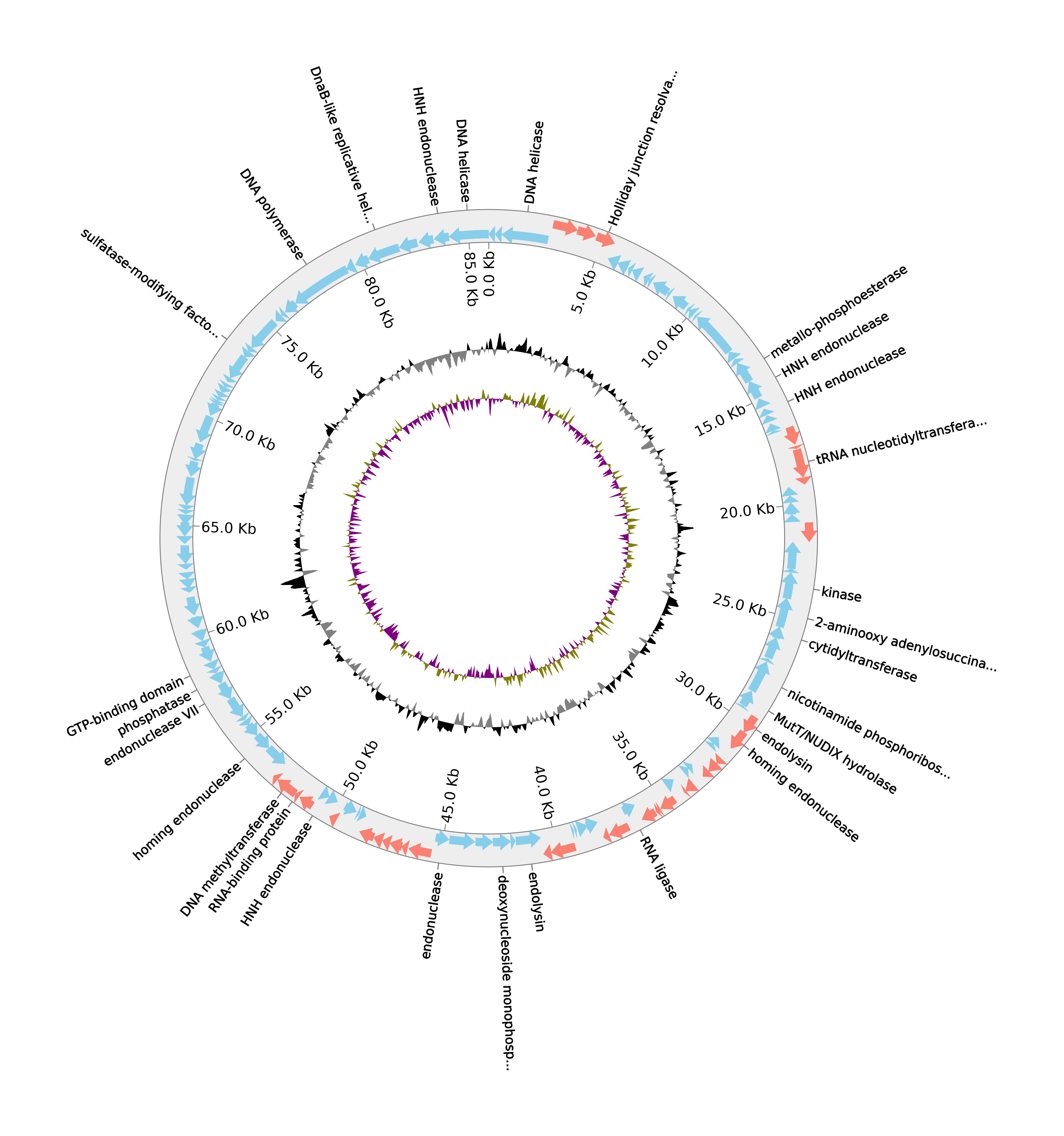
Circular visualization in Python (Circos Plot, Chord Diagram, Radar Chart)
Home Page: https://moshi4.github.io/pyCirclize/
License: MIT License
| Names | Stars & Forks | Issues | PRs | Downloads |
|---|---|---|---|---|
| pyCirclize | |
|
|
|
| pyGenomeViz | |
|
|
|
| pyMSAviz | |
|
|
|
| ANIclustermap | |
|
|
|
| COGclassifier | |
|
|
|
| phyTreeViz | |
|
|
|
| pybarrnap | |
|
|
|


Hi
is it possible to shade some links with respect to others? Like using different alpha.
Thanks
Hi @moshi4,
Do you have a preferred citation for pyCirclize?
I am officially adding it into Pharokka as of v 1.3.0 and would like to include a citation in the documentation.
George
Hi!
thank you so much for this easy to use package.
I am currently generating a circos from matrix (as its a huge dataset).
Most data have a to and from link. however, there are some points that are present in some of the sectors but dont go anywhere. I would like these to be blank extensions to the sector. I am unsure how to do this in the original raw data which has the following format:
item, from, to, value
'a'.    'one'    'two' 1
etc
There are situations where, for example, item 'b' is part of track 'one' but doesnt go anywhere. And i would like to see the sector include that data point but without any arrows going to or from that point. So for example, half of or most of that vector would have a to or from data, and the rest of the sector width would be there, but blank.
is this possible?
thank you!
Sir when I plot my time series data using pycircilize. the circos line plot is not showing the variation. for example my data is lies between 433 to 435. The Circos line plot is showing straight line i.e. there is no variation in timeseries. In pycircilize, there is no yticks why??
hi,
thanks for your wonderful contribution.
Q: Can I use different axes in the radar chart?
When I run the 'Circos.initialize_from_matrix' function, I get an error. The error is as follows:
ValueError: x=0.6189621949302285 is invalid range of 'stroma' sector.
Sector = 'stroma'
Size = 0.6189621949302284 (0 - 0.6189621949302284)
Radian size = 0.64 (-4.63 - -3.98)
Degree size = 36.69 (-265.00 - -228.31)
Hi @moshi4,
thanks for developing this super-interesting python lib!
For certain genome visualizations, I'd like to set a custom color for single features on one strand/track. For example, to colorize CDS features based on COG functional categories (or something similar). I haven't found anything in the docs. Is there an option to somehow achieve this and if this is not the case, would you be willing to implement such a feature?
Thanks again and best regards!
Oliver
Firstly, thank you for this outstanding circular visualization package.
However, I've encountered an issue while attempting to create a circos plot. I'm aiming for something similar to Example 4-2 in your documentation. My dataset consists of a 'to-from' table that includes approximately 37,000 entries, many of which are zeros. While using the following code to generate the circos diagram, I encounter a "ZeroDivisionError: float division by zero":
from pycirclize.parser import Matrix
matrix = Matrix.parse_fromto_table(tmp_weights)

circos = Circos.initialize_from_matrix(
    matrix,
    space=3,
    cmap="viridis",
    ticks_interval=5,
    label_kws=dict(size=12, r=110),
    link_kws=dict(direction=1, ec="black", lw=0.5),
)

fig = circos.plotfig()
I'm curious about the potential cause of this error. Could it be related to the size of my matrix or its sparsity? Any insights or suggestions you could provide would be immensely helpful.
Thank you so much for this terrific package and congraulations on the 1.0.0 release!
I just had a really quick comment that in a phylogenetic tree with spaces in the node labels, it seems they are displayed with only the last part after the space,
for instance
"PV AOC3" becomes "AOC3".
I use python in command line interface and I don't know how to show the plotted figure like when using matplotlib.pyplot.show() (I saw in other scripts but I have not experience with matplotlib either).
I added fig.show() at the end of one of your examples, and figure is displayed by python but immediately closed.
I can save it with circos.savefig("myfile.png") and then open with another program, but I'd prefer it to open automatically when running script, and keep open until I close the viewer.
Also, I would like to know what is the suggested way to citate your work in a publication.
Thanks a lot !
Hello,
Is it possible to adjust the vmin or vmax to a value below/above the min and max values of the data?
I get an error like this when I try and I'm wondering if there is a workaround:
ValueError: value=0.13 is not in valid range (vmin=-0.18, vmax=0.097)
Also is it possible to set a center value to anchor the colors around? Similar to the functionality in seaborns heatmap.
Thanks
Hi
Thank you for the amazing tool.
I am trying to plot multiple prokaryote genome comparisons like BLAST Ring Image Generator (BRIG), but it only plot 3 tracks no matter how much genomes
I'm using v 0.5.1
The code is
import os
from pathlib import Path
from tempfile import TemporaryDirectory

import pandas as pd
from matplotlib.patches import Patch
from Bio import SeqIO
from Bio.Blast.Applications import NcbiblastnCommandline, NcbimakeblastdbCommandline
from pycirclize import Circos
from pycirclize.utils import ColorCycler

ColorCycler.set_cmap('Set2')
palette = ColorCycler.get_color_list(len(queries))

def run_blastn(query, reference):
    with TemporaryDirectory() as tmpdir:
        blastdb = os.path.join(tmpdir, 'db')
        NcbimakeblastdbCommandline(input_file=reference, dbtype='nucl', out=blastdb)()
        stdout, stderr = NcbiblastnCommandline(query=query, db=blastdb, outfmt="6 sstart send", evalue=1e-20, )()
    return stdout


def get_match_range(blast_output):
    match_ranges = []
    for match_range in blast_output.splitlines():
        start, end = match_range.split()
        start, end = int(start), int(end)
        if start > end:
            start, end = end, start
        match_ranges.append((start, end))
    return match_ranges


track_size = 5
track_start = 90

reference = "CP037959.1.fna"
queries = [
    'MN539018.1.fna',
    'CP101234.1.fna',
    'CP103330.1.fna',
    'AP026962.1.fna',
]


sector_size = len(SeqIO.read(reference, 'fasta'))
circos = Circos(sectors={'CP037959.1': sector_size}, endspace=False)
circos.text(f"CP037959.1\n{sector_size:,} bp", size=12)

sector = circos.sectors[0]

inner_track = sector.add_track((track_start-1, track_start), r_pad_ratio=0.1)
inner_track.rect(start=0, end=sector_size, fc='k')
inner_track.xticks_by_interval(
    interval=20000,
    outer=False,
    label_margin=2,
    show_bottom_line=False,
    label_formatter=lambda x: f"{x/1000:.0f}kbp"
)

for query, color in zip(queries, palette):
    blast_output = run_blastn(query, reference)
    match_ranges = get_match_range(blast_output)
    track_end = track_start + track_size
    blast_track = sector.add_track((track_start, track_end), r_pad_ratio=0.1)
    for start, end in match_ranges:
        blast_track.rect(start=start, end=end, fc=color)
    track_start = track_end

circos.savefig('result.png', dpi=300)

Thank you
Originally posted by acarafat August 22, 2023
I am working with a GFF file that contains multiple contigs, but the ##sequence-region only shows for the contig 1 in the gff header info.
Currently, while using .get_seqid2size() from gff parser, present code relies on ##sequence-region tag, therefore it gets the range for rest of the contigs wrong.
It could be solved by not relying on the ##sequence-region, since many gff file generated by different programs may not contain this comment.
This looks like a great tool!
I am trying to do something like in the picture of this link : https://journals.asm.org/doi/10.1128/jcm.01069-17?url_ver=Z39.88-2003&rfr_id=ori%3Arid%3Acrossref.org&rfr_dat=cr_pub++0pubmed , specifically part C. For those that don't want to click on the link, it's a circular bacterial genome with a bar graph extending out of it representing coverage.
I know there's a way to do this with pycirclize, but I am lost. I think what I want to do is too simple for your examples. Sorry!
I have a tab-delimited file with the start and positions of regions and the values that I'd like to use as a bar graph, but I am unsure how to add this as a track. Could I get some guidance?
This is how far I've gotten:
from pycirclize import Circos
import pandas as pd

bed_file = "chr.bed"

circos = Circos.initialize_from_bed(bed_file)

depth_values = "depth_values.txt"

# read this in with pandas?
pd.read_table(depth_values)

# insert adding tracks and plot everything?
track = sector.add_track((110, 130), r_pad_ratio=0.1)
track.axis()
track.bar(?, ?)


fig = circos.plotfig()
My bedfile:
#chrom	chromStart	chromEnd	name
1	0	6554127	chr
My file with values (subset):
chr start end mean_depth
1 2501 3000 92.846
1 3001 3500 132.596
1 3501 4000 135.432
1 4001 4500 244.052
Hi
I am importing the matrix in attach using the example in https://github.com/moshi4/pyCirclize/blob/main/docs/plot_tips.ipynb
matrix_df=pd.read_csv('t.csv',sep='\t')

circos = Circos.initialize_from_matrix(

       matrix_df,
    r_lim=(95, 100),
    space=5,
    cmap="tab10",
    link_kws=dict(ec="black", lw=0.5, direction=1),
)
fig = circos.plotfig()
but I get error:
ZeroDivisionError Traceback (most recent call last)
Cell In [1604], line 1
----> 1 circos = Circos.initialize_from_matrix(
2
3 a.replace(0,1),
4 r_lim=(95, 100),
5 space=5,
6 cmap="tab10",
7 link_kws=dict(ec="black", lw=0.5, direction=1),
8 )
9 fig = circos.plotfig()
File /opt/homebrew/lib/python3.10/site-packages/pycirclize/circos.py:224, in Circos.initialize_from_matrix(matrix, start, end, space, endspace, r_lim, cmap, link_cmap, ticks_interval, order, label_kws, ticks_kws, link_kws)
221 circos = Circos(matrix.to_sectors(), start, end, space=space, endspace=endspace)
222 for sector in circos.sectors:
223 # Plot label, outer track axis & xticks
--> 224 sector.text(sector.name, **label_kws)
225 outer_track = sector.add_track(r_lim)
226 color = name2color[sector.name]
File /opt/homebrew/lib/python3.10/site-packages/pycirclize/sector.py:249, in Sector.text(self, text, x, r, orientation, **kwargs)
246 if x is None:
247 # Get sector center radian position
248 center_x = (self.start + self.end) / 2
--> 249 rad = self.x_to_rad(center_x)
250 else:
251 rad = self.x_to_rad(x)
File /opt/homebrew/lib/python3.10/site-packages/pycirclize/sector.py:193, in Sector.x_to_rad(self, x, ignore_range_error)
191 err_msg = f"{x=} is invalid range of '{self.name}' sector.\n{self}"
192 raise ValueError(err_msg)
--> 193 size_ratio = self.rad_size / self.size
194 x_from_start = x - self.start
195 rad_from_start = x_from_start * size_ratio
ZeroDivisionError: float division by zero
I tried doing matrix_df.replace(0,10) but still same error. Any help?
Dear Moshi04.
Thank you for your perfect system to create a beautiful combination of tree and heatmap.
I have a question about data integration between heatmap data and tree leaves. How do you integrate between them?
from pycirclize import Circos
import pandas as pd
import matplotlib.pyplot as plt
import numpy as np

#Import the tree
tree_file = "\\tree_test\\abs alignment_tree.nwk"

# Sample DataFrame
df= pd.read_csv("\\tree_test\\abs_abundance.csv", index_col= 0)
print(df)

#make a tree with pycirclize
circos, tv = Circos.initialize

_from_tree(
    tree_file,
    start=5,
    end=355,
    leaf_label_size=8,
    align_leaf_label=True,
    ladderize=True,
    r_lim=(0, 60),
    leaf_label_rmargin=10,
    ignore_branch_length=True,
    )

#making heatmap
sector = circos.sectors[0]
track1 = sector.add_track((60, 65))
track1.heatmap(df["4R"], cmap="Reds", show_value=False)
track1.text("4R",adjust_rotation=False,color="black", r=20)

track2 = sector.add_track((65, 70))
track2.heatmap(df["3R"], cmap="Reds", show_value=False)
circos.colorbar(bounds=(1.0, 0.6, 0.02, 0.3),cmap="Reds", )
fig = circos.plotfig(),
output

Here is zip containing nwk and abundance data for heat map.
I apologize to ask you basic things.
tree_test.zip
Thank you
Best regards.
Hi. First of all, thank you for this fantastic package!
I use pyCirclize to generate a circos reporting variants across a prokaryotic genome. In particular, I leverage the genomic_features function to include a list of SeqFeatures, one for each variant, to include them within a track. Now, it is unclear to me how to override the color specification and assign a specific color to each SeqFeature (I have embedded the hex color in each SeqFeature as qualifiers={"facecolor": "#fd8d00"}).
I appreciate your help!
I've been trying to get pyCirclize to work, but I've run into an error. I feel like I've installed something wrong.
Traceback (most recent call last):
  File "/Volumes/IDGenomics_NAS/Bioinformatics/eriny/CirculoCov/moshi_test.py", line 1, in <module>
    from pycirclize import Circos
  File "/home/eriny/.local/lib/python3.10/site-packages/pycirclize/__init__.py", line 1, in <module>
    from pycirclize.circos import Circos
  File "/home/eriny/.local/lib/python3.10/site-packages/pycirclize/circos.py", line 24, in <module>
    from pycirclize.parser import Bed, Matrix
  File "/home/eriny/.local/lib/python3.10/site-packages/pycirclize/parser/__init__.py", line 2, in <module>
    from pycirclize.parser.genbank import Genbank
  File "/home/eriny/.local/lib/python3.10/site-packages/pycirclize/parser/genbank.py", line 13, in <module>
    from Bio.SeqFeature import Seq, SeqFeature, SimpleLocation
ImportError: cannot import name 'SimpleLocation' from 'Bio.SeqFeature' (/home/eriny/.local/lib/python3.10/site-packages/Bio/SeqFeature.py)
I have pyCirclize version 1.2.0, BioPython version 1.79, and am working under python version 3.10.
I installed pyCirclize into my virtual environment with pip install pycirclize --user.
This is the script that I was trying to run (it's from #51).
from pycirclize import Circos
import pandas as pd
import random
random.seed(0)

# Random generate coverage dataframe
chr_size = 6554127
interval = 500
df = pd.DataFrame(
    data=[
        [1, interval * i + 1, interval * (i + 1), random.randint(50, 200)] for i in range(int(chr_size / interval))
    ],
    columns=["chr", "start", "end", "mean_depth"]
)
print(df)

circos = Circos(sectors={"1": chr_size})

for sector in circos.sectors:
    track1 = sector.add_track((65, 70))
    track1.axis()

    chr_df = df[df["chr"].astype(str) == sector.name]
    x = ((chr_df["end"] + chr_df["start"]) / 2).to_numpy()
    y = chr_df["mean_depth"].to_numpy()

    track2 = sector.add_track((70, 100), r_pad_ratio=0.1)
    track2.fill_between(x, y, color="skyblue")

circos.savefig("example.png")
Thank you very much for this very promising tool! I'm managing to plot the examples, and also use gffs downloaded from genbank so far! I would like to know if it would be possible and how to include a custom track, from another content file (for instance a .txt or .tsv file), for example, to show best blast hits for each CDS with other organisms (one color line for bacteria, another color line for virus eg). or would I need to edit the gff directly to do that?
Thank you very much
Hello, I would like to plot CDS product labels at the specified position but I got the SyntaxError: positional argument follows keyword argument as shown below. I have tried to modify the command line but cannot figure it out. Could you let me know how to fix the problem?
from pycirclize import Circos
from pycirclize.parser import Genbank
from pycirclize.utils import load_prokaryote_example_file
import numpy as np
from matplotlib.patches import Patch

# Load Genbank file
gbk = Genbank("/mnt/c/Users/Downloads/WGS/prokka_unicycler/L2_prokka/L2_prokka.gbk")

circos = Circos(sectors={gbk.name: gbk.range_size})
circos.text("Lactococcus species", size=12, r=20)
sector = circos.get_sector(gbk.name)
sector = circos.sectors[0]
cds_track = sector.add_track((90, 100))
cds_track.axis(fc="#EEEEEE", ec="none")

# Plot outer track with xticks
major_ticks_interval = 100000
minor_ticks_interval = 100000
outer_track = sector.add_track((98, 100))
outer_track.axis(fc="lightgrey")
outer_track.xticks_by_interval(
    major_ticks_interval, label_formatter=lambda v: f"{v/ 10 ** 6:.1f} Mb"
)
outer_track.xticks_by_interval(minor_ticks_interval, tick_length=1, show_label=False)

# Plot Forward CDS, Reverse CDS track
f_cds_track = sector.add_track((90, 97), r_pad_ratio=0.1)
f_cds_track.genomic_features(gbk.extract_features("CDS", target_strand=1), fc="red")
r_cds_track = sector.add_track((90, 97), r_pad_ratio=0.1)
r_cds_track.genomic_features(gbk.extract_features("CDS", target_strand=-1), fc="blue")

# Add legend
handles = [
    Patch(color="red", label="Forward CDS"),
    Patch(color="blue", label="Reverse CDS"),
]

# Extract CDS product labels
pos_list, labels = [], []
for f in gbk.extract_features("CDS"):
    start, end = int(str(f.location.end)), int(str(f.location.start))
    pos = (start + end) / 2
    label = f.qualifiers.get("product", [""])[0]
    if label == "" or label.startswith("hypothetical"):
        continue
    if len(label) > 20:
        label = label[:20] + "..."
    pos_list.append(pos)
    labels.append(label)

# Plot CDS product labels on outer position
cds_track.xticks(
    pos_list=5866, 6609,
    labels=("product"),
    label_orientation="vertical",
    show_bottom_line=True,
    label_size=6,
    line_kws=dict(ec="grey"),
)
fig = circos.plotfig()

_ = fig.legend(handles=handles, bbox_to_anchor=(0.5, 0.475), loc="center", fontsize=8) Cell In[252], line 61
)
^
SyntaxError: positional argument follows keyword argument
Thanks so much.
Sir I am following this syntax to construct a line plot in pycircilize:
track.line( x: list[float] | np.ndarray, y: list[float] | np.ndarray, *,vmin: float = 0, vmax: float | None = None, arc: bool = True, **kwargs).
I am just replacing vmin: float(np.min(y)) because line plot should not start with default zero. I am failing in providing vmin and it is showing syntax error. any suggestions sir.
Hi moshi4-
Wonderful tool.
Curious to see your roadmap on directly using a csv/tsv/json files as config and input.
It would be nice if we can bend the text
reference: r - Wrapping / bending text around a circle in plot - Stack Overflow
This would be especially useful when the text is long.
FYI, circlize has facing="bending" flag.
circos.text(x = 0.5, y = 0.5, labels = as.character(deg), facing = "bending")

Hello! I would like to save pycirclize plots to svg to submit for publication in vector format (required for the journal).
I found that upon saving to svg, the output files are massive and unwieldy in any editor. The .svg is >1 MB.
Opening the .svg file in inkscape, I found that the black borders around the sector are being rendered as hundreds of tiny points, rather than as a continuous curve in the vector.
Is there any way the code can be adjusted so that it can save to vector in a more efficient way? Arrows and links seem to work fine, it is just those border boxes so far as I can tell.
To reproduce, you can use the Example 1. Circos Plot and change the save command to:
circos.savefig("example01.svg")
This also occurs in phylogenetic trees, where the lines consist of more nodes than should be necessary (although I am unsure about how vector rendering works):

Thank you so much for this program which renders really compelling images.
Can we plot shapes of matplotlib (https://matplotlib.org/stable/api/markers_api.html#module-matplotlib.markers) on a track of the tree figure? If so, can anyone give me an example? Thank you!
For example:

Hi @moshi4 ,
Thanks for making such an amazing tool, pyCirclize is great and very simple to use.
I am trying to plot a circular phage genome so I can add it as an option in my program pharokka, mostly following your tutorials in the docs, but the legend won't load no matter what I try. Any ideas what could be causing the issue?
I'm using v 0.3.1.
The code is:
from pycirclize import Circos
from pycirclize.parser import Gff
from pycirclize.parser import Genbank
from matplotlib.patches import Patch
from matplotlib.lines import Line2D
import os
import numpy as np


# Load GFF file

def create_plot(out_dir, prefix, plot_name):
    # read in gff file
    gff_file =  os.path.join(out_dir, prefix + ".gff")
    gff = Gff(gff_file)

    # Load Genbank file
    gbk_file = os.path.join(out_dir, prefix + ".gbk")
    # get only to range of gff - as by default gbk takes all contigs, gff only the first
    gbk = Genbank(gbk_file, max_range = gff.range_size)

    # instantiate circos
    circos = Circos(sectors={gbk.name: gbk.range_size})
    #circos.text(plot_name, size=16)

    sector = circos.get_sector(gbk.name)
    cds_track = sector.add_track((90, 100))
    cds_track.axis(fc="#EEEEEE", ec="none")
    # Plot forward CDS
    cds_track.genomic_features(
        gff.extract_features("CDS", target_strand=1),
        plotstyle="arrow",
        r_lim=(95, 100),
        fc="salmon",
    )
    # Plot reverse CDS
    cds_track.genomic_features(
        gff.extract_features("CDS", target_strand=-1),
        plotstyle="arrow",
        r_lim=(90, 95),
        fc="skyblue",
    )
    # Extract CDS product labels
    pos_list, labels = [], []
    for f in gff.extract_features("CDS"):
        start, end = int(str(f.location.end)), int(str(f.location.start))
        pos = (start + end) / 2
        label = f.qualifiers.get("product", [""])[0]
        if label == "" or label.startswith("hypothetical") or label.startswith("unknown") :
            continue
        if len(label) > 25:
            label = label[:25] + "..."
        pos_list.append(pos)
        labels.append(label)
    # Plot CDS product labels on outer position
    cds_track.xticks(
        pos_list,
        labels,
        label_orientation="vertical",
        show_bottom_line=True,
        label_size=7,
        line_kws=dict(ec="grey"),
    )

        # Plot GC content
    gc_content_track = sector.add_track((50, 65))

    pos_list, gc_contents = gbk.calc_gc_content()
    gc_contents = gc_contents - gbk.calc_genome_gc_content()
    positive_gc_contents = np.where(gc_contents > 0, gc_contents, 0)
    negative_gc_contents = np.where(gc_contents < 0, gc_contents, 0)
    abs_max_gc_content = np.max(np.abs(gc_contents))
    vmin, vmax = -abs_max_gc_content, abs_max_gc_content
    gc_content_track.fill_between(
        pos_list, positive_gc_contents, 0, vmin=vmin, vmax=vmax, color="black"
    )
    gc_content_track.fill_between(
        pos_list, negative_gc_contents, 0, vmin=vmin, vmax=vmax, color="grey"
    )

    # Plot GC skew
    gc_skew_track = sector.add_track((35, 50))

    pos_list, gc_skews = gbk.calc_gc_skew()
    positive_gc_skews = np.where(gc_skews > 0, gc_skews, 0)
    negative_gc_skews = np.where(gc_skews < 0, gc_skews, 0)
    abs_max_gc_skew = np.max(np.abs(gc_skews))
    vmin, vmax = -abs_max_gc_skew, abs_max_gc_skew
    gc_skew_track.fill_between(
        pos_list, positive_gc_skews, 0, vmin=vmin, vmax=vmax, color="olive"
    )
    gc_skew_track.fill_between(
        pos_list, negative_gc_skews, 0, vmin=vmin, vmax=vmax, color="purple"
    )

    # Plot xticks & intervals on inner position
    cds_track.xticks_by_interval(
        interval=5000,
        outer=False,
        show_bottom_line=True,
        label_formatter=lambda v: f"{v/ 1000:.1f} Kb",
        label_orientation="vertical",
        line_kws=dict(ec="grey"),
    )

    # # Add legend
    handle = [
        Patch(color="skyblue", label="Forward CDS"),
        Patch(color="salmon", label="Reverse CDS"),
        Line2D([], [], color="black", label="Positive GC Content", marker="^", ms=6, ls="None"),
        Line2D([], [], color="grey", label="Negative GC Content", marker="v", ms=6, ls="None"),
        Line2D([], [], color="olive", label="Positive GC Skew", marker="^", ms=6, ls="None"),
        Line2D([], [], color="purple", label="Negative GC Skew", marker="v", ms=6, ls="None")
    ]

    fig = circos.plotfig()

    _ = circos.ax.legend(handles=handle,
                         bbox_to_anchor=(0.9, 0.475),
                         fontsize=8)

    # Add legend


    circos.savefig(savefile = os.path.join(out_dir,  "pharokka_plot.png"), dpi = 600)
I've attached an example plot too.
George
Hi,
Thanks for the wonderful package - I've been having a lot of fun with it.
I'm trying to produce a linked circle plot with an imported tsv file (three column consisting of from/too/value) - everything seems to work okay, except rendered image re-orders the first column into alphabetical order.
Is there a way to suppress that behavior and preserve the order in the input tsv file?
Attaching current code for reference:
from pycirclize import Circos
from pycirclize.parser import Matrix
import pandas as pd

fromto_table_df = pd.read_csv("sorted.tsv",sep="\t")

matrix = Matrix.parse_fromto_table(fromto_table_df)

circos = Circos.initialize_from_matrix(
	matrix,
	space=1,
	cmap="tab10",
	label_kws=dict(size=3, orientation="vertical"),
	link_kws=dict(ec="white", lw=0),
)

fig = circos.savefig('sorted.png', dpi=500)
Thank you!
First off, I'd like to thank you for providing such a great tool!
To the point to which I am writing this issue, I can't figure out of this is something easily built in or if it requires more python coding than I know.
I'm using resfinder (more specifically, starAMR) which provides a resfinder.tsv file with Gene, Start, End, and other columns.
I would like to adnotate a plasmid with prokka and build the adnotation from the gff file, which is clearly explained in your examples.
But I'd like to specifically use resfinder.tsv to adnotate AMR genes, and highlight the presence of these genes (perhaps by writting gene names in red).
The problem is that some genes would be present in both prokka.gff, as well as resfinder.tsv and their predicted names might be different. In my current case, prokka.gff adnotates a genes as "ampC" and resfinder.tsv identifies it as "CMY-2" (this is more specific, and this is what I'd want). I checked, the Start, End and Lenght are all the same.
My current understanding of python and mathlibplot (coming from a functional understanding of R and ggplot2) would lead me to try to make a combined dataframe (I hope this is not specific to R language) , substituting and appending the much larger prokka database with the resfinder hits based on Start and End match and perhaps add a custom column that would indicate AMR. Then when plotting, add an if statement that check for the AMR column, and use something like xtick.set_color(color).
A second highlight I would like to add is on the genome from the prokka.gbk file. Some AMR hits are also present in the genome level. In this high level overview, there would be far fewer things to adnotate (you don't want to plot each gene). But it would require some kind of automatic jitter-adnotation that would allow each label to be clearly seen and a line leading to the gene location. I'm attaching an example from an adnotation made with prokksee. I would imagine that you can build a custom dataset with the genes of interest, perhaps a classification column, and again take advantage of a way to use different colors to highlight the classification/function.

Thank you for this library which is easy to use. I use the following code to show the parcel source and destination.
from pycirclize import Circos
import pandas as pd


df = pd.read_csv('deliveredparcel.csv', index_col=0)
df.index.name = None


# Initialize Circos from matrix for plotting Chord Diagram
circos = Circos.initialize_from_matrix(
    df,
    space=5,
    cmap="tab10",#"viridis", or "tab10"
    ticks_interval=100,
    label_kws=dict(size=12),#label_kws=dict(size=12, r=110),
    link_kws=dict(ec="black", lw=0.5, direction=-1),
)

circos.savefig("example07.png")
fig = circos.plotfig()
The final output is shown in the figure below (see attached file). Is there a way to modify the code so that the color of the external nodes matches the color of their corresponding arcs if those arcs are the sources? For example, in the figure, the external node "City4" has a green color, and since it is the source city delivering to "City5," the color of the corresponding arc (because it is the source) should also be green to match its external node. In summary, the color of the arc should be determined by the color of its corresponding "source" external node.

Hey @moshi4 ,
Thanks for developping pyCirclize, it's really a very nice tool to visualize Phylogenetic trees and their associated metadata.
I have some trees that I would like to visualize using pyCirclize, but they have very few tips, and a linear visualization would probably be better than a circular one.
Is this something that is possible with pyCirclize ?
This is a terrific package!
I was wondering, when calling circos.link(), is there a way to draw a black arrow with the line in the middle and arrowhead located in the middle of the sector/region I call it from, rather than the wide chords or arrows? like -----> or Figure 3.23 in this link: https://jokergoo.github.io/circlize_book/book/graphics.html#circular-arrows
Thanks
Running into this issue after installing pycirclize via Anaconda (conda install -c conda-forge pycirclize), and attempting to run from pycirclize import Circos.
My specs:

Dear Mr. Moshi4 and team,
Thank you for your help in the previous discussion.
I would like to ask about some modifications to my picture. I really apologize for the many questions at this time.
Thank you so much for your help,
I learned a lot about Python from your pycirclize.
Best regards,

Dear moshi4, wish to thank you for the earlier implementation of using gff multiple contig file as input from the user, it was really helpful. Can I ask now for assistance on how to plot GC content from an uploaded table (or other type of similar information) as colorbar (or lines for sliding window for ie. as a separate track? The examples only show the calculations from .gbk files and I don't have these type of file, only .gffs. I think it would be useful for the whole community, since your tool is great and really user friendly!
I assume that here in the colorbar example: https://moshi4.github.io/pyCirclize/plot_tips/ user could provide the dataframe in the section matrix1 = np.random.randint(vmin1, vmax1, (5, 100)) ?
And for the lines I am not sure. Another idea that I had was to provide the GC value just for the CDS and map the prot_ID to the specific value, but no clue on how add this data to a specific track. Hope I am clear, and sorry if this is a really trivial problem for python users. Thank you!
How to adjust the output figure size?
Hi @moshi4 ,
Question about italicising the title.
I have code like this in my program pharokka implementing pyCirclize.
    # get only to range of gff - as by default gbk takes all contigs, gff only the first
    gbk = Genbank(gbk_file)

    # instantiate circos
    circos = Circos(sectors={gbk.name: gbk.range_size})

   # example plot name
   plot_title = "Staphylococcus Phage one"

    # title if not blank
    circos.text(plot_title, size=int(title_size), r=190)
By default, the plot_title will always plot the title without italics.
However, for this application, it would be useful if I could italicise certain words (in this case, "Staphylococcus Phage one").
There there an easy way to do this that you know of?
George
while defining the new dictionary for c map in below code, the error can be seen in label_kws and link_kws
color_dict = {}
for i in np.array(rows_df['Rows']):
    color_dict[i] = "blue"
for i in np.array(cols_df['Columns']):
    color_dict[i] = "red"

circos = Circos.initialize_from_matrix(
    matrix_df,
    space=2,
    cmap='tab10',  # Use color_dict as the colormap
    label_kws = dict(size=8, orientation='vertical'),
    link_kws=dict(ec='black', lw=0.5, direction=1, hatch="//"),
)
A declarative, efficient, and flexible JavaScript library for building user interfaces.
🖖 Vue.js is a progressive, incrementally-adoptable JavaScript framework for building UI on the web.
TypeScript is a superset of JavaScript that compiles to clean JavaScript output.
An Open Source Machine Learning Framework for Everyone
The Web framework for perfectionists with deadlines.
A PHP framework for web artisans
Bring data to life with SVG, Canvas and HTML. 📊📈🎉
JavaScript (JS) is a lightweight interpreted programming language with first-class functions.
Some thing interesting about web. New door for the world.
A server is a program made to process requests and deliver data to clients.
Machine learning is a way of modeling and interpreting data that allows a piece of software to respond intelligently.
Some thing interesting about visualization, use data art
Some thing interesting about game, make everyone happy.
We are working to build community through open source technology. NB: members must have two-factor auth.
Open source projects and samples from Microsoft.
Google ❤️ Open Source for everyone.
Alibaba Open Source for everyone
Data-Driven Documents codes.
China tencent open source team.