rougier / matplotlib-tutorial Goto Github PK
View Code? Open in Web Editor NEWMatplotlib tutorial for beginner
Matplotlib tutorial for beginner


Hi, thanks for sharing this excellent tutorial.
I am learning it via Jupyter notebook, but I found that the drip drop animation code could not update automatically. Is there any suggestion?
Indeed, it works in python IDE.
Thanks again.
Hi Nicolas,
Great tutorial !
I've used version from http://www.labri.fr/perso/nrougier/teaching/matplotlib/
and there are errata in the #other-types-of-plots
http://www.labri.fr/perso/nrougier/teaching/matplotlib/#other-types-of-plots
import maplotlib.pyplot as plt
should be:
import matplotlib.pyplot as plt
in all examples
in GitHub version it is just fine
Salut,
I'm thinking you should maybe remove the (very) few references to pylab in your tutorial, as the offcial documentation now says "The pylab API (disapproved)"
Hi,
I am referring the same query from stackoverflow (https://stackoverflow.com/questions/72149875/how-to-deal-with-the-colorbar-axis-space-in-matplotlib-subplots), that I have raised there. I have plotted multiple sub_plots (7rows * 4columns) and at the end of each row I want to put colorbar. but my last column axes size compromised with colorbar axis.
Any help from this matplotlib-tutorial community!
At "Instantiating defaults",
> # Create a new figure of size 8x6 points, using 100 dots per inch
>plt.figure(figsize=(8,6), dpi=80)
dpi means "dots per inch", why dpi in comment is 100, in parameter is 80 ?
Hi, thank you for your tutorial, it's been really helpful!
In the Moving Spines section, you've used ax.spines['right'].set_color('none') to hide the axis.
I wonder if ax.spines['right'].set_visible(False) would be a more elegant solution?
In the colormap section, it seems that you mistake divergent colormaps as sequential, and vice versa.
python check-installation.py
Throws the following error:
File "check-installation.py", line 19
print("Check for numpy: ", end="")
^
SyntaxError: invalid syntax
I understand that I should not post a typo in your blog here, but this is the only way I can contact you, since your blog points here.
In your blog "Matplotlib tutorial", chapter "Simple Plot", section "Instantiating defaults", # savefig("../figures/exercice_2.png",dpi=72) could be changed to plt.savefig("../figures/exercice_2.png",dpi=72). You might have just missed plt in your code.
I really appreciate your tutorial. It's the best I could find on the web.
Awesome Work! Thank you for creating such an amazing tutorial.
Just one note though, in your Beyond This Tutorial -> Code Documentation
You might want to change the help(plt) -> help(plt.plot) as we have imported
the matplotlib.pyplot as plt so inorder to run the help command for it's functions
help(plt.) would lead to the correct result.
Thank you
#-----------------------------------------------------------
Code documentation
The code is fairly well documented and you can quickly access a specific command from within a python session:
import matplotlib.pyplot as plt
help(plt.plot)
Help on function plot in module matplotlib.pyplot:
plot(*args, **kwargs)
Plot lines and/or markers to the
:class:~matplotlib.axes.Axes. args is a variable length
argument, allowing for multiple x, y pairs with an
optional format string. For example, each of the following is
legal::
   plot(x, y)         # plot x and y using default line style and color
   plot(x, y, 'bo')   # plot x and y using blue circle markers
   plot(y)            # plot y using x as index array 0..N-1
   plot(y, 'r+')      # ditto, but with red plusses
If x and/or y is 2-dimensional, then the corresponding columns
will be plotted.
...
#----------------------------------------------------------
We discovered in the SciPy Tutorial that the url line should be updated for people running Python V 2.7
import urllib2
and line #26 should be changed to:
url = urllib2.urlopen(feed + "4.5_month.csv")
Cheers!
Jen
Hello,
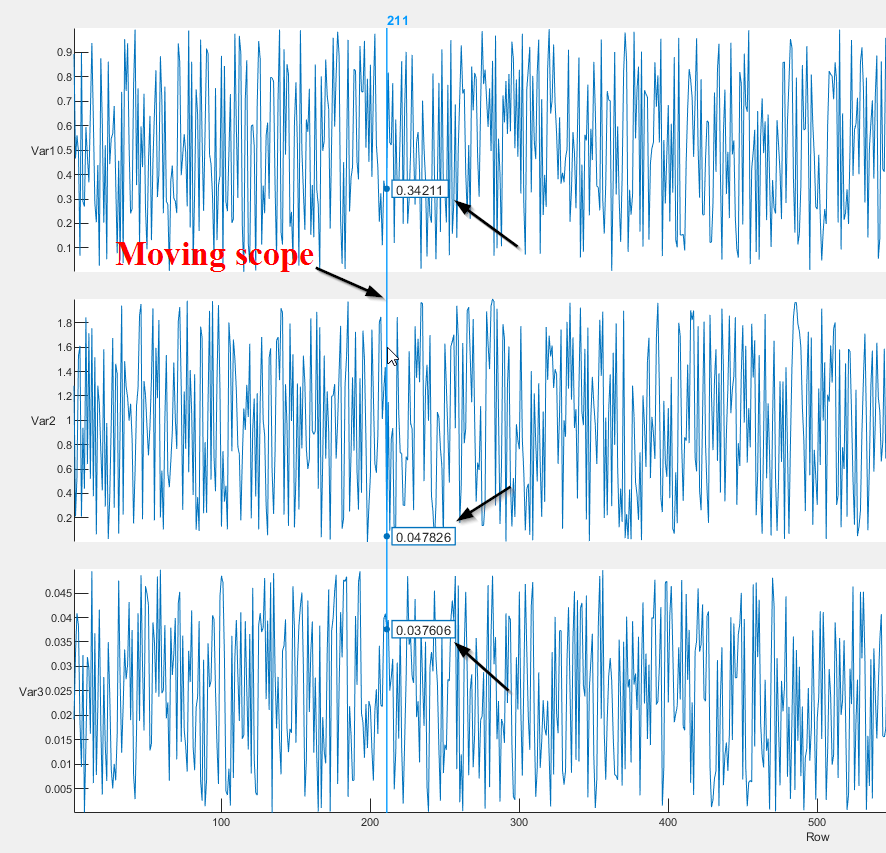
Is there a plot function available in Python that is same as Matlab's stackedplot()?
stackedplot() in Matlab can line plot several variables with the same X axis and are stacked vertically. Additionally, there is a scope in this plot that shows the value of all variables for a given X just by moving the cursor (please see the plot below). I have been able to generate subplots in Python with no issues, however, not able to add a scope like this that shows the value of all variables by moving the cursor. Is this feature available in Python?
Thanks much for your help in advance!
A declarative, efficient, and flexible JavaScript library for building user interfaces.
🖖 Vue.js is a progressive, incrementally-adoptable JavaScript framework for building UI on the web.
TypeScript is a superset of JavaScript that compiles to clean JavaScript output.
An Open Source Machine Learning Framework for Everyone
The Web framework for perfectionists with deadlines.
A PHP framework for web artisans
Bring data to life with SVG, Canvas and HTML. 📊📈🎉
JavaScript (JS) is a lightweight interpreted programming language with first-class functions.
Some thing interesting about web. New door for the world.
A server is a program made to process requests and deliver data to clients.
Machine learning is a way of modeling and interpreting data that allows a piece of software to respond intelligently.
Some thing interesting about visualization, use data art
Some thing interesting about game, make everyone happy.
We are working to build community through open source technology. NB: members must have two-factor auth.
Open source projects and samples from Microsoft.
Google ❤️ Open Source for everyone.
Alibaba Open Source for everyone
Data-Driven Documents codes.
China tencent open source team.