| 01-intro/foreword.html |
Early data visualizations were also used to answer questions pertaining to issues of public health. Epidemiologist John Snow ***LOOK HERE '***s 1854 London cholera map was created to record instances of cholera in a London neighborhood, pinpointing the cause of the outbreak to a single well. This knowledge gained from patterns in lists of names, numbers, and locations was then used to persuade London ***LOOK HERE '***s populace to install sewer systems to alleviate the proliferation and spread of disease. The human brain is particularly adept at recognizing patterns, and a good data visualization, like Snow ***LOOK HERE ’***s, optimizes displays of these patterns through effective use of Gestalt theory, design principles, and color. (Or lack of it, as this case may be.) |
| 01-intro/foreword.html |
Early visual explorations of data focused mostly on small snippets of data gleaned to expand humanity ***LOOK HERE '***s understanding of the geographical world, mainly through maps. Starting with the first recognized world maps of the 13th century, scientists, mathematicians, philosophers, and sailors used math to visualize the invisible. Stars and suns were plotted, coastlines and shipping routes charted. Data visualization, in its native essence, drew the lines, points, and coordinates that gave form to the physical world and our place in it. It answered questions like *"Where am I?", "How do I get there?", and *"How far is it?" |
| 01-intro/foreword.html |
Florence Nightingale, famous more for her nursing skills than her analytic prowess, was nonetheless also a master data scientist and storyteller. Through data presented via her signature Coxcomb diagram (also known as polar or rose charts), she convinced the British army to invest in sanitation measures after illustrating that the majority of deaths in the Crimean War were the result of preventable diseases caused by the horrible sanitary conditions in hospitals. "Why are we sick?" she asked, then answering the question herself by giving visual form to data. |
| 01-intro/foreword.html |
Looking at this graph, it is readily apparent that preventable diseases outnumbered all other causes of death. The area in blue represents deaths by preventable diseases, measured from the center, with red representing deaths caused by injuries and black indicating all other causes. Design principles at play here include the addition of color theory to take advantage of more Gestalt principles: "Similarity" and "Continuity". Color makes it easy for us to tell which segments belong to which category. It also helps to draw the eye in a continuous path around the graphic, making it easier to read. |
| 01-intro/foreword.html |
My favorite description of data visualization comes from the prolific blogger, Maria Popova, who said that data visualization is "at the intersection of art and algorithm." To learn about the history of data visualization is to become an armchair cartographer, explorer, and statistician. |
| 01-intro/foreword.html |
Snow ***LOOK HERE '***s visualization, with its absence of color, optimizes Gestalt ***LOOK HERE '***s theories of visual perception, most notably "Proximity" and "Figure and Ground." The small black dots, each one representing a single case of cholera are small black figures standing out in contrast against the ground: in this graphic, the lines and white space representing streets. The proximity of these dots around the affected well are what enabled Snow to determine the exact source of the outbreak. Today, even with our advanced computing systems and sophisticated tools for creating data visualizations, there is little you could do to improve the effectiveness of this chart. It is simple, beautiful, and true: a data visualization that saved lives. |
| 01-intro/foreword.html |
There is debate over the quality of this chart. Some claim it one of the best, most memorable visualizations ever created, not solely because of its visual communication strength, but in spite of it. It is remembered because of the change it inspired. Others deride it, claiming it ***LOOK HERE '***s just a glorified pie chart, suffering from the same misrepresentation of the information by distorting the data: in terms of visual perception, humans have a hard time accurately judging measures represented by differences in area. Despite their ubiquity, pie charts, for this very reason, are an incredibly poor way to visualize data. A simple stacked bar chart with reference lines, while not as beautiful or visually intriguing, would have communicated more effectively and on a quicker read. |
| 01-intro/foreword.html |
Unique insight is the essence of data, both big and small, and the result of the tools that allow us to access, probe, poke, prod, dissect, visualize, and hopefully, make sense of it. Tools which, through the democratization of data visualization, allow us to change our lens on the world, creating pictures of humanity from different perspectives, bringing into focus stories about humanity and the world that were previously invisible, allowing us insight into ourselves like we ***LOOK HERE '***ve never seen before. |
| 02-data-fundamentals/ch01-basic-data-types.html |
Record runners LOOK HERE ' marathon times instead of what place they finish |
| 02-data-fundamentals/ch01-basic-data-types.html |
Seeing that the time is 11:30, you think to yourself, “I’ve been in line for fifteen minutes already…???” When you start thinking about the time this way, it’s considered ratio data. Ratio data is numeric and a lot like interval data, except it does have a meaningful zero point. In ratio data, a value of zero indicates an absence of whatever you ***LOOK HERE '***re measuring - zero minutes, zero people in line, zero dairy products in your basket. In all these cases, zero actually means you don ***LOOK HERE '***t have any of that thing, which differs from the data we discussed in the interval section. Some other frequently encountered variables that are often recorded as ratio data are height, weight, age, and money. |
| 03-collecting-data/03-section-cover.html |
When you don ***LOOK HERE ’***t have time to go shopping, you can give someone else money and have them do it for you. You don ***LOOK HERE ’***t always get exactly what you want, but that ***LOOK HERE '***s the tradeoff for not going to the store yourself. Don ***LOOK HERE ’***t have enough cash or need something immediately? Most of us have borrowed a cup of sugar or an egg from a neighbor at some point! |
| 03-collecting-data/03-section-cover.html |
You also need to decide what types of each ingredient you want to include. If a recipe calls for bell peppers but doesn ***LOOK HERE '***t say what kind, you have to pick which colors to use. Do some items need to be a specific brand or variety? If you ***LOOK HERE ’***re making a strawberry pie, you may have a favorite type of strawberry you must have, but you may not care what baking soda you get, as long as it works. |
| 03-collecting-data/ch03-intro-to-survey-design.html |
One of the disadvantages of handouts is that people may be rushed to complete the survey if you are catching them in passing, which can affect the quality of your data. You will also be limited to the population that is physically present in the location where you are giving the survey. This may not be an issue if you are targeting a specific group, such as college students, shoppers at a particular store, or residents of a certain region. If you ***LOOK HERE '***re looking for a more general audience, however, you may consider handing the survey out in several different locations to reach a more diverse audience. |
| 03-collecting-data/ch03-intro-to-survey-design.html |
So far, we ***LOOK HERE '***ve talked about self-administered and administered surveys, but one of the most frequently-encountered type of survey is actually a combination of these. Say you want to hand out paper surveys and have people complete and return them immediately. The survey itself is self-administered, but since you have a trained person there who is available to answer questions, it also has features of an administered survey. |
| 03-collecting-data/ch03-intro-to-survey-design.html |
Unlike phone surveys, face-to-face surveys allow the interviewer and the respondent to see each other’s facial expressions and body language. This can be helpful because the additional physical cues can help the interviewer and the respondent understand better understand each other; however, it can also lead to the respondent being further influenced by the interviewer ***LOOK HERE '***s behavior and appearance. |
| 03-collecting-data/ch04-types-of-survey-questions.html |
You should also avoid using the word “and” if it is connecting two different ideas within a single question. Remember, each question should focus on only one issue at a time: otherwise, you won ***LOOK HERE '***t be collecting the best data that you can. By compounding multiple thoughts into a single question, you reduce the accuracy of participants’ responses and thereby limit the claims that you can make from those data. Instead, consider using filter questions to obtain the desired information. For example: |
| 03-collecting-data/ch05-additional-data-collection-methods.html |
If any of the sources are ones that you don ***LOOK HERE '***t own, make sure to properly cite them. It ***LOOK HERE '***s important to credit others LOOK HERE ' work, and it ***LOOK HERE '***s also important to be able to support your research if anyone challenges your information later on. |
| 03-collecting-data/ch05-additional-data-collection-methods.html |
Sometimes the data you need to collect are a matter of observation. Let ***LOOK HERE '***s go back to Fictionals Ice Cream Parlour for a moment. You recently purchased new furniture for the store, and you ***LOOK HERE '***re considering a couple of different layouts for it. You want to see which layout seems to work best for customer flow, so you set up the furniture one way for a few days and record your personal observations about customer movement within the shop. Then you switch the furniture to the other layout and again record what you notice. These data can help you figure out what other questions you might want to ask or what other data you need before making your decision. |
| 03-collecting-data/ch05-additional-data-collection-methods.html |
There are some variables that should be measured rather than surveyed if you ***LOOK HERE '***re trying to obtain an exact, correct statistic. Many medical variables, for example, are difficult if not impossible to gather accurately using a survey. Let ***LOOK HERE '***s say you need to collect data on participants LOOK HERE ' weight at the beginning of a study. There are a few common reasons someone might report an inaccurate number. |
| 03-collecting-data/ch05-additional-data-collection-methods.html |
What you ***LOOK HERE '***re measuring is easily and publicly observable; |
| 03-collecting-data/ch05-additional-data-collection-methods.html |
When you ***LOOK HERE '***re considering a project as a whole, it is possible that not all the research questions you ***LOOK HERE '***re trying to address can be answered using data collected from just one of the methods discussed so far. You may find that your survey will need to be supplemented with some direct measurements, or you may need to have your focus group participants complete diary forms. |
| 03-collecting-data/ch05-additional-data-collection-methods.html |
When you ***LOOK HERE '***re using other documents as the main source of your data, you should first set up a data collection plan, much the way that you design a survey. The plan should detail what pieces of data you ***LOOK HERE '***re looking for, the level of measurement you want to capture them at, the time frame you need (e.g. do you only want data from the last 6 months? the last 12?), and how much data you need (e.g. do you want to look at all the receipts or just a sample of them?). |
| 03-collecting-data/ch05-additional-data-collection-methods.html |
Whether your data need to be exact depends on how you ***LOOK HERE '***re using the the information. If you ***LOOK HERE '***re not concerned about having a precise measurement and an estimate will work, then a survey might be fine as long as it asks something people will be able to reasonably estimate. If you have a variable is likely to be incorrectly self-reported and it is important that these data are current and accurate, direct measurement should be used instead of a survey. |
| 03-collecting-data/ch05-additional-data-collection-methods.html |
You can use observation in this way to gain insight into naturalistic behavior. This can be especially useful if your subjects of interest are not human and can ***LOOK HERE '***t answer survey questions: scientists rely on observation as a data collection technique all the time! |
| 03-collecting-data/ch06-finding-external-data.html |
Assessing data quality means looking at all the details provided about the data (including metadata, or "data about the data," such as time and date of creation) and the context in which the data is presented. Good datasets will provide details about the dataset’s purpose, ownership, methods, scope, dates, and other notes. For online datasets, you can often find this information by navigating to the “About” or “More Information” web pages or by following a “Documentation” link. |
| 03-collecting-data/ch06-finding-external-data.html |
Don ***LOOK HERE '***t forget to obtain variable specifications, external data dictionaries, and referenced works. |
| 03-collecting-data/ch06-finding-external-data.html |
For example, let ***LOOK HERE '***s say you ***LOOK HERE '***re using the U.S. Census Annual Survey of Public Employment and Payroll. |
| 03-collecting-data/ch06-finding-external-data.html |
If it has and you ***LOOK HERE '***re using the data for an analysis, make sure your analysis is adding new insights to what you know has been done with the data previously. |
| 03-collecting-data/ch06-finding-external-data.html |
If yes, you ***LOOK HERE '***ll need to include your data dictionary and a list of your additional data sources. |
| 03-collecting-data/ch06-finding-external-data.html |
May allow you to work with data that requires more resources to collect than you have, or data that you wouldn ***LOOK HERE '***t otherwise have access to at all |
| 04-preparing-data-for-use/ch08-data-cleaning.html |
Once we ***LOOK HERE '***ve cleaned our data, we’re left with a brand new problem: how can we (and others!) verify that what we’ve done is correct and that we haven’t corrupted the data by making these changes? After all, the processed data may look vastly different from the raw data we started out with. |
| 04-preparing-data-for-use/ch08-data-cleaning.html |
The simple answer is to document everything, particularly if you think you might want to share your data later on with a statistician or other researchers. When you’re cleaning your data, it ***LOOK HERE '***s always a good idea to save any changes as an entirely separate file: this way you’re always able to go back and look at what changed between the raw and processed data, what rows and columns were dropped, etc. It also ensures that you can go back to the unprocessed data if you ever want to slice things up a different way that might involve different cleaning procedures. |
| 04-preparing-data-for-use/ch08-data-cleaning.html |
You should be careful to write a set of instructions as you go, documenting exactly what was done in each step to identify bad data and which data points were removed. It ***LOOK HERE '***s crucial to write this while you’re actually cleaning your data: it’s always easier to document as you go than it is to try and remember every step that you took after all is said and done. If you’re using point-and-click software to manage your data (like Excel), you should take special care to record exactly what steps were taken in cleaning the data since everything is done by hand, rather than by computer code that can be easily re-run later on. A good rule of thumb is that if you aren ***LOOK HERE '***t able to easily follow the instructions you wrote and end up with the same results a second time, you shouldn ***LOOK HERE '***t expect anyone else to be able to. |
| 04-preparing-data-for-use/ch10-what-data-cleaning-can-and-cant-catch.html |
What Data Cleaning Can and Can ***LOOK HERE '***t Catch |
| 04-preparing-data-for-use/ch11-data-transformations.html |
You may not see transforms every day, but when you do, it ***LOOK HERE '***s helpful to know why they were used and how they affect your data. It ***LOOK HERE '***s important to be able to see different parts of the picture when working with data, and transformations give you another tool to help you do just that! |
| 05-visualizing-data/05-section-cover.html |
It ***LOOK HERE '***s also important to think about how to present the dish. Some choices are a matter of focus, like when you want to highlight a few star ingredients. Some choices are functional, like when you serve a cake with a slice removed so you can display all the layers inside. Some choices still are based on appropriateness or lack thereof; if you serve soup on a flat cake plate, it will run all over the table. |
| 05-visualizing-data/ch13-graphing-the-results-of-checkbox-responses.html |
Depending on your question of interest, you can also group your data. Maybe you ***LOOK HERE '***re more interested in reporting how many devices people used rather than exactly what devices were. You could make a column chart like the one below. |
| 05-visualizing-data/ch13-graphing-the-results-of-checkbox-responses.html |
Don ***LOOK HERE '***t use pie charts if you ***LOOK HERE '***re basing your percentages on the number of respondents that selected each answer choice! Pie charts are used to represent part-to-whole relationships and the total percentage of all the groups has to equal 100%. Since the possible sum of the percentages is greater than 100% when you base these calculations on the number of respondents, pie charts are an incorrect choice for displaying these results. |
| 05-visualizing-data/ch13-graphing-the-results-of-checkbox-responses.html |
Keep in mind that this way of displaying data is based on the number of mentions of a device, not the number of consumers who use that device. While you may be tempted to say, "24% of consumers used a cellphone in the past six months," the bar chart above isn ***LOOK HERE '***t actually displaying that information. |
| 05-visualizing-data/ch13-graphing-the-results-of-checkbox-responses.html |
Let ***LOOK HERE '***s say you ***LOOK HERE '***re doing a survey and you ***LOOK HERE '***re interested in what multimedia devices your respondents have used over the last six months. You would use a checkbox response question if you wanted to find out what all the devices were that people used over the six-month period. A radio button only allows respondents to select a single answer, so you could only use it to find out, for example, which one device a person used most often during the six-month period. Each type of question has merit, it just depends on what the purpose of your question is and how you are going to use the results. |
| 05-visualizing-data/ch13-graphing-the-results-of-checkbox-responses.html |
Let ***LOOK HERE '***s take a look at a summary of possible responses to the checkbox question posed above. |
| 05-visualizing-data/ch13-graphing-the-results-of-checkbox-responses.html |
So here ***LOOK HERE '***s the most important thing to know about checkbox questions, and it ***LOOK HERE '***s why you have to consider how you graph the results of checkbox questions differently than you do the results of other types of questions. Checkbox questions aren ***LOOK HERE '***t really their own question type! They ***LOOK HERE '***re actually just a shorthand way to write a series of yes/no questions. A respondent checks a box if an answer choice applies and leaves it blank if it doesn ***LOOK HERE '***t. |
| 05-visualizing-data/ch13-graphing-the-results-of-checkbox-responses.html |
You may notice that the total number of responses (1,841) is greater than the number of people that did the survey (N=500)! Why? It ***LOOK HERE '***s because of the whole "a checkbox is really a bunch of yes/no questions rolled into one" thing. The total possible number of checked boxes in a checkbox question? It ***LOOK HERE '***s the (# of "real" answer options) X (# of respondents) (Here, a "real" answer option means one that isn ***LOOK HERE '***t "None," "N/A" or "Prefer not to Answer," since selecting one of those options would prevent a person from choosing any other answers in additional to that.) For this survey, there were 6 device options (aside from "None") that a person could select and there were 500 people that answered the survey. So the total number of boxes that had the potential to get checked during the survey was 3000, not just 500. |
| 05-visualizing-data/ch14-anatomy-of-a-graphic.html |
Symbols can sometimes be a helpful alternative to words in text, but make sure to clearly state what a symbol represents. For example, you could use “$” instead of the word “dollar.” However, this symbol is used with the currency of more than 30 countries, so you should specify which country ***LOOK HERE '***s currency you mean (e.g. US$, A$, Mex$). |
| 05-visualizing-data/ch14-anatomy-of-a-graphic.html |
There ***LOOK HERE '***s some debate over whether or not vertical axis labels should be aligned parallel to the axis or not. On the one hand, aligning the text vertically makes it very clear that it ***LOOK HERE '***s directly associated with the vertical axis. There ***LOOK HERE '***s often more room to write the axis title text if it ***LOOK HERE '***s rotated at a 90-degree angle. On the other hand, humans are not very good at reading vertical text, and readers may find themselves squinting and turning their heads to understand the chart. If you have enough room and the axis title text is short, consider keeping the text level instead of rotating it. We ***LOOK HERE '***ve also included two examples below that show what to avoid when placing your vertical axis titles. |
| 05-visualizing-data/ch15-importance-of-color-font-and-icons.html |
The exact same data is being conveyed here, but it takes the viewer slightly longer to understand it. Why? Before the viewer can correctly interpret the data, they have to create a complex metaphor in their head. First, they’re being asked to imagine that this icon represents all twenty test subjects, but they ***LOOK HERE '***re then also being asked to divide that metaphorical person by another set of criteria. As simple as they may seem, icons are still asking the mind to pretend they represent something else. The more you ask symbols to represent, the less literal and less clear they become. When it comes to using symbols and icons of any sort, stick to one simple meaning each. |
| 06-dont-be-shady/06-section-cover.html |
Don ***LOOK HERE '***t mix baking soda and vinegar. |
| 06-dont-be-shady/06-section-cover.html |
Don ***LOOK HERE '***t serve pink chicken. |
| 06-dont-be-shady/06-section-cover.html |
Don ***LOOK HERE '***t throw water on a grease fire. |
| 06-dont-be-shady/06-section-cover.html |
Some cooking don ***LOOK HERE '***ts: |
| 06-dont-be-shady/ch18-common-visualization-mistakes.html |
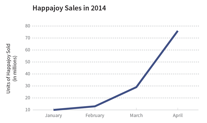
At first glance, there doesn’t appear to be a truncation issue here. The y-axis starts at zero, so that ***LOOK HERE '***s not a problem. The critical thing to understand is that it’s the x-axis that’s been truncated this time: we’re seeing sales from less than half the year. Truncating a time period like this can give the wrong impression, especially for things that go through cycles. And - you guessed it - the sale of allergy medicine goes through a seasonal cycle since allergy symptoms are typically higher in the spring and lower in the winter. |
| 07-conclusion/glossary.html |
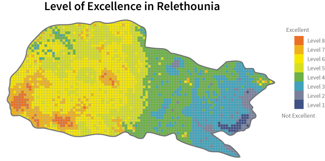
A heat map is a graph that uses colors to represent categorical data in which the saturation of the color reflects the category ***LOOK HERE '***s frequency in the dataset. |


