Giter Club home page Giter Club logo

tailwindcss-stimulus-components's Introduction

npm Tests

TailwindCSS Stimulus Components

Check out the demo

This is a set of components (Tabs, Modals, Dropdowns, etc) for TailwindCSS that uses StimulusJS controllers.

The goal is to make using TailwindCSS as easy as Bootstrap when it comes to adding Javascript components.

Install

This assumes that StimulusJS is already installed.

Add the tailwindcss-stimulus-components module:

yarn add tailwindcss-stimulus-components

or

npm install tailwindcss-stimulus-components

Basic Usage

First, you'll want to initialize StimulusJS and then you can import all the TailwindCSS components.

// Start StimulusJS
import { Application } from "@hotwired/stimulus"

const application = Application.start();

// Import and register all TailwindCSS Components or just the ones you need
import { Alert, Autosave, ColorPreview, Dropdown, Modal, Tabs, Popover, Toggle, Slideover } from "tailwindcss-stimulus-components"
application.register('alert', Alert)
application.register('autosave', Autosave)
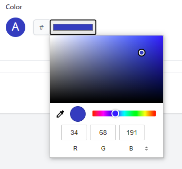
application.register('color-preview', ColorPreview)
application.register('dropdown', Dropdown)
application.register('modal', Modal)
application.register('popover', Popover)
application.register('slideover', Slideover)
application.register('tabs', Tabs)
application.register('toggle', Toggle)

This will start StimulusJS and load any controllers that you have locally and then register the TailwindCSS components.

Components

Styling

All of the styles for the Stimulus components are configurable. Our examples above show some example styles you can use, but these components themselves don't require any specific styles.

Stimulus simply requires the data- attributes to be defined correctly to trigger actions and find targets.

Some components like the modal have some styles that are necessary for proper use in the browser. The container and backgrounds are separate so that you can have a fixed size container and the modal inside of it.

Animations

Extending Components

You can use inheritance to extend the functionality of any Stimulus components.

import { Dropdown } from "tailwindcss-stimulus-components"

export default class ButtonDropdown extends Dropdown {
  static targets = ["button"]

  connect() {
    super.connect();
    console.log("the value of button : ", this.buttonTarget.value)
  }
}

These controllers will automatically have access to targets defined in the parent class.

If you override the connect, disconnect or any other methods from the parent, you'll want to call super.method() to make sure the parent functionality is executed.

Contributing

To develop locally, run npx serve and open your browser to the URL it serves on.

Bug reports and pull requests are welcome on GitHub at https://github.com/excid3/tailwindcss-stimulus-components. This project is intended to be a safe, welcoming space for collaboration, and contributors are expected to adhere to the Contributor Covenant code of conduct.

To run tests:

npm install
npm run test

License

This package is available as open source under the terms of the MIT License.

tailwindcss-stimulus-components's People

Contributors

adrienpoly avatar aerni avatar anthony0030 avatar brunnogomes avatar cabourn avatar dbil25 avatar dependabot[bot] avatar dmitrysychev avatar drnic avatar excid3 avatar iseth avatar julianrubisch avatar marcoroth avatar nickjj avatar nm avatar olimart avatar peterbrinck avatar pkayokay avatar r-obeen avatar richjdsmith avatar rob-mccormick avatar roberttravispierce avatar rockwellll avatar rudiney avatar scotteknight avatar shawnaukstak avatar stevegeek avatar t27duck avatar tashows avatar williamkennedy avatar

Stargazers

 avatar  avatar  avatar  avatar  avatar  avatar  avatar  avatar  avatar  avatar  avatar  avatar  avatar  avatar  avatar  avatar  avatar  avatar  avatar  avatar  avatar  avatar  avatar  avatar  avatar  avatar  avatar  avatar  avatar  avatar  avatar  avatar  avatar  avatar  avatar  avatar  avatar  avatar  avatar  avatar  avatar  avatar  avatar  avatar  avatar  avatar  avatar  avatar  avatar  avatar  avatar  avatar  avatar  avatar  avatar  avatar  avatar  avatar  avatar  avatar  avatar  avatar  avatar  avatar  avatar  avatar  avatar  avatar  avatar  avatar  avatar  avatar  avatar  avatar  avatar  avatar  avatar  avatar  avatar  avatar  avatar  avatar  avatar  avatar  avatar  avatar  avatar  avatar  avatar  avatar  avatar  avatar  avatar  avatar  avatar  avatar  avatar  avatar  avatar  avatar

Watchers

 avatar  avatar  avatar  avatar  avatar  avatar  avatar  avatar  avatar  avatar  avatar  avatar  avatar  avatar  avatar  avatar  avatar  avatar  avatar  avatar  avatar

tailwindcss-stimulus-components's Issues

Do you also need to install Tailwind CSS into Rails before using this?

Sorry for beginner question, but the docs explicitly say you need StimulusJS installed (and I have that) but don't mention needing Tailwind CSS installed. I wasn't sure if Tailwind was installed simply by running:

yarn add tailwindcss-stimulus-components

Without having Tailwind installed, I did run the yarn command but after registering/importing everything in application.js, no Tailwind markup seems to display in my views...

Thanks!

Test controller inheritance

For example, if someone wants to add extra functionality to modals, they should be able to create a new controller that inherits from our Modal and adds new targets, methods, etc.

Haven't tried this myself, but I'd like to see how it works. This would be great to document how to add new targets, events, etc.

Docs no longer working

Following the upgrade to Stimulus 3, docs are no longer working.

Browser's console raises TypeError: Module specifier, '@hotwired/stimulus' does not start with "/", "./", or "../".

Extending Toggle only works on the connect action? Trying to add an accordion functionality.

Staring with something as simple as this to confirm its working.

import { Toggle } from "tailwindcss-stimulus-components"

export default class extends Toggle {

  connect() {
    super.connect();
    console.log("Toggle Super")
  }

  toggle(event) {
    super.toggle(event);
    console.log("Toggle")
   }

}

The "Toggle Super" fires for each toggle group on my page. The toggles still work but the "Toggle" console action is not triggered. Trying to have an accordion functionality.

Tooltips with tippy.js

We can import tippy.js and have a stimulus wrapper around it pretty easily.

We'll need to also add css-loader to webpacker so it will compile the CSS from the library so we can provide it as well.

Question: Standalone Components?

Hi @excid3 ,

Thanks for another great library, I use this in my side projects and it's been a huge time saver.

Recently I've been integrating Stimulus into the codebase at work and so far it's delivering a lot of value.

However we still do not have re-usable modals, dropdowns and tooltips - those must be converted from jQuery and I have not had the time to write the stimulus counterparts.

While I think Tailwind is excellent for newer projects (and beyond), older codebases already have style guidelines they must follow for consistency. For that reason, I think it'd be pretty great if the component behavior could be leveraged without the Tailwind styling.

Short of copy pasting your controllers for each of these components, I'm wondering if there's a way to extend the library and offer a non stylized version of each component. Maybe they can be separated into another library and used as a dependency of this one?

The components in this library are rock solid and cover a majority of use cases, so I'd like to take advantage wherever possible.

Let me know your thoughts, thanks!

Allow modal background styling in html

Hi @excid3,

thank you very much for writing the Tailwind Stimulus components, they are really, really helpful!

One small issue: I noticed that the modal background is somewhat "hardcoded" in the modal controller js.

Any chance you might be up for enhancing this minimally by adding an optional "data-modal-backdrop-class" data attribute that could take a set of tailwind classes, and, if present in the html, would overwrite the default backdrop styles in the js?

Thanks again!

Adding Slide-Over Functionality

TailwindUI recently added Slide-overs to there offering of pre-built components. Would it be possible to include the functionality for this kind of component in this package? It seems like it would make a great addition.

Multiple modals

Documentation isn't clear about how to implement multiple modals on the same page - can you please clarify?

Example YouTube video no longer exists in demo page

Steps to reproduce:

  1. Head over to the demo page at https://excid3.github.io/tailwindcss-stimulus-components
  2. Goto the "Tabs" example
  3. Click the third tab
  4. You'll see a broken YouTube embed
  5. The referenced video is also no longer available on YouTube at https://youtu.be/y3niFzo5VLI
  6. The same broken reference is in the "Tabs with Anchors" example too

The workaround for now is to manually inspect the iframe and change it to use a working video. I would have opened a PR to fix this but picking which video to use in the demo page is a very personal decision for @excid3 to pick!

Dropdown: fix accessibility fail

aria-haspopup and aria-expanded attributes must be set for button element or div with role="button" attribute instead of outer div with data-controller="dropdown".

Moreover:

  • The links container must have role="menu" defined.
  • Each element (link) in the list must have role="menuitem" defined.
  • It would be good to set aria-controls, like in the example linked below.

Here is perfectly working Navigation Menu Button Example in accessibility perspective.

Although web developer can manually add aria-controls logic, menu and menuitem rols manually, he/she is not able to easyly move aria-haspopup and aria-expanded attributes (which are set by predefined javascript) to the proper place.

suggestion : select

Hello

thanks for your work.

I just want to know if you plan to inplemante select with tailwindcss/stimulus ?

Dropdown Examples

In Tailwind v 1.0 they have changed the classname .pin.r to .right-0.
In the examples on the GitHub page, it is still used the old class name (and if you have a dropdown on the left hand side, the dropdown goes outside the page).

Using focus event for opening modals can cause a bug.

Hey Chris, thanks for the awesome components! I have a modal that gets opened using data-action="focus->modal#open" (on an input element).
This works fine but if you switch to another window and back again while the modal is open then the open action is called again and it adds another background element to the body. Then you can't fully close out of the modal.
This could get fixed by adding e.target.blur(); to the open method. Or maybe there's a more comprehensive way to check if the modal is already open within the open method so that it doesn't get called again.

Weird issue with modal if the `body` has no classes

So. I was in the process of upgrading both tailwind and this package. After upgrading i found out that on pages where the body tag has no classes attached to it the modal would "push" the elements of the page into the left side. But, if i just add the a "class" to the body tag it stops doing this.

Screen.Recording.2022-02-02.at.15.00.42.mov

I think it might have to do with this but not quite sure yet.

document.body.classList.add('fixed', 'inset-x-0', 'overflow-hidden');

Modal background does not respect non statically positioned elements

Unfortunately, due to the nature of z-index the modal element will not respect non statically positioned elements that occur after the modal in the DOM. As a result, the transparent modal background will not sit on top of all content.

To correct, I would suggest extending the open function to append a transparent background at the end of the html body (as bootstrap does) instead of containing it within the context of the modal block. Subsequently, the close function should remove it. The modal body itself should be given a z-index greater than that of the transparent modal background.

For reference please see attache screenshot.

As you can see, the form elements wrapped in a form-group class which has been assigned position: relative. Will sit on top of the modal background.

Screenshot 2019-07-17 14 04 37

Demo examples not working

the examples in Demo page not working and it throws error

> TypeError: Failed to resolve module specifier "@hotwired/stimulus"

How to open tab if it is not the first one?

The current code sample for the tabs always select the first one, how can we set any other tabs as default? Or an even better solution would be to keep the last opened tab in a cookie I guess :-S

Please release a new version or re-build the dist folder

I am interested in using the latest feature of Alert where showClass and hideClass is being exposed.
When I include the github-version, I am getting loaded the old files
Reason: The dist folder is not up-to-date.

Can you please release a new version or re-build the dist folder?

Target Tabs through href/id

I would love to see the ability to target/switch between tabs using a button or link with a href and an id. I've been working on a wizard form and it would make the user experience better to have multiple ways to jump between tabs.

Back button breaks modal

I noticed that while the modal is open, if you navigate to another page and then go back, or if you hit back then forward while the modal is open, then you can't completely close the modal.
I wonder if using the disconnect() lifecycle method in stimulus to close the modal would fix it?

dropdown.js: what is `hasButtonTarget`?

In dropdown.js, the connect() and disconnect() methods perform a conditional action based on this.hasButtonTarget, but it doesn't appear to be defined nor used anywhere, and therefore seems to have no purpose.

if (this.hasButtonTarget) {
this.buttonTarget.addEventListener("keydown", this._onMenuButtonKeydown)
}

if (this.hasButtonTarget) {
this.buttonTarget.removeEventListener("keydown", this._onMenuButtonKeydown)
}

Is this extra cruft that should be removed?

Modal inside my form can't successfully contain a second form for another model....

I'm sorry, I'm new to Rails as well as web development in general, so forgive me if this seems elementary ....

I have an Invoice form, and want a button/link within that form to say "Add New Client", which produces a modal containing a small form for creating a new Client instance on the spot (so you don't have to exit the Invoice form if you forgot to create a new Client beforehand).

When the code for the Stimulus/Tailwind modal (taken from your docs) is inside the Invoice form's HTML, it pops open fine, but when you try to submit the Client form inside of it, Rails tries to submit the host Invoice form instead.

However, if I place the Modal code just outside my Invoice form, the modal works perfectly and creates a new Client. So the problem is hosting a form inside the modal that is inside another form.

Any idea how to accomplish this with this modal? Bootstrap's modal gives you a piece of code that just produces the trigger button that you can then place anywhere (inside a form), and it calls the rest of the modal code wherever that is. I've got this approach working as well, but I'm hoping I can similarly separate the Stimulus/Tailwind's modal button from the rest of the code, or find some other approach that works.

Any thoughts? THANKS!

Capybara Testing in Rails

Hi Chris!

For some reason, the modal library does not seem to work in my Rails system tests (for Jumpstart Pro). All other JS seems to work just fine. Here is an example of a failing test:

describe "editing posts" do
    before do
      post.update!(author: user)
      visit market_posts_path(market)
      page.driver.browser.manage.window.resize_to(2024, 1768)
      within(".post-panel") { click_link("edit") }
      screenshot_and_open_image
      expect(page).to have_content("Edit Post")
    end

    it "works" do
      within(".modal.is-active") do
        find('trix-editor').click.set('new content')
        click_button("Update Post")
      end

      expect(page).to have_content("Post was successfully updated.")
      within(".post-panel") do
        expect(page).to have_content("new content")
      end
    end
  end

The call to screenshot_and_open_image triggers a screenshot with CapybaraScreenshot. Sure enough, when clicking the button to open the modal...no modal even tries to display. No dark background, no inner modal, nothing.

Maybe you have run across this when building out Rails apps with these components?

Dropdown component on hover

I tried data-action="mouseenter->dropdown#show mouseleave->dropdown#hide", but couldn't get it work. Any suggestions? Thanks.

"slideover#_hide" is typo?

Hey Chris! In the ReadMe you reference slideover#_hide in the example code, but the demo never uses the underscore - only slideover#hide. Is this an error, or does the underscore have some undocumented functionality?

PS this library is great - thanks!

auto dismiss alert

is there a way to auto dismiss an alert after x amount of time? if so i'd be happy to open a PR with updated docs.

Are you open to a PR for a color picker preview (complete with YIQ calculations)?

Hi,

I wanted to open this issue before opening a PR to see if you would be open to merging such a component. Technically the component itself isn't related to Tailwind, AKA there's no hard reference to any class names in the component.

Use case

If a user doesn't upload an avatar you could display this instead. The preview aspect is useful for when you're picking the color in your profile and want to see a real time client side preview of what it looks like based on the color you picked.

Current implementation

This is the default HTML5 color form field with a <p> to act as the preview. All of the classes are Tailwind but at this point the Tailwind specific stuff is sitting outside of the Stimulus component since it's just sitting in your HTML.

Picking a darker color

image

Picking a lighter color

image

It automatically sets the foreground or background text to be visible based on the YIQ calculation which is only a few lines of code.

Options

It lets you choose whether or not you want to set the color or backgroundColor of your preview target.

extending Slideover - 99% there but missing target element -

Tailwindcss-stimulus-components is a small wonder 😍

I'm trying to transpose this nice write-up to fit my bill - dynamically loading forms into a slideover in a Ruby 3.0.3 on Rails 7.0.0 app.

I'm frustratingly close - in fact all I have to do is manually remove the "hidden" from the overlay DIV 🤣 ( I know - this will not fly when the kids in the nursery are going to sign in )

I've hammered on this for far too many hours now realizing that perhaps Slideover does not lend it self to being extended?!


my console complains about Missing target element "overlay" for "extended-slideover" controller (and 'menu' too btw)

// app/javascript/application.js
// Entry point for the build script in your package.json
import "@hotwired/turbo-rails"
import "./controllers"
// app/javascript/controllers/index.js
// This file is auto-generated by ./bin/rails stimulus:manifest:update
// Run that command whenever you add a new controller or create them with
// ./bin/rails generate stimulus controllerName


import { application } from "./application"

import { Alert } from "tailwindcss-stimulus-components"
application.register('alert', Alert)

import { Dropdown } from "tailwindcss-stimulus-components"
application.register('dropdown', Dropdown)

import { Slideover } from "tailwindcss-stimulus-components"
application.register('slideover', Slideover)

import ExtendedSlideoverController from "./extended_slideover_controller"
application.register('extended-slideover', ExtendedSlideoverController)

My stimulus controller looks like this (tried w/o the 'menu' and 'overlay' - same story)

// app/javascript/controllers/extended_slideover_controller.js
import { Slideover } from "tailwindcss-stimulus-components"

export default class ExtendedSlideoverController extends Slideover {
  static targets = ["form", "menu", "overlay"]

  connect() {
    super.connect()
  }

  handleSuccess({ detail: { success } }) {
    if (success) {
      super.close()
      this.formTarget.reset()
    }
  }

}
  

and the HTML - in all it's shiny TailwindUI glory - looks like this

<body class="h-full" data-new-gr-c-s-check-loaded="14.1046.0" data-gr-ext-installed="">
    <header data-controller="dropdown" class="bg-green-400 shadow" aria-haspopup="true" aria-expanded="false">
     ....8<....
    </header>

    <div class="fixed inset-x-0 bottom-0 flex items-end justify-left px-4 py-6 sm:p-6 justify-start z-30 pointer-events-none">
    </div>

    <turbo-frame id="form_slideover"></turbo-frame>

<div class="py-10">
  <div data-extended-slideover-target="overlay" class="fixed inset-0 overflow-hidden z-40 hidden" data-action="turbo:submit-end->extended-slideover#handleSuccess" aria-labelledby="slide-over-title" role="dialog" aria-modal="true">
  <div class="absolute inset-0 overflow-hidden">
    <!-- Background overlay, show/hide based on slide-over state. -->
    <div class="absolute inset-0" aria-hidden="true">
      <div id="extended-slideover-target" data-extended-slideover-target="menu" class="fixed inset-y-0 right-0 pl-10 max-w-full flex sm:pl-16">
        <!--
          Slide-over panel, show/hide based on slide-over state.

          Entering: "transform transition ease-in-out duration-500 sm:duration-700"
            From: "translate-x-full"
            To: "translate-x-0"
          Leaving: "transform transition ease-in-out duration-500 sm:duration-700"
            From: "translate-x-0"
            To: "translate-x-full"
        -->
        <div class="w-screen max-w-2xl">
            <form id="invitation_form"></form>

        </div>

      </div>
    </div>
  </div>
</div>

  <header>
  <div data-controller="extended-slideover" data-extended-slideover-active-target="#extended-slideover-target" class="max-w-7xl mx-auto px-4 sm:px-6 lg:px-8" aria-haspopup="true" aria-expanded="false">
    <!-- This example requires Tailwind CSS v2.0+ -->
    <div class="bg-white px-4 py-5 border-b border-gray-200 sm:px-6">
      <div class="-ml-4 -mt-4 flex justify-between items-center flex-wrap sm:flex-nowrap">
        <div class="ml-4 mt-4">
          <h3 class="text-lg leading-6 font-medium text-gray-900">
            Oversigt over brugere
          </h3>
          <p class="mt-1 text-sm text-gray-500">
            I denne oversigt finder du alle der har adgang til Speicher. Hver adgang er knyttet til en email adresse (der kan være flere adgange knyttet til samme email adresse). Brugernavnet er unikt.
          </p>
        </div>
          <div class="ml-4 mt-4 flex-shrink-0">
    <div data-action="click->slideover#toggle" role="button" data-slideover-target="button" tabindex="0" class="button new-button inline-block select-none">
      Ny bruger
    </div>            
  </div>
  <div class="ml-4 mt-4 flex-shrink-0">
    <a class="button new-button inline-block select-none" data-action="click->extended-slideover#toggle" data-turbo-frame="form_slideover" href="/invitations/new"><span class="translation_missing" title="translation missing: da.User.invite_button">Invite Button</span></a>
  </div>  

      </div>
    </div>
  </div>
</header>

  <main>
    <div class="max-w-7xl mx-auto sm:px-6 lg:px-8">

      <!-- This example requires Tailwind CSS v2.0+ -->
      <div class="bg-white shadow overflow-hidden sm:rounded-md">
        <ul id="users" role="list" class="divide-y divide-gray-200">
            <li id="user_2">
               ...8<...

            </li>
        </ul>
      </div>
    </div>
  </main>
</div>


</body>

sometimes the example page not working

here is the console log

excid3.github.io/:1 An import map is added after module script load was triggered.
excid3.github.io/:1 Uncaught TypeError: Failed to resolve module specifier "@hotwired/stimulus". Relative references must start with either "/", "./", or "../".

currentworkaround

just refresh it until it work

google chrome
Version 94.0.4606.81 (Official Build) (64-bit)

Slideover is child to Overlay - which means overlay animations get applied to slideover

I've been trying to get the Slideover controller to work. And, I've noticed that in the example and the docs - the "Overlay" is set to a div that is the parent of the "Menu". It seems that this is a mistake compared to the Tailwind docs - which apply the Overlay transitions to a nested element peer to the slideover.

The result is that the animations from Overlay are being applied to Slideover. You see this in the example site because the "slideover" gets the fade-in animation from the overlay applied to its entrance.

When I move the data-slideover-target="overlay" to the child element that matches the Tailwind docs, the parent menu item (which is an inset) blocks the dom because it's not hidden or unhidden.

I need to continue experimenting to find a solution - but I think it might require a data-slideover-target="sidebar" that shows/hides the entire sidebar independent of the overlay and slideover animations.

how to make tabs changing multiple class target?

the example is only showing how to change active tab class for one target

I want it to change multiple target at once how?

the css example from tailwind give me this

<!-- Current: "border-indigo-500 text-indigo-600", Default: "border-transparent text-gray-500 hover:text-gray-700 hover:border-gray-300" -->
<a href="#" class="border-transparent text-gray-500 hover:text-gray-700 hover:border-gray-300 group inline-flex items-center py-4 px-1 border-b-2 font-medium text-sm">
  <!--
    Heroicon name: solid/user

    Current: "text-indigo-500", Default: "text-gray-400 group-hover:text-gray-500"
  -->
  <svg class="text-gray-400 group-hover:text-gray-500 -ml-0.5 mr-2 h-5 w-5" xmlns="http://www.w3.org/2000/svg" viewBox="0 0 20 20" fill="currentColor" aria-hidden="true">
    <path fill-rule="evenodd" d="M10 9a3 3 0 100-6 3 3 0 000 6zm-7 9a7 7 0 1114 0H3z" clip-rule="evenodd" />
  </svg>
  <span>Invoice</span>
</a>

how to make it your tabs controller to change the <a> and <svg> class ?

IE 11 Issues in Tabs

Appreciate you're probably not too concerned about IE11 (understandably), but thought I'd share something that I came across as I unfortunately have to at the moment. Fingers crossed not for long!

It took me quite a while but I found the bit causing me issues was:

panel.classList.toggle('hidden', index != this.index)

I'm using Rails 6, with Babel 7 and the Stimulus polyfill. I'm not actually using this as a plugin library but used the code as inspiration. Maybe there's a smarter way to get around this issue, maybe it's not an issue at all. But I purely switched this to a standard IF statement such as the below:

if (index === this.index) {
 panel.classList.remove('hidden')
} else {
 panel.classList.add('hidden')
}

I barely touch JS these days so probably a much cleaner way of doing it, and maybe not an issue, i'm most likely doing something daft.

Do you think we should hide `menu` and `toggleable` on disconnect?

Hi, so i have been seeing weird behaviour on using the dropdown and other items,

Screen.Recording.2021-05-02.at.14.13.11.mov

I sovled the issue by extending the dropdown component and doing this

import { Dropdown } from "tailwindcss-stimulus-components"

export default class extends Dropdown {
    static targets = ["button"];

    disconnect() {
        this._hide();
    }
}

i would like to create a PR that addresses this if it's desired. This would also elimnate calling dropdown#toggle when using dropdown items.

?

Active class on Dropdown Toggle

Not sure if this is already implemented but It would be nice if there is some way to add a class on dropdown toggle that would suggest that drodown menu is open/no hidden.

Integration with Turbo

Hi Chris,

First of all, great work on this project 👍🏼

I am looking into fixing an issue I've found whist using the dropdown component in a Turbo/Rails setup.

The dropdown is working as expected, the issue occurs when navigating back to the screen where the dropdown link was clicked (via the back button), the dropdown remains open:

dropdown.mov

Adding data-turbo="false" to the dropdown options solves the issue, so it's definitely a turbo related problem.

I was hoping that by adding a this.hide() call, as part of the disconnect() method, would achieve the desired solution:

diff --git a/src/dropdown.js b/src/dropdown.js
index de8a0bf..ff2c64e 100644
--- a/src/dropdown.js
+++ b/src/dropdown.js
@@ -49,6 +49,7 @@ export default class extends Controller {
     if (this.hasButtonTarget) {
       this.buttonTarget.removeEventListener("keydown", this._onMenuButtonKeydown)
     }
+    this.hide();
   }


@@ -125,7 +126,7 @@ export default class extends Controller {
   }

   hide(event) {
-    if (this.element.contains(event.target) === false && this.openValue) {
+    if ((event === undefined || this.element.contains(event.target) === false) && this.openValue) {
       this.openValue = false
     }
   }

However, the hide does not occur until the page is redisplayed:

dropdown2.mov

As a workaround, I've added a turbo:before-cache to hide the dropdown e.g:

$(document).on('turbo:before-cache', function() {
  $('[data-controller="dropdown"] [data-dropdown-target]').addClass('hidden');
});

If you have any ideas on how tailwindcss-stimulus-components could be modified to accommodate this issue, I'm happy to implement the change and open a PR. Perhaps it falls outside the scope of tailwindcss-stimulus-components, and using the turbo:before-cache is the best solution?

Thanks

Modal doesn't close if doesn't have 'inset-0` class

I need the modal to be positioned top left instead of in the middle of the window. So I added top-0 left-0 class. But for the surprise, if I click the background the modal doesn't close itself as it should be. Clicking background closes modal with inset-0 class. Don't know why this is happening.
I tried to add data-modal-allow-background-close='true' but without success

version of TailwindcssStimulusComponents: v2.2.2

Nothing works with Laravel

A brutal title 😬

I'm using Turbo Laravel with Stimulus. All works well. My setup:

// stimulus.js
import { Application } from '@hotwired/stimulus'
import { definitionsFromContext } from '@hotwired/stimulus-webpack-helpers'
import { Modal } from "tailwindcss-stimulus-components"

const application =  Application.start();
application.register('modal', Modal)

application.debug = true
window.Stimulus = application;
const context = require.context("../controllers", true, /\.js$/);
Stimulus.load(definitionsFromContext(context));

Then, I create my empty controller: modal_controller.js

import { Controller } from '@hotwired/stimulus';

export default class extends Controller {
    connect() {
        console.log('modal connected'); // logs from the console
    }
}

then added the html:

<div data-controller="modal" data-modal-allow-background-close="false">
        <a href="#" data-action="click->modal#open" class="bg-blue-500 hover:bg-blue-700 text-white font-bold py-3 px-6 rounded">
          <span>Open Modal</span>
        </a>

        <!-- Modal Container -->
        <div data-modal-target="container" data-action="click->modal#closeBackground keyup@window->modal#closeWithKeyboard" class="hidden animated fadeIn fixed inset-0 overflow-y-auto flex items-center justify-center" style="z-index: 9999;">
          <!-- Modal Inner Container -->

        [..]

Looking at this modal controller, it's just a "plug and play", right? But getting error:

Action "click->modal#open" references undefined method "open"

Since I'm not using Rails, what changes I need to make in the stimulus.js file?

Dropdown component animation flickering

Hey, thanks for the amazing work by the way.
I followed the README to apply these data attributes e.g. data-dropdown-invisible-class and data-dropdown-visible-class for adding dropdown menu animation. But then I got a flickering appearance of the dropdown menu div when refreshing the page. After some digging I figured out that we are supposed to add these classes to the menu div transform transition hidden opacity-0 scale-95.
It's not an issue here I'm just wondering whether it is possible to add this bit of information to the README?

How to use modal from StimulusSlimSelect

I'm using StimulusSlimSelect controller and I want to invoke the modal when the user adds a new option. I already have the default modal in the page. I tried giving my SlimSelectController to a shared parent of both the modal and the select and call this.application.getControllerForElementAndIdentifier(self.modalTarget, "modal").open() inside the addable function of SlimSelect but it doesn't work since open requires an event.

Recommend Projects

  • React photo React

    A declarative, efficient, and flexible JavaScript library for building user interfaces.

  • Vue.js photo Vue.js

    🖖 Vue.js is a progressive, incrementally-adoptable JavaScript framework for building UI on the web.

  • Typescript photo Typescript

    TypeScript is a superset of JavaScript that compiles to clean JavaScript output.

  • TensorFlow photo TensorFlow

    An Open Source Machine Learning Framework for Everyone

  • Django photo Django

    The Web framework for perfectionists with deadlines.

  • D3 photo D3

    Bring data to life with SVG, Canvas and HTML. 📊📈🎉

Recommend Topics

  • javascript

    JavaScript (JS) is a lightweight interpreted programming language with first-class functions.

  • web

    Some thing interesting about web. New door for the world.

  • server

    A server is a program made to process requests and deliver data to clients.

  • Machine learning

    Machine learning is a way of modeling and interpreting data that allows a piece of software to respond intelligently.

  • Game

    Some thing interesting about game, make everyone happy.

Recommend Org

  • Facebook photo Facebook

    We are working to build community through open source technology. NB: members must have two-factor auth.

  • Microsoft photo Microsoft

    Open source projects and samples from Microsoft.

  • Google photo Google

    Google ❤️ Open Source for everyone.

  • D3 photo D3

    Data-Driven Documents codes.