Giter Club home page Giter Club logo

nr-theme's Introduction

Issues Pull Requests MIT License Lifecycle

NR-Theme

Description

This is a common repository for maintaining the FDS (Forest Digital Service) design system code. The design system is built on top of the Carbon Design System within Figma. Feel free to check our Figma FDS Design System.

This repository provides the custom design tokens and custom stylesheets for Carbon UI libary and Primevue UI library to support the FDS Design System. A shared landing page styling can be found here.

Installation and Usage

Prerequisite

Your project needs to have Sass configured to load .scss files

Installation

  • NPM
    • use npm i @bcgov-nr/nr-theme
  • Yarn
    • use yarn add @bcgov-nr/nr-theme

Usage (React)

  • Create a custom.scss file in ./src
  • Add import './custom.scss'; to your App.tsx file
  • Configure your custom.scss file to your taste with this example
  • Add a global css prefix bx to your project
    • in ./src/index.tsx:
      • import { ClassPrefix } from '@carbon/react';
    • wrap your <App /> with ClassPrefix:
      • <ClassPrefix prefix="bx">
            <App />
        </ClassPrefix>

Usage (Vue3)

For vue3 application, due to the restriction of the Carbon UI library, we will use PrimeVue to integrate with this common theme repo.

Configuration:

  • Follow the installation guide from PrimeVue official documentation to install PrimeVue

    npm install primevue primeicons
    
  • Add the following the main.ts file

    import { createApp } from 'vue';
    import PrimeVue from 'primevue/config';
    
    // use bootstrap4 as default style
    import 'primevue/resources/themes/bootstrap4-light-blue/theme.css';
    import 'primevue/resources/primevue.min.css';
    import 'primeicons/primeicons.css';
    
    // import the component override style sheet for primevue
    import '@bcgov-nr/nr-theme/style-sheets/primevue-components-overrides.scss';
    
    const app = createApp(App);
    app.use(PrimeVue);
    

    Install the SASS loader

    npm install -D sass-loader sass
    

Usage (Application Landing Page)

The landing page stylesheet can apply to all applications regardless the UI libraries. Apply the custom class name to your landing page elements, and import the landing page stylesheet.

@import '@bcgov-nr/nr-theme/style-sheets/landing-page-components-overrides.scss';

landing page image

nr-theme's People

Contributors

craigyu avatar derekroberts avatar github-actions[bot] avatar j0taferreira avatar jazzgrewal avatar mamartinezmejia avatar mcatherine1994 avatar mgaseta avatar nicksaglioni avatar repo-mountie[bot] avatar

Stargazers

 avatar  avatar

Watchers

 avatar  avatar  avatar  avatar  avatar

nr-theme's Issues

Field label and helper text

  • Change color to make helper darker.
  • Redefine standard size from 12px to 14 px.
  • Create documentation for helper text, label and hint.

Change the fields' label to use "primary-text" color instead of "secondary-text"

According to the title, we expect the labels color to be changed from secondary-text to primary-text.

This is currently listed in the change log.

As requested by Jack on issue #78, tagging @MCatherine1994 and @jazzgrewal

Jack copypasta from Figma - July 8, 2023

Enhancement:
Increase text inputs’ label size and color contrast

Reason:
Users found the input’s labels difficult to read and distinguish

Discussed

  • Users might find it better to ready and perceive the inputs’ labels if the color contrast and font size were enhanced
  • We need to increase the labels’ legibility
    *Changing the font size and color could have an impact on text and color hierarchy, making it very similar to the input text and body text
    *Having a label text to the body text might not happens in some scenarios

Resolution

  • We will change the label’s color style from “text-secondary” to “text-primary”
  • We will text to see if this change will be enough to improve the legibility.
  • If not, more changes might be needed and will be discussed further.

What changed
Labels color style

Text color will change

  • was: text-secondary
  • new: text-primary

Components:

  • Checkbox
  • Date picker
  • Form
  • Dropdown
  • Number input
  • Password input
  • Radio button
  • Select
  • Slider
  • Text input
  • Text area
  • Toggle

Themes:

  • Light theme
  • Dark theme

Participants:
Andrea Kolot
Jack Sam
Olga Liberchuk
Michelly Marsoleta
Marina Carvalho
Maria Fernanda Ferreira
Maria Eduarda Guimarães
Sabina Donnelly

Notifications

  • Discuss and define standard between toasts and banners for system notifications.
  • Create documentation for best practices.

Form inputs

  • Define standard about placeholder usage.
  • Define placeholder color.
  • Create documentation.

1px Grey border between header and main content

Wondering why there is a 1px height grey border between the blue header and the rest of the content. It doesn't appear in SPAR (who is currently not using this theme/repo) but it does appear in SILVA

Image

Read-only component

  • Define standard for component.
  • Documentate specification for read-only component.

Navigation tab

Review navegation tab inline, it needs more visual emphasis.

Design System Component Overrides

Create custom stylesheet for the following components, and the custom style needs to match in the Figma Design System:

  • Font
  • Card
  • Button
    • Primary button
    • Tertiary button
    • Ghost button
    • Danger button
    • Danger tertiary button
    • Danger ghost button
  • Text input
  • Checkbox
  • Radio
  • Tag
  • Dropdown
    • Single select
    • Multi select
  • Breadcrumb
  • Data table
  • Modal
  • Notification

Also if Figma can use any version control, so we know our stylesheet is for which version of the design system

Update minimum font size in Figma to 16px and have it 1em in SCSS

The proposal is to ensure that the smallest text in FDS applications is 16px (12pt font) out of Figma and that the FDS stylesheets retain relative sizing capability where 16px is equal to 1em.

This proposal originated out of a conversation between Chantelle/Andrea (Aug 21, 2023) regarding CLIENT's external form having perhaps too many levels of hierarchy (too many different font sizes). This will be addressed in a TBD ticket.

In Team Alliance's collab session (Aug 22, 2023), Ziad brought up wanting to ensure that what comes out of Figma and gets implemented in code still retains the ability for someone's browser to go bigger or smaller based on browser preferences.

In the attached screenshot from CLIENT's external application, the small helper text is currently set at 12px font (which is 16px) with 16px vertical spacing.

Image

Tables

Define standard for:

  • Zebra style.
  • Search field.
  • Filter panel.
  • Button positioning.

Landing Pages to detect theme preferences

Proposal: Should landing pages be responsible responsive to device theme preferences or stay in light mode only?

Background: The designers agreed to the Theme Toggle not appearing on the landing page only appearing on the blue header (as to not have to design a toggle that would also have to show up on the white and black backgrounds of the landing pages)

For Team Silva, Jazz implemented code for all of SILVA (including the landing page) to detect device theme settings. So after the Theme Toggle decision to have landing pages be light mode only, SILVA's landing page still detects device theme settings. There is no Theme Toggle on the landing so users do not have to the option to switch the theme.

We asked Chantelle if this was a problem (Sep 7 2023). Chantelle recognized this as a feature, as opposed to a problem. Chantelle wanted Team Silva to survey other teams if they want to adopt this approach for their landing pages.

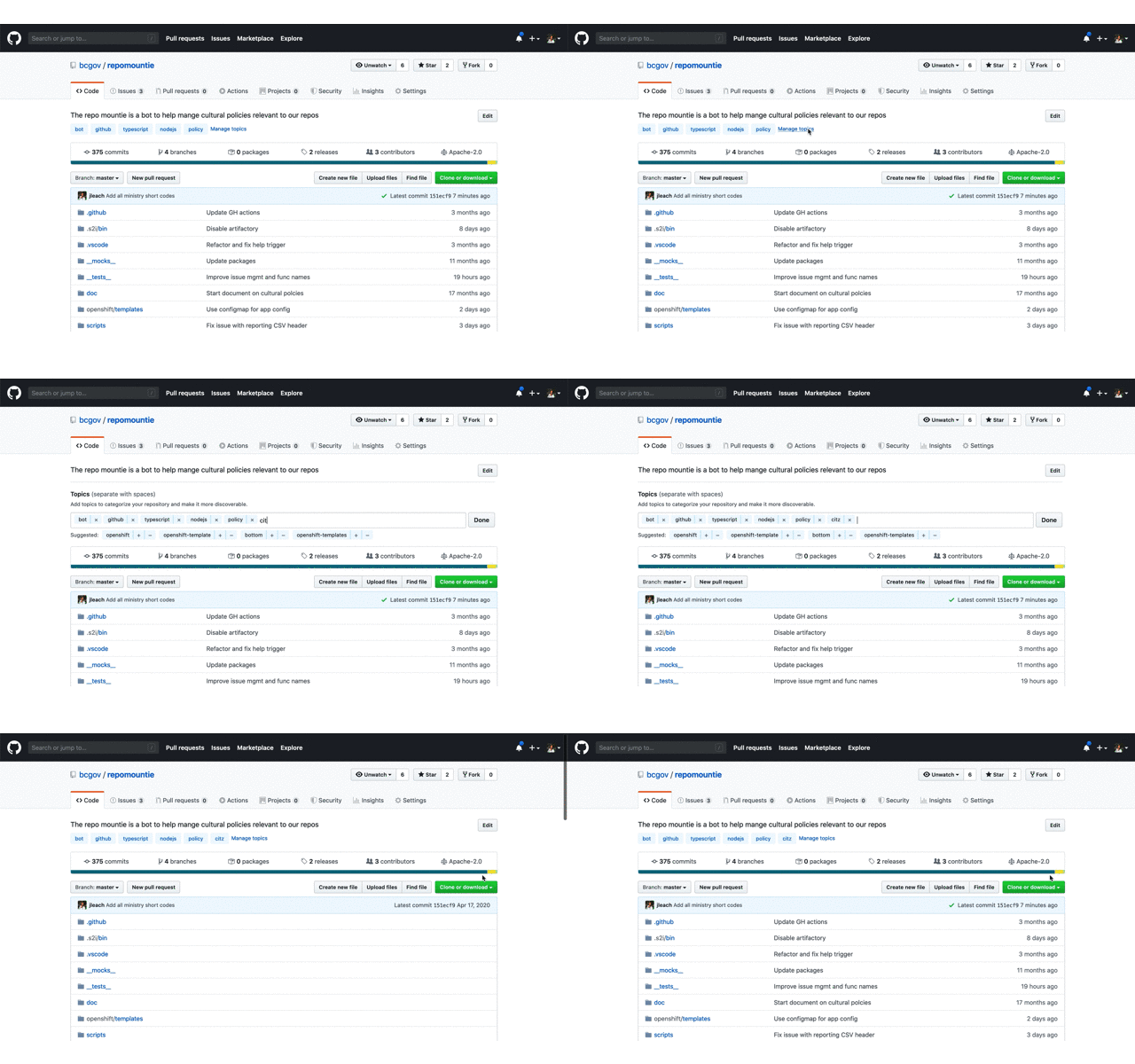
Add missing topics

TL;DR

Topics greatly improve the discoverability of repos; please add the short code from the table below to the topics of your repo so that ministries can use GitHub's search to find out what repos belong to them and other visitors can find useful content (and reuse it!).

Why Topic

In short order we'll add our 800th repo. This large number clearly demonstrates the success of using GitHub and our Open Source initiative. This huge success means it's critical that we work to make our content as discoverable as possible. Through discoverability, we promote code reuse across a large decentralized organization like the Government of British Columbia as well as allow ministries to find the repos they own.

What to do

Below is a table of abbreviation a.k.a short codes for each ministry; they're the ones used in all @gov.bc.ca email addresses. Please add the short codes of the ministry or organization that "owns" this repo as a topic.

add a topic

That's it, you're done!!!

How to use

Once topics are added, you can use them in GitHub's search. For example, enter something like org:bcgov topic:citz to find all the repos that belong to Citizens' Services. You can refine this search by adding key words specific to a subject you're interested in. To learn more about searching through repos check out GitHub's doc on searching.

Pro Tip 🤓

  • If your org is not in the list below, or the table contains errors, please create an issue here.

  • While you're doing this, add additional topics that would help someone searching for "something". These can be the language used javascript or R; something like opendata or data for data only repos; or any other key words that are useful.

  • Add a meaningful description to your repo. This is hugely valuable to people looking through our repositories.

  • If your application is live, add the production URL.

Ministry Short Codes

Short Code Organization Name
AEST Advanced Education, Skills & Training
AGRI Agriculture
ALC Agriculture Land Commission
AG Attorney General
MCF Children & Family Development
CITZ Citizens' Services
DBC Destination BC
EMBC Emergency Management BC
EAO Environmental Assessment Office
EDUC Education
EMPR Energy, Mines & Petroleum Resources
ENV Environment & Climate Change Strategy
FIN Finance
FLNR Forests, Lands, Natural Resource Operations & Rural Development
HLTH Health
IRR Indigenous Relations & Reconciliation
JEDC Jobs, Economic Development & Competitiveness
LBR Labour Policy & Legislation
LDB BC Liquor Distribution Branch
MMHA Mental Health & Addictions
MAH Municipal Affairs & Housing
BCPC Pension Corporation
PSA Public Service Agency
PSSG Public Safety and Solicitor General
SDPR Social Development & Poverty Reduction
TCA Tourism, Arts & Culture
TRAN Transportation & Infrastructure

NOTE See an error or omission? Please create an issue here to get it remedied.

Typography changes

We need to enhance how typography is presented in the design system.

  • Change header hierarchy.
  • Review typography styles.
  • Reorder from bigger to smaller sizes.
  • Reduce sizes and white areas from tables.
  • Review styles with developers.

Search field for tables

  • Define the behavior of search field inside a table.
  • Update design system components, if necessary.
  • Create documentation with defined behavior and rules.

Fix font face import

Getting this "Not found" error for the font family, looks like it's trying to get the assets folder from the project directory, not from our fsa theme package
Screen Shot 2023-05-08 at 12 55 48 PM

Add project lifecycle badge

No Project Lifecycle Badge found in your readme!

Hello! I scanned your readme and could not find a project lifecycle badge. A project lifecycle badge will provide contributors to your project as well as other stakeholders (platform services, executive) insight into the lifecycle of your repository.

What is a Project Lifecycle Badge?

It is a simple image that neatly describes your project's stage in its lifecycle. More information can be found in the project lifecycle badges documentation.

What do I need to do?

I suggest you make a PR into your README.md and add a project lifecycle badge near the top where it is easy for your users to pick it up :). Once it is merged feel free to close this issue. I will not open up a new one :)

Lets use common phrasing

TL;DR 🏎️

Teams are encouraged to favour modern inclusive phrasing both in their communication as well as in any source checked into their repositories. You'll find a table at the end of this text with preferred phrasing to socialize with your team.

Words Matter

We're aligning our development community to favour inclusive phrasing for common technical expressions. There is a table below that outlines the phrases that are being retired along with the preferred alternatives.

During your team scrum, technical meetings, documentation, the code you write, etc. use the inclusive phrasing from the table below. That's it - it really is that easy.

For the curious mind, the Public Service Agency (PSA) has published a guide describing how Words Matter in our daily communication. Its an insightful read and a good reminder to be curious and open minded.

What about the master branch?

The word "master" is not inherently bad or non-inclusive. For example people get a masters degree; become a master of their craft; or master a skill. It's generally when the word "master" is used along side the word "slave" that it becomes non-inclusive.

Some teams choose to use the word main for the default branch of a repo as opposed to the more commonly used master branch. While it's not required or recommended, your team is empowered to do what works for them. If you do rename the master branch consider using main so that we have consistency among the repos within our organization.

Preferred Phrasing

Non-Inclusive Inclusive
Whitelist => Allowlist
Blacklist => Denylist
Master / Slave => Leader / Follower; Primary / Standby; etc
Grandfathered => Legacy status
Sanity check => Quick check; Confidence check; etc
Dummy value => Placeholder value; Sample value; etc

Pro Tip 🤓

This list is not comprehensive. If you're aware of other outdated nomenclature please create an issue (PR preferred) with your suggestion.

Collaborate on design system

Tasks

  • How to sync the repo code with the figma design system
  • How to apply this design theme code to each application
    • React, Typescript -> Use Carbon React Library
    • Vue3, Typescript, what options will be?
      • carbon web component
      • other libraries?
    • In this case the application uses another library just for a specific feature, how to apply the design on top of that
  • How we apply future changes to each application

Form buttons

  • Define standard for "Next", "Confirm" and "Submit" buttons if disabled or enabled with error messages.
  • Define standard placement for "Submit" button.

Reduce the different levels of hierarchy

This proposal originated out of a conversation between Chantelle/Andrea (Aug 21, 2023) regarding CLIENT's external form having perhaps too many levels of hierarchy (too many different font sizes with potentially hard-to-read light shades of grey).

This will require a review by all FDS teams.

For example - labels vs help text look about the same size but different and chaotic

Buttons

  • Create documentation for order and placement for buttons.
  • Add combo-button to design system.
  • Create documentation for combo-button.

Recommend Projects

  • React photo React

    A declarative, efficient, and flexible JavaScript library for building user interfaces.

  • Vue.js photo Vue.js

    🖖 Vue.js is a progressive, incrementally-adoptable JavaScript framework for building UI on the web.

  • Typescript photo Typescript

    TypeScript is a superset of JavaScript that compiles to clean JavaScript output.

  • TensorFlow photo TensorFlow

    An Open Source Machine Learning Framework for Everyone

  • Django photo Django

    The Web framework for perfectionists with deadlines.

  • D3 photo D3

    Bring data to life with SVG, Canvas and HTML. 📊📈🎉

Recommend Topics

  • javascript

    JavaScript (JS) is a lightweight interpreted programming language with first-class functions.

  • web

    Some thing interesting about web. New door for the world.

  • server

    A server is a program made to process requests and deliver data to clients.

  • Machine learning

    Machine learning is a way of modeling and interpreting data that allows a piece of software to respond intelligently.

  • Game

    Some thing interesting about game, make everyone happy.

Recommend Org

  • Facebook photo Facebook

    We are working to build community through open source technology. NB: members must have two-factor auth.

  • Microsoft photo Microsoft

    Open source projects and samples from Microsoft.

  • Google photo Google

    Google ❤️ Open Source for everyone.

  • D3 photo D3

    Data-Driven Documents codes.