Giter Club home page Giter Club logo

vaadin-combo-box's Introduction

<vaadin-combo-box>

⚠️ Starting from Vaadin 20, the source code and issues for this component are migrated to the vaadin/web-components monorepository. This repository contains the source code and releases of <vaadin-combo-box> for the Vaadin versions 10 to 19.

<vaadin-combo-box> is a Web Component combining a dropdown list with an input field for filtering the list of items, part of the Vaadin components.

Live Demo ↗ | API documentation ↗

npm latest version Published on webcomponents.org Published on Vaadin Directory Discord

<vaadin-combo-box label="User" placeholder="Please select" item-value-path="email" item-label-path="email"></vaadin-combo-box>

<script>
  const comboBox = document.querySelector('vaadin-combo-box');

  fetch('https://randomuser.me/api?results=100&inc=name,email')
    .then(res => res.json())
    .then(json => comboBox.items = json.results);
</script>

Screenshot of vaadin-combo-box

Installation

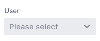
The Vaadin components are distributed as Bower and npm packages. Please note that the version range is the same, as the API has not changed. You should not mix Bower and npm versions in the same application, though.

Unlike the official Polymer Elements, the converted Polymer 3 compatible Vaadin components are only published on npm, not pushed to GitHub repositories.

Polymer 2 and HTML Imports Compatible Version

Install vaadin-combo-box:

bower i vaadin/vaadin-combo-box --save

Once installed, import it in your application:

<link rel="import" href="bower_components/vaadin-combo-box/vaadin-combo-box.html">

Polymer 3 and ES Modules Compatible Version

Install vaadin-combo-box:

npm i @vaadin/vaadin-combo-box --save

Once installed, import it in your application:

import '@vaadin/vaadin-combo-box/vaadin-combo-box.js';

Getting Started

Vaadin components use the Lumo theme by default.

To use the Material theme, import the correspondent file from the theme/material folder.

Entry points

  • The components with the Lumo theme:

    theme/lumo/vaadin-combo-box.html theme/lumo/vaadin-combo-box-light.html

  • The components with the Material theme:

    theme/material/vaadin-combo-box.html theme/material/vaadin-combo-box-light.html

  • Alias for theme/lumo/vaadin-combo-box.html theme/lumo/vaadin-combo-box-light.html

    vaadin-combo-box.html vaadin-combo-box-light.html

Running demos and tests in a browser

  1. Fork the vaadin-combo-box repository and clone it locally.

  2. Make sure you have npm and Bower installed.

  3. When in the vaadin-combo-box directory, run npm install and then bower install to install dependencies.

  4. Run npm start, browser will automatically open the component API documentation.

  5. You can also open demo or in-browser tests by adding demo or test to the URL, for example:

Running tests from the command line

  1. When in the vaadin-combo-box directory, run polymer test

Following the coding style

We are using ESLint for linting JavaScript code. You can check if your code is following our standards by running npm run lint, which will automatically lint all .js files as well as JavaScript snippets inside .html files.

Big Thanks

Cross-browser Testing Platform and Open Source <3 Provided by Sauce Labs.

Contributing

To contribute to the component, please read the guideline first.

License

Apache License 2.0

Vaadin collects development time usage statistics to improve this product. For details and to opt-out, see https://github.com/vaadin/vaadin-usage-statistics.

vaadin-combo-box's People

Contributors

alvarezguille avatar artur- avatar asashour avatar cwayfinder avatar dependabot[bot] avatar diegocardoso avatar gatanaso avatar haprog avatar jermsv1 avatar jouni avatar kisstkondoros avatar limonte avatar manolo avatar mshabarov avatar mukherjeesudebi avatar pekam avatar phan-thanhdat avatar platosha avatar samiheikki avatar saulis avatar shadikhani avatar sissbruecker avatar sohrabtaee avatar tehapo avatar tomivirkki avatar tuomasnironen avatar vicsstar avatar vursen avatar web-padawan avatar yuriy-fix avatar

Stargazers

 avatar  avatar  avatar  avatar  avatar  avatar  avatar  avatar  avatar  avatar  avatar  avatar  avatar  avatar  avatar  avatar  avatar  avatar  avatar  avatar  avatar  avatar  avatar  avatar  avatar  avatar  avatar  avatar  avatar  avatar  avatar  avatar  avatar  avatar  avatar  avatar  avatar  avatar  avatar  avatar  avatar  avatar  avatar  avatar  avatar  avatar  avatar  avatar  avatar  avatar  avatar  avatar  avatar  avatar  avatar  avatar  avatar  avatar  avatar  avatar  avatar  avatar  avatar  avatar  avatar  avatar  avatar  avatar  avatar  avatar  avatar  avatar  avatar  avatar  avatar  avatar  avatar  avatar  avatar  avatar  avatar  avatar  avatar  avatar  avatar  avatar  avatar  avatar  avatar  avatar  avatar  avatar  avatar  avatar  avatar  avatar  avatar  avatar  avatar  avatar

Watchers

 avatar  avatar  avatar  avatar  avatar  avatar  avatar  avatar  avatar  avatar  avatar  avatar  avatar  avatar  avatar  avatar  avatar  avatar  avatar  avatar  avatar  avatar  avatar  avatar

vaadin-combo-box's Issues

Fullscreen layout breaks down on Android

In the UX test proto the layout broke down on Android 5 test device. The error occurred at least when there was more than one instance of a combo box with the same items inside a form ("Languages" combo box in the proto).

  • Options list was cut half from the middle even if there was so many items that they didn't fit in the viewport.
  • Some options appeared as empty rows.

Background: UX Test Notes

Display a list of static items

An input and a button for opening and closing a display of a list of static items:

  • Dropdown menu (for large viewport sizes)
    • Positioning and sizing when close to viewport edges
  • Fullscreen popup (for small viewport sizes)
    • Ignore iOS fixed positioning quirks and the remaining vertical viewport size when the software keyboard is visible.

Use the existing prototype (alpha1) as a reference for the overall experience (look and feel, functionality, etc.), regarding the list display (not other features).

Note

Do not put iron-list or vaadin-grid inside combo-box before there is an actual need for it! And those definitely are not needed at this point (they are most likely needed only after we start including a feature that requires hundreds of items or lazy loading).

DoD:

  • Tests
  • Documentation
    • API docs
    • Demo/examples

Improve keyboard navigation for opening/closing

Specify and implement opening/closing the combo box behaviour regarding up/down and esc keypresses. Things to keep in mind:

  • prefilling the input while moving up/down in the dropdown
  • cycling options list with arrows after the dropdown is opened (jumping from top to bottom or bottom to top)
  • selecting vs. clearing the selection with which keypresses at which stages?

Background: UX Test Notes

Add items to the properties object

Polylint error – vaadin-combo-box.html:145:31
Property 'items' bound to attribute 'items' not found in 'properties' for element 'vaadin-combo-box'

Enable selecting items from a static list

  • Decided to use iron-selector temporarily for now.
  • Return value is a string from the items array
  • Selecting item will close popup
  • Value can be selected like: combobox.value = 'foobar'
  • Behavior for selecting an undefined value is undefined at this time.

Add items property

  • Support primitive types only at this point
  • Put a iron-list inside iron-selector
  • vaadin-combo-box should expose items
  • Push, Pop, Empty, Update and other array related mutations need to be tested

Dynamic data

Two possible approaches:

Use <vaadin-grid>

  • Prototyping already done
  • Supports multiple columns out of the box
  • Supports multi select, but probably needs some rework to be usable in a combobox?
  • Smaller cache footprint (grid discards items out of the viewport)
  • Supports lazy-loading out of the box
  • Anything else?

Use <iron-list>

  • Has a templating model for custom rows (and multiple columns)
  • Supports multi select
  • Smaller in size and simpler
  • Performs faster
  • Implementing lazy loading should be straight forward (there are examples)
  • Anything else?

Add label

Add label behaving similarily to one in paper-input element (a "label" property/attribute).

Consider also how bottom-aligned dropdown should be positioned if there is no label present. It might require some negative margin etc.

Add the label attribute to the existing examples, and mention the use of it in the first example.

Animation design

  • Dropdown open and close
  • Loading indicator (when lazy loading data source has been implemented)
  • Item selection

Enable scrolling

  • Enable scrolling (duh)
  • Hide soft keyboard on touch devices when scrolling (also on iPad which doesn't use fullscreen) (by blurring the input field)
  • We assume that the soft keyboard is always hidden if the are no input fields (nor text areas) focused
  • See #2

Dropdown alignment

The dropdown item list might, in some cases, be better aligned above the input field, or next to it on the left or right side.

Support HTML forms

  • Use the approach as Polymer elements (iron-form)
  • Implement Polymer.IronFormElementBehavior
  • iron-form could be used in testing (serialize() maybe?)

Input text selection logic

  • Preselect the input value when opened/focused
  • When you filter the items, and navigate using arrow keys, the ending of the value could be entered into the field and preselected, if we have an option for "begins with" type of filtering

Background: End User UX Test Notes

Add a viewport size threshold for fullscreen mode

The fullscreen mode should not depend on any user agent detection. The viewport size is the only thing that should trigger it (but it does not need to adapt when the item display is open).

The threshold should detect both viewport width and viewport height, and take the smallest of those. If either is under 600px, then use fullscreen.

Too many events are fired when opening for the first time

When a combo-box is opened for the first time, it fires at least 3 opened-changed events and 2 iron-overlay-opened events.

This is most probably because the <vaadin-adaptive-overlay> doesn't have a default value for _verticalAlign and it closes and reopens the overlay while trying to figure the alignment out.

Allow custom input values

We need to decide if we want to and can support this (allow the user to type any value to the input which is not in the actual options list).

Unselecting is impossible on fullscreen mode

After selecting an item, it is impossible to get back to initial state where nothing was selected. We should not force people to reload the page as an only way of getting back to unselected state. (tested on iPad only).

Natural way of implementing this would be to unselect when one deletes the selection with keyboard.

Improve iOS fullscreen UX

See if there are ways to enhance the end user experience, compared to the feature/fullscreen-ios branch prototype, including:

  • Double tapping on elements outside the dropdown list
  • Touch dragging other elements than the dropdown list
  • Refocusing the input field

Dropdown keyboard opening and item highlighting

Different cases to solve:

  • Key down ↓
    • Dropdown opens below
      • Key down ↓
        • Highlight first item in the list
      • Key up ↑
        • ?
    • Dropdown opens above
      • Key down ↓
        • Highlight first item in the list
      • Key up ↑
        • ?
  • Key up ↑
    • Dropdown opens below
      • Key down ↓
        • ?
      • Key up ↑
        • ?
    • Dropdown opens above
      • Key down ↓
        • ?
      • Key up ↑
        • ?

Add screenshot of fullscreen mode to readme

It would be great to promote the responsive behavior of the element in the screenshot.

The screenshot should probably include the element running inside an actual device.

Replace iron-list with vaadin-grid

  • Replace the element in vaadin-combo-box
  • Make all the existing APIs work with vaadin-grid
  • Make sure resizing / keyboard navigation works ok
    • Try to make the vaadin-grid built-in focus work first, if it seems not doable, use a similar approach as with iron-list currently (change selection on key press and perhaps use a rowclassgeenrator for highlighting the vaadin-combo-box selection)

Prevent item deselection

Currently, iron-list deselects items when you click on a selected item.

  • Instead, we should just close the popup when user clicks on a selected item. selected-items-changed should NOT fire.

Second press of up arrow should focus the dropdown

Opening the dropdown can be done with up or down arrow keys. However only down arrow can be used to bring focus to the first (or selected) item of the dropdown.

This feels a bit weird when the dropdown is positioned above the input field. It would probably make more sense to focus the dropdown item also on a second up key press.

Using the “tab” buttons on iOS when the fullscreen mode doesn’t work as expected

The two blue arrow keys above the software keyboard on iOS work unexpectedly.

When you have the fullscreen mode open for a combo box, and press either of the “tab” buttons to move the prev/next field, the combo box overlay stays open.

Similary, when “tabbing” into a combo box on a “fullscreen device”, should the overlay open automatically. Most likely not, as it might cause a too big interruption if the user is just “tabbing through”, but this needs some discussion.

Form submit should be prevented when selecting an item using the enter key

Currently, in our “Using as a form field” demo, if you select an item using the keyboard, the form is submitted immediately at the same time when the item is selected.

The form should only be submitted if the items list is not open and the user pressed the enter key – in other words, the default browser action should be prevented when the user selects an item from the list using the keyboard.

The form SHOULD be submitted when you press the enter key if the list is closed and the focus is in the input.

Keyboard navigation

Features / Behavior:

  • Let's focus on desktop behavior, if it works on fullscreen, great - if not then not.
  • Input can be focused using TAB
  • Popup opens when you start typing on it (or click the icon)
  • Popup opens when focused and you push DOWN/UP
  • If a value is selected when popup opens, it's highlighted, otherwise nothing is highlighted. Selected item is not highlighted after filtering anymore.
  • After typing in a filter, the topmost item is highlighted
  • Focus/highlight is moved up and down by pushing DOWN/UP
  • When you navigate to the topmost item, and push one more time UP, the topmost item stays focused??
  • You need to be able to navigate the value inside the input field using LEFT/RIGHT
  • Pushing ENTER will select the focused/highlighted item
  • When the input box is cleared and ENTER is pushed, combobox value is cleared.
    • Q: How is the input box cleared ? A: With BACKSPACE
    • Q: When input box is empty is it cleared ? A: combobox.value is cleared if ENTER is
      hit when input box is empty/cleared
    • Additional info: when input value is changed, the items are reset and item highlight is removed.
  • When the input box is cleared we don't want to highlight the topmost item
  • Pushing SPACEBAR is for now reserved for multi selection
  • Pushing ESCAPE will cancel and close the popup

Design questions:

  • When you navigate to the topmost item, and push one more time UP, the topmost item stays focused? or should it remove focus

Filtering with "contains"

Concepts:

  • Filter value (F)
  • Selected value (S)
  • Displayed value (D)

Features / Behaviour:

  • Typing inside the input field filters items with "contains" type of filtering
  • combobox._filter is bound to the value that is used for filtering
  • combobox._filter accepts any string
  • combobox.value is bound to the selected value
  • After the popup is closed, D is always S
  • When the popup is opened, D is always S
  • When you start typing into the input box, D is changed to F
  • If popup is closed when you start typing, it should open (desktop only ofc)
  • F is cleared when the popup is closed (either by selecting value or canceling)
  • Blurring the input does not clear F nor change D to S

Design questions:

  • Tabbing out from focus input - should it cancel selection and close popup?

Possible issues:

  • We probably need a second input for the fullscreen approach

List items overlap field underline

The "GLOBAL" text can be seen partially above the blue underline.

screen shot 2015-11-18 at 14 36 02

Acceptance criteria

  • The list items can no longer be seen outside the dropdown element in any situation

Scroll items with keyboard navigation

Currently, scroll position does not follow focused item when using keyboard navigation.

  • Focused item should be aligned with "scroll-to-any" (escalator term)

Recommend Projects

  • React photo React

    A declarative, efficient, and flexible JavaScript library for building user interfaces.

  • Vue.js photo Vue.js

    🖖 Vue.js is a progressive, incrementally-adoptable JavaScript framework for building UI on the web.

  • Typescript photo Typescript

    TypeScript is a superset of JavaScript that compiles to clean JavaScript output.

  • TensorFlow photo TensorFlow

    An Open Source Machine Learning Framework for Everyone

  • Django photo Django

    The Web framework for perfectionists with deadlines.

  • D3 photo D3

    Bring data to life with SVG, Canvas and HTML. 📊📈🎉

Recommend Topics

  • javascript

    JavaScript (JS) is a lightweight interpreted programming language with first-class functions.

  • web

    Some thing interesting about web. New door for the world.

  • server

    A server is a program made to process requests and deliver data to clients.

  • Machine learning

    Machine learning is a way of modeling and interpreting data that allows a piece of software to respond intelligently.

  • Game

    Some thing interesting about game, make everyone happy.

Recommend Org

  • Facebook photo Facebook

    We are working to build community through open source technology. NB: members must have two-factor auth.

  • Microsoft photo Microsoft

    Open source projects and samples from Microsoft.

  • Google photo Google

    Google ❤️ Open Source for everyone.

  • D3 photo D3

    Data-Driven Documents codes.