Giter Club home page Giter Club logo

texas-2036 / covid_tracker Goto Github PK

View Code? Open in Web Editor NEW
16.0 7.0 4.0 58.05 MB

This is a Texas-centric COVID Tracker that focuses on impacts felt across the state, both by those experiencing COVID-19 directly as patients or victims and those experiencing COVID-19 indirectly through economic hardship and other non-health impacts.

Home Page: https://texas2036.shinyapps.io/covid_tracker/

License: Other

R 3.78% CSS 0.31% HTML 95.92%
covid-19 texas

covid_tracker's Introduction

Texas 2036 COVID-19 Resource Kit

This is the code repository for the Texas 2036 COVID-19 Data Resource

Texas 2036 COVID-19 Data Resource

This app is built using shiny, an interactive data visualization library built in R that allows people to create powerful tools. To replicate our product, you’ll need to run the app.R file inside of RStudio.

Terms of Use

  1. This website and its contents herein, including all data, mapping, and analysis (“Website”), copyright 2020, Texas 2036, all rights reserved, is provided solely for non-profit public health, educational, and academic research purposes. You should not rely on this Website for medical advice or guidance.
  2. Use of the Website by commercial parties and/or in commerce is strictly prohibited. Redistribution of the Website or the aggregated data set underlying the Website is strictly prohibited.
  3. When linking to the website, attribute the Website as the “Texas COVID-19 Data Resource by Texas 2036”.
  4. The Website relies upon publicly available data from multiple sources that do not always agree. Texas 2036 hereby disclaims any and all representations and warranties with respect to the Website, or any content or data thereon, including accuracy, fitness for use, reliability, completeness, and non-infringement of third party rights.
  5. Any use of Texas 2036 names, logos, trademarks, and/or trade dress in a factually inaccurate manner or for marketing, promotional or commercial purposes is strictly prohibited.
  6. These terms and conditions are subject to change. Your use of the Website constitutes your acceptance of these terms and conditions and any future modifications thereof.

covid_tracker's People

Contributors

mathisonian avatar mrworthington avatar

Stargazers

 avatar  avatar  avatar  avatar  avatar  avatar  avatar  avatar  avatar  avatar  avatar  avatar  avatar  avatar  avatar  avatar

Watchers

 avatar  avatar  avatar  avatar  avatar  avatar  avatar

covid_tracker's Issues

Add County-Level Mobility Data

Add county mobility data section that leaves viewers with a clear understanding of the mobility impacts of distancing efforts/quarantines and then shows how quickly/slowly people have responded to the gradual re-opening of the economy.

This analysis should include include:

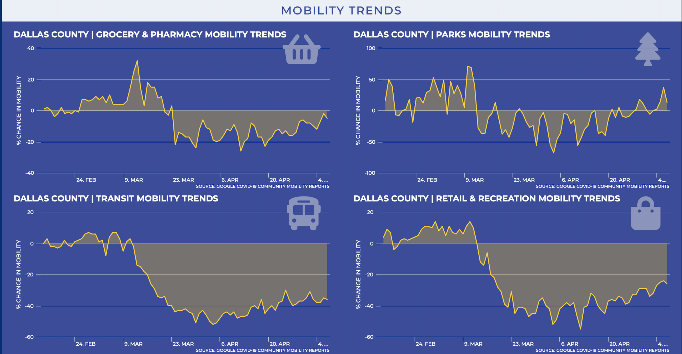
  1. graphically representing rates of mobility change versus a baseline position on a daily basis (i.e., April 26, 2020 had 40% less movement than April 26, 2019; April 27 had 35% less movement than April 27, 2019)

  2. breakdown data to show where people are going/not going (e.g., 40% decline in visiting restaurants on April 26 changed to 20% decline in visiting restaurants on May 6). See charts below from Google.

Screen Shot 2020-05-02 at 10 25 37 PM

Trauma Service Area Blocking Hover Tooltip For Counties in TSA

On County Explorer page, if a county is selected, you can't hover over other counties in that Trauma Service Area because the fill option in leaflet is layered at the front, which blocks any sort of "OnHover" events that trigger the tooltip. While fixing the layering issue would be ideal, perhaps switching to a bolder outline of the TSAs more prominent is the best immediate solution.

Explain Various Data Update Schedules for Each Datasets

One piece of feedback we received was that the Unemployment rate for March 1 caught people off guard, because most other data is recent. To reduce this surprise, help people understand the schedules for which data updates are received.

Map to show which counties are "hot spots" for case growth in the past week

Matt - Our team asked about adding info to flag which counties have shown higher than average case growth in the past week. Maybe something like other maps on the 2036 website. For May 5-May 12, Texas overall case growth was about 23%. There are 41 counties whose case growth was more than double that amount (46% growth in a week) and of those, 15 counties had fewer than 5 cases on 5/12. Maybe a map that shows these “hot spots” for the prior week, but with a distinction between counties with 5+ cases vs. fewer than? (Another option – look at this in combination with total cases per 100K. There could be two maps – one with last week’s growth, and one that shows cases per capita. Some of these high growth counties for the past week are still below the state’s average # cases/1000.)

image

Integrate County-Level Economic Data

Using TWC data, add to the county explorer tab the total job losses since March 21 for each county. This should include

  • Data point: total jobs lost
  • Data point: total jobs lost as a percentage of labor market
  • Graph: county-level job losses/gains by week (line or bar chart)
  • Graph: county-level job losses/gains by sector (bar chart)

Add TxDOT Traffic Data

While the Google mobility and SafeGraph data is more important, we also have the option of linking into the data that powers DriveTexas.org. While I'm not immediately aware of what we would learn from this source vs. Google/SafeGraph, it is worth pursuing (a) to establish a relationship that will be longer-lasting and (b) they might collect data points we don't even know about yet. I could imagine them having data that helps project motor fuels tax revenues.

Integrate OverHaul data

Dr. Lazar noted that https://over-haul.com/ has data that could help us determine freight movements and other economic activity. This would be great to incorporate into version 2.0 but we should definitely try to have it by 3.0.

County Explorer DSHS Request

DSHS has requested that we visualize a multi-criteria map of Texas. The way I envision the vague direction is as follows:

  • Start with a state map with toggle boxes to the side
  • label the boxes things like "Tier 1 county" "Tier 2 county" "Growth rate above 5%" etc
  • as people click those boxes, they'll see which counties hit the various criteria

This would need to make sense in conjunction with the state trend map, issue #34, which I still think is important.

Add State-Level Mobility Data

Add statewide mobility data section that leaves viewers with a clear understanding of the mobility impacts of distancing efforts/quarantines and then show how quickly/slowly people respond to the gradual re-opening of the economy.

This analysis should include include
(a) graphically representing overall rate of mobility change versus a baseline position on a daily basis (i.e., April 26, 2020 had 40% less movement than April 26, 2019);

(b) using a state map with a time-elapse function to show where people were more/less active at different times. This would operate like the time-elapse infection map in one of the other issues -- basically, you click play at the bottom of a map of Texas and see the counties dip into varying depths of blue due to movement reduction, then as we reach May, it starts to lighten and may reach baseline (white) or increased (red) in certain pockets. This would use daily data, starting around March 1.

(c) breakdown data to show where people are going (e.g., 40% decline in visiting restaurants on April 26 changed to 20% decline in visiting restaurants on May 6) like what google
Screen Shot 2020-05-02 at 10 30 11 PM
has.

Add Population Health Charts

On the back-end, the data has already been cut to report on incidence and fatalities by Race, Age, and Gender at the statewide level. We now just need to draw the charts. My initial ideas were to start integrating some horizontally stacked bar charts to visualize these. Something that would look a lot like the charts below. We may do pie charts, but that may feel bulky in our current layout and pie charts have a lot of controversy around them that I'd like to avoid.

Screen Shot 2020-05-15 at 4 41 15 PM

Fix Map View Issue on Mobile

The fitbounds function in the leaflet code (found inside of COVID Workbook.Rmd) needs to be adjusted so the Texas County map fits in it's container across desktop platforms and mobile platforms. Currently, it is not fitting properly in the container on mobile and some tablets.

iPhone Example

IMG_1122

iPad Portrait Example

IMG_0124

Change Homebase Data Figures to read "Estimate"

Because the Homebase data are best estimates based off of a sample of companies they work with in Texas, we need to make sure and communicate that these figures are best estimates of small business dynamics.

Add TWC Childcare Capacity Data

TWC's childcare capacity data will be an important metric for tracking the ability of parents to return to the workforce. This should be linked to the economic data portion of the state explorer and should be included in the county explorer if TWC data is sufficiently granular.

Let's try to get this into 2.0, but it can be pushed to 3.0 if necessary.

Remove County-Level ILI/CLI

In re-opening tab, remove county-level ILI/CLI tab. Consider replacing with text that says the state is no longer receiving data from a sufficient number of locations to ensure geographic/statistical validity.

Add County Comparison feature

We have a donor request that we add the ability to compare two counties side-by-side. This will involve creating a new tab on the navigation panel to a "Compare Counties" window, as well as whatever it takes to actually compare the counties.

Change "Recovered" and "Active" to estimates

For immediate action, change text to "Recovered (Est.)" and "Active (Est.)"

For long term, we should have a non-obtrusive button someone can click that redirects them to our data page with a more fulsome explanation of the data.

Version 2.5 Narrative

We need to think through a "what has happened since May 1" explainer.

Here are my initial thoughts on what people will find helpful:

  • by county, what has happened to the "daily new cases" trend line (potentially with 7-day smoothing to reflect DSHS calculations)
  • compare "tier one" county trends (per 100,000) to "tier two" county trends (per 100,000)
  • show google mobility data per county, comparing rates of movement 1 & 2 weeks prior to May 1, with 1 & 2 weeks after May 1
  • show homebase "business opened" statewide data in a way that estimates increased business activity. For the explainer, we should try to figure out how many of the sample businesses are in Tier 1 counties (my guess is almost all, if not 100%)

Disclaimer Language on Reopening Tab

On most pages, the disclaimer language sits quietly at the bottom of the page. But on the reopening tab, once you scroll to the bottom of the page, the disclaimer language appears and won't leave as you scroll back up. It ends up taking up a good portion of the screen.

Screen Shot 2020-05-02 at 9 47 51 PM

Calculate Custom Metrics

Statewide

  • Tests Per 100,000
  • Available Ventilators Per COVID-19 Case
  • Available ICU Beds Per COVID-19 Case
  • Case Growth Rate
  • Doubling Every X days
  • 1 and 7-day rates of change for cumulative cases, daily new cases, daily new deaths, and daily new hospitalized
  • Positive/Negative Testing. Current and TS.

County-Level Metrics

  • Crosswalk the NCHS and Trauma Service Area Data.
  • Integrate DSHS Tests Per County Data
  • Tests Per 100,000
  • Available Ventilators Per COVID-19 Case
  • Available ICU Beds Per COVID-19 Case
  • Case Growth Rate
  • Doubling Every X days
  • 1 and 7-day rates of change for cumulative cases, daily new cases, daily new deaths, and daily new hospitalized
  • Positive/Negative Testing. Current and TS. (If we can get comprehensive data on testing at the county level. To my knowledge, COVID-tracking only produces this at a statewide-level).

Add Air Quality Data

Work with TCEQ to identify air quality measures that can be depicted either in chart or over a Texas map to determine whether COVID has impacted the state's air quality as traffic has reduced.

Add Credits Page

Add All Credits, Acknowledgement, and Required Licensing Language

Optimize For Mobile-Friendly CSS

For both the landing page, the "Reopening Analysis" site, and both of the profiles, we need to optimize css for mobile as much as possible. Right now, when pages are loaded, it's like a massive text vomit of bold Montserrat that is overwhelming. Currently, a third of users access the site on mobile, but we haven't really launched, so over time mobile usage will likely increase.

Image from iOS (1)

State Trend Map for v2.5

For Version 2.5 (the narrative to quickly follow 2.0), we should add a state map that has a time-elapse function (click play or drag a slider at the bottom) and shows case per 100,000 trends for every county over the past 2 months (using daily intervals of the 7-day rolling average for daily new cases). What I'm thinking, basically, is an interactive version of this, but using 7-day averages rather than weekly data:

image001

It would need to be structured to automatically update daily.

Reformat Left Navigation Panel for Drop Downs

The goal here would be that when you click on "state explorer" or "county explorer," three options drop down: health data, economic data, and mobility data. When you click on economic data or mobility data, you jump to that portion of the explorer page.

"Notable Circumstances" Tab on County Explorer

((As of May 2, the data does not exist to do this))

Many stakeholders have requested that we find a way to show how much of an outbreak is tied to an isolated event, such as a nursing home or meatpacking plant. The idea is to differentiate true community spread events from concentrated super-spread events.

Recommend Projects

  • React photo React

    A declarative, efficient, and flexible JavaScript library for building user interfaces.

  • Vue.js photo Vue.js

    🖖 Vue.js is a progressive, incrementally-adoptable JavaScript framework for building UI on the web.

  • Typescript photo Typescript

    TypeScript is a superset of JavaScript that compiles to clean JavaScript output.

  • TensorFlow photo TensorFlow

    An Open Source Machine Learning Framework for Everyone

  • Django photo Django

    The Web framework for perfectionists with deadlines.

  • D3 photo D3

    Bring data to life with SVG, Canvas and HTML. 📊📈🎉

Recommend Topics

  • javascript

    JavaScript (JS) is a lightweight interpreted programming language with first-class functions.

  • web

    Some thing interesting about web. New door for the world.

  • server

    A server is a program made to process requests and deliver data to clients.

  • Machine learning

    Machine learning is a way of modeling and interpreting data that allows a piece of software to respond intelligently.

  • Game

    Some thing interesting about game, make everyone happy.

Recommend Org

  • Facebook photo Facebook

    We are working to build community through open source technology. NB: members must have two-factor auth.

  • Microsoft photo Microsoft

    Open source projects and samples from Microsoft.

  • Google photo Google

    Google ❤️ Open Source for everyone.

  • D3 photo D3

    Data-Driven Documents codes.