Giter Club home page Giter Club logo

scale's Introduction

Scale

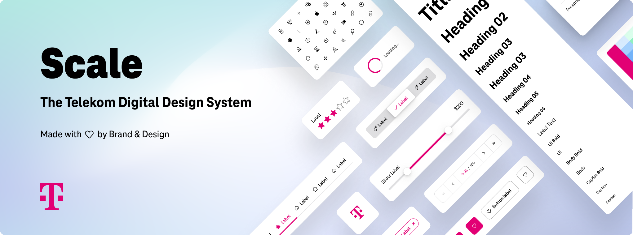
Scale is the digital design system for Telekom products and experiences. By default, Scale is built to align with our corporate brand and design but allows for easy customization to fit your particular product. It helps you build your digital products faster and create superior experiences with ease. With production-ready components for code and design, a central library, and comprehensive documentation, Scale has everything you need. Currently, Scale is an open beta.

Scale components are customizable and written in TypeScript. If you want to represent the corporate identity of a separate brand, you need to replace the Telekom default theme (see detailed instructions below).

Scale badge License: MPL-2.0 GitHub code size in bytes GitHub repo size

Welcome to Scale

Access the comprehensive documentation for Scale.

Are you a designer?

We provide a comprehensive Sketch library for designers building Telekom software. All components in the Sketch library are also available to your developers as code, making the handover very smooth and straightforward. For more information, access the Scale website.

Customizing Scale for open source software

Although the code for Scale is free and available under the MPL 2.0 License, Deutsche Telekom fully reserves all rights to the Telekom brand. To prevent users from getting confused about the source of a digital product or experience, there are strict restrictions on using the Telekom brand and design, even when built into code that we provide. For any customization other than explicitly for the Telekom, you must replace the Deutsche Telekom default theme.

To use Scale as open source software and customize it with a neutral theme, please follow the instructions for our open source version.

Open source version

By following the instructions for the open source version, you obtain source code/packages that use a neutral theme and are fully covered by the MPL-2.0 License.

Setup with NPM

npm install @telekom/scale-components-neutral@next

To install the version prior to dark mode, do npm install @telekom/scale-components-neutral (without @next)

To use the components, you need to load a CSS file and some JavaScript. The CSS file includes the fonts and design tokens.

Setup with plain HTML

<link
  rel="stylesheet"
  href="node_modules/@telekom/scale-components-neutral/dist/scale-components/scale-components.css"
/>
<script
  type="module"
  src="node_modules/@telekom/scale-components-neutral/dist/scale-components/scale-components.esm.js"
></script>

Setup with a bundler or ES modules

import '@telekom/scale-components-neutral/dist/scale-components/scale-components.css';
import {
  applyPolyfills,
  defineCustomElements,
} from '@telekom/scale-components-neutral/loader';

applyPolyfills().then(() => {
  defineCustomElements(window);
});

NPM packages

Package name Description
@telekom/scale-components-neutral Stencil components
@telekom/scale-components-react-neutral Component proxies for React
@telekom/scale-components-vue-neutral* Component proxies for Vue
@telekom/scale-components-angular-neutral* Component proxies for Angular
@telekom/scale-design-tokens-neutral** Design tokens

*deprecated since v3.0.0-beta.X — Please use @telekom/scale-components-neutral directly, support for custom elements is already great.

**deprecated since v3.0.0-beta.100 in favor of @telekom/design-tokens

Using the source code directly

If you want to use the source code, remove the following folders. These folders contain all the protected brand and design assets of the Telekom and are not available under the MPL-2.0 License:

Folder Content
assets Scale key visual
packages/components/src/components/telekom Telekom components
packages/components/src/telekom Telekom fonts & icons
packages/components/src/html/telekom Telekom code examples
packages/design-tokens/src/telekom Telekom design tokens
packages/visual-tests/ Visual tests
storybook-vue Telekom branded storybook

Telekom version

Please note that the use of the Telekom brand and design assets – including but not limited to the logos, the color magenta, the typeface and icons, as well as the footer and header components – are not available for free use and require Deutsche Telekom's express permission for use in commerce.

Setup with NPM

Install the Scale component library in your project with NPM or Yarn:

npm install @telekom/scale-components@next

To install the version prior to dark mode, do npm install @telekom/scale-components (without @next)

Setup with plain HTML

<link
  rel="stylesheet"
  href="node_modules/@telekom/scale-components/dist/scale-components/scale-components.css"
/>
<script
  type="module"
  src="node_modules/@telekom/scale-components/dist/scale-components/scale-components.esm.js"
></script>

Setup with a bundler or ES modules

import "@telekom/scale-components/dist/scale-components/scale-components.css";
import { applyPolyfills, defineCustomElements } from "@telekom/scale-components/loader";

applyPolyfills().then(() => {
  defineCustomElements(window);
});

NPM packages

Package name Description
@telekom/scale-components Stencil components
@telekom/scale-components-react Component proxies for React
@telekom/scale-components-vue* Component proxies for Vue
@telekom/scale-components-angular* Component proxies for Angular
@telekom/scale-design-tokens** Telekom design tokens

*deprecated since v3.0.0-beta.X — Please use @telekom/scale-components directly, support for custom elements is already great. Check out the info relative to frameworks in the documentation.

**deprecated since v3.0.0-beta.100 in favor of @telekom/design-tokens

Using the source code directly

Simply clone/download this repository and use the source code as is.

Monorepo packages overview

Package name Description
components Stencil components
components-angular Component proxies for Angular (auto-generated)
components-react Component proxies for React (auto-generated)
components-vue Component proxies for Vue (auto-generated)
design-token Design tokens
storybook-vue Our Storybook
visual-tests Visual snapshot testing

Contributing

Code of conduct

This project has adopted the Contributor Covenant in version 2.0 as our code of conduct. Please see the details in our CODE_OF_CONDUCT.md. All contributors must abide by the code of conduct.

How to contribute

We always welcome and encourage contributions and feedback. For more information on how to contribute, the project structure, as well as additional information, see our Contribution Guidelines. By participating in this project, you agree to abide by its Code of Conduct at all times.

Contributors

Our commitment to open source means that we are enabling - even encouraging - all interested parties to contribute and become part of its developer community.

Licensing

Copyright (c) 2021 Egor Kirpichev and contributors, Deutsche Telekom AG

Licensed under the Mozilla Public License 2.0 (MPL-2.0) (the "License"); you may not use this file except in compliance with the License.

You may obtain a copy of the License by reviewing the file LICENSE in the repository.

Unless required by applicable law or agreed to in writing, software distributed under the License is distributed on an "AS IS" BASIS, WITHOUT WARRANTIES OR CONDITIONS OF ANY KIND, either express or implied. See the LICENSE for the specific language governing permissions and limitations under the License.

scale's People

Contributors

acstll avatar annakuchtin avatar ayeshaa-m avatar chrispaj avatar christophergdynia avatar dario-i22 avatar dependabot[bot] avatar eeegor avatar felix-ico avatar halfas avatar jano314159 avatar kig avatar kreincke avatar lalaluka avatar maomaozh avatar marvinlaubenstein avatar mato-a avatar mihailsfx1nce avatar niclas18 avatar niklaswa avatar nowseemee avatar oddcelot avatar reld avatar rl-ico avatar simonhofmeister avatar steffilankes avatar sylviagonschior avatar tallence-dsulyok avatar timheiler-ico avatar tomhoefer avatar

Stargazers

 avatar  avatar  avatar  avatar  avatar  avatar  avatar  avatar  avatar  avatar  avatar  avatar  avatar  avatar  avatar  avatar  avatar  avatar  avatar  avatar  avatar  avatar  avatar  avatar  avatar  avatar  avatar  avatar  avatar  avatar  avatar  avatar  avatar  avatar  avatar  avatar  avatar  avatar  avatar  avatar  avatar  avatar  avatar  avatar  avatar  avatar  avatar  avatar  avatar  avatar  avatar  avatar  avatar  avatar  avatar  avatar  avatar  avatar  avatar  avatar  avatar  avatar  avatar  avatar  avatar  avatar  avatar  avatar  avatar  avatar  avatar  avatar  avatar  avatar  avatar  avatar  avatar  avatar  avatar  avatar  avatar  avatar  avatar  avatar  avatar  avatar  avatar  avatar  avatar  avatar  avatar  avatar  avatar  avatar  avatar  avatar  avatar  avatar  avatar  avatar

Watchers

 avatar  avatar  avatar  avatar  avatar  avatar  avatar  avatar  avatar  avatar  avatar  avatar  avatar  avatar  avatar  avatar

scale's Issues

Components as CSS

I'd love to have the components in simple css/scss files for my projects without React/Angular/Vue. Is there a possibility to export the typescript classes to css?

Carousel active indicator class

Hello,
Library looking really nice :)

Have just noticed a small issue on the carousel. It isn't setting the correct active class(or rather doesn't use classes to get the dynamic class) on the indicators and so the opacity it should show(1) isn't being applied.

I can raise a PR for this if that's ok, and perhaps a test for it as well.

Problems with integrating into React

I tried to integrate @ScaleDS into my React App, but it failed to compile.

Failed to compile
./node_modules/@scaleds/components-react/dist/components.js
Module not found: Can't resolve '@scaleds/components/loader' in '/Users/hermann/git-repos/telekom-test/node_modules/@scaleds/components-react/dist'
This error occurred during the build time and cannot be dismissed.

Unfortunately I am not sure whether the fault is on my side or it's because there is a conflict with the React Version (or something else).

Kind regards

Input field validation

Add validation to input field component

  • Allow to pass in different validators (e.g. text, number, list of values)
  • Handle input events (change, blur, focus etc.)

Add Storybook

Add Storybook for component documentation

  • Migrate existing examples from index.html to Storybook .stories

ScaleSidebarNavItem current prop issue(React)

current prop(found it in storybook about ScaleSidebarNav) is misbehaving.
Even if we set it to false, it still highlights the ScaleSidebarNavItem with magenta vertical line on the left.
Screenshot from 2021-05-12 10-59-08

example of code:

  <ScaleSidebarNav>
    <ScaleSidebarNavItem current={false}>
      <Link to="/admin/organizations">Organizations</Link>
    </ScaleSidebarNavItem>
    <ScaleSidebarNavItem current={true}>
      <Link to="/admin/users">Users</Link>
    </ScaleSidebarNavItem>
    <ScaleSidebarNavItem>
      <Link to="/admin/businessunits">Business Units</Link>
    </ScaleSidebarNavItem>
    <ScaleSidebarNavItem>
      <Link to="/admin/projects">Projects</Link>
    </ScaleSidebarNavItem>
    <ScaleSidebarNavItem>
      <Link to="/admin/marketplaces">Marketplace</Link>
    </ScaleSidebarNavItem>
  </ScaleSidebarNav>

Circle CI test command is failing

@tomhoefer

#!/bin/bash -eo pipefail
yarn workspace @telements/components test
yarn workspace v1.21.1
yarn run v1.21.1
$ stencil test --spec --e2e
[10:46.1]  @stencil/core v1.8.5 🏕
[10:46.6]  testing e2e and spec files
[10:46.6]  build, telements-components, dev mode, started ...
[10:47.8]  transpile started ...
[10:49.8]  transpile finished in 1.98 s
[10:49.8]  copy started ...
[10:49.8]  generate styles started ...
[10:49.8]  bundling components started ...
[10:50.0]  copy finished (0 files) in 243 ms
[10:50.4]  generate styles finished in 636 ms
[10:51.4]  bundling components finished in 1.55 s
[10:51.4]  build finished in 4.79 s
[10:51.4]  jest args: --e2e --spec --max-workers=36
Error: write EPIPE
    at ChildProcess.target._send (internal/child_process.js:811:20)
    at ChildProcess.target.send (internal/child_process.js:682:19)
    at ChildProcessWorker.initialize (/home/circleci/repo/node_modules/jest-worker/build/workers/ChildProcessWorker.js:181:11)
    at ChildProcessWorker.onExit (/home/circleci/repo/node_modules/jest-worker/build/workers/ChildProcessWorker.js:263:12)
    at ChildProcess.emit (events.js:321:20)
    at Process.ChildProcess._handle.onexit (internal/child_process.js:275:12)
error Command failed with exit code 1.
info Visit https://yarnpkg.com/en/docs/cli/run for documentation about this command.
error Command failed.
Exit code: 1
Command: /usr/local/bin/node
Arguments: /opt/yarn-v1.21.1/lib/cli.js test
Directory: /home/circleci/repo/packages/components
Output:
info Visit https://yarnpkg.com/en/docs/cli/workspace for documentation about this command.
Exited with code exit status 1

React: RFC: improve typescript declarations with more strict types

Introduction

typescript support for react provide a great help for developers, specially in protection against typos, autocomplete props, ensure Declarative nature of code -aka easier to predict code therefore easier to assume intentions & easier to debug & use-

Current Behavior

current react Type Declaration for react can be found in components.d.ts example:

  • some props have generic types ( not very strict ) so its not useful for autocompletion, nor for type-checking
  • too many props are declared that is not actually used, nor expected by component. especially html attributes which are hard coded in all components declaration

Expected Behavior

  1. more strict declaration: especially for props that expect one of few predefined values: example **variant** prop type "variant"?: string; is not very helpful, "variant"?: "primary" | "action" | "one more" type would give 3 options in autocomplete plus we can always add | string; to end to allow predefined options + any random string if that's required
        <ScaleAppFooter
          variant="primry" {/* <---- would be helpful to have strict type to prevent typos and increase code self-documentation  */}
          footerNavigation={[]}
        />
  1. improve component's Typing. only expected attributes should be allowed. remove hard coded attributes from declaration unless needed.

example inside components.d.ts file ( main that provide React typing )

  export declare const AppLogo: import("react").ForwardRefExoticComponent<JSX.AppLogo & Pick<import("react").HTMLAttributes<HTMLAppLogoElement>, "hidden" | "dir" | "slot" | "title" | "color" | "translate" | "prefix" | "children" | "className" ... many other html attributes> & import("./react-component-lib/interfaces").StyleReactProps & import("react").RefAttributes<HTMLAppLogoElement>>;

if we dissect this declaration we find few problems:

  1. usage of RefAttributes from react code its commented // @internal You shouldn't need to use this type since you never see these attributes also removing it has no effect
  2. StyleReactProps: define 3 attributes all of them already defined inside React.HTMLAttributes
  3. hard coded list of html attributes : not all components expect/utilize such props.
    • hard coding them make it harded to reason about expected props
    • and add alot of noise to autocomplete features.
    • most components will not pass those attributes to children, therefor should not be allowed. (example ScaleAppFooter component if we add aria-label="XXX" attribute it will be silently ignored; although its listed in type declaration so developers would expect is should have an effect.

so changing above declaration to:
export declare const ScaleAppFooter: import("react").ForwardRefExoticComponent<JSX.ScaleAppFooter & import("react").HTMLAttributes<HTMLScaleAppFooterElement>> for example give exact same typing feature but with less noise and better autocomplete feature.

final note: @telekom/scale-components exports a Components namespace that include typing, for 90% of cases
export declare const ScaleAppFooter: import("react").FC<Components.ScaleAppFooter> is enough, other components that accept html-attributes and pass them down to children component

function Component(props){
  return <div {...props} />
}

these are only ones that can accept native htmlattributes, in such case interface ScaleAppFooter extends React.HTMLAttributes<HTMLElement> will allow typescript to understand that ScaleAppFooter properties are main properties and show them before parent properties in autocomplete.

MainNavigation hrefs aren't working in first level

Hi again :D,

I am trying to setup the AppNavigation in the ScaleAppSchell component.

The goal:
I want to click on a first level element and want to perform a page switch.

What I have tried:

 const mainNav = [
    { name: "Home", id: "home", href: "/" },
    { name: "About", id: "about", href: "/about" },
  ];

<ScaleAppShell ... mainNavigation={mainNav}> ...

The component doesnt render the content of the href attribute as defined, but it renders javascript:void(0);

You can see the problem in your default example in storybook

Review toast component

  • Must include 100% unit test coverage
  • Must include at least one end-to-end test
  • Allow to pass in header content as a slot
  • Allow to pass in body content as a slot
  • Css must use variables to allow theming
  • Can have a default timeout
  • Can have a custom timeout
  • Can have an optional close button

Switch and Table not providing Styles Attribute

Hey,
i noticed that Scale Switch and Table do not provide styles Attributes like every other element.
Is there a specific reason for that? Will that change in the future?

It's a bit weird to have it a different way for just two components.

NG Serve Error

Hey guys,

I followed the instructions on the page /example/boilerplate-angular

if I executed the command:
ng serve

I got the following Error:
An unhandled exception occurred: Cannot find module '@angular-devkit/build-angular/package.json'
Require stack:

- /Users/andreaswittmann/Projects/telements/scale/examples/boilerplate-angular/node_modules/@angular-devkit/architect/node/node-modules-architect-host.js
- /Users/andreaswittmann/Projects/telements/scale/examples/boilerplate-angular/node_modules/@angular-devkit/architect/node/index.js
- /Users/andreaswittmann/Projects/telements/scale/examples/boilerplate-angular/node_modules/@angular/cli/models/architect-command.js
- /Users/andreaswittmann/Projects/telements/scale/examples/boilerplate-angular/node_modules/@angular/cli/commands/serve-impl.js
- /Users/andreaswittmann/Projects/telements/scale/examples/boilerplate-angular/node_modules/@angular-devkit/schematics/tools/export-ref.js
- /Users/andreaswittmann/Projects/telements/scale/examples/boilerplate-angular/node_modules/@angular-devkit/schematics/tools/index.js
- /Users/andreaswittmann/Projects/telements/scale/examples/boilerplate-angular/node_modules/@angular/cli/utilities/json-schema.js
- /Users/andreaswittmann/Projects/telements/scale/examples/boilerplate-angular/node_modules/@angular/cli/models/command-runner.js
- /Users/andreaswittmann/Projects/telements/scale/examples/boilerplate-angular/node_modules/@angular/cli/lib/cli/index.js
- /usr/local/lib/node_modules/@angular/cli/lib/init.js
- /usr/local/lib/node_modules/@angular/cli/bin/ng
See "/private/var/folders/xj/jjzygwsx7m5f956msf_p52qm0000gn/T/ng-S9ch0K/angular-errors.log" for further details.

Create Tooltip Component

Add tooltip component

  • Must include 100% unit test coverage (spec)
  • Must include at least 1 end-to-end test (e2e)
  • Css must use variables var() to allow themable styling

Please evaluate if we can use popper.js or some other tooltip library

Add missing documentation

Currently some components are missing documentation comments, it would be nice to go through all components and update missing docs.

  • Document CSS properties
  • Document all component props and methods

Don't forget to run yarn build before you push to generate the markdown files!

Styles interfere with other npm modules

Hello,
I am currently trying to implement NgxCharts in a project that contains Scale.
For some reason all the charts are black instead of the color they should be.
After some research in the chrome DevTools, it seems that the style of app-navigation-main-mobile.css is causing these problems:

svg path {
  fill: inherit;
}

The styles are applied globally and therefore affect other components as well, but I'm not sure if just removing this would break something else.
Is it possible to change this behavior?

Links for NextJs

Hi,

the "href" attributes for routing aren't working with NextJs.
The framework handles routes internally with the Link component from next/link.

Do you build a package for NextJs in the future?

Kind regards Christopher

Footer component does not look nice if parent background is not white

Example playground:

Introduction:

Footer has 2 spikes at the top on right and left that give cool semi-circule effect, this effect is created by overlaying a white band with curved border-radius;

Current Problem

  • space between those spikes is currently set to var(--background-mask);"white" so they look very odd on pages with image background. [Example playground]

  • even if we override .footer-mask class inside its shadow dom using ::shadow .footer-mask -which has its browser limitation- to match solid colors, this is still a problem when background of parent is an image, or is dynamic (carousel of images directly above footer for example).

Proposal

change structure of footer mask a little to allow transparent background instead of solid color.

missing Server for Sketch generator

Are you missing to implement a tiny http server to the sketch generator package?
something like:
"serve": "http-server sketch-render -p 3334"
to serve the files + port for puppeteer inside the inject.js file?

Vue 2: ScaleAppShell slots

Hi, I tried using slots in <scale-app-shell> in Vue 2 but header does not seem to work.

The syntax shown in https://www.brand-design.telekom.com/scale/?path=/docs/components-brand-header-navigation--custom-logo is not specific to Vue because it sets slot content this way: <template v-slot:header>...</header>. I am even not sure if Vue supports nested slot templates.

This is what I tried:

<scale-app-shell
  claim-lang="de"
  logo-href="#/home"
  :main-navigation="mainNavigation"
>
  <template v-slot:header>
      <h1>This won't show up anywhere</h1>
  </template>
  <template v-slot:default>
    Anything I change here is displayed on the page.
  </template>
  <!-- <the-notifier /> -->
</scale-app-shell>

Any hints how to implement a custom logo or a custom icon menu in Vue 2?

Continuous Integration

Evaluate which runner to use and what checks are required

  • Target branch has to pass all checks to be merged

React: Footers icon not displayed

Introduction

footer component has footerNavigation prop that accept an array to show links list. those links can have a icon prop. that display icon by its name to the right side of link

Current Behavior

not all icons works with footerNavigation icon prop, some icons appears correctly while others/most appear empty

example: https://codesandbox.io/s/reactscaleplayground-footer-icons-spzod?file=/src/App.js

<ScaleAppFooter
  footerNavigation={[
					{
						name: "User Profile",
						id: "User Profile",
						href: "/profile",
						icon: "user-file-user",
					},
					{
						name: "Legal notice",
						id: "Legal notice",
						href: "#legal-notice",
						icon: "alert-add",
					},
					{
						name: "Data privacy",
						id: "Data privacy",
						href: "#data-privacy",
						icon: "alert-imprint-dataprivacy",
					},
				]}
			/>

following snipper, only 3rd link "alert-imprint-dataprivary" will show icon, other 2 icons will appear empty

Expected Behavior

  • all supported icons should work, otherwise documentation should tell us available icons
  • strong typing for variant & footerNavigation props
type ScaleIconName = "alert-imprint-dataprivacy" | "user-file-user" // | .... all available icons

type ScaleAppFooterNavigation  = {
  name: string;
  id?: string;
  href?: #string
  icon?: ScaleIconName
}

interface footerNavigation {
  variant?: 'minimal' | 'angular' | 'normal'
  footerNavigation: ScaleAppFooterNavigation[]
}

Review modal component

Review modal component

  • Must include 100% unit test coverage
  • Must include at least one end-to-end test
  • Allow to pass in header content as a slot
  • Allow to pass in footer content as a slot
  • Allow to pass in body content as a slot
  • Css must use variables to allow theming

portalName in the brandHeader component has bulletpoint and can't be removed

I can't style the css selector of the ul or li element.

There can't be any conflict with the access level of the selector.
I can find the styling in my index.css, but the browser doesn't apply it.

The css class of the ul is 'sector-navigation' and of the li is 'sector-navigation__portal-name'.

I don't get it.

.sector-navigation, 
.sector-navigation__portal-name {
  list-style-type: none;
}
import "@telekom/scale-components/dist/scale-components/scale-components.css";
import "./styles/index.css";

bug in the multiple validators

In the component input-text the multiple validators is only working for validation if there is an email entered, the length value is currently ignored

React: Define custom component for Links

Introduction:

in React/any PWA in general we cannot use native <a /> tag for internal link, a cutome Component is usually used that is exported from router library in use. require("react-router").Link for example.

Current Behavior

  • ScaleLink
  • ScaleAppHeader
  • ScaleFooter

in general any component that accept a href attribute therefor generates the native a tag

const footerNavigation = [ 
  { "name":"Contact", "id":"Contact", "href":"#contact" } ,
  { "name":"Data privacy", "id":"Data privacy", "href":"#data-privacy", "icon":"alert-imprint-dataprivacy"}
]

return () => <ScaleAppFooter  footerNavigation={footerNavigation} />

Expected Behavior

React its common practice to use as prop to pass custom component to replace wrapping component

import { Link } from 'react-router'

const footerNavigation = [ 
  { "name":"Contact", "id":"Contact", "href":"#contact", as: Link },
  { "name":"Data privacy", "id":"Data privacy", "href":"#data-privacy", "icon":"alert-imprint-dataprivacy", as: Link}
]

return () => <ScaleAppFooter  footerNavigation={footerNavigation} />

Open Modal Dialog - how?

Hi there,
First of all, thank you for this great project. We will use these components in our project and it will save us alot of time. We use react as JS-Framework combined with Tailwind CSS for styling.

I tried most of the components, but I have a problem with the modal dialog. How are they opened , with the buttons - with id? I have no Idea and there are no examples. Sure its trivial if you know how ;) Thanks for the help..

TypeError using app-shell / app-header with Angular

SOLUTION / EDIT 2:

okay. now it works.
[mainNavigation] works instead of [main-navigation] . The examples with :main-navigation="mainNavigation" are miss leading.

EDIT:

It seems to work when we use the datatranfer like this

:mainNavigation='[{"name":"Topic One","id":"Topic One","children":[{"name":"S ... '

But how you bind it to angular?
[mainNavigation] = ... dont work
mainNavigation="{{ ... }}" dont work
:mainNavigation="{{ ... }}" dont work
[:mainNavigation]="..." crashes the build
:[mainNavigation]="..." dont work

Error:

index-5fb2d2c0.js:1884 
TypeError: readData(...).map is not a function
    at Header.menuSector (scale-app-header.entry.js:125)
    at Header.render (scale-app-header.entry.js:139)
    at callRender (index-5fb2d2c0.js:1160)
    at updateComponent (index-5fb2d2c0.js:1132)
    at index-5fb2d2c0.js:1114
    at then (index-5fb2d2c0.js:1244)
    at dispatchHooks (index-5fb2d2c0.js:1114)
    at Array.dispatch (index-5fb2d2c0.js:1086)
    at consume (index-5fb2d2c0.js:1923)
    at flush (index-5fb2d2c0.js:1938) 

Development

Angular: 11.2.11
NPM 16.0.0
Scale:
"@telekom/scale-components": "^3.0.0-beta.4",
"@telekom/scale-components-angular": "*",

Hint: Other Components are working

Description

We tried to used the application frame like the example in the docs and created all needed variables in the *.ts file:

  activeRouteId = 'Third Level 24';
  activeSectorId = 'Personal38';
  logoTitle = 'Custom Logo Title';
  logoHref = '#custom-href';

  mainNavigation = [{"name":"Topic One","id":"Topic One","children":[{"name":"Second Level","id":"Second Level 3","children":[{"name":"Third Level","id":"Third Level 4","href":"#third-level"},{"name":"Third Level","id":"Third Level 5","href":"#third-level"},{"name":"Third Level","id":"Third Level 6","href":"#third-level"},{"name":"Third Level","id":"Third Level 7","href":"#third-level"},{"name":"Third Level","id":"Third Level 8","href":"#third-level"},{"name":"Third Level","id":"Third Level 9","href":"#third-level"},{"name":"Third Level","id":"Third Level 10","href":"#third-level"}]},{"name":"Second Level","id":"Second Level 4","children":[{"name":"Third Level","id":"Third Level 11","href":"#third-level"},{"name":"Third Level","id":"Third Level 12","href":"#third-level"},{"name":"Third Level","id":"Third Level 13","href":"#third-level"},{"name":"Third Level","id":"Third Level 14","href":"#third-level"},{"name":"Third Level","id":"Third Level 15","href":"#third-level"},{"name":"Third Level","id":"Third Level 16","href":"#third-level"},{"name":"Third Level","id":"Third Level 17","href":"#third-level"}]},{"name":"Second Level","id":"Second Level 5","children":[{"name":"Third Level","id":"Third Level 18","href":"#third-level"},{"name":"Third Level","id":"Third Level 19","href":"#third-level"},{"name":"Third Level","id":"Third Level 20","href":"#third-level"},{"name":"Third Level","id":"Third Level 21","href":"#third-level"},{"name":"Third Level","id":"Third Level 22","href":"#third-level"},{"name":"Third Level","id":"Third Level 23","href":"#third-level"},{"name":"Third Level","id":"Third Level 24","href":"#third-level"}]},{"name":"Second Level","id":"Second Level 6","children":[{"name":"Third Level","id":"Third Level 25","href":"#third-level"},{"name":"Third Level","id":"Third Level 26","href":"#third-level"},{"name":"Third Level","id":"Third Level 27","href":"#third-level"},{"name":"Third Level","id":"Third Level 28","href":"#third-level"},{"name":"Third Level","id":"Third Level 29","href":"#third-level"},{"name":"Third Level","id":"Third Level 30","href":"#third-level"}]},{"name":"Second Level","id":"Second Level 7"}]},{"name":"Topic Two","id":"Topic Two","children":[{"name":"Second Level","id":"Second Level 1","children":[{"name":"Third Level","id":"Third Level 1","href":"#third-level"},{"name":"Third Level","id":"Third Level 2","href":"#third-level"}]},{"name":"Second Level","id":"Second Level 2","children":[{"name":"Third Level","id":"Third Level 3","href":"#third-level"}]}]},{"name":"Topic Three","id":"Topic Three","href":"#topic-three"},{"name":"Topic Four","id":"Topic Four","href":"#topic-four"},{"name":"Topic Five","id":"Topic Five","href":"#topic-five"}];
  iconNavigation = [{"name":"Search","id":"Search35","href":"#search","icon":"action-search"},{"name":"Cart","id":"Cart36","href":"#cart","icon":"action-shopping-cart"},{"name":"Login","id":"Login37","href":"#login","icon":"user-file-user"},{"id":"menu","defaultName":"Menu","openedName":"Close"}];
  sectorNavigation = [{"name":"Personal","id":"Personal38","href":"#personal"},{"name":"Business","id":"Business39","href":"#business"}];
  addonNavigation = [{"name":"Telekom Shops","id":"Telekom Shops","href":"#telekom-shops"},{"name":"Contact","id":"Contact","href":"#contact"}];
  portalName = 'Blubb';
  

  public myFunction() {
    console.log('hi');
  }
<scale-app-shell
  claim-lang="en"
  :logo-title="logoTitle"
  :logo-href="logoHref"
  :logo-click="myFunction"
  :portal-name="portalName"
  :main-navigation="mainNavigation"
  :icon-navigation="iconNavigation"
  :sector-navigation="sectorNavigation"
  :addon-navigation="addonNavigation"
  active-route-id="Third Level 24"
  active-sector-id="Personal38"
>
  <div style="height: 800px; padding: 48px 0;">
    Scroll to test header behavior
  </div>
  <div style="height: 800px; padding: 48px 0;">
    Scroll more to test header behavior
  </div>
</scale-app-shell>

Question:

What we do miss here?

Accordion Header not updating

Hi there,
it seems there is a bug or strange behavior in the accordion component. (Didn't check other components yet)

I use react and a translation functionality with (react-i18next). With normal behavior the change of language causes a rerender of all the text where the translation hook is invoked. (t-function)

here the beginning of an example code

import React from "react";
import { useTranslation } from "react-i18next";

import {
  ScaleAccordion,
  ScaleCollapsible,
} from "@telekom/scale-components-react";

const MyAccordion = (props) => {
  const { t } = useTranslation();

  return (
    <div>
      {t("sm1")}
      <ScaleAccordion>
        <ScaleCollapsible>
          <h1>{t("sm1")}</h1>
          <p>
            {t("sm1")} Freegan kinfolk farm-to-table humblebrag cred, hammock
            bespoke small batch pabst…
          </p>

after the language changes every instance of t("sm1") gets correctly translated (the one before the accordion and the one inside the p-tag - except the one in the header (h1) .. any idea why - or is there a workaround?

Scale and VUE 3

Hi,
Unfortunately, I have some issues using Scale… Is VUE 3 already supported? If not: Is Scale planned to support Vue 3 in the future and how long does it probably take?

For example:
import { ScaleButton } from '@telekom/scale-components-vue';
causes in a warning: "export 'default' (imported as 'Vue') was not found in 'vue'
But when loading the Website, it does not show anything anymore.

When using other components some are working just as expected others don’t.

Thank you for your support

@scaleds/docs

After publishing the package and using/installing it from npm the package throws an error.
I think webpack is not handling JSX right for some reason.
I will look further into this.

@nowseemee maybe you can check this too?

cheers

add iframe or another view/template/window to show components

Some components are shown on the whole browser window. For presentation on the docs site it is necessary the nested that components in something like an iframe or a template. Maybe it´s helpfull to create the demo-container generally in that style.

NG Serve - leads to error

The command
ng serve

leads to the following error:

chunk {main} main.js, main.js.map (main) 2.08 kB [initial] [rendered]
chunk {polyfills} polyfills.js, polyfills.js.map (polyfills) 722 bytes [initial] [rendered]
chunk {runtime} runtime.js, runtime.js.map (runtime) 6.15 kB [entry] [rendered]
chunk {styles} styles.js, styles.js.map (styles) 9.8 kB [initial] [rendered]
chunk {vendor} vendor.js, vendor.js.map (vendor) 339 kB [initial] [rendered]
Date: 2020-04-20T14:19:24.482Z - Hash: bb8d4ce27f84eb2da173 - Time: 5419ms

ERROR in node_modules/@scaleds/components/dist/types/components.d.ts:12:8 - error TS2307: Cannot find module 'jss'.

12 } from 'jss';
          ~~~~~
src/main.ts:9:22 - error TS2591: Cannot find name 'require'. Do you need to install type definitions for node? Try `npm i @types/node` and then add `node` to the types field in your tsconfig.

9 const { useTheme } = require('@scaleds/components/dist/theme')
                       ~~~~~~~

** Angular Live Development Server is listening on localhost:4200, open your browser on http://localhost:4200/ **

Recommend Projects

  • React photo React

    A declarative, efficient, and flexible JavaScript library for building user interfaces.

  • Vue.js photo Vue.js

    🖖 Vue.js is a progressive, incrementally-adoptable JavaScript framework for building UI on the web.

  • Typescript photo Typescript

    TypeScript is a superset of JavaScript that compiles to clean JavaScript output.

  • TensorFlow photo TensorFlow

    An Open Source Machine Learning Framework for Everyone

  • Django photo Django

    The Web framework for perfectionists with deadlines.

  • D3 photo D3

    Bring data to life with SVG, Canvas and HTML. 📊📈🎉

Recommend Topics

  • javascript

    JavaScript (JS) is a lightweight interpreted programming language with first-class functions.

  • web

    Some thing interesting about web. New door for the world.

  • server

    A server is a program made to process requests and deliver data to clients.

  • Machine learning

    Machine learning is a way of modeling and interpreting data that allows a piece of software to respond intelligently.

  • Game

    Some thing interesting about game, make everyone happy.

Recommend Org

  • Facebook photo Facebook

    We are working to build community through open source technology. NB: members must have two-factor auth.

  • Microsoft photo Microsoft

    Open source projects and samples from Microsoft.

  • Google photo Google

    Google ❤️ Open Source for everyone.

  • D3 photo D3

    Data-Driven Documents codes.