matplotlib / mplfinance Goto Github PK
View Code? Open in Web Editor NEWFinancial Markets Data Visualization using Matplotlib
Home Page: https://pypi.org/project/mplfinance/
License: Other
Financial Markets Data Visualization using Matplotlib
Home Page: https://pypi.org/project/mplfinance/
License: Other
Hey Daniel, love what you're doing with this package, it's absolutely fantastic.
I'm a pretty novice coder so excuse any code that might be unpreferred but I recently had an idea for a "point and click" technical indicator and wanted to try it out. The only issue is that I have absolutely no idea how to use event handling with the new mplfinance package.
I made a makeshift version using the old mpl_finance package. Attached is it (I'm using Alphavantage for intraday data, not sure I want to post my apikey here so I'll post everything but that):
import requests_html
import yahoo_fin.stock_info as yf
import pandas as pd
import numpy as np
import mpl_finance as mpf
import json
import requests
import datetime
import matplotlib as mpl
from mplfinance.original_flavor import candlestick_ohlc


ticker='SPY'
interval='60min'
apikey=''

r = requests.get("https://www.alphavantage.co/query?function=TIME_SERIES_INTRADAY&symbol={}&interval={}&outputsize=full&apikey={}".format(ticker,interval, apikey))
df = pd.DataFrame.from_dict(r.json()['Time Series ({})'.format(interval)]).T
df.columns=['Open','High','Low','Close','Volume']
df.index = pd.to_datetime(df.index)
df.sort_index(ascending=True, inplace=True)
df = df.apply(pd.to_numeric)

inital_data = df
inital_data.columns = map(str.title, inital_data.columns)


fig, ax = plt.subplots(figsize=(15,15))


candlestick_ohlc(ax, zip(mpl.dates.date2num(inital_data.index), inital_data['Open'], inital_data['High'], inital_data['Low'], inital_data['Close']))


def onclick(event):
    date = mpl.dates.num2date(event.xdata)
    # print(datetime.datetime.strftime(date,"%Y-%m-%d %H:%M"))
    data = inital_data.loc[date:,:]
    vwap = []


    for x in range(len(data['Close'])):
        vwap.append(np.sum((data['Close'][0:(x+1)]*data['Volume'][0:(x+1)]))/np.sum(data['Volume'][0:(x+1)]))

    data[date] = vwap
    inital_data[date]=data[date]

    ax.plot(inital_data.index,inital_data[date])

    inital_data.drop(date, axis=1, inplace=True)
    event.canvas.draw()
    print(data.index[0])

cid = fig.canvas.mpl_connect('button_press_event', onclick)
plt.show()
The point and click functionality works incredible, exactly what I wanted, but it is so ugly. I made a non-point and click version using the new mplfinance and it looks beautiful but I want the point and click functionality for that.
Here's the ugly looking one:
https://imgur.com/a/VPa0SlH
Here's the beautiful looking one:
https://imgur.com/a/6s5gQSu
Any help in getting the event handling for the new package would be much appreciated.
I'm trying to make greyscale plots from a csv file, I need to have only 3 color in my images so I plot my graph like this:
mc = mpf.make_marketcolors(
    up='white',
    down='black',
    edge={'up':'white','down':'black'},
    wick={'up':'white','down':'black'},
    inherit=True
)
s  = mpf.make_mpf_style(base_mpf_style='classic', gridstyle = '', facecolor='grey', marketcolors=mc)

mpf.plot(df2,
        type = 'candle',
        style = s,
        title = '',
        ylabel = '',
        ylabel_lower = '',
        volume = False,
        show_nontrading=True,
        savefig = save_path + str(row) + flag
)
Then I delete all the edges with PIL and this is the result:

Apparently that's exactly what I wanted to get but zooming in we can see that the colors aren't correct.

What would I have to do to get the uniform color in the candles?
Thanks a lot.
Please create a conda install for mplfinance.
Hi Daniel!
Thank you for your work to improve mplfinance!
How can I use MPF in old code (I write it by analogy):
fig, (ax1, ax2, ax3) = plt.subplots(nrows=3, ncols=1)
mpf.plot(df, type='candle', ax=ax1)
Did somebody experience this kind of look in the volume plot? The volume bars are so thick, that they overlap each other and they also seem to not match the time stamps of the candle bars:

If I use no_xgaps, then it looks better, but that is not the behaviour I expected:

Hi,Denial:
thanks for your great work! and I want to know if there is a way to add a text to figure,thank you
mc = mpf.make_marketcolors(ohlc='black')
s  = mpf.make_mpf_style(marketcolors=mc)
mpf.plot(item['Close'],type='bars',style=s)
This code works perfectly within the Anaconda Env.
I cannot run in on my VPS...
Thanks in advance...
Upon a Pull Request or Merge, the repository presently kicks off TravisCI tests for the old API. We should extend this for the new API as well. The new tests can easily be based off code in the jupyter notebooks in the examples folder.
how to change color of candle and MA lines?
Is there anyway that I can get the matplotlib axes/figure object and add my custom plotting on top.
I currently want to draw trendlines like this
ac = ([dateA, dateC], [priceA, priceC])
l = mlines.Line2D(*ac)
ax.add_line(l)
The result look like

Hi, how can I get renko values that are calculated for plot ?
And also moving average values associated ?
I've been trying to create two plots and would like to show them side by side. I'm using jupyter but everytime I create the first plot, it stops. I have to close the window to show the second plot.
mynewdf = mynewdf[['Open', 'High', 'Low', 'Close', periodname1, periodname2]]
adpict = mpf.make_addplot(mynewdf[[periodname1, periodname2]])
mpf.plot(mynewdf,type='candle',addplot=adpict) #works
Here, it shows the plot with mynewdf dataset. So far so good. The window opens and even though the code continues with:
my5mdf = pd.read_csv(filenameM5, delimiter=";",index_col='Date', parse_dates=True, date_parser = mydateparser)
my5mdf = my5mdf[['Open', 'High', 'Low', 'Close']]
mpf.plot(my5mdf,type='candle')
I can only see this second plot, when closing the first window. What is the reason for that? I'm pretty sure, I'm doing something wrong here but I'm stuck. Thanks for any help!
regards,
Marco
Hi, how can I embed my mplfinance graph in Tkinter ?
As far as I know, there are only two plots in mplfinance.
Sometime, I need other indicators that is simular with Volume.
I want to added them below the Vol plot.
How can I do it?
I desire to use mplfinance with tkinter.
To do this most straight forwardly I desire an option to return the figure.
So adding an option returnfig, using code something like the below:
Adding to vkwargs:
'returnfig': {'Default': False,'Validator': lambda value: isinstance(value, bool)},
And extending the "savefig" code something like the below:
Code something like the below:
if config['savefig'] is not None:
    save = config['savefig']
    if isinstance(save,dict):
        plt.savefig(**save)
    else:
        plt.savefig(save)
else:
    if config['returnfig'] is not None:
        save = config['returnfig']
        if save:
            return (fig)
    # https://stackoverflow.com/a/13361748/1639359 suggests plt.show(block=False)
    plt.show(block=config['block'])
Hi, is there anyway to draw vertical lines to delineate between pre-market and after-hour trading?
Sometimes the Volume subchart's peak y-axis is too high compared to the peak volume.
Here's an example:

The peak volume was ~30k. It's reasonable to stop the peak volume around 40k, but the chart above goes up to almost 60k. This wastes space in the chart and makes it harder to read the existing volume bars.
I've been trying to use returnfig=True to replot live data with matplotlib.animation, but the new axes do not update on the original figure. I believe this is due to the fact that a new figure and axes are created in mplfinance.
A config setting for plot, or a new function, to update axes rather than return a new figure and axes would help with this I think.
Hi Daniel,
I am learning Python, to be very honest and trying to plot the chart simultaneously. I am trying to plot the chart of SPX (data taken from you) for selected time frame. Here's the code-
sDate = datetime(2008, 2, 1) #Start Date
eDate = datetime(2008, 9, 30) #End Date
#Data for Ephmeris
dfE = pdE.read_csv("eph.csv", parse_dates=['dt'])
dfE = dfE[(dfE['dt'] >= sDate) & (dfE['dt'] <= eDate)]
df1 = mpf.make_addplot(dfE['Sun'])
dfS = pdS.read_csv("SPX.csv", parse_dates=['Date'])
dfS = dfS[(dfS['Date'] >= sDate) & (dfS['Date'] <= eDate)]
mpf.plot(dfS, volume=False, addplot=df1)
I am getting TypeError - Expect data.index as DatetimeIndex, generated by the last line!!!
Regards
Hi Daniel,
Thanks for the work you put into this. I tried working with it and I want to do something that I'm not sure it's supported. I want to draw trendlines over the graph (just have list of values). Is this possible?
Hi, I've made a python script to convert a csv file in a candlestick like this using mpl_finance, this is the script:
    import matplotlib.pyplot as plt
    from mpl_finance import candlestick_ohlc
    import pandas as pd
    import matplotlib.dates as mpl_dates

    plt.style.use('ggplot')

    # Extracting Data for plotting
    data = pd.read_csv('CSV.csv')
    ohlc = data.loc[:, ['Date', 'Open', 'High', 'Low', 'Close']]
    ohlc['Date'] = pd.to_datetime(ohlc['Date'])
    ohlc['Date'] = ohlc['Date'].apply(mpl_dates.date2num)
    ohlc = ohlc.astype(float)

    # Creating Subplots
    fig, ax = plt.subplots()
    plt.axis('off')
    fig.patch.set_facecolor('black')

    candlestick_ohlc(ax, ohlc.values, width=0.6, colorup='green', colordown='red', alpha=0.8)

    plt.show()

Now I need to do the same thing but using mplfinance instead of mpl_finance and I've tried like this:
    import mplfinance as mpf
    # Load data file.
    df = pd.read_csv('CSV.csv', index_col=0, parse_dates=True)

    # Plot candlestick.
    # Add volume.
    # Add moving averages: 3,6,9.
    # Save graph to *.png.
    mpf.plot(df, type='candle', style='charles',
            title='',
            ylabel='',
            ylabel_lower='',
            volume=True,
            mav=(3,6,9),
            savefig='test-mplfiance.png')
And I have this result:

So, now I need to change background color from white to black, remove grid and remove axes but I have no idea how to do it.
Thanks for the replies.
Another chart type similar to Renko Plots, are Point and Figure charts. They also don't take into account the passage of time. I think this chart type would be a good addition to the package.
Information:
https://www.dummies.com/personal-finance/investing/technical-analysis/how-to-create-a-point-and-figure-chart-of-trading-prices/
https://www.investopedia.com/terms/p/pointandfigurechart.asp
Existing Code:
https://stackoverflow.com/questions/8750648/point-and-figure-chart-with-matplotlib
If an option, I'd like to work on this feature.
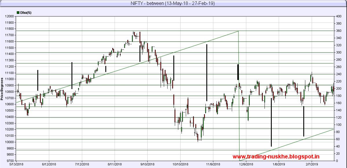
Hi Daniel,
Is it possible to have 2nd Y-axis on the either side, along with the stock price? Basically, I am looking for the same feature, as I will plot some longitudes of planets to study the impact of these planets.
If you need a pic for what I am asking, here it is -
https://1.bp.blogspot.com/-3rN2z9PfuXE/XfyyxGjH_gI/AAAAAAAACRA/b6K06eP6h7w0_LLDJi6iN-C75H5mFHQXgCLcBGAsYHQ/s1600/NIFTY%2B-%2BDhuma-2.png
In the above pic, along with the candlestick chart you can see the planetary line, here only one is used, but I may require more.
Regards
When calling mpl.plot() in a script the program stops, until the figure is closed. How can I open figures in background? I tried plt.ioff() but it didn't work.
Is your feature request related to a problem? Please describe.
When I want to compare two stocks, I'm interested in seeing the % changes in those two stocks over a period of time. Currently when I plot two stocks in mplfinance (using a secondary y-axis), I can't see the day-to-day percent changes, I only see the day-to-day price changes, which can be on different axes and thus inaccurate to compare directly.
For example, if I want to compare SPY and GOOG over a time period, I want to see the percent changes between the two (for easy comparison) rather than their stock prices which are almost an order of magnitude apart.
Describe the solution you'd like
A plot option that lets you plot the % change and lets you specify the start value that the percent changes should be compared against.
Is your feature request related to a problem? Please describe.
I am trying to rewrite a live chart plotting function I had with the previous mpl-finance module by using matplotlib animation.FuncAnimation method (documentation here).
The function expects to be passed a figure where to draw. For the func argument, I am passing a simple function animate_plot:
class Plotter(object):
...
    def plot_live_chart(self,ohlc_data):
        def animate_plot(df_generator, *fargs):
            _type = fargs[0]
            mplfinance.plot(df_generator,type=_type)

        fig = plt.figure()
        ax1 = fig.add_subplot(1,1,1)
        #ani = animation.FuncAnimation(fig,animate_plot,interval=self.plot_refresh_rate,blit=True) #blit=True means to only re-draw parts that have changed
        ani = animation.FuncAnimation(fig,animate_plot,frames=ohlc_data.iterrows(),fargs=(self.type,),interval=self.plot_refresh_rate)
When I run my code, I only get a blank canvas at the end. I am thinking that it could be because on each call to mplfinance.plot a new figure is created but I am not really sure.
Describe the solution you'd like
I would like to have another parameter option for mplfinance.plot to provide a previously created figure. Then it could be checked internally to see if the parameter was provided then that figure is used. If not, then the normal code creates one.
I think it could also be useful to have the function return the figure so it can still be used later. If these are things that are already possible then could you point me in the right direction where to find it?
Describe alternatives you've considered
I think it would be great if a live plotter method were implemented with mplfinance so there is no need to build around it.
It could be a method that uses the already existing .plot() similar to what I am doing above but better. This method could either animate a full dataframe like historical data and it could also animate continuously updating data.
I think this fits better for another feature request. I may open one soon once I have more time to think of how it could be implemented.
i need to save to io.buffer
something like:
buf = io.BytesIO()
mpf.plot(
candles,
type='candle',
mav=(3, 6, 9),
volume=True,
show_nontrading=True,
figratio=(6, 6),
title="Graph",
style='yahoo',
savefig=buf
)
buf.seek(0)Describe the bug
if one of volume = 0
2020-02-12  54.41  56.36  54.39  55.79  305454      USD
2020-02-13  55.76  56.84  54.97  56.45       0      USD
then i get error when run:
    apds = [mpf.make_addplot(moexfl['non_com'], scatter=True, color='g', secondary_y='auto')]
    mpf.plot(stock_df, addplot=apds, type='candle', figratio=(25.6, 14.4),figscale=0.5, volume=True)
header: Content-Security-Policy: upgrade-insecure-requests; block-all-mixed-content
Traceback (most recent call last):
  File "C:\PycharmProjects\DataAnalysis\venv\lib\site-packages\mplfinance\plotting.py", line 34, in decorator
    return func(*args, **kwargs)
  File "C:\PycharmProjects\DataAnalysis\venv\lib\site-packages\mplfinance\plotting.py", line 352, in plot
    lo = math.log(math.fabs(min(volumes)),10) - 0.5
ValueError: math domain error
Backend TkAgg is interactive backend. Turning interactive mode on.
Hi there, how can i adjust the candle size a bit smaller? In my sample pic, i loose the lower and upper shadows.
Is it possible to indicate custom column names for the OHLC data? I receive some candle data from Oanda as 'o','h','l','c', and volume: 'v'. However when trying to plot it will ask for names with uppercase as "Open","Low",etc.
I would like to know if there is a way I can pass an argument indicating the naming convention I am using so that I don't need to modify the dataframe or saved files.
Thanks for developing this library. It makes plotting financial data so much easier than the old mpl-finance module.
This is just an idea of a little addition that I think can be useful. It would be nice to see what is the lastest value on the volume chart, price chart and also any addplots.
Example:
The arrows have their value as a label
Both charts have a white box that indicates the latest price value

Is your feature request related to a problem? Please describe.
Your addplot.ipynb page is phenomenal and I was able to figure out that I can add scatter points by;
Describe the solution you'd like
While this is great it took a lot of energy - I'm moving from the plotpy (for the candles!) and there I simply wrote:
plt.scatter(trade_list_idx,trade_list_price,c='b')
Which was simpler than messing around with a dataframe and so on.
Hi Daniel,
Thank you for your effort. I want to use custom marker symbols in mplfinance.make_addplot when scatter somethings. Is it possible to use a custom character as in matplotlib?
https://matplotlib.org/examples/pylab_examples/scatter_symbol.html
or even SVG:
https://stackoverflow.com/questions/14324270/matplotlib-custom-marker-symbol
In Jupyter, ran !pip install mplfinance and import mplfinance as mpf, but resulted in above error
Great start so far, solid selection of plot types. There is a group of plot types that are not defined by consistent periods of time. One of these is Renko.
It would be a fantastic benefit having the ability to simply specify:
mpf.plot(df, type='renko')
Information
https://school.stockcharts.com/doku.php?id=chart_analysis:renko
https://avilpage.com/2018/01/how-to-plot-renko-charts-with-python.html
Existing code
https://github.com/chillaranand/stocktrends
https://github.com/mementum/backtrader/blob/master/backtrader/filters/renko.py
Hi Daniel, thanks for helping to develop this library. I was wondering if it'll be (or already is) possible to manipulate the resulting charts much like matplotlib charts, for example:
I'd love to be able to do this with the existing charts. Let me know if I can help. Thanks!
I have a normal scatter plot that i want to overlay on top of the candle chart generated by mplfinance, is this possible?
Hello,
is there a possibility to adjust the candle width (1, 2, 4 hours etc.)?
regards
This issue for tracking the release of version 0.12.4a0
to include the following changes:
Traceback (most recent call last):
File "d:/用户目录/Desktop/股票测试/MySql_rd.py", line 87, in
mpf.plot(iday,type='candle',mav=(5,13,21,34,55),volume=True)
File "D:\Anaconda3\lib\site-packages\mplfinance\plotting.py", line 35, in decorator
return func(*args, **kwargs)
File "D:\Anaconda3\lib\site-packages\mplfinance\plotting.py", line 154, in plot
dates,opens,highs,lows,closes,volumes = _check_and_prepare_data(data)
File "D:\Anaconda3\lib\site-packages\mplfinance_arg_validators.py", line 29, in _check_and_prepare_data
opens = data['Open'].values
File "D:\Anaconda3\lib\site-packages\pandas\core\frame.py", line 2800, in getitem
indexer = self.columns.get_loc(key)
File "D:\Anaconda3\lib\site-packages\pandas\core\indexes\base.py", line 2648, in get_loc
return self._engine.get_loc(self._maybe_cast_indexer(key))
File "pandas_libs\index.pyx", line 111, in pandas._libs.index.IndexEngine.get_loc
File "pandas_libs\index.pyx", line 138, in pandas._libs.index.IndexEngine.get_loc
File "pandas_libs\hashtable_class_helper.pxi", line 1614, in pandas._libs.hashtable.PyObjectHashTable.get_item
File "pandas_libs\hashtable_class_helper.pxi", line 1622, in pandas._libs.hashtable.PyObjectHashTable.get_item
KeyError: 'Open'
??? Open -----must be upper case ???
Hi Daniel, thank you for taking over the maintainance of mpl-finance. I agree with you about the new mission statement. Here is a feature request for you to consider. The tulipy project already implemented lots of technical indicators. It would be nice to be able to use them in mpl_finance. Here is a short piece showing how I would like to be able to pass my chosen technical indicators as arguments to candlestick_ohlc():
#!/usr/bin/python3

import numpy as np
import tulipy as ti
from datetime import datetime

def candlestick_ohlc(quotes, ti_array):
    close_prices = quotes['Close'].copy(order='C')
    for ti in ti_array:
        f = ti['f']
        del ti['f']
        print(f.full_name, f(close_prices, **ti))
        # of course in real code it should be plotting here.

dt = [float] * 6
dt[0] = 'datetime64[D]'
convertfunc = lambda x: datetime.strptime(x.decode('utf8'), '%m/%d/%Y')
daily = np.genfromtxt('SP500_NOV2019_Hist.csv',
    delimiter=',', autostrip=True, names=True, dtype=dt,
    converters = {'Date': convertfunc}
)
candlestick_ohlc(daily, [
    {'f':ti.sma, 'period':5},
    {'f':ti.sma, 'period':10},
    {'f':ti.macd, 'short_period':2, 'long_period':5, 'signal_period':9}
] )
Maybe we also need room for options telling candlestick_ohlc what colors and line width, etc. to use for each indicator line. And/or whether some of them should be displayed as solid bar and/or on a separate pane (so that volume can be processed using exactly this same interface without requiring a distinctive/separate interface). I don't have a very good suggestion yet as to how best to design that part of the interface.
is there any feature for mplfinance to change the vertical axis from linear to logarithmic?
Small tweak here to work with lowercase etc sources. I love the new mplfinance -great work
Hi, I am very new to this Library. I enjoy the simplicity of it, but I am having some issues.
I simply want to draw arrows on my candlestick graph just like you did: https://github.com/matplotlib/mplfinance/blob/master/examples/addplot.ipynb
If I try to add a scatter plot it shrinks the Y-axis shrinks massively. I added pictures so you can see.


line = mpf.make_addplot(myData["High"],scatter=False) #No issues drawing a line
scatter = mpf.make_addplot(myData["High"],scatter=True) #Issues drawing scatter

mpf.plot(myData,
               type = 'candle',
               style='yahoo',
               addplot= line,
               figscale=1.8)
now, i got an exception:
ValueError: kwarg "mav" with invalid value: "(5, 20, 60, 90)"
def _mav_validator(mav_value):
'''
Value for mav (moving average) keyword may be:
scalar int greater than 1, or tuple of ints, or list of ints (greater than 1).
tuple or list limited to length of 3 moving averages (to keep the plot clean).
'''
if isinstance(mav_value,int) and mav_value > 1:
return True
elif not isinstance(mav_value,tuple) and not isinstance(mav_value,list):
return False
if not len(mav_value) < 4:
    return False
for num in mav_value:
    if not isinstance(num,int) and num > 1:
        return False
return True
Is there a way to easily adjust font size for the charts? Thanks.
(When I increase figscale, font size does not increase proportionally. So labels are really small for larger charts.)
Thank you for your work on updating mplfinance!
Using the deprecated mpl-finance, I was able to put 2 candlestick_ohlc() charts on top of each other (overlaid, sharing the same axes), and a table below the chart, all within a single figure that could be saved.
Now, I can use returnfig=True to export the figure and axes, but not sure how to actually use those later. ax is not a valid kwarg in plot(), as it was in candlestick_ohlc(). And not sure how to draw the chart inside a parent figure. Should fig be a kwarg for plot()?
Thank you.
Nice package. But when I try to draw candles I get this error:
TypeError: '<' not supported between instances of 'numpy.ndarray' and 'str'
Works fine for line or ohlc.
mpf.plot(rawdf[['Open','High','Low','Close','Volume']].head(10), type='candle', volume=True)
The data looks like this (intraday e mini)
Also included as .txt file
Open High Low Close Volume
DateTime
2020-01-19 18:00:00 3325 3326.50 3323.25 3323.25 1815
2020-01-19 18:01:00 3323.25 3323.50 3323.25 3323.50 417
2020-01-19 18:02:00 3323.5 3323.50 3323.25 3323.50 231
2020-01-19 18:03:00 3323.25 3323.50 3323.25 3323.25 193
2020-01-19 18:04:00 3323.25 3323.50 3323.25 3323.50 147
2020-01-19 18:05:00 3323.5 3323.75 3323.50 3323.75 624
2020-01-19 18:06:00 3323.75 3324.25 3323.50 3324.25 148
2020-01-19 18:07:00 3324.25 3325.25 3324.00 3325.00 340
2020-01-19 18:08:00 3325 3325.50 3325.00 3325.50 217
2020-01-19 18:09:00 3325.75 3326.25 3325.25 3325.50 313
I'm currently using mplfinance with a dataframe that contains datetime/pandas.Timestamp instead of just date. When I plot this, the x-axis ends up having irregularly spaced timestamps.
See example:

Instead, it would be good if either there were intervals / timegaps that were user-provided or were regularly spaced (eg. 9:30am, 12pm, 4pm, etc). It would also be nice if the user can specify the date/time format to use when graphing.
heii, i want to ask, how to show price label from the last candle and the last price of MA in right axis??
maybe in left top

or like this ( in left axis )

please help me :) thanks
A declarative, efficient, and flexible JavaScript library for building user interfaces.
🖖 Vue.js is a progressive, incrementally-adoptable JavaScript framework for building UI on the web.
TypeScript is a superset of JavaScript that compiles to clean JavaScript output.
An Open Source Machine Learning Framework for Everyone
The Web framework for perfectionists with deadlines.
A PHP framework for web artisans
Bring data to life with SVG, Canvas and HTML. 📊📈🎉
JavaScript (JS) is a lightweight interpreted programming language with first-class functions.
Some thing interesting about web. New door for the world.
A server is a program made to process requests and deliver data to clients.
Machine learning is a way of modeling and interpreting data that allows a piece of software to respond intelligently.
Some thing interesting about visualization, use data art
Some thing interesting about game, make everyone happy.
We are working to build community through open source technology. NB: members must have two-factor auth.
Open source projects and samples from Microsoft.
Google ❤️ Open Source for everyone.
Alibaba Open Source for everyone
Data-Driven Documents codes.
China tencent open source team.