


Generate automagical fluid typography, with new responsive properties for font-size, line-height, and letter-spacing. Built on PostCSS.

Inspired by this post.
Part of Rucksack - CSS Superpowers
html {
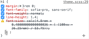
font-size: responsive;
}Pro tip: set a reaponsive font-size on
htmland useremunits throughout your project to make your whole UI fluid
Units can be in px, rem, or em. When using em units, be sure that the font-range is specified in em as well.
html {
  font-size: responsive 12px 21px; /* min-size, max-size */
  font-range: 420px 1280px; /* viewport widths between which font-size is fluid */
}html {
font-size: responsive;
min-font-size: 12px;
max-font-size: 21px;
lower-font-range: 420px;
upper-font-range: 1280px;
}PostCSS Responsive Type also allows you to set fluid sizes for the line-height and letter-spacing properties. They have the same syntax and work the same way as responsive font sizes.
html {
  line-height: responsive 1.2em 1.8em;
  line-height-range: 420px 1280px;

  /* or extended syntax: */
  line-height: responsive;
  min-line-height: 1.2em;
  max-line-height: 1.8em;
  lower-line-height-range: 420px;
  upper-line-height-range: 1280px;
}
html {
letter-spacing: responsive 0px 4px;
letter-spacing-range: 420px 1280px;
/* or extended syntax: */
letter-spacing: responsive;
min-letter-spacing: 0px;
max-letter-spacing: 4px;
lower-letter-spacing-range: 420px;
upper-letter-spacing-range: 1280px;
}Note: Unitless line heights are not supported.
To get started you only need to specify the responsive property, all other values have sane defaults.
-
min-font-size: 14px -
max-font-size: 21px -
lower-font-range: 420px -
upper-font-range: 1280px
-
min-line-height: 1.2em -
max-line-height: 1.8em -
lower-line-height-range: 420px -
upper-line-height-range: 1280px
-
min-letter-spacing: 0px -
max-letter-spacing: 4px -
lower-letter-spacing-range: 420px -
upper-letter-spacing-range: 1280px
postcss-responsive-type just uses calc, vw units, and media queries behind the scenes, so it works on all modern browsers (IE9+). Although Opera Mini is not supported.
Legacy browsers will ignore the output responsive font-size. You can easily provide a simple static fallback:
.foo {
  font-size: 16px;
  font-size: responsive;
}
MIT © Sean King


 React
React
 Typescript
 Django
 Laravel
 Facebook
 Microsoft
 Google
 Alibaba
 D3
D3
 Tencent