jolbol1 / jolly-ui Goto Github PK
View Code? Open in Web Editor NEWshadcn/ui compatible react aria components that you can copy and paste into your apps. Accessible. Customizable. Open Source.
Home Page: https://jollyui.dev
License: MIT License
shadcn/ui compatible react aria components that you can copy and paste into your apps. Accessible. Customizable. Open Source.
Home Page: https://jollyui.dev
License: MIT License
In v2 components I have extended the render props methods of styling certain components. This works however you do have to do a work around with tailwind at the moment, by making all duplicate styles important that you want to appear.
Example - Button:
To style this button we can use the render props:
import { Button } from "@/components/ui/button"

export function ButtonDemo() {
  return <Button className={({ isHovered }) => isHovered ? "!bg-red-600" : ""}>Button</Button>
}
Since the default styles however have a data-[hovered]:bg-primary/90. The default styles will be applied, unless as above we make the class important !
You could get around this by allowing the correct merge behaviour by changing the string too data-[hovered]:bg-red-600 but it seems like bad DX to check for hovering twice.
My plan, to enable all forms of styling to have good DX in the future is change all defaults to use the render prop methods, this way tailwind merge should correctly apply passed in classNames.
At this time, Table is the only component missing from React-Aria-Components.
Should mirror https://ui.shadcn.com/docs/components/table but with the RAC components.
REGISTRY_URL=https://jollyui.dev/r npx shadcn@latest add checkbox-group

Something went wrong. Please check the error below for more details.
If the problem persists, please open an issue on GitHub.

Unexpected token '<', "<!DOCTYPE "... is not valid JSON
also happens with date-range-picker, datepicker, etc
also i see there are package manager copy options (yarn, bun, etc) which doesnt seem to be different (all copies npx)
I'm experiencing an issue with the Popover component where I'm unable to override the default values, for example, for the offset and containerPadding props.
Popover component area
const Popover = ({ className, offset = 10, containerPadding = 20, ...props }: AriaPopoverProps) => (
  <AriaPopover
    offset={offset}
    containerPadding={containerPadding}
    {...props}
  />
);
Popover component instance
<Popover
  triggerRef={triggerRef}
  containerPadding={0}
  offset={0}
  {...otherProps}
/>
Expected behavior:
The popover should render with the custom values for offset and containerPadding that are passed in.
Actual behavior:
The popover renders with the default values for offset and containerPadding instead of the custom values.
The original code for this repo was forked over from shadcn/ui. Theres no need for the monorepo here as it is a single nextjs project.
Usually if we want to display a radio element we use the react aria radio group. However often we need the ability to unselect a radio element. This however is not a valid HTML behavior since you cannot unselect a radio element.
To make this work one need to use the react aria checkbox group component and style it as a radio element.
Here is a video example:
To do this I've expanded the Checkbox from the tailwindExample to accpet a renderAs prop which allows me to render radioStyles instead of checkbox styles.

Great work on getting this library started. I was wondering if you've considered collaborating with the folks working on the Draft UI project, which appears to share some of the goals as shadcn-aria. If the two are as closely aligned as they seem, it might be a great opportunity to focus efforts on a single project.
cc @IHIutch
The outline behavior in shadcn is often problematic due to limitations in Radix. Ideally, the outline or focus ring should only appear when navigating via keyboard, not when using a mouse. However, the current implementation shows the outline even with mouse interactions, requiring an extra click to remove it.
This issue is particularly noticeable with select elements, where an outline appears on mouse selection when it should only be visible during keyboard navigation. Unfortunately, shadcn can't implement this ideal behavior due to Radix constraints.
Here's an example:
Ideally, it should behave like in libraries such as Catalyst UI, where the ring appears only if the component was initially focused via keyboard. In that case, the ring remains even after selecting an item. However, if the component is selected using a mouse, the ring should never appear.
I've raised this issue in both the shadcn and Radix repositories, but it appears to be a fundamental limitation that can't be easily resolved:
shadcn issue: shadcn-ui/ui#4223
Radix issue: radix-ui/primitives#1803
Given these circumstances, it may be preferable not to emulate this suboptimal outline behavior at all in JollyUI.
18 | import { Button } from "@/registry/default/ui/button"
19 | import { Popover } from "@/registry/default/ui/popover"
i have installed jollyui in /components/jolly-ui folder and all the jolly-ui components are here
shadcn components are in /components/ui folder.
what is this @/registry/default ? referring to shadcn dependency or jollyui dependency?
also there are other dependencies like date-fns these were not installed when installing the component with sly is this expected?
Hi, there.
This project and shadcnui are amazing. It makes so easy for people to migrate from one ui lib to another and keep the customisability at the same time.
I see this project is still at initial stage, would be nice you can put out a list of work items so that the community can submit PRs accordingly. Something like fabian-hiller/valibot#287
First of all, thank you for creating this wonderful OSS!
I am currently just starting to use jollyui.
Currently I am looking for a way to write a form similar to shadcn with good code.
Handling Zod validation and server actions with forms using jollyui and react-aria was easier than creating forms in shadcn.
However, I am struggling in some areas to build forms shadcn style.
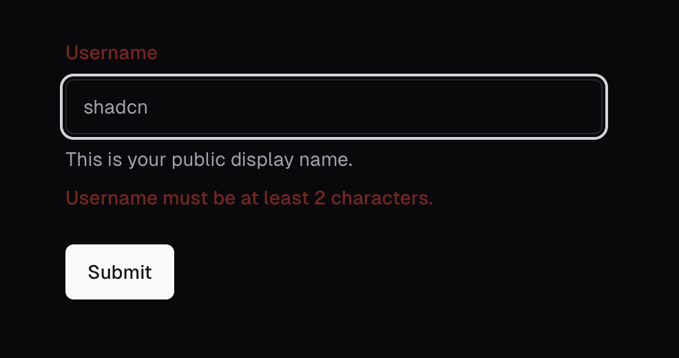
For example, shadcn will have a destructive color for the label when there is a validation error.
This is the code for the server actions form built with jollyui + react-aria.
'use client'
import { FieldError, Form, Text, TextField } from 'react-aria-components'
import { useFormState, useFormStatus } from 'react-dom'
import { Button } from '@/components/ui/button'
import { Input } from '@/components/ui/input'
import { Label } from '@/components/ui/label'
import { createAction } from './actions'
export function CreateLinkForm() {
const status = useFormStatus()
let [{ errors }, formAction] = useFormState(createAction, {
errors: {},
})
return (
<Form action={formAction} validationErrors={errors}>
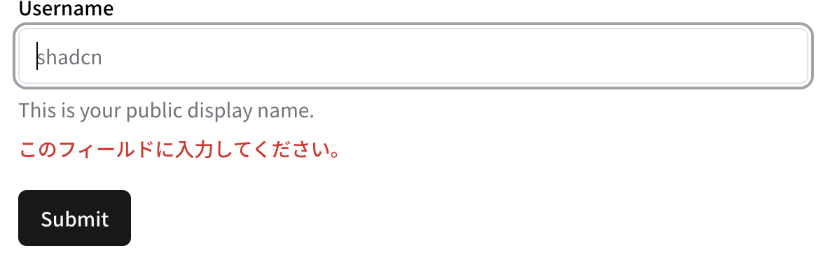
<TextField isRequired className='flex flex-col gap-y-2 pb-5'>
<Label>Username</Label>
<Input placeholder='shadcn' />
<Text slot='description' className='text-sm text-muted-foreground'>
This is your public display name.
</Text>
<FieldError className='text-sm font-medium text-destructive' />
</TextField>
<Button type='submit' isDisabled={status.pending}>
{status.pending ? 'Submitting...' : 'Submit'}
</Button>
</Form>
)
}I was able to apply the color to the error message by writing the className directly in the FieldError component.
However, I have been trying to figure out how to apply color to labels, but I am currently unable to come up with a good idea.
Has anyone built a form similar to shadcn's style with jollyui+react-aria?
Also, since it is not very pretty to write the style directly, I thought many people would be pleased if there was a component to build the form.
I'm trying to make an animated button component with framer motion and jolly ui. It would be very helpful if an example is shown show I can do it. Noob here.
Thanks in advance!
https://www.jollyui.dev/docs/components/tabs
The copy paste tab just shows the headings without the code box to copy the code from
When the dialog is in sheet mode the animation in works however when closing it appears to flash at the end of the animation
Hey, thanks for this amazing option to use react aria components, I've been trying to use it, but I always get this error:
`➜ pnpm dlx @sly-cli/sly add jolly-ui button
Packages: +78
++++++++++++++++++++++++++++++++++++++++++++++++++++++++++++++++++++++++++++++
Progress: resolved 100, reused 74, downloaded 4, added 78, done
Library/Caches/pnpm/dlx/wir6pp3fuan2dhdnga36uy5t6u/18f1504216a-3f66/node_modules/.pnpm/[email protected]/node_modules/esbuild: Running postinstall scriptLibrary/Caches/pnpm/dlx/wir6pp3fuan2dhdnga36uy5t6u/18f1504216a-3f66/node_modules/.pnpm/[email protected]/node_modules/esbuild: Running postinstall script, done in 565ms
Could not connect to the registry at https://sly-cli.fly.dev/registry/index.json.
Check to see if the registry is running, or provide a custom URL by setting the REGISTRY_URL environment variable.`
Tracking contentlayerdev/contentlayer#429 contentlayer has not received/planning to receive support going forward.
Alternatives:
Velite - Seems prertty one to one replacement
MDXTS - Looks like a really cool solution for a documentation site like this.
Jolly components fail to install on windows 11 when installing with Bun or any other package manager.
{
  "$schema": "https://ui.shadcn.com/schema.json",
  "style": "new-york",
  "rsc": true,
  "tsx": true,
  "tailwind": {
    "config": "tailwind.config.ts",
    "css": "src/app/globals.css",
    "baseColor": "neutral",
    "cssVariables": true,
    "prefix": ""
  },
  "aliases": {
    "components": "@webapp/frontend/components/ui",
    "utils": "@webapp/frontend/utils/ui",
    "ui": "src/components/ui"
  }
}
are shadcn config like this respected? I've found that style (radix-ui/react-icons rather than lucide-react) and aliiases utils/ui doesn't seem to actually work, or is component.json ignored and all configs are in sly.json
looks like styles is being tracked in jacobparis-insiders/sly#35, but how about aliases
also it doesn't like yarn and will try to use npm to install dependencies
I know react-aria-components have combobox but it would be nice to have a select with a search inside the popover. I made one myself, you can use it if you decide to add it

It can be easily achieved by adding a Search Field component to the Popover of the Select

... and then just handle the states


toolbar is not getting installed with sly nor does documentation have code for copy/pasting toolbar. You need to directly copy code from github. JFYI
React hook form is widely used, I know react aria has its own form management but it is not as rich.
Are there any plans of adding examples with react-hook-form?
Cool that you're working on this! Good call on the name change as well 👍
I noticed you have manual installation. DraftUI opted to use https://sly-cli.fly.dev/ to support automatic installation of components and I think you may find that useful as well.
Just encountered this impressive UI lib!
However, I noticed that the comp at the bottom of the doc page cause left&right sidebar to reflow during tab switch, which seem like a bad UX in my opinion.

Wanna know your opinion
Some components are not 1-to-1 with shadcn/ui.
In the case of the combobox (shadcn | jolly), for example, one is a field you can click and type into while the other acts more like a button.
I think it would be most helpful if both the components and examples led a 1:1 relationship to shadcn/ui, especially if the goal is to be a direct and more accessible alternative until shadcn/ui switches to using React Aria or similar.
I just tried to install the list-box component and got grid-list instead, probably a copy/paste error in the registry

 React
React
A declarative, efficient, and flexible JavaScript library for building user interfaces.
🖖 Vue.js is a progressive, incrementally-adoptable JavaScript framework for building UI on the web.
 Typescript
TypeScript is a superset of JavaScript that compiles to clean JavaScript output.
An Open Source Machine Learning Framework for Everyone
 Django
The Web framework for perfectionists with deadlines.
 Laravel
A PHP framework for web artisans
Bring data to life with SVG, Canvas and HTML. 📊📈🎉
JavaScript (JS) is a lightweight interpreted programming language with first-class functions.
Some thing interesting about web. New door for the world.
A server is a program made to process requests and deliver data to clients.
Machine learning is a way of modeling and interpreting data that allows a piece of software to respond intelligently.
Some thing interesting about visualization, use data art
Some thing interesting about game, make everyone happy.
 Facebook
We are working to build community through open source technology. NB: members must have two-factor auth.
 Microsoft
Open source projects and samples from Microsoft.
 Google
Google ❤️ Open Source for everyone.
 Alibaba
Alibaba Open Source for everyone
 D3
D3
Data-Driven Documents codes.
 Tencent
China tencent open source team.