Check my demo video : https://youtu.be/Bh4sUhu9UCM.
LineSeries _getChartData({
    required List data,
    required Color color,
    required String name,
}) {
    List<DateValuePair> dataList = [];
    for (int i = 0; i < data.length; i++) {
        var d = data[i];
        DateTime dateTime = DateTime.parse(d['time'].toString());
        double? value =
            d['value'] == 'null' ? null : double.parse(d['value'].toString());

        dataList.add(DateValuePair(dateTime: dateTime, value: value));
    }

    LineSeries lineSeries = LineSeries(
        name: name,
        dataList: dataList,
        color: color,
    );

    return lineSeries;
}List<LineSeries> lineSeriesCollection = [
_getChartData(
data: [
{"time": "2022-09-16 00:41:38", "value": "12.0"},
{"time": "2022-09-16 00:51:39", "value": "23.0"},
{"time": "2022-09-16 01:01:38", "value": "65.6"},
],
color: Colors.red,
name: 'Line0',
),
]
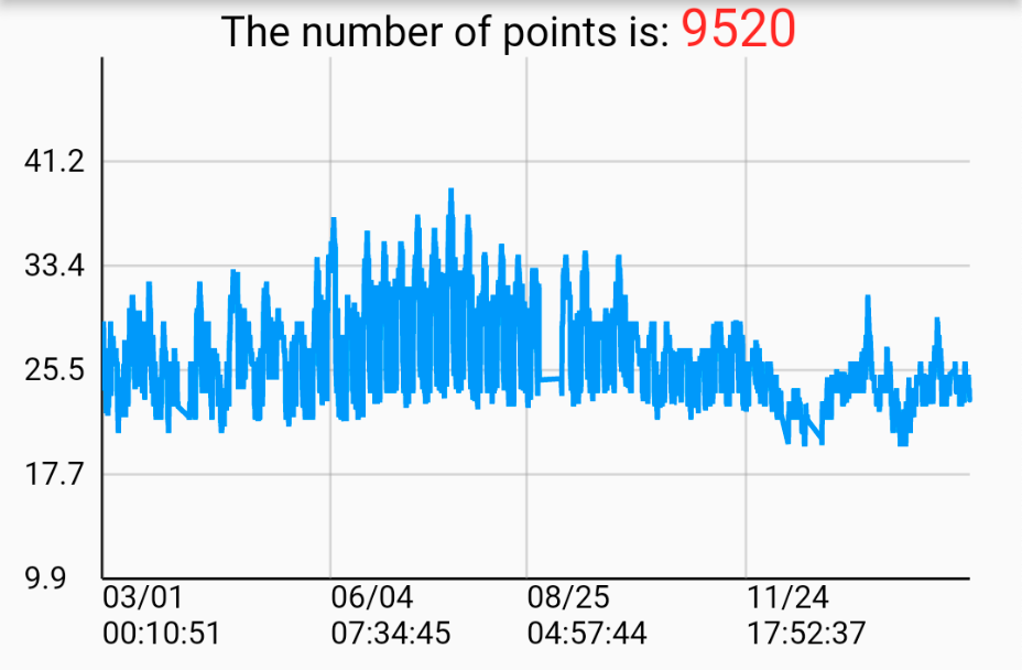
SpeedLineChart(
lineSeriesCollection: _lineSeriesCollection0,
title: _lineSeriesCollection0[0].name,
showLegend: false,
),List<LineSeries> lineSeriesCollection1 = [
_getChartData(
data: [
{"time": "2022-09-16 00:41:38", "value": "12.0"},
{"time": "2022-09-16 00:51:39", "value": "23.0"},
{"time": "2022-09-16 01:01:38", "value": "65.6"},
],
color: Colors.red,
name: 'Line0',
),
_getChartData(
data: [
{"time": "2022-09-16 00:41:38", "value": "12.0"},
{"time": "2022-09-16 00:51:39", "value": "23.0"},
{"time": "2022-09-16 01:01:38", "value": "65.6"},
],
color: Colors.orange,
name: 'Line1',
),
]
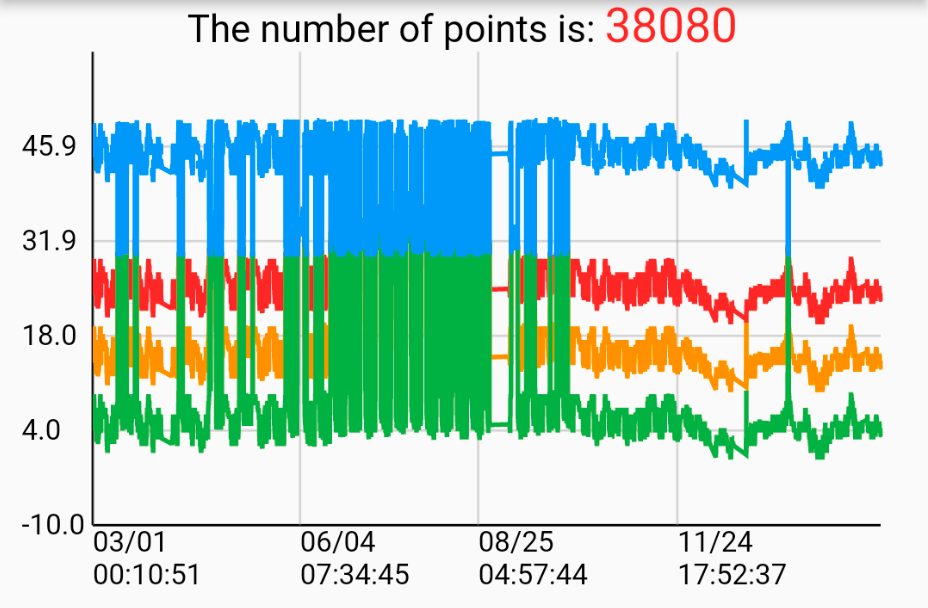
SpeedLineChart(
lineSeriesCollection: _lineSeriesCollection1,
title: _lineSeriesCollection0[0].name,
showLegend: false,
),整理一些基本知識:
原始資料點(x,y) : (DateTime, Value)
_minDate //最早的日期時間
_maxDate //最晚的日期時間
_minValue //最小值
_maxValue //最大值
_xRange = _maxDate.difference(_minDate).inSeconds.toDouble();
_yRange = _maxValue - _minValue;
- Draw Y-axis labels and horizontal grid lines
固定畫5個刻度在y軸上:yScalePoints = 5
算出y軸的每一個單位的長度:double yStep = size.height / yRange;
算出資料點的取直間隔:double yInterval = yRange / yScalePoints;
用迴圈一個一個畫:
for (int i = 0; i < yScalePoints; i++) {
    double scaleY = size.height - i * yInterval * yStep;

    // Draw horizontal grid line
    canvas.drawLine(Offset(leftOffset, scaleY),
        Offse(size.width - rightOffset + leftOffset, scaleY), _gridPaint);

    // Draw Y-axis scale points
    String label = (i * yInterval + minValue).toStringAsFixed(1);
    _axisLabelPainter.text = TextSpan(
    text: label,
    style: const TextStyle(
        fontSize: 12,
        color: Colors.black,
    ),
    );
    _axisLabelPainter.layout();
    _axisLabelPainter.paint(
        canvas,
        Offset(leftOffset - _axisLabelPainter.width - 4,
            scaleY - _axisLabelPainter.height));
}

/* example
Suppose the canvas’s size.width = 300, size.height = 200 , yRange = 50 , minValue = 10 , maxValue = 60 leftOffset = 10 ,rightOffset = 30
The 5 horizontal grid lines and labels will be:
grid line #0 (10, 200) to (280, 200), label #0 = 10
grid line #1 (10, 160) to (280, 160), label #1 = 20
grid line #2 (10, 120) to (280, 120), label #2 = 30
grid line #3 (10, 80) to (280, 80), label #3 = 40
grid line #4 (10, 40) to (280, 40), label #4 = 50
*/
2. Draw a Y-axis
3. Draw a X-axis
4. Draw X-axis labels and vertical grid lines
使用clipRect框出折線圖中呈現線段的範圍, 這樣子在縮放或平移時, 超出邊界的範圍就會遮住, 不會看起來是畫到邊界外, 但實際上還是有畫只是被遮住
canvas.translate的目的在於定義原點(0,0)位置, 把(leftOffset + offset, 0)的位置定義為(0,0)。
canvas.clipRect(Rect.fromPoints(Offset(leftOffset, 0),
    Offset(size.width + leftOffset - rightOffset + 1, size.height + 40)));
canvas.translate(leftOffset + offset, 0);
算出x軸的每一個單位的長度: double xStep = (size.width * scale - rightOffset) / xRange;
決定要畫幾個刻度在x軸上: int xScalePoints = size.width * scale ~/ 80;
算出資料點的取直間隔: double xInterval = (longestLineSeriesX.dataList.length - 1) / xScalePoints;
使用迴圈畫出所有刻度:
for (int i = 0; i < xScalePoints; i++) {
  double scaleX = (longestLineSeriesX
          .dataList[(i * xInterval).round()].dateTime
          .difference(minDate)
          .inSeconds
          .toDouble() *
      xStep);

  // Draw vertical grid line
  canvas.drawLine(
      Offset(scaleX, 0), Offset(scaleX, size.height), _gridPaint);

  // Draw X-Axis scale points
  DateTime dateTime =
      longestLineSeriesX.dataList[(i * xInterval).round()].dateTime;
  String date = DateFormat('yy-MM-dd').format(dateTime);

  String time = DateFormat('HH:mm:ss').format(dateTime);

  _axisLabelPainter.text = TextSpan(
    text: '$date\n$time',
    style: const TextStyle(
      fontSize: 12,
      color: Colors.black,
    ),
  );
  _axisLabelPainter.layout();
  _axisLabelPainter.paint(canvas, Offset(scaleX, size.height));
}

/* example
Suppose the canvas’s size.width = 390, size.height = 200, xRange = 200, yRange = 50, leftOffset = 10 ,rightOffset = 30
xStep = 400 * 1 / 200 = 2
xScalePoints = 390 * 1 ~/ 80 = 4
xInterval = (200 - 1) / 4 = 49.75
The 5 vertical grid lines and date time labels will be:
grid line #0 (scaleX0, 0) to (scaleX0, 200), label #0 = dataList[0].dateTime
grid line #1 (scaleX1, 0) to (scaleX1, 200), label #1 = dataList[50].dateTime
grid line #2 (scaleX2, 0) to (scaleX2, 200), label #2 = dataList[100].dateTime
grid line #3 (scaleX3, 0) to (scaleX3, 200), label #3 = dataList[149].dateTime
*/
-
畫折現的方式也是一樣
-
如何達到水平平移跟水瓶縮放
可以用GestureDetector的onScaleStart和onScaleUpdate
offset的值是隨著平移圖表時變化的, 帶入canvas.translate來達到平移圖表,類似sliding window在圖表上滑動,決定呈現範圍
計算offset的方法, 假設按下的點為op(已知), 縮放後的點為np(未知), op : 原圖表寬 = np : 新圖表寬(scale * 原圖表寬)
新的offset = op - np
scale的值是用onScaleUpdate提供的值來計算的, 帶入 xStep 來得到縮放單位長度
For more implement detail, refer to my Medium articles:
Create your professional widget in Flutter — Multiple Line Chart (Part.1)
Create your professional widget in Flutter — Multiple Line Chart (Part.2)


