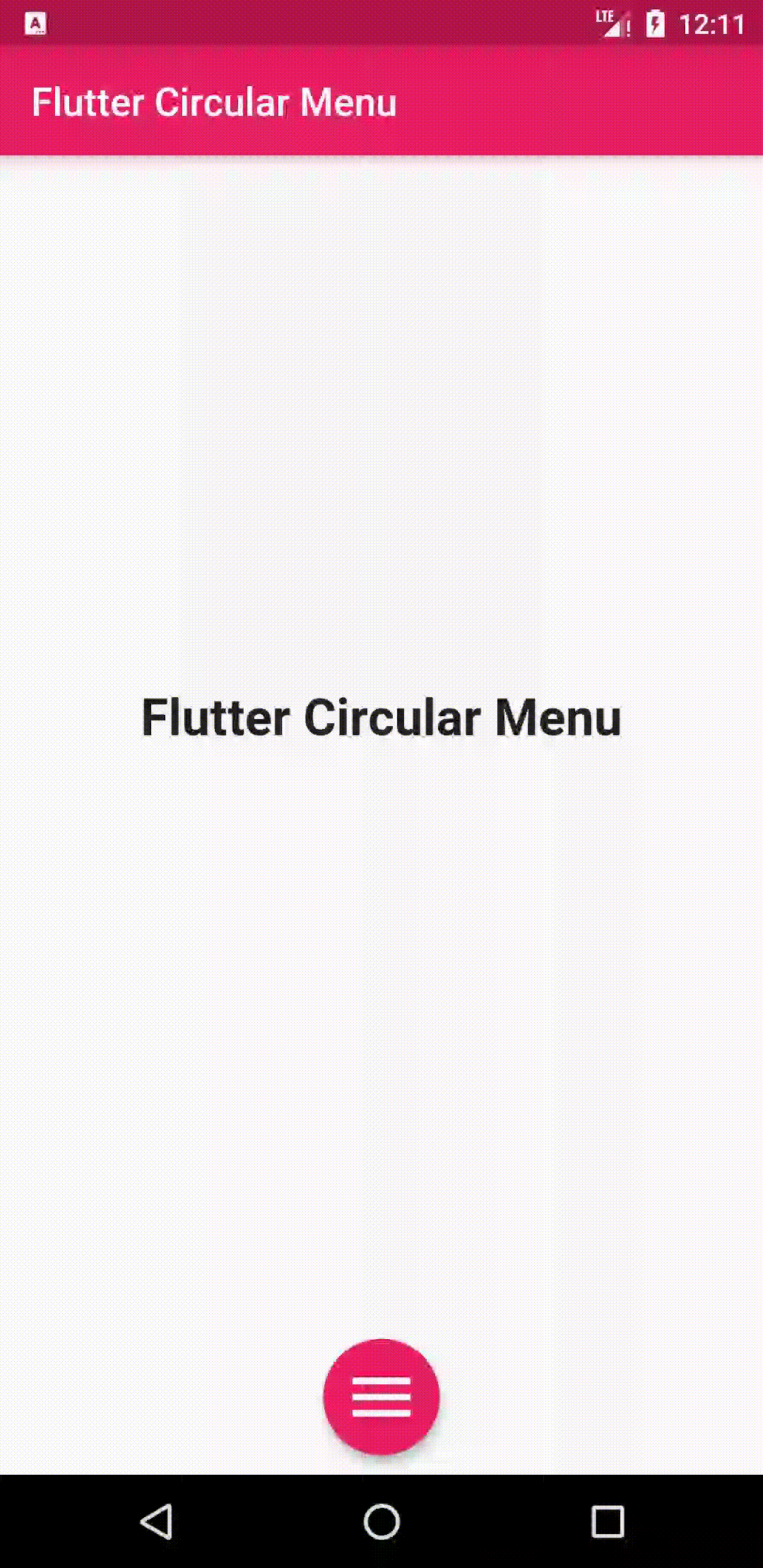
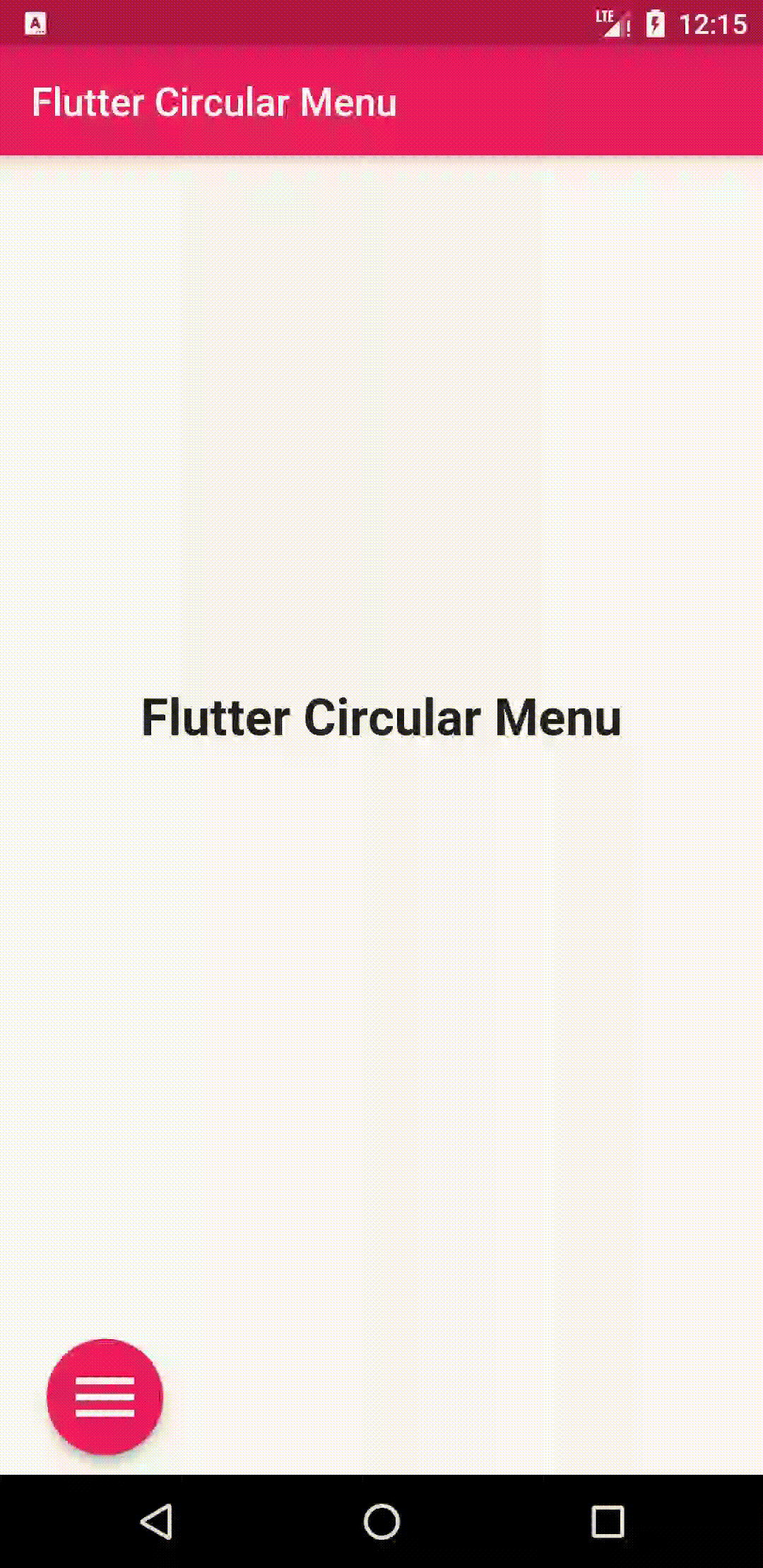
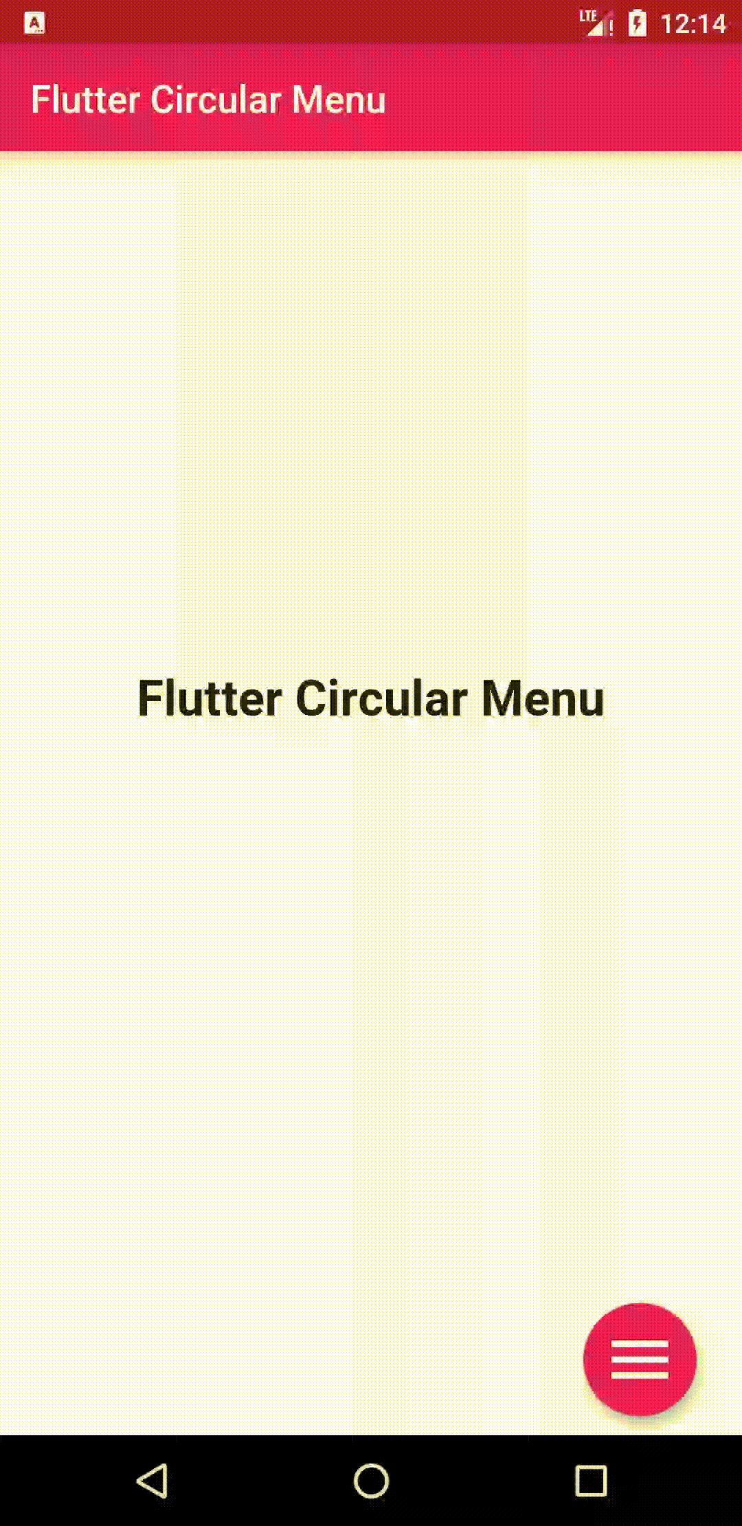
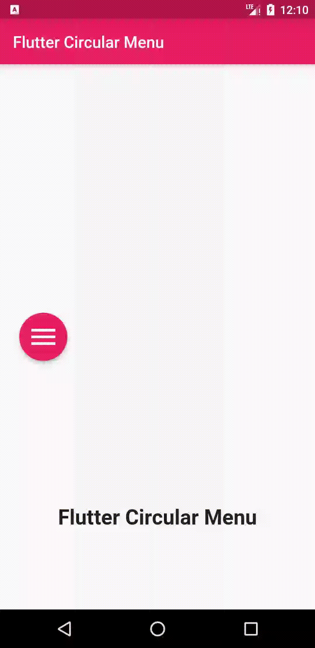
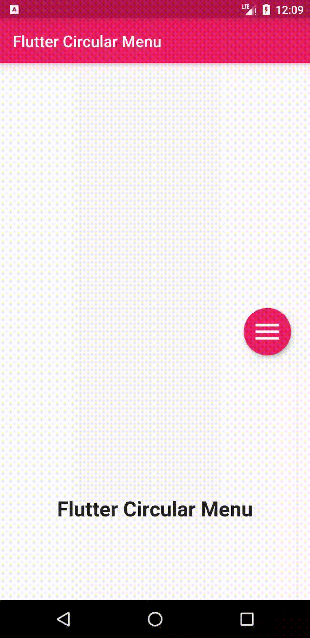
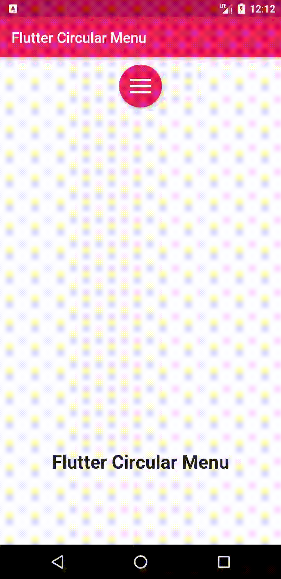
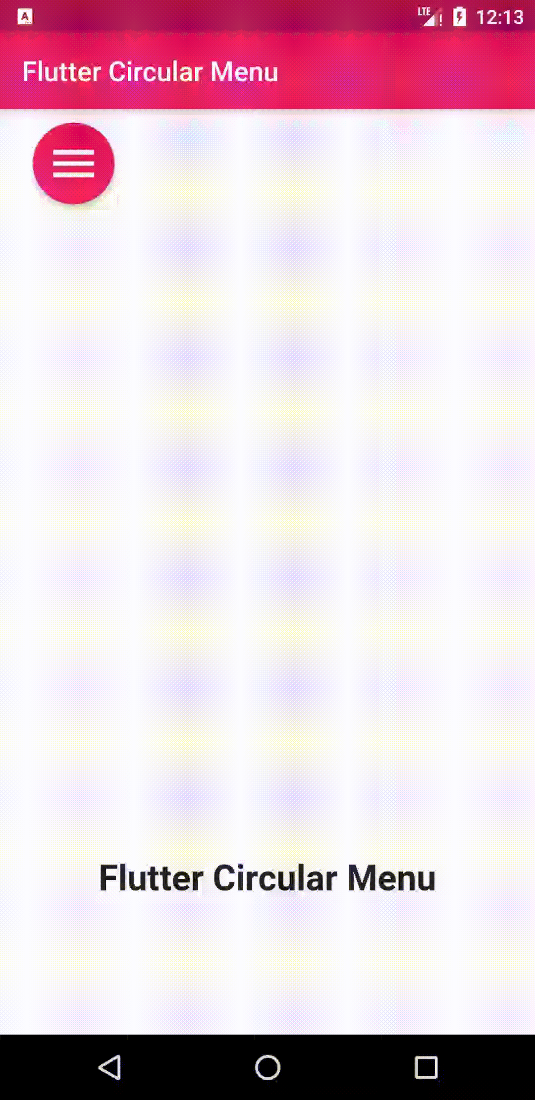
A simple animated circular menu for Flutter, Adjustable radius, colors, alignment, animation curve and animation duration.
Add
circular_menu : ^latest_version
to your pubspec.yaml, and run
flutter pub getin your project's root directory.
Import it to your project file
import 'package:circular_menu/circular_menu.dart';And add it in it's most basic form :
final circularMenu = CircularMenu(items: [
    CircularMenuItem(icon: Icons.home, onTap: () {
      // callback
    }),
    CircularMenuItem(icon: Icons.search, onTap: () {
      //callback
    }),
    CircularMenuItem(icon: Icons.settings, onTap: () {
      //callback
    }),
    CircularMenuItem(icon: Icons.star, onTap: () {
      //callback
    }),
    CircularMenuItem(icon: Icons.pages, onTap: () {
      //callback
    }),
  ]);
- There are additional optional parameters to initialize the menu with:
  final circularMenu = CircularMenu(
      // menu alignment
      alignment: Alignment.bottomCenter,
      // menu radius
      radius: 100,
      // widget in the background holds actual page content
      backgroundWidget: MyCustomWidget(),
      // global key to control the animation anywhere in the code.
      key: // GlobalKey<CircularMenuState>(),
      // animation duration
      animationDuration: Duration(milliseconds: 500),
      // animation curve in forward
      curve: Curves.bounceOut,
      // animation curve in reverse
      reverseCurve: Curves.fastOutSlowIn,
	    // first item angle
      startingAngleInRadian : 0 ,
    	// last item angle
      endingAngleInRadian : pi,
      // toggle button callback
      toggleButtonOnPressed: () {
        //callback
      },
      // toggle button appearance properties
      toggleButtonColor: Colors.pink,
      toggleButtonBoxShadow: [
              BoxShadow(
                color: Colors.blue,
                blurRadius: 10,
              ),
            ],
      toggleButtonIconColor: Colors.white,
      toggleButtonMargin: 10.0,
      toggleButtonPadding: 10.0,
      toggleButtonSize: 40.0,
      items: [
        CircularMenuItem(
          // menu item callback
          onTap: () {
            // callback
          },
          // menu item appearance properties
          icon: Icons.home,
          color: Colors.blue,
          elevation: 4.0,
          iconColor: Colors.white,
          iconSize: 30.0,
          margin: 10.0,
          padding: 10.0,
          // when 'animatedIcon' is passed,above 'icon' will be ignored
           animatedIcon:// AnimatedIcon(),
        ),
        CircularMenuItem(
            icon: Icons.search,
            onTap: () {
              //callback
            }),
        CircularMenuItem(
            icon: Icons.settings,
            onTap: () {
              //callback
            }),
        CircularMenuItem(
            icon: Icons.star,
            onTap: () {
              //callback
            }),
        CircularMenuItem(
            icon: Icons.pages,
            onTap: () {
              //callback
            }),
      ]);
- add badge to
CircularMenuItemby setting the propertyenableBadgetotrue
CircularMenuItem(
              enableBadge: true,
)- customize badge by setting the parameters
badgeColor,badgeLabel,badgeRadiusbadgeTextColor,badgeRightOffet,badgeTopOffet,badgeBottomOffet,badgeLeftOffetbadgeTextStyleto satisfy requirements .
CircularMenuItem(
              enableBadge: true,
              badgeColor: Colors.amber,
              badgeLabel: '3',
              badgeRadius: 15,
              badgeTextColor: Colors.white,
              badgeRightOffet: 0,
              badgeTopOffet: 0,
              onTap: () {
                print('badge on circular menu item');
              },
              icon: Icons.home,
              color: Colors.teal,
)- control animation anywhere in your code using a key:
GlobalKey<CircularMenuState> key = GlobalKey<CircularMenuState>();
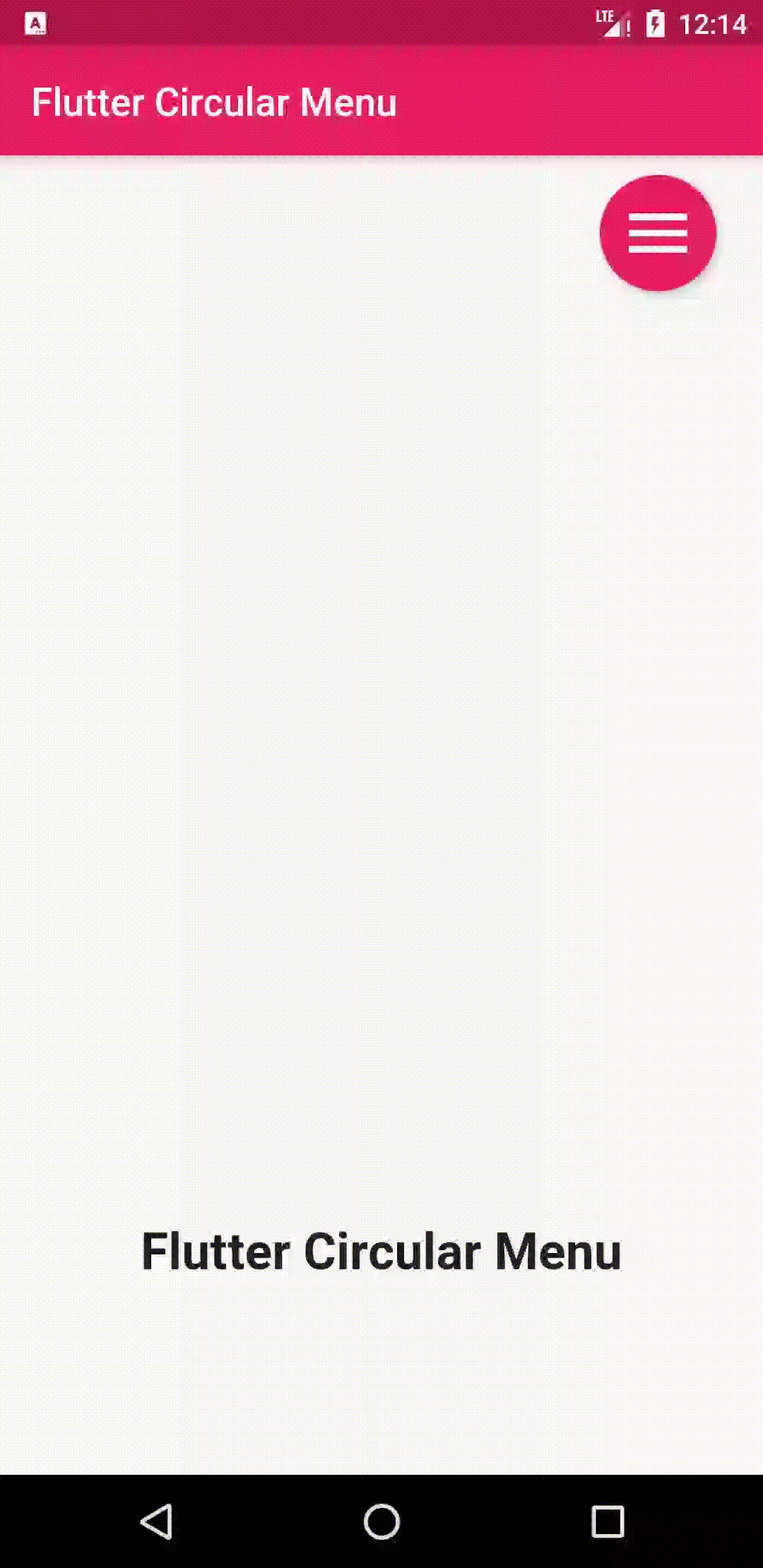
@override
Widget build(BuildContext context) {
return Scaffold(
appBar: AppBar(
backgroundColor: Colors.pink,
title: Text(
'Flutter Circular Menu',
style: TextStyle(
color: Colors.white,
),
),
),
body: CircularMenu(
alignment: Alignment.bottomCenter,
startingAngleInRadian: 1.25 * pi,
endingAngleInRadian: 1.75 * pi,
backgroundWidget: Center(
child: Row(
mainAxisAlignment: MainAxisAlignment.spaceEvenly,
children: <Widget>[
MaterialButton(
onPressed: () {
key.currentState.forwardAnimation();
},
color: Colors.pink,
shape: RoundedRectangleBorder(
borderRadius: BorderRadius.circular(15)),
padding: const EdgeInsets.all(15),
child: Text(
'forward',
style: TextStyle(
color: Colors.white,
fontSize: 24,
),
),
),
MaterialButton(
onPressed: () {
key.currentState.reverseAnimation();
},
shape: RoundedRectangleBorder(
borderRadius: BorderRadius.circular(15)),
padding: const EdgeInsets.all(15),
color: Colors.pink,
child: Text(
'reverse',
style: TextStyle(
color: Colors.white,
fontSize: 24,
),
),
),
],
),
),
key: key,
items: [
CircularMenuItem(
icon: Icons.home,
onTap: () {},
color: Colors.green,
iconColor: Colors.white,
),
CircularMenuItem(
icon: Icons.search,
onTap: () {},
color: Colors.orange,
iconColor: Colors.white,
),
CircularMenuItem(
icon: Icons.settings,
onTap: () {},
color: Colors.deepPurple,
iconColor: Colors.white,
),
],
),
);
}
}
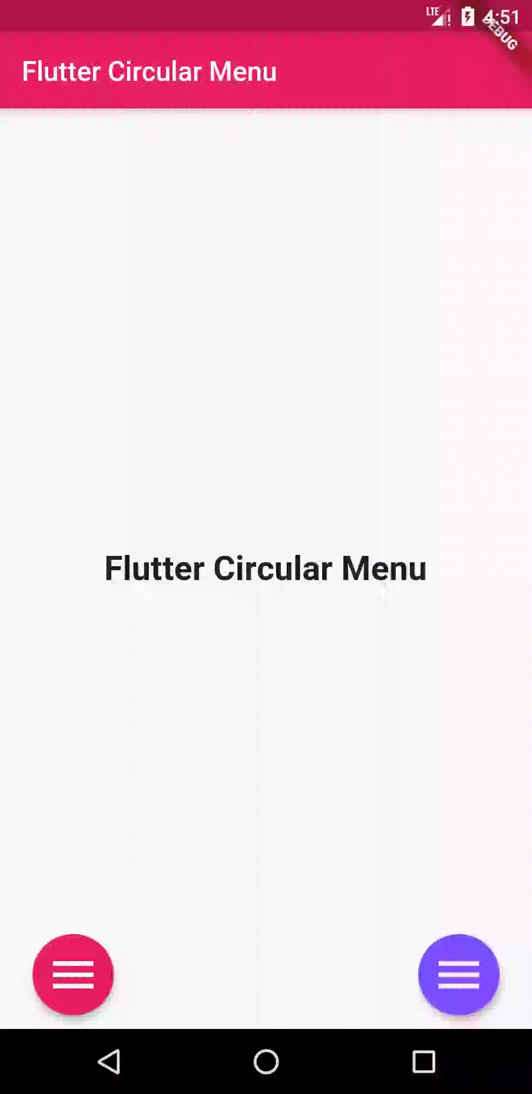
- use
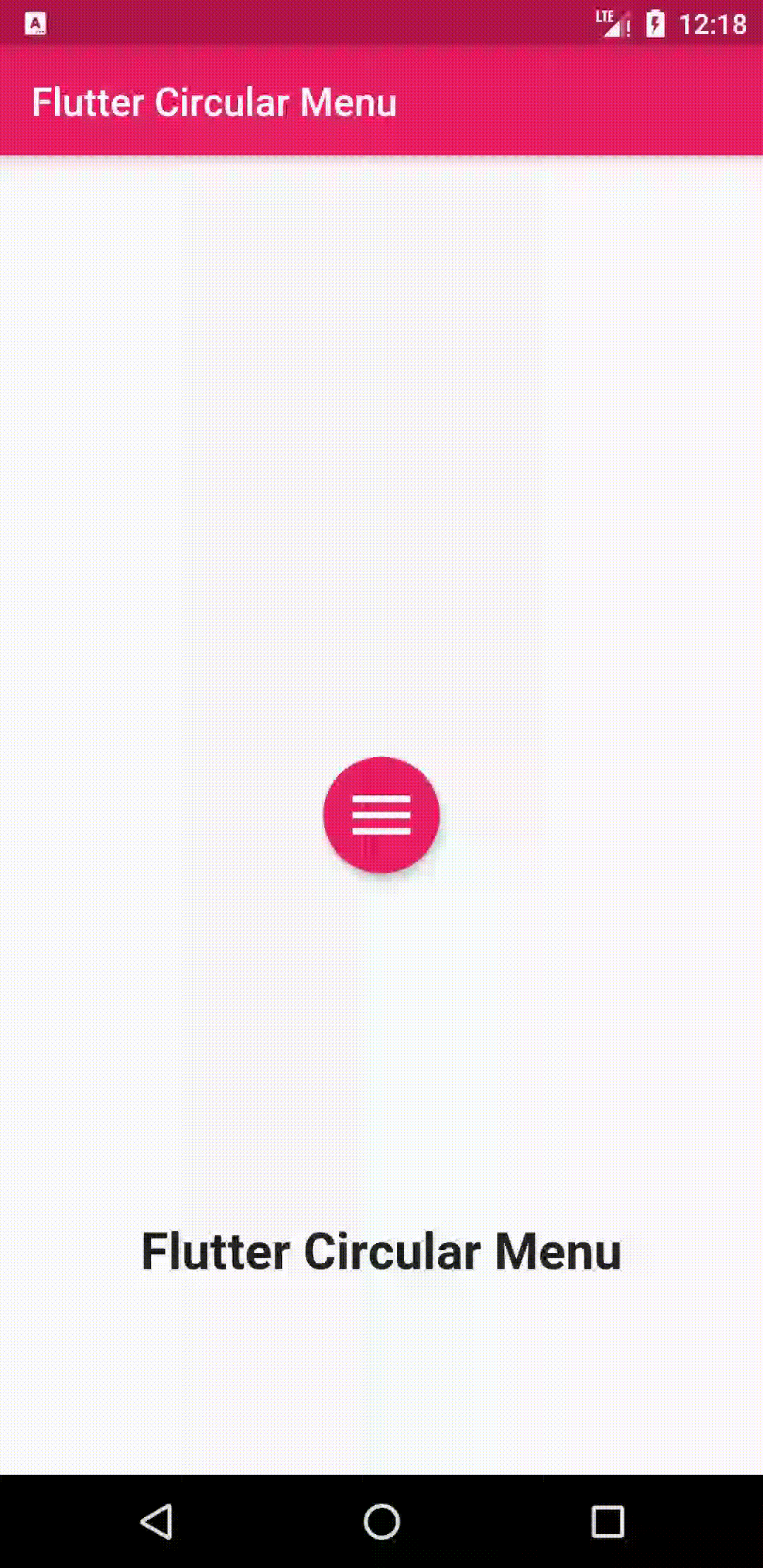
MultiCircularMenuto show more than one menu in the same widget :
MultiCircularMenu(
          backgroundWidget: Center(
            child: Text(
              "Flutter Circular Menu",
              style: TextStyle(
                fontWeight: FontWeight.bold,
                fontSize: 25,
              ),
            ),
          ),
          menus: [
            CircularMenu(
                toggleButtonColor: Colors.pink,
                alignment: Alignment.bottomLeft,
                items: [
                  CircularMenuItem(
                    onTap: () {
                      print('tapped');
                    },
                    icon: Icons.search,
                    color: Colors.blue,
                  ),
                  CircularMenuItem(
                    onTap: () {
                      print('tapped');
                    },
                    icon: Icons.home,
                    color: Colors.grey,
                  ),
                  CircularMenuItem(
                    onTap: () {
                      print('tapped');
                    },
                    icon: Icons.settings,
                    color: Colors.green,
                  ),
                ]),
            CircularMenu(
                toggleButtonColor: Colors.deepPurpleAccent,
                alignment: Alignment.bottomRight,
                items: [
                  CircularMenuItem(
                    onTap: () {
                      print('tapped');
                    },
                    icon: Icons.save,
                    color: Colors.teal,
                  ),
                  CircularMenuItem(
                    onTap: () {
                      print('tapped');
                    },
                    icon: Icons.filter,
                    color: Colors.amber,
                  ),
                  CircularMenuItem(
                    onTap: () {
                      print('tapped');
                    },
                    icon: Icons.star_border,
                    color: Colors.lightGreen,
                  ),
                ]),
          ])


 React
React
 Typescript
 Django
 Laravel
 Facebook
 Microsoft
 Google
 Alibaba
 D3
D3
 Tencent