本文是早期译版,未经校审。仅供参考。
CSS coding tips
CSS 编码技巧
Minimize code duplication
尽量减少代码中的重复
Keeping code DRY and maintainable is one of the biggest challenges in software development, and that applies to CSS as well. In practice, one big component of maintainable code is minimizing the amount of edits necessary to make a change. For example, if to enlarge a button you need to make 10 edits in many different rules, chances are you will miss a few of them, especially if you are not the one who wrote the original code. Even if the edits are obvious, or you eventually find them, you have just wasted time that could be put to better use.
在软件开发中,保持代码的 DRY 和可维护性是最大的挑战之一,而这句话对 CSS 也是适用的。在实践中,代码可维护性的最大要素是尽量减少做改动时要编辑的地方。举例来说,如果在放大一个按钮时你需要在一堆规则中做出 10 处修改,那你很可能会漏改其中某处,尤其当你是在给别人擦屁股时更是如此。即使这些要修改的地方很明显,或者你最终可以找齐它们,但你还是浪费了时间,而你原本可以利用这些时间来做点更有意义的事情。
Furthermore, this is not just about future changes. Flexible CSS makes it easier to write CSS once, and then create variations with very little code, as there are only a few values you need to override. Let’s look at an example.
而且,这还不仅仅是后期修改的问题。灵活的 CSS 通常更容易扩展——在写出基础样式之后,只用极少的代码就可以扩展出不同的变体,因为你只需要去覆盖一些变量就可以了。让我们来看个例子。
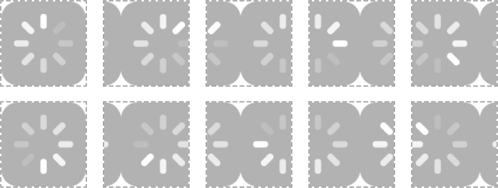
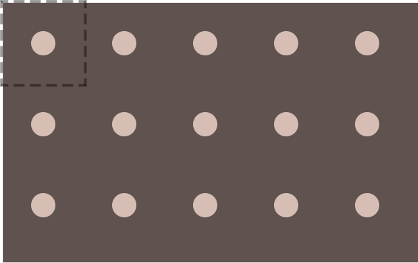
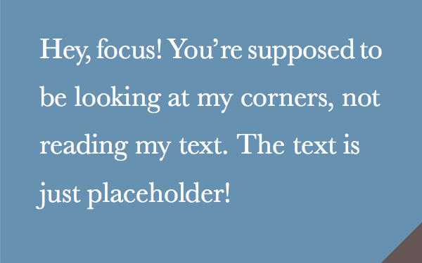
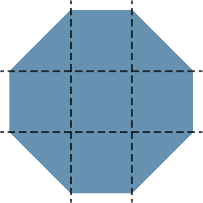
图 1.4
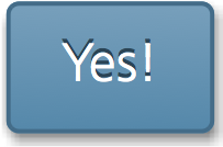
The button we are going to use in our example
在我们的示例中会一直用到这个按钮。
Take a look at the following CSS, which styles the button shown in Figure 1.4:
让我们来看一眼下面这段 CSS,它给按钮添加了一些效果(参 图 1.4):
padding: 6px 16px;
border: 1px solid #446d88;
background: #58a linear-gradient(#77a0bb, #58a);
border-radius: 4px;
box-shadow: 0 1px 5px gray;
color: white;
text-shadow: 0 -1px 1px #335166;
font-size: 20px;
line-height: 30px;
There are several issues with the maintainability of this code that we can fix. The low-hanging fruit is the font metrics. If we decide to change the font size (perhaps to create a variation that will be used for important, bigger buttons), we also need to adjust the line spacing, as they are both absolute values. Furthermore, the line spacing doesn’t reflect what its relationship is to the font size, so we would even need to perform calculations to figure out what it should be for a different font size. When values depend on each other, try to reflect their relationship in the code. In this case, the line spacing is 150% the line height. Therefore, it would be much more maintainable to show this in the code:
这段代码在可维护性方面存在一些问题,我们来一一修复。最软的杮子应该是跟字体尺寸相关的部分了。如果我们决定改变字号{1[译注:在本书中,“字号” 是对字体尺寸(font-size)的俗称。]}(可能是为了生成一个更大、更重要的按钮),那就得同时调整行高,因为这两个属性都写成了绝对值。更麻烦的是,行高并没有反应出它跟字号的关系,因此我们还得做些算术,算出字号改变之后的行高该是多少。当某些值相互依赖时,应该把它们的相互关系用代码表达出来。在这个例子中,行高是字号的 1.5 倍。因此,把代码改成下面这样会明显更易维护:
font-size: 20px;
line-height: 1.5;
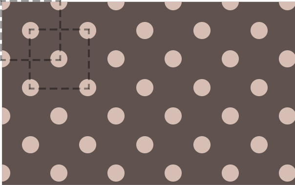
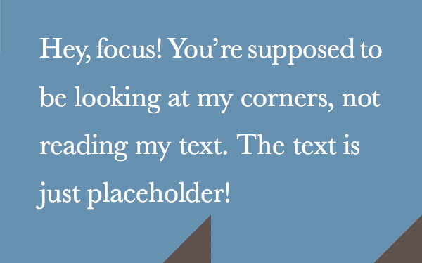
图 1.5

Enlarging the font size breaks other effects in our button (corner rounding being the most noticeable), as they are specified using absolute lengths
只放大字体会破坏按钮的其他效果(最突兀的就是圆角了),因为它们都被指定了一些绝对的长度值。
While we’re at it, why did we specify the font size as an absolute length? Sure, absolute lengths are easy to work with, but they come back to bite you every single time you make changes. Now, if we decide to make the parent font size bigger, we would have to change every single rule in the stylesheet that uses absolute font measurements. It’s much better to use percentages or ems:
既然跨出了这一步,我们为什么还把字号定为绝对长度值呢?没错,绝对值很容易掌控,但每当你想要修改它们的时候,它们都会回头反咬你一口。比如说,如果我们决定把父级的字号加大时,我们将不得不修改每一处使用绝对值作为字体尺寸的样式。如果改用百分比或 em 单位就好多了:
                 /* Assuming a 16px parent font size */
font-size: 125%; /* 假设父级的字号是 16px */
line-height: 1.5;
Now if I change the parent font size, the button will instantly become bigger. However, it will look quite different (Figure 1.5), because all other effects were designed for a smaller button and did not scale. We can make all the other effects scalable as well, by specifying any lengths in ems, so that they all depend on the font size. This way, we can control the size of the button in one place:
现在,如果我们改变父级的字号,按钮的尺寸就会随之变化。但是,它看起来很不协调(图 1.5),因为所有其他效果都是为一个小按钮设计的,并没有跟着缩放。如果我们把这些长度值都改成 em 单位,那这些效果的值就都变成可缩放的了,而且是依赖字号进行缩放。按照这种方法,我们就可以在一处控制按钮的所有尺寸样式了:
padding: .3em .8em;
border: 1px solid #446d88;
background: #58a linear-gradient(#77a0bb, #58a);
border-radius: .2em;
box-shadow: 0 .05em .25em gray;
color: white;
text-shadow: 0 -.05em .05em #335166;
font-size: 125%;
line-height: 1.5;
{原书注释!}
Here we wanted our font size and measurements to be relative to the parent font size, so we used ems. In some cases, you want them to be relative to the root font size (i.e., the font size of <html>), and ems result in complex calculations. In that case, you can use the rem unit. Relativity is an important feature in CSS, but you do have to think about what things should be relative to.
这里我们希望字号和其他尺寸能够跟父级的字号建立关联,因此我们采用了 em 单位。但在某些情况下,你可能希望这些尺寸是和根级字号(即 <html> 元素的字号)相关联的,此时使用 em 可能会导致复杂的计算。在这种情况下,你可以使用 rem 单位。在 CSS 中,相关性是一个很重要的特性,但你得想清楚到底哪些东西是真正相关的。
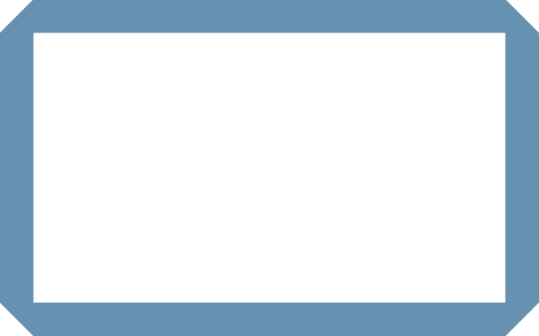
Now our larger button looks much more like a scaled version of the original (Figure 1.6). Notice that we still left some lengths as absolute values. It’s a judgment call which effects should scale with the button and which ones should stay the same. In this case, we wanted our border thickness to stay 1px regardless of the button dimensions.
现在我们的大号按钮看起来更像是一个原按钮的等比例放大版本了(图 1.6)。请注意仍然还有一些长度值是绝对值。此时就需要重新审视到底哪些效果应该跟着按钮一起放大,而哪些效果的尺寸是保持不变的。比如在这个例子中,我们希望按钮的边框粗细保持在 1px,不受按钮尺寸的影响。
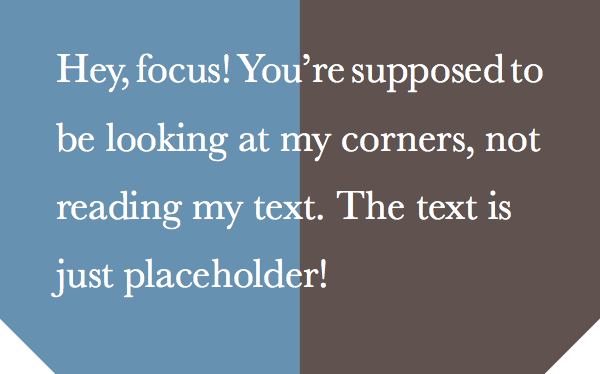
图 1.6

Now we can make our button larger, and all its effects scale too
现在我们可以把按钮放大,而且它的所有效果也都跟着放大了。
However, making the button smaller or larger is not the only thing we might want to change. Colors are another big one. For example, what if we want to create a red Cancel button, or a green OK button? Currently, we would need to override four declarations (border-color, background, box-shadow, text-shadow), not to mention the hassle of recalculating all the different darker/lighter variants of our main color, #58a, and figuring out how much lighter or darker each color is. Also, what if we want to place our button on a non-white background? Using gray for its shadow will only look as intended on a white background.
不过,让按钮变大或变小并不是我们唯一想要改动的地方。颜色是另一个重要的变数。比如说,假设我们要创建一个红色的取消按钮,或者一个绿色的确定按钮,该怎么做呢?眼下,我们可能需要覆盖四条声明(border-color、background、box-shadow 和 text-shadow),更别提另一大难题了——我们还得根据按钮的亮面和暗面相对于主色调 #58a 变亮和变暗的程度来分别推导出其他颜色各自的亮色和暗色版本。此外,假设我们想把按钮放在一个非白色的背景之上呢?显然使用灰色(gray)作投影只适用于纯白背景的情况。
We could easily eliminate this hassle by using semi-transparent white and black for lighter/darker variants, respectively, overlaid on our main color:
其实只要把半透明的黑色或白色叠加在主色调上,即可产生出主色调的亮色和暗色变体,这样就能简单地化解这个难题了:
padding: .3em .8em;
border: 1px solid rgba(0,0,0,.1);
background: #58a linear-gradient(hsla(0,0%,100%,.2),
                                 transparent);
border-radius: .2em;
box-shadow: 0 .05em .25em rgba(0,0,0,.5);
color: white;
text-shadow: 0 -.05em .05em rgba(0,0,0,.5);
font-size: 125%;
line-height: 1.5;
{小提示}
[TIP] Use HSLA instead of RGBA for semi-transparent white, as it has slightly fewer characters and is quicker to type, due to the lack of repetition.
推荐使用 HSLA 而不是 RGBA 来产生半透明的白色,因为它的字符长度更短,打起来也更快。这归功于它的重复度更低。
Now all it takes to create variations with different colors is to override background-color (Figure 1.7):
现在我们只要覆盖 background-color 属性,就可以得到不同颜色版本的按钮了(参见 图 1.7):
button.cancel {
    background-color: #c00;
}

button.ok {
    background-color: #6b0;
}
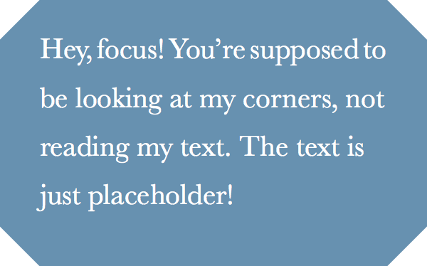
图 1.7
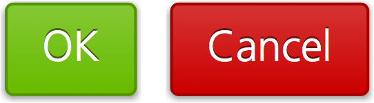
All it took to create these color variations was changing the background color
只要改变背景色,就可以得到其他颜色版本的按钮了。
Our button is already much more flexible. However, this example doesn’t demonstrate every opportunity to make your code more DRY. You will find a few more tips in the following sections.
我们的按钮现在已经非常灵活了。不过,这个例子并没有涵盖所有能让代码变得更 DRY 的方法。你会在下面几节中发现更多的技巧。
Maintainability versus brevity
代码易维护 vs 代码量少
Sometimes, maintainability and brevity can be mutually exclusive. Even in the previous example, our final code is a bit longer than our original. Consider the following snippet to create a 10px thick border on every side of an element, except the left one:
有时候,“代码易维护” 和 “代码量少” 不可兼得。比如在上面的例子中,我们最终采用的代码甚至比一开始的版本还要略长一些。来看看下面的代码片断,我们要为一个元素添加一道 10px 宽的边框,但左侧不加边框。
border-width: 10px 10px 10px 0;
It’s only one declaration, but to change the border thickness we would need to make three edits. It would be much easier to edit as two declarations, and it’s arguably easier to read that way too:
只要这一条声明就可以搞定了,但如果日后要改动边框的宽度,你需要同时改三下。但如果把你它拆成两条声明的话,改起来就容易多了,而且它的可读性或许也会更好一些:
border-width: 10px;
border-left-width: 0;
currentColor
currentColor
In CSS Color Level 3, we got many new color keywords like lightgoldenrodyellow, which aren’t that useful. However, we also got a special new color keyword, borrowed from SVG: currentColor. This does not correspond to a static color value. Instead, it always resolves to the value of the color property, effectively making it the first ever variable in CSS. A very limited variable, but a variable nevertheless.
在 CSS 颜色(第三版)规范中,增加了很多新的颜色关键字,比如 lightgoldenrodyellow 等,其实并不是很常用。但是,我们还得到了一个特殊的颜色关键字 currentColor,它是从 SVG 那里借鉴来的。这个关键字并没有绑定到一个固定的颜色值,而是总是解析为 color 属性的值——实际上,这的特性让它成为 CSS 中有史以来的第一个变量。虽然功能很有限,但它真的是个变量。
{原书注释!}
Some would argue that the em unit was actually the first variable in CSS, as it referred to the value of font-size. Most percentages play a similar role, though in less exciting ways.
可能有人会争论说 em 单位才是 CSS 中的第一个变量,因为它引用了 font-size 的值。其实大多数百分比数值也扮演了类似的角色,只不过它们的工作方式不是很起眼。
For example, let's assume we want all of the horizontal separators (all <hr> elements) to automatically have the same color as the text. With currentColor, we could do this:
举个例子,假设我们想让所有的水平分割线(所有 <hr> 元素)自动跟文本的颜色保持一致。有了 currentColor 之后,我们只需要这样写:
hr {
    height: .5em;
    background: currentColor;
}
You might have noticed similar behavior with many existing properties. For example, if you specify a border with no color, it automatically gets the text color. This is because currentColor is also the initial value of many CSS color properties: border-color, the text-shadow and box-shadow colors, outline-color, and others.
你可能已经注意到了,很多已有的属性也具有类似的行为。举例来说,如果你没有给边框指定颜色,它就会自动地从文本颜色那里得到颜色。这是因为 currentColor 本身就是很多 CSS 颜色属性的初始值,比如 border-color 和 outline-color,以及 text-shadow 和 box-shadow 的颜色值等等。
In the future, when we get functions to manipulate colors in native CSS, currentColor will become even more useful, as we will be able to use variations of it.
在未来,当我们在原生 CSS 中拥有处理颜色的函数后,currentColor 就会变得更加有用了,因为我们可以用这些函数来产生它的各种深浅明暗的变体。
Inheritance
继承
While most authors are aware of the inherit keyword, it is often forgotten. The inherit keyword can be used in any CSS property and it always corresponds to the computed value of the parent element (in pseudo-elements that is the element they are generated on). For example, to give form elements the same font as the rest of the page, you don’t need to re-specify it, just use inherit:
尽管绝大多数开发者都知道有 inherit 这个关键字,但还是很容易遗忘它。inherit 可以用在任何 CSS 属性中,而且它总是绑定到父元素的计算值(对伪元素来说,则会去取生成该伪元素的宿主元素)。举例来说,要把表单元素的字体设定为跟页面的其他部分相同,你并不需要重复指定字体属性,只需利用 inherit 的特性即可:
input, select, button { font: inherit; }Similarly, to give hyperlinks the same color as the rest of the text, use inherit:
与此类似,要把超链接的颜色设定为跟页面中其他文本相同,还是要用 inherit:
The inherit keyword can often be useful for backgrounds as well. For example, to create speech bubbles where the pointer automatically inherits the background and border (Figure 1.8):
这个 inherit 关键字对于背景色同样是非常有用的。举个例子,在创建提示框的时候,你可能希望它的小箭头能够自动继承背景和边框的样式(图 1.8):
.callout { position: relative; }

.callout::before {
    content: "";
    position: absolute;
    top: -.4em; left: 1em;
    padding: .35em;
    background: inherit;
    border: inherit;
    border-right: 0;
    border-bottom: 0;
    transform: rotate(45deg);
}
图 1.8
A speech bubble where the pointer gets the background color and border from the parent
提示框的小箭头从父元素那里获取了背景色和边框样式。
Trust your eyes, not numbers
相信你的眼睛,而不是数字
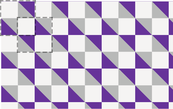
The human eye is far from being a perfect input device. Sometimes accurate measurements result in looking inaccurate and designs need to account for that. For example, it’s well known in visual design literature that our eyes don’t perceive something as being vertically centered when it is. Instead, it needs to be slightly above the geometrical middle to be perceived as such. See that phenomenon for yourself, in Figure 1.9.
人类眼睛并不是一台完美的输入设备。有时候精准的尺度看起来并不精准,而我们的设计需要顺应这种偏差。举一个在视觉设计领域广为人知的例子吧,我们的眼睛在看到一个完美垂直居中的物体时,感觉它并不居中。实际上,我们应该把这个物体从几何学的中心点再稍微向上挪一点儿,才能取得理想的视觉效果。来亲身体验一下这件怪事儿吧(请看 图 1.9)。
图 1.9

In the first rectangle, the brown square is mathematically vertically centered, but doesn’t look so; in the second one, it is actually placed slightly above the geometrical center, but it looks more centered to the human eye
在第一个矩形中,棕色方块在数学层面上是完美垂直居中的,但看起来并不是这样;在第二个矩形中,方块从几何中心向上轻微移动了一点儿,但它在人类的眼睛看来却是恰好居中的。
Similarly, in type design, it is well known that round glyphs such as “O” need to be slightly larger than more rectangular glyphs, as we tend to perceive round shapes as smaller than they actually are. Check that out for yourself in Figure 1.10.
与此类似,在字体设计领域广为人知的是,圆形的字形(比如 “0”)跟矩形字形相比,需要稍微放大一些,因为我们倾向于把圆形感知得比它实际的尺寸更小一些。在 图 1.10 中你也可以体验一下。
图 1.10
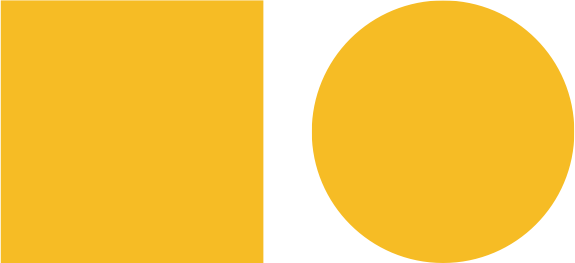
The circle looks smaller, but its bounding box is exactly the same as the square
圆形看起来要小一些,但实际上它占据的宽高和方形是完全一样的。
Such optical illusions are very common in any form of visual design, and need to be accounted for. An extremely common example is padding in containers with text. The issue is present regardless of the amount of text--it could be a word or several paragraphs. If we specify the same amount of padding on all four sides of a box, it actually ends up looking uneven, as Figure 1.11 demonstrates. The reason is that letterforms are much more straight on the sides than their top and bottom, so our eyes perceive that extra space as extra padding. Therefore, we need to specify less padding for the top and bottom sides if we want it to be perceived as being the same. You can see the difference this makes in Figure 1.12.
这些视觉上的错觉在任何形式的视觉设计中都普遍存在,需要我们有针对性的作为调整。一个非常常见的例子是给一个文本容器设置内边距。不论内容文本有多长,是一个单词还是几个段落,这个问题都是会出现。假如我们给容器的四边指定相同的内边距,则实际效果看起来并不相等,就像 图 1.11 显示的那样。原因在于,字母的形状在两端都比较整齐,而顶部和底部则往往参差不齐,从而导致你的眼睛把这些参差不齐的空缺部分感知为多出来的内边距。因此,如果我们希望四边的内边距看起来是基本一致的,就需要减少顶部和底部的内边距。你可以在 图 1.12 中看出这种差异。
图 1.11

Specifying the same padding (.5em here) on all four sides of a container with text makes it look larger on the top and bottom sides
为容器的四边指定了相同的内边距(这里用了 .5em),但实际看起来上下空得多,而左右空得少。
图 1.12
Specifying larger padding (here: .3em .7em) on the left and right side makes it look much more uniform
如果把左右内边距增大一些(这里把 padding 属性写成 .3em .7em),则看起来就明显更加统一了。
On Responsive Web Design
关于响应式网页设计
RWD has been all the rage over the past few years. However, the emphasis is often placed on how important it is for websites to be “responsive,” leaving a lot unsaid about what good RWD entails.
响应式网页设计(Responsive Web Design,简称 “RWD”)在最近这几年已经火得不行了。但是,人们大多只是在不停念叨网页的 “响应式” 是多么重要,而极少有人去深入探讨怎样才能做好响应式设计。
The common practice is testing a website in multiple resolutions and adding more and more media queries to fix the issues that arise. However, every media query adds overhead to future CSS changes, and they should not be added lightly. Every future edit to the CSS code requires checking whether any media queries apply, and potentially editing those too. This is often forgotten, resulting in breakage. The more media queries you add, the more fragile your CSS code becomes.
比较常见的实践是用多种不同的分辨率来测试一个网站,然后添加越来越多的媒体查询(Media Query)规则来修补网站在这些分辨率下出现的问题。但是,对于今后的 CSS 改动来说,每个媒体查询都会增加成本,而这种成本是不应轻易上升的。未来每次对 CSS 代码的修改都要求我们逐一核对这些媒体查询是不是都需要配合修改,甚至可能要求我们反过来修改这些媒体查询的设置。这一点常常被我们忽略,但后患无穷。你添加的媒体查询越多,你的 CSS 代码就会变得越来越经不起折腾。
That is not to say that media queries are a bad practice. Used right, they can be indispensable. However, they should be a last resort, after every other attempt to make a website design flexible has failed, or when we want to completely change an aspect of the design in smaller/larger viewports (e.g., making the sidebar horizontal). The reason is that media queries do not fix issues in a continuous manner. They are all about specific thresholds (a.k.a. “breakpoints”), and unless the rest of the code is written to be flexible, media queries will only fix specific resolutions, essentially sweeping issues under the rug.
这并不是说媒体查询是一种不良实践。只要用对了,它们就是利器。但是,你只应该把它作为最后的手段——比如你想把网站做得弹性灵活,但其他尝试全都失败了;或者我们希望在较大或较小的视口下完全改变网站的设计形态(譬如,把侧栏改成水平布局)。我这么说的原因在于,媒体查询不能以一种连续的方式来修复问题。它们的工作原理是基于某几个特定的阶梯(亦称 “断点”)的,如果大部分样式代码并不是以弹性的方式来编写的,那媒体查询能做的只是修补某个特定分辨率下的特定问题——这本质上只是把灰尘扫到地毯下面而已。
{小提示}
Consider using ems in your media queries instead of pixels. This allows text zoom to trigger layout changes as necessary.
不妨考虑在你的媒体查询中使用 em 单位取代像素单位。这允许文本缩放在必要时可以触发布局的变化。
Of course, it goes without saying that media query thresholds should not be dictated by specific devices, but by the design itself. Not only because there are so many different devices (especially if we take future devices into account) that a website should look good at any possible resolution, but also because a website on the desktop might be viewed in a window of any size. If you are confident that your design works well in every possible viewport size, who cares about what resolution specific devices have?
当然,有一点上面并没有提到,媒体查询的断点不应该由具体的设备来决定,而应该根据设计自身来决定。不仅是因为我们的网站需要面向的设备太多了(尤其是当我们考虑到未来的设备时),还因为一个网站在桌面端可能会以任意尺寸的窗口来显示。如果你有信心做到让你的设计在任何可能出现的视口尺寸下都能工作良好,谁关心这些设备的分辨率具体是多少呢?
Following the principles described in the XXXX will also help with this, as you won’t have to override as many declarations in your media queries, essentially minimizing the overhead they cause.
遵从 **“{$section$}” 段落(第 {$page$} 页)**所描述的原则对此也是有帮助的,因为你不需要去覆盖媒体查询里的同样数量的声明,这在本质上减轻了它们所产生的维护成本。
Here are a few more tips to avoid needless media queries:
这里还有一些建议,可能会帮你避免不必要的媒体查询:
- Use percentages instead of fixed widths. When that’s not possible, use viewport-relative units (
vw, vh, vmin, vmax), which resolve to a fraction of the viewport width or height.
- 使用百分比长度来取代固定长度。如果实在做不到这一点,也应该尝试使用与视口相关的单位(
vw、vh、vmin 和 vmax),它们的值解析为视口宽度或高度的百分比。
- When you want a fixed width for larger resolutions, use
max-width, not width, so it can still adapt to smaller ones without media queries.
- 当你需要在较大分辨率下得到固定宽度时,使用
max-width 而不是 width,因为它可以适应较小的分辨率,而无需使用媒体查询。
- Don’t forget to set a
max-width of 100% for replaced elements such as img, object, video, and iframe.
- 不要忘记为替换元素(比如
img、object、video、iframe 等)设置一个 max-width,值为 100%。
- In cases when a background image needs to cover an entire container,
background-size: cover can help maintain that regardless of said container’s size. However, bear in mind that bandwidth is not unlimited, and it’s not always wise to include large images that are going to be scaled down via CSS in mobile designs.
- 万一背景图片需要完整地铺满一个容器,
background-size: cover 这个属性可以做到这一点,不管容器的尺寸如何变化。但是,我们也要绷紧一根弦儿——带宽并不是无限的,因此,在移动网页中通过 CSS 来把一张大图缩小显示往往是不太明智的。
- When laying out images (or other elements) in a grid of rows and columns, let the number of columns be dictated by the viewport width. Flexible Box Layout (a.k.a. Flexbox) or
display: inline-block and regular text wrapping can help with that.
- 当图片(或其他元素)以行列式进行布局时,让视口的宽度来决定列的数量。弹性盒布局(即 Flexbox),或者
display: inline-block 加上常规的文本折行行为,都可以实现这一点。
- When using multi-column text, specify
column-width instead of column-count, so that you get one column only in small resolutions.
- 在使用多列文本时,指定
column-width(列宽)而不是指定 column-count(列数),这样它就可以在较小的屏幕上自动显示为单列布局。
In general, the idea is to strive for liquid layouts and relative sizing between media query breakpoints. When a design is sufficiently flexible, making it responsive shouldn’t take more than a few short media queries. The designers of Basecamp wrote about this very matter in late 2010:
总的来说,我们的思路是尽最大努力实现弹性可伸缩的布局,并在媒体查询的各个断点区间内指定相应的尺寸。当网页本身的设计足够灵活时,让它变成响应式应该只需要用到一些简短的媒体查询代码。Basecamp 的设计师在 2010 年曾写过这种非常规情况:
“As it turned out, making the layout work on a variety of devices was just a matter of adding a few CSS media queries to the finished product. The key to making it easy was that the layout was already liquid, so optimizing it for small screens meant collapsing a few margins to maximize space and tweaking the sidebar layout in the cases where the screen is too narrow to show two columns.”
——Experimenting with responsive design in Iterations
“结果我们发现,想让网页在一堆不同的设备上合理展示,只需要在最终产品上添加一丁点儿 CSS 媒体查询就可以了。这件事情之所以这么简单,关键在于我们的布局原本就是弹性可伸缩的。因此,优化网页在小屏幕上的表现,其实只意味着把一些外边距收拢到最小程度,然后再把因为屏幕太窄而无法显示成双列的侧栏调整为单列布局而已。”
{--:}——在 Iterations 中实践响应式设计
If you find yourself needing a boatload of media queries to make your design adapt to smaller (or larger) screens, take a step back and reexamine your code structure, because in all likelihood, responsiveness is not the only issue there.
如果你发现你自己需要一大堆的媒体查询才能让你的设计适应大大小小不同的屏幕,那不妨往后退一步,重新审视你的代码结构。因为在所有的情况下,响应式都不是唯一需要考虑的因素。
Use shorthands wisely
合理使用简写
As you probably know, the following two lines of CSS are not equivalent:
你可能知道,以下两行 CSS 代码并不是等价的:
background: rebeccapurple;
background-color: rebeccapurple;
The former is a shorthand and will always give you a rebeccapurple background, whereas the element with the longhand (background-color) could end up with a pink gradient, a picture of a cat, or anything really, as there might also be a background-image declaration in effect. This is the problem when you mainly use longhands: you are not resetting all the other properties that could be affecting what you’re trying to accomplish.
前者是简写,它可以确保让你得到 rebeccapurple 纯色背景;但如果你用的是展开式的单个属性(background-color),那这个元素的背景最终有可能会显示为一个粉色的渐变图案、一张猫的图片、或任何东西,因为同时可能会有一条 background-image 声明在起作用。通常在使用展开式属性的写法时,会遇到这样的问题:展开式写法并不会帮助你清空所有相关的其他属性,从而可能会干扰你想要达到的效果。
You could of course try to set all the longhands and call it a day, but then you might forget some. Or the CSS WG might introduce more longhands in the future, and your code will have failed to reset those. Don’t be afraid of shorthands. It is good defensive coding and future-proofing to use them, unless we intentionally want to use cascaded properties for everything else, like we did for the colored button variants in the XXXXXXXXXXXX.
当然你可以把所有的展开式属性全都设置一遍,然后收工,但你可能会漏掉几个没写全。又或者,CSS 工作组可能会在未来引入更多的展开式属性,那时你的代码就无法完全覆盖它们了。不要不敢用简写属性。合理使用简写是一种良好的防卫性的编码方式,可以抵御未来的风险。当然,如果我们很明确地要去覆盖某个具体的展开式属性并保留其他相关样式,那就用展开式属性,就像我们在 **“{$section$}” 段落(第 {$page$} 页)**中为了得到按钮的其他颜色版本所做的那样。
Longhands are also very useful in combination with shorthands, to make code DRY-er in properties whose values are a comma-separated list, such as the background properties. This is best explained with an example:
展开式属性与简写属性的配合使用也是非常有用的,可以让代码更加 DRY。对那些接受一个用逗号分隔的列表的属性(比如 background)来说,尤其如此。下面的例子可以很好地解释这一点:
background: url(tr.png) no-repeat top right / 2em 2em,
            url(br.png) no-repeat bottom right / 2em 2em,
            url(bl.png) no-repeat bottom left / 2em 2em;
Notice how the background-size and background-repeat values are repeated three times, despite being the same for every image. We can take advantage of CSS list expansion rules which say that if only one value is provided, it is expanded to apply to every item in the list, and move these repeated values to longhands:
请注意 background-size 和 background-repeat 的值被重复了三遍,尽管每层背景的这两个值确实是相同的,但这仍然是一种冗余。其实我们可以从 CSS 的 “列表扩散规则” 那里得到好处——它的意思是说,如果只为某个属性提供了一个值,那它就会扩散并应用到列表中的每一项。因此,我们可以把这些重复的值从简写属性中抽出来写成一个展开式属性:
background: url(tr.png) top right,
            url(br.png) bottom right,
            url(bl.png) bottom left;
background-size: 2em 2em;
background-repeat: no-repeat;
Now we can change the background-size and background-repeat with only one edit instead of three. You will see this technique used throughout the book.
现在,我们只需要在一处修改,就可以改变所有的 background-size 和 background-repeat 了。你会发现这个技巧在本书中的使用非常普遍。
{小花絮}
Weird shorthand syntax
怪异的简写语法
You might have noticed in the shorthand and longhand example that specifying background-size in the background shorthand requires also providing a background-position (even if it’s the same as the initial one) and using a slash (/) to separate them. Why do some shorthands have such weird rules?
你可能已经注意到前面那个背景属性简写的例子了:在 background 简写属性中指定 background-size 时,需要同时提供一个 background-position 值(哪怕它的值就是其初始值也需要写出来),而且还要使用一个斜杠(/)作为分隔。为什么有些简写的语法如此怪异?
This is almost always done for disambiguation purposes. Sure, in the example here, it’s obvious that top right is a background-position and 2em 2em a background-size regardless of their ordering. However, think of values like 50% 50%. Is it a background-size or a background-position? When you are using the longhands, the CSS parser knows what you mean. However, in the shorthand, the parser needs to figure out what that 50% 50% refers to without any help from the property name. This is why the slash is needed.
这通常都是为了消除歧义。是的,在这个例子中,很显然 top right 是 background-position,而 2em 2em 是 background-size,不管它们的顺序如何。但是,请设想一下 50% 50% 这样的值。它到底是 background-size 还是 background-position 呢?当你在使用展开式属性时,CSS 解析器是知道你的意图的。但当你使用简写属性时,解析器需要在没有属性名提示的情况下弄清楚 50% 50% 到底是指什么。这就是为什么需要引入这个斜杠。
For most shorthands, there is no such disambiguation issue and their values can be specified in any order. However, it’s always good practice to look up the exact syntax, to avoid nasty surprises. If you are familiar with regexes and grammars, you could also check the grammar for the property in the relevant specification, which is probably the quickest way to see if there is a specific ordering.
对绝大多数的简写属性来说,并没有这样的歧义问题,因而简写属性的多个值往往可以随意排列。不过,我还是建议你养成随手查阅语法的好习惯,以免踩坑。如果你对正则表达式以及规范的语法描述方式(grammar)很熟悉的话,不妨直接在相关规范中查询语法描述——如果要确定某个属性的值是不是有明确的顺序要求,这可能是最快方式。
Should I use a preprocessor?
我应该使用预处理器吗?
You've probably heard of CSS preprocessors such as LESS, Sass, or Stylus. They offer several conveniences for authoring CSS, such as variables, mixins, functions, rule nesting, color manipulation, and more.
你很可能听说过像 Stylus、Sass 或 LESS 这样的 CSS 预处理器。它们为 CSS 的编写提供提供了一些便利,比如变量、mixin、函数、规则嵌套、颜色处理等等。
Used properly, they can help keep code more flexible in a large project, when CSS itself proves too limited to let us do so. As much as we strive to code robust, flexible, DRY CSS, sometimes we just stumble on the limitations of the language. However, preprocessors also come with a few issues of their own:
如果使用得当,它们在大型项目中可以让代码更加灵活,而 CSS 自身在这方面确实有很大局限。只要我们在代码健壮性、灵活性、DRY 方面有追求,我们就会感受到 CSS 在这方面的局限。不过,预处理器也不是完美无缺的:
- You lose track of your CSS’ filesize and complexity. Concise, small code might compile to a CSS behemoth that is sent down the wires.
- CSS 的文件体积和复杂度可能会失控。即使是简洁明了的源代码,在经过编译之后也可能会变成一头从天而降的巨兽。
- Debugging becomes harder, as the CSS you see in the developer tools is not the CSS you wrote. This is becoming less of an issue, as SourceMaps get more debugger support. SourceMaps are a cool new technology that aims to mitigate this issue by telling the browser what preprocessor CSS corresponds to what generated CSS, down to the line number.
- 调试难度会增加,因为你在开发工具中看到的 CSS 代码并不是你写的源代码。不过这个问题已经大大好转了,因为已经有越来越多的调试工具开始支持 SourceMap 了。SourceMap 是一种非常酷的新技术,正是为了解决这个痛点而生的,它会告诉浏览器那些编译生成的 CSS 代码是对应到哪些预处理器 CSS 代码的,精确到行号。
- They introduce some degree of latency in our development process. Even though they are generally fast, it still takes a second or so to compile your code to CSS, which you have to wait for before previewing its result.
- 预处理器在开发过程中引入了一定程度的延时。尽管它们通常很快,但仍然需要差不多一秒钟的时间来把你的源代码编译成 CSS,而你不得不等待这段时间才能预览到代码的效果。
- With every abstraction, comes more effort required by someone to start working on our codebase. We either have to only collaborate with people fluent in the preprocessor dialect of our choice, or teach it to them. So we are either restricted in our choice of collaborators or need to spend extra time for training, both of which are suboptimal.
- 每次抽象都必然会带来更高的学习成本,每当有新人加入到我们的代码库中,这个问题都会重演。他要么已经对我们选择的这门预处理器 “方言” 很熟悉,要么得从头学。这意味着我们要么强制协作者接受我们的选择,要么花费额外的时间来培训,而这两者都不是我们想要的。
- Let’s not forget the Law of Leaky Abstractions: “All non-trivial abstractions, to some degree, are leaky.” Preprocessors are written by humans, and like every non-trivial program humans have ever written, they have their own bugs, which can be very insidious as we rarely suspect that a preprocessor bug might be the culprit behind our CSS issues.
- 另外,别忘了还有抽象泄漏法则:“所有重大的抽象机制在某种程度上都存在泄漏的情况。” 预处理器是由人类写出来的,就像所有由人类写出来的大型程序一样,它们有它们自己的 bug。这些 bug 可能会潜伏很久,因为我们很少会怀疑预处理器的某个 bug 才是我们 CSS 出错的幕后元凶。
In addition to the issues listed here, preprocessors also pose the risk of making authors dependent on them, perpetuating their use even when unnecessary, such as in smaller projects or in the future, after their most popular features have been added to native CSS. Surprised? Yes, many preprocessor-inspired features have been making their way into pure CSS:
除了上面列出的这些问题,预处理器还可能导致这种风险——网站开发者们可能会不自觉地 “依赖” 和 “滥用”。因为在某些时候,预处理器并不必要,比如在小型项目中,或者在未来,说不定预处理器最受欢迎的那些特性都被加入到原生 CSS 中了。很惊讶吗?没错,很多受预处理器启发的特性都已经以各种方式融入到原生 CSS 中了:
- There is already a draft about variable-like custom properties, under the title of CSS Custom Properties for Cascading Variables.
- 已经有一份关于(跟变量类似的)自定义属性的草案了,名称叫作 CSS 自定义属性暨层叠式变量。
- The function
calc() from CSS Values & Units Level 3 not only is very powerful for performing calculations, but also very well supported, even today.
- CSS 值与单位(第三版)中的
calc() 这个函数,不仅在处理运算时非常强大,而且已经得到了广泛的支持,当下可用。
- The
color() function in CSS Color Level 4 will provide means to manipulate colors.
- CSS 颜色(第四版)引入的
color() 函数将会提供颜色运算方法。
- There are several serious discussions in the CSS WG about nesting, and even a draft spec (ED) existed about it in the past.
- 关于嵌套,CSS 工作组内部正在进行一些正式的讨论,甚至以前还有过一份相关的草案(ED)。
图 1.13
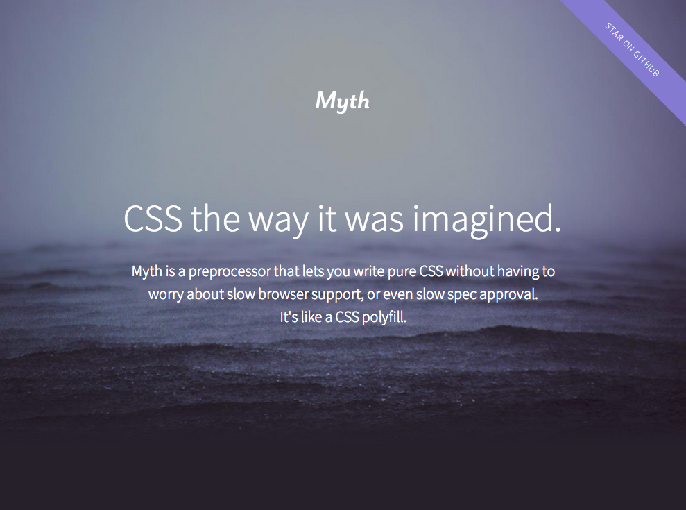
Myth is an experimental preprocessor that emulates these native CSS features, instead of introducing proprietary syntax, essentially acting like a CSS polyfill
Myth 是一款实验性质的预处理器,它只去模拟上述这些原生的 CSS 新特性,而不是引入私有语法。它本质上扮演了 CSS polyfill 的角色。
Note that native features like these are generally much more powerful than the ones provided by preprocessors, as they are dynamic. For example, a preprocessor has no clue how to perform a calculation like 100% - 50px, because the value percentages resolve to is not known until the page is actually rendered. However, native CSS calc() has no trouble evaluating such expressions. Similarly, variable use like the following is not possible with preprocessor variables:
请注意这些原生特性通常会比预处理器提供的版本要强大得多,因为它们是动态的。举个例子,预处理器完全不知道如何完成 100% - 50px 这样的计算,因为在页面真正被渲染之间,百分比值是无法解析的。但是,原生 CSS 的 calc() 在计算这样的表达式时没有任何压力。与此类似,下面这样的变量玩法在预处理器中是不可能做到的:
{原书注释!}
Don’t forget that native CSS features like these can be manipulated through scripting too. For example, you could use JS to change the value of a variable.
不要忘了这样的原生 CSS 特性也可以通过脚本来操纵。比如说,你可以用 JS 来改变一个变量的值。
ul { --accent-color: purple; }
ol { --accent-color: rebeccapurple; }
li { background: var(--accent-color); }
Can you see what we did there? The background of list items in ordered lists will be rebeccapurple, whereas the background of list items in unordered lists will be purple. Try doing that with a preprocessor! Of course, in this case, we could have just used descendant selectors, but the point of the example was to show how dynamic these variables will be.
你看清楚这段代码的意图了吗?有序列表的列表项的背景色将是 rebeccapurple,但在无序列表中,列表项的背景色将是 purple。你试试用预处理器能不能做到吧!当然,在这个例子中,我们可以直接使用后代选择符,只不过这个例子的重点在于——向你展示 CSS 的原生变量所具备的动态性。
Because most of the aforementioned native CSS features are not well supported today, in many cases using preprocessors is unavoidable if maintainability matters (and it should). My advice would be to start off every project with pure CSS, and when it starts being impossible to keep it DRY, switch to using a preprocessor then. To avoid becoming completely dependent on preprocessors or using them when they are not actually needed, their use needs to be a conscious decision, not a mindless first step performed by default in every new project.
上面提到的原生 CSS 特性绝大多数在目前还没有得到很好的支持,因此,在很多情况下,如果可维护性很重要(它确实很重要),使用预处理器是不可避免的。我的建议是,在每个项目开始时使用纯 CSS,只有当代码开始变得无法保持 DRY 时,才切换到预处理器的方案。为了避免可能发生的 “依赖” 或 “滥用”,在引入预处理器的问题上需要冷静决策,不应该在每个项目一开始时就不动脑筋顺着惯性来。
In case you were wondering (and haven’t read the first chapter, tsk-tsk), the style of this book was authored in SCSS, although it started as pure CSS and only switched when the code grew too complex to be maintainable. Who said CSS and its preprocessors are only for the Web?
可能你还不知道(居然直接跳过前言了,啧啧),这里再说一次,这本书的样式是用 SCSS 写的。但这些样式代码是以纯 CSS 起步的,而且只在代码增长得太过复杂以致无法维护时才切到 SCSS 的。谁说 CSS 和预处理器只能用在网页上?
![[CSS Secrets 简体中文版 - 封面]](https://cloud.githubusercontent.com/assets/1231359/14773652/5bf7c006-0adf-11e6-8712-70be89b3b97d.jpg)


![[CSS Secrets 简体中文版 - 预览]](https://cloud.githubusercontent.com/assets/1231359/14773972/2fd74902-0ae3-11e6-8679-c39bade84867.png)
![[CSS Secrets 简体中文版 - 预览]](https://cloud.githubusercontent.com/assets/1231359/14773973/2fd850d6-0ae3-11e6-8e7e-f76818c98ab2.png)
![[CSS Secrets 简体中文版 - 预览]](https://cloud.githubusercontent.com/assets/1231359/14773974/2fd8ac5c-0ae3-11e6-9436-9f7c08a548c9.png)
![[CSS Secrets 简体中文版 - 预览]](https://cloud.githubusercontent.com/assets/1231359/14773975/2fdb2ea0-0ae3-11e6-8bb1-7a2d560104c1.png)
![[CSS Secrets 简体中文版 - 预览]](https://cloud.githubusercontent.com/assets/1231359/14773995/5dffe9ba-0ae3-11e6-8ff4-8575b2e06db7.png)
![[CSS Secrets 简体中文版 - 预览]](https://cloud.githubusercontent.com/assets/1231359/14773994/5dff276e-0ae3-11e6-8205-3f95527837e8.png)
![[CSS Secrets 简体中文版 - 预览]](https://cloud.githubusercontent.com/assets/1231359/14773996/5e0e8b3c-0ae3-11e6-81d0-939cf2784403.png)
![[CSS Secrets 简体中文版 - 预览]](https://cloud.githubusercontent.com/assets/1231359/14774504/52ea3be2-0ae9-11e6-822a-4d6eeadc9ad7.png)
![[CSS Secrets 简体中文版 - 预览]](https://cloud.githubusercontent.com/assets/1231359/14774505/53181576-0ae9-11e6-8c1a-610b4492108f.png)
![[CSS Secrets 简体中文版 - 预览]](https://cloud.githubusercontent.com/assets/1231359/14774506/5373c1dc-0ae9-11e6-9fea-10fa6bec0b3b.png)


![[CSS Secrets 繁体中文版 - 封面]](http://www.gotop.com.tw/Waweb2004/WawebImages/BookXL/A447.jpg)
![[CSS Secrets 繁体中文版 - 预览]](http://www.gotop.com.tw/waweb2004/WawebImages/BookCom/A447/9789863478744_b1.jpg)
![[CSS Secrets 繁体中文版 - 预览]](http://www.gotop.com.tw/waweb2004/WawebImages/BookCom/A447/9789863478744_b2.jpg)
![[CSS Secrets 繁体中文版 - 预览]](http://www.gotop.com.tw/waweb2004/WawebImages/BookCom/A447/9789863478744_b3.jpg)
![[CSS Secrets 繁体中文版 - 预览]](http://www.gotop.com.tw/waweb2004/WawebImages/BookCom/A447/9789863478744_b4.jpg)
![[CSS Secrets 繁体中文版 - 预览]](http://www.gotop.com.tw/waweb2004/WawebImages/BookCom/A447/9789863478744_b5.jpg)
![[CSS Secrets 繁体中文版 - 预览]](http://www.gotop.com.tw/waweb2004/WawebImages/BookCom/A447/9789863478744_b6.jpg)
![[CSS Secrets 繁体中文版 - 预览]](http://www.gotop.com.tw/waweb2004/WawebImages/BookCom/A447/9789863478744_b7.jpg)
![[CSS Secrets 繁体中文版 - 预览]](http://www.gotop.com.tw/waweb2004/WawebImages/BookCom/A447/9789863478744_b8.jpg)
![[CSS Secrets 繁体中文版 - 预览]](http://www.gotop.com.tw/waweb2004/WawebImages/BookCom/A447/9789863478744_b9.jpg)
![[CSS Secrets 繁体中文版 - 预览]](http://www.gotop.com.tw/waweb2004/WawebImages/BookCom/A447/9789863478744_b10.jpg)
![[CSS Secrets 繁体中文版 - 预览]](http://www.gotop.com.tw/waweb2004/WawebImages/BookCom/A447/9789863478744_b11.jpg)
![[CSS Secrets 繁体中文版 - 预览]](http://www.gotop.com.tw/waweb2004/WawebImages/BookCom/A447/9789863478744_b12.jpg)
![[CSS Secrets 繁体中文版 - 预览]](http://www.gotop.com.tw/waweb2004/WawebImages/BookCom/A447/9789863478744_b13.jpg)
 React
React
 Typescript
 Django
 Laravel
 Facebook
 Microsoft
 Google
 Alibaba
 D3
D3
 Tencent