

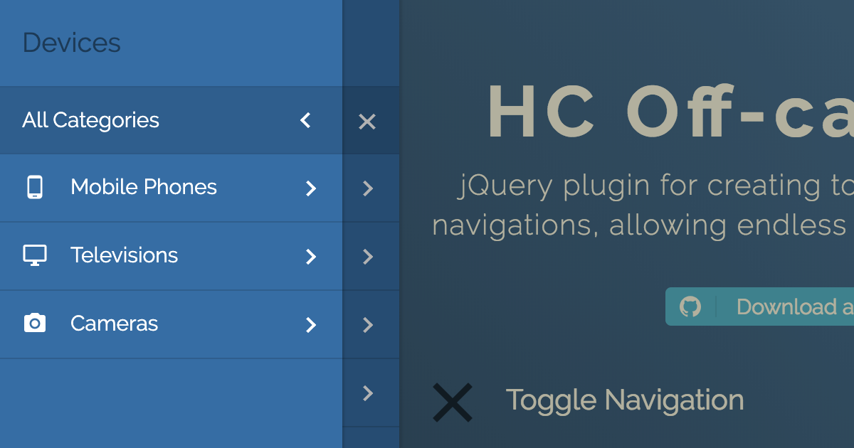
jQuery plugin for creating off-canvas multi-level navigations, using ARIA. Demo
- Multi-level menu support
- Endless nesting of navigation elements
- Custom content inside menu items
- Push/Slide DOM elements of choice
- Touch swipe guestures
- Different navigation positions
- Flexible, simple markup
- A number of exposed Options, Methods and Events
- Cross-browser compatibility
- Full ARIA keyboard support
- It relies on ARIA Design pattern for Dialogs
- The tab key loops through all of the keyboard focusable items within the offcanvas navigation
- You can close it using Esc
This package can be installed with:
- npm:
npm install --save hc-offcanvas-nav
Or download the latest release.
<link rel="stylesheet" href="/path/to/hc-offcanvas-nav.css">
<script src="/path/to/jquery.js"></script>
<script src="/path/to/hc-offcanvas-nav.js"></script>
<script>
  jQuery(document).ready(function($) {
    $('#main-nav').hcOffcanvasNav({
      disableAt: 1024
    });
  });
</script><nav id="main-nav">
<ul>
<li><a href="#">Home</a></li>
<li><a href="#">About</a></li>
<li>
<a href="#">Services</a>
<ul>
<li>
<a href="#">Hosting</a>
<ul>
<li><a href="#">Private Server</a></li>
<li><a href="#">Managed Hosting</a></li>
</ul>
</li>
<li><a href="#">Domains</a></li>
<li><a href="#">Websites</a></li>
</ul>
</li>
<li><a href="#">Contact</a></li>
</ul>
</nav>| Property | Default | Type | Description |
|---|---|---|---|
| width | 280 |
int / str | Width of the nav. Used for left and right positions. |
| height | 'auto' |
int / str | Height of the nav. Used for top and bottom positions. |
| disableAt | false |
int / bool | Resolution above which to hide the offcanvas menu, and show the original. |
| pushContent | false |
bool / str / jQuery obj | Content element (string selector or jQuery object) that will be pushed when the navigation is open. |
| expanded | false |
bool | Initialize menu in expanded mode. It won't push content. |
| position | 'left' |
str | Position on which the menu will open. Available options: 'left', 'right', 'top' and 'bottom'. |
| swipeGestures | true |
bool | Enable open/close swipe gestures like in native apps. Works only for left and right positions. |
| levelOpen | 'overlap' |
str | Submenu levels open effect. Available options: 'overlap', 'expand', 'none' or false. |
| closeOpenLevels | true |
bool | Should all open sub levels be closed when the nav closes. |
| closeActiveLevel | false |
bool | Should initially active sub level (see data-nav-active) be cleared when the nav closes. |
| levelSpacing | 40 |
int | If levels are overlaped, this is the spacing between them, if they are expanding or always open, this is the text indent of the submenus. |
| levelTitles | true |
bool | Show titles for submenus, which is the parent item name. Works only for overlaped levels. |
| navTitle | null |
str | Main navigation (first level) title. |
| navClass | '' |
str | Custom navigation class. |
| disableBody | true |
bool | Disable body scroll when navigation is open. |
| closeOnClick | true |
bool | Close the navigation when links are clicked. |
| customToggle | null |
str / jQuery obj | Custom navigation toggle element. |
| insertClose | true |
bool / int | Insert navigation close button. You can also use an integer representing 0-based index that will be the position of the button in the list. Negative numbers are also supported. |
| insertBack | true |
bool / int | Insert back buttons to submenus. You can also use an integer representing 0-based index that will be the position of the button in the list. Negative numbers are also supported. Works only for overlaped levels. |
| levelTitleAsBack | true |
bool | Use level titles as back labels. |
| labelClose | 'Close' |
str | Label for the close button. |
| labelBack | 'Back' |
str | Label for the back buttons. |
| rtl | false |
bool | Set the content direction to right-to-left. |
| bodyInsert | 'prepend' |
str | Choose to prepend or append navigation to body. |
| removeOriginalNav | false |
bool | Remove original menu from the DOM. Don't use this if planning to update the nav! |
The HC Off-canvas Nav API offers a couple of methods to control the offcanvas and are publicly available to all active instances.
var Nav = $('#main-nav').hcOffcanvasNav();Returns current settings.
var currentSettings = Nav.getSettings();Checks if the nav is open, and returns boolean.
if (Nav.isOpen()) {
  // do something
}Updates just the specified settings with the new ones.
Nav.update({
  disableAt: 1024,
  navTitle: 'All pages'
});
Updates nav DOM. You don't have to pass empty settings object, the method is smart. Use this when original nav has been altered.
Nav.update(true);Updates both settings and nav DOM. Use this when original nav was changed and you also want to update some specific settings.
Nav.update({
  disableAt: 1024,
  navTitle: 'All pages'
}, true);Opens the nav if closed.
Nav.open();Open the nav and also a specific sub menu. Each level sub menu has its own index that is relative to that level, not the parent menu.
Nav.open(2, 1);Above code will open the nested menu in the example structure bellow:
<nav>
  <ul><!-- Level: 0 -->
    <li></li>
    <li>
      <ul><!-- Level: 1, Index 0 -->
        <li>
          <ul><!-- Level: 2, Index: 0 -->
            <li></li>
            <li></li>
          </ul>
        </li>
        <li>

          <ul><!-- Level: 2, Index: 1 -->
            <li></li>
            <li></li>
          </ul>

        </li>
      </ul>
    </li>
    <li></li>
    <li>
      <ul><!-- Level: 1, Index 1 -->
        <li>
          <ul><!-- Level: 2, Index: 2 -->
            <li></li>
            <li></li>
          </ul>
        </li>
        <li></li>
      </ul>
    </li>
  </ul>
</nav>Closes the nav if open.
Nav.close();| Event | Description |
|---|---|
| open | Triggers each time when the nav is opened. |
| close | Triggers each time when the nav is closed. |
| close.once | Triggers only the first time the nav is closed, and than it detaches itself. |
All events return Event object, and the plugin Settings object.
var Nav = $('#main-nav').hcOffcanvasNav();

// change nav open position after each close
Nav.on('close', function(event, settings) {
  Nav.update({
    position: settings.position === 'left' ? 'right' : 'left'
  });
});

// will change nav open position only once
Nav.on('close.once', function(event, settings) {
  Nav.update({
    position: settings.position === 'left' ? 'right' : 'left'
  });
});| Attr | Accepts | HTML Element | Description |
|---|---|---|---|
| data-nav-active | <ul>, <li> |
The next time nav opens it will open specified sub menu (or sub menu whose parent <li> element has the attribute). Works with expanded option. |
|
| data-nav-highlight | <li> |
Highlight list item. | |
| data-nav-custom-content | <li> |
Attached on the list items. Will clone item's content as is. | |
| data-nav-close | bool | <a> |
Attached on the item links. Tells the nav if it needs to be closed on click or not. |
<nav id="main-nav">
  <ul>
    <li data-nav-custom-content>
      <div>Some custom content</div>
    </li>
    <li data-nav-highlight><a href="#">Home</a></li>
    <li data-nav-active>
      <a href="#">About</a>
      <ul data-nav-active><!-- or active attribute can be here -->
        <li><a href="#">Team</a></li>
        <li><a href="#">Project</a></li>
        <li><a href="#">Services</a></li>
      </ul>
    </li>
    <li><a href="#">Contact</a></li>
    <li><a data-nav-close="false" href="#">Add Page</a></li>
  </ul>
</nav>If you want to make your WordPress theme nav data ready, just place this code to your functions.php file and it should work out of the box. Do not assign this custom Walker to your wp_nav_menu arguments! And don't worry if you already use your own custom Walker, this code will take care of everything.
$hc_nav_menu_walker;

class HC_Walker_Nav_Menu extends Walker_Nav_Menu {

  public function start_lvl(&$output, $depth = 0, $args = array()) {
    global $hc_nav_menu_walker;
    $hc_nav_menu_walker->start_lvl($output, $depth, $args);
  }

  public function end_lvl(&$output, $depth = 0, $args = array()) {
    global $hc_nav_menu_walker;
    $hc_nav_menu_walker->end_lvl($output, $depth, $args);
  }

  public function start_el(&$output, $item, $depth = 0, $args = array(), $id = 0) {
    global $hc_nav_menu_walker;

    $item_output = '';

    $hc_nav_menu_walker->start_el($item_output, $item, $depth, $args, $id);

    if ($item->current_item_parent) {
      $item_output = preg_replace('/<li/', '<li data-nav-active', $item_output, 1);
    }

    if ($item->current) {
      $item_output = preg_replace('/<li/', '<li data-nav-highlight', $item_output, 1);
    }

    $output .= $item_output;
  }

  public function end_el(&$output, $item, $depth = 0, $args = array(), $id = 0) {
    global $hc_nav_menu_walker;
    $hc_nav_menu_walker->end_el($output, $item, $depth, $args, $id);
  }
}

add_filter('wp_nav_menu_args', function($args) {
  global $hc_nav_menu_walker;

  if (!empty($args['walker'])) {
    $hc_nav_menu_walker = $args['walker'];
  }
  else {
    $hc_nav_menu_walker = new Walker_Nav_Menu();
  }

  $args['walker'] = new HC_Walker_Nav_Menu();

  return $args;
});This package comes with Gulp. The following tasks are available:
defaultcompiles the JS and SCSS into/distand builds the demos into/docs.demoexecutesdefaulttask and opens the demo html page.watchwatches source JS and SCSS files and builds them automatically whenever you save.
You can pass a --dev command if you don't want the compiled JS and Css to be minified.
The code and the documentation are released under the MIT License.


 React
React
 Typescript
 Django
 Laravel
 Facebook
 Microsoft
 Google
 Alibaba
 D3
D3
 Tencent