Giter Club home page Giter Club logo

wporg-parent-2021's Introduction

WordPress.org Parent Theme, 2021 edition

Development

Prerequisites

  • Docker
  • Node/npm
  • Yarn
  • Composer

Setup

  1. Set up repo dependencies.

    yarn setup:tools
  2. Build the assets. The theme can't be activated until this step is done.

    yarn workspaces run build
  3. Start the local environment.

    yarn wp-env start
  4. Run the setup script.

    yarn setup:wp
  5. Visit site at localhost:8898. Note the nonstandard port, this will enable the parent theme + any child theme projects to be up at the same time.

  6. Log in with username admin and password password.

Environment management

These must be run in the project's root folder, not in theme/plugin subfolders.

  • Stop the environment.

    yarn wp-env stop
  • Restart the environment.

    yarn wp-env start
  • SSH into docker container.

    yarn wp-env run wordpress bash
  • Run wp-cli commands. Keep the wp-cli command in quotes so that the flags are passed correctly.

    yarn wp-env run cli "post list --post_status=publish"
  • Update composer dependencies and sync any repo-tools changes.

    yarn update:tools

Asset management

  • Build assets once: yarn workspace wporg-parent-2021 build
  • Watch assets and build on changes: yarn workspace wporg-parent-2021 start

If you want to test changes to the parent theme against a child theme in another repository, you can follow the instructions in the Main theme readme.

Design

Layout

By default, the main content width is 680px and wide width is 1160px.

Colors

These colors map to the values used in Figma.

  • In block attributes (patterns, templates, etc), use the slug directly for a value, ex "backgroundColor":"blueberry-1", though some attributes will use the var format, ex "text":"var:preset|color|white".
  • In CSS, the custom property is generated using the format --wp--preset--color--${slug}, ex, --wp--preset--color--charcoal-1, --wp--preset--color--white.
Name slug Hex
Charcoal 0 charcoal-0 #1a1919
Charcoal charcoal-1 #1e1e1e
Charcoal 2 charcoal-2 #23282d
Charcoal 3 charcoal-3 #40464d
Charcoal 4 charcoal-4 #656a71
Charcoal 5 charcoal-5 #979aa1
Light Grey light-grey-1 #d9d9d9
Light Grey 2 light-grey-2 #f6f6f6
White white #ffffff
Dark Blueberry dark-blueberry #1d35b4
Deep Blueberry deep-blueberry #213fd4
Blueberry blueberry-1 #3858e9
Blueberry 2 blueberry-2 #7b90ff
Blueberry 3 blueberry-3 #c7d1ff
Blueberry 4 blueberry-4 #eff2ff
Pomegrade pomegrade-1 #e26f56
Pomegrade 2 pomegrade-2 #ffb7a7
Pomegrade 3 pomegrade-3 #ffe9de
Acid Green acid-green-1 #33f078
Acid Green 2 acid-green-2 #c7ffdb
Acid Green 3 acid-green-3 #e2ffed
Lemon lemon-1 #fff972
Lemon 2 lemon-2 #fffcb5
Lemon 3 lemon-3 #fffdd6

Fonts

Font families

These three font families are available to switch in the editor, for blocks that support custom font family (ex, Headings).

Example of the generated property: var(--wp--preset--font-family--eb-garamond)

Name Slug Font family
EB Garamond eb-garamond 'EB Garamond', serif
Inter inter 'Inter', sans-serif
Monospace monospace 'IBM Plex Mono', monospace

Font sizes

These settings can be used in the editor & should also apply the correct line-height and switch to small-screen values (at 600px). The line heights are applied based on block classes, ex .has-heading-1-font-size applies the heading-1 line height too.

Example of the generated property: --wp--preset--font-size--extra-small

Name Slug Size / LH Small Size / LH
Extra Small extra-small 12px/1.67 no change
Small small 14px/1.71 no change
Normal normal 16px/1.875 no change
Large large 20px/1.7 no change
Extra Large extra-large 24px/1.58 20px/1.5
Huge huge 32px/1.5 no change
Heading 6 heading-6 22px/1.27 18px/1.22
Heading 5 heading-5 26px/1.3 20px/1.2
Heading 4 heading-4 30px/1.33 22px/1.09
Heading 3 heading-3 36px/1.28 26px/1.15
Heading 2 heading-2 50px/1.2 30px/1.07
Heading 1 heading-1 70px/1.05 52px/1.08
CTA Heading heading-cta 120px/1 52px/1.08

Spacing

The responsive/scaling size values are still being updated, but for now they are as follows. The "Min"/"Max" columns refer to where the scaling stops at each end of the scale. For example, at 590px, --wp--preset--spacing--40 is 30px; while at 1320px, --wp--preset--spacing--80 is 120px.

Name Slug Value Min Max
3X-Small 10 10px
2X-Small 20 20px
X-Small 30 30px
Small 40 clamp(30px, 5vw, 50px) 600 1000
Medium 50 clamp(40px, calc(5vw + 10px), 60px) 600 1000
Large 60 clamp(20px, calc(10vw - 40px), 80px) 600 1000
X-Large 70 100px
2X-Large 80 clamp(80px, calc(6.67vw + 40px), 120px) 600 1200
3X-Large 90 clamp(80px, 13.33vw, 160px) 600 1200
Edge Spacing edge-space 80px; <890px = 20px

History

This is started as a fork of Blockbase. The News Theme was the first iteration of this generation of new sites.

wporg-parent-2021's People

Stargazers

 avatar  avatar  avatar  avatar  avatar  avatar  avatar  avatar  avatar  avatar  avatar  avatar  avatar

Watchers

 avatar  avatar  avatar  avatar  avatar  avatar  avatar  avatar  avatar  avatar  avatar

wporg-parent-2021's Issues

Remove the example child theme

The child theme here was only added for testing purposes. Real use cases will have their own project repos, so this child theme will never be used.

Move `prevent_arrow_emoji` from wporg-main-2022 to here

See WordPress/wporg-main-2022#30 — Arrows in the content are converted to emoji, but it looks better if they're not, since Inter includes matching arrows. This was done for wporg-main-2022, but other child themes will use similar patterns and should also not have emoji arrows.

For example, in the documentation design:

Screenshot 2022-11-22 at 1 54 24 PM

https://github.com/WordPress/wporg-main-2022/blob/4f8a3a9c1e1f6cb2a3aff648457a85278679d6cb/source/wp-content/themes/wporg-main-2022/functions.php#L88-L100

Some theme styles, like layout, are missing in the editor

The site editor currently doesn't load the CSS, which controls the layout of the page. The basic styles are there from the theme.json, but it's hard to build out a page without the correct alignments.

Frontend:
Screen Shot 2022-04-25 at 11 34 30

Site editor:
Screen Shot 2022-04-25 at 11 34 28

Alternately, switching to a block style for the layout might help load the required CSS, without needing to load the full style.css.

Pattern: Heading with arrow

This pattern is like the "Latest release" section on News. A big heading, with an arrow, in a container with a background color.

Mockup:

image

The container group might also have other content (or maybe this is unrelated content just below it?)

Screen Shot 2022-07-20 at 4 59 13 PM

Screen Shot 2022-07-20 at 5 00 52 PM

Paragraphs need EB Garamond font style option

Headings are EB Garamond, and body text is Inter. These are set in the theme.json. In a few cases, elements in the mockup use the opposite font though, so we need to be able to control that somehow.

This should be a p, but it's using the heading font.
Screen Shot 2022-07-28 at 10 32 40 AM 1

Maybe block styles? Or is there a block-level font family control we can use?

Heading 'Link & Arrow' style doesn't support RTL

The Link and Arrow style used on the w.org homepage, showcase and enterprise pages (and maybe others) doesn't support RTL reading direction:

Home
Screen Shot 2023-01-13 at 4 16 37 PM

Enterprise
Screen Shot 2023-01-13 at 4 11 19 PM

Showcase
Screen Shot 2023-01-13 at 4 20 52 PM

Steps to repro

  1. Open any of these pages
  2. Add attribute dir="rtl" to the HTML element
  3. Scroll to the bottom of the page and observe that the arrow is pointing the wrong way, and when hovering it also moves in the wrong direction

Smaller block spacing size option needed for

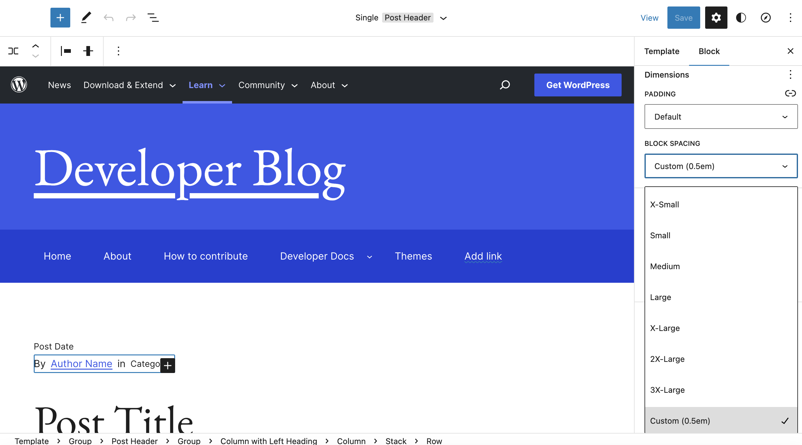
We could use something between the 0 spacing size and the Custom (0.5rem) size for spacing in the Row block for post meta so that By Date in Categories reads more naturally. Just needs to be a tiny bit narrower.

Another option might be enabling custom spacing sizes in the theme.json for these situations:

block-spacing-small

This is made up of a Row block that wraps Paragraph + Post Date + Paragraph + Categories.

I tried adding before/after spaces in the Paragraph blocks themselves, but the editor trims them.

Make left & right content spacing match header and footer spacing

See WordPress/wporg-showcase-2022#62, WordPress/wporg-mu-plugins#302, and WordPress/wporg-mu-plugins@2ca5e5b. The spacing to the left and right of content in the header & footer was updated to be 80px on large screens, and snap down to 20px on small-medium screens (<890). This left the page content out of alignment, because the parent theme sets this value on a scale.

A new spacing preset called "Edge Spacing" has been added to the parent theme (df307d7). We'll use this value (or --wp--preset--spacing--edge-space if CSS is needed).


Previous notes

In the wporg-documentation-2022 theme, I've added a local override to get these to match up. We should fix this in the other themes too. We can use a temporary local workaround so the change doesn't break other live themes. Once this has been fixed in the other themes, we can update the large spacing value in the parent theme, and remove the local workarounds.

Default table style

The default table style uses a font size which is too small:

  • Bump the font size of jazzers inside the WordPress history release table. It should be at least the same font size as the body text above.
  • If we use tables like this, with a smaller font size inside, elsewhere on the site, we should bump those as well.

History page
Screen Shot 2023-03-22 at 10 13 06 AM

Roadmap page
Screen Shot 2023-03-22 at 10 17 43 AM

Spacing grid opportunities

One of the things we've explored as part of the refreshed Showcase, is a more systematic approach to a spacing grid. Instead of a variety of different variables (15, 16, 20, 44), have a neater grid system (10, 20, 30, 40) etc. We are already applying this, in a static form, across website refreshes and notably the Showcase refresh.

There may be a challenge in rolling this out, in part even if a grid system wasn't fully evolved in the Figma mockups until recently, there was one for the WP.org parent theme: https://github.com/WordPress/wporg-parent-2021/#spacing

Secondly, because rolling out new values here may end up causing some issues in other designs that leverage the existing system, such as News. A fair bit of the way, the new grid system sticks to the existing base10 increments, but the web-spacing system includes some clamp based values:

Screenshot 2023-08-04 at 16 22 17

The Figma-based grid system and web-based grid system don't have to match, Figma will show static mockups, after all, whereas on the web values will need to be responsively smart to as to scale with the viewport.

But perhaps there is an opportunity to still sync up part. This codepen outlines an idea of essentialy splitting out the clamp values from the grid values, and leveraging the latter to power the former. To distill it with an example:

	// Base grid, matches Figma
	--s-04: 4px;
	--s-08: 8px;
	--s-10: 10px;
	--s-20: 20px;
	--s-30: 30px;
	--s-40: 40px;
	--s-50: 50px;
	--s-60: 60px;
	--s-70: 70px;
	--s-80: 80px;

	// Responsive spacings, web
	--3x-small: var(--s-10);
	--2x-small: var(--s-20);
	--x-small: var(--s-30);
	--medium: clamp( var(--s-40), calc(100vw / 16), var(--s-60) );
	--large: clamp( var(--s-20), calc(100vw / 18), var(--s-80) );
	--x-large: var(--s-100);
	--2x-large: clamp( var(--s-80), calc(100vw / 7), var(--s-120) );
	--3x-large: clamp( var(--s-80), calc(100vw / 7), var(--s-160) );
	--edge-space: var();

☝️ The above is just a sketch, the actual implementation and variable names I'll defer to those implementing it. But the core idea is that the base grid matches Figma, figma can use those for static non-scaling mockups, and then the web can build clamp-based responsive values based off of them. The benefit would, theoretically, be a closer link between mockups and final result.

Would this be useful?

Add Cards style for lists

Required for the Developer home page, and subsequent redesigns.

Should support 2 and 3 column configuration. 3 columns should change to 2 on medium screens, and both to one on small screens.

This initial style will be added to list blocks. The expected markup is:

<ul>
    <li>
        <a>
            <strong>{title}</strong></br>{detail}
       </a>
    </li>
</ul>

States:

Card

Developer Design:

Update card grid style to work with LinkWrapper blocks

Currently the grid expects children to have markup like:

<!-- wp:heading {"level":3,"fontSize":"small","fontFamily":"inter"} -->
<h3 class="wp-block-heading has-inter-font-family has-small-font-size">
    <a href="https://developer.wordpress.org/apis">
        <strong><?php esc_html_e( 'Common APIs', 'wporg' ); ?></strong><?php esc_html_e( 'Interested in interacting with various APIs?', 'wporg' ); ?>
    </a>
</h3>
<!-- /wp:heading -->

However this isn't ideal because the output text has the 'title' and 'description' jammed together for anything that disregards the strong tag. A better html structure is to wrap separate elements in an anchor tag. We have a block in mu-plugins which does exactly this, the LinkWrapper:

<!-- wp:wporg/link-wrapper -->
<a class="wp-block-wporg-link-wrapper" href="https://make.wordpress.org/cli/">
    <!-- wp:heading {"level":3,"style":{"typography":{"fontStyle":"normal","fontWeight":"700"}},"fontSize":"small","fontFamily":"inter"} -->
    <h3 class="wp-block-heading has-inter-font-family has-small-font-size" id="cli-handbook" style="font-style:normal;font-weight:700"><?php esc_html_e( 'CLI Handbook', 'wporg' ); ?></h3>
    <!-- /wp:heading -->

    <!-- wp:paragraph {"fontSize":"small"} -->
    <p class="has-small-font-size"><?php esc_html_e( 'A collection of helpful guides and resources for using WP-CLI.', 'wporg' ); ?></p>
    <!-- /wp:paragraph -->
</a>
<!-- /wp:wporg/link-wrapper -->

We need to update the styles to expect this markup instead.

The style should remain the same, eg.

Screenshot 2023-09-22 at 4 51 28 PM

Prevent or alert missing Gutenberg plugin

The new themes are designed to work with the Gutenberg plugin installed, so we can make use of new features and fixes.

This means that if the plugin is disabled, and the site reverts to core's bundled editor, some features or layout might change.

To avoid this, the parent theme(?) should either prevent the Gutenberg plugin from being disabled, or at least alert if it gets disabled. It could produce a dashboard notice and/or ping the dotorg-alerts channel.

Context: https://wordpress.slack.com/archives/C02S78ZAL/p1662983457375559

This regression happened because the plugin was inadvertently disabled.

Unify 404 pages with /news as the baseline

This is likely going to be a technically difficult challenge, and it isn't one that I would consider a priority. Filing here so it's captured: let me know if this isn't the right repository for this!

The News page has a lovely new 404 page: https://wordpress.org/news/404:

Screenshot 2022-10-24 at 11 03 41

Every other section on the site has its own spin on 404 pages, including:

While the main header section is likely going to change between these, the content and footer should probably be unified across all of these, so we have a single consistent 404 page design.

Remove unnecessary templates & CSS

The parent theme inherited a lot of look & feel from News, but most sites we build will it will probably be more like wporg-main-2022 (full pages) rather than a News blog.

If we look at wporg-main-2022 and the other sites we might use this parent theme for in the future (ex, showcase, various directories, 5ftf, etc), they don't have blogs. The only templates we would need to provide are an index.html so the theme works, and a blank page.html (like this) so pages can be built up in the editor.

The wporg-developer-blog theme is a child theme, but the majority of templates can be moved into that theme where they're useful.

This way, the parent theme becomes the provider of the design library (by way of theme.json), shared blocks, block styles, and patterns, and we'll use a process like we've settled on in wporg-main-2022 for the other sites.

Misc: Revisit the text highlight color

At the moment, selecting text and items highlights in red/orange/coral, which has an appearance of being a warning:

Screenshot 2023-03-28 at 14 28 05

Additionally, it doesn't invert the links, and is not quite as flexible as the native highlight color. Let's remove the custom highlight for now.

Remove Sass

ideally, the theme would use postcss like wporg-mu-plugins does.

xref WordPress/wporg-mu-plugins#6 (review)

the sooner we do it, the easier it'll be, but i'm also leery of getting bogged down in non-essentials right now 🤔

8270ecd1f04223c53a9ffcc6a81fa118f5ba8a09 added %footer-archive-dark, %local-header-off-white, etc. If PostCSS doesn't have a similar concept, we might be able to convert them to regular classes, and have the templates add the class, but that would rely on WordPress/gutenberg#32939

we currently import some mixins, breakpoints, etc from gutenberg's sass. i'm not sure a good solution for that

there may be a tool that'll convert most sass to postcss automatically

Update templates to use new `constrained` layout setting

See WordPress/gutenberg#42763 — This new constrained layout type replaces the inherit: true setting in layout, and constrains the inner content to use the given content/wide width (vs no constraint = full screen width).

The new layout setting will be released with GB 14.0, though the old setting will probably be supported still (how long?)

We should update the parent & child templates (wporg-main-2022) to use this new setting.

I think the patterns in wporg-main-2022 would update automatically with the build:patterns script, but worth checking that too.

For example:

- <!-- wp:group {"layout":{"inherit":true}} -->
+ <!-- wp:group {"layout":{"type":"constrained"}} -->

("On Hold" because technically 14.0 is not out yet, but it should be released today)

↗︎ emoji is very similar to "external link" and "opens in new tab" icons

Screenshot 2022-12-09 at 2 44 54 PM

When I saw the ↗︎ emoji in that link, I assumed it was being used to indicate that the link opens in a new tab or was an external site, because of how similar it is to the the icons that are commonly used for that purpose. It seems to me like the upwards arrow is the substantive part that communicates an "exit" from the site/tab, and the surrounding box is decorative.

@shaunandrews and @jasmussen mentioned that ↗︎ was only meant to be decorative, though. I wonder if we should consider a different emoji for that purpose, to avoid confusion?

Consider hiding admin bar for most pages

The adminbar seems useful mainly to contributors, which is likely a very small percentage of visitors. Can we hide the adminbar on virtually every page, unless you're logged in? Perhaps keep it mainly for the Make sites?

I think this should ultimately be a ticket in meta since it's a significant change. Leaving this ticket open here for now.

Separator block broken when using the dots style

I'm working on a new page in w.org, and it looks like I've encountered a bug with the separator block when it uses the dots style
Screenshot 2023-07-19 at 20 16 29
Screenshot 2023-07-19 at 20 16 39

The page uses the Template page-download in case that's related

Screenshot 2023-07-19 at 20 27 24

Link to the draft page

Color Palette: Add new charcoal values

A new dark charcoal and a lighter charcoal have been added to the color system. We can add them with minimal changes by zero-indexing the charcoal set.

Name slug Hex
🆕 Charcoal 0 charcoal-0 #1a1919
Charcoal charcoal-1 #1e1e1e
Charcoal 2 charcoal-2 #23282d
Charcoal 3 charcoal-3 #40464d
Charcoal 4 charcoal-4 #656a71
🆕 Charcoal 5 charcoal-5 #979aa1

The one instance of charcoal-5 in wporg-mu-plugins (#1c2024, for the header hover color) can be renamed to Nero to prevent confusion with this set of main colors.

Recommend Projects

  • React photo React

    A declarative, efficient, and flexible JavaScript library for building user interfaces.

  • Vue.js photo Vue.js

    🖖 Vue.js is a progressive, incrementally-adoptable JavaScript framework for building UI on the web.

  • Typescript photo Typescript

    TypeScript is a superset of JavaScript that compiles to clean JavaScript output.

  • TensorFlow photo TensorFlow

    An Open Source Machine Learning Framework for Everyone

  • Django photo Django

    The Web framework for perfectionists with deadlines.

  • D3 photo D3

    Bring data to life with SVG, Canvas and HTML. 📊📈🎉

Recommend Topics

  • javascript

    JavaScript (JS) is a lightweight interpreted programming language with first-class functions.

  • web

    Some thing interesting about web. New door for the world.

  • server

    A server is a program made to process requests and deliver data to clients.

  • Machine learning

    Machine learning is a way of modeling and interpreting data that allows a piece of software to respond intelligently.

  • Game

    Some thing interesting about game, make everyone happy.

Recommend Org

  • Facebook photo Facebook

    We are working to build community through open source technology. NB: members must have two-factor auth.

  • Microsoft photo Microsoft

    Open source projects and samples from Microsoft.

  • Google photo Google

    Google ❤️ Open Source for everyone.

  • D3 photo D3

    Data-Driven Documents codes.