wcharczuk / go-chart Goto Github PK
View Code? Open in Web Editor NEWgo chart is a basic charting library in go.
License: MIT License
go chart is a basic charting library in go.
License: MIT License


![dependabot[bot] avatar](https://avatars.githubusercontent.com/in/29110?v=4 "dependabot[bot]")


When the label is too long to show the label at one line, the label is dispeared, and I puzzled!
I finally find the problem, in BarChart's function drawXAxis, there is calling of function
Draw.TextWithin, this function has a bug;
in draw.go line 23
lines := Text.WrapFit(r, text, box.Width(), style)
lines array will contains empty string, like ["", "test"], empty string will cause lineBox := r.MeasureText(line), lineBox.Width() and lineBox.Height() get invalid value.
I fixed this by rewriting the code in text.go WrapFitWord function, line 101
// old

	output = append(output, t.Trim(line))
// new
if len(line) != 0 {
	output = append(output, t.Trim(line))
}
My custom formatter is overlapping the text so I need to either adjust the tick intervals or angle the test. I can see some references in the code to setting text angle but I can't see how it's exposed.
What are my options here.
Also, thanks for being responsive to my other issues :)
I've tried a few different pie charts and and it looks like when one of the segments makes up >50% of the pie that segment is drawn using 360-angle, which in the example below is the orange segment.
This is the png version that I was expecting the svg version to look like:

And here is a screenshot of the svg that I got:

Code Snippet:
	palette := summaryPalette{chart.AlternateColorPalette, myOverrideColors}

	pie := chart.PieChart{
		Width:  width,
		Height: height,
		Values: []chart.Value{
			{Value: notAtDepotRemaining.Value, Label: fmt.Sprintf("Remaining %.0f %s", notAtDepotRemaining.Value, notAtDepotRemaining.Unit)},
			{Value: notAtDepotUsed.Value, Label: fmt.Sprintf("Empty %.0f %s", notAtDepotUsed.Value, notAtDepotUsed.Unit)},
			{Value: depotUsed.Value, Label: fmt.Sprintf("Returned %.0f %s", depotUsed.Value, depotUsed.Unit)},
			{Value: depotRemaining.Value, Label: fmt.Sprintf("Stock %.0f %s", depotRemaining.Value, depotRemaining.Unit)},
		},
		ColorPalette: palette,
	}

        ext := path.Ext(r.URL.Path)
	switch ext {
	case ".png":
		w.Header().Set("Content-Type", "image/png")
		if err := pie.Render(chart.PNG, w); err != nil {
			return fmt.Errorf("PNG: %s", err)
		}

	case ".svg":
		w.Header().Set("Content-Type", "image/svg+xml")
		if err := pie.Render(chart.SVG, w); err != nil {
			return fmt.Errorf("SVG: %s", err)
		}

	default:
		http.NotFound(w, r)
	}
Could you explain what this means?
Grafana can read the field - float64.
code is here:
https://github.com/5k3105/genchart
I'm evaluating using go-chart to replace our server side wkhtmltopdf + d3 setup but one of the chart styles we use a lot is the d3 donut chart
https://bl.ocks.org/mbostock/3887193
Do you have any pointers as to how to add such style of chart?
sorry if this is not the proper place, but your website posted on GH profile is down and I didn't see another way to get in touch with you...
I have some very large data sets of accelerometer data (X, Y, Z, Time) that has rows in the 100,000s. With go-chart...is it possible to control the size of the output PNG? if I wanted each data point at a certain space from the previous in order to make a looooong scrolling PNG, is that possible?
I see that you have LegendLeft already, but sometimes, the series name can be so long that It's probably the most practical to put all of them at the bottom, outside the graph.
The height of the image need to take this into consideration, though.
What do you think?
Can we add additional axis? It looks like for loops are out until a small refactor so can we add an additional if check for a third-axis?
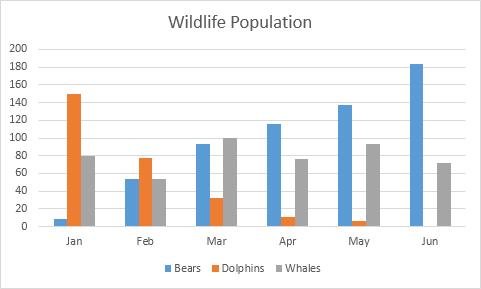
I'm trying this example but the result doesn't contains bars.
Expected:

Result:

Hello,
I am using StackedBarChart and the title overlaps the bars, is there a way to prevent this? Thanks in advance.
Everybody loves candlesticks. Please!
Hi,
I'm using it in a home automation application I'm developing to show historic values and it works very well, thanks.
I'm wondering if it's possible to show the time (and not only the date) in the x-axis, didn't figure how I can do that ...
Is there an easy way or example of a way to fit a best fit curve to a ContinuousSeries chart?
There is a default float format (DefaultFloatFormat = %2f) I would like to change. There doesn't seem to be a good way to do it without recreating the whole chart.ContinuousSeries struct so you can change the ValueFormatter
my legend content is too long that I can not see ! How can I see the full content using LegendThin? Looking forward to your reply ,Thanks!

Hello, I would like to have a horizontally positioned stacked bar chart. I have tried a few things to change the view like text rotation degree, then the bars and the texts overlapped.
Thanks in advance
package main

import (
	"fmt"
	"os"

	"github.com/wcharczuk/go-chart"
)

func drawChart() {
	sbc := chart.BarChart{
		Height:   512,
		BarWidth: 60,
		XAxis: chart.Style{
			Show: true,
		},
		YAxis: chart.YAxis{
			Style: chart.Style{
				Show: true,
			},
		},
		Bars: []chart.Value{
			{Value: 0, Label: "Blue"},
			{Value: 0, Label: "Green"},
			{Value: 0, Label: "Gray"},
			{Value: 0, Label: "Orange"},
			{Value: 0, Label: "Test"},
			{Value: 0, Label: "??"},
			{Value: 0, Label: "!!"},
		},
	}

	println("rendering")
	err := sbc.Render(chart.PNG, os.Stdout)
	if err != nil {
		fmt.Printf("Error rendering chart: %v\n", err)
	}
}

func main() {
	drawChart()
}Without setting ticks:

Setting ticks:
xaxis.Ticks = [{1.498608e+09 Jun 28} {1.4988672e+09 Jul 01} {1.4989536e+09 Jul 02} {1.49904e+09 Jul 03} {1.4991264e+09 Jul 04} {1.4992128e+09 Jul 05} {1.4992992e+09 Jul 06} {1.4993856e+09 Jul 07} {1.499472e+09 Jul 08} {1.4996448e+09 Jul 10} {1.4997312e+09 Jul 11}]
(Note that the ticks are set to be exactly under each dot in the series.)
The full code is at https://github.com/fiatjaf/ght/tree/541f3b7ee589a45437091e6df0808b43b5d76e82
First of all ,thanks for this awesome library, it helps a lot for me.
But a chart legend problem bothers me. demo picture is below
, i want to change the legend order like this:
output.png contains svg code

Hello,
I am using the following to generate the above graph:
graph := chart.Chart{
	Title: interfaceName + " – " + statName + " – " + timeScale,
	TitleStyle: chart.Style{
		Show: true,
		Padding: chart.NewBox(0, 0, 1000, 1000),
 		TextRotationDegrees: -90,
		TextHorizontalAlign: chart.TextHorizontalAlignLeft,
		TextVerticalAlign: chart.TextVerticalAlignTop,
	},
	XAxis: chart.XAxis{
		Name: "Time",
		NameStyle: chart.Style{
			Show: true,
		},
		Style: chart.Style{
			Show: true,
			StrokeColor: colors.White,
		},
		ValueFormatter: chart.TimeValueFormatterWithFormat("01-02 3:04:05PM"),
	},
	YAxis: chart.YAxis{
		Name: "Bandwidth (GB)",
		NameStyle: chart.Style{
			Show: true,
		},
		Style: chart.Style{
			Show: true,
			StrokeColor: colors.White,
		},
		ValueFormatter: func(v interface{}) string {
			if vf, isFloat := v.(float64); isFloat {
				return fmt.Sprintf("%.1f", vf)
			}
			return ""
		},
	},
	Series: []chart.Series{
		chart.TimeSeries{
			Style: chart.Style{
				Show:        true,
				FillColor:   fillColor,
				StrokeColor: strokeColor,
				StrokeWidth: 2,
			},
			XValues: xValues,
			YValues: yValues,
		},
	},
}
I had assumed that something from the following list would work for repositioning the title:
Padding: chart.NewBox(0, 0, 1000, 1000)
TextRotationDegrees: -90
TextHorizontalAlign: chart.TextHorizontalAlignLeft
TextVerticalAlign: chart.TextVerticalAlignTop
I was just trying parameters to figure out how to move it. Those values are likely not the result I would like.
Is it possible to move the title? In this case, perhaps left or center align the title slightly below the top of the image, or possibly rotate it -90 degrees as well, if that looks better.
Any suggestions would be greatly appreciated. Thanks for this helpful package!
I'm experimenting with go-chart to replace some python charting (matplotlib), and I need to produce an XY scatter plot with values against time (see attached as a sample).
When I plot these series using go-chart it draws lines between the points, and I couldn't figure out how to plot points/ticks only.
Is it possible? Is this something you're considering? How would you recommend going about this if I were to help implement it? :)

The problem seems to be a interaction between my value of BarSpacing = 10 and the name of my bars (01/01/2019) . I have been able to track the issue down to (t text) MeasureLines producing a box with infinite height.

package path
/Users/eleven/Desktop/mygo/src/github.com/golang/freetype
font.go also have this struct

please tell me what probable will cause this problem?thanks
Because of the way checkRanges is implemented here: https://github.com/wcharczuk/go-chart/blob/master/chart.go#L274, one can't plot something like f(x)=3.14.
I was wondering if it's possible to draw something like that:
http://www.excel-easy.com/data-analysis/images/charts/column-chart.png
I've been through your godoc and I don't think it's possible.
how to save the chart in local?
This is a great lib! Would love a handful of examples that demonstrate more of the functionality and how to override it.
On the readme it shows three point series in a two axis chart. There is no example for this.
I've been attempting to write multiple point series but it only shows one.
Thanks.
package main

import (
	"bytes"
	"os"
	//"time"
	"github.com/wcharczuk/go-chart" //exposes "chart"
)

func main() {

	var b float64
	b = 1000

	ts1 := chart.ContinuousSeries{ //TimeSeries{
		Name: "Time Series",

		//XValues: []time.Time{time.Unix(3*b,0),time.Unix(4*b,0),time.Unix(5*b,0),time.Unix(6*b,0),time.Unix(7*b,0),time.Unix(8*b,0),time.Unix(9*b,0),time.Unix(10*b,0)},
		XValues: []float64{10 * b, 20 * b, 30 * b, 40 * b, 50 * b, 60 * b, 70 * b, 80 * b},
		YValues: []float64{1.0, 2.0, 30.0, 4.0, 50.0, 6.0, 7.0, 88.0},
	}

	ts2 := chart.ContinuousSeries{ //TimeSeries{
		Style: chart.Style{
			Show:        true,
			StrokeColor: chart.GetDefaultColor(1),
		},

		YValues: []float64{15.0, 52.0, 30.0, 42.0, 50.0, 26.0, 77.0, 38.0},
	}

	graph := chart.Chart{

		XAxis: chart.XAxis{
			Name:           "The XAxis",
			NameStyle:      chart.StyleShow(),
			Style:          chart.StyleShow(),
			ValueFormatter: chart.TimeMinuteValueFormatter, //TimeHourValueFormatter,
		},

		YAxis: chart.YAxis{
			Name:      "The YAxis",
			NameStyle: chart.StyleShow(),
			Style:     chart.StyleShow(),
		},

		Series: []chart.Series{
			ts2, ts1,
		},
	}

	buffer := bytes.NewBuffer([]byte{})
	err := graph.Render(chart.PNG, buffer)

	fo, err := os.Create("output.png")
	if err != nil {
		panic(err)
	}

	if _, err := fo.Write(buffer.Bytes()); err != nil {
		panic(err)
	}

}I'd like to print concrete values inside stacked bar chart just like so (legend not relevant on the plot):

I realize that this is most likely not possible as of now, but if I'd like to contribute something like this:
Some graphs take a disproportionately long time to render to images.
Sorry I haven't had time to investigate this further yet .... but here's some stuff...
I noticed that there is some really odd variances in the speed of rendering ... even when there is similar number of points and the identical chart rendering code. The only variables were really the number of series (don't think that was it) ... and the scale/etc of the values. Odd.
The profiling I was doing showed lots of time spent in Rasterizer.findCell().
This graph plots only about 5000 points at only 360 points/second ...

with a profile like this ...
  flat  flat%   sum%        cum   cum%
19.33s 86.53% 86.53%     19.36s 86.66%  github.com/golang/freetype/raster.(*Rasterizer).findCell
 1.94s  8.68% 95.21%     21.36s 95.61%  github.com/wcharczuk/go-chart/drawing.(*LineStroker).End
 0.65s  2.91% 98.12%      0.65s  2.91%  runtime.usleep
 0.02s  0.09% 98.21%     19.39s 86.79%  github.com/golang/freetype/raster.(*Rasterizer).setCell
 0.01s 0.045% 98.25%     19.42s 86.93%  github.com/golang/freetype/raster.(*Rasterizer).Add1
 0.01s 0.045% 98.30%     19.37s 86.71%  github.com/golang/freetype/raster.(*Rasterizer).saveCell
There's some sort of catastrophic behaviour in findCell or it's caller.
then another graph using the same code renders ~15,000 points at 139,262 points/second!!

with profile ...
  flat  flat%   sum%        cum   cum%
  30ms 33.33% 33.33%       30ms 33.33%  image/png.filter
  20ms 22.22% 55.56%       20ms 22.22%  github.com/golang/freetype/raster.(*RGBAPainter).Paint
  10ms 11.11% 66.67%       10ms 11.11%  compress/flate.(*Writer).Close
  10ms 11.11% 77.78%       20ms 22.22%  compress/flate.(*compressor).deflate
  10ms 11.11% 88.89%       10ms 11.11%  github.com/golang/freetype/raster.(*Rasterizer).findCell
Maybe something to do with the distance of the line drawn??
I have some x,y nodes with connections (edges) I would love to be able to chart using go-chart. Is there any support for graphing nodes like this?


I tried to make a StackedBarChart and render it to PNG. During the render process, however, the computation just got stuck.
I traced the bug down and ended up in the freetype library (via flattener.LineTo). The execution resulted in an infinite for-loop here: https://github.com/golang/freetype/blob/master/raster/raster.go#L285
(both yi and yiDelta were negative which means yi diverged from y1i further and further).
Now I don't know enough about the rendering procedure to know what exactly causes this, so can't really open a bug report with golang/freetype (although I think the algorithm should detect values that result in an endless loop).
I found, however, that the issue was resolved by breaking very long words in my BarChart x-Axis labels with spaced. I tried to use "TextWrapRune" which I thought would wrap very long words at a certain character, but that didn't work. So I just put a space in between the long word and configured "TextWrapWord".
By default, when using the series graphs, the Y axis is rendered on the right hand side of the chart, is there a simple way of getting this to be on the left hand side?
When I get one value or a series of same value, and draw a BarChart, I will get an error 'invalid data range; cannot be zero'.
Finally, I found the reason.
yr = bc.getRanges()
	if yr.GetMax()-yr.GetMin() == 0 {
		return fmt.Errorf("invalid data range; cannot be zero")
	}
In the function getRanges,when one value or a series of same valuebc.Bars,min and max is same all the time. As a result, program will throw an error 'invalid data range; cannot be zero'.
min, max := math.MaxFloat64, -math.MaxFloat64
	for _, b := range bc.Bars {
		min = math.Min(b.Value, min)
		max = math.Max(b.Value, max)
}After examining current Go chart options, I find this one to be best-in-class for aesthetics and detail. For my purposes, I'm only missing one key feature: colormaps.
Specifically, for plotting X/Y scatterplots, I have a Z axis of values associated with each X/Y point. I need that Z axis to have its values from Z-min to Z-max mapped to a color range for each point, as shown here.
A good set of colormaps is discussed here and here. As you can see there, the viridis colormap is consistently high performing for the human eye.
Often the legend is placed on top of my data, obscuring the lines. It should be placed in an area that doesn't overlap data.
rt
$ go get github.com/wcharczuk/go-chart
E:\Code\Go\src\github.com\wcharczuk\go-chart\vector_renderer.go:173: vr.fc.MeasureString(body).Ceil undefined (type fixed.Int26_6 has no field or method Ceil)
intel i7 amd64 win10
As a user I would like to be able to invert a chart axis so that I can show values as having a low absolute value but a high relative value at the top of the graph.
Context
I'm charting rank values with 1 being the highest rank and 100 being a lower relative rank. I would like to be able to invert the Y axis so that the higher rank shows as being higher on the chart.
When trying to start a binary on Windows that uses this library the program panics during the init stage.
It looks to be because go-chart sets up time zone helpers, except it ignores the error from
_eastern, _ = time.LoadLocation("America/New_York")
This casues _eastern to be nil.
The error returned here is
UTC open /usr/local/go\lib\time\zoneinfo.zip: The system cannot find the path specified.
Note this only happens on systems that do not have Go installed because a Go installation contains the required zoneinfo.zip. https://golang.org/pkg/time/#LoadLocation.
Is it possible to defer initialisation of time zone helpers until they are actually needed? It seems you cannot rely on accurate time zone information in Go.
sorry for the confusing title, but I have a strange situation where I am setting the width by the number of data points I have...
graph.Width = (len(data.Time) / 30) * 4
I have 30 reading from an accelerometer every second so I am making each second of data 4 pixels wide (I believe)
Here is the code that I am using:
func main() {
	fileName := os.Args[1]
	readFile := fmt.Sprintf("./%s", fileName)
	outFile := fmt.Sprintf("./%s.svg", strings.Split(fileName, ".")[0])
	fmt.Println(readFile, outFile)
	data, err := readAccelerometerFile(readFile)
	var x []float64
	for i := range data.Time {
		//fmt.Println(data.Time[i], data.Time[i].Unix())
		x = append(x, float64(data.Time[i].UnixNano()))
	}
	fmt.Println(len(data.X), len(data.Time))

	graph := chart.Chart{
		XAxis: chart.XAxis{
			Style: chart.Style{
				Show: true,
			},
			ValueFormatter: func(v interface{}) string {
				typed := v.(float64)
				typedDate := util.Time.FromFloat64(typed)
				return fmt.Sprintf("%d:%d:%d", typedDate.Hour(), typedDate.Minute(), typedDate.Second())
			},
		},
		YAxis: chart.YAxis{
			Style: chart.Style{
				Show: true,
			},
			GridMajorStyle: chart.Style{
				Show:        true,
				StrokeColor: chart.ColorAlternateLightGray,
				StrokeWidth: 1.0,
			},
			GridLines: []chart.GridLine{
				chart.GridLine{Value: -6.0},
				chart.GridLine{Value: -4.0},
				chart.GridLine{Value: -2.0},
				chart.GridLine{Value: 2.0},
				chart.GridLine{Value: 4.0},
				chart.GridLine{Value: 6.0},
			},
		},
		Series: []chart.Series{
			chart.ContinuousSeries{ // x axis acceleration
				XValues: x,
				YValues: data.Z,
			},
			chart.ContinuousSeries{ // x axis acceleration
				XValues: x,
				YValues: data.X,
			},
			chart.ContinuousSeries{ // x axis acceleration
				XValues: x,
				YValues: data.Y,
			},
		},
	}

	graph.Width = (len(data.Time) / 30) * 4
	buffer := bytes.NewBuffer([]byte{})
	err = graph.Render(chart.SVG, buffer)
	if err != nil {
		fmt.Println(err)
	}

	err = ioutil.WriteFile(outFile, buffer.Bytes(), 0644)
	if err != nil {
		fmt.Println(err)
	}
}
If youll notice, I have printed the length to verify that the length of the Y-axis data is the same as the X(time) axis data. it prints 482980 482980 so they are the same.
If I use a pixel width per second of 4 (like in the example above) everything comes out ok, like this example file: (sorry, GH will not accept the file, and it is about 15mb)
http://s000.tinyupload.com/index.php?file_id=25360982963139220109
but if I change the number to 8 or 16 which is where I want it, the time axis stops at a certain point.
http://s000.tinyupload.com/index.php?file_id=02149796522295593801
So I was indeed able to use our features from #33 to plot my z values. But it was pretty ugly. I had to index the z value from the x and y float64 values. The only way I could see to do this was to hash x and y using sprintf("%.3f_%.3f", x, y) and map it to the z value:
zFirst := zSequence[0]
zMin, zMax := zFirst, zFirst
for _, z := range zSequence[1:] {
	if z < zMin {
		zMin = z
	}
	if z > zMax {
		zMax = z
	}
}

getHash := func(x, y float64) string {
	hash := sprintf("%.3f_%.3f", x, y)
	return hash
}

zHash := map[string]float64{}
for i, x := range xSequence {
	y := ySequence[i]
	z := zSequence[i]
	hash := getHash(x, y)
	zHash[hash] = z
}

viridisOfZ := func(xr, yr chart.Range, x, y float64) drawing.Color {
	hash := getHash(x, y)
	z := zHash[hash]
	return chart.Viridis(z, zMin, zMax)
}
I think it would be much better to just add and process an optional ZValues in chart.ContinuousSeries the same way XValues and YValues are processed. Then we would need to change DotColorProvider to have tho following signature:
type DotColorProvider func(xrange, yrange, zrange Range, x, y, z float64) drawing.Color
If the ZValues are not defined, the runtime can just send this function 0 for z and have zrange be from 0 to 0.
With this functionality added, my entire program above could be reduced to
viridisOfZ := func(xr, yr, zr chart.Range, x, y, z float64) drawing.Color {
	return chart.Viridis(z, zr.GetMin(), zr.GetMax())
}
I think you would have a much easier time implementing this one than I since you know the flow of the plotting section of the package.
Hi,
I've just been trying this out and I must say I'm very impressed :). I was just wondering if you were planning to add, or if it would be possible for you to add the ability to do stacked graphs?
Just checked out making pie charts; holy crap this is nice.
I'm hoping to make a diagram that is "pie char like." I am wanting to make a visualization of a consistent hash ring similar in spirit to the image below. Basically, a node has a given int32 value, and many nodes exist, and there can be duplicates. In the image below, there could be multiple red and or green nodes for example. Ideally, I would be able to have control over the color, size, and shape of the node representation along the circle diagram (like, square, circle, triangle). Do you feel that go-chart could be leveraged or hacked to do something like this? If not, I can start digging into the std lib, but it was just so easy to make a pie chart, I thought I'd get your input on the flexibility of go-chart to be leveraged first. Cheers!
When I added a YAxis Name to my chart it caused the title to be rotated and positioned weirdly. This only happens while using the charts.SVG renderer. Switching to charts.PNG fixes the issue.
Example file: https://fn.lc/s/0.svg
NameStyle: chart.StyleShow()

graph := chart.Chart{
	Title:      fmt.Sprintf("%s vs. %s", gp.Name(dim), gp.OutputName()),
	TitleStyle: chart.StyleShow(),
	XAxis: chart.XAxis{
		Name:      gp.Name(dim),
		NameStyle: chart.StyleShow(),
		Style:     chart.StyleShow(),
	},
	YAxis: chart.YAxis{
		Name: gp.OutputName(),
		NameStyle: chart.StyleShow(), // Commenting this line fixes the issue.
		Style: chart.StyleShow(),
	},
	Background: chart.Style{
		Padding: chart.Box{
			Top:    20,
			Left:   20,
			Bottom: 20,
			Right:  20,
		},
	},
}
graph.Elements = []chart.Renderable{
	chart.Legend(&graph),
}

graph.Series = append(
	graph.Series,
	chart.ContinuousSeries{
		Name:    "Mean",
		XValues: x,
		YValues: means,
	},
	chart.ContinuousSeries{
		Name:    "+1σ",
		XValues: x,
		YValues: uppers,
	},
	chart.ContinuousSeries{
		Name:    "-1σ",
		XValues: x,
		YValues: lowers,
	},
)

graph.Series = append(
	graph.Series,
	chart.ContinuousSeries{
		Name:    "Known",
		XValues: knownX,
		YValues: knownY,
		Style: chart.Style{
			Show:        true,
			StrokeWidth: chart.Disabled,
			DotWidth:    5,
		},
	},
)

if err := graph.Render(chart.SVG, w); err != nil {
	return err
}None of the examples show labelled axes, and it's not immediately obvious to me how I would do this.
A declarative, efficient, and flexible JavaScript library for building user interfaces.
🖖 Vue.js is a progressive, incrementally-adoptable JavaScript framework for building UI on the web.
TypeScript is a superset of JavaScript that compiles to clean JavaScript output.
An Open Source Machine Learning Framework for Everyone
The Web framework for perfectionists with deadlines.
A PHP framework for web artisans
Bring data to life with SVG, Canvas and HTML. 📊📈🎉
JavaScript (JS) is a lightweight interpreted programming language with first-class functions.
Some thing interesting about web. New door for the world.
A server is a program made to process requests and deliver data to clients.
Machine learning is a way of modeling and interpreting data that allows a piece of software to respond intelligently.
Some thing interesting about visualization, use data art
Some thing interesting about game, make everyone happy.
We are working to build community through open source technology. NB: members must have two-factor auth.
Open source projects and samples from Microsoft.
Google ❤️ Open Source for everyone.
Alibaba Open Source for everyone
Data-Driven Documents codes.
China tencent open source team.


