OhmineDT is a Joplin external CSS theme and and aims to provide you a better Markdown note-taking experience!
Let's see what's OhmineDT brings you:
- 20 useful custom elements to improve your Joplin note-taking experience
- 35 useful switchers for quick customizing the theme
- No more messy markdown table syntax
- Well paragraph separation layout brings you the best screen reading experience
- Split out the Non-Monospace and Monospace fonts for easily identifying the main content.
- Eye-protector to protect your eyes from bright colors
- Including additional styles for helpful plugins
- Well formatting of exported PDF and HTML
- A magical background color #151b1a that make you quickly jump into a deep focus state
- Easy to customize whatever elements and colors of Joplin
- And more...

-
Markdown Editor:
- Change: remove underline for strong, emphasize, and mark text
- Change: give back the line-throught effect for strikethrough text
- Change: give back the solid underline for insert text
- Change: give back the background color to mark text
- Change: abbreviation description using monospace font
-
Joplin UI:
- Fix: notebook panel > note count label visual broken
- Fix: notebook panel > sync information text color missing
-
Source Code: userchrome.css:
- Change:
--switcher-mde-horizontal-line-background-colorset default to turn off.
- Change:
-
Source Code: userstyle.css:
- Change:
--switcher-link-bracket-displaydefault to turn off.
- Change:
- DESIGN
- FEATURES
- MORE SCREENSHOTS
- MUST KNOW ABOUT OHMINE DARK THEME
- MORE INFORMATION
- FAQ
The design inspiration comes from the below Japanese Sake Ohmine-3-Grain:

This is a gift from my friend and I was tasting it when I made this theme. I pretty much love the whole design series of Ohmine-3-Grain and this is originally designed by Stockholm Design Lab.

If you are interested to know more about the Ohmine-3-Grain design you may like to check out the below links:
Stockholm Design Lab - Ohmine page
Ohmine Official Video on Youtube
Markdown Editor is where your eyes will always keep focus for a long time when you write your Markdown notes. It means the Markdown Editor is always the key point to protect your eyes.
- Have you ever felt distressed to write notes when you have blurred vision?
- Have you ever felt visual messy due to using Markdown Syntax to create a complex note?
- Do you want to experience writing notes for a long time without feeling tired?
Ohmine Dark Theme is completely designed to solve these problems.
The key adjustments for the Markdown Editor are as below:
- Reduce the color contrast between the main content and the background
- Reduce brightness and fonts size for non-essential content
- Reduce the use of unnecessary colors
- Using a MAGICAL background color #151b1a
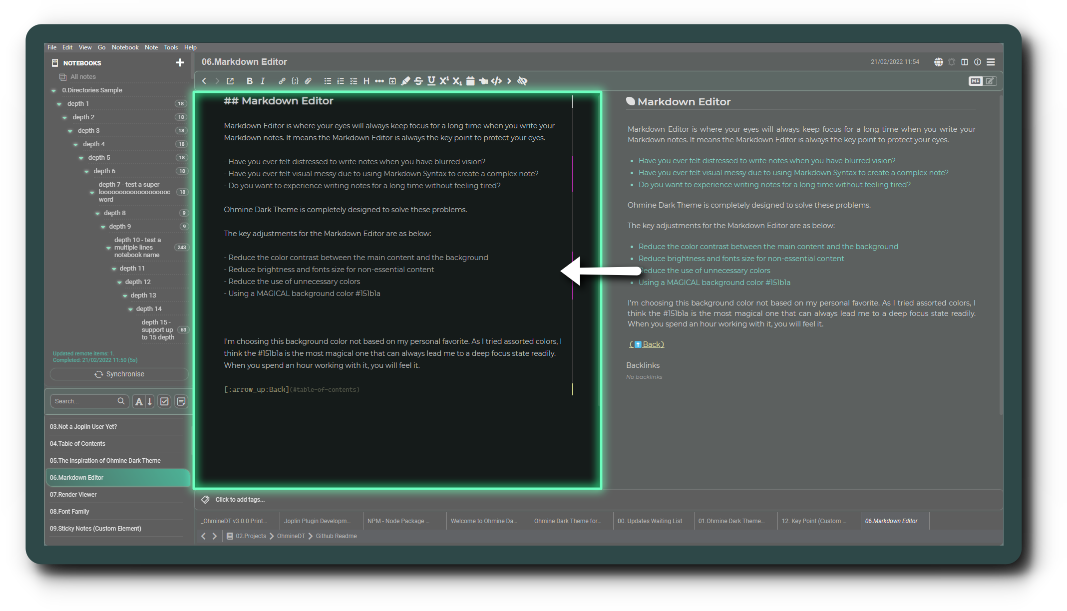
I'm choosing this background color not based on my personal favorite. As I tried assorted colors, I think the #151b1a is the most magical one that can always lead me to a deep focus state readily. When you spend an hour working with it, you will feel it.
Render Viewer is the place where you often want to quickly find out the correct information. It' means the Render Viewer needs a great content separating structure to let you identify the key information easily.
The key adjustments for the Render Viewer are as below:
- Use soft colors to differentiate content
- Clear separation of content
- Stand out the key information
- Avoid bright colors when scrolling down to read content

Ohmine dark theme is using the below font family for both Markdown Editor and Render Viewer:
- Montserrat
- Chiron Sans HK Pro (for Simplified & Traditional Chinese 簡、繁體中文)
- Avenir (Joplin default)
- Arial (Joplin default)
- Sans-Serif (Joplin default)
Montserrat is mostly recommended for this theme. When I've tested over 40 fonts with sizes from 12 to 15px, Montserrat is the ultimate champion. It provides the best reading experience with 14px.
Montserrat sample:

Then, the monospace font is used on all Markdown Syntax, such as a Markdown table, Markdown link, etc. You'll also see it in the code block and inline code.
Let's take a look at the monospace font family:
- Cascadia Mono Light
- Monospace (Joplin default)
- Chiron Sans HK Pro (for Simplified & Traditional Chinese 簡、繁體中文)
Cascadia Mono is one of the best monospace fonts. It would be a good choice if you don't need the ligature, and it provides clear symbol characters and works great at the 12px font size.
Cascadia Mono Light sample:

If you didn't install the above recommended fonts on your computer, Joplin will pick the default fonts for you.
Additionally, there are a few setting properties in Tools> Options> Appearance that would be no longer work once you installed this theme:
- Editor font size
- Editor font family
- Editor monospace font family
You should always edit all the font-related settings directly in the CSS files.
Ohmine Dark Theme has 7 custom elements for creating the Sticky Notes: note , tip , question , explain , warning , keyword , important. They can help you build the article structure. Normally, you would be removed them from the content when you have completed your article.
Let’s see what are the Sticky Notes for:
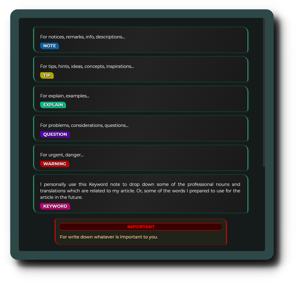
- Make sure there is a blank line before the open tag, otherwise it may cause the format problem.
- Start typing your content in a new line.
- Use plain text within a custom element.
- Use
ENTERto add a line break. - Do not including any blank line within the Sticky Notes, if you want to adding a blank line please use
<br>.
Code Sample:
<note>
here to type any of your content.
</note>
Output:

Sticky Notes switchers for reference:
| Root Property | Value(ON) | Value(Off) | Description |
|---|---|---|---|
| --switcher-print-sticky-notes-display: | block; | none; | show/hide the sticky notes from the PDF */ |
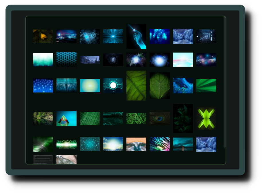
Art Gallery provides 11 custom elements for you to split attached images into columns. It would be helpful if you have many images needed to attach to your note.
Art Gallery has limited the max-height to 60% viewport height by default. Let's see how its work:
| Custom Elements | Force Columns |
|---|---|
| ag2 | 2 |
| ag3 | 3 |
| ag4 | 4 |
| ag5 | 5 |
| ag6 | 6 |
| ag7 | 7 |
| ag8 | 8 |
| ag9 | 9 |
| ag10 | 10 |
| ag11 | 11 |
| ag12 | 12 |
Below is the sample of the art gallery(ag6) with 48 images:
- The custom element name
agstands for Art Gallery. - The art gallery tag must use right behind the plain text .
- Do not including any blank line within this part of the codes, blank line will break the format .
Code Sample:
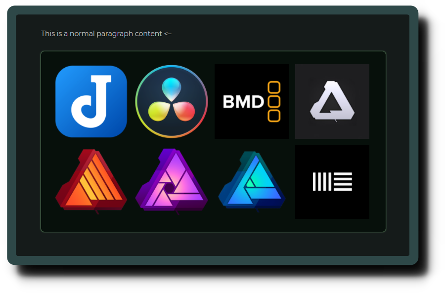
This is a normal paragraph content. <--
<ag4>


</ag4>
Output:
Custom Title Block would be suitable for supplementing information that you think is important to readers. The usage is very similar to a blockquote but come up with a clear heading, it's making a key concept more outstanding.
Let's see what it looks like:

- The custom element name
ctbstands for Custom Title Block. - Type your title next to the open tag .
- Keep your title within one line.
- Start typing your content in the second line.
- Use plain text within a custom element.
- Please mention that within one line means it's according to your panel width.
Code Sample:
<ctb>Here To Type The title
Here to type any of your content
</ctb>
Output:

The custom element Key Point is super useful while you want to split out a paragraph without using the Heading or Strong Text. It also can keeps your mind clear from the sense of overly using the Strong Text or Heading. The usage is very similar to the HTML Description List element.
3 best timing to use the Key Point:
- To keep multiple paragraph of content stay within one heading.
- To explain a part of knowledge that with multiple key points and each one have a paragraph of description.
- To avoiding using Strong Text to create a paragraph. (keep your strong text only appear within a paragraph content.)
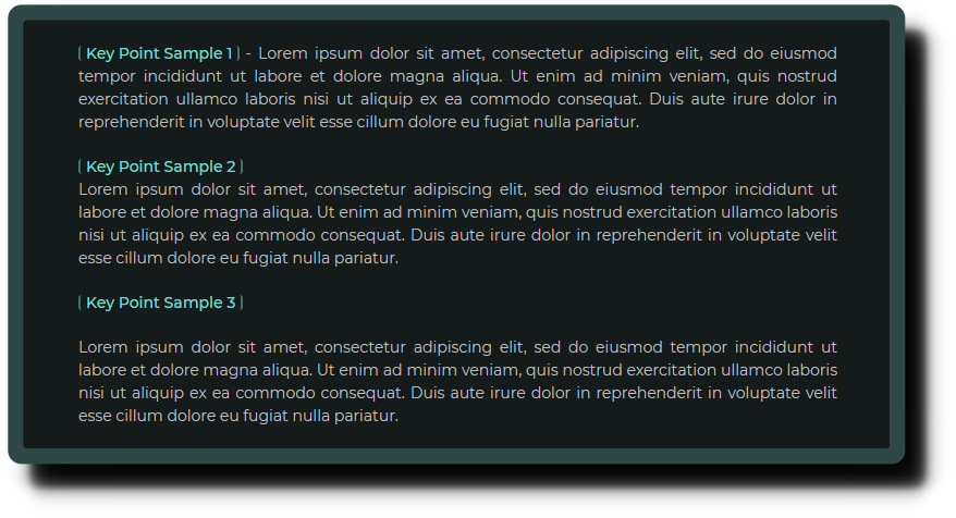
- The custom element name
kpstands for Key Point. - I recommend only use it at the beginning of line.
- It cannot be used within any other block elements such as Custom Title Block, Spoiler Block, Sticky Notes, etc...
Code Sample:
<kp>The Key Point</kp>- with a short description here.

<kp>The Key Point</kp>
With a paragraph of description here. Let the Ket Point on top of the paragraph to keep it more eye-catching from the paragraph.

<kp>The Key Point with multiple paragraphs of description</kp>

When you have a Key Point which is a whole sentence and you need more than one paragraph to describe it, you better to add a blank line between them.

It's make sense right? I hope you would enjoy to use this Key Point feature, and not to use the Strong Text to create a paragraph separation any more!
Output:

Tips: It would be great to wrok together with the Horizontal Line ***.
Abstract Content Bar helps you to identify the elements through the color bar which would be appearing on the right of the Markdown Editor. It will check your text line by line and then tell you what they are:

It would be helpful when you want to release your eyes from the text for sometimes, or when you are going to double-check the missing part of your content.
- The only thing you may need to do is to understand those colors' meanings.
- If there is more than one element in the same line, it would be showing the color depending on their priority.

(bigger number means higher priority)
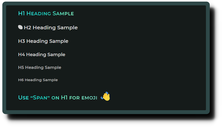
Headings are the most important things to boost your reading mood. Since OhmineDT v3.0.0, you can easily customize the color:, font-size, border of headings. Let's check out what the headings look like:
Heading samples (with border):

Heading samples (without border):
You can quick customize all of the heading's border through the CSS root section, below list out all the heading switchers for reference:
| Root Property | Value(ON) | Value(Off) | Description |
|---|---|---|---|
| --switcher-h1-font-variant: | small-caps; | none; | turn on/off the small-caps effect of h1 heading |
| --switcher-h1-text-fill-color: | transparent; | none; | turn on/off heading gradient color effect |
| --switcher-h1-border-display: | block; | none; | show/hide h1 heading border |
| --switcher-h2-rice-icon-display: | inline-block; | none; | show/hide h2 heading rice icon |
| --switcher-h2-border-display: | block; | none; | show/hide h2 heading border |
| --switcher-h3-border-display: | block; | none; | show/hide h3 heading border |
| --switcher-h4-border-display: | block; | none; | show/hide h4 heading border |
| --switcher-h5-border-width: | 1px; | 0; | show/hide h5 heading border |
| --switcher-h6-border-width: | 1px; | 0; | show/hide h6 heading border |
| --switcher-mde-h1-font-variant: | small-caps; | none; | turn on/off the small-caps effect of h1 heading on Markdown editor |
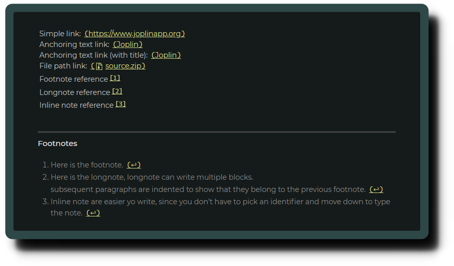
Joplin provides us a great built-in Markdown TOC feature which let you create the TOC by typing a simple command [[toc]] within your notes. OhmineDT has restyle it and made it floating at the bottom left of the Render Viewer.

The Markdown TOC feature is disable by Joplin default. To use the Markdown TOC, you should enable the the extension manually.
Related Switchers:
| Root Property | Value(ON) | Value(Off) | Description |
|---|---|---|---|
| --switcher-markdown-toc-position-left: | 0; | none; | turn on/off to position the markdown TOC button to the left/right |
| --switcher-markdown-toc-link-text-wrap: | normal; | nowrap; | turn on/off the wrap text of the Markdown TOC link text |
All attached images and mermaid charts will default to 20% darker than the original, to avoid bright light flickering your eyes while reading the notes. Hovering over them will restore the original brightness slowly.
Since OhmineDT v3.0.0, the Eye-Protector effect's switcher is split out into two, so you would be allowed to turn one of them on/off.

You can quick customize the eye-protector effects through the CSS root section, below list out all the eye-protector switchers for reference:
| Root Property | Value(ON) | Value(Off) | Description |
|---|---|---|---|
| --switcher-eye-protector-for-images-filter: | brightness(25%); | none; | turn on/off the reduce raw brightness effect on attached image |
| --switcher-eye-protector-for-images-animation: | eye-protector 1.5s forwards 1; | none; | turn on/off the brightness increasing hover effect on attached image |
| --switcher-eye-protector-for-mermaid-filter: | brightness(25%); | none; | turn on/off the reduce raw brightness effect on mermaid chart |
| --switcher-eye-protector-for-mermaid-animation: | eye-protector 1.5s forwards 1; | none; | turn on/off the brightness increasing hover effect on mermaid chart |
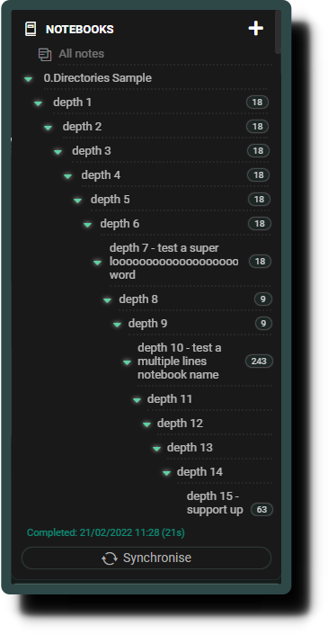
The CSS styling of Ohmine Dark Theme will only support up to 15 levels of subdirectories when Joplin didn't limit it to you. And sure, you can edit my CSS to fit your needs.
Since OhmineDT v3.0.0, you can now using Shift + Scroll to check out the overflow text from notebook panel.
Joplin didn't provide enough CSS classes for styling the special text in Markdown Editor, so the styling of this part is relying on another plugin to get complete. That means you must download and install the plugin named Rich Markdown to get the style works.
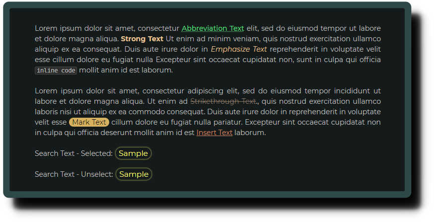
Special Text is including the below:
- Emphasize Text (
*emphasize*) - Strong Text (
**strong**) - Insert Text (
++insert++) - Strikethrough Text (
~~strikethrough~~) - Abbreviation Text (
*[abbreviation]: description) - Mark Text (
==mark==) - Inline Code Text (
`inline code`) - Search Text (Search Results)
- Math Notation Text (
$$math notation$$)
First to see how they look like in the Render Viewer:
And the Math Notation Text on Render Viewer:

Since OhmineDT v3.0.0, the special text styles have changed on the markdown editor. Emphasize, Strong, Insert, Strikethrough, Mark, Abbreviation, they are now all grouped into the same color and using the dotted underline, and more clearly differentiated from the look of the search text.
See how they look like in the Markdown Editor:

Related Switchers:
| Root Property | Value(ON) | Value(Off) | Description |
|---|---|---|---|
| --switcher-link-bracket-display: | inline; | none; | turn on/off the effect of automatically adding the monospace bracket to links |
| --switcher-link-break-word: | break-all; | break word; | turn on/off to set how a line break present on the link text |


OhmineDT has been styling lots of Joplin elements, and all of them are helpful to you. Some of the effects are highly rely on the Joplin built-in settings to get work, so you may need to follow the below guides to get 100% of what OhmineDT brings to you!
OhmineDT needs to run with the Joplin built-in Dark theme. Otherwise, it might cause some of the colors abnormal.
- Open Joplin
- Go to
tools>Options>Appearance>Theme - Choose
Dark - Click
Apply
OhmineDT has styled the Special Text, but some of them didn't turn on by Joplin default, so you should turn them on manually.
-
Open Joplin
-
Go to
tools>Options>Markdown -
Enable all of the below:
Enable math expressions (wysiwyg: yes)Enable Mermaid diagrams support (wysiwyg: yes)Enable ==mark== syntax (wysiwyg: yes)Enable footnotes (wysiwyg: no)Enable table of contents extension (wysiwyg: no)Enable ~sub~ syntax (wysiwyg: yes)Enable ^sup^ syntax (wysiwyg: yes)Enable abbreviation syntax (wysiwyg: no)Enable ++insert++ syntax (wysiwyg: yes)
-
Click
Apply
OhmineDT can be styling everything on the Joplin UI but not within the plugins, so if you want your plugin's background color to match with OhmineDT, you should set it manually.
- Open Joplin
- Go to
tools>Options>Plugins> Whatever plugins that let you change the background color - Set the plugin background-color value to
#191919 - Click
Apply
OhmineDT has spent almost a week searching and testing fonts before public release. Everything I test on this theme are based on these fonts, so I honestly recommend you use the fonts below:
- Montserrat - It's for the Non-Monospace font family
- Cascadia Mono - It's for the Monospace font family
- Chiron Sans HK Pro - for both Traditional and Simplified Chinese
They are all included in the repository package. You can download it by clicking code > Download ZIP, but you may need to install them to your computer manually.
Or, In case you want to download it directly from the official page:
- Google Fonts: Montserrat
- Github Repository/Microsoft/Cascadia-Code: Cascadia Mono
- Github Repository/chiron-fonts: Chiron Sans HK Pro
OhmineDT has additional CSS codes that are written for some useful plugins. So, I would recommend you download the below plugins!
To quickly install and setting all the plugins, please follow the below one-flow steps:
- Open Joplin
- Go to
tools>Options>Plugins - Search the plugin by inputting the word
rich - Click
Installon theRich Markdown - Search the word
html - Click
installtheQuick HTML Tags - Search the word
color - Click
installtheMarkdown Table: Colorize - Search the word
spoiler - Click
installtheSpoiler - Search the word
turn - Click
installon theTurnToChart - Quit and restart Joplin
- Go to
Tools,Options,Rich Markdown - Enable the
Add additional CSS classes for enhanced customization - Click
Apply - Copy this line of text:
kp;span;ctb;ag;note;tip;explain;question;keyword;important; - Go to
Tools>Options>Quick HTML Tags - Go to
HTML predefined tags - Paste the text into the input bar
- Click
OK
Then, you can still check out below to know more about how those plugins work with OhmineDT.
This plugin has provided several great features. OhmineDT is relying on this plugin to style the Special Text and Abstract Content Bar because Joplin didn't give the CSS classes to specify those elements. So, it might cause some styles missing from OhmineDT while you didn't install this plugin, or you didn't enable the settings.
Quick setting up:
- Open Joplin
- Go to
tools>Options>Plugins - Search the plugin by inputting the word
rich - Click
Installon theRich Markdown - Quit & restart Joplin app
- Go to
Tools,Options,Rich Markdown - Enable the
Add additional CSS classes for enhanced customization - Press
OKit's done!
This plugin provides you with a quick and easy way to create HTML tags in your notes, and it's helpful to create the custom elements of OhmineDT.
Quick setting up:
- Copy this line of text:
kp;span;ctb;ag;note;tip;explain;question;keyword;important; - Open Joplin
- Go to
Tools>Options>Plugins - Search plugin by input the word
html - Click
Installwhich on theQuick HTML Tagsplugin - Quit & restart Joplin app
- Go to
Tools>Options>Quick HTML Tags - Go to
HTML predefined tags - Paste the text in the input bar
- Press
Okit's done!
After this, you can use this plugin like below:
- Whenever you want to use an HTML tag just press
ctrl + h - Then, press the
Downkey on your keyboard to find the right tag - Press the
Enterkey. It's done!
Please mention that the <ag> is not a complete custom element name. You should add a number on it every time, such as <ag4>, <ag8> etc... Art Gallery lets you create 2 to 12 columns for images, so each time you create an ag tag with the Quick HTML Tags plugin, just don't forget to give it a number.
This plugin adds colors to Joplin markdown table syntax so you can quickly identify what column the content belongs to.
Sometimes, Markdown table syntax can be very messy when too much information is within the table. Thanks to the Markdown Table Colorize plugin, OhmineDT can create a better style for the markdown table now!
After installing the Markdown Table Colorize plugin and OhmineDT, you will see the markdown table syntax looks like below:

- Separating table rows into independent sections
- Use colored letters as a column mark
- Support up to 20 columns
Use Tips:
I would like to share the steps of how I create a markdown table. And these steps are perfect for use with this plugin style.
First to create the table structure:
||||||
||||||
||||||
Then, add the format to it:
||||||
|-|-|-|-|-|
||||||
Last, add content to it:
|TH|TH|TH|TH|TH|
|-|-|-|-|-|
|TD|TD|TD|TD|TD|
Quick setting up:
- Open Joplin
- Go to
tools>Options>Plugins - Search the plugin by inputting the word
color - Click
Installon theMarkdown Table: Colorize - Quit & restart Joplin app
This plugin allows you to create inline spoilers and spoiler blocks with title and extendable body. And the below shows what Spoiler looks like in OhmineDT:
Let's take a look to the spoiler block:

In addition, OhmineDT has been created 4 more custom styles that you can use within the Spoiler block for advanced usage:
- Spoiler Block > Span
- Spoiler Block > List
- Spoiler Block > List > Span
- Spoiler Block > Custom Title Block

- Open Joplin
- Go to
tools>Options>Plugins - Search the plugin by inputting the word
spoiler - Click
Installwhich is on theSpoiler - Quit & restart Joplin app
OhmineDT provides some of the features that function by Custom Elements. I recommend you use it to create a better reading experience, but first, you have to consider the below:
- Not all Markdown editor software support using Custom Elements.
- Custom Elements content will become plain text format when you export your notes to
.mdfile or transfer your notes to other software. - Even if other note-taking software is supported using Custom Element you may need to copy the related codes to that software manually.
So, if you are only taking notes within Joplin, you don't have to worry about that. Otherwise, you should consider which notes you should use Custom Elements and which don't.
Here are a few things you should know before you Print or Export a note to PDF :
- There are some "Switcher" within the
rootsection ofuserstyle.css, and they help you quickly define what should show on the PDF:
| Root Property | Value(ON) | Value(OFF) | Description |
|---|---|---|---|
| --switcher-print-note-title-display: | block; | none; | show/hide the notebook title |
| --switcher-print-sticky-notes-display: | block; | none; | show/hide the sticky notes |
| --switcher-print-h1-border-display: | block; | none; | show/hide the h1 heading border |
| --switcher-print-link-href-display: | inline; | none; | show/hide the link href after the link text |
| --switcher-print-markdown-toc-display: | block; | none; | show/hide the markdown toc |
- Art Gallery and Code Block are default to releasing the overflow limit, and listing out all the content.
- Various elements are standalone restyled for print/export PDF.
- By Joplin default, you can't select and copy the text if you are using the
printto create a PDF file. If you expect to create a PDF file that allows you to do it, please use theexport. - By the Spoiler plugin default, Spoiler Block will only appear normal when you use
export. - By the Spoiler plugin default, Inline Spoiler will not show the text.
- By the TurnToChart plugin default, the chart will only appear normal when you use
export.
Export PDF Sample: export_pdf_v3.1.28 (26-FEB-2022)
Export HTML Sample: export_html file_v3.1.28 (26-FEB-2022)
This is a quick guide for CSS beginners, please mention that this is only guiding you to edit OhmineDT and not a complete CSS tutorial.
OhmineDT put all the hot properties within the :root section, you might find them at the top of the source code on both userstyle.css and userchrome.css documents. Before you try to customize it, you may need to understand some basic concepts of CSS below:
- Property - This is a name that tells you what is the property for.
- Value - Every property should have a value to get it to work.
- Comments - Used to explain the code, and may help when you edit the source code at a later date.
When you see the property name start with two hyphens in the :root section, that is a root property name (or variable name), for example:
--h1-font-size:--h1-text-color:
Right behind a root property, you may see a value, for example:
14px;#bdbdbd;
When combining the property and value, we call that a "declaration", for example:
--h1-font-size: 14px;--h1-text-color: #bdbdbd;
When you see the text starts with /* and ends with */, we call it a comment, for example:
/* This is a font size setting for h1 heading *//* This is the color value of h1 heading */
And combining all together, that's all you will see within the :root section, for example:
--h1-font-size: 14px; /* This is a font size setting for h1 heading */--h1-text-color: #bdbdbd; /* This is the color value of h1 heading */
And the comments are always describe the declaration which is under or in front of it , for example:
:root {
	/* headings -------------------------------------------- */
	--h1-font-size: 14px; /* This is a font size setting for h1 heading */
	--h1-text-color: #bdbdbd; /* This is the color value of h1 heading */

	/* paragraph ------------------------------------------- */
	--paragraph-text-color: #bdbdbd;
}
Additionally, you may see a declaration like below:
--h3-border-color: var(--h2-border-color);
It means the --h3-border-color is equal to --h2-border-color.
Finally, when you are going to customize this theme, all you have to do is to give the property a right value. And due to that, you have to learn about how to do this.
There are two kinds of values you may use in the OhmineDT:
SIZE:
CSS is providing many different units of size values, but here you might only use the below serval units to customize OhmintDT:
| Size Units | Description |
|---|---|
| px | pixels |
| em | Relative to the font-size of the element (2em means 2 times the size of the current font) |
| % | Relative to the parent element |
| vh | Relative to 1% of the height of the viewport(depends on the browser window size) |
| vw | Relative to 1% of the width of the viewport(depends on the browser window size) |
For reference, you can go to visit this page: CSS units
COLOR:
CSS also provides many color values, but you may just learn the HEX Color Code and Gradient Color is enough to customize OhmineDT. For reference, you can go to visit this page: HEX Color & Gradient Color
Overall, when you are customizing the color, then give it the right color value; when you are customizing the size, then give a size value etc... Let's open the CSS file, read the comments, and then edit it, It's that easy!
- Open Joplin
- Go to
Tools>Options>Appearance - Click
Show Advance Settings - Click
Custom Stylesheet for Rendered Markdownto open theuserstyle.css - Click
Custom Stylesheet for Joplin-Wide App Stylesto open theuserchrome.css
P.S. After edit the CSS document, you should quit & restart Joplin.
 Joplin is the best note-taking app in the market if you are looking for the below advantages:
- Free & Opensource
- Multiple text editors (Rich Text and Markdown)
- End-To-End Encryption to secure your notes
- Cross platforms app that available on Windows, macOS, Linux, Android, iOS, and terminal.
- Synchronizing with various services, including Joplin Cloud, Dropbox, OneDrive, Next cloud...
- Take screenshots and save web pages as note with a Web Clipper browser extension.
- Customize the app with your own scripts and plugins using the Extension API.
- Or... You love the Ohmine Dark Theme 😎❤️
- And much more...
It can be covering all your needs in note-taking! Especially the privacy protection!
Visit Joplin Homepage for more details.
- Open Joplin
- Go to
tools>Options>Appearance>Theme - Choose
Dark - Click
Apply - In the same page, click
Show Advanced Settings - Click
Custom stylesheet for rendered Markdown, it will open auserstyle.css - Copy my
userstyle.csscodes on this page: https://github.com/Nacandev/Ohmine-Dark-Theme-For-Joplin/blob/main/userstyle.css - Paste my codes on your
userstyle.css - Back to the
Appearancepage again - Click
Custom stylesheet for Joplin-wide app styles. it will open auserchrome.css - Copy my
userchrome.csscodes on this page: https://github.com/Nacandev/Ohmine-Dark-Theme-For-Joplin/blob/main/userchrome.css - Paste on your
userchrome.css - Quit & restart Joplin and it's done.
- Go to
Tools>Options>Appearance - Click
Show Advanced Settings - Click
Custom stylesheet for rendered Markdown, it will open auserstyle.css - Click
Custom stylesheet for Joplin-wide app styles. it will open auserchrome.css - Delete all the related codes within these two documents.
- It's done! but I'm hurt!
- Go to
Tools>Options>Plugins - Search a plugin name
- Click
Install - After installing all you need, quit & restart Joplin app
If you want to discover all of the Joplin plugins, you can go visit the Joplin Plugins Repository
The answer is "DEFINITELY YES!" And the OhmineDT v3.0.0 updates is the first step to doing this.
Whatever you like this theme or not, I'll open my mind to accept any of your comments and treat your feeling as mine. It would be my pleasure if I could get any feedback from you! Go to leave me a message on Joplin Forum or Github Discussions
If you experiencing any bugs or bad issues while using this theme, please create a bug report on issues page and let me know it.

 React
React
 Typescript
 Django
 Laravel
 Facebook
 Microsoft
 Google
 Alibaba
 D3
D3
 Tencent