Giter Club home page Giter Club logo

wcag21's Introduction

wcag21

WCAG 2.1 was published as a W3C Recommendation June 2018.

This repository was used to develop content for WCAG 2.1, as well as associated understanding documents and techniques. It is no longer in use and this repository is merely an archive.

Work on new versions of WCAG, as well as support material for all versions of WCAG, now takes place in the wcag repository.

wcag21's People

Contributors

alastc avatar allanj-uaag avatar awkawk avatar cwadamsoforacle avatar davidmacdonald avatar detlevhfischer avatar goodwitch avatar greg-lowney avatar j9t avatar jake-abma avatar jkshapiro avatar jmcsorle avatar joshueoconnor avatar kimpatch avatar kwahlbin avatar lauracarlson avatar lseeman avatar marcjohlic avatar mbgower avatar patrickhlauke avatar shawna-slh avatar steverep avatar wayneedick avatar

Stargazers

 avatar  avatar  avatar  avatar  avatar  avatar  avatar  avatar  avatar  avatar  avatar  avatar  avatar  avatar  avatar  avatar  avatar  avatar  avatar  avatar  avatar  avatar  avatar  avatar  avatar  avatar  avatar  avatar  avatar  avatar  avatar  avatar  avatar  avatar  avatar  avatar  avatar  avatar  avatar  avatar  avatar  avatar  avatar  avatar  avatar  avatar  avatar  avatar  avatar  avatar  avatar  avatar  avatar  avatar  avatar  avatar  avatar  avatar  avatar  avatar  avatar  avatar  avatar  avatar  avatar  avatar  avatar  avatar  avatar  avatar  avatar  avatar  avatar  avatar  avatar  avatar  avatar  avatar  avatar  avatar  avatar  avatar  avatar  avatar  avatar  avatar  avatar  avatar  avatar  avatar  avatar  avatar  avatar  avatar  avatar  avatar  avatar  avatar  avatar  avatar

Watchers

 avatar  avatar  avatar  avatar  avatar  avatar  avatar  avatar  avatar  avatar  avatar  avatar  avatar  avatar  avatar  avatar  avatar  avatar  avatar  avatar  avatar  avatar  avatar  avatar  avatar  avatar  avatar  avatar  avatar  avatar  avatar  avatar  avatar  avatar  avatar  avatar  avatar  avatar  avatar  avatar  avatar  avatar  avatar  avatar  avatar  avatar  avatar  avatar  avatar  avatar  avatar  avatar  avatar  avatar  avatar  avatar  avatar  avatar  avatar  avatar  avatar  avatar  avatar  avatar  avatar  avatar  avatar  avatar  avatar  avatar  avatar  avatar  avatar  avatar  avatar  avatar  avatar  avatar  avatar  avatar  avatar  avatar  avatar  avatar  avatar  avatar  avatar  avatar

wcag21's Issues

Extra help

Extra Help

SC Shortname: Extra Help

SC Text

Extra Help: Provide easily available beginner's help or human help for critical services

Suggestion for Priority Level


AA


Related Glossary additions or changes

beginner's help: Help that:

  • does not assume people are familiar with the Internet
  • does not assume people use other Internet services such as email or social media
  • does not use Internet jargon
  • explains the use of any design patterns other than standard HTML controls of underlined links, buttons and text boxes.
  • uses symbols at the beginning of most paragraphs and headings
  • gives detailed instructions on how to complete critical tasks

easily available (or easily available mode or setting), one or more of the follwing is true:

  • can be set one time with as wide a scope as possible (such as using the standards of the OS, ETSI or GPII when available)
  • has the option to save or to change the setting, where available interoperably, but also for the scope of the set of web pages
  • is reachable from each screen where it may be needed and the path and the control conforms to all of this document.

critical services that are needed to prevent significant harm, risk or loss such as: significant financial loss, illness, injury or deterioration in a patient's condition or effective loss of rights or freedoms.


What Principle and Guideline the SC falls within.


Principle 3, Help users avoid and correct mistakes. Guideline 3.3 “Input Assistance”


Description

It is hard to find a user interface design that is obvious to all users. Human help or beginners help gives flexibility and support to people who are struggling with the interface.

Beginner's help is useful for people who are new to using the Internet or for people who learn slowly or have an impaired memory and therefore do not remember terms and design.

Help content enables a user to conveniently access information needed to understand how to use the website effectively. Users who need help are usually already confused so help content should be clear and simple.

Human help includes:

  • Live help option. Note: It must be easy and clear to close the window.
  • A phone number that will automatically call via an interoperable Voice over IP specification.
  • A simple contact us form.
  • Use available standards to get human help such as using the 0 digit on voice menu systems.

Benefits

This Success Criterion enables users to:

  • access quick answers to users' questions
  • easily get human help

Related Resources (optional)

Resources are for information purposes only, no endorsement implied.

Testability


This Success Criterion can be tested manually.

Test Procedure

  1. Identify if this is a critical service according to the definition
  2. If this is a critical service, confirm that there is one of the following:
    • beginners help
    • human help
Expected Results: Passes checks 1 and 2

Techniques

  • Providing a live help option. Note: It must be easy and clear to close the live help session.
  • Providing a phone number that will automatically call via an interoperable Voice over IP specification. This will be initiated by the user via a link similar to an embedded (Skype) number so that the user is in effect calling the support.
  • Providing a simple contact us form.
  • Using available standards to get human help such as using the 0 digit on voice menu systems.
  • Using COGA semantics to enable extra help on standards controls
  • Using COGA semantics to enable symbols
  • Adding icons and graphics.
  • Advisory: providing both human help and beginner's help
  • Advisory: providing beginner's help for non-critical content
  • Advisory: providing human help for non-critical content

Working groups notes (optional)

Critical features

SC Text: Critical features

Critical features and important information are above the fold and are accentuated in the main modality of the content.

Suggestion for Priority Level (A/AA/AAA)

Related Glossary additions or changes

critical features
features that are required to complete the main role or tasks of the user interface
main modality of the content
modalities considered in the design of the content
above the fold
positioned in the upper part of a web page and so visible without scrolling down the page in the main modality of the content.

What Principle and Guideline the SC falls within.

Under principle 2, Operable

2.4 Provide ways to help users navigate, find content, and determine where they are.

Or

Under principle 3 Understandable

3.2 Make Web pages appear and operate in predictable ways,

Or

Under principle 3 Understandable

3.3 Help users avoid and correct mistakes.

Description

The intent of this Success Criterion is that users who do not remember to use the scroll will be able to use critical features.

When the main features are under the fold, these users will be unable to complete the main task. Therefore, designers should either have critical features above the fold or have a clearly labeled mechanism to help users find critical feature (such as a menu button).

This can also be achieved via personalization.

For example , in an application for drafting an email, the send button is a critical feature without which the application has no use. The author must put any critical features, such as send, above the fold.

See the section on testability for additional clarity.

Benefits

People with low executive function, impaired memory, and other cognitive and learning disabilities may not be able to find features that are under the fold and that require the use of the scroll bar.

Many users are happy with important features being "discoverable" where they have to figure out or learn how to use them. The interface becomes a problem to solve. However people with some cognitive and learning disabilities may lack the executive function to figure this out, and people with impaired memory may not remember to use the scroll as a mechanism for finding content.

See also

Testability

Testing requires three parts:

Part one: Identify critical features

Part two: Confirm that they are above the fold in the main modality of the content.

Part three: Confirm that they are accentuated in the main modality of the content.

Step 1 Identify critical feature

Identify the main role or tasks of the page, such as:

  • sending an email
  • finding out how to contact us
  • finding out what we do

Note that the main role is usually identified in the page title

Perform a dry run of the task. Review the steps involved. Identify what information needs to be read or what events need to be activated for each step and/or the main task. These are the critical features.

For example:

  • If the main role is sending an email, drafting and sending an email are critical features
  • If the main role is finding out how to contact us, then access to the contact information is the critical feature

Step 2: Confirm they are above the fold

Load the page in the main modalities of the content, such as a laptop and mobile device. Confirm critical features are viewable, or a clearly labeled mechanism is available to reach them (see sufficient techniques).

Step 3: Confirm that they are accentuated in the main modality of the content.

  • Identify the main modality of the content (such as a visual screen)
  • Confirm that a sufficient technique has been used to accentuate them OR
  • Confirm with a focus group that 9 out of 10 users will consider them accentuated.

Note: We may need to define semantics in the header, accessibility conformance statement or other mechanism for declaring the main modality.

Techniques

Sufficient techniques for "Critical features are above the fold"

  • Critical features are above the fold
  • Providing a clear mechanisism to reach critical features above the fold, such as a clear link
  • Using coga-simplification semantics and personalization to identify, position, and accentuate features

Sufficient techniques such that critical features are accentuated

  • Critical features and important information to the user are visually differentiated and accentuated
  • Critical features appear before the other main content
  • Using coga-simplification semantics and personalization to identify, position, and accentuate features
  • Auditory emphasis using a slightly louder content, a change in the pitch, or a change in the voice

working groups notes (optional)

Narrowing failures of 4.1.1 duplicate id's

I think there is a fair amount of agreement that many identical id circumstances don't affect accessibility. For WCAG next do we want to limit that failure to circumstances where the id is referenced by something that shows up in the Accessible API, such as aria references, and HTML labels etc.

Extra symbols

Current versions of SC and Definitions

Extra Symbols

SC Text

A mechanism is available such that controls that are used to reach, or are part of, a critical service, and each instruction that contains important information that directly relates to a critical service, is preceded by a symbol or picture, which relates to the topic of the control or instruction.

Suggestion for Priority Level

AA

Note

It is a bit controversial to say that people with Aphasia, etc. are not in an intended audience. However, when we remove the intended audience clause this seems to become a AAA conformance criterion, which is more problematic. We are open to other alternatives.

Related Glossary additions or changes

Important information: information the user may need to complete any action or task including an offline task, or related to safety, risks, privacy, health or opportunities

What Principle and Guideline the SC falls within.

Principle 3, 3.1 Make text content readable and understandable.

Description

Symbols are added at the beginning of short sentences and phrases to aid understanding. However, as some people have difficulty remembering symbols, use text with the symbol.

  • Use clear symbols that can easily be seen and expanded
  • Use images understood by different users
  • In left-to-right languages, place the image to the left of the text

We are also drafting semantics that will add symbols that are easy to use by the individual user.

See widget and easy read for some good examples.

Examples of content and features where the intended audience includes people who may require the use of symbols, use augmentative/alternative communication systems, have expressive and receptive written language difficulties or have intellectual disabilities, include:

  • All important tasks in critical services such as making a doctor's appointment
  • Navigation to important tasks in critical services, such as making a doctor's appointment
  • Paying for utility bills, such as paying a water bill
  • Critical government information sites
  • Any content that is intended for a wide audience.

It should be noted that to conform to the principle of personalization (SC 6), symbols and graphics must be:

  • Interoperable so that when possible, symbols can be replaced by symbols that are familiar to the user.
  • Default setting should allow for the number of symbols shown to be reduced, such as only showing symbols by headings, controls and links. This reduces the clutter for non-symbol users.

If these conditions are not explicit in the personalization requirement, it should be added to this success criteria.

Note that graphics should be clear and make it easy to identify what is going on. This topic and why the use of symbols must support personalization and interoperability is discussed at Symbols for Non-Verbal.

Benefits

The benefit of this Success Criterion to people who find reading or language difficult cannot be underestimated. This population may include people who have developmental delays or acquired or progressive brain damage. For example, a person with severe aphasia, where they have the intellectual ability to understand concepts, but cannot express those concepts, read text or write the word needed in a search field, is dependent on the use of symbols to browse pages for information.

The user needs are more fully described in the issue paper Symbols for Non-Verbal and User needs Table.

Related Resources (optional)

Resources are for information purposes only, no endorsement implied.

Testability

This Success Criterion can be tested manually by inspection.

Techniques

  • Adding icons and graphics.
  • Using COGA semantics for interoperable icons and concepts
  • Using semantics to add symbols to sections that help the user identify key content including:
    • types of contact information
    • types of help
    • types of functions
    • warnings
    • key points
    • errors
    • system messages
    • notes
    • definitions
    • more information
    • tables of content and site maps
    • file types
    • search
    • required information
    • errors
    • opinions
    • essential information
    • types of transactions and types of reminders
    • instructions and status of an element
    • invalid fields
    • non-native
    • content and sponsored content are clearly marked and visually differentiated by standardized techniques

New SC Proposal: Programmatic notification is provided for each change in content that indicates an action was taken or that conveys information

Current versions of SC and Definitions

SC Short Name

Change of content

SC Text

Programmatic notification is provided for each change in page content unless one or more of the following is true:

  1. There is a programmatically determinable relationship between the new content and the control that triggers it;
  2. The user has been advised of the behavior before using the control;
  3. The change in content is not a result of a user action and not related to the the primary purpose of the page.

Editor's Note for next draft: "The working group is seeking input to account for situations where there is frequent, or constant updating."

Suggested Priority Level

Level AA

Related Glossary additions or changes

  • Change of content: changes made to a web page after it has been delivered to the user agent, whether or not initiated by the user
  • primary purpose of the page: If removed, the page would loose it's meaning or main reason for existing.

What Principle and Guideline the SC falls within

Principle: Perceivable

3.2

Description (Intent)

This Success Criteria is intended to help users of assistive technology be aware of changes that many users can easily see and understand.
There are a number of cases where content changes on a page after it is loaded. Users who are blind or have low vision that rely on a screen reader may have trouble knowing that information on a page changed. They may be working on the part of the page which is not near where changes have occurred on a page. It may be on a part of the web page that they have already read and wouldn't consider reviewing that part of the page for unannounced changes.

These messages would be very short in nature, such as:

  • "Your shopping cart has been updated, 5 items"
  • "Your form was successfully submitted."
  • "There are 5 results for your search"
  • "There are 3 errors on this form"
  • "Scores updated"
  • "content loading" (when a busy indicator is onscreen)

Examples of situations where this type of notification would be appropriate include:

  • Interactive controls may change the page based on a users selection
  • Filter / sort selections of data already displayed on page add/remove content
  • Additions and subtractions to/from a cart
  • A notification that 'support by chat' is available for this task at hand, or
  • Results of form submission when they are displayed on same page
  • A global error message placed above the form saying "form submission failed etc." or a thank you message after completion of a multi-step process,
  • On switching from grid view to list view,
  • In data table when sort column is changed,
  • On selecting a different pagination link
  • When a graphical spinning "busy" signal notifies visual users.

Dynamic changes to a page sometimes cause the page to become inactive for a period of time while it is being updated. Users of assistive technology may think the page has crashed and may loose their work if they either reload the page or leave the page thinking the browser crashed. This notification will ensure they are aware that something is happening in the background, the way that sighted users are aware when they see a spinning icon or the words "loading". If there is no such visual indication there is no requirement in the Success Criterion to provide programmatic notification, only when there is a visual notification, is there a requirement to make that notification also programmatic. This is not about the initial wait to load a new page. Those are announced to screen readers.

Note: SC 4.1.2 covers notification of changes in content that are a result of a change in the state of a control, such as selecting a new Tab in a tabbed interface, opening and closing a menu, clicking a link or button that opens up a dialog or tooltip. The text of 4.1.2 is "... states, properties, and values that can be set by the user can be programmatically set; and notification of changes to these items is available to user agents, including assistive technologies."

Specific Benefits of Success Criterion

Users of assistive technology will know what changed on the page, and will be able to make decisions based on that information.

Benefits

  • Users who are blind will know if a shopping cart was successfully updated, or if form was successfully submitted, or if there were errors on their form.
  • Helps people with visual disabilities, cognitive limitations, and motor impairments by reducing the chance that a control will be accidentally activated or action will occur unexpectedly.
  • Individuals who are unable to detect changes on the page will be able to know what people who can see those changes know.

Justification and Evidence

This issue is currently a best practice recommended by most WCAG evaluators, and most evaluators have come across situations where a screen reader user became confused because something changed on the page that they were unaware of. There is a long thread on the mail archives which started here: https://lists.w3.org/Archives/Public/w3c-wai-gl/2016AprJun/0808.html. The current wording is a result of those discussions and has good momentum from working group members on the list.

There was an issue which filed against WCAG for WCAG next. See Issue 12 here https://www.w3.org/WAI/GL/wiki/Post_WCAG_2_Issues_Sorted

Testability

This can be tested programmatically or functionally. In the code, identify elements that show/hide content etc, and ensure they have programming that exposes the user to notifications about this new data. Functionally, a screen reader can be run while the page is updating to determine changes to the page are announced to the user.

Related Resources

This is also in the Pearson guideline 5 http://wps.pearsoned.com/accessibility/115/29601/7577872.cw/index.html

COGA has a similar notification SC which is a little wider currently. https://rawgit.com/w3c/coga/master/extension/rapid-and-direct-feedback.html

Techniques

  • Using aria-live to notify a user of changes in content

possible narrowing of scope to user initiated changes

Editor note: we are seeking input about whether to limit this success criteria to user initiated changes by inserting the word "user initiated" before the word "change" and removing the last bullet.Editor note: we are seeking input about whether to limit this success criteria to user initiated changes by inserting the word "user initiated" before the word "change" and removing the last bullet.

Size (all content) (LV)

SC Shortname

Size (all content)

SC Text

Users can change the size of all content.

Current:

None

Proposed:

Add the following bullet to 1.4.8 Visual Presentation:

Users can change the size of all content.

Suggested Priority Level

Level A

Related Glossary additions or changes

None.

What Principle and Guideline the SC falls within.

Principle 1, Guideline 1.4.8 Visual Presentation

Description

Zoom functions preserve all spatial relationships on the page and all functionality continues to be available.

Simply put: a person can make everything bigger or smaller as needed.

Benefits

Some people need to increase the size of all interface content in order to perceive information. Although increasing size is most common, some people with tunnel vision and good visual acuity may prefer to decrease the size so they can see more information at a time.

Source: Accessibility Requirements for People with Low Vision, Section 3.3.5: Size of All Content

Testability

  1. Display content in a user agent.
  2. Increase zoom to the maximum.
  3. Decrease zoom to the minimum.
  4. Check whether all content scales and is perceivable with no loss of content or functionality (e.g. boxes do not overlap, controls are not obscured or separated from their labels, etc.).

Expected Results

  • Check #4 is true.

Techniques

All existing techniques for Proposed New SC: "Size (all content)"

  1. G146: Using liquid layout and AND using measurements that are relative to other measurements in the content by using one or more of the following techniques:
  2. G206: Providing options within the content to switch to a layout that does not require the user to scroll horizontally to read a line of text

New Techniques

  1. Using fluid grids. Ref: fluid grids
  2. Using em based media queries. Ref: em based media queries
  3. Using responsive images. Ref: HTML picture element and srcset attribute
  4. @@ Consider a failure technique on fixed sized containers and fixed position content??
  5. @@ Consider a failure technique on "Interfering with a user agent's ability to zoom" i.e., author using: maximum-scale or minimum-scale or user-scalable=no or user-scalable=0 in the meta element ?? @@ Note: In Pinch zoom thread on the WCAG list people did not seem to be in favor of this as a failure.

Related Information

Actions

Articles

Zoom Articles

Responsive Images Articles

Email

GitHub

Minutes

Tools

Wiki Pages

Change on request

##Current versions of SC and Definitions

Change on Request

Current:

3.2.5 Change on Request: Changes of context are initiated only by user request or a mechanism is available to turn off such changes. (Level AAA)

Proposed:

@@3.2.5 Change on Request: Changes of context, functionality, settings, route and orientation are initiated only by user request or an easily available mechanism is available to turn off such changes. An easily available mechanism is also available to go to previous context, functionality, settings, route and orientation. Exception: The changes are part of an activity where it is essential (e.g. a game)@@

Suggestion for Priority Level:

AA

Related Glossary

route: Directions and flow such as a GPS route

orientation: perspective or view such as map direction

easily available (or easily available mode or setting): one or more of the follwing is true:

  • can be set one time with as a wide a scope as possible (such as using the standards of the OS, From ISO 9241-112 or GPII when available);
  • with the option to save or to change the setting, were available interoperably, but also for the scope of the set of web pages;
  • is reachable from each screen where it may be needed, and the path and the control conforms to all of this document.
  • can be set one time with as wide a scope as possible (such as using the standards of the OS, ETSI or GPII when available); and
  • with the option to save or to change the setting, were available interoperably, but also for the scope of the set of Web pages; and
  • is reachable from each screen where it may be needed, and the path and the control conforms to all of the document.

What Principle and Guideline the SC falls within.

Principle 3, Guideline 3.2 - Predictable
Update to 3.2.5

Description

Any content, settings or functionality which changes unexpectedly, without user initiation can result in significant barriers for users with cognitive disabilities. Unexpected changes in any of these areas can result in loss of focus, anxiety, or confusion in understanding or using a user interface. Examples include but are not limited to:

  • Automatic launching of new windows or pop-ups
  • Submission of forms through mechanisms other than a button that is clearly labeled using simple language to submit the form
  • Rerouting automatically by a GPS
  • Changing the direction of a map in a GPS

For example, a user may not have a sense of direction or know their left and right. Before using a GPS they may study the route so that they know approximately what they are doing and can augment the directions of the GPS with their own context, using the GPS for cues. The GPS automatically reroutes them because of a small traffic delay. They become completely lost and disorientated and can no longer use the application.

Benefits

This Success Criterion give users with cognitive disabilities more control over how Websites and applications behave and display information giving them the opportunity to make choices that enable them to use the content and complete the task.

Initiating changes only when requested by a user is particularly helpful for:

  • Focus and attention related disabilities
  • Users with weak orientation
  • Users with low executive function
  • Memory related disabilities
  • Users with anxiety disorders

See:

Related Resources

Resources are for information purposes only, no endorsement implied.

Testability

For all content

Step 1: Identify any automatic changes in context, functionality, settings, route and orientation (using a similar way to how we identify changes in context now)

Step 2: Confirm there is an easy way for the user to suppress any changes from step 1

Step 3: Confirm an easy to use mechanism is available to go to the previous context, functionality, settings, route and orientation from Step 1.


Content specific examples

For slide shows, audio or video, confirm that:

  • Content does not autoplay or
  • A mechanism for stopping or pausing is present

For intermittent content updates such as news feeds or embedded social media updates, confirm that:

  • A mechanism for pausing an update is present
  • A roll back is present

Techniques

  • Providing warning for any of the changes in context and allowing the user to prevent the change if required. The warning allows sufficient time for the user to process the warning and react.
  • Providing a "pause" button for sideshows, video and audio
  • Providing a "request update" and "pause update" button for news feeds or embedded social media updates
  • Setting the autoplay attribute on an embedded YouTube video to "0"
  • Using semantics and personalization to control changes
  • Allowing a user to turn off reroutes
  • Allowing a user to turn off changes in orientation

Working groups notes

Interruptions

SC Shortname: Interruptions

SC Text

There is an easily available mechanism to postpone and suppress interruptions and changes in content unless they are initiated by the user or involve an emergency.

Suggestion for Priority Level (A/AA/AAA)

A or AA

Related Glossary additions or changes

current context - as defined in WCAG

easily available (or easily available mode or setting) one or more of the following are true:
  • can be set one time with as wide a scope as possible (such as using the standards of the OS, From ISO 9241-112 or GPII when available)
  • has the option to save or change the setting, where available interoperably, but also for the scope of the set of web pages
  • is reachable from each screen where it may be needed, and the path and the control conforms to all of this document

What Principle and Guideline the SC falls within.

Principle 2 Guideline 2

Description

The intent of this Success Criterion is that people with impaired attention and memory can complete a task. When users are interrupted, they may forget what they are doing and abandon the task. This can happen even when the original task is extremely important. For example, a user is making a doctor's appointment, but interruptions cause the user to forget what they were doing and the critical appointment is not made.

From Etsi “Presented information is free from distractions if the information is presented so that required information will be perceived without other presented information interfering with its perception. Distractions from a user's point of view can result from distracting events and from information overload. Freedom from distraction involves minimizing distractions and avoiding distractions.”

Where a site may generate interruptions and changes of content, the user must be able to easily turn them off to control them, such that:

  1. Interruptions can be easily controlled and turned off
  2. Secondary content (such as special offers or complementary material) can be easily identified, controlled and turned off
  3. No sudden changes occur on the site
  4. Media events can be easily controlled and turned off
  5. Chat can be easily turned off and on again
  6. Non-critical messages can easily be turned off and on again
  7. Where standard techniques exists for the above, they should be used
  8. Further pop-ups and similar distractions must always be easy to close and avoid so that all people can continue their task.

    It is worth noting that the task force is proposing semantics to support an integrated solution. This is a proposal to help people stay focused and productive. It is based on a matrix for distractions at the operating system, browser, or cloud level. Currently people can turn off distractions such as Skype, and Facebook, across different devices, and then may forget to turn them back on. This idea manages all distractions by forming a cross-application and cross-device distraction matrix that manages all distractions in one setting. People and users can be clustered in terms of importance or groups. For example, the CEO and your child's care giver could both be considered critical contacts. So even if they do not feel the message is urgent, they can sometimes disrupt the user anyway. Some family members and important colleagues can be in another group, friends and extended family in a third group, system messages from the compliance system can be a different group again.

    Dimensions in the matrix can include: Groups of contacts, how urgent the contact feels any message is, and the level of interruptions the user can tolerate at any given time or setting. The user can set how to handle any combination of the above for the level of concentration needed at the time. For example, during normal work hours, messages from important colleagues could interrupt the user, but any other messages would get logged and read when the user has time. In another example, the user may be giving a talk and sets the interruption level to critical. Then, only critical messages from key colleagues and family can interrupt (for example, messages that a critical contact feels are critical and urgent). Default systems can include setting work hours. Optionally, distractions such as news websites could also be limited in low distraction times.

    Further pop-ups and similar distractions must always be consistently easy to close and avoid so that all people can continue their task.


Benefits

Distractions can cause people with cognitive disabilities to lose focus on the current action being performed or draw attention away from the primary content and can be difficult for some users to know how to understand, avoid and/or stop them. Drawing the user's attention away from primary content can create a range of issues depending on the user's impairment(s). If a user also has a low short term memory they may forget what task they are doing, and be unable to continue. If a user is consuming content and their attention is drawn away this may impact their ability to consume the primary content or complete an interaction or process. If a user is carrying out a complete multi-step action (such as form filling), being distracted may cause the user to lose context, thread or position in the action or sequence of actions.

Once people have become distracted it can be difficult for them to remember what they were doing. This is especially problematic for people with both low attention and impaired memory such as people with dementia.

Attention is affected for most people with cognitive disabilities, including dementia and ADHD. Other people with disabilities may find it hard to focus with a high-arousal page with moving text and animated images.

This is fully discussed in the Distraction Issue paper

Related Resources (optional)

Resources are for information purposes only, no endorsement implied.

Testability

  • Step 1: Is there content added to or replacing the content in the current context that was not initiated by the user or other interruptions?
  • Step 2: If yes, can the user easily postpone or suppress them, or are they for emergencies only?

Expected results:

  • Step one is negative or
  • Step two is positive

Techniques

  1. Using semantics and personalization to allow a user to turn off distractions
  2. Providing methods to control and turn off media events
  3. Media events can be easily controlled and turned off

Failures

  1. Failure of success criteria 2.2.4 due to secondary content (such as special offers or complementary material) that cannot be easily identified, controlled, and turned off
  2. Failure of success criteria 2.2.4 because sudden changes occur on the site
  3. Failure of success criteria 2.2.4 because media events cannot be easily controlled and turned off
  4. Failure of success criteria 2.2.4 because chat cannot be easily turned off and on again
  5. Failure of success criteria 2.2.4 because non-critical messages interrupt the user

working groups notes (optional)

Safety

Current versions of SC and Definitions

SC Shortname

Safety

SC Text

Do not automatically choose non-typical options that may disadvantage users without their approval, or add mechanisms that are likely to confuse users in a way that may do them harm.

Note that this does not include selling clearly-labeled and identified products known to be harmful, such as cigarettes.

Suggestion for Priority Level

Priority Level A

Related Glossary additions or changes

non-typical options: An option that is typicaly selected by less then 50% of users, in at least one focus group study

harm: Loss of or damage to a person's right, property, or physical or mental well-being. Where it is unclear if something is a damage we consider a test to be that over 80% of random people asked would consider it to be a damage as defined above.

What Principle and Guideline the SC falls within.

Principle 2: Operable.

Current:

Guideline 2.3 "Do not design content in a way that is known to cause seizures."

Proposed:

Guideline 2.3 "Do not create mechanisms that are known to potentially harm a user."

Description

This success criterion prevents people from:

  • Tricking users in a way that specifically targets people with cognitive disabilities; and then
  • Claiming they conform to specifications for accessibility and inclusion.

For example, some commerce sites automatically increment the number of items selected without warning the user. Most users will notice that they have ordered two bicycles, or that the price is double the anticipated price. However, someone with a disability, such as dementia or severe dyscalculia, may be unable to notice the change. Indeed, many of these scams are targeting people who have a cognitive disability, the aging, and new-Internet users.

Having been subject to these tricks, users lose confidence in their ability to perform tasks online. The cumulative effects of this type of behavior is that many users, who need access to commerce, will be the least likely to be able to use it.

This success criterion prevents people from tricking users in a way that specifically targets people with cognitive disabilities; and claiming they are conforming to specifications for accessibility and inclusion.

There are also other ways that people can add mechanisms that confuse the user and cause harm such as:

  • they accept a misleading option that could do them harm by exposing private information or,
  • downloading software that have harmful effects that were not made clear to the user.

Sites that include these bad practices should not be able to conform to WCAG.

It is worth noting that a COGA task force member has downloaded malicious software during the booking process to a disability event.

Benefits

The benefit of this success criterion is that users can be safe online, and will be able to participate in the Internet community.

The need of this success criterion is more fully discussed at Online Safety Issue Paper and user needs table 1: Authentication and Safety.

Testability

Procedure

  1. Are there any automatic choices or decisions made for the user, such as options being selections?
  2. If the answer to step 1 is yes, confirm that they cannot harm users, or the relevent techniques listed in the sufficient techniques section are used to protect users.
  3. Check if other failure techniques occur on the page.

Pass Outcomes

  1. No to steps one and three; or
  2. YES to step one and YES to step two, and NO to step three.

Techniques

  • Avoiding automatic changes or selections that can result in unwanted financial charges or subscriptions.
  • Marking advertisements and paid articles to indicate it is third-party content not generated by the web site
  • Notifying the user before leaving the site or task where it may cause unwanted consequences. Note, an example for a health care site, when looking for one drug, and an advertisement takes the user to a different drug.
  • Indicating when a site contains or offers sexual content, or is intended for chats of a sexual nature
  • Setting up bill payments that are easy to understand (like set up recurring payments vs. one-time payments - don’t hide the options and don’t reset the options if you get an additional account - show similar payment options to what they have on other accounts and ask the user if that’s OK).
  • Making it as easy to unsubscribe for something as it was to subscribe. (Mmany subscriptions are very difficult to stop - they require a telephone call, contact information is well hidden, etc.)

Failures

  • Failure of Success Criterion 2.3.x (@@ change ‘x’ to the SC number once known) for adding automatically-incrementing numbers of selected items without warning
  • Failure of Success Criterion 2.3.x (@@ change ‘x’ to the SC number once known) for not clearly identifying sexually explicit content on a web site
  • Failure of Success Criterion 2.3.x (@@ change ‘x’ to the SC number once known) for not explaining potential scams that could be accessed using third party content appearing on the web site Adding automatically-incrementing numbers of selected items without warning users.
  • Failure of Success Criterion 2.3.x for showing products of other brands not asked for
  • Failure of Success Criterion 2.3.x for having an obtuse payments plan
  • Failure of Success Criterion 2.3.x for having a multi step unsubscribe

Clear Text and Voice

SC Shortname: Clear Text and Voice

SC Text

clear text and voice: Provide clear typography (text and numbers), punctuation, and voice (speech) for readability and comprehension.

Exception: If a specific typography, punctuation, content (text or voice) is essential.

Suggestion for Priority Level (A/AA/AAA)

AA

Related Glossary additions or changes

Clear typography (font ), punctuation, or voice is one that is:

  • backed up by user research where COGA users are part of the user testing; or
  • identified in a known WCAG technique; or
  • identified by user preferences (preferred); or
  • defined by an international standard.

What Principle and Guideline the SC falls within

We suggest a new guideline under Principle 3 " Provide a clear structure and layout".

Description and Benefits

The intent of this SC is that users do not need to spend extra cognitive function deciphering letters, numbers, and words, and can focus on understanding the meaning of the content. When words are hard to read or discriminate, users with language-related disabilities will fully focus on identifying the letters, and on building the words. They then have to piece together the words to build the sentence. However, there is a limit to how many cognitive tasks a person can do at the same time. If so much energy is put into identifying the words, it is often not possible to also understand the meaning of a sentence.

This may be avoided by making the task of reading and identifying words easier, so that the user can focus on the meaning.

If identifying words takes too much of a user's focus, the content will not be understood, making it not usable.

Layout for Numbers

Check use of white space and punctuation; and characters between numbers. Use of spaces and commas within numbers can change how text-to-speech engines read it. This confuses people with cognitive disabilities.

Where any numbers are presented, their use needs to be considered. If they are representing dates, times, references, telephone numbers, or mathematical notation, their layout impacts on users' understanding. Users need not only to recognize standardized layouts, but also to understand the meaning as the numbers are read aloud by text-to-speech engines. This feature can provide those with dyscalculia, dyslexia, and attention deficit disorder, and those who may be under high-cognitive load or situationally disabled, with a better understanding of the concepts.
Example
  • Reference numbers compared to a quantity or a value, e.g., "Ref: 7241500", as opposed to "7,241,500 chickens".
  • Telephone numbers have localized layouts. Text-to-speech readers cope in different ways with the layout. Thus, a telephone symbol and/or a word for telephone/mobile/cell phone, alongside the number, can help avoid confusion.

Roman Numerals

Roman Numerals should be presented in upper case if used in isolation.

Roman Numerals can be presented as lower case or upper case, especially when used with musical notation. However, these may not always be recognized by text-to-speech engines, or may be confused with other navigational elements, such as numerical bullet points. Use of Roman Numerals is not always easily understood. The use of this format for isolated numbers impacts on comprehension for those with dyscalculia, dyslexia, and attention deficit disorder, and should be avoided if possible.

Examples§

Text-to-speech engines will try to read the lower case Roman Numeral as a word, e.g., "vi" instead of "VI" - read as /vie/ instead of six.

Pass example: Roman Numerals presented in upper case if used in isolation.

Note that a blind person may also be dyslexic, or have a language disability.

Related Resources

"Am I making myself clear?" Mencap's guidelines for accessible writing http://www.easy-read-online.co.uk/media/10609/making-myself-clear.pdf

"Top Five Instructional Tips for Students with Down syndrome" http://specialedpost.org/2013/01/31/top-five-instructional-strategies-for-students-with-down-syndrome/

"Down syndrome and Learning" http://inclusive.tki.org.nz/guides/down-syndrome-and-learning/

See http://www.bdadyslexia.org.uk/about-dyslexia/further-information/dyslexia-style-guide.html

http://dyslexiahelp.umich.edu/sites/default/files/good_fonts_for_dyslexia_study.pdf

Rello et al 2013 - http://taln.upf.edu/content/biblio/578

W3C working group draft F82: Failure of Success Criterion 3.3.2 by visually formatting a set of phone number fields but not including a text label http://www.w3.org/TR/WCAG20-TECHS/F82.html

University of Loughborough DDIG - personal perceptions of dyscalculia and Dyspraxiahttp://www.lboro.ac.uk/departments/mec/activities/maths-statistics-support/thedyscalculiaanddyslexiainterestgroup/personalperspectives/.

Toepoel, V., Das, M. and van Soest, A. 2006. Design of web questionnaires: The effect of layout in rating scales, Tilberg, , The Netherlands: Tilburg University. (Discussion Paper No. 2006�30, CentERdta)https://www.researchgate.net/profile/Vera_Toepoel/publication/4784408_Design_of_Web_Questionnaires_The_Effect_of_Layout_in_Rating_Scales/links/0deec520de9f388043000000.pdf (accessed 5th june, 2015)

Hartley, J. and Betts, L. 2010. Four layouts and a finding: the effects of changes in the order of the verbal labels and the numerical values on Likert�type scale scores. International Journal of Social Research Methodology, 13: 17-27

COGA links

issue papers

COGA Techniques

Testability

  1. Are fonts (text and numbers), punctuation, and voice (speech) known to be clear from the WCAG techniques?
  2. If not, can the font, clear punctuation, or voice be changed via an interoperable user setting?
  3. If not, has the font, punctuation, or voice usability been tested via user testing with at least five users with reading disabilities?

Pass result is a yes to one of the above questions.

Techniques

  • Use a plain, evenly-spaced, sans-serif font, such as Arial or other simple typography, with good spacing, appropriate kerning, and leading, to separate text and darker-weight fonts. (List of good fonts.)
  • Use appropriate punctuation and spacing when representing numbers and times.
  • For left to right languages, use left justification with ragged right edge.
  • For right to left languages, use right justification with ragged left edge.
  • Take care to use bold text just for key items.
  • Avoide using italics, ALL CAPS, or underline for emphasis.
  • Make important information two font sizes bigger.
  • Numbers
    • Reference numbers compared to a quantity or value, e.g., "Ref: 7241500" as opposed to "7,241,500 chickens".
    • Telephone numbers have localized layouts. Text-to-speech readers cope in different ways with the layout. Thus, a telephone symbol and/or a word for telephone/mobile/cell phone, alongside the number, can help avoid confusion.
    • Numbers representing specific concepts can be recognized by their layout, as well as being read aloud accurately by text-to-speech engines.
    • Roman Numerals presented in upper case if used in isolation.
<2>Failures
  • Changing fonts in the same region.(List)
  • Using all capital letters inappropriately.
  • Using non-standard font alternatives, such as "Cufo'n".
  • Roman Numerals presented in lower case.
  • Numbers fail to conform to recognized layouts, and are not read aloud accurately by text-to-speech engines.

working groups notes (optional)

Plain language (Enhanced)

Current versions of SC and Definitions


Not the discussion for AA is at issue #30
Full proposal is at Plain language AA
Note we have been asked:

  • not to worry about formatting at this point.
  • Testability is to show that the proposed success criteria is potentially testable rather than be intended as rigorous test

More information and explanations are available on request.

Timeouts

Open issues and Surveys

Open issues: https://www.w3.org/WAI/GL/wiki/WCAG_2.1_SC_status#Issue_14_-_Timeouts
Surveys (Links to surveys require W3C Member access):

SC Shortname

Timeouts

SC Text

For the current SC text, follow the links above. Below is the initially proposed text, which is now out of date
Where content can time out, the content must also conform to all of the below:

  • Loss of data: The user can easily return to the same point in a task, without data loss, for a period of at least one week as the default, or via a user-settable option available throughout the task. If the data will only be preserved for a limited time, the user is informed of the length of time that data are preserved at the start of the task.
  • Timing adjustable: The function to turn off, adjust, or extend timing is controlled by a simple action, and is labeled with simple, understandable language.
  • Aware: The user is informed of timeout limits at the start of the task, including the length of the warning.

Suggestion for Priority Level

(A)

Related Glossary additions or changes

  • sensitive information
    information that can put users at risk, or information a user wishes to protect
  • essential
    if removed, would fundamentally change the information or the functionality of content; and information and functionality cannot be achieved in another way that would conform
  • safe standardized techniques
    standardized by WCAG, other W3C groups, or by the platform, browser, or operating system, where user vulnerabilities are not exposed without informed consent (This will be a discussion, and is not yet finalized.)
  • understandable language
    conforms to all understandable-language success criteria

What Principle and Guideline the SC falls within.

Principle 2, Guideline 2.2

This is an update to SC 2.2.1

Description

The use of timed events can present significant barriers for users with cognitive disabilities, as these users may require more time to read content or to perform functions, such as completing an online form.

During the completion of an online process for reserving a hotel room and purchasing a plane ticket, a user with a cognitive impairment may become overwhelmed with the amount of instruction and data input required to complete the process. The user may not be able to complete the process in one sitting, and may need to take a break. Users should be able to leave a process without losing their current place within the process, and without losing data that have already been entered. If users cannot take a break and check their work, many will often be unable to complete a task correctly.

While making a purchase on an e-commerce Web site, a user with a cognitive disability may not remember required information (e.g., a phone number or a zip code) that may seem easy to remember for users without a cognitive impairment. Users with cognitive disabilities may need additional time to look up the information required to complete a transaction, without losing their place in the process, and without losing data that have already been entered.

In another example, users’ cognitive skills may temporarily diminish as they get tired. They then must stop the task for that day, and continue it when they are feeling better, and when their reading or processing skills are back to their higher levels.

For situations where the absence of a timed event would significantly change the intended functionality of an application (e.g., an auction or another real-time event), it is important to ensure that users with disabilities are properly notified. Notifications should include information about timed events, and an indication of the duration of the time given. As well, they should include mechanisms clearly labeled to adjust, extend, or stop the duration of an event, to allow users to fully engage and interact with Web content and functionality. For example, if an e-commerce Web site's checkout process provides secure credit card transactions, the user is notified of the timeout, and is given at least 120 seconds to extend it.

These experiences have been reported by members of the task force who have various cognitive impairments. There is significant user research indicating that timed events rarely help anyone; and can cause stress and frustration.

It should be noted that many users, within 20 seconds, cannot read instructions to extend a time limit. We thus extended the time limit to 120 seconds.

We also require simple text conforming to the understandable language success criteria.

Benefits

This Success Criterion helps users who need additional time performing tasks or reading content. This can include the following.

  • A Web site uses a client-side time limit to help protect users who may step away from their computers. After a period of inactivity, the Web page asks if the user needs more time. If the user does not respond within 120 seconds, a timeout occurs. The user is able to request more time at least 10 times.
  • A Web page has a section that automatically updates with the latest headlines in a rotating fashion. There is an interactive control that is easy to activate and is labeled with simple text. It allows the user to extend the length of time, between each update, to as much as ten times the default. The control can be operated by mouse, keyboard, or touch.
  • A ticket-purchasing web site allows users two minutes to confirm purchase of selected seats, but warns users when their time is almost out. It allows users to extend this time limit at least 10 times using a simple action, which is labeled with simple text, such as a button labeled "Extend time limit".
  • In an auction, there is a time limit on the amount of time a user has to submit a bid. Because the time limit applies to all users who want to bid on an item, it would be unfair to extend the time limit for one user. Therefore, a time limit is required for this type of activity. No extension, adjustment, or deactivation of such a time limit is required by this Success Criterion.

The Success Criterion helps people with a variety of disabilities including the following.

  • People with physical disabilities, who often need more time to react, to type, and to complete activities. - People with low vision need more time to locate things on screen, and to read. People who are blind, and who use screen readers, may need more time to understand screen layouts, to find information, and to operate controls. People, who have cognitive or language limitations, need more time to read and to understand. People who are deaf, and who communicate in sign language, may need more time to read textual information (which may be a second language for some).
  • In circumstances where a sign-language interpreter may be relating audio content to a user who is deaf, control over time limits is also important.
  • People with reading disabilities, cognitive limitations, and learning disabilities, who may need more time to read or to comprehend information, can pause content to have additional time to read it.

This Success Criterion helps people with many different cognitive disabilities, including people with:

  • language-related disabilities;
  • memory-related disabilities;
  • focus-and-attention-related disabilities; and
  • disabilities that affect executive function and decision making.

Related Resources

Resources are for information purposes only. No endorsement is intended or implied.

  • User Needs Table 3: Entering data, error prevention & recovery
  • Background research document

Techniques

  • Do not expire a session timeout unless there has been a week of inactivity.
  • If a situation exists where a timeout is appropriate, use a mechanism to prevent data loss, and a conformant mechanism with clear controls, to turn off, adjust, or extend the timeout. The mechanism(s) should include both a warning and the ability to return to the original point.

Timed events rarely help anyone; and can cause stress and frustration.

Testability

For Web Content

  • Check if there is a timeout (over a week). If there is no timeout, then it conforms.
  • If there is a timeout, confirm it is an exception. If there is no exception, it fails. If it is a Real-time or Essential Exception, it passes.
  • Where there is a Security Exception or 20 Hour Exception, confirm it conforms to the criteria of No loss of data, Timing adjustable, and Aware.

Test for Timing Adjustable, as has been addressed in WCAG 2.0.

Test for Aware. It can be confirming, at the first screen of a task, that a timeout limit is provided.

Test for no loss of data. It could be:

  1. Begin entering data, into a process containing multiple Web forms, over more than one page.
  2. Complete the first form on Page 1 in the process, and proceed to Page 2 in the process.
  3. On Page 2 of the process, stop interacting with the page.
  4. Wait for a period fewer than 168 hours (1 week).
  5. Confirm that the following are both true.
  • It is possible to return to Page 2 in the process.
  • All data previously entered into the form are able to be retrieved by default, via a standardized system setting, or via a user preference that has a conformant interface.

Help

Current versions of SC and Definitions

SC Shortname:

Provide Support

SC Text

Content is provided that helps users understand complex information, long documents, numerical information, relative and cardinal directions, forms and non-standard controls.

Suggestion for Priority Level

AA

Related Glossary additions or changes

Cardinal Directions:
Points of the Compass (North, South, East and West)

Long Documents:
300 words or more

Complex Information:
Something with at least three parts where at least two of those parts interact with each other in multiple ways.

What Principle and Guideline the SC falls within.

Principle 3, Guideline 3.3 - Input Assistance

Description

The use of complex information, long documents and data in a particular format and the use of non-standard controls in Web forms can present significant barriers to users with cognitive accessibility needs. The intent of this Success Criterion is to ensure that navigation, operability and the ability to complete tasks associated with a website is fully understandable and accessible to people with cognitive accessibility needs through the provision of context sensitive help, tooltips and explanation of jargon. For example:

  • A user with dyscalculia may have difficulty processing temperature data when presented only in a numeric format. However if non-numeric alternatives are provided (cold, warm, hot etc.) then the likelihood that they will have no issue in processing the data is high.
  • Promoting clarity when complex information is presented by providing a summary or keywords will make the information more accessible to all users, especially users with cognitive accessibility needs.
  • People who find reading or language difficult can be helped by a chart or graph.
  • People who do not know their left from right will be able to use navigation systems.

The main reason for the upgrade in the conformance level is to ensure that user needs are consistently addressed across the different disabilities.

Note that graphics should be clear and it should be easy to identify meaning and context. The ability to "read between the lines"; of a text, graphic, or lecture may seem obvious to many users without cognitive accessibility needs but it may create barriers for people with autism, who may not be able to readily discern the intended relevance of graphical data.

Further use aria-describedby to associate the graphic or sections of a graphic or chart and the text that describes it can be read by a screen reader while the right section of the chart is highlighted.

Benefits

The benefit to users with cognitive accessibility needs is that the information in the help is presented in a way that it is understandable and therefore supports the user in accessing the information or service which would otherwise be too complex for them to consume. This Success Criterion addresses two broad classes of issues associated with this type of information:

  • If the user perceives the activity to be too complex the user may decide to abandon the activity and therefore be excluded from the information and/or services derived from the completion of the activity.
  • If the activity relies on the comprehension of complex information, long documents, data in a particular format or non-standard controls then the likelihood of errors being made during the activity increases, particularly for users with cognitive accessibility needs.

While providing clarity and accessibility is of benefit to all users it is of particular benefit to a wide range of users with differing cognitive accessibility needs including users with:

  • Language related disabilities
  • Memory related disabilities
  • Disabilities that effect executive function and decision making
  • Focus and attention related disabilities

Providing comprehensive help not only benefits users with diverse cognitive accessibility needs but also benefits any user who is unfamiliar with the material and therefore the benefits are not restricted to a relatively small subset of users.


The user needs are more fully described in the User needs Table.

Please review the following user needs table

  • Table 3: Entering data, error prevention & recovery
  • Table 4: Help and support
  • Table 7: Clear and understandable content and text
  • Table 9: Navigation and GPS

Also see our Background research document

Related Resources

Resources are for information purposes only. No endorsement is intended or implied.

“Accommodating-ASD-In-STEM.pdf”. Nathan W . Moon, PhD Robert L. T odd, M S David L. Morton, PhD Emily Ivey, M S (You can download it from John's Dropbox account at http://bit.ly/18wev76.)

See http://www.bdadyslexia.org.uk/about-dyslexia/further-information/dyslexia-style-guide.html

Garrett, K. L., Beukelman, D. R., & Low-Morrow, D. (1989). A comprehensive augmentative communication system for an adult with Broca's aphasia. Augmentative & Alternative Communication, 5(1), 55.

Top Five Instructional Tips for Students with Down syndrome" http://specialedpost.org/2013/01/31/top-five-instructional-strategies-for-students-with-down-syndrome/

"Down syndrome and Learning" http://inclusive.tki.org.nz/guides/down-syndrome-and-learning/

Phiriyapkanon. Is big button interface enough for elderly users, P34, Malardardalen University Press Sweden 2011

Neilson Norman Group article: Pop-ups and Adaptive Help Get a Refresh by Katie Sherwin on March 15, 2015 - http://www.nngroup.com/articles/pop-up-adaptive-help/. Present help content in a small modeless overlay window. Provide a link to more detailed information if available. Alow user to minimize, resize and move the window. What about small screens?

Testability

This Success Criterion can be tested manually.

Test Procedure

  • Identify by inspection:
    • complex information,
    • long documents,
    • numerical information,
    • relative and cardinal directions (North, South, East, and West),
    • forms (except for simple search forms)
    • and non-standard controls
  • For each of the above conform that a sufficient technique has been used to supply additional support

Techniques


Sufficient techniques for icons and jargon

Ensure one of the following techniques are used:

  • All icons and jargon have a short explanation available. (Where a standard mechanism exists for the platform or technologies it should be used. (COGA Techniques 2.7)
  • Using COGA semantics to supply a short explanation for icons or jargon
  • Short tooltips on all icons and jargon that clarify the meaning are provided.
  • a href="http://www.w3.org/TR/WCAG20-TECHS/G62.html">WCAG 2.0 Technique G62: Providing a glossary.

Sufficient techniques for content relating to numbers and complex information. (use whichever apply)

  • Charts or graphics are provided where they aid the comprehension of complex information. (COGA Techniques 2.7.3)
  • Tables are provided where they aid the comprehension of information.
  • Where an understanding of mathematics is not a primary requirement for using this content use one of the following:
    • Reinforce numbers with non-numerical concepts, e.g., Very Cold, Cold, Cool, Mild, Warm, Hot, Very Hot
    • Using COGA semantics to supply a non-numerical concepts
  • For content with sections use one of the following:
    • Using enable semantics to add symbols to sections
    • Adding symbols as an addition to headings, key short sentences and phrases to aid understanding.
      However as some people have difficulty remembering symbols, use text with the symbol.
      • Use clear symbols that can easily be seen and expanded
      • Use images understood by different users
      • In left to right languages place the image to the left of the text

    Sufficient techniques for content with more than 300 words

    • a href="http://www.w3.org/TR/WCAG20-TECHS/G86.html">WCAG 2.0 Technique G86: Providing a text summary that can be understood by people with lower secondary education level reading ability. For pieces of content with less than 300 words the heading may act as a summary.
    • Semantic headings are used to break the information down into a more manageable size and provide structure to the information being presented. This particularly benefits users of Assistive Technology.
    • The content owner identifies at least two keywords that aid comprehension for the user and these keywords are programmatic determinable and emphasized in the modality of the user.
    • Using COGA semantics to identify keywords
    • Using COGA semantics to supply a summary
    • Using a plugin to supply a summary

    Sufficient techniques for forms

    • Using a standard mechanism for the platform or technologies exists for context sensitive help
    • Using COGA semantics for context sensitive help
    • Semantic headings are used to provide a logical structure to a form adding both the understanding of the form layout and the information required. This will also benefit users of Assistive Technology.

    Sufficient techniques for non-standard controls

    • Clear and non-ambiguous instructions should be available for non-standard controls.
    • Using COGA semantics for instructions should be available for non-standard controls

    For relative and cardinal directions (North, South, East, and West),

    • Using a standard mechanism for the platform or technologies exists for personalization of relative and cardinal directions and terms
    • Providing alternative terms relative and cardinal directions (North, South, East, and West) where personalization is not supported

    For key content and call out boxes (this might belong to another SC)

    • Consistent cues are provided that identifies different content types and the status of elements and regions that help the user understand its role or state.
    • Provide symbols that help the user identify key content including:
      • types of contact information
      • types of help
      • types of functions
      • warnings
      • key points
      • errors
      • system messages
      • notes
      • definitions
      • more information
      • tables of content and site maps
      • file types
      • search
      • required information
      • errors
      • opinions
      • essential information
      • types of transaction and type of reminder
      • instructions and status of an element
      • invalid fields
      • non-native
      • content and sponsored content are clearly marked and visually differentiated by standardized techniques

    Failure Technique: Adding a star next to key content as that does not help the user to understand the context of the key content.

    Working groups notes (optional)

    This is the short name for the SC (e.g. "Non-text Content" is the short name for SC 1.1.1 in WCAG 2.0)

    Test Procedure was changed. original was:

    • Ensure by inspection that each area of an input section that relies on long documents, complex information or data in a particular format has specifically associated help provided. If nine out of ten people who have not seen the content before consider the content to fall under the types of content covered by this Success Criterion then the provision of specific help is required.
    • Ensure that any specific help provided is both clear and unambiguous. If nine out of ten people who have not seen the content before consider the content to be both clear and unambiguous then the Success Criterion can be considered to have been met.
    • Ensure that the method of accessing any specific help is obvious to all users, regardless of their mode of accessing the content

Seeing All Interface Elements (LV)

Seeing All Interface Elements

SC Shortname

Seeing all elements.

SC Text

Users can see and interact with all content and user interface controls presented visually.

Current:

None

Proposed:

Add the following bullet to 1.4.8 Visual Presentation:

Users can see and interact with all content and user interface controls presented visually.

Suggested Priority Level

Level AA

Related Glossary additions or changes

None

What Principle and Guideline the SC falls within.

Principle 1, Guideline 1.4.8 Visual Presentation

Description

Simply Put: Enlarged text fits in text boxes, content does not overlap, text is not obscured, button content stays on the page.

Benefits

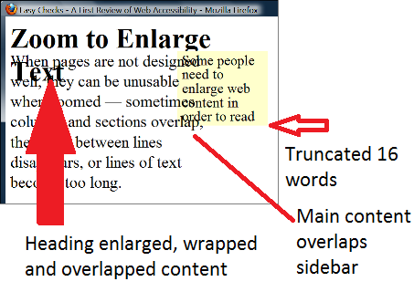
When people increase text size, increase line spacing, or change other text display aspects through text-only zoom or other text settings, content that is poorly designed can become unusable. For example, with text areas in web pages, sometimes columns and sections overlap, the space between lines disappears, lines of text become too long, or text disappears.

Figure 14: Example showing that when text size is increased, the heading overlaps the main text, the main text overlaps the sidebar text, and the sidebar text is cut off at the bottom.

  • web page with larger text
  • web page with larger text

Often it is best for text areas to automatically resize to fit the text, and for users to be able to change the size of text areas. When the areas cannot be resized to accommodate all content, usually a scrollbar should be available. See also the Rewrap for one direction scrolling section.

When people use large fonts or lower screen resolution, it is not uncommon for dialog boxes to include information that is not in the viewport. In such cases, it is usually best practice for scrollbars to be provided for the dialog box.

Scrollbars generally provide the additional benefit of communicating where the user is in an interface.

Some users increase the size of mouse pointers in their operating system or with screen magnification software. These should not obscure tooltip text.

Source: Accessibility Requirements for People with Low Vision, Section 3.7.1

Obscured Tooltip on Hover Examples

The following images were created based on University of Minnesota Duluth usability testing with students with low vision. Original samples from the video are linked on the Use case Wiki page [Laura, UC-5]). An email explaining Obscured Tooltip issue is available.

  • Icon with hand cursor obscuring a tooltip. The letter 'F' and 'otes' are visible. The middle of the word 'footnotes' is missing.

    On hover, a hand cursor obscures a tooltip that should read: "footnotes"

  • Icon with hand cursor obscuring a tooltip. It reads: 'ssary'.

    On hover, a hand cursor obscures a tooltip that should read: "glossary"

  • Icon with hand cursor obscuring a tooltip. It reads: 'ail'.

    On hover, a hand cursor obscures a tooltip that should read: "mail".

User Need: All Elements

Users can see and interact with all content and user interface controls presented visually, including when users have changed display settings such as text size, magnification, and cursor appearance.

Source: LVTF RESOLUTION, 9 March 2016

Testability

  1. Display content in a user agent.
  2. Check whether all content is perceivable with no loss of content or functionality (e.g. content does not overlap, text is not obscured by cursors, etc.).

Expected Results

  • Check #2 is true.

Techniques

Related Existing Techniques

New Techniques

  • Using onscreen text and not relying on title attributes for tooltips. (future technique)
  • Disabled controls are indicated by other than color alone (can't just be grayed out) (future technique)

Related Information

Actions

Articles

  • Title Attributes - Joanna Briggs, (Article regarding tooltips and large cursors. "When hovering over a link that has a title attribute, the large mouse pointer covers the start of the title attribute. Longer title attributes may not fit inside the viewport with higher levels of magnification.")
  • Obscured Tooltip on Hover - Laura Carlson

Email

GitHub

Minutes

Surveys

Wiki Pages

Clear controls

SC Shortname:

Clear Controls

SC Text

Clear controls: Visual interactive controls are clear or clear controls are easily available though personalization that conforms to all of the following:

  • Interactive controls are visually discriminable and have a border around the interactive area of the element with a contrast ratio of at least 4.5:1 with its background, or has fill that provides a contrast ratio of at least 3:1 from the background. It is sufficient for links to be consistently underlined.
  • Interactive controls are available in a standard style that indicates how they can be used and what action it will trigger or have clearly labeled instructions that explains their use.

An exception is available if the style is an essential part of the main function of the site, such as for a game.

Suggestion for Priority Level (A/AA/AAA)

Level AA

Related Glossary additions or changes

easily available (or easily available mode or setting)
  • Can be set one time with as wide a scope as possible (such as using the standards of the OS, ETSI or GPII when available) and
  • with the option to save or change the setting, were available interoperability but also for a scope of the set of web pages and
  • is reachable from each screen where it may be needed, and the path and control conforms to all of the document.

What Principle and Guideline the SC falls within.

Principle 3, The COGA task force suggests that updates to this principle apply to content other than text content only.

Description

The intent of this success criterion is to help a person understand which elements in the content are interactive. The success criterion would be met by ensuring there are sufficient visual affordances to indicate the boundaries of an element and how to interact with it. This will not only set it apart from plain text content that is not interactive, but also indicate the clickable area for easier selection. We want to avoid people accidentally triggering events and ensure that they know how to trigger the events that they need.

Note that visual affordances can take different forms. One common visual affordance is to display an underline under a link. Another is to provide borders around interactive elements that have sufficient contrast to show the active clickable area for the element.

Benefits

Many people cannot easily learn design metaphors that cause interactive controls to have subtle visual differences from the rest of the content such as techniques found in flat design. When interactive controls have understandable visual affordances, users can more easily locate desired items to interact with and know what that interaction might do. In addition, when users can easily see the active boundaries for controls it improves the ability to select that control via a pointing device or by touch. This is discussed fully in the COGA Flat Design Issue Paper

Many people cannot easily learn new design metaphors or remember things that they have learned for example, people with Mild Cognitive Impairment (MCI) or dementia. Without these skills it can be much harder or impossible to know what the interaction may do and to learn new controls. As one user with mild dementia stated "I have great difficulty remembering things, working things out, and interpreting things."

As long as interfaces are familiar and clear the user can continue to use the Web.

Related Resources

Resources are for information purposes only. No endorsement is intended or implied.

Testability

  1. Confirm that links are underlined or can be underlined via personalization
  2. Other Interactive controls - Confirm one of the following:
    1. A border is present around the interactive area of the element with a contrast ratio of at least 4.5:1 with its background,
    2. or has a fill that provides a contrast ratio of at least 3:1 from the background.
    3. The sufficient background or border is available via personalization (not more then one click or interaction away)
  3. Confirm one of the following:
    1. Controls are available in a standard style and function such as HTML controls or standard controls for the native platform
    2. Controls are available as standard controls as described in a WCAG technique
    3. Detailed instructions on how to trigger each event are easily available (not more then one click or interaction away)
    4. One of the above is available via personalization
  4. For non-link elements, ensure there is either a border, or a fill that:
    • Outlines the active area (e.g. clickable, touchable part) of the element. Note: if an element has multiple actions or active areas, each has an ` border or fill.

Techniques

  1. Existing technique: G183: Using a contrast ratio of 3:1 with surrounding text and providing additional visual cues on focus for links or controls where color alone is used to identify them">
  2. New technique: Providing a border around the interactive area of the element with a contrast ratio of 4.5:1 with its background, or has fill that provides a contrast ratio of at least 3:1 from the background
  3. Some examples of interactive elements where the border would be most helpful:

    • Icons
    • Buttons
    • Text input fields
    • Switches
    • Sliders
  4. New technique: Providing an underline to identify links
  5. New technique: Using personalization to enhance visual affordances on interactive elements
  6. New technique: Using standard controls
  7. Adding semantics to enable personalized controls
  8. Adding instructions
  9. Adding semantics to enable instructions

Working groups notes

Could be merged with the Low Vision and Mobile TF SC such asMetadata On Hover” and is “Content that appears on hover should not obscure the triggering element or other content.”

Alternative wording

Interactive controls use a visual style that makes it understandable that the controls are interactive and indicate the active area for the control with the following exception:

  • Customizable: The visual affordances for interactive controls are available through personalization.

Original wording: Interactive controls are clear or clear controls are easily available though personalization Boundaries on a interactive controls and icons should have a sufficient color contrast of 1.5 (visual only) or can be emphasized in the modality of the user. Auditory emphasis can include slightly louder content, a change in the pitch or a change in the voice.

Plain language (All Content)

Current versions of SC and Definitions


Plain language (All Content)

Plain language: Allow the user to use plain language and provide clear and simple language in all content so that all of the following are true:

  • Simple tense: Use the present tense and active voice. (See exceptions for different context and language.)
  • Simple, clear and common words: Use words or phrases that are most frequently used for the current context, unless this will result in a loss of meaning or clarity. This includes not using abbreviations, words or phrases, unless they are the common form to refer to the concept for beginners. Where word frequencies are known for the context, they can be used.
  • Double negatives are not used
  • Literal language: Non-literal language is not used, or can be automatically replaced, via an easy-to-set user setting. All meaning must be retained when non-literal text is replaced.
Exceptions:
  • When a passive voice or other tense can be clearer. Other voices, tenses and terms may be used when it has been shown, via user testing, to be easier to understand, friendlier, or appropriate.
  • In languages where present tense and active voice do not exist, or are not clearer in the language of the content, use the tense and the voice that are clearest for the content.
  • When describing or discussing past or future events, the present tense is not required.
  • If the writing style is an essential part of the main function of the site, such as a game, a literary work, or teaching new terms.
  • Where less common words are found to be easier to understand for the audience. Such findings are supported by user testing that includes users with cognitive disabilities.
  • The writing style items may be replaced for a location or type of content in which user testing has shown a more effective writing style to aid comprehension for people with cognitive disabilities. Such as for content written in a specific natural language.
  • The content will be penalized for not conforming to a given writing style (such as a CV, dissertation, or Ph.D. proposal).

What Principle and Guideline the SC falls within.

Under WCAG 3.1

Suggestion for Priority Level

AAA or AA depending on whether technology can ensure that this is reasonable via alternative content.

Related Glossary additions or changes

concrete wording
concrete wording uses literal language, is specific and describes things you experience through your senses: smoke, mist, a shout.
 
word frequencies
word frequency are lists of a language's words grouped by frequency of occurrence within some given text corpus. Word lists should also give the meaning of the usage
 
non-literal language
non-literal is language that uses words or expressions with a meaning that is different from the literal interpretation. Figurative language includes, but is not limited to, metaphor, sarcasm, simile, personification, hyperbole, symbolism, idioms, and cliché. For example:
  • "I've told you a million times to clean your room!"
  • "The sun is like a yellow ball of fire in the sky."
  • "You are what you eat."
  • "Busy as a bee."


Description

The intent of this Success Criterion is to ensure people can understand and use all content. For language to be usable by many people with cognitive disabilities it needs to be written in plain, clear language. This is an important accessibility principle.

It should be noted that the exceptions ensure it is widely applicable.


Benefits

This success criterion supports those who have reading difficulties, language disabilities, and some visual perceptual difficulties. It can include people with intellectual disabilities, receptive aphasia, and/or acquired dyslexia, as well as those with general cognitive learning disabilities. This supports those who have dementia, and/or acquire cognitive disabilities as they age.

Related Resources

Stroke Association Accessible Information Guidelines http://www.stroke.org.uk/professionals/accessible-information-guidelines

Computers helping people with special needs, 14 international conference ICCHP 2014 Eds. Miesenberger, Fels, Archambault, et al. Springer (pages 401). Paper: Never Too Old to Use a Tablet, L. Muskens, et al. pages 392 - 393.

[i.49]    Vogindroukas, I. & Zikopoulou, O. (2011). Idiom understanding in people with Asperger syndrome/high functioning autism. Rev. soc. bras. fonoaudiol. Vol.16, n.4, pp.390-395.
NOTE:    Available at http://www.scielo.br/scielo.php?script=sci_arttext&pid=S1516-80342011000400005&lng=en&nrm=iso .
[i.50]    Oi, M., Tanaka, S. & Ohoka, H. (2013). The Relationship between Comprehension of Figurative Language by Japanese Children with High Functioning Autism Spectrum Disorders and College Freshmen's Assessment of Its Conventionality of Usage, Autism Research and Treatment, vol. 2013, Article ID 480635, 7 pages, 2013. doi:10.1155/2013/480635.
NOTE:    Available at http://www.hindawi.com/journals/aurt/2013/480635 /.
[i.51]    de Villiers, P. A. et al. (2011). Non-Literal Language and Theory of Mind in Autism Spectrum Disorders. Poster presented at the ASHA Convention, San Diego.
NOTE:    Available at http://www.asha.org/Events/convention/handouts/2011/de-Villiers-de-Villiers-Diaz-Cheung-Alig-Raditz-Paul/ .
[i.52]    Norbury, C. F. (2005). The relationship between theory of mind and metaphor: Evidence from children with language impairment and autistic spectrum disorder.; Oxford Study of Children's Communication Impairments, University of Oxford, UK; British Journal of Developmental Psychology, 23, 383-39.
NOTE:      Available at http://www.pc.rhul.ac.uk/sites/lilac/new_site/wp-content/uploads/2010/04/metaphor.pdf.

[i.53]     Language and Understanding Minds: Connections in Autism; Helen Tager-Flusberg, Ph.D; Chapter for: S. Baron-Cohen, H. Tager-Flusberg, & D. J. Cohen (Eds.), Understanding other minds: Perspectives from autism and developmental cognitive neuroscience. Second Edition. Oxford: Oxford University Press.

NOTE:      Available at http://www.ucd.ie/artspgs/langimp/TAG2.pdf.


Phiriyapkanon. Is big button interface enough for elderly users, P34, Malardardalen University Press Sweden 2011.

Neilson-aging

Top Five Instructional Tips for Students with Down Syndrome"http://specialedpost.org/2013/01/31/top-five-instructional-strategies-for-students-with-down-syndrome/

http://www.autism.org.uk/working-with/autism-friendly-places/designing-websites-suitable-for-people-with-autism-spectrum-disorders.aspx (downloaded 08/2015)

Students with Down Syndrome, http://www.downssa.asn.au/__files/f/3203/A%20Student%20with%20Down%20Syndrome%202014.pdf


Task force links

Issue papers


Testability

The success criterion is testable if each of the bullet points are testable. If all the content fails any bullet point, it is not conformant to this success criterion. If it passes all of the bullet points, it is conformant.

Bullet points:

  • Simple tense: Use present tense and active voice. (See exceptions for different context and language.)

Tense and voice are objective, and hence are verifiable. Also, it is expected that natural language processing algorithms will be able to confirm this automatically with reasonable accuracy.

Testing for exceptions:

If present tense and active voice have not been used, the tester will need to confirm if one of the exceptions is relevant. If an exception is not relevant, and present tense and active voice have not been used, then the content fails this success criterion.

  • Simple and clear words: Use words or phrases most frequently used for the current context, unless this will result in a loss of meaning or of clarity. Where word frequencies are known for the context, they can be used. This includes not using abbreviations, words, and phrases unless they are the common forms to refer to the concept for beginners.

Even languages with a small number of users have published lists of the most frequent words (such as Hebrew). If there is a natural language that does not have one, algorithms exist that calculate these lists for a language, or for specific contexts. Testing content against these word lists can be done manually. However, it is expected there will be a natural language processing testing tool by the time this goes to CR. (It is already integrated into a tool by IBM.)

Testing for exceptions is as discussed above.

  • Double negatives are not used.

Use of double negatives is a fact, and hence is verifiable. It is assumed a natural language processing tool will also test for this. Testing for exceptions is as discussed above.


  • Literal text: Metaphors and non-literal text are not used, or can be automatically replaced via an easy-to-set user setting. All meaning must be retained when non-literal text is replaced.

Non-literal text and metaphors can be identified when the meaning of the sentence is something other than the meaning of the individual words. This is human testable. Cognitive computing algorithms can test for this as well.

If the text is not literal, then the tester must confirm that personalization and an easy user setting enables it to be replaced, such that all meaning is retained.


Techniques

  • Using common words
  • Using personalization and COGA semantics to provide easily available plain language
  • Using active voice in English, and the present tense
  • Using an alternative word frequency list for a given context
  • Using concrete wording
  • Using clear terms in menu items that describe functions
  • Associating a common word or clear definition when a proprietary word is used.
  • Failure of SC 3.1.x due torequiring users to learn new terms or new meanings for terms or symbols;
  • Failure of SC 3.1.x due toshowing words that are common, but not in the correct context or with an unclear meaning;
  • Failure of SC 3.1.x due touse of non-literal text without an easy-to-use literal text replacement

WCAG 2 should be clearer that for responsive sites, each breakpoint/view needs to be conforming, and different breakpoints can't be considered conforming alternatives

Filing this here in addition to the WCAG 2 Repo w3c/wcag#197.
As a fallback in case some feel it shouldn't be amended in 2.0... it is to clarify that a "Web Page" in WCAG means that every break point of that page needs to conform.

There was quite a long thread on the list, and this is the outcome of the discussion. I presented both Gregg and Loretta with this scenario

Company X has a responsive web site. A page has 2 break points based on viewport size. A user on a mobile device gets the same page as as the desktop, except it has a Hamburger menu icon instead of the mega menu.

The mega menu conforms to WCAG, the Hamburger menu does not. On a mobile device, there is no link to the desktop version. Does this page conform to WCAG?

Some feel that it currently passes because there is one accessibility supported solution. Others think that it does not pass because the user on the mobile device doesn't have a choice about which view they get, (unless there is an accessible link to the desktop -alternative conforming- version.)

What are your thoughts?

  1. Does it pass without a link to the conforming desktop view of the same page?
  2. Does it pass if it has a link to the conforming desktop view of the same page

The question is important for decisions in 2.1

Loretta Answers:

Just a quick response because I'm on vacation and can't investigate the historical record.

We had a lot if relevant discussion when trying to define web page (or all the alternate terms we were considering). Part of the discussion was about web apps, which dynamically change what is delivered from the same URI. As I recall, we concluded that any version of the page that could be delivered from that URI had to conform in order to claim that the URI conformed.

I think this generalizes to saying that all the break points must conform to claim that the URI conforms.

But this is just my recollection. Sorry I can't point to a specific discussion.

Gregg answers:

I would think about it like I would a site where there was an accessible alternative - but the alternative was behind a firewall and only available to some.

Unless the accessible version is available to all - it does not qualify and an alternative for all (and fails the SC).

They essentially have a page that morphs into an inaccessible form that the user has no control of.

IN SHORT

  • it fails the conformance clause because the accessible alternative is only available from the in accessible version under certain conditions - not at all time.

Most others agree also. The clarification that a "full page" in Conformance Criteria 2 includes each of it's breakpoints, does not appear anywhere in the current documentation. I think in an age where most sites are responsive this is necessary. There is no proposal to change WCAG, just a statement in the Understanding Conformance Criteria 2 section about this: The proposal is a follows:

"The full page includes each view of the page that is customized for various devices, browsers, or screen sizes. Each of these views (or their respective conforming alternate versions) would need to conform in order for the entire page to conform. On the other hand, if a user voluntarily chooses a setting on the page that optimizes or personalizes the state of the page for accessibility reasons, this new state does not necessarily need to pass every Success Criteria in order to personalize the page, because the conforming version can be reached by undoing the setting."

It would be placed after the last paragraph in the section "Understanding Requirement 2" (just before the Notes at the end of the section. https://www.w3.org/TR/UNDERSTANDING-WCAG20/conformance.html#uc-conformance-requirements-head

Search

Search

Search: Provide a search capability.

An exception is provided for small organizations and for small websites that include simple links to each page from the home page.

Suggestion for Priority Level

AA

Related Glossary additions or changes

A small organization is defined as not more than 50 employees, or the definition within your jurisdiction.

A small website is a site with less than 15 pages

Principle and Guideline

Principle 3, Guideline 3.3

or Guideline 3.2 Make Web pages appear and operate in predictable ways

Description

Search capabilities enable a user to conveniently find and access information.

Benefits

Having a search capability allows users to find the content they need even if they cannot determine how to navigate a site. Search is a method that you can learn one time and reuse on all sites.

User studies have shown the aging population tend to rely on search to locate information rather than navigating menus or surfing.

Menu systems, and most site navigation require the user to understand the categories of the pages that the content provider has created for general use. Users with impaired executive function may be unable to identify the correct categories

In some cases, users identify the correct category via memory, rather than logic. For example, most users remember that the print function is often found under the file menu. Users with impaired memory will be disadvantaged at finding menu items based on recall.

Navigating a site and going to many pages to look for content, is also bad for people with impaired short-term memory or for people who are easily distracted, as they may lose focus and forget what they are looking for.

Search is most useful when it allows for common misspellings, yet still finds the appropriate content or provides suggested auto-corrected versions of the search terms that the user can choose from.

Related Resources (optional)

Resources are for information purposes only, no endorsement implied.

See also

  • Seniors as Web Users, Jakob Nielsen, May 2013

Testability

Procedure

  1. Check that a search box exists.
  2. Search box is visible across the entire site, ideally near the top navigation or it can be made visible via interoperable personalization settings.
  3. If 1 or 2 fail, then check that an exception is valid. An exception is provided for small organizations and small websites that include simple links to each page from the home page. Note: A small organization is defined as not more than 50 employees, or the definition within your jurisdiction.

Expected Results

  • Passes checks 1 and 2
  • Or passes check three (an exception is valid)

Techniques

  1. Making a search box available.
  2. Positioning search box in a prominent position and visible across entire site via personalization settings

working groups notes (optional)

Small change to 3.1

SC Shortname

content (was text)

SC Text

Current:

Guideline 3.1: Make text content readable and understandable.

Proposed:

Guideline 3.1: Make content readable and understandable.

(the word "text" is removed)

Suggestion for Priority Level (A/AA/AAA)

N/A it is a guideline

Related Glossary additions or changes

NA

What Principle and Guideline the SC falls within.

Principle 3

Description

This is a small but important change. Content needs to be understandable whether it is text, video or audio. Using clear words will help with any of these modalities.

Benefits

The benefit is that people will understand the content, including many people with learning and cognitive disabilities. For example, if a bot uses complex words and sentences, many people with language processing impairments will not be able to use that bot.

An audio stream has uncommon words and complex sentences it will not be usable by many people with cognitive disabilities.

Related Resources (optional)

Resources are for information purposes only, no endorsement implied.

See the road-map

User needs Table (table number 5 and 7)

related issue papers

  • Multi-modal Content Delivery
  • Distractions
  • Voice Menu Systems
  • Symbols for Non-Verbal
  • Numbers and Math

Plain language (Minimum)

Current versions of SC and Definitions


Plain language (Minimum)

Provide clear and simple language in instructions, labels, navigational elements, and error messages which require a response to continue, so that all of the following are true:

  • Simple tense: Use present tense and active voice.
  • Simple, clear, and common words:Use the most common 1500 words or phrases or, provide words, phrases or abbreviations that are the most-common form to refer to the concept in the identified context.
  • Double negatives: double negatives are not used.
  • Concrete language: Non-literal language is not used, or can be automatically replaced, via an easy-to-set user setting. All meaning must be retained when non-literal text is replaced.
  • Instructions: Each step in instructions is identified.
Exceptions:
  • When a passive voice or a tense (other than present tense) is clearer. Other voices or tenses may be used when it has been shown to be easier to understand, friendlier, or appropriate.
  • In languages where present tense and active voice do not exist, or are not clearer in the language of the content, use the tense and the voice that are clearest for the content.
  • When describing or discussing past or future events, the present tense is not required.
  • If the writing style is an essential part of the main function of the site, such as a game, a literary work, or teaching new terms.
  • Where less common words are easier to understand for the audience.
  • The content will be penalized for not conforming to a given writing style (such as a CV, dissertation, or Ph.D. proposal).
  • If there are no tools available in the language of the content that identify uncommon words, instructions that are longer then 400 words are exempt unless they directly relate to a critical service.
  • What Principle and Guideline the SC falls within.

    Under WCAG 3.1

    Suggestion for Priority Level

    A

    Related Glossary additions or changes

    identified context
    context and a context specific word frequency list (and glossary) has been identified in an accessibility statement or other known technique
    A word frequency list has to be generated from at least 1000 sources from the same context.
    critical service
    service that is needed to prevent significant harm, risk or loss such as: significant financial loss, illness, injury or deterioration in a patient's condition or effective loss of rights or freedoms

    Description

    The intent of this success criterion is to ensure people can understand and use navigational elements, user interfaces, and instructions. Clear language for all content is an important accessibility principle. However, if the user does not understand words and terms in these critical areas, the whole application or web site often becomes unusable.

    A real-life example is a person, with mild dementia, trying to use an application to turn on a heating and air conditioning unit. The menu item for selecting heat or air conditioning is labeled "mode". The user does not know that "mode" refers to heat or to air conditioning, and thus cannot use the whole unit because of this one term.

    In this real-life example (reported by a task force member), a visitor turned on an air conditioner and did not turn it off when leaving the dwelling. The weather became a bit cooler. The user, who could not turn on the heat because of the language used, became hypothermic, and needed emergency treatment.

    People with dementia have impaired short-term memory, and difficulty remembering new information. Therefore, learning and remembering new terms can be impossible. However, if an interface uses familiar terms and design, it is fully usable. Not being able to use these applications mean that more people require live-in help, and lose their independence.

    In another example, many task force members cannot use GitHub because the terms it uses are not typical for functions (such as "push" instead of "upload").

    Some users, particularly those on the autism spectrum, will have difficulty with figurative language, as they will try to interpret it literally. This will frequently lead to the user to failing to comprehend the intended meaning, and may instead act as a source of stress and confusion. (Taken from ETSI)

    It should be noted that restrictions on scope make it practical from the content providers' perspective, and the exceptions ensure it is widely applicable. For example, error messages, which require a response to continue, are being included as a level A because, without understanding these messages, the user is completely unable to continue. Error messages, which do not require a response, may be frustrating, but do not always make the whole application unusable.

    Benefits

    This supports those who have reading difficulties, language disabilities, and some visual perceptual difficulties. It can include people with intellectual disabilities, Receptive Aphasia, and/or Dyslexia, as well as those with general cognitive learning disabilities. This supports those who have Dementia, and/or acquire cognitive disabilities as they age.

    Related Resources

    Stroke Association Accessible Information Guidelines http://www.stroke.org.uk/professionals/accessible-information-guidelines

    Computers helping people with special needs, 14 international conference ICCHP 2014 Eds. Miesenberger, Fels, Archambault, et al. Springer (pages 401). Paper: Never Too Old to Use a Tablet, L. Muskens et al. pages 392 - 393.

    Phiriyapkanon. Is big button interface enough for elderly users, P34, Malardardalen University Press Sweden 2011.


    [i.49]    Vogindroukas, I. & Zikopoulou, O. (2011). Idiom understanding in people with Asperger syndrome/high functioning autism. Rev. soc. bras. fonoaudiol. Vol.16, n.4, pp.390-395.
    NOTE:    Available at http://www.scielo.br/scielo.php?script=sci_arttext&pid=S1516-80342011000400005&lng=en&nrm=iso .
    [i.50]    Oi, M., Tanaka, S. & Ohoka, H. (2013). The Relationship between Comprehension of Figurative Language by Japanese Children with High Functioning Autism Spectrum Disorders and College Freshmen's Assessment of Its Conventionality of Usage, Autism Research and Treatment, vol. 2013, Article ID 480635, 7 pages, 2013. doi:10.1155/2013/480635.
    NOTE:    Available at http://www.hindawi.com/journals/aurt/2013/480635 /.
    [i.51]    de Villiers, P. A. et al. (2011). Non-Literal Language and Theory of Mind in Autism Spectrum Disorders. Poster presented at the ASHA Convention, San Diego.
    NOTE:    Available at http://www.asha.org/Events/convention/handouts/2011/de-Villiers-de-Villiers-Diaz-Cheung-Alig-Raditz-Paul/ .
    [i.52]    Norbury, C. F. (2005). The relationship between theory of mind and metaphor: Evidence from children with language impairment and autistic spectrum disorder.; Oxford Study of Children's Communication Impairments, University of Oxford, UK; British Journal of Developmental Psychology, 23, 383-39.
    NOTE:      Available at http://www.pc.rhul.ac.uk/sites/lilac/new_site/wp-content/uploads/2010/04/metaphor.pdf.

    [i.53]                   Language and Understanding Minds: Connections in Autism; Helen Tager-Flusberg, Ph.D; Chapter for: S. Baron-Cohen, H. Tager-Flusberg, & D. J. Cohen (Eds.), Understanding other minds: Perspectives from autism and developmental cognitive neuroscience. Second Edition. Oxford: Oxford University Press.

    NOTE:      Available at http://www.ucd.ie/artspgs/langimp/TAG2.pdf.

    Neilson-aging

    Top Five Instructional Tips for Students with Down syndrome"http://specialedpost.org/2013/01/31/top-five-instructional-strategies-for-students-with-down-syndrome/

    http://www.autism.org.uk/working-with/autism-friendly-places/designing-websites-suitable-for-people-with-autism-spectrum-disorders.aspx (downloaded 08/2015)

    Students with Down Syndrome, http://www.downssa.asn.au/__files/f/3203/A%20Student%20with%20Down%20Syndrome%202014.pdf

    Task force links

    Issue papers

    COGA Techniques

    Testability

    This success criterion is testable if each of the bullet points are testable. If the content fails any bullet point, it is not conformant to this success criterion. If it passes all of the bullet points, it is conformant.

    Bullet points:

    • Simple tense: Use present tense and active voice. (See exceptions for different context and language.)

    Tense and voice are objective, and hence are verifiable. (It is expected that natural language processing algorithms will be able to conform to this automatically with reasonable accuracy.)

    Testing for exceptions:

    If present tense and active voice have not been used, the tester will need to confirm if one of the exceptions is relevant. If an exception is not relevant; and present tense and active voice have not been used; then the content fails this success criterion.

    • Simple and clear words: Use words or phrases most frequently used for the current context, unless this will result in a loss of meaning or of clarity. Where word frequencies are known for the context, they can be used. This includes not using abbreviations, words, and phrases, unless they are the common forms to refer to concepts for beginners.

    Even languages with a small number of users have published lists of most-frequent words (such as Hebrew). If there is a natural language that does not have such a list, algorithms exist that calculate these lists for languages, or for specific contexts. Testing content against these word lists can be done manually. However, it is expected there will be a natural language processing testing tool by the time this goes to CR. (It is already integrated into a tool by IBM.)

    Testing for exceptions is as discussed above.

    • Double negatives are not used.

    Use of double negatives is a fact, and hence is verifiable. It is assumed a natural language processing tool will also test for this. Testing for exceptions is as discussed above.

    • Literal text: Metaphors and other non-literal text are not used, or can be automatically replaced via an easy-to-set user setting. All meaning must be retained when non-literal text is replaced.

    Non-literal text, such as metaphors, can be identified when the meaning of the sentence is something other than the meaning of the individual words. This is human testable. Cognitive computing algorithms can test for this as well.

    If the text is not literal, then the tester must confirm that personalization and an easy user setting enables it to be replaced, such that all meaning is retained.

    • Words on controls and labels identify an element's function.

    This can be tested by identifying the function of the control, and checking if it is identified in the label.

    • Each step of instructions is identified, and concrete wording is used.

    This is human testable by completing the instructions literally, and confirming that the effect is correct.

    Techniques

    • Using a default term as the text on a function of an operating system platform; or
    • Using text on a button or a link that is the function of a button or a link (such as "search" in place of "go"); or
    • Using text on a link that is the link destination (such as "home"or "contact us"); or
    • Using personalization and COGA semantics to provide easily-available plain language; or
    • Using active voice in English, and the present tense; or
    • Using an alternative word-frequency list for a given context; or
    • Using concrete wording; or
    • Using clear terms in menu items that describe functions; or
    • Associating a common word or clear definition when a proprietary word is used.
    • Failure of SC 3.1.x due to replacing words with pronouns, as this decreases clarity; or
    • Failure of SC 3.1.x due to requiring users to learn new terms or new meanings for terms or symbols; or
    • Failure of SC 3.1.x due to showing words that are common, but not in the correct context, or with an unclear meaning; or
    • Failure of SC 3.1.x due to use of non-literal text without an easy-to-use literal text replacement.

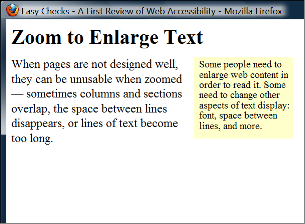
user information

Links not working...

SC Shortname: User Information

SC text

User Information: Use known techniques to keep sensitive user information safe that can be used to identify the user or identify that user may have a disability.Warn users of any known risk.

Priority Level

A

Suggestion for Priority Level (A/AA/AAA)

A

Related Glossary additions or changes

Harm: Loss of or damage to a person's right, property, or physical or mental well-being. Where it is unclear if something is a damage we consider a test to be that over 80% of random people asked would consider it to be a damage as defined above.

Identify the user: Personally identifiable user information is information that may by itself or in conjunction with other information be used to discover the identity of, locate, or contact a specific person

What Principle and Guideline the SC falls within.

Suggested priciple is 2,and we suggest changing guideline 2.3 from

  • Do not design content in a way that is known to cause seizures.

to

  • Do not design content in a way that is known to harm users.

Description and Benefits

Don’t store personal information that could be used to harm a user without being very careful to minimise any risk to the user.

Examples: storing information, which suggests a user user has Dementia, may make a target for scams; or storing information, which suggests a user has an intellectual disability, may make a target for predators.

A predatory company could send requests for money, saying “you haven’t made your donation” despite the user having made one.

It is vital that users stay safe.

Another consideration is that many users have weak executive functioning, and are thus less likely to identify risks correctly.

The benefit of this SC is to keep users safe while online.

Related Resources (optional)

Issue papers: Online

Also see

Testability

  • Step 1. Identify if user information is being stored. (If no, then pass. If yes, then continue.)
  • Step 2. Identify if one of the known techniques are used.
  • Step 3. Identify that the risks are available to users in clear language.

Acceptable  outcomes:

No to Step 1
OR
Yes to all three steps.

Techniques

  1. For personalization information: Use functional requirements for personalization that do not suggest  users have disablities.
  2. Use approved security techniques, in your jurisdiction, for sensitive data.
  3. Obtain approval by the Helsinki Committee for Human Rights, which is a an ethics committee used by the European Union.
  4. Failure technique to be added: associating a user to a code that is used mainly for people with cognitive disabilities.

Advisory techniques

  • Chat options prevent any exchange of personal information.
  • Users are regularly warned to avoid scams.
  • Getting help, and/or reporting something worrying, is easy-to-do, and includes a statement that users will never be penalized for reporting something.
  • An easy-to-use feature is provided for users to report to cyber crime fighters in their jurisdictions.
  • Easy-to-use videos and tips with explanations provided about cyber criminals, how to stay safe, and how to report anything found odd.
  • Server-side solutions, such as analytics, are employed to find cyber-criminals.
  • Advertisements and paid articles are clearly marked, as external content, in an easy-to-understand way.
  • Sites offering sexual content, or intended for chats of a sexual nature, state that clearly.

See also

https://www.owasp.org/index.php/Client_Side_Testing

https://www.owasp.org/index.php/Cross-site_Scripting_(XSS)

https://www.owasp.org/index.php/Transport_Layer_Protection_Cheat_Sheet#Rule_-_Keep_Sensitive_Data_Out_of_the_URL

working groups notes (optional)

We could (if needed ) make this AA and make the following A :

Use known techniques to keep sensitive user information safe that can be used to identify that user may have a disability.Warn users of any known risk.

Error Prevention

Current versions of SC and Definitions

Error Prevention

Current:

3.3.4 Error Prevention (Legal, Financial, Data): For Web pages that cause legal commitments or financial transactions for the user to occur, that modify or delete user-controllable data in data storage systems, or that submit user test responses, at least one of the following is true: (Level AA)

  1. Reversible: Submissions are reversible.

  2. Checked: Data entered by the user is checked for input errors and the user is provided an opportunity to correct them.

  3. Confirmed: A mechanism is available for reviewing, confirming, and correcting information before finalizing the submission.

Proposed:

@@3.3.4 Error Prevention (Legal, Financial, Data): For Web pages that cause legal commitments or financial transactions for the user to occur, that modify or delete user-controllable data in data storage systems, that submit user test responses or submit or store important information each of the following is true:

  1. Modify: A simple mechanism is provided to allow the user to assess and correct mistakes, including mistakes that might not be automaticaly identified. The user can repair information via clearly labeled actions and get back to the place they were at, in one clearly labeled action without unwanted loss of data.

  2. Checked: Data entered by the user is checked for input errors and the user is provided an opportunity to correct them.

  3. Confirmed: A summary is provided before submitting important information and the user is notified when they are about to submit the final information.

  4. Time frames for cancelling transactions can be programmiticaly determined@@

Suggestion for Priority Level

A

What Principle and Guideline the SC falls within.

Principle 3, Guideline 3.3 - Update to SC 3.3.4

Description

The intent of this Success Criterion is to give users with cognitive disabilities mechanisms for avoiding serious consequences that are the result of a mistake made when performing an action that they are unable to reverse or finding tasks too difficult to be managed correctly.

Benefits

People with cognitive impairments make many more mistakes in filling out forms than the general population. When mistakes cannot be easily corrected they can not complete the task.

For example, a user with a memory impairment may not remember that they have already added an item to their shopping cart and may add the item a second time within the same online session. They may confused the dates when booking a trip, or made numerous other mistakes. It is essential that people with cognitive impairments have the opportunity to check their work AND can fix their mistakes easily.

For people with cognitive disabilities, a process being theoretically reversible is not enough. Typically the process of reversing a transaction is too complex for them to manage without help. They may not have access to that help meaning they have to live with all the mistakes they have made. For example, when inputting credit card information incorrectly these mistakes can be devastating.

In addition if the process of correcting mistakes is too difficult, users may give up, either losing the transaction or buying unwanted items because of the one required item.

The effect of this happening multiple times is devastating and can result in a large number of users with disabilities avoiding using the Internet for many tasks.

The presence of a simple mechanism for modifying the number of items in the shopping cart at various times in the checkout process can significantly reduce the chances of an unwanted purchase by giving the user the ability to change the quantity associated with a product. In the same scenario, a summary of the order, including product quantities and associated costs, along with a notification prior to final order submission, gives the user the chance to identify any errors and confirm the choices made or make changes to the order.

In the example given, a summary of the purchase would show both the error in quantity as well as a higher then expected order total. (See Working Group Notes). In some cases a user may realize that a mistake has been made after the final submission of data.

Implementing timeframes for canceling transactions which are programmatic determined helps the user understanding the amount of time the user has to cancel a transaction and makes them less susceptible to scams.

Users with cognitive disabilities can make errors for a variety of reasons including problems with language, memory related disabilities, focus and attention related disabilities and attention with details. Because errors may occur without being noticed at any point in a process containing multiple steps, this Success Criterion helps users review and make corrections to input prior to final submission.

For example, a user with ADHD purchasing a travel ticket on a website may have poor attention to detail, low attention span and may be easily discouraged. As the user goes through the order completion flow, manual errors such as an incorrect billing address are not captured until all of the information is submitted. The successful completion of the order relies on the information provided at multiple steps in the process. While there may be significant error controls, for instance format correction and default values for the travel departure and arrival dates, if the manually inputted details are incorrect, the payment will not be processed correctly. An error due to lack of accuracy or attention to detail such as an incorrect street number or zip code in the billing address will result in a declined payment. If a summary is not provided before submitting the final order or the ability to go back in the process to make correction is not provided or is not clear the user may not understand the reason for the declined payment and abandon the order.

Related Resources

Resources are for information purposes only. No endorsement is intended or implied.

issue papers

Testability

If the website causes legal commitments or financial transactions for the user to occur, that modify or delete user-controllable data in data storage systems, or that submit user test responses, confirm that:

  1. A sufficient technique is used for Checked, Confirmed and Modify or
  2. The submission can be Checked, Confirmed and Modify: via clearly labeled actions and get back to the place they were at, in one clearly labeled action without unwanted loss of data. AND

AND

  1. A sufficient technique is used for timeframes which are programmiticaly determined

Techniques

Sufficient technique for Checked, Confirmed and Modify

  • Provide a summary before submitting important information. Make it clearly labelled to repair information and one click to return to the summary
  • Provide clickable breadcrumbs that allow users to see the previous steps, go back, and change them.

From WCAG

  • 3.3.6 Error Prevention (All): For Web pages that require the user to submit information, ALL of the following is true: ( Change is needed to conform to change)

Sufficient technique for timeframes

  1. Using semantics for identifying timeframes (uses new semantics)
  2. Using RDFA for identifying timeframes (more difficult bu now supported)

Working groups notes

Thad - The SC requires pre-confirmation but what about post confirmation for example an email confirmation with the potential to modify or cancel a transaction within a given amount of time

New SC proposal: After initial page load, programmatic notification is provided for each visual indicator that content is loading or the page is busy.

Short Name

Notification of Loading/Busy:

SC Text

After initial page load, programmatic notification is provided for each visual indicator that content is loading or the page is busy or change of screen orientation.

Suggested Priority Level

Level AA

Related Glossary additions or changes

Programmatic notification: Notification by software from data provided in a user-agent-supported manner such that the user agents can extract and present this notification to users in different modalities, without further action by the user, except for focusing on the control which caused the change, or activating the control which caused the change.

What Principle and Guideline the SC falls within

Principle: Perceivable

Proposed new Guideline 1.5:
Notification: Make it easier for users to know about changes to dynamic content

Description (Intent)

The purpose of this Success Criterion is to ensure screen readers users such as those who are blind or who have low vision, are aware that a page is reloading or busy when changes are happening to a web page and there is a visual indication. Some users who are blind get confused if the page orientation changes and things drop off the page.
Dynamic changes to a page sometimes cause the page to become inactive for a period of time while it is being updated. Users of assistive technology may think the page has crashed and may loose their work if they either reload the page or leave the page thinking the browser crashed. This notification will ensure they are aware that something is happening in the background, the way that sighted users are aware when they see a spinning icon or the words "loading". If there is no such visual indication there is no requirement in the Success Criterion to provide programmatic notification, only when there is a visual notification, is there a requirement to make that notification also programmatic. This is not about the initial wait to load a new page. Those are announced to screen readers.

Specific Benefits of Success Criterion 1.5.1

  • Users who are blind will know if a shopping cart was successfully updated, or if form was successfully submitted, or if there were errors on their form.
  • Helps people with visual disabilities, cognitive limitations, and motor impairments by reducing the chance that a control will be accidentally activated or action will occur unexpectedly.
  • Individuals who are unable to detect changes on the page will be able to know what people who can see those changes know.

Justification and Evidence

This issue is currently a best practice recommended by most WCAG evaluators, and most evaluators have come across situations where a screen reader user became confused because the page paused to load something, and they thought there was a crash. There is a long thread on the mail archives which started here: https://lists.w3.org/Archives/Public/w3c-wai-gl/2016AprJun/0808.html. The current wording is a result of those discussions and has good momentum from working group members on the list.

There was an issue which filed against WCAG for WCAG next. See Issue 12 here https://www.w3.org/WAI/GL/wiki/Post_WCAG_2_Issues_Sorted

Testability

This can be tested programmatically or functionally. In the code identify elements that are updated and ensure they have programming that exposes the user to this new data. this is primarily accomplished with aria-live. Functionally a screen reader can be run while the page is updating to determine changes to the page are announced to the user.

Related Resources

Resources are for information purposes only, no endorsement implied.
This is also in the Pearson guideline 5 http://wps.pearsoned.com/accessibility/115/29601/7577872.cw/index.html

Techniques

  • Using aria-live to notify a user of changes in content

Notes for working group

  • This may be combined with M15 which is "notification of change of content."
  • The last 4 words of the SC say "or change of screen orientation". Notification of screen orientation change may not be possible by the author unless the author is forcing a change in the layout. So the phrase is at risk and may be dropped off if it can be demonstrated that this a function of the user repositioning the device.

Consistent Cues

SC Short name

Consistent Cues

SC Text

Provide Consistent Cues: Within a set of web pages, consistent cues are provided that identify different content types, and the state of elements and regions, which help the user understand their roles or states.

Suggestion for Priority Level (A/AA/AAA)

(AA)

Related Glossary additions or changes

Content types: The type and function of a content element. Content types are typically defined in HTML tag names, ARIA roles, or personalization semantics.

Examples include: roles, types of contact information, types of help, types of functions, warnings, key points, errors, system messages, notes, definitions, more information, tables of content, site maps, file types, search, required information, errors, opinions, essential information, types of transaction, types of reminder, usage instructions, status of elements, invalid fields, non-native content, and sponsored content.

What Principle and Guideline the SC falls within.

Principle 3, Guideline 3.3 “Input Assistance”

Description

The use of inconsistent cues can present significant barriers to users with cognitive accessibility needs. The intent of this Success Criterion is to ensure that navigation, operability, and the ability to complete tasks associated with a website, are fully supported by consistent cues throughout the website.

For example:

  • A user with cognitive accessibility needs may have difficulty understanding the state of a particular control if the mechanism for displaying the state of the control is inconsistent throughout a website.
  • If the content type and the format required by an input field are not clearly defined, users with cognitive accessibility needs may have difficulty determining the format of the information required.

Benefits

The benefit to users with cognitive accessibility needs is that consistent cues and prompts, provided throughout a website or application, create familiarity and reduce cognitive load. The advantages of familiarity and reduced cognitive load are that processes are easier to follow and appear to be less complex. This may benefit users with cognitive accessibility needs in several ways, including:

  • If the user perceives the activity to be too complex, the user may decide to abandon the activity. Therefore, the user will be excluded from the information and/or the services derived from the completion of the activity. Familiarity and consistent cues will alleviate this considerably.
  • If an activity relies on completion of several tasks, then the likelihood of errors being made during the activity increases, particularly for users with cognitive accessibility needs, if the cues provided are inconsistent.

While providing consistent cues is of benefit to all users, it is of particular benefit to a wide range of users with differing cognitive accessibility needs, including users with:

  • language-related disabilities;
  • memory-related disabilities;
  • disabilities that affect executive function and decision making; and
  • focus-and-attention-related disabilities.

Providing consistent cues is a cornerstone of good UX design. They not only benefit users with diverse cognitive accessibility needs, but also benefit any user who is unfamiliar with the content. As such, the benefits are not restricted to a relatively small subset of users.
Related Resources (optional)

The Aphasia Alliance's Top Tips for 'Aphasia Friendlier' Communication taken from http://www.buryspeakeasy.org.uk/documents/Aphasia%20Alliance%20Aphasia%20Friendier%20Communication.pdf

Phiriyapkanon. Is big button interface enough for elderly users, P34, Malardardalen University Press Sweden 2011.

Testability

Test Procedure

  1. Ensure, by inspection, that headings and regions are identified consistently.
  2. Change the states of elements, such as tab panels and selected options. Confirm that each cue is consistent with other cues within a set of web pages.

Automatic tests can include if:

CSS toggles consistently on different states on similar items;

CSS is used consistently on headings, roles, personalization, and semantics.

Techniques

Symbols are available that help the user identify key content types identified in a glossary section.

Using CSS to show a state consistently.

Using CSS to consistently show a content type.


Failure Technique: Adding a star next to key content, as that does not help the user to understand the context of the key content.

working groups notes (optional)

Manageable blocks

Current versions of SC and Definitions

SC Shortname: Manageable blocks

SC Text

Statements which instruct a user to make a choice or take an action:

  • have only one instruction per sentence, except when two things have to be done simultaneously;
  • use sentences of no more than 15 words;
  • should have no more than one relative pronoun per sentence.

Suggestion for Priority: Level (AA)

Related Glossary additions or changes

Relative pronoun
any of the words "who", "whom", "that", "which", "whose", "where", "when" and "why"

What Principle and Guideline the SC falls within.

Guideline 3.1

Benefits

Chunking content, whether it is visual or auditory, supports those with working memory deficits, such as those with learning disabilities and brain injury. The breaking down of content into small sections, whether it is developed as audio or video output; mathematical symbols; or a paragraph of text; improves levels of comprehension.

References for evidence of the benefits include:

  • Evmenova, Anna S., and Michael M. Behrmann. "Research-Based Strategies for Teaching Content to Students with Intellectual Disabilities: Adapted Videos." Education and Training in Autism and Developmental Disabilities 46.3 (2011): 315-25. Web.
  • Hock, M. and Mellard, D. (2005), Reading Comprehension Strategies for Adult Literacy Outcomes. Journal of Adolescent & Adult Literacy, 49: 192-200.
  • Zhang, D., Ding, Y., Stegall, J. and Mo, L. (2012), The Effect of Visual-Chunking-Representation Accommodation on Geometry Testing for Students with Math Disabilities. Learning Disabilities Research & Practice, 27: 167- 177. doi:10.1111/j.1540-5826.2012.00364.x .

Splitting information into manageable blocks assists:

  • the increasing population who are over 60 (20% in the Northern Hemisphere by 2030) and many people with cognitive impairments, including language and learning disabilities. More than half of people over 60 years old have some form of memory impairment, including mild cognitive impairment and age-associated memory impairment (AAMI).
  • working memory and retention of content. Research indicates 50% of people surfing web pages spend fewer than 12 seconds on a page; and 17% between 2 and 4 seconds.
  • those with reduced attention spans, and enables information to be understood more easily. Research indicates the average attention span in 2015 was 8.25 seconds.

A real world example is someone with Dyslexia working with a task force member.

"If I am faced with along paragraph with sub clauses, I will copy it out and put in line breaks where I find a new keyword or point. If I chunk the text, it is easier to follow each concept. Otherwise, it is just a wash of words and I lose track of which part I am meant to be concentrating on. When there are no line breaks and I have to scroll across, I forget what is at the beginning of the line". Adult with Dyslexia.

Note that reading takesfull cognitive function for many people, making remembering what was written at the same time much harder.

Related Resources

Resources are for information purposes only. No endorsement is intended or implied.


Testability


Identify the relevant standard techniques. Ensure content conforms to those standards, where they can be used for testing, such that information is provided in manageable blocks.


For text:


  • a single point per paragraph: A paragraph should consist of one or more sentences that deal with a single point.


Possible test: Identify a keyword, or point, or topic sentence (a sentence that expresses the main idea of the paragraph in which it occurs). Confirm that each sentence relates directly to that keyword, point, or topic sentence . (Keywords can be identified in the mark up with COGA semantics at a later stage.)


  • Short sentences: Sentences have a maximum of one conjunction and two commas. A sentence should consist of a single idea. Exception: Where usability testing has found a longer sentence to be clearer or easier to understand.


Possible test: This should be easy to test for, as one can count the numbers of conjunctions and commas. It is assumed that, by the time this success criterion becomes adopted, automated tools will identify nonconforming sentences for the author. (This could be an algorithm using regular expressions.)


  • Lists are used appropriately: When there are three or more consecutive items that could be considered a list, a list is used.


Possible test: An algorithm could identify sentences with 3 commas or colons (like this one....); keywords such as "such as:", "for the following reasons", or "step 1"; sentences with bullet points (such as a, b, c); etc.


For a paragraph with four or more sentences, it should be confirmed that there are not three or more list items. (The first sentence may be the context, and the next three may be list items.)


Three or more consecutive paragraphs do not have to be checked as list items because they should be made up of separate points.


For audio or visual media


Media are divided into programmatically-determinable and logical sequences. Media segments should be:


  • six minutes or fewer:
    Media should be divided into segments that are 6 minutes or fewer in duration.

  • programmatically-determinable and logical:
    Media should be presented in a programmatically-determinable and
    logical order.

  • navigable: Navigation to each segment, and a
    unique descriptive label, are provided for each media segment.


This is testable by timing/identifing the gap between programmatically-determinable and logical ; and navigation to chunks that have unique descriptive labels. If a gap is over 6 minutes, it does not conform.


This is testable by:


  • Timing each segment. Confirm that each media segment is 6 minutes, or under

  • Confirming segments have unique descriptive labels

  • Confirming each segment can be navigatable to

  • Confirm that the segments can be programmatically determinable and are in a logical order


Detemining how to ensure it is logical and navigable, or unique and descriptive, is
described in other WCAG tests. (Will add if needed.)


Techniques include:


Common Failures for Success Criterion:


A sentence with multiple clauses, which could be tagged as a list, but is not.


A paragraph with multiple points.


A long video not broken into programmatically-determinable chucks of fewer than 6 minutes.


A long video broken into programmatically-determinable chucks, but without a unique descriptive label on each chunk.


working groups notes (optional)


maybe replace paragraph with chunk and paragraph as an example

Request to clarify relationship of guidelines to web content-based publications

Another significant item for digital publications that came out of the discussion on October 25th is how to understand and apply WCAG in relation to a publication that is comprised of multiple documents (e.g., where you have one "web page" per chapter).

For the EPUB accessibility specification, a lot of our effort went into explaining an EPUB publication as the equivalent of a set of web pages, with clarifying techniques that explain potential differences when a single document entity is broken across multiple pages.

EPUB is often compared to a "web site in a box", but despite that being a fair representation of what you find inside the zip container, users see the publication as though it were a single paginated document. Whether a digital publication is obtainable from a single URI by HTTP is complicated by this duality, as it assumes an online world.

With packaged web content, like EPUB, the type of reading system will also affect the state (e.g., a web-based system would have publications accessible at a single URI, but dedicated applications are working off the file system, as an EPUB file doesn't have to live on the web or travel by HTTP to get to users). Moreover, reading systems will often explode the contents of the zip archive when presenting the content, but some extract resources straight from the zip as needed (i.e., the state of an EPUB publication is variable between a single archive and a group of resources at consumption time).

It might be the case that the description of a single URI accessed by HTTP becomes more true in the future, especially with the work going on around web publications, but even in that work there will be packaged offline publications that have a canonical URI for identification but don't live at it.

We skirted this issue for EPUB and only drew a parallel in applicability of the guidelines and practices to what also amounts to web content. It would be helpful if publications more neatly fell into the picture of WCAG applicability, though.

We've been thinking that adding a description of a web publication to the web page definition examples would help, but are unclear about how to approach the offline/packaged case.

task completion

Current versions of SC and Definitions

SC Shortname

Task completion

SC Text

Task completion: Successfully completing tasks does not rely on users memorizing information presented in the current, or previous, user-interaction dialog steps.
Note that the following requirements must apply: understandable language; clear structure and relationships; and clear and unambiguous separation of menu items, which must be level A in this scope. (This may be addressed by reiterating these requirements here to increase conformance.)
Exception: This success criterion does not apply if memorizing, or otherwise mentally processing information, is the primary purpose of the dialog step (e.g., a step in a game which deliberately tests the player's memory skills).

Suggestion for Priority Level (A/AA/AAA)

A

Related Glossary additions or changes

NA

What Principle and Guideline the SC falls within.

Principle 2 : Operable
Guidleline 2.4 Provide ways to help users navigate, find content, and determine where they are.
(It can also be under

Description

In multi-step user-interaction dialogs, such as voice-menu systems, there is a risk that users will encounter a barrier, which prevents them from completing a step, and as a result, which prevents them from achieving whatever they wished to achieve. Unlike visually-presented menus, which can be examined at the user’s leisure, the options in a voice menu are presented serially. They often have to be held in working memory until a user is able to decide which of the options best meets their goals. The intent of this success criterion is to make these systems useable for people with low working memory.

Benefits

Without this SC, many people cannot use an application at all. See Voice Menu Systems issue paper for a full description of this issue; and how it stops many people from using services that are often critical. Many people cannot make doctors' appointments, etc. by themselves, get their water turned back on, etc.. This may be partly responsible for the lower life expectancy of people with learning and cognitive disabilities.

The benefit of this SC is to ensure that users are not prevented from completing a user-interaction dialog because they have limited abilities to process information stored in working memory. Systems that do rely on user memorization will cause people significant stress, time spent repeatedly listening to the same voice menu, and a need to resort to techniques such as writing down the options (if they have the ability to write things down). Such problems could cause unacceptable delays, and possibly failure to access what could be vitally-important services (e.g., emergency health services). Real-life examples, where failing this success criterion impacts people, include an inability to get a telephone line re-connected, getting urgent access to a doctor, etc..

User-interaction dialogs, in which completion actions have a one-to-one mapping to simple discrete options, may meet this SC. Examples of user-interaction dialogs that do not depend on user memorization are ones where a voice-menu system has an alternative visual-menu system, or ones where there is easy access to a human operator who can help users achieve their goals.

Related Resources (optional)


Issue papers Voice Menu Systems
See also:

Testability

Test option 1: Check if one of the methods offered in task completion techniques conforms to the sufficient techniques,
Test option 2:


  • Step 1. Identify all the actions that complete a user-interaction dialog step.

  • Step 2. Identify if the choice of the appropriate completion action might be dependent on information acquired from more than one serially-presented chunk of information (including short term memory, such as remembering a number). Also identify if the menu items use simple terms and have a one-to-one mapping to simple, discrete options.

  • Step 3. Identify if there is an alternative way, which does not rely on memorized information, to complete a dialog step.


Acceptable outcomes for test option 2:
No to step 2
OR

Yes to steps 2 and 3

Techniques

Included Techniques


  • Using user interaction dialogs in which

    1. completion actions have a one-to-one mapping to simple, discrete options; and

    2. ach option is described before a number is associated with it and

    3. clear language is used and conforms to the SC X.X (understandable language)


  • Using a user-interaction dialog, such as the standard "0" from any point, where there is easy access to a human operator who can help users achieve their goals.

  • Human help is offered at any step that does not conform to Method 1 and

    • the option for human help is described before a number is associated with it; and

    • clear language, which conforms to the SC X.X (understandable language), is used for the human help option.


  • Advisory technique: Cue users to write something that may be useful at a later point, and give them time to do so.


A voice-menu system offers an alternative visual-menu system.
More details on this issue and on alternatives are available at https://rawgit.com/w3c/coga/master/issue-papers/voice-menus.html

test

Hello

jfkjdskfld

Rewrite of 4.1.2 Name, Role, Value

Current versions of SC and Definitions

Branch
https://github.com/w3c/wcag21/tree/name-role-value_ISSUE-22

Short name: 4.1.2 Name, Role, State, Value

Proposed by Lisa Seeman and Richard Schwerdtfeger

Current
4.1.2 Name, Role, Value: For all user interface components (including but not limited to: form elements, links and components generated by scripts), the name and role can be programmatically determined; states, properties, and values that can be set by the user can be programmatically set; and notification of changes to these items is available to user agents, including assistive technologies. (Level A)

Proposed
4.1.2 Name, Role,@@ State,@@ Value: For all user interface components (including but not limited to: form elements, links and components generated by scripts)

  • the name and role of the component @@can be programmatically determined,
  • the @@ states, author-settable properties, and values of the component can be programmatically determined, @@
  • states, author-settable properties, and values that can be set by the user can be programmatically set, by user agents, including assistive technologies and
  • notification of changes @@to any@@ of these items is available to user agents, including assistive technologies.

Glossary

author-settable properties – properties that can be set by the author in the markup or native coding language to provide information about the user interface components or its relationship to other components the document.

Description

The intent of this change is to provide the following clarifications
• Initial values properties and states must be programmatically determined, including the initial states and values
• Initial settings of values, properties and states need to be accessible.
• States, properties, and values that can be set by the user can be programmatically set; by user agents including assistive technology.
• What properties need to be accessible is clarified

Benefit

We have seen web developer feel they have conformed without making the states accessible, as the values were originally clear. This rewording clarifies what needs to be done.

Testability

Current tests and techniques

accessible authentication

Current versions of SC and Definitions

SC text: User Authentication Methods

User Authentication Methods: A user authentication method is offered that does not rely upon a user's ability to memorize information; recall information from memory; speak; or mentally process presented or recalled information beyond the mental processes that are required to use a simple web page.

An alternative user authentication is available for users who are unable to use the primary user authentication method, unless it can be shown that all users have access via the primary method. This alternative user authentication method does not rely upon the user's ability to do any of the following:

  • memorize character strings, including memorizing correct spellings; or
  • perform calculations, such as including correctly identifying and entering numbers and letters from a character string; or
  • speak; or
  • reliably produce gestures; or
  • recognize characters presented on screen, and then enter them into an input field.

Exception: A user identification method, which relies on one of the above abilities, can be the alternative method if an ability is essential to make effective use of the content accessed via the user authentication method.

Suggestion for Priority Level

(A)

Related Glossary additions or changes

A simple web page is a page with simple text; a simple search; and clearly marked links and buttons.

What Principle and Guideline the success criterion falls within.

This topic is directly related to Principle 2 "Operable", as failure to successfully overcome user authentication barriers will mean that users are unable to access and make use of underlying content.

We may need a new guideline or change guideline "2.2 Enough Time: Provide users enough time to read and use content" to something like Guideline "2.2 Barriers and Time: Provide users enough time to read and use content and avoid barriers that prevent some users from accessing content. "

Description

The intent of this success criterion is to ensure that, if users are able to make use of content they are seeking, they do not encounter a barrier that prevents them from accessing it.

Most user interfaces are designed to help users complete tasks. However, traditionally, web security and privacy technologies intentionally introduce barriers to task completion. They require users to perceive more and to do more to complete tasks.

Many user authentication methods rely upon trying to differentiate between a human, and software (bots) that try to pose as a human. The most common way of trying to make this distinction is by the setting of tasks that rely upon human abilities, and that are almost impossible for software (bots) to perform. These methods can frequently be quite challenging for people who have a high level of relevant ability. For people who have a lower level of relevant ability, an authentication task often presents an insurmountable barrier.

An alternative user authentication method is required for users who are temporarily or permanently unable to use the primary user-authentication method. One important example is where users would be unable to use a primary user authentication method, such as when they do not have a suitable trusted device, or if they are not subscribed to or are unable to access third-party services (often part of user authentication methods), which would meet the criteria for primary user-authentication methods.

The six abilities that are referred to in the alternative success criterion are those that are frequently employed as user authentication methods. The SC asks for the availability of at least one method that does not rely upon any of these abilities being offered.

Benefits

Without this success criterion, many people cannot use an application or content at all. See Security and Privacy Technologies issue paper for the full description of this issue, and how it stops people from using web services that are often critical. Many people cannot make doctors appointments, etc., by themselves. This may be partly responsible for the reduced life expectancy of people with learning and cognitive disabilities.

With this success criterion, people who are able to use a primary user authentication method will be able to successfully complete a user authentication procedure almost irrespective of the level of their cognitive abilities. Those who have to use an alternative method will be able to successfully complete a user authentication even though they have limited levels of the cognitive abilities specified in the success criterion.

Related Resources

Issue papers:

Other

See also

https://www.improvinghealthandlives.org.uk/uploads/doc/vid_7479_IHaL2010-3HealthInequality2010.pdf

http://www.hscbereavementnetwork.hscni.net/wp-content/uploads/2014/05/Death-by-Indifference-Mencap-March-2007.pdf

Testability

Test option 1: Check if one of the user authentication methods offered conforms to sufficient techniques for primary authentication below, and if there is an alternative authentication method that conforms to sufficient techniques for alternative authentication.

Or

Test option 2: Inspection of user authentication methods offered by a web service to determine there is one available that does not contain tasks that are dependent on a user's cognitive abilities to memorize information; recall information from memory; speak; or mentally process presented or recalled information beyond the mental processes that are required to use a simple web page.; and inspection of alternative methods to determine whether they involve the human abilities specified for alternative methods.

Note: Option 1 is simple to check for developers. It is provided as an easy way to quickly test. We should identify all know conformant security mechanism and most developers can simply use one.

However some developers may need a different method, or maybe developing their own security. In this unusual case they will need to understand cognitive abilities and what tasks depend on the ability to memorize information; recall information from memory; speak; and mentally process information. To help them we have the issue paper and research document that explains these functions in detail.

Having these two methods allow most developers to easily conform and developers pioneering new security to conform, although time and effort may be required.

Techniques

Using the web authentications specification may enable full compliance for primary and secondary methods. But, we need to confirm this when it gets to CR. A technique may be written to show how to use it in a conforming way.

Other methods of meeting the requirements for primary user authentication would include:

  1. Automatic user authentication based upon the use of a trusted device (to which the user has already logged in with their own identity);
  2. biometrics;
  3. being already logged in to third-party authentication services (e.g., OAuth, Facebook, etc.).

Methods of meeting requirements for alternative user authentication would include:

  1. Clicking a link sent to an email address or a phone number; (Note that this is easy to implement and may be useful for minimal security, such as allowing comments on a blog)
  2. Logging in by using information present in users' personal documentation, such as the total number of a current account balance, with explanation on how to find this information.

Note more techniques are anticipated.

Working group notes

We had a discussion of whether an alternative user authentication method should be included, as banks and others may find it too hard.

We concluded it was okay because they can provide an alternative, easy to use method, such as a USB key.

However, we could add an exception for the alternative user authentication, which we will need to define, for highly-sensitive data.

New SC: [SC Title]

SC Shortname

This is the short name for the SC (e.g. "Non-text Content" is the short name for SC 1.1.1 in WCAG 2.0)

SC Text

This is the text of the Success Criterion.

If suggesting a wording change to an existing success criteria, write the complete SC text and then follow that with a version which indicates the changes by surrounding new text with "@@". For example (just an example):

Current:

1.4.3 Contrast (Minimum): The visual presentation of text and images of text has a contrast ratio of at least 4.5:1, except for the following: (Level AA)

Proposed:

1.4.3 Contrast (Minimum): The visual presentation of @@text, images of text, and icons@@ has a contrast ratio of at least 4.5:1, except for the following: (Level @@A@@).

Suggestion for Priority Level (A/AA/AAA)

Related Glossary additions or changes

Details of any suggested glossary definitions or changes.

What Principle and Guideline the SC falls within.

A simple answer, such as "Principle 1, Guideline 1.4".
If proposing a new Guideline, indicate the Principle.

Relates to work in other TF

Where a proposed SC maps to current or proposed work in another TF - please outline here.

Description

A description of what the intent of the SC is, including what users benefit from the content successfully addressing it (examples are helpful, but not required).

Benefits

Clear information about how the proposal will benefit users, along with justification and evidence of the benefits (this may be a link to a different resource).

Testability

Description of how this SC can be tested. This may include manual, automated, or semi-automated mechanisms.

Techniques

Possible technique titles which could be used to satisfy the SC (just the titles). If existing techniques will help satisfy the SC these can be identified here also.

For example, a simple change to 1.4.3 (as in the above example), might result in a response like this:

  1. All existing techniques for 1.4.3
  2. New technique: Providing sufficient contrast for icons

Support Personalization

Current versions of SC and Definitions

SC Shortname

Support Personalization (minimum)

SC Text

A version of the content is available such that one of the following is true:

  • It serves the same purpose as the original content, important information comes before other information; there are a maximum of 5 controls per screen; and controls have icons and visible text labels.
  • Contextual Information that can be conveyed through author settable properties or meta-data is available for essential functionality and content and critical features can be programmatically determined.

Suggestion for Priority Level

(A)

Related Glossary additions or changes

Contextual information
semantics and tags that give meaning to the content such as context of elements; concept and role; relevance and information for simplification; position in a process
Personalization
user interface that is driven by the individual user's preferences
Author settable properties
type of distraction, type of help, type of transaction and type of reminder, instructions and status of an element
critical features
features that are required to complete the main role or tasks of the user interface
important information
information the user may need to complete any action or task including an offline task, or related to safety, risks, privacy, health or opportunities
standardized technique
part of a W3C standard, the standard of the native platform, or a WCAG technique (please note: other success criterion have better definitions for this term)

What Principle and Guideline the SC falls within.

This could fall under:

WCAG 1 Perceivable - Guidline 1.3 Create content that can be presented in different ways (for example simpler layout) without losing information or structure

Description

The intent of this success cryteria is to support user preferences or needs of the user. For example, having familiar terms and symbols is key to being able to use the web. However what is familiar for one user may be new for another requiring them to learn new symbols. Personalization could include loading a set of symbols that is appropriate for the specific user, ensuring that all users find the icons simple and familiar.

Technology holds the promise of being extremely flexible and the design of many systems includes the expectation that users will be able to optimise their interaction experience according to their personal preferences or accessibility requirements (needs).

Benefits

This Success Criterion helps users who need extra support or a familure interface. This can include:

  • Symbols and graphics that they are familiar with
  • Tool tips
  • Language they understand
  • Less features
  • Separating advertisements, so they do not confuse them with native content
  • Keyboard short cuts

We need personalization because:

  • Different user needs can conflict
  • Learning new design patterns (and widgets) can be confusing - we want to allow users to stick with what works for them
  • Extra support can be annoying to people who do not need it
  • Making content predictable is necessary for accessibility but can often be considered boring design
  • Ability to change levels of complexity (increase or decrease) - As people skills improve or decrease over time or context.
  • Enable us to really meet the user needs

This helps people with many diffrent cognitive disabilities including people with:

  • Language related disabilities
  • Memory related disabilities
  • Focus and attention related disabilities
  • Disabilities that effects executive function and decision making

Togther this can effect 11% of school age people and over half of people over 60 years old - including mild cognative imparment an Age-Associate Memory Impairment (AAMI).

Research on these benefits can be found at [cudd-1] and the task forces issue-papers on personalization and preferences. Also see the example of an adaptive page.

An example is a user can be a person growing older whose ability to learn new things has slowed down. This includes learning new interfaces, symbols and designs. They also rely on tool tips. So long as the design is on they know they can use the application and stay in the work force. When the interfaces change, they tryand learn the new interface, but the cognitive load becomes to great and they need to retire.
Another example:

"Research has shown that dementia changes a person's perception of distances, objects, and colours. Dementia can reduce or remove the ability to see colours from the blue to purple end of the spectrum. Decorative patterns can 'strobe' and possibly confuse or unsettle people. Even something as simple as a silver strip between different floor coverings in a doorway can appear to a person with dementia like something threatening, such as a step or a hole."

Taken from https://www.alzheimers.org.uk/site/scripts/documents_info.php?documentID=2591

Related Resources

Resources are for information purposes only, no endorsement implied.

Testability

General test

For HTML and Web Content

  1. Identify the role of elements
  2. Identify the context of regions and controls
  3. Check that the context and role is clear from the markup - if not add the role and context from native HTML, ARIA and COGA (where it is supported)
  4. Ensure content conforms to those standards where they can be used for personlisation or additional support.and set the applicable auther settable properties

Techniques

Techniques include:

  • Use semantics and standardized techniques to provide extra help (COGA Techniques 4.1).
  • Provide semantics that symbols on key content (COGA Techniques 4.2)
  • Enable user agents to find the version of the content that best fits their needs.
  • Use of aria-invalid and aria-required
  • Use of aria epub on document content
  • Use of aria landmarks - but with coga context where supported

Common Failures for Success Criterion

The following are common mistakes that are considered failures of Success Criterion 3.1.1 by the WCAG Working Group.

  1. standardized semantics for personalization were appropriate and not used.
  2. standardized platform technique for personalization were appropriate and not used.

Undo

Current versions of SC and Definitions

SC Shortname:

Undo

SC Text:

Users are provided with the ability to undo an action and to correct mistakes such that:

  • A user can go back steps in a process via a clearly labeled action.
  • The user can repair information via a clearly labeled action and get back to the place they were at, via a clearly labeled action, without unwanted loss of data.

Suggestion for Priority Level:

A

Related Glossary additions or changes

None

What Principle and Guideline the SC falls within.

Principle 3, Guideline 3.3.3

Description

The intent of this Success Criterion is to allow users to easily undo steps in a process at any point in the process, and not just at the confirmation prior to submission.

This is especially important for people with learning and cognitive disabilities, who make many more mistakes than most people. They may realize their mistake at any point and need to correct it. For example, a work group member was booking a trip online. Due to their dyslexia, they selected a destination with a similar spelling to their intended destination. They noticed this at a later step when trying to book a hotel. The user needs to correct the mistake then, and not wait for the confirmation just prior to submission. If the user is not able to check for and correct a mistake immediately, they run the risk of forgetting their mistake later on or abandoning the whole process.

It is vital for people who are prone to making mistakes, that data they have entered correctly is not deleted when undoing a mistake. Each time the user has to reenter data, there is a new chance for new mistakes to occur. Therefore, if the user has to redo a form each time they correct one section, it can become impossible to submit all the data correctly.

For example, when booking a trip a user can make a mistake at many points, such as incorrect dates, location, hotel, flight, etc. If the user typically makes one or two mistakes in the process, they need to take breaks and double check their work a few times. If a detail is incorrect, such as booking a hotel that is too far away from an event, they must be able to fix that detail. However, if they need to redo the whole process, then when they reenter the other data they are likely to make another mistake. For example, they might invert the dates. If they need to redo the process again from the beginning a third time, they will be tired and probably make more mistakes. Hence the task becomes impossible.

Benefits

Those who have difficulties accurately entering information correctly or perceiving errors will need to undo incorrect actions. It allows all users, but especially those with learning and cognitive disabilities, to re-check data entered and make necessary changes if errors have occurred.

Undo can simplify actions, reduce fear of failure, and make it possible for users to complete their task.

The benefits of having data remaining intact, even if submitted in error, allows for correction for users with poor short term memory and for those with learning disabilities.

It is part of the COGA theme to prevent the user from making mistakes and make it easy to correct mistakes when they do occur.

Related Resources

Issue Paper: Online Payments

COGA Techniques

See also

Testability

In a process which requires a user to enter data, confirm that at every step all of the following are true for the user:

  • Can go back steps in a process via a clearly labeled action.
  • Can repair information via a clearly labeled action and
  • Can get back to the place they were at, via a clearly labeled action
  • Their other data has not been lost and does not need to be replaced

Techniques

  • Clickable breadcrumbs provided with previous steps and data is not lost
  • Providing back and undo features without unwanted data loss
  • Using semantics and personalization to log the steps and return to a step in the process

working groups notes (optional)

Consistent Identification and Styles

Consistent Identification @@ and Styles

SC Text

Current:
3.2.4 Consistent Identification: Components that have the same functionality within a set of Web pages are identified consistently. (Level AA)
Proposed:


Consistent Identification @@and Styles@@: Components that have the same functionality within a set of Web pages are identified consistently. @@components that have the same type of information, or have the same function within a set of Web pages, are styled consistently in the primary modality of the content.
Exception: If a specific structure is an essential part of the main function of the Web page. @@ (Level AA)

Suggestion for Priority Level (AA)

AA

Related Glossary additions or changes

Styled consistently: usage of the same font or voice; font colors and background colors; shape; font style; images and special effects (and position in the same location relative to other recurring components and regions in the content).
[Same type of information : includes information with the same role, function, or concept, such as ARIA role, element name, or COGA concept.

Define the primary modality of the content as modalities considered in the design of the content.

What Principle and Guideline the SC falls within.

Principle 3, Guideline 3.2

Description

The intent of this Success Criterion is to ensure consistent styles of functional components that appear repeatedly within a set of Web pages. The intent is to be consistent within a single web page, and within a set of web pages, where something is repeated on more than one page in the set.

  • All headings with the same role have the same style.
  • Appearance of controls and menu items are consistent in all areas.
  • Icons, controls, and menus are used consistently across a site.

Benefits

The more predictable the content, the easier it is to know how to use it. Many users with cognitive and learning disabilities rely heavily on their familiarity with a web pages’ components. They may learn a specific interface. If identical functions are presented differently on different Web pages, the site will be considerably more difficult to use. It will also be confusing, and increase the cognitive load for people with cognitive disabilities, limiting some users from accessing the content. This supports those who have reading and some visual-perceptual difficulties due to Receptive Aphasia and acquired dyslexia; as well as those with general cognitive learning disabilities. It also helps those with visual-acuity difficulties, where stroke and age-related disabilities co-occur. Also, users with memory impairments will need to learn a lot more to be able to use the site, making it impossible for some. Therefore, consistent styles will increase the number of people who can use the site, and will help many others.


See also

Computers helping people with special needed, 14 international conference ICCHP 2014 Eds. Miesenberger, Fels, Archambault, Et. Al. Springer (pages 401). Paper: Tablets in the rehabilitation of memory impairment, K Dobsz et. al.

Neilson-aging

The Aphasia Alliance's Top Tips for 'Aphasia Friendlier' Communication taken from http://www.buryspeakeasy.org.uk/documents/Aphasia%20Alliance%20Aphasia%20Friendier%20Communication.pdf

Phiriyapkanon. Is big button interface enough for elderly users, Malardardalen University Press Sweden 2011.


COGA Resources

Testability

General test
For HTML and Web Content

Step 1. Ensure (by inspection) all components, including navigation components, links, and icons, are identified and styled consistently.
Step 2. Ensure all controls, which have the same function, are styled consistently.

Step 3: All headings with the same level and role have the same style.

Techniques

  • Using CSS to style all items with the same role, such as examples, with the same style.
  • Using CSS to style items of the same role and class consistently.

working groups notes (optional)

User Interface Component Contrast (Minimum)

Current versions of SC and Definitions

Open issues and Surveys

Open issues: SC Status page

SC Shortname

User Interface Component Contrast (Minimum)

SC Text

Essential visual identifiers of user interface components have a contrast ratio of at least 4.5:1 against the immediate surrounding color(s), except for the following situations:

  1. Thicker: A contrast ratio of at least 3:1 is required where the minimum width and height are at least 3 CSS pixels, for the essential visual identifier.
  2. Inactive: Disabled or otherwise inactive user interface components are exempt from this requirement.
  3. User agent control: The color(s) of the user interface component and any adjacent color(s) are determined by the user agent and are not modified by the author.

SC Notes

  • Examples of essential visual identifiers of user interface components may include (a border, edge, or icon) current value (such as non-text visual indication of aria-valuenow on a slider) and current state (such as selection indicator, focus indicator) or other essential visual indication (which do not rely on color alone).
  • Under consideration: simplify this Success Criterion by setting the minimum color contrast requirement to 3:1 and removing any need for measuring thickness.

Suggested Priority Level

Level AA

Related Glossary additions or changes

essential
Uses current WCAG 2.0 definition of "essential"

What Principle and Guideline the SC falls within.

Principle 1, Guideline 1.4

Description

The intent of this success criterion is to apply the contrast requirements to essential visual identifiers related to user interface components in a similar way that it is applied to text in 1.4.3 Contrast (Minimum).

Essential

If essential non-text information is needed to understand the state and/or functionality of the user interface component then it must be perceivable for people with low vision or color blindness.

Thin and Thick

Visual identifiers that are very thin are harder to perceive, therefore have a higher contrast requirement of 4.5:1. Visual identifiers that are thicker or are solid shapes have a lower requirement of 3:1.

The size 3 CSS pixel for 'thick' was selected as it aligns with the large-text requirement of 1.4.3 Contrast (Minimum). See additional information about this concept at on how contrast and thickness were derived.

Sufficient Contrast Examples

For designers developing focus indicators, selection indicators and user interface components that need to be perceived clearly, the following are examples that have sufficient contrast.

@@Additional examples could be added for any native html elements that are interactive and have visual affordances (including: select, radio button, checkbox, details / summary, video and/or audio controls ). @@

Visual Focus Indicator Examples
Type Contrast Required Description Examples
Visual Focus Indicator
with 3 CSS pixel stroke
3 to 1 Visual focus indicator for a link that is a 3 CSS pixel blue outline around the link. The 3 CSS pixel blue outline does provide a sufficient contrast that is equal to 3 to 1. 3 CSS pixel blue visual focus indicator line (#6699cc) against the immediate surrounding color of white (#FFFFFF) has a contrast ratio of exactly 3 to 1. Example of accessible visual focus with 3 CSS pixel stroke
See working examples at Accessible Visual Focus Indicators
Visual Focus Indicator
with 1 CSS pixel stroke
4.5 to 1 Visual focus indicator for a link that is a 1 CSS pixel black outline around the link. The 1 CSS pixel black outline provides sufficient contrast greater than 4.5 to 1. 1 CSS pixel black visual focus indicator line (#000000) against the immediate surrounding color of white (#FFFFFF) has a contrast ratio of 21 to 1. Example of accessible visual focus with 1 CSS pixel stroke
See working examples at Accessible Visual Focus Indicators
Selection Indicator Contrast Examples
Type Contrast Required Description Examples
Thick Selection Indicator 3 to 1 Selected Tab is visually indicated with a tab background of black (#000000). The black (#000000) background on the selected tab provides a sufficient contrast that is greater than 3 to 1. The black (#000000) tab against the immediate surrounding color of light grey (#eeeeee) has a contrast ratio of 18.1 to 1. The selected tab's color of black (#000000) has a contrast of at least 3 to 1 with the color of the white (#FFFFFF) non-selected tabs The black tab background is larger that 3 CSS pixel wide and 3 CSS pixel high so it is considered "thick" and only has to meet a 3 to 1 color contrast ratio.. See working example at Accessible Contrast for Selection Indicators
Text Input Examples
Type Contrast Required Description Examples
Text Input
with 3 CSS pixel border stroke
3 to 1 Text Input with a 3 CSS pixel border. The 3 CSS pixel blue outline does provide a sufficient contrast that is equal to 3 to 1. 3 CSS pixel blue border line (#6699cc) against immediate surrounding color of white (#FFFFFF) has a contrast ratio of exactly 3 to 1. See working example at Accessible Contrast for Text Input
Text Input
with 3 CSS pixel border stroke on bottom only
3 to 1 Text Input with a 3 CSS pixel border on bottom. The 3 CSS pixel blue bottom border does provide a sufficient contrast that is equal to 3 to 1. 3 CSS pixel blue border line (#6699cc) against immediate surrounding color of white (#FFFFFF) has a contrast ratio of exactly 3 to 1. See working example at Accessible Contrast for Text Input
Text Input
with 1 CSS pixel stroke
4.5 to 1 Text Input with a 1 CSS pixel border. The 1 CSS pixel black outline provides sufficient contrast greater than 4.5 to 1. 1 CSS pixel black line (#000000) against immediate surrounding color of white (#FFFFFF) has a contrast ratio of 21 to 1. See working example at Accessible Contrast for Text Input
Text Input
with 1 CSS pixel border stroke on bottom only
4.5 to 1 Text Input with a 1 CSS pixel border on bottom. The 1 CSS pixel black bottom border does provide a sufficient contrast that is greater than 4.5 to 1. 1 CSS pixel black border line (#000000) against immediate surrounding color of white (#FFFFFF) has a contrast ratio of 21 to 1. See working example at Accessible Contrast for Text Input
Text Input with no border 3 to 1 Text Input with no border. The white background of the text input does provide sufficient contrast that is equal to 3 to 1. While there is no border, the solid area of the white text input easily meets the minimum 3 css pixel by 3 css pixel requirement to qualify as thick. The white (#FFFFFF) text input against the immediate surrounding color of blue(#6699cc) has a contrast ratio of exactly 3 to 1. See working example at Accessible Contrast for Text Input
Submit Button Examples
Type Contrast Required Description Examples
Transparent Submit Button
with 3 CSS pixel border
3 to 1 Transparent submit button with a 3 CSS pixel blue border. The 3 CSS pixel blue border does provide a sufficient contrast that is equal to 3 to 1. 3 CSS pixel blue border line (#6699cc) against immediate surrounding color of white (#FFFFFF) has a contrast ratio of exactly 3 to 1. See working examples at Accessible Contrast for Submit Button
Light Grey Submit Button
with 3 CSS pixel border
3 to 1 Light Grey (#EBEBEB) submit button with a 3 CSS pixel blue border. The 3 CSS pixel blue border does provide a sufficient contrast that is equal to 3 to 1. 3 CSS pixel blue border line (#6699CC) against immediate outer surrounding color of white (#FFFFFF) has a contrast ratio of exactly 3 to 1. The fact that the background of the submit button is a light grey (#EBEBEB) is irrelevant for testing the color contrast of the border line of the button, because this SC only requires the border line to contrast with the immediate outer color. See working examples at Accessible Contrast for Submit Button
Transparent Submit Button
with 1 CSS pixel border
4.5 to 1 Transparent submit button with a 1 CSS pixel black border. The 1 CSS pixel black border provides sufficient contrast greater than 4.5 to 1. 1 CSS pixel black border line (#000000) against immediate surrounding color of white (#FFFFFF) has a contrast ratio of 21 to 1. See working examples at Accessible Contrast for Submit Button
Blue Submit Button with no border 3 to 1 Blue submit button with no border. The blue button provides sufficient contrast equal to 3 to 1. While there is no border, the solid area of the blue button easily meets the minimum 3 css pixel by 3 css pixel requirement to qualify as thick. The blue (#6699cc) text input against the immediate surrounding color of white (#FFFFFF) has a contrast ratio of exactly 3 to 1. See working examples at Accessible Contrast for Submit Button
Transparent Submit Button
with no border
4.5 to 1 Transparent submit button with a no border. There is no visual affordance indicating this is a button for any user. This SC does not require the visual affordance to exist, it just requires that if the essential visual affordance (non-text) does exist, that essential visual affordance is accessible to people with low vision too. Note: The proposed SC that does relate to the cognitive usability problem created with a button like this is Issue #36 Clear Controls See working examples at Accessible Contrast for Submit Button

Failure Examples

Submit Button Failure Examples for Color Contrast
Type Contrast Required Description Failure Example
Transparent Submit Button
with very light grey
3 CSS px border
(Failure)
3 to 1 Failure - Transparent submit button with a 3 CSS px very light grey border. The 3 CSS px very light grey does not meet the minimum contrast requirement of 3 to 1. 3 CSS px very light grey border line (#D2D2D2) against immediate outer surrounding color of white (#FFFFFF) has a contrast ratio of only 1.5 to 1. See working failure examples at Failure Contrast for Submit Button Border

Transparent Submit Button
with 1 CSS px light blue border (Failure)

4.5 to 1 Failure - Transparent submit button with a 1 CSS px light blue border. The 1 CSS px light blue border does not meet the minimum contrast requirement of 4.5 to 1. 1 CSS px light blue border line (#6699cc) against immediate surrounding color of white (#FFFFFF) only has a contrast ratio of 3 to 1. See working failure examples at Failure Contrast for Submit Button Border

Recommended for Silver or a Future Version of WCAG 2.X

Disabled Interactive Elements

Due to the different needs and preferences of low vision users, the contrast requirements for inactive user interface components (also known as disabled interactive elements) is recommended for inclusion in Silver. RECOMMEND adding an ARIA-status of "disabled" so automated testing tools can ignore. A solution to consider for Silver is to make it a preference to "enhance color contrast for Low Vision AND/OR add a symbol for "disabled interactive elements".'

disabled interactive element
an inactive user interface component that is visible but not currently usable. Example: A submit button at the bottom of a form that is visible but cannot be activated until all the required fields in the form are completed.

Disabled Submit Button Example for Silver

  • A disabled submit button that has a closed lock on it indicating that this button is not active yet.

Table Borders

When a data table has visual borders, there are times when it could be argued that those visual borders are essential to being able to read the table. But table borders are not part of an interactive element, so they are not covered by this proposed SC. We propose that the visual affordance of essential table borders be included as a part of the proposed COGA Issue #31 SC Consistent Cues .

Benefits

The intent of this Success Criterion is to provide enough contrast for interactive user interface components, form field borders, focus and selection indicators so they can be perceived by people with moderately low vision (who do not use contrast-enhancing assistive technology).

People with low vision often have difficulty perceiving graphics that have insufficient contrast. This can be exacerbated if the person has a color vision deficiency that lowers the contrast even further. Providing a relative luminance (lightness) difference of 4.5:1 or greater can make these items more distinguishable when the person does not see a full range of colors and does not use assistive technology.

When non-text content is larger, a color contrast of 3:1 or greater can be sufficient for perception by people with moderately low vision.

Examples

  • A thin (under 3 CSS pixel width) border on form fields in a university admissions application have a 4.5:1 minimum contrast ratio.
  • A thick (3 CSS pixel or wider) border on form fields in a university admission application has a 3:1 minimum contrast ratio.
  • Focus indicators on all links in a Web site have a 4.5:1 minimum contrast ratio.

Testability

User Interface Component Border

For each user interface component or the essential border of each user interface component,

  1. If there is an essential border defining the edge(s) of the user interface component and the width of the border line is greater than or equal to 3 CSS pixels.
    • Check that the border line has a contrast ratio of at least 3:1 against the immediate surrounding color.
  2. else
    • Check that the edge of the user interface component OR the border line has a contrast ratio of at least 4.5:1 against the immediate surrounding color.

Expected Results

  • 1 or 2 is true.

Focus Indicators

For each focus indicator:

  1. If the visual presentation of the focus indicator has a (height consistently greater than or equal to 3 CSS pixels) AND a (width consistently greater than or equal to 3 CSS pixels)
    • Check that the visual presentation of the focus indicator has a contrast ratio of at least 3:1 against the immediate surrounding color(s).
  2. else
    • Check that the visual presentation of the focus indicator has a contrast ratio of at least 4.5:1 against the immediate surrounding color(s).

Expected Results

  • 1or 2 is true.

Selection Indicators

For each selection indicator:

  1. If the visual presentation of the selection indicator has a (height consistently greater than or equal to 3 CSS pixels) AND a (width consistently greater than or equal to 3 CSS pixels)
    • Check that the visual presentation of the selection indicator has a contrast ratio of at least 3:1 against the immediate surrounding color(s).
    • Check that the color of the selection indicator has a contrast ratio of at least 3:1 against the color of the indicator when it is not selected.
  2. else
    • Check that the visual presentation of the selection indicator has a contrast ratio of at least 4.5:1 against the immediate surrounding color(s).
    • Check that the color of the selection indicator has a contrast ratio of at least 4.5:1 against the color of the indicator when it is not selected.

Expected Results

  • 1or 2 is true.

Testing with current browsers

Luminosity Brightness of Enabled/Disabled Form Controls using default browser styling

Techniques

Existing Relevant Techniques for 1.4.3

New Techniques

  • Using sufficient contrast for images that convey information (Draft)
  • Using sufficient contrast for borders (future link)
  • Using sufficient contrast for links when they receive keyboard focus (future link)
  • Using a double line with sufficient contrast for borders (future link)
  • Using a focus indicator that works for all backgrounds (future link)

Related WCAG 2.0 Success Criteria and Techniques (2.4.7)

Related Information on LVTF wiki

change documentation
diff of WIKI page.

Consistent Navigation

Consistent Navigation

SC Text

Current:
3.2.3 Consistent Navigation: Navigational mechanisms that are repeated on multiple Web pages within a set of Web pages occur in the same relative order each time they are repeated, unless a change is initiated by the user. (Level AA)


Proposed:

3.2.3 Consistent Navigation: Navigational mechanisms that are repeated on multiple Web pages within a set of Web pages occur in the same relative order each time they are repeated, unless a change is initiated by the user. @@common navigation, search, and control elements have a consistent position within a set of web pages in the primary modality of the content, unless a change is initiated by the user.@@

Exception: If an inconsistent layout is an essential part of the main function of the site.

Suggestion for Priority Level (AA)

AA

Related Glossary additions or changes

Define the primary modality of the content as modalities considered in the design of the content.

What Principle and Guideline the SC falls within.

Principle 3, Guideline 3.2

Description

The intent of this success criterion is to ensure consistent position of common navigation, search, and control elements that appear repeatedly within a set of Web pages. For example, controls and menu items consistently positioned across a site.

Benefits

Many users with cognitive and learning disabilities rely heavily on their familiarity with Web page components. If identical functions are found in different places, on different Web pages, the Web site will be considerably more difficult to use. It will be confusing, and increase the cognitive load for people with cognitive disabilities, increasing mistakes, and limiting some users from accessing the content. This supports those who have reading and some visual perceptual difficulties due to Receptive Aphasia, as well as those with general cognitive learning disabilities. It also helps those with visual acuity difficulties, where stroke and age-related disabilities co-occur. Also, users with memory impairments will need to learn a lot more to be able to use the Web site, making it impossible for some. Therefore, consistent styles will increase the number of people who can use the Web site, and will help many others.


See also

Computers helping people with special needed, 14 international conference ICCHP 2014 Eds. Miesenberger, Fels, Archambault, Et. Al. Springer (pages 401). Paper: Tablets in the rehabilitation of memory impairment, K Dobsz et. al.

Neilson-aging

The Aphasia Alliance's Top Tips for 'Aphasia Friendlier' Communication taken from http://www.buryspeakeasy.org.uk/documents/Aphasia%20Alliance%20Aphasia%20Friendier%20Communication.pdf

Phiriyapkanon. Is big button interface enough for elderly users, Malardardalen University Press Sweden 2011.


COGA Resources

Testability

Step 1. Ensure (by inspection) all components, including navigation components and icons, are positioned consistently.

Techniques

  • Using CSS to consistently position common navigation, search, and control elements.
  • Using a template to consistently position common navigation, search, and control elements.

working groups notes (optional)

Familiar Design (Minimum)

SC Shortname: Familiar Design (Minimum)

SC Text

Familiar design (Minimum): Help, navigation to help and search forms are easily identifiable and available to the user in one or more of the following ways:

  • Platform specific: A platform specific user interface design.
  • Adaptive interface: An adaptive user interface design that can be personalized.
  • User interface from a prior version: A user interface design that was used successfully by users in a prior version of the application.


Exception: The style is an essential part of the main function of the site, such as for a game.

Suggestion for Priority Level:

A

Related Glossary additions or changes

Help: a mechanism provided to give a user access to help content, a support page or a support function

What Principle and Guideline the SC falls within.

Principle 3, Guideline 3.2: Predictable

Description and Benefits

Many people cannot easily learn new design metaphors or remember things which they have learned for example, people with Mild Cognitive Impairment (MCI) or dementia. Without these skills it can be much harder or impossible to:

  • Locate desired items to interact with and
  • Know what the interaction may do.

However at a minimum level (Conformance level A) as many users as possible should be able to reach help and a search mechanism.

Using a familiar design, terms and symbols is key to being able to use the Web for people who cannot remember new symbols for example, people with memory related impairments like dementia. Therefore, this success criteria addresses the user need for things to be familiar including:

  • Location of elements
  • Symbols

When an author is creating a platform specific UI, the look and feel of these features should appear and operate in a manner which is consistent with the platform or be capable of being personalized. The only exception would be a design that has been proven through user testing to be intuitive and easy to use even though it departs from that of the platform.

COGA is also working on standardizing the relevant semantics and personalization settings to support alternative implementations.


See User research

Gap analysis

Related Resources

Resources are for information purposes only, no endorsement implied.

Testability

Test procedure

Identify any help, navigation to help and search forms . Where item 1, 2 or 3 can be applied, confirm that either item 1, 2 or 3 below is true for each help and search element:

1. The icons and navigation conform to a standard identified in a WCAG technique or in the UI standard of the native platform

2. Semantics are used to enable personalization

3. A roll back option to the previous interface that has been in use by the user is available (in this case the roll back must be to a user interface that has been previously widely used)

Techniques

The more predictable your content is the easier it is to know how to use it.

  • Using standard Web layout design, so it is easy to find the help and search. In 2015 for English sites this includes:
    • The location of the search box is in the top right hand corner
    • A question mark as the graphical symbol for help, etc
    • Using COGA semantics such that search and help components and icons are programmatic determinable and that their positions can be standardized via personalization

    Following the standard user interface guidelines for a specific platform. See also:

    Follow the standard user interface guidelines for a specific platform.

working groups notes (optional)

Text Size (LV)

SC Shortname

Text Size

SC Text

Except for images of text, text can be resized without assistive technology up to the user agent maximum without loss of content and functionality.

Current WCAG 1.4.4

Except for captions and images of text, text can be resized without assistive technology up to 200 percent without loss of content or functionality.

Proposed Change:

Except for captions and images of text, text can be resized without assistive technology up to 200 percent @@the user agent maximum without loss of content and functionality@@.

Suggested Priority Level

Level A

Related Glossary additions or changes

None

What Principle and Guideline the SC falls within.

Principle 1, Guideline 1.4.4 Resize text

Description

A person can increase or decrease text-size only. Non-text content does not change. A key functionality to preserve is that complete lines of text fit within the viewport. For any block of text, the last word of a line is the immediate predecessor of the first word in the next line in reading order. No exceptions. Also, text fits within bounding boxes, lines, and columns if present. Finally, margins should not change with text size.

Benefits

Some people need larger text in order to perceive letters. Although increasing size is most common, some people with tunnel vision and good visual acuity may prefer smaller letters so they can see more words at a time.

Example issues:

  • Text settings don't increase the text in tool-tip text and other pop-up text
  • Text settings don't increase the text in images
  • Text settings don't increase the text in maps

User Need - Text Size: Users can change the text size (font size) of all text, without zooming the entire interface. - Source: Accessibility Requirements for People with Low Vision, Section 3.3.1: text size

Testability

  1. Display content in a user agent.
  2. Increase text size to the maximum.
  3. Check whether text scales and is perceivable.

Expected Results

  • Check #3 is true.

Techniques

All Existing Techniques for Changed SC

New Techniques

  • Ensuring that there is no loss of content or functionality when the text resizes and text containers do not change when resized up to user agent maximum. To be based on G179, which is currently limited to a 200% maximum.
  • Failure of Success Criterion 1.4.4 when resizing visually rendered text up to user agent maximum causes the text, image or controls to be clipped, truncated or obscured. To be based on F69, which is currently limited to a 200% maximum.

Related Information

Actions

Articles

  • Font size - Education and Outreach Working Group Tutorial

Email

GitHub

Minutes

Wiki Pages

Animation from interactions

Current versions of SC and Definitions

SC Shortname

Animation from interactions

SC Text

For motion or scaling animations triggered by a user action that is not an essential part of the action, there is a mechanism for the user to pause, stop or hide the animations while still performing the same action.

Suggestion for Priority Level (A/AA/AAA)

Level AAA.

It extends "Pause, stop hide" (Level A) to cover another scenario. The level AAA is suggested because there is not sufficient research to define what size, length of time or other factors should be tested to draw a line.

Related Glossary additions or changes

Essential (already defined)

(Not used in the AAA version) Significant animation: animation which continues for more than 3 seconds, or is synchronized with a user action (e.g. parallax scrolling effects), and affects more than 1/3 of the viewport.

What Principle and Guideline the SC falls within.

Principle 2, Guideline 2.2.

It applies the same principle as "2.2.2 Pause, Stop, Hide", which is under "Guideline 2.2 Enough Time".

Description

"SC 2.2.2 Pause, Stop, Hide" applies when the web page initiates animation, "Animation from interactions" should apply when an interaction of the user initiates animation unexpectedly.

When users take an action not normally associated with animation but some animation is triggered, it can cause distraction or nausea. For example, if scrolling a page causes elements to move (other than the normal movement associated with scrolling) it can trigger vestibular disorders, causing nausea and headaches. A good overview of vestibular disorders on A List Apart from a web design point of view, and an official organisation.

If backgrounds move at a different rate to foregrounds (often termed "parallax scrolling") that can be a trigger, as are foreground animations of items moving in or out of view, rotating etc.

This interview goes through examples. For more information please consult Evidence and Examples on the Wiki.

A webpage needs to either not use these types of animation, or provide mechanism for the user to turn them off.

There is a new CSS media query to assist with the implementation that has support in Safari, and feature requests in the other browsers.

Benefits

The people who benefit from this SC include those who benefit from "Pause, Stop, Hide", as it adds another situation where animation can be triggered. People with vestibular disorders are added as beneficiaries as they cannot always anticipate when animation happens, and are negatively affected if there is no warning or way of turning off the animations.

Note: The impact can be quite severe, triggering nausea, migraine, and potentially bed rest to recover.

Testability

For each example of animation on a page/view check if:

  1. The animation is triggered by a user-action, and
  2. the animation includes movement that is not essential to the action, and
  3. there is no way of using the webpage without triggering the animation.

If all are true then it fails.

Techniques

Related Information

Articles

Public and Member Comments

Surveys

Clear structure and relationships

Current versions of SC and Definitions


SC Shortname:Clear structure and relationships

SC Text

Clear structure and relationships: Information, structure, and relationships, conveyed through presentation, provide for a clear and unambiguous identification of relationships between elements, and for the separation of different sections of content.

Exception: If a specific structure is an essential part of the main function.

Suggestion for Priority Level (A/AA/AAA)

AA or A

Related Glossary additions or changes

What Principle and Guideline the SC falls within.

We suggest a new guideline under principle 3 "Provide a clear structure and layout"

Description and Benefits

This success criterion is part of the need to provide a clear layout that people with different disabilities will know how to use. Many users may experiment with different layouts and structures until they work out how to use them. However, people with cognitive disabilities may not be able to do so, and thus will be unable to use content or an application.

For example, consider the difficulty in determining which scroll bar to use if there are more than one embedded in scrollable regions. When users try the wrong scroll bar, they do not get the effect they desire. Many users will look again at the content; try and work out what they are supposed to do; and discover the correct scroll bar. However, many people with cognitive disabilities will not be able to work out what they did incorrectly. Others will feel cognitive overload, and will give up before they try. They may assume the application is broken, or that it is just too complicated for them. For all of these users, the application will not be usable.

In another example, chunks of content run into each other with a "flat design". Whereas some users can work out which chunks belong together, many users with cognitive disabilities will find it challenging or impossible. Thus, all the benefits of chunking content are lost.

Who it helps

This supports people with intellectual disabilities, and those who have any type of Aphasia, specific learning difficulties, as well as those with general cognitive learning disabilities. This also supports those who have Dementia, and/or who acquire cognitive disabilities as they age.

See also:

https://www.mencap.org.uk/sites/default/files/documents/2008-04/make%20it%20clear%20apr09.pdf

The Aphasia Alliance's Top Tips for 'Aphasia Friendlier' Communication taken from http://www.buryspeakeasy.org.uk/documents/Aphasia%20Alliance%20Aphasia%20Friendier%20Communication.pdf

Phiriyapkanon. Is a big button interface enough for elderly users? P34, Malardardalen University Press Sweden 2011.

Toepoel, V., Das, M. and van Soest, A. 2006. Design of web questionnaires: The effect of layout in rating scales, Tilberg, , The Netherlands: Tilburg University. (Discussion Paper No. 2006‐30, CentERdta) https://www.researchgate.net/profile/Vera_Toepoel/publication/4784408_Design_of_Web_Questionnaires_The_Effect_of_Layout_in_Rating_Scales/links/0deec520de9f388043000000.pdf (accessed 5th june, 2015)

Hartley, J. and Betts, L. 2010. Four layouts and a finding: the effects of changes in the order of the verbal labels and the numerical values on Likert‐type scale scores. International Journal of Social Research Methodology, 13: 17-27

.

You can find more evidence in the links below, including the COGA Techniques and Background research document. Feel free to add more!

Related Resources From COGA

Testability

Part 1

  1. Look at the content. Are there controls that act only on one section of the content? If no, go to Part 2.
  2. Are they separated using a known technique OR are unambiguous via user testing (user testing of at least 5 users with cognative disabilities in the primary modality of the content) (Note: it also needs to be programmability determinable for 1.3.1.)

(pass outcome:

  • no to item 1 and yes to item 2 OR
  • yes to item 2)

Part 2

  1. Look at the content. Identify different regions, including paragraphs and areas with a different function, such as call out boxes, navigation bars, and advertisements.
  2. Determine if they are separated using a known technique or, via user testing of at least 5 users (in the primary modality of the content), if they are unambiguous.

(pass: yes to item 2)

Techniques

  • Paragraphs are clearly separated (e.g., by white space in text or by a pause in speech content).
  • Sub-menu items are clearly associated with the main menu items under which they fall.
  • Search boxes or tool bars are clearly associated with the contents they will search.
  • Scroll bars and their content areas are clearly associated, and cannot be confused.

Failures

  • When scroll bars are embedded in scrollable regions, and it is unclear which scroll bar to use.
  • The search box relates to one area of a page, and not for another region. It is unclear which region the search is for.
  • Controls act on one region of a view. It is not clear which areas are acted on. Out of 5 users (including 60+ and people with learning disabilities), not all understand the relationships immediately.
  • Paragraphs and call out boxes are not separated with white space or lines.

working groups notes (optional)

Reminders

SC Shortname

Reminders

SC Text


Reminders: The user is able to set a reminder for date and time sensitive events. Reminders must be set only at the users request and the user must be able to personalize the reminder method. Where a standard mechanism exists for the platform or technologies, it must be used.

Suggestion for Priority Level (A/AA/AAA)

AA

Related Glossary additions or changes

Date and time sensitive event:
Any event that has to be completed by a certain time. The time constraints on such an event may be defined by a calendar date and time or by the total elapsed time.

What Principle and Guideline the SC falls within.

Principle 3, Guideline 3.3 - Input Assistance

Description

Managing events that are time bound (such as meetings, submitting a request by a certain date or completing a form within a specified time period) can present significant barriers to users with cognitive accessibility needs. The intent of this Success Criterion is to ensure that when required, a user can set reminders and the delivery method of the reminder can be personalized by the user.
For example:

  • A user may have difficulty processing and retaining time based information.
  • A user may have difficulty in sequencing time bound events.
  • A user's skills decreases when tired to such an extent that they have to stop a task. They may wish to reschedule the task.

Benefits

The benefit to users with cognitive accessibility needs is that they can manage appointments, deadlines and scedules. The ability to set reminders can reduce the cognitive load associated when processing time bound tasks. Time dependent activities may be monitored and tracked by the user to ensure that they are completed in a timely manner. This Success Criterion addresses two broad classes of issues associated with this type of information:

  • If the user perceives the activity to be too complex the user may decide to abandon the activity and therefore be excluded from the information and/or services derived from the completion of the activity.
  • If the activity relies on a number of distinct events being carried out sequentially over an extended period of time or if a single event must be completed by a specified date and time then the likelihood of errors being made during the activity increases, particularly for users with cognitive accessibility needs. Activities are often missed because the date and time is confused.

While the ability to set reminders is of benefit to all users, it is of particular benefit to a wide range of users with differing cognitive accessibility needs including users with:

  • Learning disabilities
  • Cognitive and memory related disabilities
  • Disabilities that effect executive function and decision making
  • Focus and attention related disabilities

Providing a mechanism to allow users to set reminders not only benefits users with diverse cognitive accessibility needs but also benefits any user who uses electronic calendars and task managers. Therefore, the benefits are not restricted to a relatively small subset of users.

These use cases are fully discussed at:

User needs Table 2: Context and distractions

Related Resources

Resources are for information purposes only. No endorsement is intended or implied.

Testability

The basis of the Success Criterion is that there is a mechanism for a user to set a reminder for a date or time sensitive event. Manual assessment of the success or failure of this Success Criterion will depend on the tester having a degree of familiarity with what is considered a time sensitive event.
Test Procedure

  • Identify any time sensitive events
  • Check that the user is given the option to set a reminder for the event , using a WCAG technique or other standard's technique (when available)
  • Check that the user is given the option not to set a reminder
  • ecommended: Ensure that any reminder mechanism method can be personalized by the user
  • ecommended: Ensure that the method of setting a reminder is obvious to all users

Techniques

  • Enable the user to set a reminder for date and time sensitive events. Reminders should be set only at the user's request and the user should be able to personalize the reminder method.
  • Using standard scripts and COGA semantics to set reminders

working groups notes (optional)

Identify charges

SC Shortname: Identify Charges

SC Text

Identify Charges:

Identify Charges: All types of charges are identified at the start of transaction tasks. When a minimum or typical value is known for a type of charge it must be be made clear at the start of the transaction task. Conditions and terms are available at the start of transaction tasks.

Suggestion for Priority Level:

A

Related Glossary additions or changes

None

What Principle and Guideline the SC falls within.

Principle 3, Guideline 3.3: Help users avoid and correct mistakes.

Description

The intent of this Success Criterion is to ensure that final transactions do not include charges or conditions that are unknown because they are not apparent to a user at the start of a transaction task. Identifying charges and conditions at the start of a transaction task will give the user necessary information, allowing them to decide whether to start a process that includes a transaction or not.

Under Guideline 3.3 the current Success Criterion focuses on user input and help but does not include a Success Criterion that mitigates mistakes as a result of unknown information such as charges and conditions. Users with cognitive disabilities who have trouble with memory, attention to detail or reading comprehension may not be aware of charges unless they are explicitly noted at the start of a transaction task. We allow terms and conditions to be under a link but charges must be clearly displayed.

Benefits

Clearly identifying charges and conditions at the start of a transaction task benefits all users. Those with cognitive disabilities will particularly benefit from clear identification at the start of a transaction task, particularly if the charge or condition is inferred, assumed or only identified early in the user flow or in another location, for example on the homepage.

People with impaired Executive Function or memory, need to have all the consequences presented in an orderly form to be able to make an informed decision. When charges are not clear, the consent of the transaction is unclear.

Further, people with Learning and Cognitive disabilities are particularly susceptible to scams and marketing tricks. It also can take much longer for users with disabilities to go through the process of making a purchase. If a person has spent hours making an online purchase, it is much more difficult and upsetting to find out that they cannot afford it. They will often blame themselves for not understanding the price and may experience a loss of confidence. They may stop trusting themselves for day-to-day activities.

This Success Criteria has the following benefits:

  • Final transactions will not include unknown charges that result in higher-than-expected total charges
  • Final transactions will not include conditions of purchase that are not apparent to users.
  • Users will not engage in transactions that contain charges or conditions that they do not want.
  • Users will be more likely to make an informed decision

This Success Criterion helps a wide range of people with differing cognitive disabilities including people with:

  • Memory-related disabilities
  • Disabilities that affect executive function and decision making
  • Focus and attention-related disabilities

Related Resources

Testability

A Website used for purchasing a product

Step 1 - Go to a page where you can select a product and add the product to the shopping cart

Step 2 - Verify that any charges associated with the product are displayed, for example an indicator that shipping costs will be charged along with the amount of the product if known at this time in the purchase flow.

Step 3 - Add the product to the shopping cart

Step 4 - Start the checkout process

Step 5 - Verify that any charges associated with the product indicated in Step 2 are explicitly displayed within the checkout process and any additional charges, for example sales tax are also displayed

Step 6 - Place the final order

Pass: Only charges displayed on the product page in Step 2 or during the checkout process in Step 4 are charged

Techniques

  • Clarifying charges are made clear at the start of the transaction task
  • Clarifying terms
  • Using semantics to clarify terms
  • Failure: having hidden charges that are only brought to the users' attention after they have given their credit card information. All charges must be clear before the start of the transaction task.

working groups notes (optional)

Standardized APIs

Standardized APIs

Standardized APIs: Support known standardized API's for tools that help the user understand and use the content.

Exceptions:

  • When there is a security or safety requirement, these API's may be disabled for the relevant field
  • If it breaks the main function of the site, such as evaluation and testing applications

Suggestion for Priority Level A

Related Glossary additions or changes

Standardized API's
identified in the native platform's documentation or in a WCAG technique

What Principle and Guideline the SC falls within.

Principle 3, Guideline 3.3

Description

The intent of this Success Criterion is to support compatibility with assistive technology and standardized personalization. The definition of standardized API's are identified in the native platform's documentation or in a WCAG technique. This is important as the success criterion is not open ended.

People with cognitive disabilities are often using add-ons as assistive technology. It is essential that add-ons and similar tools work. Otherwise, we need to make the author support all the functions of the add-ons in use as assistive technology.

This includes:

  • Support of standards for the Internet of Things that allow for simplified and personalized interfaces such as the ISO/IEC 24752 “Universal Remote Console Framework” standard
  • Standardized techniques to support interoperable symbol sets that are used when available.
  • Allow reading of the long form of acronyms
  • Support for text-to-speech with synchronized highlighting of the phrase being read
  • Content simplification
  • Creating mind maps out of the heading structure
  • Support for retaining content that has already been entered
  • Password management
  • Spell checking

Benefits

People with ADHD, Alzheimer's disease and other forms of dementia, traumatic brain injury, or weak executive function can experience memory impairments impacting their ability to remember details such as:

  • The Internet of Things (IoT) interface
  • Their user name and password
  • What an acronym stands for
  • A phone number
  • The meaning of uncommon words

Poor working memory (i.e. difficulty holding on to several pieces of information at the same time) may also be experienced by people with these types of disabilities.

Providing access to simplified content and certain types of content (e.g. the long form of acronyms) helps, and in some cases is necessary, to allow people with cognitive disabilities an opportunity to comprehend the content.

Supporting password management tools enables people with memory-related disabilities to successfully login and avoid being locked out of secure sites.

Storing non-sensitive, user-provided information offers the means for completing a task in manageable pieces rather than all at once. This is especially helpful for people with ADHD as well as other cognitive disabilities, who may become distracted and logged out, or fatigued while filling out a form.

Suggesting common information, like a person's phone number or address when encountering form fields requesting this type of information, helps all people, especially those with cognitive disabilities, avoid making mistakes. It also eliminates the need for accurately recalling this information from memory or having to copy and paste it, which is a task that can prevent successful interaction with a form.

When people with literacy impairments or autism are unable to understand, or when they become overwhelmed by textual content, support for interoperable symbol sets can provide a way for the content to be comprehended.

The Internet of Things (IoT)

Individuals with lower literacy may have different reading patterns than high-literacy readers when it comes to understanding displays for “smart objects.” While high-literacy readers scan text, low-literacy users may read the text “word-for-word.” This can create a narrow field of view which may cause them to miss objects and information not directly in the flow of text that they are reading. For example, low-literacy users might miss information that is essential for successfully completing an interaction with wifi for remote monitoring.

Too many options may add to the complexity of interacting with IoT devices. Additional options should be easy to ignore and not require a lot of reading to understand that they are additional, as well as how to skip them.

Sometimes IoT interfaces may confuse the user, such as a default "reading" on a meter being set to “2” and not “1.” The user would then need to reset it to “1.”

It is important in any proposed solution to make operational tasks, such as interacting with the IoT, as transparent as possible so that users can focus their attention on the functional aspects, such as relating to content. The following solutions support general usability of the IoT for everyone, in addition to assisting those with cognitive disabilities.

The task force discussed this paper on 0/03/2015 and felt that the following changes should be made to the content below:

  1. We want interfaces either to support adaptability, be compatible with supportive API's, or provide an alternative, simplified control. We cannot expect only standard controls to be used.
  2. A lot of this will be covered by the API's such as URC http://www.openurc.org/
  3. We need to review that the API's provide the support we need, such as less features.
  4. We need to ensure web interfaces have the needed semantics, such as via ARIA. See personalization semantics


Related Resources (optional)

Resources are for information purposes only, no endorsement implied.

Issue Papers

See also:

  1. The Internet of Things Paper Prepared for the First Berlin Symposium on Internet and Society, October 25-27, 2011
  2. blog: accessibility requirements in the internet-of-things
  3. simplyaccessible.co things
  4. accessibility in the internet-of-things from psfk.com

Testability

  1. Look at the applicable standards identified in the native platform's documentation or in a WCAG technique
  2. Confirm that the page conforms to the standard
  3. Confirm that none of the failure techniques apply

Techniques

For HTML: Using HTML tags appropriately and using WAI-ARIA roles appropriately (Note: for HTML we will not be asking for full conformance, just correct use of element names and aria roles)

For native content: Using the native platform's documentation for help support and design patterns

For Internet of Things: Using “Universal Remote Console Framework” standard for IoT (Internet of Things) devices (need to confirm that this gives the support we need)

For AAC content: Using concept codes on augmentative and alternative communication (AAC)

Failures

  • disabling the items in the right click menu-bar
  • disabling spell-check

working groups notes (optional)

Request to consider inclusion of accessibility metadata

At the end of the joint call we had about digital publication issues on October 25, the digital publishing side were asked to raise the issue of the inclusion of discovery metadata for further discussion. To kick that discussion off, I'd like to provide some background.

Schema.org currently contains a set of four properties under CreativeWork that allow the expression of metadata about the accessible characteristics of a web page: accessibilityFeature, accessibilityHazard, accessibilityAPI and accessibilityControl. An additional three properties are currently pending inclusion: (accessMode](https://schema.org/accessMode), accessModeSufficient and accessibilitySummary. These properties are primarily based on the IMS Global Access for All metadata standard, and the original set of properties were submitted by IMS.

I won't try to describe all these properties in detail, but, beyond their definitions in schema.org, more information about them is available in the Web Schemas accessibility wiki. The pending properties are documented in a wiki. More information about the use of these properties in EPUB is also available in the Discovery sections of the accessibility specification and techniques.

The referenced EPUB documents should make clear the importance that we place on this metadata for publications, especially those that are packaged and distributed through third parties. The metadata allows users to discover more detailed information about publications without having to consume them first, as it can be processed by any search engine, whether in a proprietary bookstore or on the open web.

In a large and heterogeneous Web, helping users with accessibility needs locate accessible content is an important way to support the use of the Web by people with disabilities, and the same developers who are following WCAG guidelines to improve the accessibility of their Web content are likely to be the most motivated to apply accessibility metadata.

In summary, given the benefits of descriptive documents, we'd like to propose the inclusion of accessibility metadata for consideration in WCAG 2.1.

Section headings

SC Shortname: Section Headings

Current:

2.4.10 Section Headings: Section headings are used to organize the content. (Level AAA)

Note 1: "Heading" is used in its general sense and includes titles and other ways to add a heading to different types of content.

Note 2: This success criterion covers sections within writing, not user interface components. User Interface components are covered under Success Criterion 4.1.2.

Proposed:

2.4.10 Section Headings: Section headings are provided that organize the content @@(Level AA)@@

Note 1: "Heading" is used in its general sense and includes titles and other ways to add a heading to different types of content.

Note 2: This success criterion covers sections within writing, not user interface components. User Interface components are covered under Success Criterion 4.1.2.

Suggestion for Priority Level:

AA

Related Glossary additions or changes

None

What Principle and Guideline the SC falls within.

Principle 2, Guideline 2.4

Description

The intent of this Success Criterion is to provide headings for all sections of a Web page. The current Success Criterion is included at Level AAA, however headings can be implemented as invisible by authors or hidden by a user and included when needed using personalization and semantics. The option to implement headings which are not necessarily visually displayed to any or all users, makes the suggested success criterion widely applicable and able to be included at level AA as opposed to AAA. For example, a long letter would often cover different topics, but putting headings into a letter would be strange, so they would only be visible on the user request or from personalization settings.

The main reason to upgrade the conformance level is to be consistent with user needs that are addressed across the different disabilities.

Benefits

Headings provide a roadmap for readers. They provide assistance in knowing what to expect and where to find information. This grouping of information within written content is helpful to guide readers and can be useful for users experiencing difficulty with language and reading comprehension. Readers with difficulty retaining focus can benefit as headings will help the user orientate themselves within the content of a page. User research shows that content created specifically for users with dyslexia tends to have well-structured text with headings, thereby reducing reading of irrelevant text.

It supports users who need a structure that is easy to follow by providing signposts for users to find the information they need.

Related Resources (optional)

Resources are for information purposes only, no endorsement implied.

Example issue papers

Testability

Procedure

  1. Determine the sections of a page
  2. Ensure that a visible or invisible heading exists for each defined section
  3. Each heading provides context for the section it is associated with

Expected Results

  • Step 2 and 3 are true

Techniques

  • H69: Providing heading elements at the beginning of each section of content
  • G141: Organizing a page using headings
  • Providing headers in multimedia
  • Providing headings that can be made visible or hidden by the user through personalization and using semantics
  • Headings can be invisible or hidden by the user and can be included when needed using personalization and semantics

working groups notes

Support Personalization

Support Personalization

Enable personalization: Contextual information and author settable properties of regions and elements are programatically determinable so that personalization is available.

[Contextual information includes: context of elements; concept and role; relevance and information for simplification; position in a process.

Author settable properties includes: type of distraction, type of help, type of transaction and type of reminder, instructions and status of an element.] - note this could be in the main text or in the definition

Exception: Information does not need to be exposed when there is not a standardized way of exposing it in the technology or the platform.

Suggestion for Priority Level

(A)

Related Glossary additions or changes

    <dl>
      <dt>&nbsp;</dt>
      <dd>&nbsp;</dd>
      <dt>&nbsp;</dt>
    </dl>
    <dl>
      <dt><em>Contextual information</em></dt>
Defined terms and tags that give meaning to the content such as context of elements; concept and role; relevance and information for simplification; position in a process
Personalization
User interface that is driven by the individual user's prefrences.
Author settable properties
Properties that can be set by the author or by a script, such as: type of distraction, type of help, type of transaction and type of reminder, instructions and status of an element. Typical they set the type of the role or element at a second level taxonomy
    <p>&nbsp;</p>

What Principle and Guideline the SC falls within.

This could fall under:

WCAG 1 Perceivable - Guidline 1.3 Create content that can be presented in different ways (for example simpler layout) without losing information or structure

Or under:

WCAG 3 Understandable - Guidline 3.2 Make Web pages appear and operate in predictable ways.

Description

The intent of this success cryteria is to support user preferences or needs of the user. For example, having familiar terms and symbols is key to being able to use the web. However what is familiar for one user may be new for another requiring them to learn new symbols. Personalization could include loading a set of symbols that is appropriate for the specific user, ensuring that all users find the icons simple and familiar.
Technology holds the promise of being extremely flexible and the design of many systems includes the expectation that users will be able to optimise their interaction experience according to their personal preferences or accessibility requirements (needs).

Benefits

This Success Criterion helps users who need extra support or a familure interface. This can include:

        <ul>
          <li> Symbols and graphics that they are familiar with </li>
          <li> Tool tips </li>
          <li> Language they understand </li>
          <li> Less features </li>
          <li> Separating advertisements, so they do not confuse them with native content </li>
          <li> Keyboard short cuts </li>
        </ul>

We need personalization because:

        <ul>
          <li>Different user needs can conflict </li>
          <li>Learning new design patterns (and widgets) can  be confusing - we want to allow users to stick with what works for them </li>
          <li>Extra support can be annoying to people who do  not need it </li>
          <li>Making content predictable is necessary for  accessibility but can often be considered boring design </li>
          <li>Ability to change levels of complexity (increase  or decrease) - As people skills improve or decrease over time or context. </li>
          <li>Enable us to really meet the user needs </li>
        </ul>

This helps people with many diffrent cognitive disabilities including people with:

        <ul>
          <li>Language related disabilities </li>
          <li>Memory related disabilities </li>
          <li>Focus and attention related disabilities </li>
          <li>Disabilities that effects  executive function and decision making </li>
        </ul>

Togther this can effect 11% of school age people and over half of people over 60 years old - including mild cognative imparment an Age-Associate Memory Impairment (AAMI).

Research on these benefits can be found at [cudd-1] and the task forces issue-papers on personalization and preferences. Also see the example of an adaptive page.

  <h3 id="resources">Related Resources</h3>

Resources are for information purposes only, no endorsement implied.

      <ul>
        <li> Open source project of  <a rel="nofollow" href="https://github.com/ayelet-seeman/coga.personalisation/tree/Script-Options">example script</a> that a web author can use or include that read the user settings   in the JSON files and adapt the page for the user needs example script and <a rel="nofollow" href="https://github.com/ayelet-seeman/coga.personalisation/tree/ExampleWebPage/">example of adaptive page</a></li>
        <li><a href="https://rawgit.com/w3c/coga/master/issue-papers/personalization-preferences.html">Issue-papers on personalization and preferences</a></li>
        <li><a href="https://rawgit.com/w3c/coga/master/gap-analysis/#table-7-clear-and-understandable-content-and-text">Gap analysis Table 7 - Clear and understandable content and text </a></li>
        <li> <a href="https://rawgit.com/w3c/coga/master/gap-analysis/table.html/#table-6-familiar-interface">User needs Table 6 (less polished but more up-to date version)</a></li>
        <li><a rel="nofollow" href="https://w3c.github.io/wcag/coga/user-research.html">Background research document</a></li>
        <li> <a rel="nofollow" href="https://rawgit.com/w3c/coga/master/issue-papers/links-buttons.html">Semantics for adaptive interfaces</a></li>
      </ul>
    <p>.</p>
    <h2><a id="user-content-testability" href="https://github.com/w3c/wcag21/wiki/Proposals-for-new-Success-Criteria#testability" aria-hidden="true"></a>Testability</h2>

General test

For HTML and Web Content

Step 1. Identify the role of elements

    <p>Step 2. Identify the context of  regions and controls </p>
    <p>Step 3. Check that the context and role is clear from the markup - if not add the role and context from native HTML, ARIA and COGA (where it is supported)</p>
    <p>Step 4. Ensure content conforms to those standards where they can be used for personlisation or additional support.and set the applicable auther settable properties</p>
    <p></p>
    <h2><a id="user-content-techniques" href="https://github.com/w3c/wcag21/wiki/Proposals-for-new-Success-Criteria#techniques" aria-hidden="true"></a>Techniques</h2>
    <p>&nbsp;</p>
    <p><strong>Techniques include: </strong></p>
    <ul>
      <li>Use semantics and standardized techniques to provide extra help (<a href="https://rawgit.com/w3c/coga/master/techniques/index.html">COGA Techniques</a> 4.1).</li>
      <li>Provide semantics that symbols on key content (<a href="https://rawgit.com/w3c/coga/master/techniques/index.html">COGA Techniques</a> 4.2)</li>
      <li>Enable user agents to find the version of the content that best fits their needs.</li>
      <li>Use of aria-invalid and aria-required</li>
      <li>Use of aria epub on document content</li>
      <li>Use of aria landmarks - but with coga context where supported </li>
    </ul>
    <div>
      <h3 id="Failures">Common Failures for Success Criterion</h3>
      <p>The following are common mistakes that are considered failures of Success Criterion 3.1.1 by the<acronym title="Web Content Accessibility Guidelines"> WCAG</acronym> Working Group.</p>
      <ol>
        <li>standardized semantics for personalization were appropriate and not used.</li>
        <li>standardized platform technique for personalization were appropriate and not used.</li>
      </ol>
    </div>


Examples of Success Criterion 3.1.1

(May be added after December 1st)

  • Example 1. An app for the heating system that has terms and icons on that the user does not understand, and has many options that makes it overwelming

    Also see the example page at http://rawgit.com/ayelet-seeman/coga.personalisation/demo/conactUs.html


    <section>
    <div>

Working groups notes

    <p>old wording - </p>
    <p>Use <a data-link-type="dfn" href="https://rawgit.com/w3c/coga/master/extension/index.html#dfn-semantics">semantics</a> and <a data-link-type="dfn" href="https://rawgit.com/w3c/coga/master/extension/index.html#dfn-safe-standardized-techniques">safe standardized techniques</a> that enable the content to be adapted to the user scenario including <a data-link-type="dfn" href="https://rawgit.com/w3c/coga/master/extension/index.html#dfn-enabling-additional-support">enabling additional support</a> and <a data-link-type="dfn" href="https://rawgit.com/w3c/coga/master/extension/index.html#dfn-personalization">personalization</a>. </p>
    <p>&nbsp;</p>
    <p>An alternative way to word this would be to require personalization support for a full list of items, such as familiar icons, text, simplification , less options, extra help etc. This seemed more scary for authors and would limit the form of personalization away from how the user wants specific information handled. However it may be worth revising.</p>
    <p>&nbsp;</p>
    <p>&nbsp;</p>
    </div>
    </section>

Minimize User Errors

Current versions of SC and Definitions

SC Shortname

Minimize User Errors

SC Text

Common input errors are automatically corrected where the corrections can be reliably made.

Suggestion for Priority Level

(A)

Related Glossary additions or changes

  • common input error: errors that have been documented in the understanding of the Success Criteria section or have supportive techniques or that have been reported or documented more then one time and there is a known way to identify them
  • reliable and achievable (known to be): Identified in the WCAG techniques as possible to reliably correct an errors, or found in user testing to constantly

What Principle and Guideline the SC falls within.

Principle 3 Understandable - Guideline 3.3: Help users avoid and correct mistakes.

This is an update to 3.3.3 Error Suggestion

Description

The intent of this Success Criteria is to minimize user generated errors by detecting, and when reliable and possible, automatically correcting common input errors.

For example, while registering for an online banking account a form requires the input of the user's birthdate. The required input format is xx/xx/xxxx with a leading zero for single digits. If a single input field with no input correction is presented, a user with a cognitive disability may enter 1/3/1996 thus triggering an error notification. It may not be clear to the user that the required format is 01/03/1996 even if an example for instance, xx/xx/xxxx, is shown below the input field or in the error notification. To alleviate any confusion for the user the application should insert a leading zero if a single digit is entered into the month or day along with the required forwardslash characters which act as a delimeter between the month, day and year.

Minimizing user generated errors by automatically correcting them will also minimize error notifications. Error notifications may be distracting for some users with cognitive disabilities, taking focus away from tasks and task completion. Users with cognitive disabilities may find it difficult to understand how to correct an error even when a notification is given. In the case of an unsuccessful form submission, this group of users may abandon forms because they are unsure of how to correct the error even though they are aware that an error has occurred.

If automatic correction is reliable and possible it should be implemented. If automatic correction is not possible the content author, the user agent or supported APIs should provide a description of the error along with suggestions for fixing the error except when to do so would jeopardize the security or purpose of the content.

This Success Criterion helps users who need help preventing errors.

Benefits

People with cognitive disabilities and aging users abandon tasks and believe they cannot complete them if they receive too many errors. See Neilson studies.

We need to minimize errors because:

  • Error notifications may be confusing for users with cognitive disabilities. Many users will not understand the problem making the task impossible to complete
  • Correcting errors is often difficult and frustrating for the user. Many users give up when they get successive errors
  • Error notifications can distract a user from tasks and task completion
  • Correcting errors before they occur will minimize the number of actions needed to complete a task or process

This Success Criterion helps people with many different cognitive disabilities including people with:

  • Language related disabilities
  • Memory related disabilities
  • Focus and attention related disabilities
  • Disabilities that effects executive function and decision making

Related Resources

Testability

  1. Identify data with a constrained format in the form
  2. look at techniques for these types of data formats to see if they are included as reliably fixable
  3. Input common formats for a field which has a data format requirement (as identified in the techniques)
  4. Confirm that all common formats for writing the information are accepted

Techniques

  • Accept as many formats as possible of different ways of writing a phone number
  • Accept as many formats as possible of different ways of writing a date format
  • Using an interface were only valid dates can be selected
  • Accept voice prompts for people with a speech impairment
  • Correct errors of the post code being written in the text field with the city or state information
  • Calendars and dates
    -- Calendars should default to the first relevant day. Work calendars should default to first working day of a user's locale.
    -- Calendar based booking systems must avoid ability to book return date before departure date.
    Failure example: The booking form provides two calendars without clear labels and instruction and user is able to select dates without warning as to whether they are possible e.g. flight out on June 1st - flight return May 30th.

Pass example:User is unable to select inappropriate dates and a simple explanation provided should he/she try to do so.

Failure example: User can select inappropriate dates without warning. Calendar merely grays out inappropriate dates which may not be noticed. No warnings provided.

  • Temperature
    Use the default temperature format of location. The requirement to convert between Centigrade and Fahrenheit and vice versa is burdensome so defaulting to the format of the locale removes one layer of complexity.
    We can also include:
    -- Automatic correction of required formats for any input fields
    -- Appropriate default values for date fields within the context of the application
    -- Appropriate default time zone format based on location
    -- Appropriate default currency format based on location
    -- Appropriate default temperature format based on location

Working group notes

removed the first sentence: Identify common input errors.

It was decided that the original COGA Success Criteria below should be broken into three separate Success Criteria - Minimize User Errors (outlined above), Labels or Instructions, and Identify Charges.

Prevent the user from making errors

Was: Support is provided that help users complete and check their task, that includes

(may be provided via a standard personalization mechanism) (COGA Techniques 2.9 )

In forms

  1. Use known techniques to prevent errors that are relevant to the content. All standard ways of representing information are accepted as input formats, such as different ways of writing a phone number and date formats.
  2. Documented common input errors can be corrected automatically. (example spelling mistakes)
  3. Enable and identify the default format and standards of locale and allow for change of format on labels and user input (removed use the default format and standards of locale and allow for change of format)
  4. Clear visual indicators are provided that identify what information is essential, and non-essential information is clearly differentiated from essential information.
  5. Instructions are provided if there is not a label that fully describe the control or if it is not clear were to get the required information. Instructions should explain the purpose and usage of the control. (Graphics with a text alternative may be sufficient) ( A clear instruction or information is on where 99% of your target audience understand immediately what to do)

For legal and financial transactions

  1. Options that may disadvantage the user are only selected at the users specific request.
  2. All types of charges must be clear at the start of a transaction task.
  3. When a minimum is known for a type of charge it must be be made clear at the start of the transaction task. (from support the user)

For all content

  1. Non native content and sponsored content are clearly marked and visually differentiated by standardized techniques
  2. Clearly differentiate between facts and less substantiated opinions. Was rewritten from "Clearly differentiate between opinions and facts "

Finding help

Current versions of SC and Definitions

Finding Help

Help content, support page or support function is reachable with one user action. When human help is available the correct contact information or help is reachable within one user action for voice menus and a maximum of two user actions in other modalities.

Suggestion for Priority Level: AA

AA

Related Glossary additions or changes

user action: the intentional interaction taken by the user to manipulate the content of the page.

Principle and Guideline

Principle 2 Operable, Guideline 2.4 Provide ways to help users navigate, find content, and determine where they are.

or

Principle 3, Guideline 3.5 'Help' or Principle 3, Guideline 3.1 'Readable'

Description

Help content enables a user to conveniently access information needed to understand how to use the website effectively. Users who need help content are usually already confused. The existence of the help content or support page and support function should be obvious to the user and reachable within one user action whenever they require it.

When human help is available the correct contact information or help is reachable within one user action for voice menus and a maximum of two user actions in other modalities. Human help includes:

  • Live help option. Note: It must be easy and clear to close the window.
  • A phone number that will automatically call via an interoperable Voice over IP specification.
  • A simple contact us form.
  • Use available standards to get human help such as using the 0 digit on voice menu systems.
  • Benefits

    This Success Criterion enables users to:

  • access quick answers to questions
  • easily get human help when available
  • Related Resources (optional)

    Resources are for information purposes only, no endorsement implied.

  • Gap analysis Table 4: Help and support
  • User needs Tables Table 3: Entering data, error prevention & recovery
  • Background research document
  • Semantics for adaptive interfaces
  • Personalization and Preferences
  • Voice Menu Systems
  • COGA Techniques
  • Testability

    Procedure

    1. Check that help content, support page or support function exist and is reachable with one user action.
    2. When human help is available the correct contact information or mechanism should be reachable within two user interactions.

    Expected Results

    • All checks above are true

    Techniques

    • Making the help content reachable with one user action.
    • Making the human help reachable within two user interactions.
    • Providing a link to help content in the header and footer, especially on long pages and the home page.
    • Using COGA semantics to enable extra help on standard controls
    • Using COGA semantics to enable symbols
    • using personalization to make help easily available

    working groups notes (optional)

    • Can this be combined with SC 29?

    • Benefits - should we use “easily get human or beginner’s help when available” to be consistent with SC human help
    • Benefits - should we use “easily get human or beginner’s help when available” to be consistent with SC human help

    Graphics Contrast

    Current version of SC and Definitions

    Open issues and Surveys

    (Links to surveys require W3C Member access)

    Open issues: SC Status page

    Success Criteria (SC) Shortname

    Graphics Contrast

    SC Text

    The visual presentation of graphical objects that are essential for understanding the content or functionality have a contrast ratio of at least 4.5:1 against the adjacent color(s), except for the following:

    Thicker
    For graphical objects with a minimum width and height of at least 3 CSS pixels, the graphic has a contrast ratio of at least 3:1.
    Sensory
    Non-text content that is primarily intended to create a visual sensory experience has no contrast requirement;
    Logotypes
    Graphics that are part of a logo or brand name have no minimum contrast requirement.
    Essential
    A particular presentation of the graphical is essential to the information being conveyed.

    Suggested Priority Level

    Level AA

    Related Glossary additions or changes

    CSS Pixels
    A CSS pixel is the canonical unit of measure for all lengths and measurements in CSS. This unit is density-independent, and distinct from actual hardware pixels present in a display. User agents and operating systems should ensure that a CSS pixel is set as closely as possible to the CSS Values and Units Module Level 3 [reference pixel](https://www.w3.org/TR/css3-values/#reference-pixel) which takes into account the physical dimensions of the display and the assumed viewing distance (factors which cannot be determined by content authors).

    What Principle and Guideline the SC falls within.

    Principle 1, Guideline 1.4

    Description

    The intent of this success criterion is to apply the contrast requirements to important graphical elements in a similar way that it is applied to text in 1.4.3 Contrast (Minimum).

    If a graphic is needed to understand the content or functionality of the webpage then it should be perceivable for people with low vision or other impairments.

    The term "graphical object" is intended to apply to stand-alone icons such as a print icon (with no text), and the important parts of a more complex diagram such as each line in a graph. Not every graphical object needs to have sufficient contrast with its surroundings, only those that are required to understand what the graphic is conveying.

    Graphics that are very thin are harder to perceive, therefore have a higher contrast requirement of 4.5:1. Graphics that are thicker or are solid shapes have a lower requirement of 3:1.

    The term essential information is used as many graphics do not need to meet the contrast requirements. If a person needs to perceive a graphic, or part of a graphic (a graphical object) in order to understand the content it should have sufficient contrast. That is not a requirement for:

    • A graphic with text embedded or overlayed that conveys the same information, such as labels and values on charts.
    • The graphic is for aesthetic purposes that does not require the user to see or understand it to understand the content or use the functionality.
    • The information is available in another form elsewhere on the page, or linked from the page.
    • The graphic is part of a logo or brand name.

    For designers developing icons that need to be perceived clearly, the following is an example of several sizes of icon having sufficient contrast at different sizes.

    The thicker lines (3px or more) have 3:1 contrast (#949494 on #FFFFFF), the small lines (2px or less) need a darker grey (#777777 on #FFFFFF).

    Icon shown at 100px wide down to quite a small version.

    Benefits

    The intent of this Success Criterion is to provide enough contrast for graphics that convey important information so they can be perceived by people with moderately low vision.

    People with low vision often have difficulty perceiving graphics that have insufficient contrast. This can be exacerbated if the person has a color vision deficiency that lowers the contrast even further. Providing a relative luminance (lightness) difference of 4.5:1 or greater can make these items more distinguishable when the person does not see a full range of colors and does not use assistive technology.

    Examples

    1. Status icons on an application's dashboard (without associated text) have a 4.5:1 minimum contrast ratio.
    2. A pharmacy web site uses a warning image to indicate allergic reactions between medications. The image has a 4.5:1 minimum contrast ratio between the image's colors and its background.

    Pie Charts

    Pie charts make a good case study for this success criteria, the following pie charts are intended to convey the proportion of market share each browser has. NB: The actual figures are made up, these are not actual market shares.

    Fail: The following pie chart has labels for each slice (so passes 1.4.1 Use of Color), but in order to understand the proportions of the slices you must discern the edges of the slices (the graphical objects conveying essential information), and the contrast between the slices is not over 3:1.

    Fail of this SC

    Not applicable: The following pie chart has visible labels and values that convey equivalent information to the graphical objects (the pie slices):

    Pass

    Pass: The following pie chart has visible labels, and sufficient contrast around and between the slices of the pie chart (the graphical objects):

    Pass

    Note that on the last example, the spaces between the small slices is less than 3px wide, therefore those slices need a 4.5:1 contrast ratio against the white background.

    Many other examples have been worked through on different graphic types.

    Notes on how the contrast and thickness were derived

    The contrast levels are transferred directly from the current 1.4.3 Contrast (Minimum).

    The size of 3px for 'thicker' was selected as it aligns with the large-text requirement of 1.4.3 Contrast (Minimum).

    The following images show 24px (large) text, and a zoomed in view of a 24px word to show the pixels that make it up. The "i" character is 3 pixels wide.

    Screen capture of 24px text.
    Enlarged view of a word of 24px text.

    Testability

    For each graphic that conveys important information:

    1. Change the viewport width until the graphic is the smallest it can be at the default zoom level.
    2. Check whether there is an input agnostic way of showing more information (e.g. pop-overs or enhanced contrast shown with mouse, touch or keyboard interaction), if so that graphic / graphical object can be skipped.
    3. Check that each remaining graphical object has a contrast ratio of at least 3:1 with adjacent colors;
    4. If the thickness of the graphical object or its adjacent color(s) is less than 3px wide & high, check it has a contrast ratio of 4.5:1.

    Expected Results

    • # 3 and # 4 are true.

    See Graphical element examples for specific examples.

    Techniques

    Existing Relevant Techniques for 1.4.3

    New Techniques

    Related Information on LVTF WIKI

    Familiar design (Enhanced)

    SC Shortname: Familiar Design (Enhanced)

    SC Text

    Familiar design (Enhanced): Navigation mechanisms and common icons are easily identifiable and available to the user in one or more of the following ways:

    • Platform specific: A platform specific user interface design.
    • An adaptive user interface design that can be personalized.
    • User interface from a prior version: A user interface design that was used successfully by users in a prior version of the application.


    An exception is available if the style is an essential part of the main function of the site, such as for a game.

    Alternative wording

    A familiar layout of navigational elements and common icons are easily available such as: the standard for the user platform or, a previous versions of this product that the user is familiar with and has successfully used.

    Suggestion for Priority Level:

    AA

    Related Glossary additions or changes

    common icons

    What Principle and Guideline the SC falls within.

    Principle 3, Guideline 3.2: Predictable

    Description

    The intent of this success criteria is to ensure a clear relationship between the cues provided for navigation and the intended action. Icons, symbols and other mechanisms used for navigation should be consistent throughout a platform. If abstract designs are used, alternatives should be provided that are understandable to as many users as possible.

    The intent is to help as many users as possible understand the site and know how to use it. This often involves using things that are clear and familiar to the user so that they do not have to learn new symbols, terms or design patterns. As many users, for example, people with memory impairments such as dementia, cannot learn new designs, this is essential for them to be able to use the content. Personalization and good use of semantics can help make symbols and design as familiar to the user as possible.

    Many people cannot easily learn new design metaphors or remember things that they have learned for example, people with Mild Cognitive Impairment (MCI) or dementia. Without these skills it can be much harder or impossible to:

    • Locate desired items to interact with
    • Know what the interaction will do

    Using familiar design, terms and symbols is key to being able to use the Web for people who cannot remember new symbols for example, some people with memory related impairments like dementia. Therefore this success criteria addresses the user need tfor hings to be familiar including:

    • Location of elements
    • Symbols

    Note: Familiar text is addressed in another SC.

    An adaptive user interface design which changes based on user preferences allows users with a variety of cognitive disabilities to adjust an interface based on their specific needs. Various platforms may offer guidance for creating user interface designs. Following such guidelines helps to create consistency not only within a single application but across multiple applications. These guidelines reinforce consistency which is known to have a positive impact on users with a variety of cognitive disabilities.

    It should be noted that the task force has worked to show the viability of easy personalization with:

    • Easy to tailor symbols, user interface for user profiles
    • Easy to get help that works for this user profile
    • General help and context sensitive help

    JSON is being used for collections of name/value pairs for each skin.

    We are also standardizing the relevant semantics and personalization settings to support alternative implementations.

    Benefits

    Consistent navigational cues benefit all web users, providing clear, effective and efficient way finding. It has particular benefit for those who have cognitive impairments, which may have an impact on memory, visual and auditory perception and comprehension. These users should not be faced with barriers such as complex abstract imagery or ambiguous navigational elements.

    For example, a user may have used an email program for the last few years. Now the interface has been updated and with these changes the user needs to learn new icons, and navigation. If the user is learning impaired or has an impaired memory and is not able to learn the new navigation this may keep them from reaching and using the content.

    As one user with mild dementia stated "I have great difficulty remembering things, working things out, and interpreting things."

    As long as interfaces are familiar the user can continue to use the Web.

    Using common icons in the expected position help. But, because what is familiar to one person may not be familiar to another person enabling personalization of icons is the most useful approach.

    Related Resources

    Resources are for information purposes only, no endorsement implied.

    Testability

    Identify any icons and navigation element. Where item 1, 2 or 3 can be applied, confirm that either item 1, 2 or 3 bellow is true for each icon and navigation element:

    1. The icons and navigation conforms to a standard identified in a WCAG technique or the UI standard of the native platform

    2. Semantics are used to enable personalization

    3. A role back option to the previous interface that has been in use by the user is available (this case the role back user interface must have been widely used)

    Techniques

    The more predictable your content is the easier it is to know how to use it.

    • Using COGA semantics such that common components and icons programmatic determinable enables their positions to be standardized via personalization.

    • Use standard Web layout design, so it is easy to find common content. In 2015 in English sites this includes:
      • The search box is in the right hand corner
      • A link to home page in the left hand corner
      • The site map in the footer, etc.
      • Main menus are at the top of the page under the log and search or on the left hand side.
      • Links are underlined
      • Using common icons :
        • Icons used in a standard or common operating system.
        • A question mark for help
        • An exclamation mark for warnings
    • For iOS on each screen UI Bars, UI Views and UI Controls align with iOS Human Interface Guidelines

    Follow the standard user interface guidelines for a specific platform.

    working groups notes (optional)

    The reword document also includes the following notes:

    Add at level A

    Familiar layout: Help, navigation to help and search forms are easily identifiable and available to the user in one or more of the following ways:

    • Platform specific: A platform specific user interface design.
    • Adaptive: An adaptive user interface design.
    • User interface from a prior version: A user interface design that was used successfully by users in a prior version of the application.

    Recommend Projects

    • React photo React

      A declarative, efficient, and flexible JavaScript library for building user interfaces.

    • Vue.js photo Vue.js

      🖖 Vue.js is a progressive, incrementally-adoptable JavaScript framework for building UI on the web.

    • Typescript photo Typescript

      TypeScript is a superset of JavaScript that compiles to clean JavaScript output.

    • TensorFlow photo TensorFlow

      An Open Source Machine Learning Framework for Everyone

    • Django photo Django

      The Web framework for perfectionists with deadlines.

    • D3 photo D3

      Bring data to life with SVG, Canvas and HTML. 📊📈🎉

    Recommend Topics

    • javascript

      JavaScript (JS) is a lightweight interpreted programming language with first-class functions.

    • web

      Some thing interesting about web. New door for the world.

    • server

      A server is a program made to process requests and deliver data to clients.

    • Machine learning

      Machine learning is a way of modeling and interpreting data that allows a piece of software to respond intelligently.

    • Game

      Some thing interesting about game, make everyone happy.

    Recommend Org

    • Facebook photo Facebook

      We are working to build community through open source technology. NB: members must have two-factor auth.

    • Microsoft photo Microsoft

      Open source projects and samples from Microsoft.

    • Google photo Google

      Google ❤️ Open Source for everyone.

    • D3 photo D3

      Data-Driven Documents codes.