
A full-featured tree component for React.
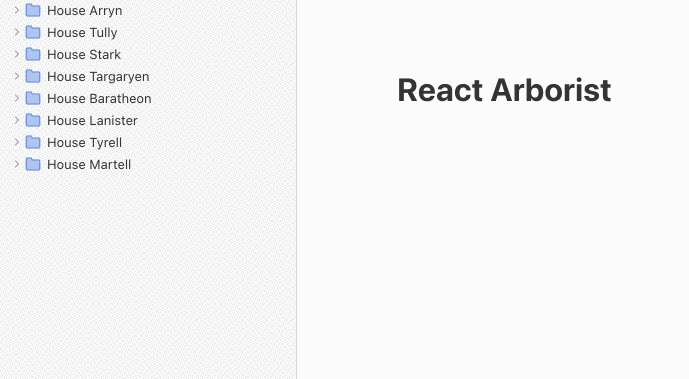
Demo: https://react-arborist.netlify.app/
The tree UI is ubiquitous in software applications. There are many tree component libraries for React, but none were full-featured enough to stand on their own.
This library provides all the common features expected in a tree. You can select one or many nodes to drag and drop into new positions, open and close folders, render an inline form for renaming, efficiently show thousands of items, and provide your own node renderer to control the style.
yarn add react-arborist
npm install react-arborist
Render the tree data structure.
const data = {
  id: "A",
  name: "Root",
  children: [
    { id: "B", name: "Node 1" },
    { id: "C", name: "Node 2" },
  ],
};

function App() {
  return <Tree data={data}>{Node}</Tree>;
}

function Node({ ref, styles, data }) {
  return (
    <div ref={ref} style={styles.row}>
      <div style={styles.indent}>{data.name}</div>
    </div>
  );
}The Tree component expects the data prop to be a tree-like data structure with the following type:
type Data = {
  id: string, /* Required */
  children?: Data[]
  isOpen?: boolean
  ...rest /* Any other data you wish to provide */
}
If your data does not look like this, you can provide a childrenAccessor prop. You can also provide isOpenAccessor. The value can be a string or a function.
<Tree childrenAccessor="items" ...
// Or
<Tree childrenAccessor={(node) => node.items} ...Unlike other Tree Components, react-arborist is designed as a controlled component. This means the consumer will provide the tree data and the handlers to update it. The only state managed internally is for drag and drop, selection, and editing.
| Prop | Default | Description |
|---|---|---|
| data | (required) | The tree data structure to render as described above. |
| width | 300 | The width of the tree. |
| height | 500 | The height of the tree. To dynamically fill it's container, use a hook or component to gather the width and height of the Tree's parent. |
| rowHeight | 24 | The height of each row. |
| indent | 24 | The number of pixels to indent child nodes. |
| hideRoot | false | Hide the root node so that the first set of children appear as the roots. |
| onToggle | noop | Handler called when a node is opened or closed. This and the subsequent functions should update the data prop for the tree to re-render. |
| onMove | noop | Handler called when a user moves one or more nodes by dragging and dropping. |
| onEdit | noop | Handler called when a user performs an inline edit of the node. |
| childrenAccessor | "children" | Used to get a node's children if they exist on a property other than "children". |
| isOpenAccessor | "isOpen" | Used to get a node's openness state if it exists on a property other than "isOpen". |
| openByDefault | true | Choose if the node should be open or closed when it has an undefined openness state. |
| className | undefined | Adds a class to the containing div. |
| dndRootElement | undefined | The element for react-dnd to bind it's events to. Defaults to window. See brimdata#33 |
The only child of the Tree Component must be a NodeRenderer function as described below.
const NodeRenderer = ({
  innerRef, data, styles, handlers, state, tree
}) => ...

const MyApp = () =>
  <Tree>
    {NodeRenderer}
</Tree>The Node Renderer is where you get to make the tree your own. You completely own the style and functionality. The props passed to it should enable you to do whatever you need.
The most basic node renderer will look like this:
function NodeRenderer({ innerRef, styles, data, state, handlers, tree }) {
  return (
    <div ref={innerRef} style={styles.row}>
      <div style={styles.indent}>{data.id}</div>
    </div>
  );
}
The function above is passed data for this individual node, the DOM ref used for drag and drop, the styles to position the row in the virtualized list and the styles to indent the current node according to its level in the tree.
| Prop | Type | Description |
|---|---|---|
| data | Node | A single node from the tree data structure provided. |
| innerRef | Ref | Must be attached to the root element returned by the NodeRenderer. This is needed for drag and drop to work. |
| styles | object | This is an object that contains styles for the position of the row, and the level of indentation. Each key is described below. |
| state | object | An handful of boolean values that indicate the current state of this node. See below for details. |
| handlers | object | A collection of handlers to attach to the DOM, that provide selectable and toggle-able behaviors. Each handler is described below. |
| tree | TreeMonitor | This object can be used to get at the internal state of the whole tree component. For example, tree.getSelectedNodes(). All the methods are listed below in the Tree Prop section. |
These are the properties on the styles object passed to the NodeRenderer.
| Name | Type | Description |
|---|---|---|
| row | CSSProperties | Since the tree only renders the rows that are currently visible, all the rows are absolutely positioned with a fixed top and left. Those styles are in this property. |
| indent | CSSProperties | This is simply a left padding set to the level of the tree multiplied by the tree indent prop. |
These are the properties on the state object passed to the NodeRenderer.
| Name | Type | Description |
|---|---|---|
| isOpen | boolean | True if this node has children and the children are visible. Use this to display some type a open or closed icon. |
| isSelected | boolean | True if this node is selected. Use this to show a "selected" state. Maybe a different background? |
| isHoveringOverChild | boolean | True if the user is dragging n node, and the node is hovering over one of this node's direct children. This can be used to indicate which folder the user is dragging an item into. |
| isDragging | boolean | True if this node is being dragged. |
| isSelectedStart | boolean | True if this is the first of a contiguous group of selected rows. This can be used to tastefully style a group of selected items. Maybe a different border radius on the first and last rows? |
| isSelectedEnd | boolean | True if this is the last of a contiguous group of selected rows. |
| isEditing | boolean | True if this row is being edited. When true, the renderer should return some type of form input. |
These are the properties on the handlers object passed to the NodeRenderer.
| Name | Type | Description |
|---|---|---|
| select | MouseEventHandler | Attach this to the element that tiggers selection. Maybe you want to add it to the outermost div. <div onClick={handlers.select}> |
| toggle | MouseEventHandler | Attach this to the element that opens and closes the node. Maybe you want to add it to the +/- icon. <icon onClick={handlers.toggle}> |
| edit | () => void |
Makes this node editable. This will re-render the Node with the state.isEditing prop set to true. |
| submit | (update: string) => void |
Sends the update to the onEdit handler in the Tree component, and sets the state.isEditing prop to false. |
| reset | () => void |
Re-renders with the state.isEditing prop set to false. |
The tree monitor provides methods to get and change the tree's internal state. A use case might be in a right click menu.
// In your node renderer
onContextMenu={() => {
  // Do something with all the selected nodes
  tree.getSelectedIds()
}}| Methods | Returns | Description |
|---|---|---|
getSelectedIds() |
string[] |
Get the the ids of all currently selected nodes. |
edit(id: string) |
Promise<{cancelled: boolean, value: string | undefined}> |
Edit a node programatically. Resolves when the edit is finished or cancelled. |
submit(id: string, value: string) |
void | Submit the edit. |
reset(id: string) |
void | Cancel the edit. |
select(index: number, meta = false, shift = false) |
void |
Select a node by it's visible index in the tree. The meta flag, when true, will allow multiple items to be selected. The shift flag, when true, will select all nodes between the last one selected, and this one. |
selectById(id: string, meta = false, shift = false) |
void |
Same as above but selects by id. If the id is not present (in a collapsed folder), nothing will happen. First use the scrollToId function which will open all the parents and scroll to the id. |
scrollToId(id: string) |
void | Scroll to the id opening all it's parents if needed. |
You may need to access the tree from the parent component. This can be done by passing a ref.
function MySection() {
  const tree = useRef(null)

  useEffect(() => {
    tree.current.scrollToId("B")
  }, [])

  return <Tree ref={ref} ... />
}
Authored by James Kerr


 React
React
 Typescript
 Django
 Laravel
 Facebook
 Microsoft
 Google
 Alibaba
 D3
D3
 Tencent