Giter Club home page Giter Club logo

mui-treasury's Introduction

πŸ‘‹ Welcome! to Material Treasury

All Contributors

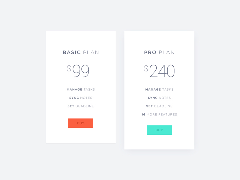
Material Treasury is a collection of blocks that are ready-to-use for Material UI projects.

The blocks are made to live from design inspiration resources such as Dribbble and Pinterest, etc.

There are 2 way to use the blocks in your project.

  • Copy and paste: open the "Doc" of the block you want and copy the code. Then paste it to your project, it should work instantly (open an issue if it does not).
  • Use CLI to clone the latest blocks to your project.

CLI

  1. go to mui-treasury
  2. find a block you want to clone from the sidebar (let's say that I want the Card/News/Maldives)
  3. open your terminal and go to your root project directory
  4. run npx mui-treasury@latest clone card-news-maldives
  5. you will see that the code is downloaded to src/mui-treasury folder (in your local project)

Note: to clone multiple blocks, just add more names to the command with a space in between, e.g. npx mui-treasury clone [blocks...]

Usage: npx mui-treasury@latest [options] [command]

Options:
  -v, --version                 output the current version
  -h, --help                    display help for command

Commands:
  init
  clone [options] <sources...>  clone components/styles to your config directory
  help [command]                display help for command

init

create a mui-treasury.config.js file that will be used when running clone.

npx mui-treasury@latest init

Note that config file will be overridden by cli options (if specified)

clone

Usage: npx mui-treasury@latest clone [options] <sources...>

clone components/styles to your config directory

Options:
  -d, --dir [directory]      destination directory
  -t, --template [template]  template of the files, typescript (default) | javascript
  -b, --branch [branch]      target branch on github
  --storybook                storybook file(s) will be included.
  --test                     test file(s) will be included.
  -h, --help                 display help for command

clone multiple blocks

npx mui-treasury@latest clone card-galaxy info-basic

Donation

To help me keep this project alive! every dollar matters.

Contribution

I am profoundly appreciate any contribution you submit, thanks.

License

This project is licensed under the terms of the MIT license.

Contributors ✨

Thanks goes to these wonderful people (emoji key):


Siriwat Kunaporn

🎨 πŸ’» πŸ› πŸ“– πŸ’‘ πŸ€” πŸ“† 🚧 πŸš‡ πŸ‘€ ⚠️

Kunanan

πŸ”§

renamoo

πŸ“– πŸ’»

Punn Siriphanthong

πŸ’»

_borBier

πŸ’»

Thongrapee Panyapatiphan

πŸ’»

Kijpokin

πŸ’»

Davide D'Antonio

πŸ’»

Aaron Hayes

πŸ’»

tokdaniel

πŸ›

Alejandro Venegas

πŸ’»

Bartosz Podgruszecki

🚧

Paddy

πŸ“– 🚧 πŸ’»

Alexandre Teyar

️️️️♿️

Max Wassiljew

πŸ’»

tsutomu

πŸ’»

David Granado

🚧

Marek

πŸ’»

Matthew Lancellotti

πŸ’»

This project follows the all-contributors specification. Contributions of any kind welcome!

mui-treasury's People

Contributors

aaronhayes avatar allcontributors[bot] avatar aress31 avatar barthicus avatar david0178418 avatar dependabot-preview[bot] avatar dependabot[bot] avatar mareoraft avatar murbanowicz avatar nestiank avatar pacurtin avatar renamoo avatar siriwatknp avatar tsutomunakamura avatar venegasalejandro avatar

Stargazers

 avatar  avatar  avatar  avatar  avatar  avatar  avatar  avatar  avatar  avatar  avatar  avatar  avatar  avatar  avatar  avatar  avatar  avatar  avatar  avatar  avatar  avatar  avatar  avatar  avatar  avatar  avatar  avatar  avatar  avatar  avatar  avatar  avatar  avatar  avatar  avatar  avatar  avatar  avatar  avatar  avatar  avatar  avatar  avatar  avatar  avatar  avatar  avatar  avatar  avatar  avatar  avatar  avatar  avatar  avatar  avatar  avatar  avatar  avatar  avatar  avatar  avatar  avatar  avatar  avatar  avatar  avatar  avatar  avatar  avatar  avatar  avatar  avatar  avatar  avatar  avatar  avatar  avatar  avatar  avatar  avatar  avatar  avatar  avatar  avatar  avatar  avatar  avatar  avatar  avatar  avatar  avatar  avatar  avatar  avatar  avatar  avatar  avatar  avatar  avatar

Watchers

 avatar  avatar  avatar  avatar  avatar  avatar  avatar  avatar  avatar  avatar  avatar  avatar  avatar  avatar  avatar  avatar  avatar  avatar  avatar  avatar  avatar  avatar  avatar  avatar  avatar  avatar  avatar  avatar

mui-treasury's Issues

SimpleArrow.js:3: move SimpleArrow from previous version.

The puzzle 165-f7a467f7 from #165 has to be resolved:

// @todo #165 move SimpleArrow from previous version.

The puzzle was created by @siriwatknp on 21-Oct-19.

role: DEV.

If you have any technical questions, don't ask me, submit new tickets instead. The task will be "done" when the problem is fixed and the text of the puzzle is removed from the source code. Here is more about PDD and about me.

(Update)-Predefined-Button-v1.1

Predefined Button v1.1

Enhancements

  • Add "square" as another shape (previously has chubby & circular)

Fixes & Adjustments

  • Fix "danger button" to have proper color state (right now if you hover, color is not changed)
  • Adjust proper padding when button is full-width and label is expanded.
  • Change borderWidth variable to outlinedBorderWidth
  • Reset letterSpacing=0 & use fontWeight=500 at initial
    use default icon size = 14, I think it is the best size after comparing various values.

a link to a branch

Typescript support

Thanks for your sharing and appreciate for your huge effort to make it live.
Hope this will support typescript as well.

(Breaking Change) Upgrade to Material-UI v4

Changes

  1. withTheme API
// before
withTheme()(Component) 

// v4
withTheme(Component)
  1. classNames : From hashed to global className

  2. MuiThemeProvider is no longer used, use ThemeProvider from '@material-ui/styles' instead

  3. Official MuiButton-flat to MuiButton-text affect Predefined Button v1.1

  4. Tab style attribute "label" & "labelContainer" is no longer available.

Components Checklist

  • Button
  • Card
  • Icon
  • Input
  • Tabs
  • Text Field
  • Typography

Pages Checklist

  • Login
  • Peapods

use prettier

This tool is becoming a standard and can help keep the code readable and maintainable.

It also saves developers tons of time wasted on formatting code.

(Update) Layout-v1.1

Fixes

  • remove config in state when first mount, config is controlled from props.
  • fix hover bg color of collapsed icon button
    change prop "open" to "visible" for more declarative.

(1st-Update) Peapods Components

Enhancements

  • follow predefined button v1.1
  • move form in PeaFullProfile to PeaProfileEditor
    turn PeaTextArea into an independent component
    follow predefined typography v1.1

Amigo E-Commerce Template

Components

  • App Bar (AmiHeader)
  • Mega Menu
  • Product Ads
  • Product Card
  • Collapsor
  • Color Picker
  • Size Picker
  • Pagination

(Update) Predefined-Typography-v1.2

Enhancements

  • link, highlight style
  • block quote (normal, offset)
  • anchor
  • space (top, bottom)

Fixes & Adjustments

  • render Link when "link" is true
  • fix bug typo "space" to "spacing"

publish multiple npm packages

I would like to be able to import all the components via an npm package.

Seeing as this repo has not been published yet, I suggest refactoring the project folder structure to have a src/packages folder for each exported package.

Besides @mui-treasury/peapods and @mui-treasury/core what else should we export?

Add Fullscreen Button

Using Fullscreen and FullscreenExit combined with Fullscreen API is a common component to have in some backoffice driven apps.

Maybe would be nice to publish this component under Mui Treasure, it depends of #72

Actual code, copied from https://www.npmjs.com/package/@straw-hat/react-fullscreen (I am the author)

import IconButton from '@material-ui/core/IconButton';
import FullscreenIcon from '@material-ui/icons/Fullscreen';
import FullscreenExitIcon from '@material-ui/icons/FullscreenExit';
import * as React from 'react';
import { useFullscreen } from '@straw-hat/react-fullscreen';

export function FullscreenButton() {
  const target = React.useRef(window.document.body);
  const { isFullscreen, toggleFullscreen } = useFullscreen(target);

  return (
    <IconButton color="inherit" onClick={toggleFullscreen}>
      {isFullscreen ? <FullscreenExitIcon /> : <FullscreenIcon />}
    </IconButton>
  );
}

Cheers,

Duplicate identifier in layout generator for ChevronLeftIcon

Hello, in the generated code for a Layout using chevron icons, there are two different lines that import as ChevronLeftIcon, and nothing that imports as ChevronRightIcon. This causes these layouts to throw errors.

I will submit a pull request shortly.

(Update) Predefined-Button-v1.2

fixes

  • change span className from MuiButton-text to MuiButton-span due to material-ui v4 #32
  • add "square" to shape prop-types
  • add more variable to help other people customize easier (no need to look at styles, just change the value)

Examples

  • add icon examples to Button Page

(Update) Predefined-Button-v1.3

  • use function to identify icon size
  • use transformX(-50%) to reduce customization
  • add absolute props (for icon) => label can stay center

Fixed Side Nav Position when header Clipped

Description
When the header is fixed, clipped, and the side drawer is permanent or persistent then side nav first item is not visible because it is behind the header app bar

I have tried all presets and custom made using Layout Builder but couldn't resolve the issue.

To Reproduce
Steps to reproduce the behavior:

  1. In a set environment with all required files, use
    <Root config={presets.createMuiTreasuryLayout()} >
  2. try adding data in <Header> and <Nav>
  3. Now In Computer Browser, with full resolution(>960px), you may notice header is clipped and side nav's first (or first few items depending on height) are not visible.

Expected behavior
It would be better if there was top margin when drawer is permanent or persistent and header is clipped

Screenshots
Screenshot 2019-08-16 at 5 49 26 PM

Screenshot 2019-08-16 at 5 49 45 PM

Notice in above image that Inbox(First Item) is hidden because App Header Bar is overlapping it.

Steps to demo component in Sandbox

Steps

  1. Open sandbox
  2. Create new create-react-app template
  3. add dependencies (@material-ui/core, @material-ui/styles)
  4. add icon font material-fonts, fontawesome5
  5. copy components to sandbox, change path from predefined to ./
  6. import Demo to index.js
  7. render Demo

Improvements

  1. Open sandbox from template in How to use (step 1 + 2 + 3 + 4 + 6)
  2. copy components to sandbox

Bugs

  1. ComponentInfo - copy button does not show in mobile. (may be z-index)
  2. ComponentInfo - reduce component name and add gutter bottom in mobile

(Brand) Peapods move to lib

/src
/brands
/peapods
/lib (this will be move to @mui-treasury/peapods in the future)
/assets
/theme
…pure components
/demo (this is for Peapods Page in mui-treasury)

Contribution guidelines?

This is a fantastic project and I would like to participate in the development process.
Can you write a contribution guidelines? Maybe accompanied by a roadmap.

Recommend Projects

  • React photo React

    A declarative, efficient, and flexible JavaScript library for building user interfaces.

  • Vue.js photo Vue.js

    πŸ–– Vue.js is a progressive, incrementally-adoptable JavaScript framework for building UI on the web.

  • Typescript photo Typescript

    TypeScript is a superset of JavaScript that compiles to clean JavaScript output.

  • TensorFlow photo TensorFlow

    An Open Source Machine Learning Framework for Everyone

  • Django photo Django

    The Web framework for perfectionists with deadlines.

  • D3 photo D3

    Bring data to life with SVG, Canvas and HTML. πŸ“ŠπŸ“ˆπŸŽ‰

Recommend Topics

  • javascript

    JavaScript (JS) is a lightweight interpreted programming language with first-class functions.

  • web

    Some thing interesting about web. New door for the world.

  • server

    A server is a program made to process requests and deliver data to clients.

  • Machine learning

    Machine learning is a way of modeling and interpreting data that allows a piece of software to respond intelligently.

  • Game

    Some thing interesting about game, make everyone happy.

Recommend Org

  • Facebook photo Facebook

    We are working to build community through open source technology. NB: members must have two-factor auth.

  • Microsoft photo Microsoft

    Open source projects and samples from Microsoft.

  • Google photo Google

    Google ❀️ Open Source for everyone.

  • D3 photo D3

    Data-Driven Documents codes.