The aim of the script plot_dist.R is to create diagrams of distribution to be used when illustrating Bayesian hierarchical models in the style of John K. Kruschke's Doing Bayesian Data Analysis. The image below shows an example taken from DBDA and Kruschke describes the advantages of this style of diagram compared to DoodleBUGS style diagrams in this blog post.
In order to create Kruschke style diagrams you need pretty pictures of the different distribution you have in your model, pictures that you later can stitch together in some drawing program (for example Libre Office Draw or Inkscape). The script plot_dist.R (written in R) helps with this and to create a diagram of the normal distribution you would run the following code in your current R session.
# Reads in the functions plot_dist, plot_dist_svg, plot_dist_png and a
# list of predefined distributions called dists.
source("plot_dist.R")
plot_dist(dists$normal)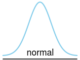
If you want to you can fill in the parameters yourself in the drawing program later but you can also make plot_dist draw the parameters by supplying a character or expression vector.
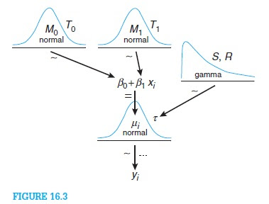
plot_dist(dists$normal, labels = c(mean = expression(mu[j]), right_sd = expression(tau)))
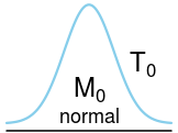
plot_dist(dists$normal, labels = c(mean = expression(M[0]), right_sd = expression(T[0])))
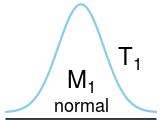
plot_dist(dists$normal, labels = c(mean = expression(M[1]), right_sd = expression(T[1])))
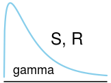
plot_dist(dists$gamma, labels = c(params = "S, R"))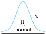
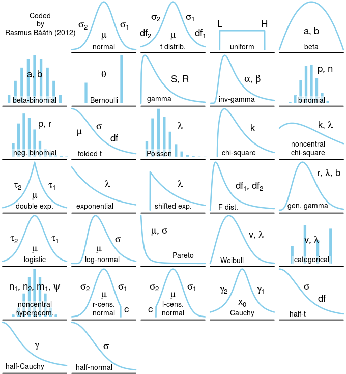
The image below shows the distributions that are currently implemented which covers the univariate distributions in jags and some more. I am not overly familiar with all of these distributions and I was not sure what was the most "canonical" shape for some of them (the generalized gamma distribution for example). If you have any feedback, questions or suggestion (maybe on what distributions to add) please don't hesitate to contact me ([email protected])!
The file plot_dist.R contains all you need to get going: the functions plot_dist, plot_dist_svg, plot_dist_png and the list of the predefined distributions.
If you don't want to bother with generating your own images you can download png and svg images for all the distributions here. The actual script that generated the images is available here which might be useful to look at as it contains many examples of how plot_dist works.
I've also made a nifty template you can use together with the open-source Libre Office Draw that makes it really easy to make Kruschke style diagrams. Download the template here. A file with some extra distributions for Libre Office Draw is available here. For these templates to work the Math component of Libre Office needs to be installed.
I also made a short screencast that shows how to use the Libre Office template:

The diagrams produced by plot_dist are made to look good when being around 2-3 inches wide and 1.5-2.5 inches high. If you want to make larger plots you have to play around with the scale parameter:
plot_dist(dists$beta, labels = c(params = "a, b"), scale = 3)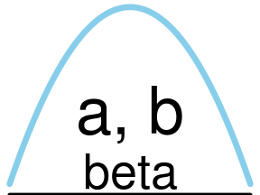
However, if you just want to make svg or png files to import into a drawing program you can use the convenience functions plot_dist_svg and plot_dist_png.
plot_dist_png("bernouli_dist.png", dists$bernouli, expression(theta))
plot_dist_png("bernouli_dist.svg", dists$bernouli, expression(theta))
As svg is a vector format you can then scale the diagrams to your liking in your drawing program.
In order to know the label names of the different parameters you just look at the labels element of the corresponding distribution. For example:
dists$t$labels## $mean
## [1] 0.5 0.3
##
## $right_sd
## [1] 0.75 0.65
##
## $left_sd
## [1] 0.25 0.65
##
## $right_df
## [1] 0.90 0.35
##
## $left_df
## [1] 0.10 0.35
Here we see that the t distribution has five named labels and to make a diagram with a df to the right we would write:
plot_dist(dists$t, labels = c(mean = expression(mu),
          left_scale = expression(sigma), right_df = "df"))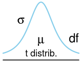
You can also change the color of the diagrams using the parameter color.
plot_dist(dists$bernouli, labels = c(p = "p"), color = "purple")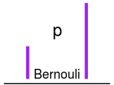
If you want to coustomize a diagram further you can create new distribution definitions. For examples of the current definitions look in the file plot_dist.R. The following is the definition of the normal distribution:
normal = list(
# Name of the distribution to be displayed in the plot
name = "normal",
# Position of the name in the plot
name_pos = c(0.5, 0.1),
# Plot type, "line" for a line plots and "bar" for bar plots.
plot_type = "line",
# The values of the x-axis.
x = seq(-3.3, 3.3, 0.01),
# If top_space = 0 the distribution extends to the top of the graph, if
# 0 > top_space < 1 then that proportion of space is left at the top.
top_space = 0,
# The function defining the probability density function
ddist = dnorm,
# The arguments given to the probability density function (has to be named)
ddist_params = list(mean=0, sd=1),
# Coordinates and names for the parameter labels
labels = list(mean = c(0.5, 0.3), right_sd = c(0.80, 0.5), left_sd = c(0.20, 0.5))
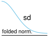
)If we, e.g., wanted to make a folded normal distribution, we could take this denifintion and change it in the following way:
folded_normal <- dists$normal
folded_normal$name <- "folded norm."
folded_normal$name_pos <- c(0.35, 0.1)
folded_normal$x <- seq(0, 3.3, 0.1)
folded_normal$labels <- list(sd = c(0.55, 0.5))
plot_dist(folded_normal, "sd")