

The fundamental-react library is a set of React components built using SAP Fundamental Styles.
The Fundamental Styles library is a design system and HTML/CSS component library used to build modern product user experiences with the SAP look and feel.
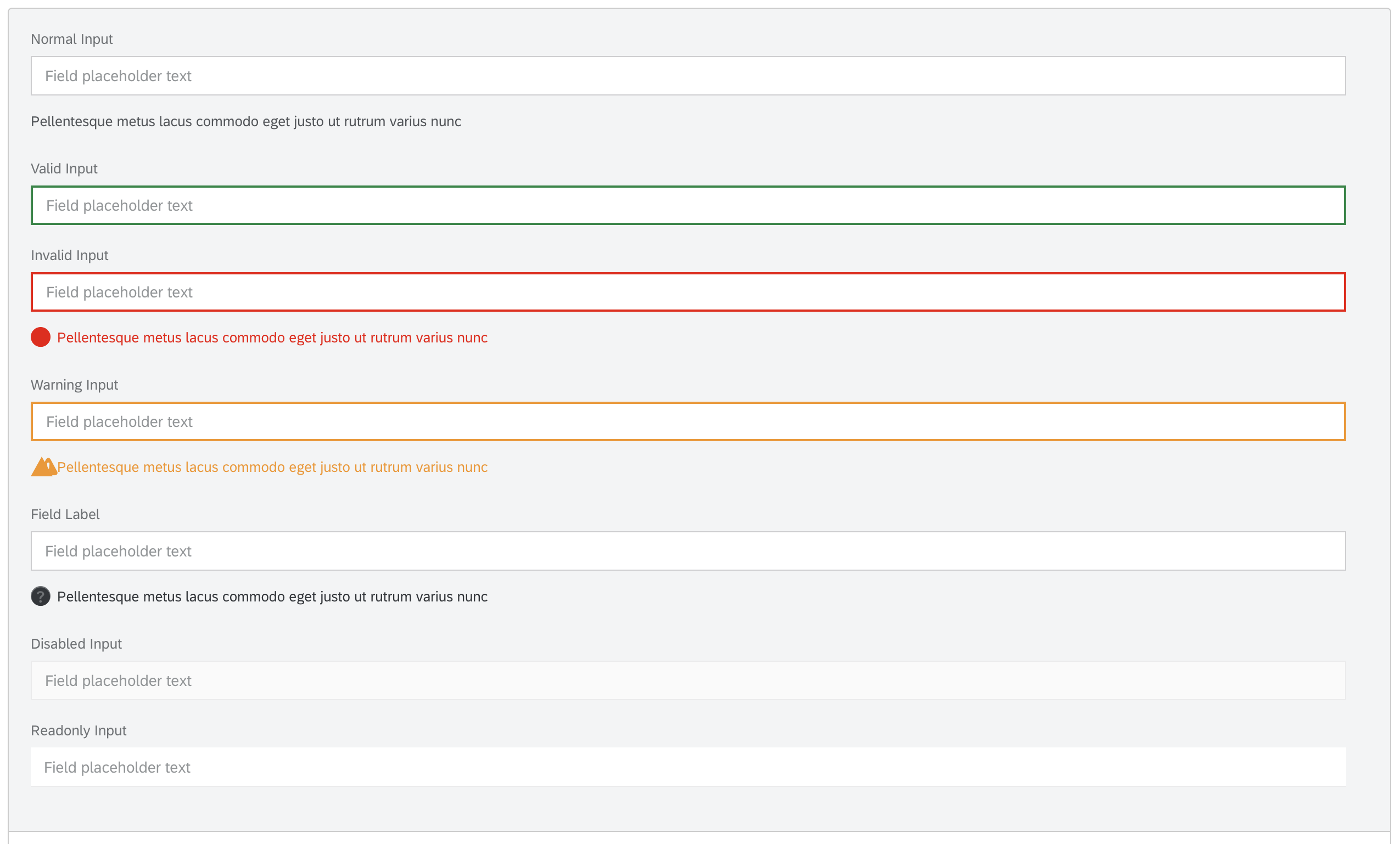
See Component Documentation for examples and API details.
You will need to install Node and Node Package Manager.
Fundamental React requires a polyfill for:
You will need to add your own polyfills. See core-js for instructions.
For an existing react application, follow the steps below:
-
Install
fundamental-react.npm install fundamental-react
-
All components are currently packaged together with their respective
css, you will need to edit your webpack configuration to handle these files. See css-loader. -
Import components as needed. See Component Documentation for examples and API details.
import { MessageStrip } from 'fundamental-react/lib/MessageStrip';
or
import { MessageStrip } from 'fundamental-react';
NOTE: Importing from specific component is recommended. Doing so will bring in only the component you are using instead of the whole library, which will reduce your bundle size significantly.
-
This project does not contain fonts and icons - they must be added to your project separately. Download Font 72 and SAP icons. After adding fonts and icons to your project, include the following in your css:
    @font-face {
        font-family: "72";
        src: url("path/to/fonts") format("woff"); /* Bold, Light, Regular available in woff and woff2 */
        font-weight: normal;
        font-style: normal;
    };

    @font-face {
        font-family: "SAP-icons";
        src: url("path/to/icons") format("woff"); /* available in woff, woff2 and ttf */
        font-weight: normal;
        font-style: normal;
    }
Additionally, edit your webpack configuration to load font and icon fonts - see file-loader.
All styles are based on rem units. Include the following in your CSS to ensure components are sized correctly:
    html {
        font-size: 16px;
}The fundamental-react library follows Semantic Versioning. These components strictly adhere to the [MAJOR].[MINOR].[PATCH] numbering system (also known as [BREAKING].[FEATURE].[FIX]).
Merges to the main branch will be published as a prerelease. Prereleases will include an rc version (e.g. [MAJOR].[MINOR].[PATCH]-rc.[RC]).
The following circumstances will be considered a BREAKING change:
- A component’s existing API is altered (with the exception of additions)
- The existing underlying HTML markup of a component is altered
- An existing unit test is altered to account for either of the above
The following circumstances will NOT be considered a BREAKING change:
- Additions to a component’s API
- Non-visual HTML attribute changes/additions (such as
role,aria-*,data-*) - An existing unit test is altered to account for non-visual HTML attribute changes/additions (such as
role,aria-*,data-*)
This library supports css-modules. The motivation for this support is to be able to include multiple versions or instances of fundamental styles on the same page without collisions in styles. This can be useful if you have a page using fundamental-ngx alongside fundamental-react, for example.
One way to use fundamental-react with hashed class names is to pass the library code through css-loader in your webpack config
// If you have an existing css rule
{
    test: /.css$/,
    exclude: [
        /node_modules\/fundamental-styles/
    ],
    use: [
        'style-loader',
        'css-loader'
    ]
},
// run css-loader with modules enabled for css files from fundamental-styles
{
    test: /.css$/,
    include: [
        /node_modules\/fundamental-styles/
    ],
    use: [
        'style-loader',
        {
            loader: 'css-loader',
            options: {
                modules: {
                    localIdentName: '[local]-[sha1:hash:hex:6]'
                }
            }
        }
    ]
},
It's important to include [local] in the localIdentName which keeps the class name in the hash. This is because some of the style rules in fundamental-styles reference the name of the class, like [class*=level].
Please see Issues.
If you encounter an issue or want to request a feature, you can create an issue.
If you want to contribute, please check the Contribution Guidelines. Also see our Developer Guide to Getting Started.
For the MAC M1 user, to Set up your local dev environment, you need to run the project under node x86.


![dependabot-preview[bot] avatar](https://avatars.githubusercontent.com/in/2141?v=4 "dependabot-preview[bot]")
![dependabot[bot] avatar](https://avatars.githubusercontent.com/in/29110?v=4 "dependabot[bot]")


 React
React
 Typescript
 Django
 Laravel
 Facebook
 Microsoft
 Google
 Alibaba
 D3
D3
 Tencent