Get it from NuGet:


| Supported MAUI platforms | Supported XF platforms |
|---|---|
| ✔️ Android | ✔️ Android |
| ✔️ iOS | ✔️ iOS |
| ❓ Windows | ✔️ UWP |
| ❓ Mac |
- MAUI version
- Fully customizable
- Underlined tabs, bottom tabs, Segmented control, scrollable tabs
- Vertical tabs
- Lazy and Delayed views
- Material tabs specs full implementation
- SVG support thanks to GeometryIcon
- Badge on tabs
- Component oriented architecture
- Layout your tabs and ViewSwitcher as you want
- Shadows included in TabHost
- Bindable
| MAUI sample |
|---|
 |
| Bottom bar tabs | Fixed tabs |
|---|---|
 |
 |
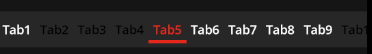
| BottomTabItem | UnderlinedTabItem |
| Segmented tabs | Neumorphic tabs |
|---|---|
 |
 |
| TabType.Scrollable | inherit from TabItem |
| Material top icon | Material leading icon |
|---|---|
 |
 |
| IconOptions="TopIcon" | IconOptions="LeadingIcon" |
| Scrollable tabs | Custom tabs |
|---|---|
 |
 |
| TabType.Scrollable | inherit from TabItem |
| BadgeView | BadgeView (Chips) |
|---|---|
 |
 |
| Numbers, Indicator | Chips with text |
| Vertical Tabs |
|---|
 |
| Orientation="Vertical" |
For dotnet MAUI, you can just have a look at the MauiSample solution.
For Xamarin.Forms the tabs components are presented in the Silly! app in the following repository:
https://github.com/roubachof/Xamarin-Forms-Practices
public static class MauiProgram
{
    public static MauiApp CreateMauiApp()
    {
        var builder = MauiApp.CreateBuilder();
        builder
            .UseMauiApp<App>()
            .UseSharpnadoTabs(loggerEnable: false);

        return builder.Build();
    }
}Because Tabs uses platform-specific effects like tinted images and tap feedback color, you must install the nuget package in all your targeted platforms projects (netstandard, ios, android, uwp).
- In Core project in
App.xaml.cs:
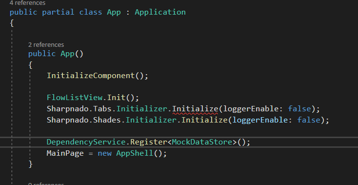
For the namespace xaml schema to work (remove duplicates xml namespace: see this xamarin doc), you need to call tabs and shadows initializers from the App.xaml.cs file like this:
public App()
{
    InitializeComponent();

    Sharpnado.Tabs.Initializer.Initialize(false, false);
    Sharpnado.Shades.Initializer.Initialize(loggerEnable: false);
    ...
}- Mandatory initializations on iOS:
    Xamarin.Forms.Forms.Init();
Sharpnado.Tabs.iOS.Preserver.Preserve();- Mandatory initializations on UWP:
    var rendererAssemblies = new[]
    {
        typeof(UWPShadowsRenderer).GetTypeInfo().Assembly,
        typeof(UwpTintableImageEffect).GetTypeInfo().Assembly,
    };
Xamarin.Forms.Forms.Init(e, rendererAssemblies);You can use Commands.Tap to add a tap gesture to any view.
The TouchEffect.Color property will set a native touch feedback with the desired color.
You probably know the LazyView by now, the DelayedView is an evolution of it enabling full control of your UI building times.
Using a DelayedView will reduce application startup time by deferring the UI building of your components by some milliseconds (the value can be configured).
delayedView.mp4
All you have is wrap your view in a DelayedView inside your ViewSwitcher, or even anywhere in your app.
<tabs:ViewSwitcher x:Name="Switcher"
                           Grid.RowSpan="3"
                           Margin="0"
                           Animate="True"
                           SelectedIndex="{Binding SelectedViewModelIndex, Mode=TwoWay}">
    <tabs:DelayedView x:TypeArguments="views:TabM"
                        AccentColor="{StaticResource Primary}"
                        Animate="True"
                        BindingContext="{Binding HomePageViewModel}"
                        UseActivityIndicator="True" />
    <tabs:DelayedView x:TypeArguments="views:TabA"
                        AccentColor="{StaticResource Primary}"
                        Animate="True"
                        UseActivityIndicator="True" />
    <tabs:DelayedView x:TypeArguments="views:TabU"
                        AccentColor="{StaticResource Primary}"
                        Animate="True"
                        UseActivityIndicator="True" />
    <tabs:LazyView x:TypeArguments="views:TabI" Animate="True" />
</tabs:ViewSwitcher>
It can totally work outside of the Tabs context.
The TabHostView inherits directly from Shadows. It means you can add as many shades as you like to your tab bar.
It behaves exactly the same as the Shadows component.
Since shadows are now handled by Shades, the old shadow renderers have been removed.
The ShadowType property is gone.
For more information about custom shades, visit the Sharpnado.Shadows repo.
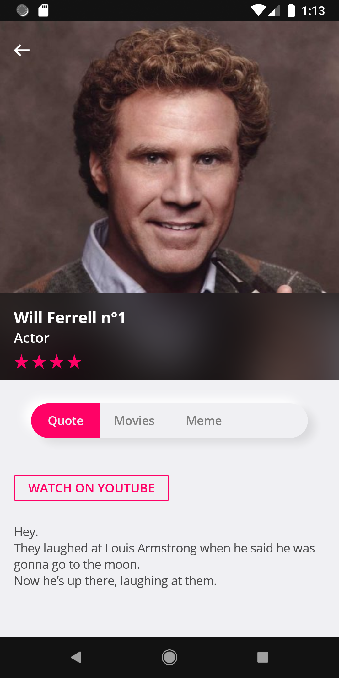
Let's consider this view:
And let's have a look at its code:
<Grid Padding="{StaticResource StandardThickness}"
      ColumnSpacing="0"
      RowSpacing="0">
    <Grid.RowDefinitions>
        <RowDefinition Height="200" />
        <RowDefinition Height="40" />
        <RowDefinition Height="30" />
        <RowDefinition Height="30" />
        <RowDefinition Height="50" />
        <RowDefinition Height="Auto" />
    </Grid.RowDefinitions>

    <!-- first 4 rows then... -->

    <tabs:TabHostView x:Name="TabHost"
                      Grid.Row="4"
                      Margin="-16,0"
                      BackgroundColor="#272727"
                      SelectedIndex="{Binding Source={x:Reference Switcher}, Path=SelectedIndex, Mode=TwoWay}">
        <tabs:TabHostView.Tabs>
            <tabs:UnderlinedTabItem Style="{StaticResource TabStyle}" Label="{loc:Translate Tabs_Quote}" />
            <tabs:UnderlinedTabItem Style="{StaticResource TabStyle}" Label="{loc:Translate Tabs_Filmography}" />
            <tabs:UnderlinedTabItem Style="{StaticResource TabStyle}" Label="{loc:Translate Tabs_Meme}" />
        </tabs:TabHostView.Tabs>
    </tabs:TabHostView>

    <ScrollView Grid.Row="5">
        <tabs:ViewSwitcher x:Name="Switcher"
                           Animate="True"
                           SelectedIndex="{Binding SelectedViewModelIndex, Mode=TwoWay}">
            <details:Quote Animate="True" BindingContext="{Binding Quote}" />
            <details:Filmo Animate="True" BindingContext="{Binding Filmo}" />
            <details:Meme Animate="True" BindingContext="{Binding Meme}" />
        </tabs:ViewSwitcher>
    </ScrollView>
</Grid>
The TabHostView and the ViewSwitcher are really two independent components, and you can place them anywhere. They don't need to be next to each other (even if it would be weird I must admit).
Since they don't know each other, you just need to link them through their SelectedIndex property. You will bind the ViewSwitcher to your view model, and the TabHostView to the ViewSwitcher's SelectedIndex property.
You can also see a mysterious Animate property. It just adds a nice appearing effect. It's really just a little bonus.
UnderlinedTabItem.UnderlineAllTab=(true|false)
You can decide whether or not you want the underline to take the whole tab width, or just the text width.

    public TaskLoaderNotifier<SillyDudeVmo> SillyDudeLoader { get; }

    public QuoteVmo Quote { get; private set; }

    public FilmoVmo Filmo { get; private set; }

    public MemeVmo Meme { get; private set; }

    public int SelectedViewModelIndex
    {
        get => _selectedViewModelIndex;
        set => SetAndRaise(ref _selectedViewModelIndex, value);
    }

    public override void Load(object parameter)
    {
        SillyDudeLoader.Load(() => LoadSillyDude((int)parameter));
    }

    private async Task<SillyDudeVmo> LoadSillyDude(int id)
    {
        var dude = await _dudeService.GetSilly(id);

        Quote = new QuoteVmo(
            dude.SourceUrl,
            dude.Description,
            new TapCommand(url => Device.OpenUri(new Uri((string)url))));
        Filmo = new FilmoVmo(dude.FilmoMarkdown);
        Meme = new MemeVmo(dude.MemeUrl);
        RaisePropertyChanged(nameof(Quote));
        RaisePropertyChanged(nameof(Filmo));
        RaisePropertyChanged(nameof(Meme));

        return new SillyDudeVmo(dude, null);
    }
Well I won't go into details it's pretty obvious.
If you want to know more about the mystery TaskLoaderNotifier, please read this post (https://www.sharpnado.com/taskloaderview-2-0-lets-burn-isbusy-true/).
The tab style is defined in the content page resources, but we could put it the App.xaml since most of the time we will have one type of top tabs (well it's up to your crazy designer really :)
<ContentPage.Resources>
    <ResourceDictionary>
        <Style x:Key="TabStyle" TargetType="tabs:UnderlinedTabItem">
            <Setter Property="SelectedTabColor" Value="{StaticResource AccentColor}" />
            <Setter Property="FontFamily" Value="{StaticResource FontSemiBold}" />
            <Setter Property="LabelSize" Value="14" />
            <Setter Property="UnselectedLabelColor" Value="White" />
        </Style>
    </ResourceDictionary>
</ContentPage.Resources>And let's have a look at its xaml:
<Grid ColumnSpacing="0" RowSpacing="0"
      BackgroundColor="#F0F0F3">
    <Grid.RowDefinitions>
        <RowDefinition Height="{StaticResource ToolbarHeight}" />
        <RowDefinition Height="*" />
        <RowDefinition Height="95" />
    </Grid.RowDefinitions>

    <tb:Toolbar Title="Silly App!"
                BackgroundColor="{StaticResource Accent}"
                ForegroundColor="White"/>

    <tabs:ViewSwitcher x:Name="Switcher"
                       Grid.Row="1"
                       Animate="False"
                       SelectedIndex="{Binding SelectedViewModelIndex, Mode=TwoWay}">
        <customViews:LazyView x:TypeArguments="tabsLayout:HomeView" BindingContext="{Binding HomePageViewModel}" />
        <customViews:LazyView x:TypeArguments="tabsLayout:ListView" BindingContext="{Binding ListPageViewModel}" />
        <customViews:LazyView x:TypeArguments="tabsLayout:GridView" BindingContext="{Binding GridPageViewModel}" />
    </tabs:ViewSwitcher>

    <tabs:TabHostView Grid.Row="2"
                      HorizontalOptions="Center"
                      VerticalOptions="Start"
                      HeightRequest="60"
                      WidthRequest="280"
                      TabType="Fixed"
                      IsSegmented="True"
                      CornerRadius="30"
                      Margin="15"
                      BackgroundColor="#F0F0F3"
                      Shades="{sh:NeumorphismShades}"
                      SelectedIndex="{Binding Source={x:Reference Switcher}, Path=SelectedIndex, Mode=TwoWay}">
        <tabs:TabHostView.Tabs>
            <tabs:BottomTabItem Style="{StaticResource BottomTabStyle}"
                                IconImageSource="house_96"
                                Label="{localization:Translate Tabs_Home}" />
            <tabs:BottomTabItem Style="{StaticResource BottomTabStyle}"
                                IconImageSource="list_96"
                                Label="{localization:Translate Tabs_List}" />
            <tabs:BottomTabItem Style="{StaticResource BottomTabStyle}"
                                IconImageSource="grid_view_96"
                                Label="{localization:Translate Tabs_Grid}" />
        </tabs:TabHostView.Tabs>
    </tabs:TabHostView>

</Grid>Warning: the CornerRadius property will only be effective if the IsSegmented property is true.
BottomTabItem.IsTextVisible=(true|false)
If you like your bottom bar items without text:

You can set a color for the selected tab via SelectedTabColor.
If you want to have a different color for the text, you can specify SelectedTabTextColor.
<ContentPage.Resources>
    <ResourceDictionary>
        <Style x:Key="BottomTabStyle" TargetType="tabs:BottomTabItem">
            <Setter Property="SelectedTabColor" Value="{StaticResource Accent}" />
            <Setter Property="UnselectedLabelColor" Value="Gray" />
            <Setter Property="UnselectedIconColor" Value="LightGray" />
            <Setter Property="FontFamily" Value="{StaticResource FontLight}" />
            <Setter Property="LabelSize" Value="14" />
            <Setter Property="IconSize" Value="28" />
            <Setter Property="IsTextVisible" Value="False" />
        </Style>
    </ResourceDictionary>
</ContentPage.Resources>
A new Property TabType was added to the TabHostView:
public TabType TabType

public enum TabType
{
    Fixed = 0,
    Scrollable,
}Contributor: @mkanyo (Miklos Kanyo)
Since version 2.2, a new type of tab has been introduced: the MaterialUnderlinedTabItem.
It's a full implementation of the material tabs specifications:
https://material.io/components/tabs

IconOptions values:
- TopIcon
- IconOnly
- LeadingIcon
- TextOnly
You can also set precisely the gap between the icon and the text thanks to the IconTextSpacing.
Instead of using a classic Image you can also set a svg Geometry (SVG image) icon thanks to the GeometryIcon property.
Cool Hack: you can use MaterialUnderlinedTabItem (and then use a SVG image) as a bottom bar item, just specify UnderlineHeight = 0.
If you chose to go down this road you can also set the following properties:
public bool Fillpublic double StrokeThicknesspublic double IconTextSpacing
<tabs:TabHostView x:Name="TabHost"
                  Grid.Row="4"
                  Style="{DynamicResource DynamicBottomShadow}"
                  Margin="-16,0"
                  BackgroundColor="{DynamicResource Elevation4dpColor}"
                  ShowScrollbar="False"
                  TabType="Scrollable"
                  SelectedIndex="{Binding Source={x:Reference Switcher}, Path=SelectedIndex, Mode=TwoWay}">
    <tabs:TabHostView.Tabs>
        <tabs:MaterialUnderlinedTabItem Style="{StaticResource ScrollableTabStyle}"
                                        IconImageSource="list_96.png"
                                        IconOptions="TopIcon"
                                        IconSize="24"
                                        IconTextSpacing="0"
                                        Label="{localization:Translate Tabs_Quote}"
                                        UnderlineHeight="2" />
        <tabs:MaterialUnderlinedTabItem Style="{StaticResource ScrollableTabStyle}"
                                        IconImageSource="theme_96.png"
                                        IconOptions="IconOnly"
                                        IconSize="24"
                                        IconTextSpacing="0"
                                        Label="FILMO" />
        <tabs:MaterialUnderlinedTabItem Style="{StaticResource ScrollableTabStyle}"
                                        IconImageSource="grid_view_96.png"
                                        IconOptions="LeadingIcon"
                                        IconSize="24"
                                        IconTextSpacing="0"
                                        Label="{localization:Translate Tabs_Meme}" />
        <tabs:MaterialUnderlinedTabItem Style="{StaticResource ScrollableTabStyle}"
                                        Padding="10,0"
                                        IconImageSource="house_96.png"
                                        IconOptions="TextOnly"
                                        IconSize="24"
                                        IconTextSpacing="0"
                                        Label="NONSENSE" />
      </tabs:TabHostView.Tabs>
</tabs:TabHostView> Contributor: @nor0x (Joachim Leonfellner)
Since version 2.1, you can change the orientation of the tabs to achieve vertical tabs. It could be pretty convenient for landscape or tablet layout.
<sho:TabHostView x:Name="TabHostLogo"
    Grid.Row="3"
    WidthRequest="200"
    HeightRequest="60"
    Margin="15"
    Padding="20,0"
    HorizontalOptions="Center"
    VerticalOptions="Start"
    BackgroundColor="{DynamicResource DynamicBottomBarBackground}"
    CornerRadius="30"
    IsSegmented="True"
    Orientation="Horizontal"
    Shades="{DynamicResource DynamicBottomTabsShadow}"
    TabType="Fixed">
You can find in the silly app (https://github.com/roubachof/Xamarin-Forms-Practices/blob/master/SillyCompany.Mobile.Practices/Presentation/Views/TabsLayout/SillyBottomTabsPage.xaml.cs) an example of dynamically adapting tabs orientation while switching from portrait to landscape:

Since version 1.7 we can mimic iOS segmented control style.
A new tab item has been created: the SegmentedTabItem.
Use it with IsSegmented, SegmentedOutlineColor, and SegmentedHasSeparator, and you will have the classic iOS style.

<tabs:TabHostView x:Name="TabHost"
                    Grid.Row="4"
                    HeightRequest="40"
                    Margin="20,15,20,0"
                    VerticalOptions="Center"
                    BackgroundColor="#F0F0F3"
                    Shades="{sh:SingleShade Offset='0,8',
                                            BlurRadius=10,
                                            Color={StaticResource Accent}
                                            Opacity=0.2}"
                    CornerRadius="20"
                    IsSegmented="True"
                    SegmentedHasSeparator="True"
                    SegmentedOutlineColor="{StaticResource Accent}"
                    TabType="Fixed"
                    SelectedIndex="{Binding Source={x:Reference Switcher}, Path=SelectedIndex, Mode=TwoWay}">
    <tabs:TabHostView.Tabs>
        <tabs:SegmentedTabItem Style="{StaticResource SegmentedTabStyle}" Label="Quote" />
        <tabs:SegmentedTabItem Style="{StaticResource SegmentedTabStyle}" Label="Movies" />
        <tabs:SegmentedTabItem Style="{StaticResource SegmentedTabStyle}" Label="Meme" />
    </tabs:TabHostView.Tabs>
</tabs:TabHostView><Style x:Key="SegmentedTabStyle" TargetType="tabs:SegmentedTabItem">
<Setter Property="SelectedTabColor" Value="{StaticResource Accent}" />
<Setter Property="FontFamily" Value="{StaticResource FontSemiBold}" />
<Setter Property="LabelSize" Value="14" />
<Setter Property="SelectedLabelColor" Value="#F0F0F3" />
<Setter Property="UnselectedLabelColor" Value="Gray" />
</Style>IsSegmented |
Enables segmentation thus clipping for the TabHostView. |
CornerRadius |
Sets the corner radius for the view. Only works if IsSegmented is set to true. |
SegmentedOutlineColor |
Sets the corner radius for the view. Only works if IsSegmented is set to true. |
SegmentedHasSeparator |
Sets a separator between each tab item, the color is given by the SegmentedOutlineColor property. |
Sometimes your designer wants to spice-up a bit the bottom bar tabs by adding a button like a take a picture button. The issue is that the semantic differs from the others tabs since you will make an action instead of swaping views.
So I created the TabButton for scenarios like this.

It has a load of properties to fulfill your designer wildest dreams:
public string IconImageSource

public ICommand TapCommand

public int CornerRadius

public Color ButtonBackgroundColor

public Thickness ButtonPadding

public double ButtonWidthRequest

public double ButtonHeightRequest

public double ButtonCircleSize
For the circle button the issue is that most of the time, you want it to be bigger and to come out a bit of the bar. It needs a little trick to make it works. For example this is the source of the above circle button:
<tabs:TabHostView x:Name="TabHost"
                    Grid.Row="2"
                    BackgroundColor="#272727"
                    SelectedIndex="{Binding Source={x:Reference Switcher}, Path=SelectedIndex, Mode=TwoWay}"
                    TabType="Fixed">
    <tabs:TabHostView.Tabs>
        <tabs:BottomTabItem Style="{StaticResource BottomTabStyle}"
                            IconImageSource="house_96.png"
                            Label="{localization:Translate Tabs_Home}" />
        <tabs:BottomTabItem Style="{StaticResource BottomTabStyle}"
                            IconImageSource="list_96.png"
                            Label="{localization:Translate Tabs_List}" />

        <!--  Circle button  -->
        <tabs:TabButton ButtonBackgroundColor="Accent"
                        ButtonCircleSize="60"
                        ButtonPadding="15"
                        IconImageSource="theme.png"
                        Scale="1.3"
                        TranslationY="-10" />

        <tabs:BottomTabItem Style="{StaticResource BottomTabStyle}"
                            IconImageSource="grid_view_96.png"
                            Label="{localization:Translate Tabs_Grid}" />
        <tabs:BottomTabItem Style="{StaticResource BottomTabStyle}"
                            IconImageSource="house_96.png"
                            Label="{localization:Translate Tabs_Home}" />
    </tabs:TabHostView.Tabs>
</tabs:TabHostView>
So just a bit of translation and scale here.
You can also decide to have a more boring button, why not?

<tabs:TabButton Padding="5"
                ButtonBackgroundColor="Accent"
                ButtonPadding="10"
                CornerRadius="5"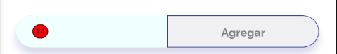
IconImageSource="camera_96.png" />You can add a badge on any UnderlinedTabItem and BottomTabItem.
By default the BadgeView is placed in the top right corner of the TabItem by setting HorizontalOptions=End and VerticalOptions=Start.
SillyBottomTabsPage.xml from the Silly! app
<!--  Example of segmented tab bar (rounded floating tabs)  -->
<tabs:TabHostView Grid.Row="2"
                    WidthRequest="280"
                    HeightRequest="60"
                    Margin="15"
                    HorizontalOptions="Center"
                    VerticalOptions="Start"
                    CornerRadius="30"
                    IsSegmented="True"
                    Shades="{sh:NeumorphismShades}"
                    TabType="Fixed"
                    SelectedIndex="{Binding Source={x:Reference Switcher}, Path=SelectedIndex, Mode=TwoWay}">
    <tabs:TabHostView.Tabs>
        <tabs:BottomTabItem IconImageSource="house_96.png" Label="{localization:Translate Tabs_Home}">
            <tabs:BottomTabItem.Badge>
                <tabs:BadgeView BackgroundColor="White"
                                BorderColor="{StaticResource Accent}"
                                TextColor="{StaticResource Accent}"
                                Text="999+" />
            </tabs:BottomTabItem.Badge>
        </tabs:BottomTabItem>
        <tabs:BottomTabItem IconImageSource="list_96.png" Label="{localization:Translate Tabs_List}">
            <tabs:BottomTabItem.Badge>
                <tabs:BadgeView BackgroundColor="DodgerBlue"
                                BadgePadding="4,2"
                                TextSize="13"
                                Text="{Binding ListPageViewModel.SillyCount}" />
            </tabs:BottomTabItem.Badge>
        </tabs:BottomTabItem>
        <tabs:BottomTabItem IconImageSource="grid_view_96.png" Label="{localization:Translate Tabs_Grid}">
            <tabs:BottomTabItem.Badge>
                <tabs:BadgeView Margin="20,5"
                                BackgroundColor="Red"
                                ShowIndicator="True"
                                TextSize="14"
                                Text="3" />
            </tabs:BottomTabItem.Badge>
        </tabs:BottomTabItem>
    </tabs:TabHostView.Tabs>
</tabs:TabHostView>
SillyDudePage.xml from the Silly! app
<tabs:TabHostView x:Name="TabHost"
                    Grid.Row="4"
                    Margin="-16,0,-16,30"
                    BackgroundColor="{DynamicResource DynamicBottomBarBackground}"
                    CornerRadius="20"
                    Shades="{DynamicResource DynamicTabsShadow}"
                    TabType="Fixed"
                    SelectedIndex="{Binding Source={x:Reference Switcher}, Path=SelectedIndex, Mode=TwoWay}">
    <tabs:TabHostView.Tabs>
        <tabs:UnderlinedTabItem Style="{StaticResource SegmentedTabStyle}" Label="Quote">
            <tabs:UnderlinedTabItem.Badge>
                <tabs:BadgeView BackgroundColor="{StaticResource Accent}"
                                BadgePadding="6,2"
                                FontFamily="{StaticResource FontExtraBold}"
                                TextSize="12"
                                Text="9" />
            </tabs:UnderlinedTabItem.Badge>
        </tabs:UnderlinedTabItem>
        <tabs:UnderlinedTabItem Style="{StaticResource SegmentedTabStyle}" Label="Movies">
            <tabs:UnderlinedTabItem.Badge>
                <tabs:BadgeView BackgroundColor="DodgerBlue"
                                BadgePadding="6,1,6,2"
                                Text="new" />
            </tabs:UnderlinedTabItem.Badge>
        </tabs:UnderlinedTabItem>
        <tabs:UnderlinedTabItem Style="{StaticResource SegmentedTabStyle}" Label="Meme">
            <tabs:UnderlinedTabItem.Badge>
                <tabs:BadgeView Margin="20,0"
                                HorizontalOptions="Start"
                                VerticalOptions="Center"
                                BackgroundColor="White"
                                BorderColor="{StaticResource Accent}"
                                TextColor="{StaticResource Accent}"
                                Text="14" />
            </tabs:UnderlinedTabItem.Badge>
        </tabs:UnderlinedTabItem>
    </tabs:TabHostView.Tabs>
</tabs:TabHostView>| Property | Description | Default |
Text |
Sets the text for the badge text. If it's an integer, the badge will be hidden if the value is 0. |
string.Empty |
TextSize |
Sets the text size used for the badge text. | 10 |
TextColor |
Sets the text color used for the badge text. | Color.White |
FontFamily |
Sets the font family used for the badge text. | null |
BadgePadding |
Precisely adjust inner text margin. | new Thickness(4, 2) |
ShowIndicator |
Shows a small dot instead of the babdge. | false |
BackgroundColor |
Sets the background for the badge. | Color.Red |
BorderColor |
Sets a border color for the badge. | Transparent |
Margin |
Sets a precise margin for the badge. | 10 |
HorizontalOptions |
Sets the horizontal location of the badge. | LayoutOptions.End |
VerticalOptions |
Sets the vertical location of the badge. | LayoutOptions.Start |
As I said, your designer can go cuckoo and you won't even sweat it.
Just extend the abstract TabItem and fulfill the wildest dreams of your colleagues.

<tabs:TabItem x:Class="SillyCompany.Mobile.Practices.Presentation.CustomViews.SpamTab"
              xmlns="http://xamarin.com/schemas/2014/forms"
              xmlns:x="http://schemas.microsoft.com/winfx/2009/xaml"
              xmlns:tabs="clr-namespace:Sharpnado.Presentation.Forms.CustomViews.Tabs;assembly=Sharpnado.Presentation.Forms"
              x:Name="RootLayout">
    <ContentView.Content>
        <Grid ColumnSpacing="0" RowSpacing="0">
            <Image x:Name="Spam"
                   VerticalOptions="End"
                   Aspect="Fill"
                   Source="{Binding Source={x:Reference RootLayout}, Path=SpamImage}" />
            <Image x:Name="Foot"
                   Aspect="Fill"
                   Source="monty_python_foot" />
        </Grid>
    </ContentView.Content>
</tabs:TabItem>

...

<tabs:TabHostView x:Name="TabHost"
                  Grid.Row="2"
                  BackgroundColor="White"
                  SelectedIndex="{Binding Source={x:Reference Switcher}, Path=SelectedIndex, Mode=TwoWay}">
    <tabs:TabHostView.Tabs>
        <tb:SpamTab SpamImage="spam_classic_home" />
        <tb:SpamTab SpamImage="spam_classic_list" />
        <tb:SpamTab SpamImage="spam_classic_grid" />
    </tabs:TabHostView.Tabs>
...
Please don't be shy with Xamarin.Forms animations, it's so easy to use and so powerful thanks to the amazing C# Task api.
USE.
THEM.
private void Animate(bool isSelected)
{
    double targetFootOpacity = isSelected ? 1 : 0;
    double targetFootTranslationY = isSelected ? 0 : -_height;
    double targetHeightSpam = isSelected ? 0 : _height;

    NotifyTask.Create(
        async () =>
        {
            Task fadeFootTask = Foot.FadeTo(targetFootOpacity, 500);
            Task translateFootTask = Foot.TranslateTo(0, targetFootTranslationY, 250, Easing.CubicOut);
            Task heightSpamTask = Spam.HeightRequestTo(targetHeightSpam, 250, Easing.CubicOut);

            await Task.WhenAll(fadeFootTask, translateFootTask, heightSpamTask);

            Spam.HeightRequest = targetHeightSpam;
            Foot.TranslationY = targetFootTranslationY;
            Foot.Opacity = targetFootOpacity;
        });
}


 React
React
 Typescript
 Django
 Laravel
 Facebook
 Microsoft
 Google
 Alibaba
 D3
D3
 Tencent