romainberger / react-portal-tooltip Goto Github PK
View Code? Open in Web Editor NEWAwesome React tooltip
Home Page: http://romainberger.github.io/react-portal-tooltip/
License: MIT License
Awesome React tooltip
Home Page: http://romainberger.github.io/react-portal-tooltip/
License: MIT License


Is there something I'm missing to get the tooltip to stay active on hover?
https://github.com/weflex/react-portal-tooltip has got an additional transition prop, but has a lower version (1.0.1) and no stars (1 so far).
Hi @romainberger,
I love the component and am using it in a project but I need some changes from some open pull requests. I noticed you seem quite busy and was wondering if you might want someone added as a maintainer for this project? I would be happy to take up that mantle.
Apologies if this is intrusive or uncouth. I just want to see this library succeed and to use it to its fullest potential for myself and my projects.
Hi guys thanks again for this component it's really useful. I found two little bugs on the arrow position when the tooltip go outside the screen:
when position = bottom / top & arrow right

when position = bottom / top & arrow = center the position is not really center:

I propose a fix here: #61
I was going through the documentation and example, but still didn't really grasp the group functionality? Could you please clarify that - how does it work, and when would it be useful to have?
Also, when we have multiple tooltips on a page (like in your examples), is there a way to just have one component and refresh its props than having multiple tooltip components?
Hello, guys,
I'm having a problem. I'm not able to see the tooltip. I've added the code as you have told in your documentation but I can't understand what is going wrong. Here is the code:
@CSSModules(styles, { allowMultiple: true })
class UserAvatar extends Component {
    state= {
        isTooltipActive: true,
    };

    showTooltip = () => {
        this.setState({isTooltipActive: true})
    };

    hideTooltip = () => {
        this.setState({isTooltipActive: false})
    };

    renderCustomAvatar = () => {
        const { user, size } = this.props;
        let userInitials = '';
        const {
            isTooltipActive
        } = this.state;

        if (user.customAvatarUrl) {
            return (
                <div id="container" name="avatar">
                    <img
                        alt={`${userInitials}`}
                        src={user.customAvatarUrl}
                        height={size}
                        width={size}
                        id="text"
                    />
                    <ToolTip active={isTooltipActive} position="top" arrow="center" parent="#text">
                        <div>
                            <p>This is the content of the tooltip</p>
                        </div>
                    </ToolTip>
                </div>
            );
        }
    };

    render() {
        const { user, edit } = this.props;

        return (
            <section>
                <div
                    className="avatar"
                >

                    { this.renderCustomAvatar()}
                </div>
            </section>
        );
    }
}


export default UserAvatar;
I made the isTooltipActive flag active by default but I was not able to see anything in console. Can somebody tell me what is going wrong

@romainberger
CheckWindowPosition, getStyle methods are duplicated in source code
My tooltip content is some time so big I'd like to make the tooltip content scrollable. But by making the content scrollable via the style prop, the arrow disappears. See my render() method:
render(){
	const style = {
		style: {
			maxHeight: '200px',
			maxWidth: '200px',
			overflowY: 'auto'
		},
		arrowStyle: {
			color: 'rgba(0,0,0,1)',
		}
	}

	return (
		<span>
			<i
				id={this.parentId}
				style={{ cursor: 'pointer' }}
				className="mdi mdi-information-outline"
				onMouseEnter={this.showTooltip}
				onMouseLeave={this.hideTooltip}
			/>
			<Tooltip
				active={this.state.isTooltipActive}
				parent={'#'+this.parentId}
				arrow="top"//{this.props.arrow}
				position={this.props.position}
				tooltipTimeout={this.props.tooltipTimeout}
				style={style}
			>
				<div>
					<ReactMarkdown source={this.state.markdown} />
				</div>
			</Tooltip >
		</span>
	)
This will cause the tooltip arrow to disappear. Is there any way of making the tooltip content scrollable AND the tooltip arrow visible?
It would be useful to be able to pass in a className instead of using inline styles.
I know that having stateless components is more desirable, but I find myself repeating the same pattern again and again when I want to use react-portal-tooltip
onMouseEnter, onMouseLeave eventsactive state accordinglyI am thinking that it could be better if we have a "stateful" version of react-portal-tooltip. For example
const button = (
  <button>Show tooltip</button>
)
<StatefulToolTip trigger={button} showOn="mouseEnter" hideOn="mouseLeave">
  Actual content of the tooltip
</StatefulToolTip>
Let me know if you think it's useful to have such component :)
Hello guys thanks for this great component! I found that the arrow size was not take in consideration to compute its position:

It's almost invisible for big or medium element but if you want to use it around an icon you can see a slight offset.
I propose a solution here
By introducing the arrow size it's looks perfectly centered:

Hi @romainberger! I am trying to use tooltips to show form errors but I need to hide the tooltip if the user clicks anywhere outside the tooltip. I'm wondering if I can do that with react-portal-tooltip?
Thank you for open sourcing the library!
Salut! Awesome lib filling exactly my needs, thanks for sharing.
A bug: I have 3 buttons on top of each other, with a bit of space between them.
Basically it's 3 times this example:
const button = <span>Hover me to display the tooltip</span>

return (
  <StatefulToolTip parent={ button }>
    Stateful Tooltip content here!
  </StatefulToolTip>
)
Here is what happen when I'm quickly hovering above them: http://www.offirmo.net/assets/share/2018-07-31_17-53-16.mp4
May be related to #39
hi, it seems for me that the bottom position is not working anymore in my upgraded setup (with "react": "^16.0.0")
for instance
      <div>
        <div className='title' style={{ height: '50px'}}>
          MY TITLE
        </div>
        <ToolTip active parent='.title' position='bottom' arrow='top'>
          <div>
            HERE
          </div>
        </ToolTip>
      </div>
makes my tooltip still positioned just below the top of the title box.
Is there something wrong in my config?
tx
Why is this transition needed? I've managed to disable it via arrowStyle override, and nothing's broken, the glitch fixed.
Hi,
is there a way to close the tooltip programmatically?
For example:
<ToolTip active={this.state.isTooltipActive} position="top" arrow="center" parent="#text">
    <button onClick='this.closeToolTip'>CLOSE</button>
</ToolTip>
Hey, I'd like my ToolTip to have a bit more padding around the arrow.
If i understand the code correctly the FG_SIZE & BG_SIZE constants are used for calculating the paddings/margins/positions.
Would you accept a PR making these constants props?
Hi,
The tooltip doesn't show up for some reason. When I checked on react dev-tools, the hover event functions seem to work, but the <Card /> component does not get visible. Note that the prop parentEl=null, and its immediate child has inline display:none.
So what could be the issue?

Allow more sane styling of arrow instead of hardcoded values. E.g. arrow size, border width.
Is there any plan to upgrade to [email protected]
I get peerInvalid error when I try to install it in my project which has [email protected]
When using the tooltip on an svg image, I got this error: "Warning: NaN is an invalid value for the left css style property."
The issue is that on svg type elements, the offsetHeight and offsetWidth is deprecated so it returns undefined. I tried swapping them with getBoundingClientRect().width and getBoundingClientRect().height but it isn't exactly the same and the tooltip wasn't placed where it should be.
Would be great if this could work with svgs as well. Thanks!
Really like your tooltip! Having a slight issue I hope you can help with.
Using Tooltip for option select and toggling whether it's open or closed based on clicking. My issue is that after clicking an option within the Tooltip, the Tooltip won't close until the mouse is no longer hovering over the option menu. I'm pretty sure it's from this line in your source code:
visibility: this.state.hover || this.props.active ? 'visible' : 'hidden',
Is there a work around for this?
I'd like the appear & disappear animation to be quite a bit faster.
How can I achieve this?
I'd want something like 160ms.
When i am trying to display multiple tooltips for my error validation on a form, it just displays the last one ignoring all the previous Tooltip components. I could see that the active prop on all of them is set to "True" as well. Is this a known issue or am i missing something?
I guess this has to be done via "groups" prop. I tried to access the below link to know more about its usage, but this doesnt seem to work.
http://romainberger.github.io/react-portal-tooltip/#/groups?_k=7znvtw
Can you explain on its usage to display multiple tooltips at the same time?
Keep the position props simple with top, bottom, right, left, and add an arrow props with center, top, bottom, right, left, limited regarding the position prop.
The current release's package.json has a peerdependency on React 0.14 meaning that installing it alongside react 15 results in an NPM warning.
Hi!
Your .babelrc is incompatible with Babel6 (I think). Certainly with the setup I'm using I'm getting
Module build failed: ReferenceError: [BABEL] \node_modules\react-portal-tooltip\lib\index.js: Using removed Babel 5 option: \node_modules\react-portal-tooltip.babelrc.stage
I suspect that (from other discussions) "...you need to add .babel.rc to the npmignore" (whatever that means, I'm a bit of a noob at this!)
Just started using this library and it's really helpful. Great job.
Seeing it has 4k npm downloads in the last month but no commits / issues responses for about 2 months I'm a bit worried.
@romainberger - are you there? Can we use react-portale-tooltip with no worry?
Thanks for this project. And again, really helpful.
Hi, react It doesn't allow me to dynamically set the id and parent of the object.
var rowID = id + auditeeAssignee,
rowHas = "#" + rowID;
<a href={link} id={rowID} className="malibu-text click" onMouseEnter={this.showTooltip.bind(this)} onMouseLeave={this.hideTooltip.bind(this)}>
<span>{id}</span>
</a>
<ToolTip active={true} position="top" arrow="center" parent={rowHas}>
<div>
<p>This is the content of the tooltip</p>
</div>
</ToolTip>
`
I have been using react-tooltip in a few places on an app that I am working with. At work I'm required to add tests when I add any feature. I'm finding it hard to add tests using enzyme. For some reason I can render the tooltip but there is no tooltip related HTML to make assertions on.
Original file
import ToolTip from 'react-portal-tooltip';
import React, { Component } from 'react';
import PropTypes from 'prop-types';

class WarningTooltip extends Component {
  constructor() {
    super();
    this.state = {
      isActive: false,
    };
  }

  setActive = isActive => () => {
    this.setState({ isActive });
  };

  setRef = r => {
    this.element = r;
  };

  toolTipStyles = {
    style: {
      fontSize: '13px',
      padding: '10px',
      color: '#fff',
      fontFamily: 'helvetica',
      maxWidth: '250px',
      background: '#e22f41',
      boxShadow: 'none',
      boxSizing: 'border-box',
    },
    arrowStyle: {
      borderTopColor: '#e22f41',
      transform: 'translateY(-5px)',
    },
  };

  render() {
    return (
      <div
        ref={this.setRef}
        onMouseOver={this.setActive(true)}
        onMouseOut={this.setActive(false)}
        style={this.props.style}
      >
        {this.props.children}
        {this.element && <ToolTip
          active={this.props.show && this.state.isActive}
          style={this.toolTipStyles}
          parent={this.element}
          position="top"
          tooltipTimeout={30}
          useHover={false}
          arrow="center"
        >
          {this.props.text}
        </ToolTip>
        }
      </div>
    );
  }
}

export default WarningTooltip;

WarningTooltip.propTypes = {
  show: PropTypes.bool,
  text: PropTypes.string,
  children: PropTypes.node,
  className: PropTypes.string,
  iconStyles: PropTypes.object,
};
Test
describe('AddProductButton', () => {
  test('should render tooltip', () => {
    const wrapper = mount(
      <AddProductButton
        show={true}
        text="Hello"
        onClick={() => {} }
      />,
    );

    wrapper.simulate('mouseover');
    wrapper.update();
    console.log(wrapper.html());
    expect(wrapper.find(Tooltip).length).toBe(1);
  });
});
HTML Output
<div style="display: inline-block;"><div class="addProductButton">+ ADD PRODUCT</div><!-- react-empty: 3 --></div>Expected output
    <div style="display: inline-block;"><div class="addProductButton">+ ADD PRODUCT</div>
   // Expecting here to see the tooltip component?
</div>@romainberger Is there anyway to add additional placement options?
Such as:
bottomLeft
bottomRight
leftBottom
rightBottom
rightTop
topLeft
topRight
The position of the tooltip drifts depending on how much the page has been scrolled.
Tooltip placement is wrong on internet explorer 11. Check image.
http://imgur.com/pkA6Jqr
Is it possible to disable the animation for showing up? So it just shows it directly instead of an animation.
When I was set the 'parent' prop as ref, I could see this warning
Warning: Failed prop type: The prop
parentis marked as required inToolTip, but its value isundefined.
but 'Tooltip' is good working!
what happen?
Hello, i would like to add typescript support (typings) to this package. If a PR is created, would it be accepted?
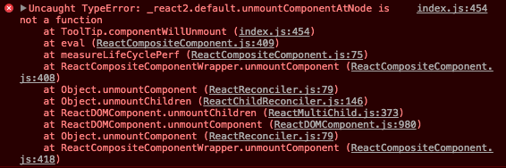
Hi, thank you for the great plugin. I am getting the following error sometime
DOMException: Failed to execute 'removeChild' on 'Node': The node to be removed is not a child of this node. at ToolTip.componentWillUnmount
react: 16.6.3
react-dom: 16.6.3
react-portal-tooltip: 2.4.1
React has deprecated React.PropTypes in favour of using the prop-types repository. Suggest changing...
import React, {PropTypes} from 'react'to
import React from 'react'
import PropTypes from 'prop-types'
Happy to open a PR if it makes life easier :)
When I'm trying to utilize tooltip for multiple elements data is not updating with respect to the element, I can see the message from last element for all the elements. Kindly suggest me some solution for multiple tooltips.
<div id="hoverMe" onMouseEnter={this.showTooltip} onMouseLeave={this.hideTooltip}>
                Hover me!!!
</div>

<div id="leaveme" onMouseEnter={this.showTooltip} onMouseLeave={this.hideTooltip}>
          Hover mine!!!
</div>
here is render function
import ToolTip from 'react-portal-tooltip';

showTooltip(e) {
    console.log(e, e.target, e.target.name, e.options);
    this.setState({isTooltipActive: true})
  }
  hideTooltip(e) {
    this.setState({isTooltipActive: false})
  }

 this.showTooltip = this.showTooltip.bind(this);
 this.hideTooltip = this.hideTooltip.bind(this);

this.state = {
    isTooltipActive : false
}
And one more method which I had tried is that passing message as a parameter as follows
toolTip(e, value) {
    console.log(e, value);
    // this.setState({isTooltipActive: true});
    return (<ToolTip active={this.state.isTooltipActive} position="top" arrow="center"
        parent="#hoverMe">
        <div>
            <p>{value}</p>
        </div>
    </ToolTip>);
  }

 <div id="hoverMe" onMouseEnter={(e) => this.toolTip(e, "hrloo mcsdo!!1")} onMouseLeave={this.hideTooltip}>
                Hover me!!!
            </div>
But, unfortunately It's not working hope It have some mistakes. Suggest me some workable way in to this
The demo page (http://romainberger.github.io/react-portal-tooltip/) is bringing my CPU usage up to 80% immediately.

I think it's something to do with timers, but I couldn't profile it properly when my PC is freezing every few seconds.
Update: can't reproduce on another PC, will check again.
Hello If I use Link component from react-router inside tooltip I get
Link.js:95 Uncaught TypeError: Cannot read property 'pushState' of undefined
I am us Tooltip like this
<div className="collageImage" style={{ width: this.props.size + 'px', height: this.props.size + 'px'}} >
  <img id={elID}
       onMouseEnter={::this.showTooltip}
       onMouseLeave={::this.hideTooltip}
       className=""
       src={record.image_collage}
       style={{ width: this.props.size + 'px', height: this.props.size + 'px'}} />
  <ToolTip pushState={this.props.pushState} active={this.state.isTooltipActive}
           position="bottom"
           arrow="center"
           parent={'#'+elID}
           tooltipTimeout="3000">
    <div className="collageImagePopover">
      <div className="collageImagePopoverTitle">{record.name}</div>
      <div className="collageImagePopoverText">{record.text}</div>
      <Link pushState={this.props.pushState} to={'/record/' + record.id} className="collageImagePopoverLink"> Read More </Link>
    </div>
  </ToolTip>
</div>
Another question I have is, that how do I add css for customising the position of popover. I want to move it up 10px from where it's displayed right now.
Thanks.
Hello. Your lib is not working in IE8, that because you using accessors. Tell me please, do you want to make working it in IE8?
Thanks, Val.
Hi!
Please look at the example https://stackblitz.com/edit/react-t211ct
Make sure your window is narrower than that number container (500px or less). Then scroll to the right and hover over rightmost numbers. The body width equals window width, but the tooltip container is wider than the body.
I hotfixed the bug in my project by updating the if block at line 267-272 of your index.js so it looks like
if (rightOffset > 0) {
    ...
    style.left = window.innerWidth + rightOffset - this.state.width - this.margin + parentSize.width;
    ...
}
rightOffset was basically unused, and it seems to me it exists there to handle this situation... But no idea if that's a good solution
Thanks
When two elements with tooltips are next to (or on top of) each other then there won't be a gap where the tooltip is disabled. The tooltip is then not shown correctly if at all.
(The workaround is to delay triggering the hover state on mouseEnter)
I think switching to the new React16 portal API would actually be a not insane amount of work and it would enable support React16, as the current implementation doesn't work.
Hi!
When setting the style prop on the Tooltip component, the arrow is visible after the tooltip content is hidden. It seems it is visible for additional ~500ms (the default tooltipTimeout value) after the tooltip content is hidden. My render method:
render(){
	const style = {
		style: {
			background: '#337AB7',
			opacity: 0.9,
			color: '#FFF',
		},
		arrowStyle: {
			color: '#337AB7',
		}
	}

	return (
		<span>
			<i
				id={this.parentId}
				style={{ cursor: 'pointer' }}
				className="mdi mdi-information-outline"
				onMouseEnter={this.showTooltip}
				onMouseLeave={this.hideTooltip}
			/>
			<Tooltip
				active={this.state.isTooltipActive}
				parent={'#'+this.parentId}
				arrow="top"
				position="right"
				tooltipTimeout={this.props.tooltipTimeout}
				style={style}
			>
				<div>TEST</div>
			</Tooltip >
		</span>
	)
}
Version: 2.3.0
 React
React
A declarative, efficient, and flexible JavaScript library for building user interfaces.
🖖 Vue.js is a progressive, incrementally-adoptable JavaScript framework for building UI on the web.
 Typescript
TypeScript is a superset of JavaScript that compiles to clean JavaScript output.
An Open Source Machine Learning Framework for Everyone
 Django
The Web framework for perfectionists with deadlines.
 Laravel
A PHP framework for web artisans
Bring data to life with SVG, Canvas and HTML. 📊📈🎉
JavaScript (JS) is a lightweight interpreted programming language with first-class functions.
Some thing interesting about web. New door for the world.
A server is a program made to process requests and deliver data to clients.
Machine learning is a way of modeling and interpreting data that allows a piece of software to respond intelligently.
Some thing interesting about visualization, use data art
Some thing interesting about game, make everyone happy.
 Facebook
We are working to build community through open source technology. NB: members must have two-factor auth.
 Microsoft
Open source projects and samples from Microsoft.
 Google
Google ❤️ Open Source for everyone.
 Alibaba
Alibaba Open Source for everyone
 D3
D3
Data-Driven Documents codes.
 Tencent
China tencent open source team.