Giter Club home page Giter Club logo

radix-vue's Introduction


Logo

Radix Vue

An unofficial Vue port of Radix UI.
Radix is an unstyled, customisable UI Library with built in accessibility for building top quality design systems.

NPM version NPM Downloads GitHub stars

Get involved!

Documentation | Getting Started | Examples | Why Radix Vue?
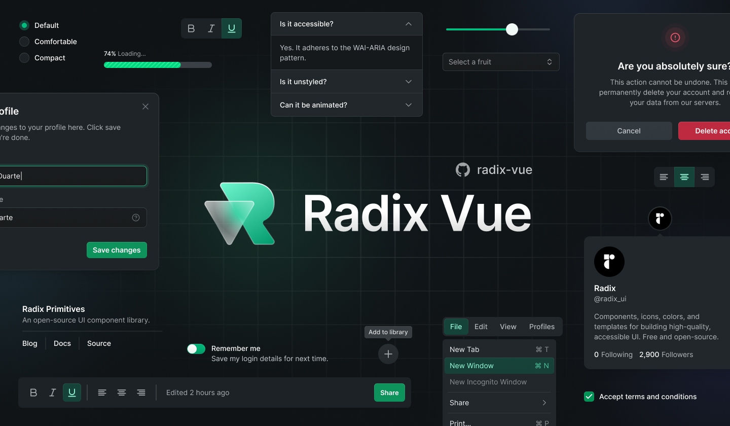
hero image design by: icarusgkx, melkam

Installation

pnpm add radix-vue
npm install radix-vue
yarn add radix-vue

Documentation

For full documentation, visit radix-vue.com.

Releases

For changelog, visit releases.

Contributing

We would love to have your contributions! All PRs all welcomed! We need help building the core components, docs, tests, stories! Join our discord and we will get you up and running!

Dev Setup

Docs

  1. Clone the repo
  2. Run pnpm i
  3. Run pnpm build to run build radix-vue locally
  4. Run pnpm docs:dev to run vitepress
  5. Open http://localhost:5173

Package

  1. Clone the repo
  2. Run pnpm i
  3. Run pnpm story:dev to run histoire (storybook)
  4. Open http://localhost:6006

Authors

Credits

All credits go to these open-source works and resources

  • Radix UI for doing all the hard work to make sure components are accessible
  • Floating UI for creating powerful components that as the base of many Radix Vue components
  • VueUse for providing many useful utilities.
  • Ark UI for the <Primitive> component
  • Radix Svelte
  • Headless UI

radix-vue's People

Contributors

andreww2012 avatar baybreezy avatar benjamincanac avatar chrisgv04 avatar chrtyaka avatar damianglowala avatar dependabot[bot] avatar dwightjack avatar enkot avatar epr3 avatar kdnk avatar khairulhaaziq avatar libondev avatar madebyfabian avatar mellkam avatar messenjer avatar misbahansori avatar mujahidfa avatar mukundshah avatar nicooprat avatar npldevfr avatar onmax avatar remonke avatar romanhrynevych avatar sadeghbarati avatar saeid-za avatar scrum avatar teleskop150750 avatar uyloal avatar zernonia avatar

Stargazers

 avatar  avatar  avatar  avatar  avatar  avatar  avatar  avatar  avatar  avatar  avatar  avatar  avatar  avatar  avatar  avatar  avatar  avatar  avatar  avatar  avatar  avatar  avatar  avatar  avatar  avatar  avatar  avatar  avatar  avatar  avatar  avatar  avatar  avatar  avatar  avatar  avatar  avatar  avatar  avatar  avatar  avatar  avatar  avatar  avatar  avatar  avatar  avatar  avatar  avatar  avatar  avatar  avatar  avatar  avatar  avatar  avatar  avatar  avatar  avatar  avatar  avatar  avatar  avatar  avatar  avatar  avatar  avatar  avatar  avatar  avatar  avatar  avatar  avatar  avatar  avatar  avatar  avatar  avatar  avatar  avatar  avatar  avatar  avatar  avatar  avatar  avatar  avatar  avatar  avatar  avatar  avatar  avatar  avatar  avatar  avatar  avatar  avatar  avatar  avatar

Watchers

 avatar  avatar  avatar  avatar  avatar  avatar  avatar  avatar  avatar  avatar  avatar

radix-vue's Issues

Feat: Separator

reference

Root

The separator.

Name Required Type Default Description Status
asChild false boolean false Change the default rendered element for the one passed as a child, merging their props and behavior. Read our Composition guide for more details.
orientation "horizontal" | "vertical" "horizontal" The orientation of the separator.
decorative boolean When true, signifies that it is purely visual, carries no semantic meaning, and ensures it is not present in the accessibility tree.
Attribute Values Status
[data-orientation] ['vertical', 'horizontal']

Feat: Progress

reference

Reference

Root

Contains all of the progress parts.

Name Required Type Default Description Status
asChild false boolean false Change the default rendered element for the one passed as a child, merging their props and behavior. Read our Composition guide for more details.
value number | null The progress value.
max number The maximum progress value.
getValueLabel (value: number, max: number) => string A function to get the accessible label text representing the current value in a human-readable format. If not provided, the value label will be read as the numeric value as a percentage of the max value.
Attribute Values Status
[data-state] ['complete', 'indeterminate', 'loading']
[data-value] The current value
[data-max] The max value

Indicator

Used to show the progress visually. It also makes progress accessible to assistive technologies.

Name Required Type Default Description Status
asChild false boolean false Change the default rendered element for the one passed as a child, merging their props and behavior. Read our Composition guide for more details.
Attribute Values Status
[data-state] ['complete', 'indeterminate', 'loading']
[data-value] The current value
[data-max] The max value

feat: implement asChild to every component needed

Task

  • Find and list each elements with asChild API
  • Implement it

You can check out packages/radix-vue/src/Collapsible/CollapsibleTrigger.vue for how to import the asChild props by using PrimitiveXXX component

Feat: Dialog

reference

API Reference

Root

Contains all the parts of a dialog.

Name Type Description
defaultOpen boolean The open state of the dialog when it is initially rendered. Use when you do not need to control its open state.
open boolean The controlled open state of the dialog. Must be used in conjunction with onOpenChange.
onOpenChange (open: boolean) => void Event handler called when the open state of the dialog changes.
modal boolean The modality of the dialog. When set to true, interaction with outside elements will be disabled and only dialog content will be visible to screen readers.

Trigger

The button that opens the dialog.

Name Type Description
asChild boolean Change the default rendered element for the one passed as a child, merging their props and behavior. Read our Composition guide for more details.
Attribute Values
[data-state] ['open', 'closed']

Portal

When used, portals your overlay and content parts into the body.

Name Type Description
forceMount boolean Used to force mounting when more control is needed. Useful when controlling animation with React animation libraries. If used on this part, it will be inherited by Dialog.Overlay and Dialog.Content.
container HTMLElement Specify a container element to portal the content into.

Overlay

A layer that covers the inert portion of the view when the dialog is open.

Name Type Description
asChild boolean Change the default rendered element for the one passed as a child, merging their props and behavior. Read our Composition guide for more details.
forceMount boolean Used to force mounting when more control is needed. Useful when controlling animation with React animation libraries. It inherits from Dialog.Portal.
Attribute Values
[data-state] ['open', 'closed']

Content

Contains content to be rendered in the open dialog.

Name Type Description
asChild boolean Change the default rendered element for the one passed as a child, merging their props and behavior. Read our Composition guide for more details.
forceMount boolean Used to force mounting when more control is needed. Useful when controlling animation with React animation libraries. It inherits from Dialog.Portal.
onOpenAutoFocus (event: Event) => void Event handler called when focus moves into the component after opening. It can be prevented by calling event.preventDefault.
onCloseAutoFocus (event: Event) => void Event handler called when focus moves to the trigger after closing. It can be prevented by calling event.preventDefault.
onEscapeKeyDown (event: KeyboardEvent) => void Event handler called when the escape key is down. It can be prevented by calling event.preventDefault.
onPointerDownOutside (event: PointerDownOutsideEvent) => void Event handler called when a pointer event occurs outside the bounds of the component. It can be prevented by calling event.preventDefault.
onInteractOutside (event: React.FocusEvent MouseEvent
Attribute Values
[data-state] ['open', 'closed']

Close

The button that closes the dialog.

Name Type Description
asChild boolean Change the default rendered element for the one passed as a child, merging their props and behavior. Read our Composition guide for more details.

Title

An accessible title to be announced when the dialog is opened.

If you want to hide the title, wrap it inside our Visually Hidden utility like this <VisuallyHidden asChild>.

Name Type Description
asChild boolean Change the default rendered element for the one passed as a child, merging their props and behavior. Read our Composition guide for more details.

Description

An optional accessible description to be announced when the dialog is opened.

If you want to hide the description, wrap it inside our Visually Hidden utility like this <VisuallyHidden asChild>. If you want to remove the description entirely, remove this part and pass aria-describedby={undefined} to Dialog.Content.

Name Type Description
asChild boolean Change the default rendered element for the one passed as a child, merging their props and behavior. Read our Composition guide for more details.

Feat: Collapsible

reference

Root

Contains all the parts of a collapsible.

Name Required Type Default Description Status
asChild false boolean false Change the default rendered element for the one passed as a child, merging their props and behavior.

Read our Composition guide for more details.
defaultOpen false boolean - The open state of the collapsible when it is initially rendered. Use when you do not need to control its open state.
open false boolean - The controlled open state of the collapsible. Must be used in conjunction with onOpenChange.
onOpenChange false (open: boolean) => void - Event handler called when the open state of the collapsible changes.
disabled false boolean - When true, prevents the user from interacting with the collapsible.
Attribute Values Status
[data-state] open, closed
[data-disabled] Present when disabled

Trigger

The button that toggles the collapsible.

Name Required Type Default Description Status
asChild false boolean false Change the default rendered element for the one passed as a child, merging their props and behavior.

Read our Composition guide for more details.
Attribute Values Status
[data-state] open, closed
[data-disabled] Present when disabled

Content

The component that contains the collapsible content.

Name Required Type Default Description Status
asChild false boolean false Change the default rendered element for the one passed as a child, merging their props and behavior.

Read our Composition guide for more details.
forceMount false boolean - Used to force mounting when more control is needed. Useful when controlling animation with React animation libraries.
Attribute Values Status
[data-state] open, closed
[data-disabled] Present when disabled
CSS Variable Description Status
--radix-collapsible-content-width The width of the content when it opens/closes
--radix-collapsible-content-height The height of the content when it opens/closes

[Feature]: Export component as 'Namespaced Component'

Is your feature request related to a problem? Please describe.

In Radix-ui, they are using namespaced component to export all child component (including root component) as a component.

(eg: DialogRoot.vue -> Dialog.Root).

Describe the solution you'd like

We can do the same for Radix-vue too. Can check out https://github.com/xiaoluoboding/vue-command-palette/blob/main/packages/index.ts to learn how it was achievable.

(This is just a nice to have, so we don't need to import all the child component manually when building a custom component)

Feat: Alert Dialog

Todo:

Anatomy

<Accordion.Root>
    <Accordion.Item>
      <Accordion.Header>
        <Accordion.Trigger />
      </Accordion.Header>
      <Accordion.Content />
    </Accordion.Item>
  </Accordion.Root>

API

API Reference

Root

Contains all the parts of an alert dialog.

Name Required Type Default Description
defaultOpen false boolean - The open state of the dialog when it is initially rendered. Use when you do not need to control its open state.
open false boolean - The controlled open state of the dialog. Must be used in conjunction with onOpenChange.
onOpenChange false (open: boolean) => void - Event handler called when the open state of the dialog changes.

Trigger

A button that opens the dialog.

Name Required Type Default Description
asChild false boolean false Change the default rendered element for the one passed as a child, merging their props and behavior.

Read our Composition guide for more details.

Data Attributes

  • [data-state]: open, closed

Portal

When used, portals your overlay and content parts into the body.

Name Required Type Default Description
forceMount false boolean - Used to force mounting when more control is needed. Useful when controlling animation with React animation libraries. If used on this part, it will be inherited by AlertDialog.Overlay and AlertDialog.Content.
container false HTMLElement document.body Specify a container element to portal the content into.

Overlay

A layer that covers the inert portion of the view when the dialog is open.

Name Required Type Default Description
asChild false boolean false Change the default rendered element for the one passed as a child, merging their props and behavior.

Read our Composition guide for more details.
forceMount false boolean - Used to force mounting when more control is needed. Useful when controlling animation with React animation libraries. It inherits from AlertDialog.Portal.

Data Attributes

  • [data-state]: open, closed

Content

Contains content to be rendered when the dialog is open.

Name Required Type Default Description
asChild false boolean false Change the default rendered element for the one passed as a child, merging their props and behavior.

Read our Composition guide for more details.
forceMount false boolean - Used to force mounting when more control is needed. Useful when controlling animation with React animation libraries. It inherits from AlertDialog.Portal.
onOpenAutoFocus false (event: Event) => void - Event handler called when focus moves to the destructive action after opening. It can be prevented by calling event.preventDefault.
onCloseAutoFocus false (event: Event) => void - Event handler called when focus moves to the trigger after closing. It can be prevented by calling event.preventDefault.
onEscapeKeyDown false (event: KeyboardEvent) => void - Event handler called when the escape key is down. It can be prevented by calling event.preventDefault.

Data Attributes

  • [data-state]: open, closed

Cancel

A button that closes the dialog. This button should be distinguished visually from AlertDialog.Action buttons.

Name Required Type Default Description
asChild false boolean false Change the default rendered element for the one passed as a child, merging their props and behavior.

Read our Composition guide for more details.

Action

A button that closes the dialog. These buttons should be distinguished visually from the AlertDialog.Cancel button.

Name Required Type Default Description
asChild false boolean false Change the default rendered element for the one passed as a child, merging their props and behavior.

Read our Composition guide for more details.

Title

An accessible name to be announced when the dialog is opened. Alternatively, you can provide aria-label or aria-labelledby to AlertDialog.Content and exclude this component.

Name Required Type Default Description
asChild false boolean false Change the default rendered element for the one passed as a child, merging their props and behavior.

Read our Composition guide for more details.

Description

An accessible description to be announced when the dialog is opened. Alternatively, you can provide aria-describedby to AlertDialog.Content and exclude this component.

Name Required Type Default Description
asChild false boolean false Change the default rendered element for the one passed as a child, merging their props and behavior.

Read our Composition guide for more details.

Accessibility:

Key Description Status
Space When focus is on an Accordion.Trigger of a collapsed section, expands the section.
Enter When focus is on an Accordion.Trigger of a collapsed section, expands the section.
Tab Moves focus to the next focusable element.
Shift + Tab  Moves focus to the previous focusable element.
ArrowDown Moves focus to the next Accordion.Trigger when orientation is vertical.
ArrowUp Moves focus to the previous Accordion.Trigger when orientation is vertical.
ArrowRight Moves focus to the next Accordion.Trigger when orientation is horizontal.
ArrowLeft Moves focus to the previous Accordion.Trigger when orientation is horizontal.
Home When focus is on an Accordion.Trigger, moves focus to the first Accordion.Trigger.
End When focus is on an Accordion.Trigger, moves focus to the last Accordion.Trigger.

Example

Working Demo

<script setup lang="ts">
import { ref } from "vue";
import {
  AlertDialogRoot,
  AlertDialogTrigger,
  AlertDialogContent,
  AlertDialogOverlay,
  AlertDialogCancel,
  AlertDialogAction,
  AlertDialogPortal,
  AlertDialogTitle,
  AlertDialogDescription
} from "radix-vue";

const alertDialogOpen = ref(false);

function handleAction(){
  alert('clicked action button!')
}
</script>

<template>
   <AlertDialogRoot v-model="alertDialogOpen">
    <AlertDialogTrigger class="text-violet11 hover:bg-mauve3 shadow-blackA7 inline-flex h-[35px] items-center justify-center rounded-[4px] bg-white px-[15px] font-medium leading-none shadow-[0_2px_10px] outline-none focus:shadow-[0_0_0_2px] focus:shadow-black">
        Delete account
    </AlertDialogTrigger>
    <AlertDialogPortal>
      <AlertDialogOverlay class="bg-blackA9 data-[state=open]:animate-overlayShow fixed inset-0" />
      <AlertDialogContent class="data-[state=open]:animate-contentShow fixed top-[50%] left-[50%] max-h-[85vh] w-[90vw] max-w-[500px] translate-x-[-50%] translate-y-[-50%] rounded-[6px] bg-white p-[25px] shadow-[hsl(206_22%_7%_/_35%)_0px_10px_38px_-10px,_hsl(206_22%_7%_/_20%)_0px_10px_20px_-15px] focus:outline-none">
        <AlertDialogTitle class="text-mauve12 m-0 text-[17px] font-medium">
          Are you absolutely sure?
        </AlertDialogTitle>
        <AlertDialogDescription class="text-mauve11 mt-4 mb-5 text-[15px] leading-normal">
          This action cannot be undone. This will permanently delete your account and remove your
          data from our servers.
        </AlertDialogDescription>
        <div class="flex justify-end gap-[25px]">
          <AlertDialogCancel class="text-mauve11 bg-mauve4 hover:bg-mauve5 focus:shadow-mauve7 inline-flex h-[35px] items-center justify-center rounded-[4px] px-[15px] font-medium leading-none outline-none focus:shadow-[0_0_0_2px]">
              Cancel
          </AlertDialogCancel>
          <AlertDialogAction @click="handleAction" class="text-red11 bg-red4 hover:bg-red5 focus:shadow-red7 inline-flex h-[35px] items-center justify-center rounded-[4px] px-[15px] font-medium leading-none outline-none focus:shadow-[0_0_0_2px]">
              Yes, delete account
          </AlertDialogAction>
        </div>
      </AlertDialogContent>
    </AlertDialogPortal>
  </AlertDialogRoot>
</template>

fix: Hover Card and Tooltip delay open and close

  • implement delay open and close behavior
  • create open and close delayMs props

Behavior

  • dont open if not hovered for the delay duration
  • dont close if not hover outside for the delay duration
  • handle wether open/close if hover over card/tooltip

Discord link on readme invalid

Describe the bug
The Discord link is not valid anymore

To Reproduce

Expected behavior
Valid invitation to the Discord server

Screenshots

Desktop (please complete the following information):

Smartphone (please complete the following information):

Additional context

Feat: Switch

reference

API Reference

Root

Contains all the parts of a switch. An input will also render when used within a form to ensure events propagate correctly.

Status Name Required Type Default Description
asChild false boolean false Change the default rendered element for the one passed as a child, merging their props and behavior.
defaultChecked boolean The state of the switch when it is initially rendered. Use when you do not need to control its state. ⚠️
checked boolean The controlled state of the switch. Must be used in conjunction with onCheckedChange. ⚠️
onCheckedChange function Event handler called when the state of the switch changes. ⚠️
disabled boolean When true, prevents the user from interacting with the switch.
required boolean When true, indicates that the user must check the switch before the owning form can be submitted.
name string The name of the switch. Submitted with its owning form as part of a name/value pair.
value string on The value given as data when submitted with a name.
Status Attribute Values
[data-state] checked, unchecked
[data-disabled] Present when disabled

Thumb

The thumb that is used to visually indicate whether the switch is on or off.

Status Name Required Type Default Description
asChild false boolean false Change the default rendered element for the one passed as a child, merging their props and behavior.
Status Attribute Values
[data-state] checked, unchecked
[data-disabled] Present when disabled

Accessibility

Status Keys Description
Space Toggles the component's state.
Enter Toggles the component's state.

feat: declaring props to all components

implementing props is one thing, declaring is another.

By declaring every props and typing them Im hoping that we can speed up the development even further.

Feat: Radio Group

reference

API Reference

Root

Contains all the parts of a radio group.

Name Required Type Default Description Status
asChild false boolean false Change the default rendered element for the one passed as a child, merging their props and behavior. Read our Composition guide for more details.
defaultValue string The value of the radio item that should be checked when initially rendered. Use when you do not need to control the state of the radio items.
value string The controlled value of the radio item to check. Should be used in conjunction with onValueChange.
onValueChange (value: string) => void Event handler called when the value changes.
disabled boolean When true, prevents the user from interacting with radio items.
name string The name of the group. Submitted with its owning form as part of a name/value pair.
required boolean When true, indicates that the user must check a radio item before the owning form can be submitted.
orientation false "horizontal" | "vertical" | undefined The orientation of the component.
dir false "ltr" | "rtl" The reading direction of the radio group. If omitted, inherits globally from DirectionProvider or assumes LTR (left-to-right) reading mode.
loop false boolean true When true, keyboard navigation will loop from last item to first, and vice versa.
Attribute Values Status
[data-disabled] Present when disabled

Item

An item in the group that can be checked. An input will also render when used within a form to ensure events propagate correctly.

Name Required Type Default Description Status
asChild false boolean false Change the default rendered element for the one passed as a child, merging their props and behavior. Read our Composition guide for more details.
value string The value given as data when submitted with a name.
disabled boolean When true, prevents the user from interacting with the radio item.
required boolean When true, indicates that the user must check the radio item before the owning form can be submitted.
Attribute Values Status
[data-state] ['checked', 'unchecked']
[data-disabled] Present when disabled

Indicator

Renders when the radio item is in a checked state. You can style this element directly, or you can use it as a wrapper to put an icon into, or both.

Name Required Type Default Description Status
asChild false boolean false Change the default rendered element for the one passed as a child, merging their props and behavior. Read our Composition guide for more details.
forceMount boolean Used to force mounting when more control is needed. Useful when controlling animation with React animation libraries.
Attribute Values Status
[data-state] ['checked', 'unchecked']
[data-disabled] Present when disabled

Feat: Avatar

  • Phase 1: #50
  • Phase 2
  • Phase 3

reference

Anatomy

<Avatar.Root>
  <Avatar.Image />
  <Avatar.Fallback />
</Avatar.Root>

API Reference

Root

Contains all the parts of an avatar.

Name Required Type Default Description Status
asChild false boolean false Change the default rendered element for the one passed as a child, merging their props and behavior.

Read our Composition guide for more details.

Image

The image to render. By default it will only render when it has loaded. You can use the onLoadingStatusChange handler if you need more control.

Name Required Type Default Description Status
asChild false boolean false Change the default rendered element for the one passed as a child, merging their props and behavior.

Read our Composition guide for more details.
onLoadingStatusChange false (status: "idle" | "loading" | "loaded" | "error") => void - A callback providing information about the loading status of the image. This is useful in case you want to control more precisely what to render as the image is loading.

Fallback

An element that renders when the image hasn't loaded. This means whilst it's loading, or if there was an error. If you notice a flash during loading, you can provide a delayMs prop to delay its rendering so it only renders for those with slower connections. For more control, use the onLoadingStatusChange handler on Avatar.Image.

Name Required Type Default Description Status
asChild false boolean false Change the default rendered element for the one passed as a child, merging their props and behavior.

Read our Composition guide for more details.
delayMs false number - Useful for delaying rendering so it only appears for those with slower connections.

Accessibility

Examples

Working Demo

<script setup lang="ts">
import { AvatarRoot, AvatarImage, AvatarFallback } from "radix-vue";
</script>

<template>
  <div class="flex gap-5">
    <AvatarRoot class="bg-blackA3 inline-flex h-[45px] w-[45px] select-none items-center justify-center overflow-hidden rounded-full align-middle">
      <AvatarImage
        class="h-full w-full rounded-[inherit] object-cover"
        src="https://images.unsplash.com/photo-1492633423870-43d1cd2775eb?&w=128&h=128&dpr=2&q=80"
        alt="Colm Tuite"
      />
      <AvatarFallback
        class="text-violet11 leading-1 flex h-full w-full items-center justify-center bg-white text-[15px] font-medium"
        :delayMs="600"
      >
        CT
      </AvatarFallback>
    </AvatarRoot>
    <AvatarRoot class="bg-blackA3 inline-flex h-[45px] w-[45px] select-none items-center justify-center overflow-hidden rounded-full align-middle">
      <AvatarImage
        class="h-full w-full rounded-[inherit] object-cover"
        src="https://images.unsplash.com/photo-1511485977113-f34c92461ad9?ixlib=rb-1.2.1&w=128&h=128&dpr=2&q=80"
        alt="Pedro Duarte"
      />
      <AvatarFallback
        class="text-violet11 leading-1 flex h-full w-full items-center justify-center bg-white text-[15px] font-medium"
        :delayMs="600"
      >
        JD
      </AvatarFallback>
    </AvatarRoot>
    <AvatarRoot class="bg-blackA3 inline-flex h-[45px] w-[45px] select-none items-center justify-center overflow-hidden rounded-full align-middle">
      <AvatarFallback class="text-violet11 leading-1 flex h-full w-full items-center justify-center bg-white text-[15px] font-medium">
        PD
      </AvatarFallback>
    </AvatarRoot>
  </div>
</template>

Feat: Tooltip

reference

Behaviors

  • Delay open

  • Delay close

  • #65

  • #77

API

Provider

Name Type Default Description Status
delayDuration number 700 The duration from when the mouse enters a tooltip trigger until the tooltip opens.
skipDelayDuration number 300 How much time a user has to enter another trigger without incurring a delay again.
disableHoverableContent boolean Prevents Tooltip.Content from remaining open when hovering. Disabling this has accessibility consequences.

Root

Contains all the parts of a tooltip.

Name Type Default Description Status
defaultOpen boolean The open state of the tooltip when it is initially rendered. Use when you do not need to control its open state.
open boolean The controlled open state of the tooltip. Must be used in conjunction with onOpenChange.
onOpenChange (open: boolean) => void Event handler called when the open state of the tooltip changes.
delayDuration number 700 Override the duration given to the Provider to customize the open delay for a specific tooltip.
disableHoverableContent boolean false Prevents Tooltip.Content from remaining open when hovering. Disabling this has accessibility consequences. Inherits from Tooltip.Provider.

Trigger

The button that toggles the tooltip. By default, the Tooltip.Content will position itself against the trigger.

Name Required Type Default Description Status
asChild boolean false Change the default rendered element for the one passed as a child, merging their props and behavior. Read our Composition guide for more details.

Portal

When used, portals the content part into the body.

Name Type Default Description Status
forceMount boolean Used to force mounting when more control is needed. Useful when controlling animation with React animation libraries. If used on this part, it will be inherited by Tooltip.Content.
container HTMLElement document.body Specify a container element to portal the content into.

Content

When used, portals the content part into the body.

Name Required Type Default Description Status
asChild boolean false Change the default rendered element for the one passed as a child, merging their props and behavior. Read our Composition guide for more details.
aria-label string By default, screen readers will announce the content inside the component. Use aria-label as a more descriptive label if needed.
onEscapeKeyDown (event: KeyboardEvent) => void Event handler called when the escape key is down.
onPointerDownOutside (event: PointerDownOutsideEvent) => void Event handler called when the pointer is down outside of the Tooltip.Content.
trapFocus boolean Disables the focus trap behaviour, allowing focus to move outside of the Tooltip.Content.
shouldCloseOnBlur (event: FocusEvent) => boolean Custom function to control whether the Tooltip.Content should close when focus is lost.
forceMount boolean Used to force mounting when more control is needed. Useful when controlling animation with React animation libraries.

Examples

<script setup lang="ts">
import { TooltipRoot, TooltipTrigger, TooltipPortal, TooltipContent, TooltipArrow } from "radix-vue";
import { Icon } from "@iconify/vue";
import { ref } from "vue";

const toggleState = ref(false);
</script>

<template>
  <div class="absolute left-4 top-3 text-sm">
    <p>{{ toggleState ? "checked" : "uncheked" }}</p>
  </div>
  <TooltipRoot v-model="toggleState">
    <TooltipTrigger class="text-violet11 shadow-blackA7 hover:bg-violet3 inline-flex h-[35px] w-[35px] items-center justify-center rounded-full bg-white shadow-[0_2px_10px] outline-none focus:shadow-[0_0_0_2px] focus:shadow-black">
        <Icon icon="radix-icons:plus" />
    </TooltipTrigger>
    <TooltipPortal>
      <TooltipContent
        class="data-[state=delayed-open]:data-[side=top]:animate-slideDownAndFade data-[state=delayed-open]:data-[side=right]:animate-slideLeftAndFade data-[state=delayed-open]:data-[side=left]:animate-slideRightAndFade data-[state=delayed-open]:data-[side=bottom]:animate-slideUpAndFade text-violet11 select-none rounded-[4px] bg-white px-[15px] py-[10px] text-[15px] leading-none shadow-[hsl(206_22%_7%_/_35%)_0px_10px_38px_-10px,_hsl(206_22%_7%_/_20%)_0px_10px_20px_-15px] will-change-[transform,opacity]">
        Add to library
        <TooltipArrow class="bg-white"  size="8" />
      </TooltipContent>
    </TooltipPortal>
  </TooltipRoot>
</template>

Feat: Toggle Group

reference

Root

Contains all the parts of a toggle group.

Name Type Default Description Status
asChild boolean false Change the default rendered element for the one passed as a child, merging their props and behavior. Read our Composition guide for more details.
type "single" | "multiple" Determines whether a single or multiple items can be pressed at a time.
value string The controlled value of the pressed item when type is "single". Must be used in conjunction with onValueChange.
defaultValue string The value of the item to show as pressed when initially rendered and type is "single". Use when you do not need to control the state of the items.
onValueChange (value: string) => void Event handler called when the pressed state of an item changes and type is "single".
value string[] [] The controlled value of the pressed items when type is "multiple". Must be used in conjunction with onValueChange.
defaultValue string[] [] The values of the items to show as pressed when initially rendered and type is "multiple". Use when you do not need to control the state of the items.
onValueChange (value: string[]) => void Event handler called when the pressed state of an item changes and type is "multiple".
disabled boolean false When true, prevents the user from interacting with the toggle group and all its items.
rovingFocus boolean true When false, navigating through the items using arrow keys will be disabled.
orientation "horizontal" | "vertical" | undefined undefined The orientation of the component, which determines how focus moves: "horizontal" for left/right arrows and "vertical" for up/down arrows.
dir "ltr" | "rtl" The reading direction of the toggle group. If omitted, inherits globally from DirectionProvider or assumes LTR (left-to-right) reading mode.
loop boolean true When true and rovingFocus is true, keyboard navigation will loop from the last item to the first, and vice versa.

<DataAttributesTable
data={[
{
attribute: '[data-orientation]',
values: ['vertical', 'horizontal'],
},
]}
/>

Item

An item in the group.

Name Type Default Description Status
asChild boolean false Change the default rendered element for the one passed as a child, merging their props and behavior. Read our Composition guide for more details.
value string A unique value for the item.
disabled boolean When true, prevents the user from interacting with the item.

<DataAttributesTable
data={[
{
attribute: '[data-state]',
values: ['on', 'off'],
},
{
attribute: '[data-disabled]',
values: 'Present when disabled',
},
{
attribute: '[data-orientation]',
values: ['vertical', 'horizontal'],
},
]}
/>

Feat: Hover Card

reference

Root

Contains all the parts of a hover card.

Name Required Type Default Description Status
defaultOpen - boolean - The open state of the hover card when it is initially rendered. Use when you do not need to control its open state. ⚠️
open - boolean - The controlled open state of the hover card. Must be used in conjunction with onOpenChange. ⚠️
onOpenChange - (open: boolean) => void - Event handler called when the open state of the hover card changes. ⚠️
openDelay - number 700 The duration from when the mouse enters the trigger until the hover card opens.
closeDelay - number 300 The duration from when the mouse leaves the trigger or content until the hover card closes.

Trigger

The link that opens the hover card when hovered.

Name Required Type Default Description Status
asChild - boolean false Change the default rendered element for the one passed as a child, merging their props and behavior.

Read our Composition guide for more details.
⚠️

Portal

When used, portals the content part into the body.

Name Required Type Default Description Status
forceMount - boolean - Used to force mounting when more control is needed. Useful when controlling animation with React animation libraries. If used on this part, it will be inherited by HoverCard.Content.
container - HTMLElement document.body Specify a container element to portal the content into.

Content

The component that pops out when the hover card is open.

Name Required Type Default Description Status
asChild - boolean false Change the default rendered element for the one passed as a child, merging their props and behavior.

Read our Composition guide for more details.
forceMount - boolean - Used to force mounting when more control is needed. Useful when controlling animation with React animation libraries. It inherits from HoverCard.Portal.
side - "top" | "right" | "bottom" | "left" "bottom" The preferred side of the trigger to render against when open. Will be reversed when collisions occur and avoidCollisions is enabled.
sideOffset - number 0 The distance in pixels from the trigger.
align - "start" | "center" | "end" "center" The preferred alignment against the trigger. May change when collisions occur.
alignOffset - number 0 An offset in pixels from the "start" or "end" alignment options.
avoidCollisions - boolean true When true, overrides the side and align preferences to prevent collisions with boundary edges.
collisionBoundary - Element | null | Array<Element | null> [] The element used as the collision boundary. By default this is the viewport, though you can provide additional element(s) to be included in this check.
collisionPadding - number | Partial<Record<Side, number>> 0 The distance in pixels from the boundary edges where collision detection should occur. Accepts a number (same for all sides), or a partial padding object, for example: { top: 20, left: 20 }.
arrowPadding - number 0 The padding between the arrow and the edges of the content. If your content has border-radius, this will prevent it from overflowing the corners.
sticky - "partial" | "always" "partial" The sticky behavior on the align axis. "partial" will keep the content in the boundary as long as the trigger is at least partially in the boundary whilst "always" will keep the content in the boundary regardless.
hideWhenDetached - boolean false Whether to hide the content when the trigger becomes fully occluded.

Arrow

An optional arrow element to render alongside the hover card. This can be used to help visually link the trigger with the HoverCard.Content. Must be rendered inside HoverCard.Content.

Name Required Type Default Description Status
asChild - boolean false Change the default rendered element for the one passed as a child, merging their props and behavior.

Read our Composition guide for more details.
width - number 10 The width of the arrow in pixels.
height - number 5 The height of the arrow in pixels.

Feat: Slider

reference

API Reference

Root

Contains all the parts of a slider. It will render an input for each thumb when used within a form to ensure events propagate correctly.

Name Required Type Default Description Status
asChild false boolean false Change the default rendered element for the one passed as a child, merging their props and behavior. Read our Composition guide for more details.
defaultValue number[] The value of the slider when initially rendered. Use when you do not need to control the state of the slider.
value number[] The controlled value of the slider. Must be used in conjunction with onValueChange.
onValueChange onValueChange?(value: number[]): void Event handler called when the value changes.
onValueCommit onValueCommit?(value: number[]): void Event handler called when the value changes at the end of an interaction. Useful when you only need to capture a final value e.g. to update a backend service.
name string The name of the slider. Submitted with its owning form as part of a name/value pair.
disabled boolean false When true, prevents the user from interacting with the slider.
orientation "horizontal" | "vertical" "horizontal" The orientation of the slider.
dir "ltr" | "rtl" The reading direction of the slider. If omitted, inherits globally from DirectionProvider or assumes LTR (left-to-right) reading mode.
inverted boolean false Whether the slider is visually inverted.
min number 0 The minimum value for the range.
max number 100 The maximum value for the range.
step number 1 The stepping interval.
minStepsBetweenThumbs number 0 The minimum permitted steps between multiple thumbs.
Attribute Values Status
[data-disabled] Present when disabled
[data-orientation] ['vertical', 'horizontal']

Track

The track that contains the Slider.Range.

Name Required Type Default Description Status
asChild false boolean false Change the default rendered element for the one passed as a child, merging their props and behavior. Read our Composition guide for more details.
Attribute Values Status
[data-disabled] Present when disabled
[data-orientation] ['vertical', 'horizontal']

Range

The range part. Must live inside Slider.Track.

Name Required Type Default Description Status
asChild false boolean false Change the default rendered element for the one passed as a child, merging their props and behavior. Read our Composition guide for more details.
Attribute Values Status
[data-disabled] Present when disabled
[data-orientation] ['vertical', 'horizontal']

Thumb

A draggable thumb. You can render multiple thumbs.

Name Required Type Default Description Status
asChild false boolean false Change the default rendered element for the one passed as a child, merging their props and behavior. Read our Composition guide for more details.
Attribute Values Status
[data-disabled] Present when disabled
[data-orientation] ['vertical', 'horizontal']

bug: popover wont close after clicking inside popper

Describe the bug
Poppover wont close when clicked outside after clicking inside popper

To Reproduce
Steps to reproduce the behavior:

  1. Open the popover from the demo
  2. Click inside the opened popper
  3. Click outside, it wont close

Expected behavior
Popover should behave as usual and closed when clicked outside

Feat: Checkbox

reference

Root

Contains all the parts of a checkbox. An input will also render when used within a form to ensure events propagate correctly.

Name Required Type Default Description Status
asChild false boolean false Change the default rendered element for the one passed as a child, merging their props and behavior.

Read our Composition guide for more details.
⚠️
defaultChecked false boolean - The checked state of the checkbox when it is initially rendered. Use when you do not need to control its checked state. ⚠️
checked false boolean - The controlled checked state of the checkbox. Must be used in conjunction with onCheckedChange. ⚠️
onCheckedChange false (checked: boolean | 'indeterminate') => void - Event handler called when the checked state of the checkbox changes. ⚠️
disabled false boolean - When true, prevents the user from interacting with the checkbox.
required false boolean - When true, indicates that the user must check the checkbox before the owning form can be submitted.
name false string - The name of the checkbox. Submitted with its owning form as part of a name/value pair.
value false string 'on' The value given as data when submitted with a name.
Attribute Values Status
[data-state] checked, unchecked, indeterminate
[data-disabled] Present when disabled

Indicator

Renders when the checkbox is in a checked or indeterminate state. You can style this element directly, or you can use it as a wrapper to put an icon into, or both.

Name Required Type Default Description Status
asChild false boolean false Change the default rendered element for the one passed as a child, merging their props and behavior.

Read our Composition guide for more details.
⚠️
forceMount false boolean - Used to force mounting when more control is needed. Useful when controlling animation with React animation libraries.
Attribute Values Status
[data-state] checked, unchecked, indeterminate
[data-disabled] Present when disabled

Examples

Working Demo

<script setup> import { ref } from "vue"; import { CheckboxRoot, CheckboxIndicator } from "radix-vue"; import { Icon } from "@iconify/vue"; const checkboxOne = ref(false); const checkboxTwo = ref(false); const checkboxThree = ref(false); </script>
States: {{ checkboxOne ? "one on" : "one off" }} - {{ checkboxTwo ? "two on" : "two off" }} - {{ checkboxThree ? "three on" : "three off" }}
Checkbox Disabled Checkbox Required Checkbox

fix: fix all components that should be controllable and uncontrollable

Fix relevant components to be able to be used with or without v-model(controllable or uncontrollable)
Use the useVueModel, refer to #95
Related to all components with open/close

  • #1 ~wait until built first
  • #2
  • #5
  • #6
  • #8
  • #9
  • #11
  • #13 ~wait until built first
  • #14 ~wait until built first
  • #15
  • #17 ~needs refactor to support without v-model first
  • #19 ~wait until built first
  • #21 ~needs refactor to support without v-model first
  • #22 #91
  • #23 ~needs refactor to support without v-model first
  • #25
  • #26 ~needs refactor to support without v-model first
  • #28

Feat: Tabs

reference

API Reference

Root

Contains all the tabs component parts.

Name Required Type Default Description Status
asChild false boolean false Change the default rendered element for the one passed as a child, merging their props and behavior. Read our Composition guide for more details.
defaultValue false string The value of the tab that should be active when initially rendered. Use when you do not need to control the state of the tabs.
value false string The controlled value of the tab to activate. Should be used in conjunction with onValueChange.
onValueChange false (value: string) => void Event handler called when the value changes.
orientation false "horizontal" | "vertical" | undefined "horizontal" The orientation of the component.
dir false "ltr" | "rtl" The reading direction of the tabs. If omitted, inherits globally from DirectionProvider or assumes LTR (left-to-right) reading mode.
activationMode false "automatic" | "manual" "automatic" When automatic, tabs are activated when receiving focus. When manual, tabs are activated when clicked.
Attribute Values Status
[data-orientation] ['vertical', 'horizontal']

List

Contains the triggers that are aligned along the edge of the active content.

Name Required Type Default Description Status
asChild false boolean false Change the default rendered element for the one passed as a child, merging their props and behavior. Read our Composition guide for more details.
loop false boolean true When true, keyboard navigation will loop from last tab to first, and vice versa.
Attribute Values Status
[data-orientation] ['vertical', 'horizontal']

Trigger

The button that activates its associated content.

Name Required Type Default Description Status
asChild false boolean false Change the default rendered element for the one passed as a child, merging their props and behavior. Read our Composition guide for more details.
value true string A unique value that associates the trigger with a content.
disabled false boolean false When true, prevents the user from interacting with the tab.
Attribute Values Status
[data-state] ['active', 'inactive']
[data-disabled] Present when disabled
[data-orientation] ['vertical', 'horizontal']

Content

Contains the content associated with each trigger.

Name Required Type Default Description Status
asChild false boolean false Change the default rendered element for the one passed as a child, merging their props and behavior. Read our Composition guide for more details.
value true string A unique value that associates the content with a trigger.
forceMount boolean Used to force mounting when more control is needed. Useful when controlling animation with React animation libraries.
Attribute Values Status
[data-state] ['active', 'inactive']
[data-orientation] ['vertical', 'horizontal']

Feat: Toolbar

reference

API

Root

Contains all the toolbar component parts.

Name Type Default Description Status
asChild boolean false Change the default rendered element for the one passed as a child, merging their props and behavior. Read our Composition guide for more details.
orientation "horizontal" | "vertical" | undefined The orientation of the toolbar.
dir "ltr" | "rtl" The reading direction of the toolbar. If omitted, inherits globally from DirectionProvider or assumes LTR (left-to-right) reading mode.
loop boolean true When true, keyboard navigation will loop from last tab to first, and vice versa.

Button

A button item.

Name Type Default Description Status
asChild boolean false Change the default rendered element for the one passed as a child, merging their props and behavior. Read our Composition guide for more details.

Link

A link item.

Name Type Default Description Status
asChild boolean false Change the default rendered element for the one passed as a child, merging their props and behavior. Read our Composition guide for more details.

ToggleGroup

A set of two-state buttons that can be toggled on or off.

Name Type Default Description Status
asChild boolean false Change the default rendered element for the one passed as a child, merging their props and behavior. Read our Composition guide for more details.
type "single" | "multiple" Determines whether a single or multiple items can be pressed at a time.
value string The controlled value of the pressed item when type is "single". Must be used in conjunction with onValueChange.
defaultValue string The value of the item to show as pressed when initially rendered and type is "single". Use when you do not need to control the state of the items.
onValueChange (value: string) => void Event handler called when the pressed state of an item changes and type is "single".
value string[] [] The controlled value of the pressed items when type is "multiple". Must be used in conjunction with onValueChange.
defaultValue string[] [] The values of the items to show as pressed when initially rendered and type is "multiple". Use when you do not need to control the state of the items.
onValueChange (value: string[]) => void Event handler called when the pressed state of an item changes and type is "multiple".
disabled boolean false When true, prevents the user from interacting with the toggle group and all its items.

ToggleItem

An item in the group.

Name Type Default Description Status
asChild boolean false Change the default rendered element for the one passed as a child, merging their props and behavior. Read our Composition guide for more details.
value string A unique value for the item.
disabled boolean When true, prevents the user from interacting with the item.

Separator

Used to visually separate items in the toolbar.

Name Type Default Description Status
asChild boolean false Change the default rendered element for the one passed as a child, merging their props and behavior. Read our Composition guide for more details.

Feat: Aspect Ratio

reference

Root

Contains the content you want to constrain to a given ratio.

Name Required Type Default Description Status
asChild false boolean false Change the default rendered element for the one passed as a child, merging their props and behavior.

Read our Composition guide for more details.
⚠️
ratio false number 1 The desired ratio

Examples

Working Demo

<script setup lang="ts">
import { AspectRatio } from "radix-vue";
</script>

<template>
  <div class="shadow-blackA7 w-[300px] overflow-hidden rounded-md shadow-[0_2px_10px]">
    <AspectRatio :ratio="16 / 9">
      <img class="h-full w-full object-cover"
        src="https://images.unsplash.com/photo-1535025183041-0991a977e25b?w=300&dpr=2&q=80"
        alt="Landscape photograph by Tobias Tullius" />
    </AspectRatio>
  </div>
</template>

Feat: Toggle

reference

API

Root

Name Type Default Description Status
asChild boolean false Change the default rendered element for the one passed as a child, merging their props and behavior. ⚠️
defaultPressed boolean The pressed state of the toggle when it is initially rendered. Use when you do not need to control its pressed state. ⚠️
pressed boolean The controlled pressed state of the toggle. Must be used in conjunction with onPressedChange. ⚠️
onPressedChange function Event handler called when the pressed state of the toggle changes. ⚠️
disabled boolean When true, prevents the user from interacting with the toggle.
model boolean When true, prevents the user from interacting with the toggle.

Data Attributes:

Keys Description
[data-state] ['on', 'off']
[data-disabled] Present when disabled.

Accessibility:

Keyboard Interactions:

Keys Description
Space Activates/deactivates the toggle.
Enter Activates/deactivates the toggle.

Recommend Projects

  • React photo React

    A declarative, efficient, and flexible JavaScript library for building user interfaces.

  • Vue.js photo Vue.js

    🖖 Vue.js is a progressive, incrementally-adoptable JavaScript framework for building UI on the web.

  • Typescript photo Typescript

    TypeScript is a superset of JavaScript that compiles to clean JavaScript output.

  • TensorFlow photo TensorFlow

    An Open Source Machine Learning Framework for Everyone

  • Django photo Django

    The Web framework for perfectionists with deadlines.

  • D3 photo D3

    Bring data to life with SVG, Canvas and HTML. 📊📈🎉

Recommend Topics

  • javascript

    JavaScript (JS) is a lightweight interpreted programming language with first-class functions.

  • web

    Some thing interesting about web. New door for the world.

  • server

    A server is a program made to process requests and deliver data to clients.

  • Machine learning

    Machine learning is a way of modeling and interpreting data that allows a piece of software to respond intelligently.

  • Game

    Some thing interesting about game, make everyone happy.

Recommend Org

  • Facebook photo Facebook

    We are working to build community through open source technology. NB: members must have two-factor auth.

  • Microsoft photo Microsoft

    Open source projects and samples from Microsoft.

  • Google photo Google

    Google ❤️ Open Source for everyone.

  • D3 photo D3

    Data-Driven Documents codes.