philipwalton / flexbugs Goto Github PK
View Code? Open in Web Editor NEWA community-curated list of flexbox issues and cross-browser workarounds for them.
License: MIT License
A community-curated list of flexbox issues and cross-browser workarounds for them.
License: MIT License


Description:
Just ran into this issue w/ flexbox, it's not containing the content like it does on other browsers. Here's an example:

Update: oops, took me awhile to realize that IE7 straight up does not support flexbox
It would be cool if these bugs were covered in the Web Platform Docs.
Bug: align-items: baseline doesn't properly align flex items of nested blocks with display: flex.
Workaround: Use display: inline-flex instead.
Demo: http://codepen.io/wilddeer/pen/aObevX
Tested in Firefox 37.0.1
This was just brought up on the mailing list and can be hit already in the wild (which was found by a webdev). Here is the issue, needs a workaround. @tabatkins points out here why they should flex to 0 based on flex-basis defaults.
Explained in this question:
http://stackoverflow.com/questions/24538100/issue-when-centering-vertically-with-flexbox-when-heights-are-unknown
But I'm not sure if that's a true bug or a tricky part of Flexbox?
Bug: word-wrap: break-word doesn't work properly inside flex items in Firefox.
Workaround: set min-width: 0 or overflow-x: hidden on flex item.
Demo: http://codepen.io/wilddeer/pen/BNaXyQ
Tested in Firefox 37.0.1
I've noticed a weird discrepancy between IE (11) and other Browsers when you apply padding to elements that are child elements of a display:flex container.
I've documented it on my blog here:http://michaelgunner.co.uk/padding-flexbox-child-elements-causing-chaos-ie/
To summarise, if you set a flex-basis value and use flex-wrap:wrap, when you add padding to the elements in IE the layout totally screws up.
It's quite possible that being January, and also recovering from a bad cold/xmas/ny, I'm missing a beat somewhere and pulling a bit of a noob move - but I can't figure it out.
Code link: http://codepen.io/brightonmike/pen/KwNLpo
I'm aware I could remove the wrap property - but I want to my elements to wrap, not squeeze onto one line. Using width instead of basis fixes it too, but that reduces the flexibility of the code.
https://code.google.com/p/chromium/issues/detail?id=341310
if flex item's size is modified by stretch, flexgrow, flexshrink, its children won' be able to measure parent's size, so 100% will be 100% of the original parent size (before flexgrow or stretch), not based on the real size
Just noticed an odd bug that I'm only seeing in Safari right now. When children of a parent container set to flex are given a fluid width and a static max-width, the max-width doesn't seem to override.
My solution for now is to just set the parent to text-align:center and the children to display:inline-block, but it seems odd that this works in Chrome, Safari and IE.
Another limitation of the early version of the spec: http://www.w3.org/TR/2009/WD-css3-flexbox-20090723/
Unfortunately, auto margin doesn't seem to work. This is a lovely convenience of modern implementations as it lets you easily offset to one side. For example:
http://codepen.io/benfrain/pen/rVMydO
<div class="wrapper">
item in root
    <span>span</span>
</div>.wrapper {
display: -webkit-box;
display: -webkit-flex;
display: -ms-flexbox;
display: flex;
}
.wrapper span {
margin-left: auto;
}Instead you can workaround (in a fashion like this). Be aware that this requires Modernizr to provide the fork.
.wrapper {
  display: -webkit-box;
  display: -webkit-flex;
  display: -ms-flexbox;
  display: flex;
  /* position relative only needed for positioning context for workaround */
  position: relative;
}
.wrapper span {
  margin-left: auto;
}

span {
  /* For devices that have legacy implementations (and not current flexbox)*/
}
.no-flexbox.flexboxlegacy span {
  position: absolute;
  right: 0;
  top: 50%;
  -webkit-transform: translateY(-50%);
      -ms-transform: translateY(-50%);
          transform: translateY(-50%);
}-webkit-flex: 0.0000001 0 auto;
0.0000001 to correct flex grow bug
https://code.google.com/p/chromium/issues/detail?id=460510
I've been working on a flexbox layout for a media browser and have run into what I believe to be a flexbox bug in Firefox. I've also noticed the same issue in Spartan.
I've created a codepen to show the issue. Have a look in Firefox 37 and see notes on lines 72 and 110 of the CSS source.
Safari (correct, top left), Firefox (incorrect, right), Spartan (incorrect, bottom left)
With the box model the child affects the parent. With flexbox, the parent and siblings affect the child. Webkit seems to be the only engine to fully grasp this; or I’ve lost my mind. Could be that too.
Webkit and non-Webkit browsers seem to disagree on how to handle intrinsic container sizing on elements with a display:flex;flex-direction:column; parent. For example, if we have a look at the codepen in Firefox 37 and uncomment line 110 we see that our tbody, seen below in red, is the perfect size it should be:
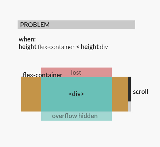
It fills the remaining space just like we want. Isn't that lovely? Now if only it would stay that way! The concept of this "holy grail" layout is that the topbar and footer are always visible and our tbody content area uses overflow-y:auto to scroll it's innerContent if needed. The problem is non-Webkit browsers allow the tbody container to grow as tall as it's innerContent, rather than stay the size the flexbox spec says it should be. In other words, once you add enough content to your tbody rather than kicking in scrollbars the tbody will just keep getting taller, breaking the layout entirely.
Notice in the codepen everything from the body down to the tbody uses flexbox. I did this in an attempt to ensure to rid out any traditional box model layout rules that Firefox may apply but it was to no avail, it lets the parent grow unless we set an explicit height or max-height. This is not a solution because
Possibly related to #8
Possibly related to #26
Possibly related to #41
Also see jpdevries/eureka#8
If you look at the .row{} selector in the CSS you will see that the -webkit-flex-wrap: wrap; property is set.
In Safari, removing that line of code makes the scrollbars reappear.
Not exactly a bug, more a limitation of the prior spec http://www.w3.org/TR/2009/WD-css3-flexbox-20090723/ that Android 2.3 works against.
If you have a flex parent and set justify-content: space-around Android 2.3 will ignore the declaration entirely. This may result in non-optimal layout as all flex-children will justify to the flex-start. You may find it preferable to use both possible space-* declarations for justify-content. This will get you space-between in Android 2.3 and space-around in modern implementations which may be preferable depending upon your goals.
Working example: http://codepen.io/benfrain/pen/yymaOr
.wrapper {
    display: flex;
    flex: 1 1 60%;
    /* Android 2.3 understands the first declaration and ignores the second */
    justify-content: space-between;
    /* Modern browsers overwrite the first declaration with the second */
    justify-content: space-around;
}
This can be worked-around by not using the shorthand if you need to use calc. For example:
.FlexItem {
  flex-grow: 0;
  flex-shrink: 0;
  flex-basis: calc(100%/3);
}When a flex element has a child img that is larger than itself, flex-basis is ignored. Better illustrated:
http://jsfiddle.net/walidvb/hsm77su5/7/
The workaround i found was to not use flex-basis, but width instead(which kind of defeats the whole purpose.)
Tested in Firefox 35.0.1.
Bug on bugzilla with testcase: https://bugzilla.mozilla.org/show_bug.cgi?id=865920
I have a very basic example that contains a parent set to display: flex and two paragraph elements.
.flex {
    display: flex;
    width: 400px;
}
On Firefox and IE, these two paragraphs are appropriately sized and contained within the parent container. On Google Chrome, the first paragraph utilizes more space than necessary and makes the second paragraph overflow.
See the following simple example that works on IE/Firefox, but not Chrome.
Any ideas how to workaround this?
I haven't had a chance to debug the various ones on this site. They may be related to ones we already have addressed or new ones but I'm creating a placeholder to remind myself to look into them and provide work arounds.
IE11 ignores max-width: 100% on a child element. In this example, the left iframe should only grow to the max width of the column (as it does in Chrome or FF).
I first reported this issue at stack overflow two months ago, please see the broader explanation there.
My workaround was to define the max-width in px with the usage of "calc( 100% - 0.1px )".
Is this probably linked to flexbug 1?
Firefox has big problems with flexboxes where Internet Explorer and Chrome display them without issues.
See this link to test : http://codepen.io/anon/pen/dhzJE
The slider allows user to increase the number of flexboxes.
Under IE & Chrome : no latency while dragging the slider left and right, under FireFox, if you scroll too much to the right, Firefox crash… -.-"
Ps : thx philipwalton, flexbugs is a good idea
IE 11 (and IE10) are not shrinking elements unless a flex-basis is specified: Demo
IE 11:

Chrome:

Firefox:

Does anyone know a workaround?
Workaround: put an element inside the button and apply the flex rules to that instead.
I had the same issue on:
Should I create a PR to add them?
There is a bug in at least Chrome 40.0.2214.115 (64-bit) in which a style that overrides a previously styled justify-content property causes unexpected layout. The same styling produces the expected result in at least Firefox 36.
Here is an demonstration using media queries to trigger the styling: http://codepen.io/niaconis/pen/VYExLe
Here is a work around (at least when using media queries): http://codepen.io/niaconis/pen/MYPGWq
When applying flex-wrap: wrap-reverse to a container that has align-items: flex-start set, all other tested browsers (Chrome 41, Firefox 38, Safari 8.0.3, Android 4.4) render the columns with an implicit align-items: flex-end. IE11 renders without this.
Applying align-items: flex-end to the container via a scoped media query for IE (see Codepen) makes IE render the same as all other browsers.
Top: Safari (correct) Bottom: Firefox (incorrect)
So in this codepen we have a flex parent (.eureka) with two children .pathbrowser (blue) and .stage (green).
The .stage is also a flex parent that uses flex-direction:column to lay it's two children (.topbar and .eureka-table) out vertically.
The .eureka-table contains a basic table that a has a tbody that uses overflow-x:auto for scrollbars with a bunch of content in it.
The concept of the layout is the blue sidebar on the left takes up a fixed amount of space while the stage takes up the rest. The stage should be able to overflow content without breaking the layout.
Currently In Firefox 38 and Edge nightly the content does not overflow correctly and the layout breaks.
This codepen forks the above codepen and makes one change (line 34) that sets .eureka {flex-direction:column}. This will make the blue sidebar layout incorrectly but notice the table content now overflows correctly.
Also see #42
When u set fixed flex-basis and content is bigger than that value, column or row will has behaviour like table without table-layout: fixed;
http://stackoverflow.com/questions/27424831/firefox-flexbox-overflow
In Internet Explorer, if a flex container has a child element that contains another flex container, this nested flex container's items do not attempt to size properly.
For example, if the child of the nested flex container is a paragraph element, then the paragraph text will not even attempt to wrap -- it will continue for as much text as there is. Below is an example of the markup necessary to notice this problem, assuming .flex { display: flex }.
<div class="outer flex">
    <div class="left">
        ...
    </div>
    <div class="right">
        <div class="some-other-content">...</div>
        <div class="inner flex">
            <p>...</p>
        </div>
    </div>
</div>
In the following example, the uppermost flex container has max-width: 400px. Despite this, the nested flex container's paragraph element stretches to 661 pixels on Internet Explorer 11. On Chrome and Firefox, the paragraph wraps properly (but on Chrome, we can see a separate issue as described in Issue #48).
If the nested flex container is an immediate child of the parent flex container, Internet Explorer appears to work properly.
http://jsfiddle.net/n6dtynq4/2/
However, this may not be an appropriate solution, as it we may not desire an immediate flex container within a flex container.
Scroll bars created with overflow: auto disappeared in my web app when viewed in Chrome v44. They worked as designed in Chrome v43.
The workaround turned out to be adding a max-height: 75vh; to the overflow container. Additionally a background color should be applied to the overflow container to prevent the content from expanding outside of the parent container's background-color.
The fixed example uses some set height elements that needed to be further calculated. These examples show a slightly complex design.
Before the viewport height fix:
http://codepen.io/slwfleming/pen/aOWaqQ
Using the viewport height fix:
http://codepen.io/slwfleming/pen/VLbGvR
Is the following example calculating a valid width for the items?
http://jsfiddle.net/4cg7e1xp/2/
Seems like to work the same in every browser.
Even changing box-sizing doesn't change the width calculation.
What's the reason for this?
I was looking around the web to find an explanation but didn't find anything so I was hoping anybody would help me out here - feel free to close this issue.
Anyone care to verify? I don't have any time for it.
Related tweet: https://twitter.com/HugoGiraudel/status/601740314282430464.
Relevant demo: http://codepen.io/HugoGiraudel/pen/EjgeaY/.
http://jsbin.com/nocoperimu/2/edit?html,css,js,output
https://code.google.com/p/chromium/issues/detail?id=451387
Does anyone know of a work-around for this?
Demo: http://codepen.io/anon/pen/ogrYOr
I expected the flex container div to be sized and positioned according to its parent (just like block) div but it's not.
Am I missing something?
For a longer-term view, it might be useful to submit the test cases you've constructed to the official test suite at https://github.com/w3c/csswg-test. That tends to encourage browser vendors to fix the issues, and ensures that any new implementations can benefit from your tests—apparently these particular cases were difficult to get right in existing implementations, so new implementations might be at risk of getting them wrong too.
I've got a problem with flexbox on IE11. Using the following code I get three horizontal boxes of uneven size in all browsers. The middle box is slightly wider than the outside boxes, but all boxes are the same height.
Here's the code in full.
<!DOCTYPE html>
<html lang=en>
<head>
<meta charset="UTF-8" />
<meta http-equiv=X-UA-Compatible content="IE=edge,chrome=1" />
<meta name="viewport" content="width=device-width, minimum-scale=1, maximum-scale=1" />
<meta name="keywords" content="IEEE, Queensland, Section" />
<meta name="description" content="official IEEE queensland Section website" />
<meta name="author" content="Mike Robinson" />
<title>IEEE Queensland Section</title>
</head>
<body onload="">
<style>
.ieee {
display: flex;
flex-direction: row;
margin-right: .5cm;}
.box {
\* flex: 1; *\
margin: 1% 0 1% 1%;
box-shadow: 0 0 10px #888888;
background: #c5d4e9;
padding: 10px 10px;
font-size: 10.25pt;}
@media only screen and (max-width:680px) {.ieee {flex-direction: column;}}
</style>
<section>
<br />
<div class="ieee">
<div class="box">
<h3>The IEEE</h3>
<p>Founded in May 1884, the IEEE - with over 400,000 members world-wide - is the world's largest technical professional organisation dedicated to advancing technological innovation and excellence for the benefit of humanity.</p>
<p>IEEE and its members inspire a global community through its publications, conferences, technology standards, and professional and educational activities.</p>
<p>Membership of the Institute offers many rewards, including professional development, access to the latest technical publications, and the opportunity to network with like-minded professionals.</p>
</div>
<div class="box">
<h3>IEEE Queensland Section</h3>
<p>The IEEE Queensland Section was founded on February 22nd, 1985. It is situated in the Asia-Pacific region, known as IEEE <a href="http://www.ieeer10.org/" target="_blank">Region 10</a>. The section conducts local activities and provides services to IEEE members who live and work in the part of Queensland, Australia, below 23° south.</p>
<p>The section supports the activities of eight chapters of IEEE technical societies, as well as the Women in Engineering and Young Professional Program affinity groups.</p>
<p>The section website informs members of the broad range of services and activities that are available, and chronicles the activities of the section's chapters, affinity groups, and members.</p>
</div>
<div class="box">
<h3>IEEE Membership</h3>
<p>Click <a href="http://www.ieee.org/membership_services/membership/join/index.html" target="_blank">here</a> if you would like information about becoming an IEEE member, and <a href="http://www.ieee.org/membership_services/membership/benefits/index.html" target="_blank">here</a> to review membership benefits.</p>
<p>If you have been an IEEE member for several years you should consider elevating your membership to Senior Member grade. Click <a href="http://ewh.ieee.org/r10/queensland/v2/doku.php/upgrade">here</a> for detailed information on the different types of membership elevation that are available.</p>
<p>Click <a href="http://www.ieee.org/membership_services/membership/renew/index.html" target="_blank">here</a> to renew your membership for <script>document.write (new Date().getFullYear());</script>.</p>
<p>Please contact the Queensland <a href="mailto:[email protected]?Subject=Volunteering%20enquiry">Section Chair</a> if you are interested in serving on the section's executive committee, or volunteering in any other way.</p>
</div>
</div>
</section>
</body>
</html>Uncommenting flex: 1; in .box{...} fixes the unequal box size problem, but when I downsize the IE11 browser the three boxes are overlayed in a weird fashion. In all other downsized browsers the boxes are stacked vertically, which is the correct result.
Any suggestions?

IE12 (Project Spartan) hasn't shipped yet so users haven't hit this in the wild but it would be good for us to have a work-around. They haven't implemented the update from the flex spec (which will be going to CR soon) regarding intrinsic sizing where you calculate the hypothetical main-size based on the cross-size taking the aspect ratio into account.
This example demonstrates the problem: http://codepen.io/anon/pen/xbmxjz
The button toggles between flex-basis: 0%; and flex-basis: 0px; on the element that has overflow content. In both Chrome 41 and Safari 8 toggling the class has no effect. In Firefox, the height of wrapper overflow: auto; element grows to the height of its content when the basis uses 0% instead of 0px.
This can probably be boiled down to an even smaller test case to put into a concise bug report. Seeing that Safari and Chrome have no problem and that 0% == 0px == 0 in all other CSS attributes this doesn't seem like correct behavior.
In order to accomplish this I just wrapped the two flex containers that needed a min-height with another flex container with the flex direction set to column.
Am I misunderstanding the bug or is this a fix?
This is related to issue #29 - Problem with animated sprites.
I'm redesigning http://ieee-qld.org to be responsive, using flexbox as the basis for the redesign. The original website shows how the sprite is supposed to work.
The code below better reflects the way I want to use animated sprites than the code in issue #29. The sprite is supposed to take up the first 150 pixels of the host flex item. Instead it occupies the entire width of the flex item, ie, 20% of the screen width. The rendering error appears in Win7 with Chrome, FF, Opera and IE11.
I have set up a demo of the problem at http://ieee-qld.org/sprite.
<!doctype html>
<html>
<head>
<meta charset="UTF-8" />
<meta name="viewport" content="width=device-width, initial-scale=1" />
<title>flex problem</title>
</head>
<body>
 <style>
 * {margin:0; padding:0; border:0; outline:0; vertical-align:baseline;}
 body {line-height:1.5; font-size:75%; color:#222; background:#b6d3e4; font-family:"Helvetica Neue", Arial, Helvetica, sans-serif;}
 .sprite {width:150px; height:140px; background-image:url("sprite.jpg");
     -webkit-animation: play 30s steps(6) infinite;
     animation: play 30s steps(6) infinite;}
 @-webkit-keyframes play{from{background-position:0px;}to{background-position:-900px;}}
 @keyframes play{from{background-position:0px;}to{background-position:-900px;}}
 header {display:flex;flex-direction:row;align-items:center; background:#4971a2; position:fixed; left:0px; top:18px; height:25%; width:100%;}
 .box {flex:1;}
 .box:nth-child(2){flex-grow:4;}
 .bold {font-weight:bold;}
 .c {text-align:center;}
 .w  {color:white;}
 h1,h2,h3,h4,h5,h6 {font-weight:normal; color:#111;}
 h1 {font-size:3em; line-height:1; margin-bottom:0.5em;}
</style>
<header>
    <div class="box sprite"></div>
    <div class="box"><h1 class="c bold">IEEE Queensland Section</h1></div>
    <div class="box">
       <img src="ieee_logo.png" width="142" height="44" alt="IEEE logo" />
       <p class="w"><br />IEEE is the world's largest<br />professional association for the<br />advancement of technology</p>
     </div>
 </header>
</body>
</html>


Bugs (2), (4), and (5), which affect IE11, don't have "Tracking bugs" columns.
Also might want to loop in the super-awesome @jonathansampson of the IE Team.
Anyway, cheers from a fellow bug documenter!
Having some issues with FF 36 and intrinsic container sizing. Not sure if this is a new bug in FF or even a bug at all.
I was looking at this SO item and jsfiddle that has Flex container that scrolls; it works fine in Chrome but not in Firefox.
http://stackoverflow.com/questions/20776491/inner-div-using-100-of-height-of-an-outer-div-thats-based-itself/20776611#20776611
http://jsfiddle.net/nu83c/6/
Also this example works in Chrome but not FF. I believe this used to work in FF but am not familiar enough with the Flexbox spec to describe what is broken.
http://stackoverflow.com/questions/25351810/scrollable-flexbox-list
http://jsfiddle.net/ch7n6/4/
I'm developing a website using flexbox and want to use animated sprites on it. Flexbox doesn't like animated sprites and they throw flexbox's calculations out dramatically. There are two websites where the code is demonstrated: ieee-qld.org/flex-bad and ieee-qld.org/flex-good. On the first site the animated graphic is 75% bigger than it should be, spreading over two sprite frames.
In the code below I've commented out the flexbox-enabling code (ieee-qld.org/flex-good). Removing the comments causes the animated sprite to misbehave (ieee-qld.org/flex-bad).
<!doctype html>
<html>
<head>
<meta charset="UTF-8" />
<meta name="viewport" content="width=device-width, initial-scale=1" />
<title>flex problem</title>
</head>
<body>
<style>
* {margin:0; padding:0; border:0; outline:0; vertical-align:baseline; background:transparent;}
body {line-height:1.5; font-size:75%; color:#222; background:#b6d3e4; font-family:"Helvetica Neue", Arial, Helvetica, sans-serif;}
.sprite {width:150px; height:130px; border-width: 5px; border-style:solid; border-color:#ffffff; border-radius:5px; background-image:url("sprite.jpg");
    -webkit-animation: play 20s steps(4) infinite;
    -ms-animation: play 20s steps(4) infinite;
    animation: play 20s steps(4) infinite;}
@-webkit-keyframes play{from{background-position:0px;}to{background-position:-600px;}}
@-ms-keyframes play{from{background-position:0px;}to{background-position:-600px;}}
@keyframes play{from{background-position:0px;}to{background-position:-600px;}}

header {background:#4971a2; position:fixed; left:0px; top:18px; height:15%; width:100%; clear:both;}

/* ************** flexbox code commented out at ieee-qld.org/flex-good *************************
.box {flex:1;}
.box:nth-child(2){flex-grow:2;}
.flexy {display:flex;flex-direction:row;align-items:center;height:30px;background:yellow;}
* {-webkit-box-sizing:border-box; -moz-box-sizing:border-box; box-sizing:border-box;}
***************************************************** */
.c {text-align:center;}
.bold {font-weight:bold;}
.box {margin-left:4%; margin-right:4%;}
h1,h2,h3,h4,h5,h6 {font-weight:normal; color:#111;}
h1 {font-size:3em; line-height:1; margin-bottom:0.5em;}
</style>
  <header>
  <div class="flexy">
    <div class="box sprite"></div>
     <div class="box"><h1 class="c bold">IEEE Queensland Section</h1></div>
    <div class="box">clue</div>
  </div>
  </header>
 </body>
</html>
The sprite is attached below.

 React
React
A declarative, efficient, and flexible JavaScript library for building user interfaces.
🖖 Vue.js is a progressive, incrementally-adoptable JavaScript framework for building UI on the web.
 Typescript
TypeScript is a superset of JavaScript that compiles to clean JavaScript output.
An Open Source Machine Learning Framework for Everyone
 Django
The Web framework for perfectionists with deadlines.
 Laravel
A PHP framework for web artisans
Bring data to life with SVG, Canvas and HTML. 📊📈🎉
JavaScript (JS) is a lightweight interpreted programming language with first-class functions.
Some thing interesting about web. New door for the world.
A server is a program made to process requests and deliver data to clients.
Machine learning is a way of modeling and interpreting data that allows a piece of software to respond intelligently.
Some thing interesting about visualization, use data art
Some thing interesting about game, make everyone happy.
 Facebook
We are working to build community through open source technology. NB: members must have two-factor auth.
 Microsoft
Open source projects and samples from Microsoft.
 Google
Google ❤️ Open Source for everyone.
 Alibaba
Alibaba Open Source for everyone
 D3
D3
Data-Driven Documents codes.
 Tencent
China tencent open source team.