API documentation and live playground for Web Components. Based on custom elements manifest JSON format.
<api-viewer src="./custom-elements.json"></api-viewer>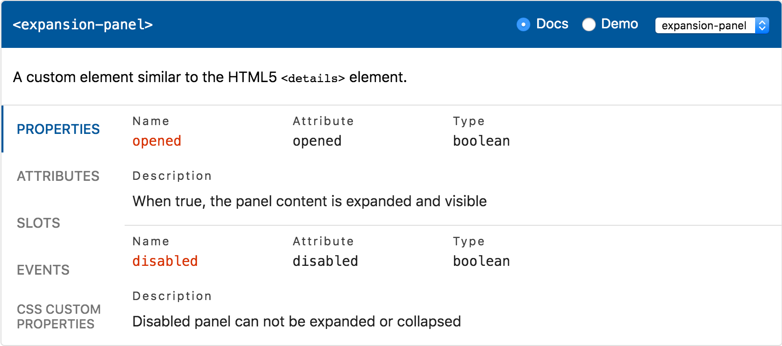
- API docs viewer
- Properties - JS properties publicly exposed by the component.
- Attributes - HTML attributes (except those that match properties).
- Events - DOM events dispatched by the component.
- Slots - Default
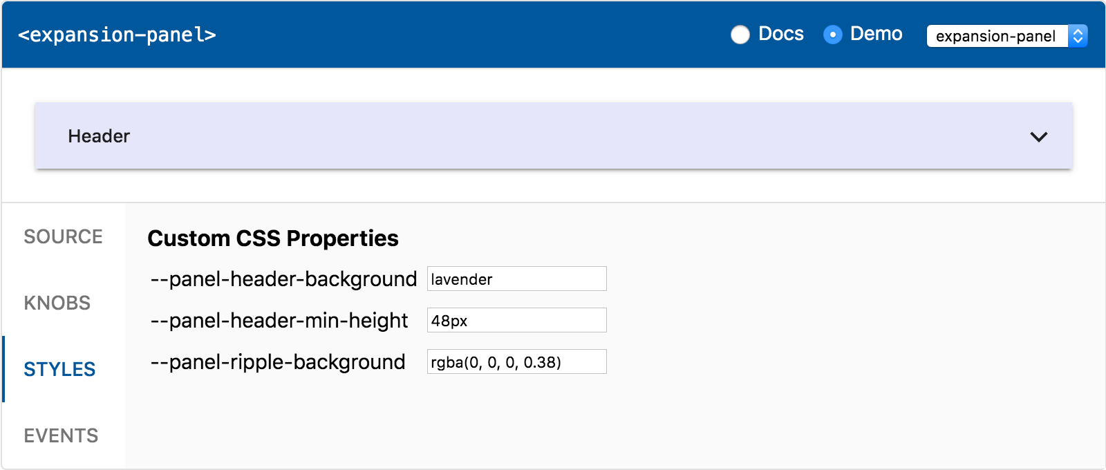
<slot>and / or named slots, if any. - CSS Custom Properties - Styling API of the component.
- CSS Shadow Parts - Elements that can be styled using
::part().
- Live playground
npm install api-viewer-elementCheck out the Getting Started guide.
The following web components are available:
yarnyarn devyarn startyarn dist- Big thanks to @thepassle for creating Custom Elements Manifest Analyzer, that this project is built upon.
- Big thanks to @runem for creating Web Component Analyzer used in older versions of API Viewer.
- Big thanks to Modern Web for Web Dev Server and Rocket used for the documentation website.
- Thanks to @bahrus for wc-info, a similar web component that served as a source of inspiration for me.
- The
@api-viewer/tabsweb component is based on tabs example from HowTo: Components project. - The visual appearance is largely inspired by older version of Vuetify API documentation.


![dependabot[bot] avatar](https://avatars.githubusercontent.com/in/29110?v=4 "dependabot[bot]")
![github-actions[bot] avatar](https://avatars.githubusercontent.com/in/15368?v=4 "github-actions[bot]")


 React
React
 Typescript
 Django
 Laravel
 Facebook
 Microsoft
 Google
 Alibaba
 D3
D3
 Tencent