
The goal of this project is to create a fictional business to customer website that offers an information point for existing members and additional content to attract and grow their customer base.
- Creating an online presence for The Gym Warehouse
- Offering a comprehensive list of classes provided
- Offer an insight into the personal training team
- Offer an easy to sign up free pass to allow potnetial new customers the chance to experience the Gym
- Create simple easy to use UX to enhance the customers ease of use and promote a positive emotional response
- Selecting images that generate a positive emotional response as well as motivating the user. The desired effect would be for the customer to feel the gym family is one they can see themselves being a part of
Prospective users There are two core prospective users for this website;
- An existing gym customer looking for information and details on the class timetable, personal trainers and contact information
- A potential new customer looking for information on contact details, facilities & services and sign up offers
The ideal user of this website is;
- Is looking for the best gym in their area to sign up to
- Enjoys personal training and fitness classes
- Is a gym member looking to easily and quickly book an upcoming class
- Provides honest feedback on both the website and gym facility
- As a user i need to;
- Be able to navigate through the website comfortably and easily
- Understand the purpose of the page
- Easily find out about the gym facilities and services
- Find out the location of the gym and how to contact the management team
- Would be more inclined to sign up to the gym with a free trial
- Find out more about the gym through their social media pages
- Easily book a class online
- Learn more about the personal training team
This website is divided into three pages. A home page, a classes page and a contact page. Each page follows the basic structure of a responsive nav bar, hero image, a map and a footer with links to the business social media accounts.
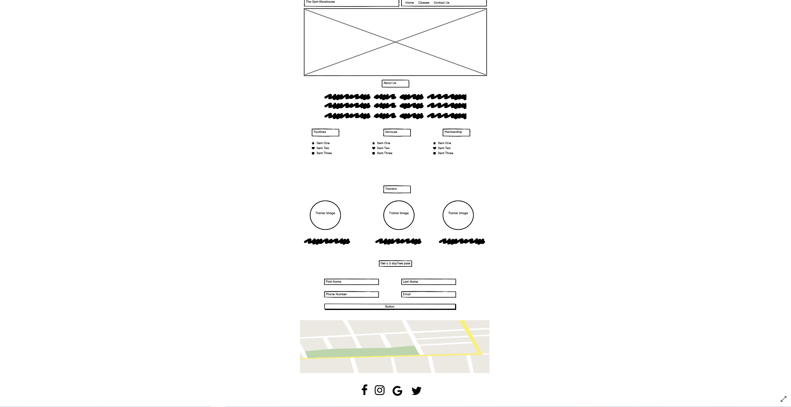
The home page gives is split into four main sections. The first being "About us" along with a hero and second image. This section is desinged to give new users a brief insight into the business and leave them wanting to explore more of the website. The second section details the facilities, services and type of membership the gym has to offer. This is designed with new users and potential customers in mind looking for clear and easy to read bullet points on what the gym can offer. Beneath this is a section with details and customer friednly images of the personal trainers who work for the gym and will lead any classes. This section is designed for both new and existing users to gain insight into the speciality each trainer offers. Finally the last section is an incentive to potential new customers, a free three day pass. This section is targeted at drawing in potential new customers, once they are in the gym staff members can discuss memberships and other sales opportunities.
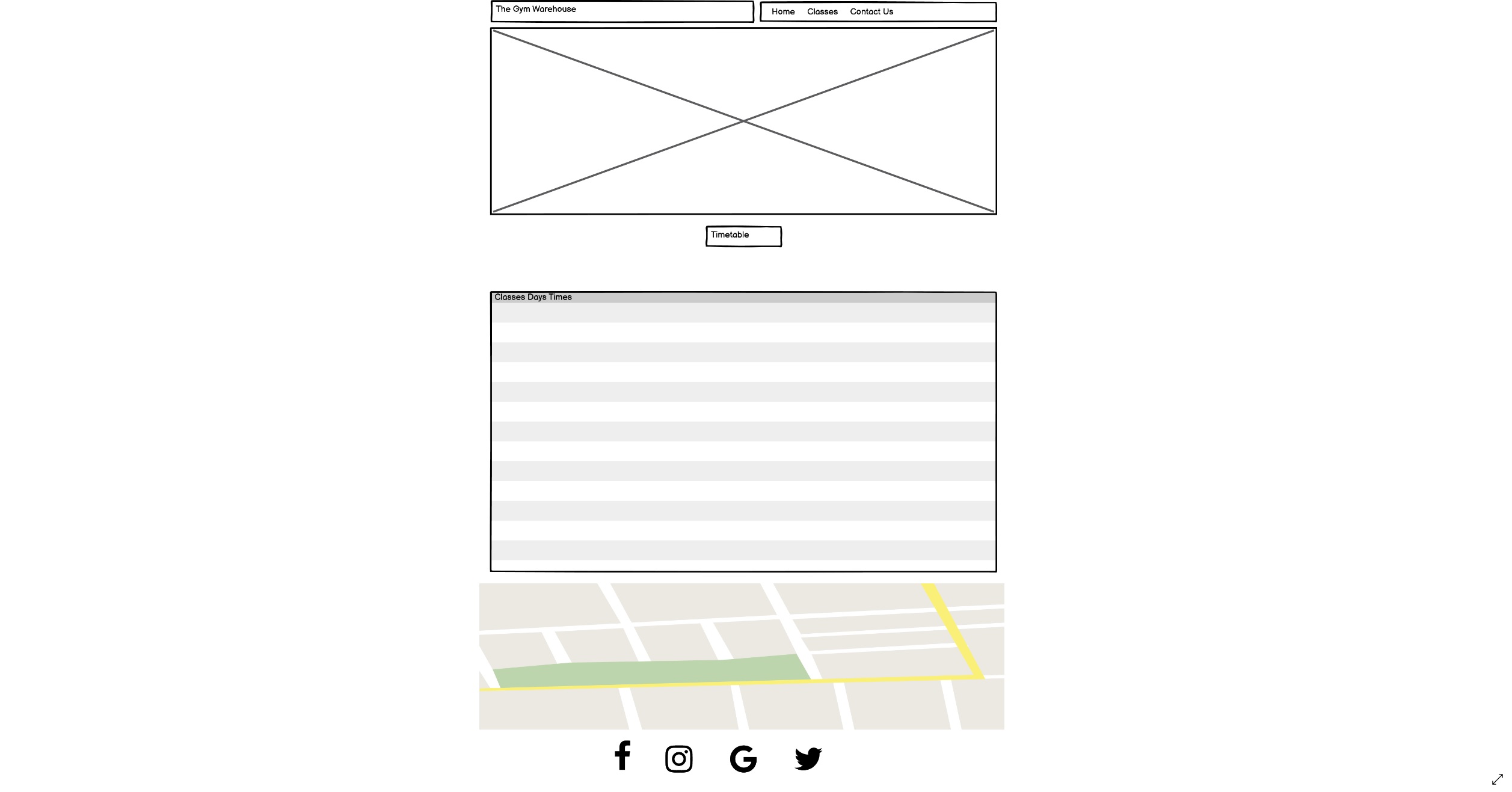
The classes page is split into two sections, an informative piece on the classes run in the gym and a sign up form for these classes. The timetable details which classes are held on which day at specific times, this is designed to give new users an insight into the variety of classes offered by the gym and existing members a reminder of which classes they wish to attend. The timetable can be viewed in full on laptop and has a scroll bar on both tablet and mobile devices, so the user is not affected by screen size. The second section is a form with a dropdown option which enables the user to book a class on their device without having to book whislt at the gym. This form has been desinged with data validation to ensure the user enters all their details and a success message when all the details have been sent correctly, letting the user know a confirmation email will be sent.
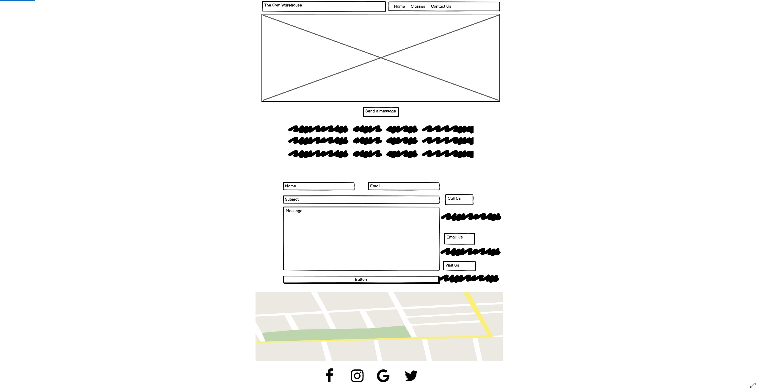
The contact page is split into two sections, a feedback form and specific contact details. The contact form is designed for both new and existing users to ask any unanswered questions they may have that hasnt been detailed on the website. It also give the user a chance to leave feedback on the layout and details of the website or the gym itself. The second section details specific contact details like, address, phone number and email address for the user to contact the gym directly should they need any further information.
- The gym name is feature on each page at the top left of the screen in the nav bar. Its function is to build and promote brand awareness and thereofre, is styled consistantly accross all three pages. As a secondary function the brand name can be used as a clickable link to direct back to the homepage, this is apparent when hovering over the name as the color changes on a cursor hover.
- The navigation links are styled to the right of the brand name and similarly to the brand name they change color on any cursor hover as to indicate they are to be clicked. These links are responsive to screen size and collapse into a hamburger style icon on smaller screens, allowing for a cleaner feel to the screen.
- The hero image is consistant accross all three pages. The image was chosen as it accuratly represents the gym for any visitors and hints towards the same colors used accross the rest of the page. This is to keep branding consistant for the user.
- The footer located at the bottom of the screen lists all the business social media accounts and are linked to these pages. Again these links change color on a cursor hover like the nav bar as to keep the branding consistant accross the site.
The typography i chose is Hind Siliguri with sans-serif as a fall-back should the initial choice not load. I chose this as i felt it was a clean easy to read style for all users. I used this styling in different sizes with my headers as to keep brand consistancy.
I chose the below color palette as i felt it best represented what the website offered. To me the palette gives the feel of a hardworking warehouse with the darker colors and a striking contrast with the aqua, a feeling of nightlife and motivation.
The imagery i used was found on Unsplash. The hero image and about us image were chosen as they matched the aesthetic and color of the website whislt also representing what the gym actually looks like. The perosnal trainer images were used as customer friendly images of the trainers they can expect to meet and work with.
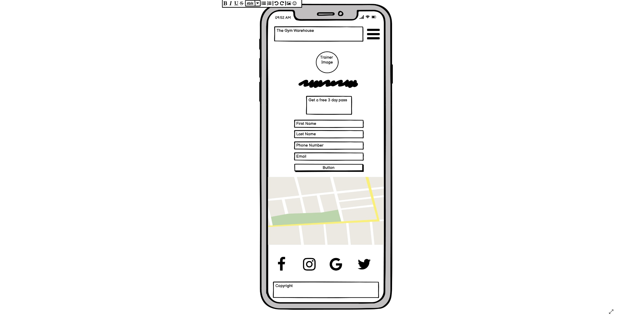
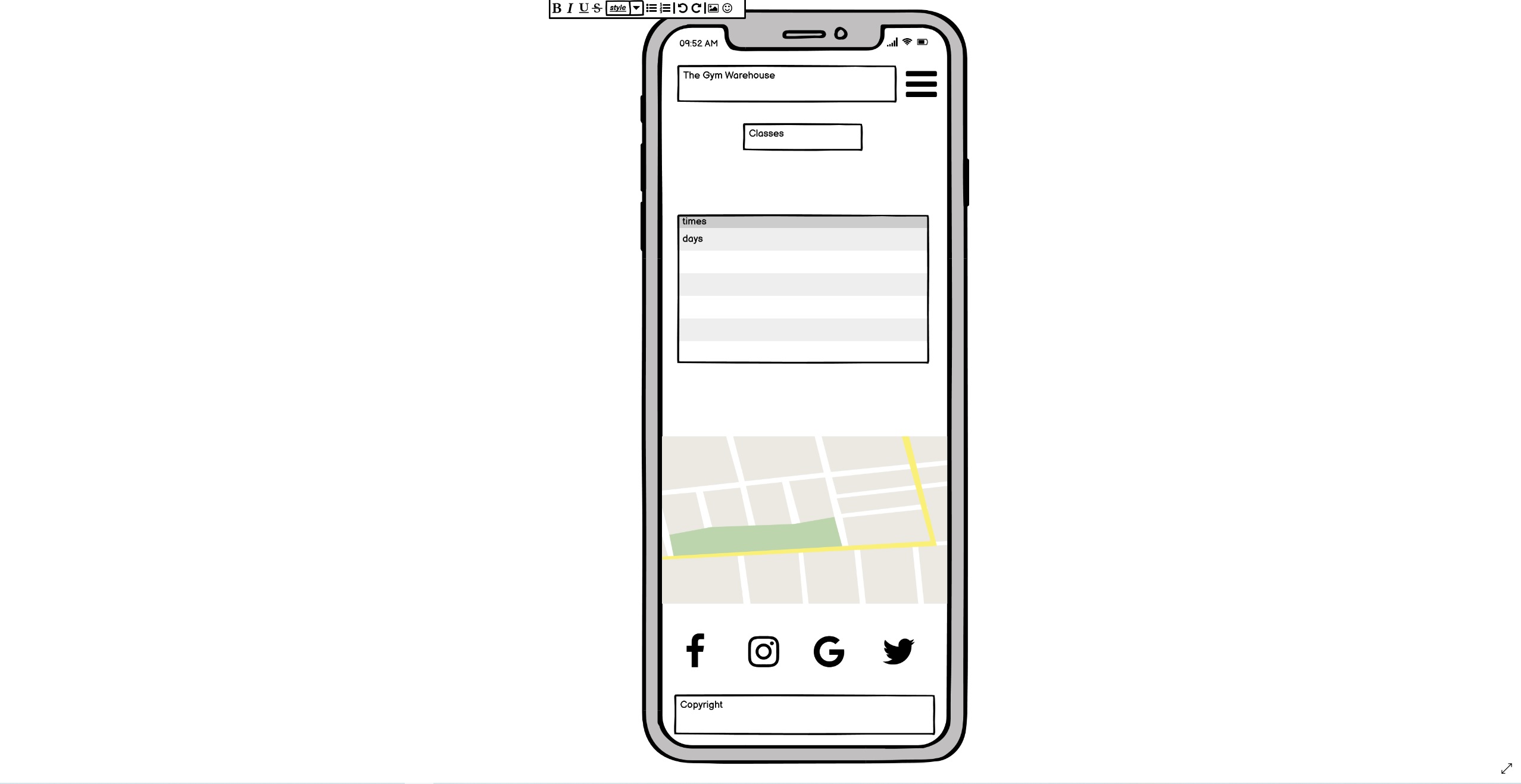
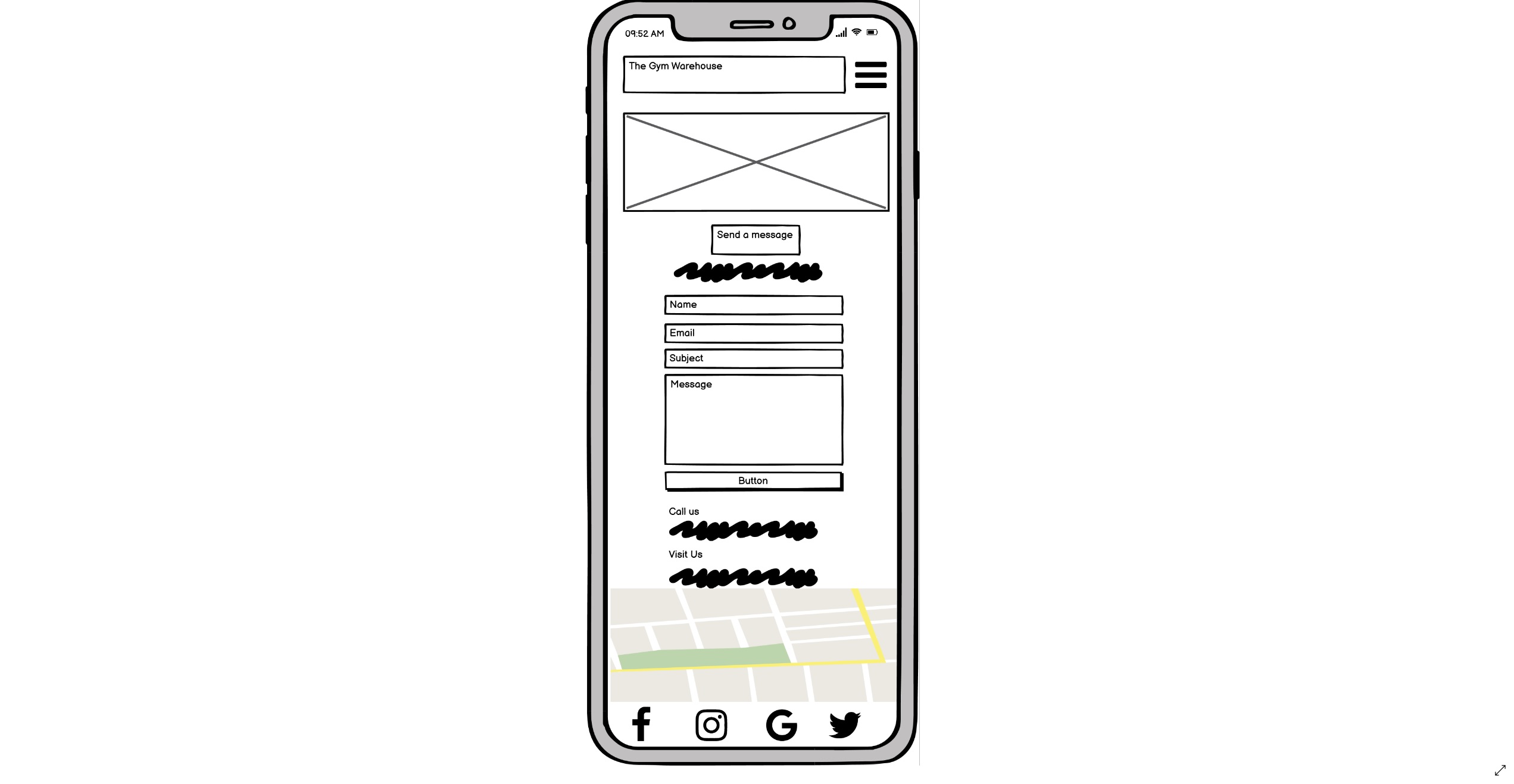
- My wireframes were created using Balsamiq wireframes and are detailed below
-
Desktop
-
Mobile
-

-
Workspaces
- Gitpod was used as the integrated development environment
-
Languages
-
Frameworks and Libraries
- Bootstrap 5 was used for the responsiveness and styling
- Font Awesome was used for the icons
- Google Fonts was used for font styles
- Unsplash was used for the main source of images
-
Version control
-
Wireframes
- Balsamiq was used to create the initial wireframes
-
Other
- Google Maps was used across the site
- W3C Markup Validator was used as a tool to check HTML erorrs
- W3C Jigsaw was used to check for erorrs in CSS
- Chrome lighthouse Testing was used
- Google Dev Tools was used throughout
- Responsinator was used to test the responsiveness of the website
-
There are two types of ideal or prospective users of the web page as outlined in the customer goals. The first of these is a potential customer looking for a gym to sign up to in the area, the second is a current member looking to easily book an upcoming class. The above testing was performed from a general point of veiw, however to ensure these two users had a successful journey i focused on the below;
-
As a new user was i easily and fully informed and would i sign up to this gym?
- I am aware of the brand name and identity as it is displayed in the navigation bar. This is important to me as i am new to the brand
- I am immediately met with a large motivational image which also gives me an idea of the gym layout and theme
- I am then met with an about us section, with some marketing text to engage the reader
- I am then informed of the gym's facilities, services and membership options. This is important to me as i am looking for specific facilities in the gym i chose to sign up to
- I then see a clearly defined section about the personal trainers of the gym and friednly inviting images. This is of interest to me as i am interested about professional background of the trainers i may be working out with
- I am then drawn into an offer to experience the gym and its facilities for free with an easy to use form. This is important to me as other gyms i am looking at dont provide a free opportunity to experience the gym
- Finally i am informed of the gyms location and social media pages to explore further. This is of interest to me as i wish to see more images and detail of the gym and its facilities
- From the homepage it is easy to understand there are further informative pages and how i can access these, it is clear is can find further contact information and ask a member of staff a question on the contact page
-
This is a clear structured index page with all the detail i would need to feel informed and incentivised to make a decision
-
As a gym member i would like to easily see the class timetable and book a class
- From the homepage it is clear where i can find details on classes the gym offers
- Upon entering the classes page i am met with a clearly structured timetable. It is important to me that the timetable is clearly structured and easy to read
- if i am on another device it is clear i can use a scroll function to see the full timetable
- Below the timetable i am given the option to book a class using a form. This is important to me as i can sign up to a class without having to be in the gym or call the customer service team
- On completing the form i am met with prompts should i miss a section and a success message on completion stating i will be sent a confirmation email. This is important to me as i need confirmation in order to attend the class i wish
-
It is a simple and easy process to book a class or find out more by asking a question on the contact form
-
-
The above details specific user stories. The below section is more generic for all users
-
To be able to naviagte through the website easily
- The user is immediately met with the navigation bar at the top of the page
- The clickable links in the nav bar change color on a cursor hover in order to make the purpose of these links clear
-
To understand the purpose of the page
- The first section you see on loading the page is "about us" this section clearly details the purpose of the page
-
Easily find out about the gym facilities and services
- The homepage of the website is structured into clear headed sections for the suer to easily identify facilities, services and the personal training team
-
To be able to locate the gym and how to contact the management team
- The user has the option to leave feedback using an easy to use form on the contact page along with a detailed map on each page showing the gyms location
-
Find out more about the gym on their social media pages
- listed in the footer of each page are clear links to the business social media pages
- All these links change colour as they should in the theme of the page to indicate they are clickable links
- As is best practice these pages open in a new tab for the user so they can return to the gym page easily
-
Easily book a class online
- The website has a dedicated page with a timetable detailing all the classes offered. The user can then book one of these classes using the form on the same page
- This form provides feedback when i havent entered all or the correct information and a success message when i have
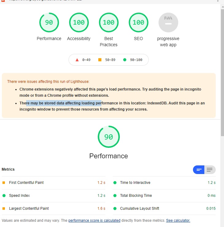
- I ran a lighthouse test on the homepage and the results came back as below;
- I wasnt happy with the overall performance so took the below actions to fix some issues:
- To improve accessability i added a title to the map iframe on each page
- To improve SEO i added a meta description
- To improve the performance i resized all the images
- To improve best practice i added "rel=noopener" to all my social media external links
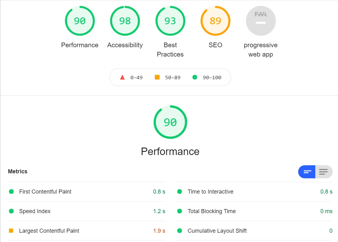
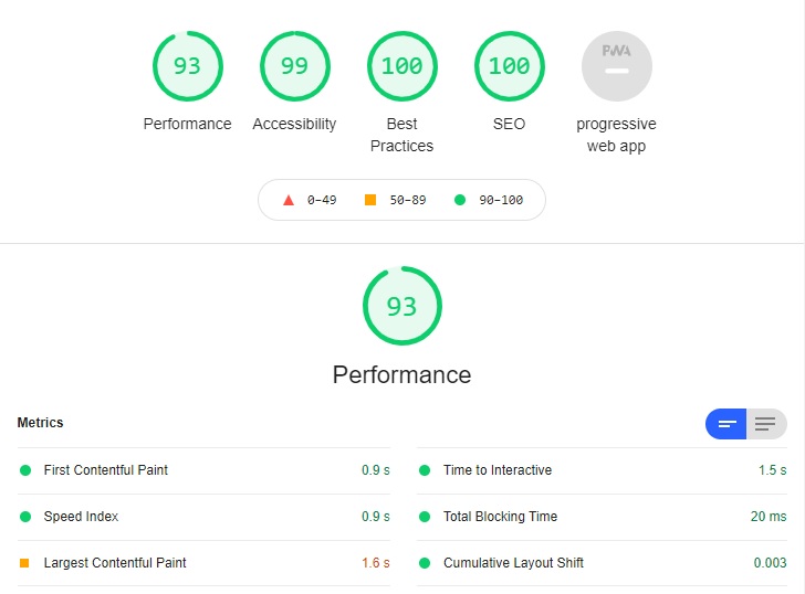
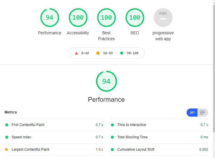
My final Lighthouse testing results are as below;
- Home page
- Classes Page
- Contact Page
- Index
- Starting with the navbar i tested the hover.css on the links to other pages and the title.
- I tested the functionality of the form by entering information both partially and fully to see either a success message or prompt for more information
- I tested the functioanlity of the location map and was able to move around as well as veiw a larger map in a seperate tab
- I tested the hover.css and functionality of the social media links ensuring the web page opened in a seperate tab
- Classes
- I tested the timetable on a smaller device to ensure to scroll function was working
- I tested the functionality of the form by entering information both partially and fully to see either a success message or prompt for more information
- Contact Page
- I tested the functionality of the form by entering information both partially and fully to see either a success message or prompt for more information
- On testing the contact page i found there was an added margin and the page could be scrolled right and overflowing due to content inside contact details section. To fix this i added a "no-gutters" to my row inside the container
- responsiveness
- I tested all the about functions across mobile, tablet and desktop to ensure they were consistantly working
- I tested the functionality, responsiveness and readability across mobile, tablet and desktop
- The website was tested on Google Chrome, Internet Explorer, Microsoft Edge and Safari browsers
- The website was veiwed on a variety of devices such as Desktop, laptop, iPhone 7 plus, iPhone X and iPad mini 4
- The above testing showed no errors and the website is cross-browser and cross-device compatible
To validate my code i used the below;
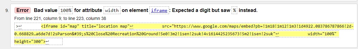
- W3C Markup was used to validate my HTML.
- One error was presented when validating my HTML. A width of 100% had been added into the HTML code, i therefore removed this and added it to my CSS
- One error was presented when validating my HTML. A width of 100% had been added into the HTML code, i therefore removed this and added it to my CSS
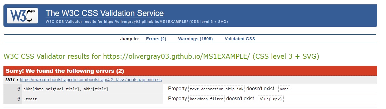
- W3C CSS was used to validate my CSS.
- Two errors were found when running this, as seen below. However, these errors are caused by the bootstrap CDN
- Two errors were found when running this, as seen below. However, these errors are caused by the bootstrap CDN
This project was deployed to Github pages using the following steps:
- Log into Github
- Select the OliverGray03/MS1-TheGymWarehouse respository
- Click the settings tab at the top of the repository
- Scroll to the "GitHub Pages" section of the page
- Under "Source", click the dropdown called "None" and select "Master Branch"
- The page will automatically refresh
- The project has now been deployed. Scroll back to the GitHub pages section and click on the link above the source heading to view the live site.
By forking the GitHub Repository we make a copy of the original repository on our GitHub account to view and/or make changes without affecting the original repository by using the following steps:
- Log into Github
- Select the OliverGray03/MS1-TheGymWarehouse respository.
- At the top of the Repository (not top of page) just above the "Settings" Button on the menu, locate the "Fork" Button
- You should now have a copy of the original repository in your GitHub account
- Log into GitHub
- Select the OliverGray03/MS1-TheGymWarehouse respository
- Under the repository name, click "Clone or download"
- To clone the repository using HTTPS, under "Clone with HTTPS", copy the link
- Open Git Bash
- Change the current working directory to the location where you want the cloned directory to be made
- Type "git clone", and then paste the URL you copied in Step 3
- Bootstrap 5.0 was used throughout the project, mainly to make the site reponsive
- The inspiration for the table on classes.html came from Wrapbootstrap
- The hero image was originally obtained from Luis Vidal on unsplash.com
- The About us image was originally obtained from Victor Freitas on upsplash.com
- The Marc Jensen image was originally obtained from Anastase Maragos on unsplash.com
- The Antoni Boyd image was originally obtained from Luemen rutkowski on upsplash.com
- The Connie Waters image was originally obtained from Sushil Ghimire on upsplash.com

 React
React
 Typescript
 Django
 Laravel
 Facebook
 Microsoft
 Google
 Alibaba
 D3
D3
 Tencent