Giter Club home page Giter Club logo

matplotx's Introduction

matplotx

Some useful extensions for Matplotlib.

PyPi Version Anaconda Cloud PyPI pyversions DOI GitHub stars Downloads

gh-actions codecov Code style: black

This package includes some useful or beautiful extensions to Matplotlib. Most of those features could be in Matplotlib itself, but I haven't had time to PR yet. If you're eager, let me know and I'll support the effort.

Install with

pip install matplotx[all]

and use in Python with

import matplotx

See below for what matplotx can do.

Clean line plots (dufte)

matplotlib matplotx.styles.dufte, matplotx.ylabel_top, matplotx.line_labels matplotx.styles.duftify(matplotx.styles.dracula)

The middle plot is created with

import matplotlib.pyplot as plt
import matplotx
import numpy as np

# create data
rng = np.random.default_rng(0)
offsets = [1.0, 1.50, 1.60]
labels = ["no balancing", "CRV-27", "CRV-27*"]
x0 = np.linspace(0.0, 3.0, 100)
y = [offset * x0 / (x0 + 1) + 0.1 * rng.random(len(x0)) for offset in offsets]

# plot
with plt.style.context(matplotx.styles.dufte):
    for yy, label in zip(y, labels):
        plt.plot(x0, yy, label=label)
    plt.xlabel("distance [m]")
    matplotx.ylabel_top("voltage [V]")  # move ylabel to the top, rotate
    matplotx.line_labels()  # line labels to the right
    plt.show()

The three matplotx ingredients are:

  • matplotx.styles.dufte: A minimalistic style
  • matplotx.ylabel_top: Rotate and move the the y-label
  • matplotx.line_labels: Show line labels to the right, with the line color

You can also "duftify" any other style (see below) with

matplotx.styles.duftify(matplotx.styles.dracula)

Further reading and other styles:

Clean bar plots

matplotlib dufte dufte with matplotx.show_bar_values()

The right plot is created with

import matplotlib.pyplot as plt
import matplotx

labels = ["Australia", "Brazil", "China", "Germany", "Mexico", "United\nStates"]
vals = [21.65, 24.5, 6.95, 8.40, 21.00, 8.55]
xpos = range(len(vals))

with plt.style.context(matplotx.styles.dufte_bar):
    plt.bar(xpos, vals)
    plt.xticks(xpos, labels)
    matplotx.show_bar_values("{:.2f}")
    plt.title("average temperature [°C]")
    plt.show()

The two matplotx ingredients are:

  • matplotx.styles.dufte_bar: A minimalistic style for bar plots
  • matplotx.show_bar_values: Show bar values directly at the bars

Extra styles

matplotx contains numerous extra color schemes, e.g., Dracula, Nord, gruvbox, and Solarized, the revised Tableau colors.

import matplotlib.pyplot as plt
import matplotx

# use everywhere:
plt.style.use(matplotx.styles.dracula)

# use with context:
with plt.style.context(matplotx.styles.dracula):
    pass
Many more styles here...

Other styles:

Smooth contours

plt.contourf matplotx.contours()

Sometimes, the sharp edges of contour[f] plots don't accurately represent the smoothness of the function in question. Smooth contours, contours(), serves as a drop-in replacement.

import matplotlib.pyplot as plt
import matplotx


def rosenbrock(x):
    return (1.0 - x[0]) ** 2 + 100.0 * (x[1] - x[0] ** 2) ** 2


im = matplotx.contours(
    rosenbrock,
    (-3.0, 3.0, 200),
    (-1.0, 3.0, 200),
    log_scaling=True,
    cmap="viridis",
    outline="white",
)
plt.gca().set_aspect("equal")
plt.colorbar(im)
plt.show()

Contour plots for functions with discontinuities

plt.contour matplotx.contour(max_jump=1.0)

Matplotlib has problems with contour plots of functions that have discontinuities. The software has no way to tell discontinuities and very sharp, but continuous cliffs apart, and contour lines will be drawn along the discontinuity.

matplotx improves upon this by adding the parameter max_jump. If the difference between two function values in the grid is larger than max_jump, a discontinuity is assumed and no line is drawn. Similarly, min_jump can be used to highlight the discontinuity.

As an example, take the function imag(log(Z)) for complex values Z. Matplotlib's contour lines along the negative real axis are wrong.

import matplotlib.pyplot as plt
import numpy as np

import matplotx

x = np.linspace(-2.0, 2.0, 100)
y = np.linspace(-2.0, 2.0, 100)

X, Y = np.meshgrid(x, y)
Z = X + 1j * Y

vals = np.imag(np.log(Z))

# plt.contour(X, Y, vals, levels=[-2.0, -1.0, 0.0, 1.0, 2.0])  # draws wrong lines

matplotx.contour(X, Y, vals, levels=[-2.0, -1.0, 0.0, 1.0, 2.0], max_jump=1.0)
matplotx.discontour(X, Y, vals, min_jump=1.0, linestyle=":", color="r")

plt.gca().set_aspect("equal")
plt.show()

Relevant discussions:

spy plots (betterspy)

Show sparsity patterns of sparse matrices or write them to image files.

Example:

import matplotx
from scipy import sparse

A = sparse.rand(20, 20, density=0.1)

# show the matrix
plt = matplotx.spy(
    A,
    # border_width=2,
    # border_color="red",
    # colormap="viridis"
)
plt.show()

# or save it as png
matplotx.spy(A, filename="out.png")
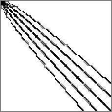
no colormap viridis

There is a command-line tool that can be used to show matrix-market or Harwell-Boeing files:

matplotx spy msc00726.mtx [out.png]

See matplotx spy -h for all options.

License

This software is published under the MIT license.

matplotx's People

Contributors

nschloe avatar remdelaportemathurin avatar

Stargazers

 avatar  avatar  avatar  avatar  avatar  avatar  avatar  avatar  avatar  avatar  avatar  avatar  avatar  avatar  avatar  avatar  avatar  avatar  avatar  avatar  avatar  avatar  avatar  avatar  avatar  avatar  avatar  avatar  avatar  avatar  avatar  avatar  avatar  avatar  avatar  avatar  avatar  avatar  avatar  avatar  avatar  avatar  avatar  avatar  avatar  avatar  avatar  avatar  avatar  avatar  avatar  avatar  avatar  avatar  avatar  avatar  avatar  avatar  avatar  avatar  avatar  avatar  avatar  avatar  avatar  avatar  avatar  avatar  avatar  avatar  avatar  avatar  avatar  avatar  avatar  avatar  avatar  avatar  avatar  avatar  avatar  avatar  avatar  avatar  avatar  avatar  avatar  avatar  avatar  avatar  avatar  avatar  avatar  avatar  avatar  avatar  avatar  avatar  avatar  avatar

Watchers

 avatar  avatar  avatar  avatar  avatar  avatar

matplotx's Issues

Bar labels when bar is too short

Sometimes when using show_bar_values(alignemnent="horizontal") and the bar is too small this can happen:
image

The expected behaviour would be:
image

Adapt `line_labels` for `PolyCollections`

I'm keen on making a PR to adapt line_labels to make it work with fill_between objects (PolyCollection)

This would be the usage and output:

import matplotlib.pyplot as plt
import matplotx
import numpy as np

x = np.linspace(0, 1)
y1 = np.linspace(1, 2)
y2 = np.linspace(2, 4)

plt.fill_between(x, y1, label="label1")
plt.fill_between(x, y1, y2, label="label1")

matplotx.label_fillbetween()
plt.show()

image

@nschloe would you be interested in this feature?

Inline labelling on the left?

It would be useful to switch the line labels to the left (instead of right currently) for curves that are converging and overlapping on the right.

image

Improper ylabel_top placement

I've been using matplotx.ylabel_top and just noticed an issue with the label placement after setting the y tick labels explicitly. A working example is below.

import numpy as np
from seaborn import scatterplot
import matplotx

rng = np.random.default_rng(42)
x = rng.random(100)
y = -2*x + rng.normal(0, 0.5, 100)
ax = scatterplot(
    x=x,
    y=y
)
ax.set_yticks([0, -1, -2])
matplotx.ylabel_top('Example\nLabel')

example

i'm using

numpy==1.23.4
seaborn==0.12.1
matplotx==0.3.10

meet at center

If a quad has one edge with a contour, draw a line from that segment to the quad center. This avoids situations like:

screenshot

Support for subplots

Perhaps this is already implemented and I'm just unable to find it. I think this package in general is great; very easy to use and very beautiful. Thank you for your time making it.

I'm unable to get matplotx working properly when using subplots. Adapting the Clean line plots (dufte) example to include two subplots (side-by-side, or one-below-the-other) appears not to work.

import matplotlib.pyplot as plt
import matplotx
import numpy as np

# create data
rng = np.random.default_rng(0)
offsets = [1.0, 1.50, 1.60]
labels = ["no balancing", "CRV-27", "CRV-27*"]
x0 = np.linspace(0.0, 3.0, 100)
y = [offset * x0 / (x0 + 1) + 0.1 * rng.random(len(x0)) for offset in offsets]

fig, axes = plt.subplots(2,1)                                           # add subplots

for ax in axes:                                                         # Let's make two identical subplots
    with plt.style.context(matplotx.styles.dufte):
        for yy, label in zip(y, labels):
            ax.plot(x0, yy, label=label)                                # changed plt. to ax.
        ax.set_xlabel("distance [m]")                                   # changed plt. to ax.
        matplotx.ylabel_top("voltage [V]")                              # move ylabel to the top, rotate
        matplotx.line_labels()                                          # line labels to the right
        #plt.show()                                                     # Including this adds the 'pretty axis' below the subplots.                             

image

Some styles are broken

Using the code example in the readme:

import matplotlib.pyplot as plt
import matplotx
plt.style.use(matplotx.styles.ayu)

I get this error:

File ~/.conda/envs/.../lib/python3.10/site-packages/matplotlib/style/core.py:117, in use(style)
    115 for style in styles:
    116     if not isinstance(style, (str, Path)):
--> 117         _apply_style(style)
    118     elif style == 'default':
    119         # Deprecation warnings were already handled when creating
    120         # rcParamsDefault, no need to reemit them here.
    121         with _api.suppress_matplotlib_deprecation_warning():

File ~/.conda/envs/.../lib/python3.10/site-packages/matplotlib/style/core.py:62, in _apply_style(d, warn)
     61 def _apply_style(d, warn=True):
---> 62     mpl.rcParams.update(_remove_blacklisted_style_params(d, warn=warn))

File ~/.conda/envs/.../lib/python3.10/_collections_abc.py:994, in MutableMapping.update(self, other, **kwds)
    992 if isinstance(other, Mapping):
    993     for key in other:
--> 994         self[key] = other[key]
    995 elif hasattr(other, "keys"):
    996     for key in other.keys():

File ~/.conda/envs/.../lib/python3.10/site-packages/matplotlib/__init__.py:649, in RcParams.__setitem__(self, key, val)
    647     dict.__setitem__(self, key, cval)
    648 except KeyError as err:
--> 649     raise KeyError(
    650         f"{key} is not a valid rc parameter (see rcParams.keys() for "
    651         f"a list of valid parameters)") from err

KeyError: 'dark is not a valid rc parameter (see rcParams.keys() for a list of valid parameters)'

Lib versions:

matplotlib-base           3.5.2           py310h5701ce4_1    conda-forge
matplotx                  0.3.7                    pypi_0    pypi

This happens with aura, ayu, github, gruvbox and others.

Some of the themes working are: challenger_deep, dracula, dufte, nord, tab10

Support for horizontal barchart

matplotx.show_bar_values works perfectly with vertical bar charts but not with horizontal bar charts.

These are often used with long text labels.

import matplotlib.pyplot as plt
import matplotx

labels = ["Australia", "Brazil", "China", "Germany", "Mexico", "United\nStates"]
vals = [21.65, 24.5, 6.95, 8.40, 21.00, 8.55]
ypos = range(len(vals))

with plt.style.context(matplotx.styles.dufte_bar):
    plt.barh(ypos, vals)
    plt.yticks(ypos, labels)
    matplotx.show_bar_values("{:.2f}")
    plt.title("average temperature [°C]")
    plt.tight_layout()
    plt.show()

Produces:
image

I can write a PR and add a show_hbar_values() function that works with horizontal bar charts and produces:
image

Or it can also be an argument of matplotx.show_bar_value defaulting to "vertical" like show_bar_value(alignement="horizontal")

What do you think @nschloe ?

First example images not properly clickable in readme

I just came across this project, looks really neat. Especially the smooth contourf got me curious.

I've noticed in the readme that (at least on firefox) if I click any of the three images, the link that opens (even with the "open image in new tab" context menu option) is https://github.com/nschloe/matplotx/blob/main/tests/dufte_comparison.py. In contrast, the contourf images open just fine, for instance.

I assume the reason for this is the enclosing a tag for the first example:

<a href="tests/dufte_comparison.py">

In case this is not just a firefox thing, I would recommend trying to make the first three images clickable on their own right.

Citation

Great package! Thank you so much it really helps!

I will surely use this in my next paper/talk. How can I cite this package?

Do you plan on adding a Zenodo DOI?

Cheers
Remi

Remove some typing hint to support older numpy ?

Hello, I got an error ModuleNotFoundError: No module named 'numpy.typing' due to the typing hint from numpy.typing import ArrayLike.

Would you mind remove this hint to support older numpy version like 1.19.* ? It seems no performance issue after remove it.

Recommend Projects

  • React photo React

    A declarative, efficient, and flexible JavaScript library for building user interfaces.

  • Vue.js photo Vue.js

    🖖 Vue.js is a progressive, incrementally-adoptable JavaScript framework for building UI on the web.

  • Typescript photo Typescript

    TypeScript is a superset of JavaScript that compiles to clean JavaScript output.

  • TensorFlow photo TensorFlow

    An Open Source Machine Learning Framework for Everyone

  • Django photo Django

    The Web framework for perfectionists with deadlines.

  • D3 photo D3

    Bring data to life with SVG, Canvas and HTML. 📊📈🎉

Recommend Topics

  • javascript

    JavaScript (JS) is a lightweight interpreted programming language with first-class functions.

  • web

    Some thing interesting about web. New door for the world.

  • server

    A server is a program made to process requests and deliver data to clients.

  • Machine learning

    Machine learning is a way of modeling and interpreting data that allows a piece of software to respond intelligently.

  • Game

    Some thing interesting about game, make everyone happy.

Recommend Org

  • Facebook photo Facebook

    We are working to build community through open source technology. NB: members must have two-factor auth.

  • Microsoft photo Microsoft

    Open source projects and samples from Microsoft.

  • Google photo Google

    Google ❤️ Open Source for everyone.

  • D3 photo D3

    Data-Driven Documents codes.