Contributers: Nick Haener, Christopher Kites, Alexander Bonilla, Warren Cho
All the data sets we worked with can be found at: http://www.cdc.gov/diabetes/atlas/countydata/County_ListofIndicators.html
This data set is based on information from the CDC website on obesity rates by county in each state. This data set has obesity statistics from 2004 to 2012.
The data sets we used are:
- Obesity Prevalance
- Leisure-time physical inactivity prevalance
This data teaches you about the obesity prevalence (prevalence by state) and visualizes the relationship between obesity prevalence and leisure-time devoted to physical activity. This information can be used for an array of purposes including but not limited to:
- Health care industry (obesity impacts hospital infrastructure such as bed size, availability of lifts to help move patients, staff training to safely care for over weight patients, etc.)
- legislators (they set funding levels for health care spending, research on obesity related illnesses)
- other government officials (national, state, local) that set the policies to deal with the impacts of a increasingly obese population.
To create the visual representations we used Shiny, plotly, choroplethr, choroplethrMaps, and shinyjs. For the in depth data manipulation we implemented dplyr.
We focused mainly on the percentages of people obese and the percentage of time during lesiure time spent inactive with respect to every state in the U.S. and every county within each state. Below is a breakdown of what the terms used mean:
- County <- All counties within given state
- Surveyed <- Number of people surveyed in a given state or county
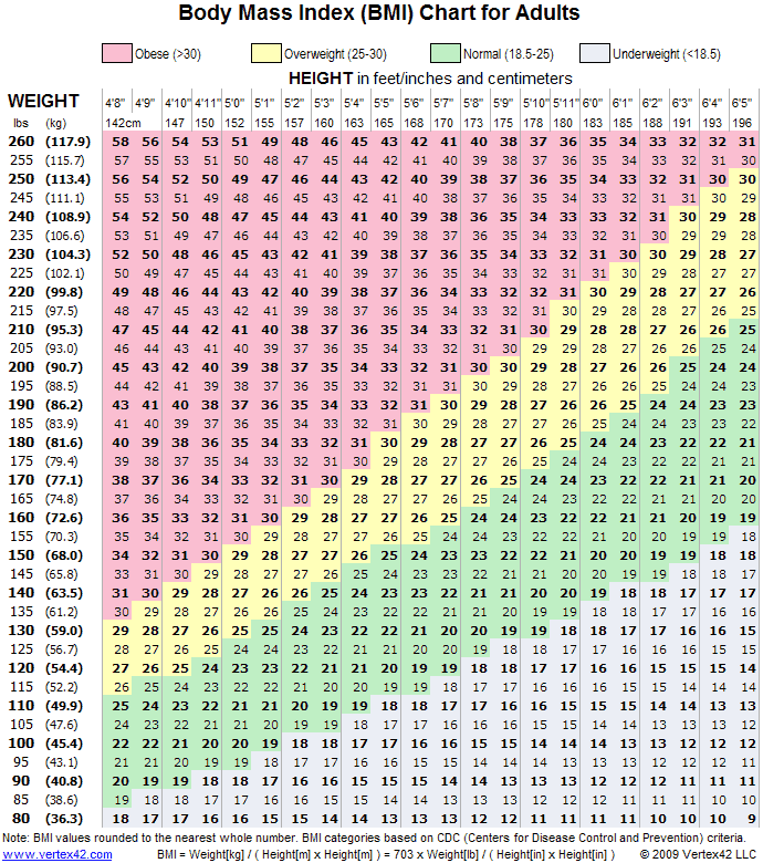
- Percent Obese <- a person is considered obese if they have a Body Mass Index (BMI) of over 30; for a given county, this is the direct percentage of people obese from the number of people surveyed; for a given state, Percent Obese refers to the the state average of people who are obese.