


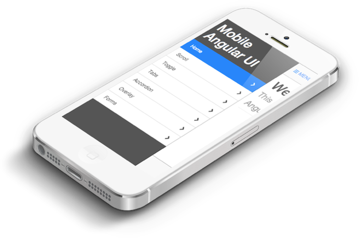
Mobile Angular UI is an HTML5 mobile UI framework that will let you use Angular Js and Bootstrap 3 for mobile app development.
npm i mobile-angular-uiGetting Started, Demo, Docs at http://mobileangularui.com.

Released Under MIT License.
Angular.js Mobile UI Framework with Bootstrap 3
Home Page: http://mobileangularui.com/
License: MIT License
Mobile Angular UI is an HTML5 mobile UI framework that will let you use Angular Js and Bootstrap 3 for mobile app development.
npm i mobile-angular-uiGetting Started, Demo, Docs at http://mobileangularui.com.
Released Under MIT License.


Using http://filamentgroup.github.io/Overthrow/ its the best solution for mobile use.
angular.module("mobile-angular-ui.scrollable", []).directive("scrollable", function() {
        return {
            replace: false,
            restrict: "C",
            link: function(scope, element, attr) {
                angular.element(element[0]).addClass("overthrow");
            }
        };
});I am developing app for windows phone using cordova.
Tested it on Nokia Lumia 720, 520 with Windows Phone 8 (with Back Update )
One of major issue is clicking of hidden elements (i.e. Sidebar ) , even though video is of website same issues are carried forward in mobile application.
other major issue is i cannot get array of objects to display as a list on overlay, all i am able to display is a last element in array.
Here is what i have tried:
followed windows msdn guidelines for website changing meta tags,
used bootstrap guide lines for IE support and
http://www.excellentwebworld.com/common-problems-solution-for-windows-phone-8-phonegap/
Same application works amazingly wonderful on android and ios without any issues
Please need assistance.
I have uploaded the video with various issues.
https://www.dropbox.com/s/daw0elm5if7wcbo/WP_20140419_002.mp4
I can't seem to be able to properly add a sidebar to BOTH sides.
The result depends on whether the right column is declared first, or the left. Neither way works entirely as expected.
If the left column is declared first, it does create a sidebar on both sides when in mobile format, but it includes the contents of both the right and left sidebars inside the left sidebar (see image). The right sidebar appears properly.
If the right column is declared first, then the left column is fine, but the right includes content from the left, not its own content.
Also, in desktop mode the right hand sidebar disappears completely.
I don't think that we are supposed to be using two sidebars yet, but it looks really close to working... and that second sidebar would work really well to use up screen real estate in desktop mode.
This is the HTML I used:
<div class="sidebar sidebar-right" toggleable parent-active-class="sidebar-right-in" id="mainSidebarRight">
    <h1 class="app-name">Chat</h1>

    <div class="scrollable">
        <div class="scrollable-content">
            <div class="list-group" toggle="off" bubble target="mainSidebarRight">
                <p>Some chat boxes here</p>
                <!-- ... -->
            </div>
        </div>
    </div>
</div>


<div class="sidebar sidebar-left" toggleable parent-active-class="sidebar-left-in" id="mainSidebar">
    <h1 class="app-name">My App</h1>

    <div class="scrollable">
        <div class="scrollable-content">
            <div class="list-group" toggle="off" bubble target="mainSidebar">
                <a class="list-group-item" href="#/">Home <i class="fa fa-chevron-right pull-right"></i></a>
                <!-- ... -->
            </div>
        </div>
    </div>
</div>
At this time, in order to customize look and feel, mobile-angular-ui.less, mobile-angular-ui-desktop.less and variables.less files need to customized.
If there were an import statement at the end of variables.less file as follows
@import "customer.less"
along with an empty customer.less file (in src/less directory), a customer could simply modify that file (through gulp/grunt) and get a customized CSS.
I am not sure if you are open to suggestions or even whether this would fit in, but a Tinder-style swipe, with a nice bit of animation, for swiping left/right and up/down would be very nice.
This interaction works very well on mobile devices allowing users to sift through multiple visual 'cards' quickly.
Example CSS here: http://smotko.si/tinder-css/
In your Demo, The label "Payed" should be spelled "Paid"
Also: This project rocks!! Keep this shit up!
Hi All,
Congratulations guys; Great job.
Scroll in not working (Not able to scroll) for demo site and the problem is only for Google Chrome (Version: 28.0.1500.95).
Note: iScroll 5 is working fine on same chrome.
Thanks,
Madan Mohan Singh
I've noticed that once you swipe from right to left the content will start to change during mouse clicks.
Any ideas on how to avoid that?
with jquery-1.11.0.min.js included, the label is missing
Hi,
Please I have this error when I'm doing the first code with MobileAngular-UI and AngularJS.
In firefox, it's display :
Error: http://localhost:8000/lib/angular/angular.min.js is being assigned a //# sourceMappingURL, but already has one
Error: http://localhost:8000/lib/angular/angular-route.min.js is being assigned a //# sourceMappingURL, but already has one
But nothing In Chrome or Chronium .....
How to solve it please ?
On iPad with iOS 7.1 The Bottom Nav is not shown complete.
The last 5 or 8 Pixel are cut away.
This only happens on iPad.
On my iPhone 5 with 7.1 everything is ok. Mac Browser is also ok. Just iPad.

Hey @mcasimir,
if a scrollable (e.g. sidebar) is in the DOM before angular executes run blocks, the height of the scrollable is adjusted twice, which will lead to a max-height of 99999px.
It does not happen when you include the scrollable later, e.g. via ng-include or ng-view. This is why it is not an issue in your demo example.
I fixed this issue by deleting this line:
If we can assume that .scrollable is always parent of .scrollable-content, removing this line will not be an issue because the scrollableContent directive takes care of adjusting the size of its .scrollable parent.
PS: I fixed this in my fork, did a grunt build and pushed the changes: https://github.com/jmaicher/mobile-angular-ui/commit/4becc4e31517b216e82ad804a173cd6588ced908. A lot of files have been changed, especially the bower deps. Not sure if you want me to issue a PR with so many changes. Do you? :-)
Fine piece of work - if you put this in place I'd like to contribute something:
https://github.com/blog/57-getting-paid-the-open-source-way
just discovered this lib - you have the right idea and it's very, very nice (we were real frustrated with all the other ui options)
would be helpful to have version # on download page so can see whether new commits are incorporated
Will make a shout out on this project at my upcoming talk at Open West - hope we can get it incorporated into a few of our projects by then to show off.
roadmap suggestion - on wide screen we would rather have a left dropdown button than automatic side menu showing (actually looking same as phone screen) My philosophy - design totally for mobile, just don't make wide screen suck too bad for those using desktop.
we will try to contribute but we don't do coffeescript
Hi There,
I'm using more than one controller in my angularjs app and when i try to use the mobile angular ui i'm having problem bidding my data to the controller. I'm using $routeprovider for page routing and assigning the controller from the $routeprovider also.
Any suggestion.
Thank you,
Karl
Hey, congratulation for your great job.
Side menu does not open when app is inside cordova. Sometimes it open at the first start of the application if you click 1/ menu and 2/ list (right of the bottom bar of the demo app). If you select an item of the side menu, side menu does not close except for overlay item. If you click on menu icon, sidemenu does not close. the app was running on my samsung galaxy note 2. Sorry for my bad english
Bruno
Could you add support for Dart?
I am trying to create a list in angularUI, but the list is not rendered on the entire row. Instead it takes only a fixed width equal to the longest element (length) in the list.
How can I make it align with other elements such as textbox etc which take the entire width of the form.
 <div class="form-group container-fluid">
        <div class="row">
        <label for="nameList" class="control-label col-sm-2"><b>List</b></label>
        <div class="col-sm-10">
                      <select ng-change="listSelected()"  ng-model ="item" id="nameList">
                      <option value="" selected="">{{mobileMap}}</option>
                      <option value="AP">Select Option 1</option>
                      <option value="ARP">Select Option 2</option>

                    </select>
        </div>
    </div>
</div>This is a feature request...I've found it useful to not only bind to a $scope object in the controller via ng-model, but also to call another function to store the $scope object into a service that all controllers in the app can use. I think a common use case for the toggle switch is for app settings, which is what I'm using it for.
I accomplished the feature just by adding another attribute called on-click (although I haven't tried putting two ng-clicks directives together) and passed it in the directive's isolate scope with the '&' operator and then invoked it in the linking function.
Great work by the way!
I still get that white space at the bottom of the page. I guess that problem #30 is not fixed yet. This breaks my UI, because it makes the top naviation bar scroll off the screen.
I can reproduce the problem like this:
The problem can be observed in Chrome
On Galaxy Note 3, Mozilla/5.0 (Linux; Android 4.4.2; SM-N9005 Build/KOT49H) AppleWebKit/537.36(KHTML like Gecko) Chrome/34.0.1847.114 Mobile Safari/537.36)
The problem does not show in the Stock browser
On Galaxy Note 3, Mozilla/5.0 (Linux; Android 4.4.2; de-ch,SAMSUNG SM-N9005 Build/KOT49H) AppleWebKit/537.36(KHTML like Gecko) Version/1.5 Chrome/28.0.1500.94 Mobile Safari/537.36)
I installed mobile-angular-ui with bower, v 1.1.0-beta.7.
I'm having trouble with iScroll and iScroll lite, with either fastclick or ngtouch.
With HTML like this:
 <div class="scrollable">
     <div class="scrollable-content">
         <p>1sdfbdfgndrtuymdv</p>
         <p>2sdfbdfgndrtuymdv</p>
         <p>3sdfbdfgndrtuymdv</p>
         <p>4sdfbdfgndrtuymdv</p>
         <p>5sdfbdfgndrtuymdv</p>
         <p>6sdfbdfgndrtuymdv</p>
         <p>7sdfbdfgndrtuymdv</p>
         <p>8sdfbdfgndrtuymdv</p>
         <p>9sdfbdfgndrtuymdv</p>
         <p>10sdfbdfgndrtuymdv</p>
     </div>
</div>
I was expecting iScroll to let me drag the mouse as shown in http://lab.cubiq.org/iscroll/examples/simple/
Firefox 29 is not throwing errors in the console. Chrome 30 showed:
ReferenceError: element is not defined
    at http://localhost:9000/bower_components/mobile-angular-ui/dist/js/mobile-angular-ui-scrollable-iscroll-lite.js:969:30
    at Object.invoke (http://localhost:9000/bower_components/angular/angular.js:3805:17)
    at http://localhost:9000/bower_components/angular/angular.js:5355:43
    at Array.forEach (native)
    at forEach (http://localhost:9000/bower_components/angular/angular.js:323:11)
    at Object.<anonymous> (http://localhost:9000/bower_components/angular/angular.js:5353:13)
    at Object.invoke (http://localhost:9000/bower_components/angular/angular.js:3805:17)
    at http://localhost:9000/bower_components/angular/angular.js:3647:37
    at Object.getService [as get] (http://localhost:9000/bower_components/angular/angular.js:3768:39)
    at addDirective (http://localhost:9000/bower_components/angular/angular.js:6402:51)
Just in case I checked both the coffee and js iscroll files and they look wrong. they are using an unreferenced variable. I'll make a pull request in a minute showing this
When you try to close the right sidebar swiping it this is the result

I have a page set up with 2 tabs and inside these tabs I want to show a scrollable list.
This however doesn't seem possible...?
Hello,
I built an app for ipad based on your framework.
It is an ipad 1 with ios 5.1
When I scroll through the contents is cut ...
Do you have any idea?
Watch my video : http://youtu.be/vPhFIChN5nc
I will delete this video when you have viewed sorry for my english ;)
Thanks for your reply.
Cordially,
Matt
When I try to scroll a scrollable container and release my fingers during scrolling, the container bounces up and down, and when the bouncing ends, the container loses its original position .
Is this a known issue? Any ideas on how I can tackle down this issue?
when you start the project, the bottom navbar is correctly anchored to the bottom of the page. If you resize the browser window, it will correctly change to the mobile format. If you enlarge it again the bottom navbar becomes scrollable, leaving a blank stripe below

I recently stumbled upon a bug with the overlay-feature by trying to use more than one overlay.
Following the guide on the website I created to 2 different overlays and two links to open them. The problem was that every time I tried to open one of these overlays, both overlays got visible (overlapping each other).
Digging into the source I think the misbehaviour is caused by the toggle-mechanism (especially the css-part of it). Every overlay gets a .overlay-class on the markup-generation of the overlay-directive. By clicking on a link that targets an overlay, the .overlay-in-class is added to the body. So due to the following CSS-rule all overlays get visible: .overlay-in > .overlay {display: block;}
Searching for the most easy way to solve this issue, I was kind of surprised to basically detect the solution in the source itself. Toggle.helpers.updateElemClasses already provides the necessary function to add additional classes to indicate an overlay's status. After adding the active-class- and inactive-class-attributes to the overlay-markup (mobile-angular-ui.js:196):
html = "<div class=\"overlay\" id=\"" + id + "\" toggleable active-class=\"overlay-show\" inactive-class=\"overlay-hide\" parent-active-class=\"overlay-in\">\n <div class=\"overlay-inner\">\n <div class=\"overlay-background\"></div>\n <a href=\"#" + id + "\" toggle=\"off\" class=\"overlay-dismiss\">\n <i class=\"fa fa-times-circle-o\"></i>\n </a>\n <div class=\"overlay-content\">\n <div class=\"overlay-body\">\n " + body + "\n </div>\n </div>\n </div>\n</div>";
there are only some tweaks to the mobile-angular-ui-base.css:6665 needed to get it working: .overlay-in > .overlay-show {
Additionally I want to suggest an enhancement to the overlay presentation. If the content of an overlay doesn't use the full width, the contents gets pushed to the left. It would be sufficient to change the content's width to 100% by default (mobile-angular-ui-base.css:6643):
.overlay .overlay-inner > .overlay-content {
    width: 100%;
    box-sizing: border-box; /* necessary due to static padding */
    …
Hi,
We are using mobile-angular-ui to build this app. Its an portuguese app:)
I want to be able to show the overlay on default based on the output of a function like ng-show.
How would I do this?
Hi,
If yield-to children is null, throws an error.
 <div class="navbar-brand navbar-brand-center" yield-to="title">

</div>In iOS native apps, when I open a left sidebar menu, I can tap anywhere in the 'main content' area that is still shown (the strip down the right side) and it closes the menu, showing the main content area by sliding it back over the menu.
In both Google Chrome (desktop) and Safari on iOS 7.1.1 (iPhone 4S), the Mobile Angular UI demo doesn't seem to do this.
I can click near the top of the main content area since that's where the 'Menu' button is that lets me toggle the sidebar, but tapping/clicking in any of the rest of the main content area either does nothing or (if it was clickable) does the button action (like going to the docs for the demo where the 'Docs' button in the bottom navbar is still clickable)
Dears,
I build the demo app with cordova and tested on my Samsung S4.
The demo is great but... there is a vertical space between the main window and the chat window that lets us see a background (see attached)

. This space moves as soon as we scroll. I wanted to know if this is a problem of your library and, if not, how to resolve it.
In the positive case, I would definitely choose your library for our project !
Best regards
home page beginning with:
home page does not render - if the 2nd line is commented out, the page will render (without scroll bars ). Side menus seem to work fine
running js and css dist files dated 4/26, angular 1.3 beta 6, and on chrome browser
col-xs-12 col-md-6 will incorrectly show vertical layout even w/ wide screen
col-xs-6 col-md-6 will correctly show side by side in both small and large screen
This is an ongoing document to identify features and improvements for the first final release.
Feel free to provide feedback and suggestions here!
form-control)select with .form-control.form-control-feedback.Bugs:
Wont:
Demanded to 1.2
Suggest your own!
It should either use @body-bg from bootstrap's variables.less or create a new variable @app-bg
Hi,
First of all: Awesome project.
While testing the mobile-angular-ui in Intel XDK I found that there is a white space at the bottom of the screen after the keyboard has been triggered by e.g. a form input field.
I attached screenshots: 1) App in normal state. 2) Triggering the keyboard. 3) App after keyboard, extra white space at bottom of 'page'.
Screenshots where taken from both my device (Galaxy S2 plus) and the Intel XDK debug view.

I found out if using scollable-iscroll.js during ios development, if the ajax call finished after the scrollable directive init then its not working.
The reason is that iscroll5 does not support CheckDomChange config( only working for iscoll4), so when DOM changed the iscroll not refreshed.
I managed to solve this issue by adding $watch inside the directive.
          var iscroll = new IScroll(element[0]);
          scope.$watch(attr.watch, function(){
            setTimeout(iscroll.refresh(), 200);
          });
          return iscroll;
With iscroll4, Inputs on the half bottom of the screen are hidden when android virtual keyboard is opened. and cant be scrolled. (built-in browser and chrome on galaxy note 2.)
Using Iscroll5 seems to correct this.
Firstly, Mobile Angular UI is awesome, thank you :)
A minor visual issue:
Using a small window for Firefox and Chrome (forcing the sidebar to be hidden) in Windows 8.1, the bottom navbar is lifted up to the height of a scroll bar when the sidebar is closed. In other words, the navbar hugs the bottom of the window when the sidebar is opened, but lifts up when the sidebar is closed. This is visible on the demo page.
In Firefox it then drops down again once the animation has completed. In Chrome, the navbar remains a scrollbar height from the bottom of the window.
It appears to work perfectly in IE.
Screenshot from Chrome
I am having troubling using bower to install a specific tagged version.
When I attempt to install 1.1.0-beta.14 (which is angular 1.2.16).
I end up with 1.1.0-beta.19 (which needs angular 1.2.17) causing me conflicts.
Why does bower fetch beta.19?
Some output from my install command
$ node_modules/bower/bin/bower install mobile-angular-ui#1.1.0-beta.14
bower mobile-angular-ui#1.1.0-beta.14       not-cached git://github.com/mcasimir/mobile-angular-ui.git#1.1.0-beta.14
bower mobile-angular-ui#1.1.0-beta.14          resolve git://github.com/mcasimir/mobile-angular-ui.git#1.1.0-beta.14
bower mobile-angular-ui#~1.1.0              not-cached git://github.com/mcasimir/mobile-angular-ui.git#~1.1.0
bower mobile-angular-ui#~1.1.0                 resolve git://github.com/mcasimir/mobile-angular-ui.git#~1.1.0
bower mobile-angular-ui#1.1.0-beta.14         download https://github.com/mcasimir/mobile-angular-ui/archive/1.1.0-beta.14.tar.gz
bower mobile-angular-ui#~1.1.0                download https://github.com/mcasimir/mobile-angular-ui/archive/1.1.0-beta.19.tar.gz
List cached to see what it downloaded:
node_modules/bower/bin/bower cache list
angular=git://github.com/angular/bower-angular.git#1.2.17-build.162+sha.5319621
angular-route=git://github.com/angular/bower-angular-route.git#1.2.16
angular-toggle-switch=git://github.com/cgarvis/angular-toggle-switch.git#0.3.0
angular-touch=git://github.com/angular/bower-angular-touch.git#1.2.16
bootstrap=git://github.com/twbs/bootstrap.git#3.0.3
fastclick=git://github.com/ftlabs/fastclick.git#1.0.1
font-awesome=git://github.com/FortAwesome/Font-Awesome.git#4.0.3
iscroll=git://github.com/cubiq/iscroll.git#5.1.1
jquery=git://github.com/jquery/jquery.git#2.1.1
mobile-angular-ui=git://github.com/mcasimir/mobile-angular-ui.git#1.1.0-beta.14
mobile-angular-ui=git://github.com/mcasimir/mobile-angular-ui.git#1.1.0-beta.19
overthrow=git://github.com/filamentgroup/Overthrow.git#0.7.0
Using a Galaxy S3 in the demo site, when menu is going to class 'in' be slow. My suggestion is using -webkit-transform: translate3d(250px, 0px, 0px); like
http://topcoat.io/
I'm not doing a pull request becouse, i still dont know coffe and less.
Adding an animation class to ng-view together with app-content class will cause the page not to render.
Works fine without the animation css class, but not as neat with no animations of course.
How to reproduce:
Downloaded angular, route and animate from https://code.angularjs.org/1.2.9/
html :
<div class="app-body">
<div ng-view class="app-content fadetransistion"></div>
</div>
js :
angular.module("app", [
"ngRoute",
"ngAnimate",
"mobile-angular-ui",
"mobile-angular-ui.touch",
"mobile-angular-ui.scrollable"]);
css :
.fadetransistion {
position: absolute;
top: 0;
left: 0;
right: 0;
height: 100%;
opacity: 1;
}
.fadetransistion.ng-enter,
.fadetransistion.ng-leave {
-webkit-transition: all 1s ease;
-moz-transition: all 1s ease;
-o-transition: all 1s ease;
transition: all 1s ease;
}
.fadetransistion.ng-enter {
opacity: 0;
}
.fadetransistion.ng-enter-active {
opacity: 1;
}
.fadetransistion.ng-leave {
opacity: 1;
}
.fadetransistion.ng-leave-active {
opacity: 0;
}
Just a few points around this subject:
After opening the left side bar, you can still scroll over to the right. If you scroll to the right and open up the actual right sidebar which displays example friends, the entire template will break.
To reproduce the issue, open the demo on an iPhone:
http://mobileangularui.com/demo/#/
tap "MENU" on the top left corner of the screen, then scroll with your finger to the right and open "CHAT" in the upper right corner of the screen.
You'll see that the entire template will begin acting very weird and to fix it you need to refresh the entire page.
When use FastClick in android browser on <input> or <select> in some specific case this happens:
https://www.dropbox.com/s/8gr32445wigtk3d/2014-03-06%2015.42.00.mp4
We solve using this:
angular.module("mobile-angular-ui.fastclick-needsclick", []).directive("select", function() {
        return {
            replace: false,
            restrict: "E",
            link: function(scope, element, attr) {
                element.addClass("needsclick");
            }
        };
    }).directive("input", function() {
        return {
            replace: false,
            restrict: "E",
            link: function(scope, element, attr) {
                element.addClass("needsclick");
            }
        };
    }).directive("textarea", function() {
        return {
            replace: false,
            restrict: "E",
            link: function(scope, element, attr) {
                element.addClass("needsclick");
            }
        };
});http://mobileangularui.com/ site works correctly by opening menu on click on menu icon. (Menu icon is visible after the window width is reduced.)
But on the site and demo packaged with code, clicking on menu icon doesn't do anything.
In addition, clicking on the "Online Demo" button (in the blue section) results in
Cannot GET /demo
 React
React
A declarative, efficient, and flexible JavaScript library for building user interfaces.
🖖 Vue.js is a progressive, incrementally-adoptable JavaScript framework for building UI on the web.
 Typescript
TypeScript is a superset of JavaScript that compiles to clean JavaScript output.
An Open Source Machine Learning Framework for Everyone
 Django
The Web framework for perfectionists with deadlines.
 Laravel
A PHP framework for web artisans
Bring data to life with SVG, Canvas and HTML. 📊📈🎉
JavaScript (JS) is a lightweight interpreted programming language with first-class functions.
Some thing interesting about web. New door for the world.
A server is a program made to process requests and deliver data to clients.
Machine learning is a way of modeling and interpreting data that allows a piece of software to respond intelligently.
Some thing interesting about visualization, use data art
Some thing interesting about game, make everyone happy.
 Facebook
We are working to build community through open source technology. NB: members must have two-factor auth.
 Microsoft
Open source projects and samples from Microsoft.
 Google
Google ❤️ Open Source for everyone.
 Alibaba
Alibaba Open Source for everyone
 D3
D3
Data-Driven Documents codes.
 Tencent
China tencent open source team.

