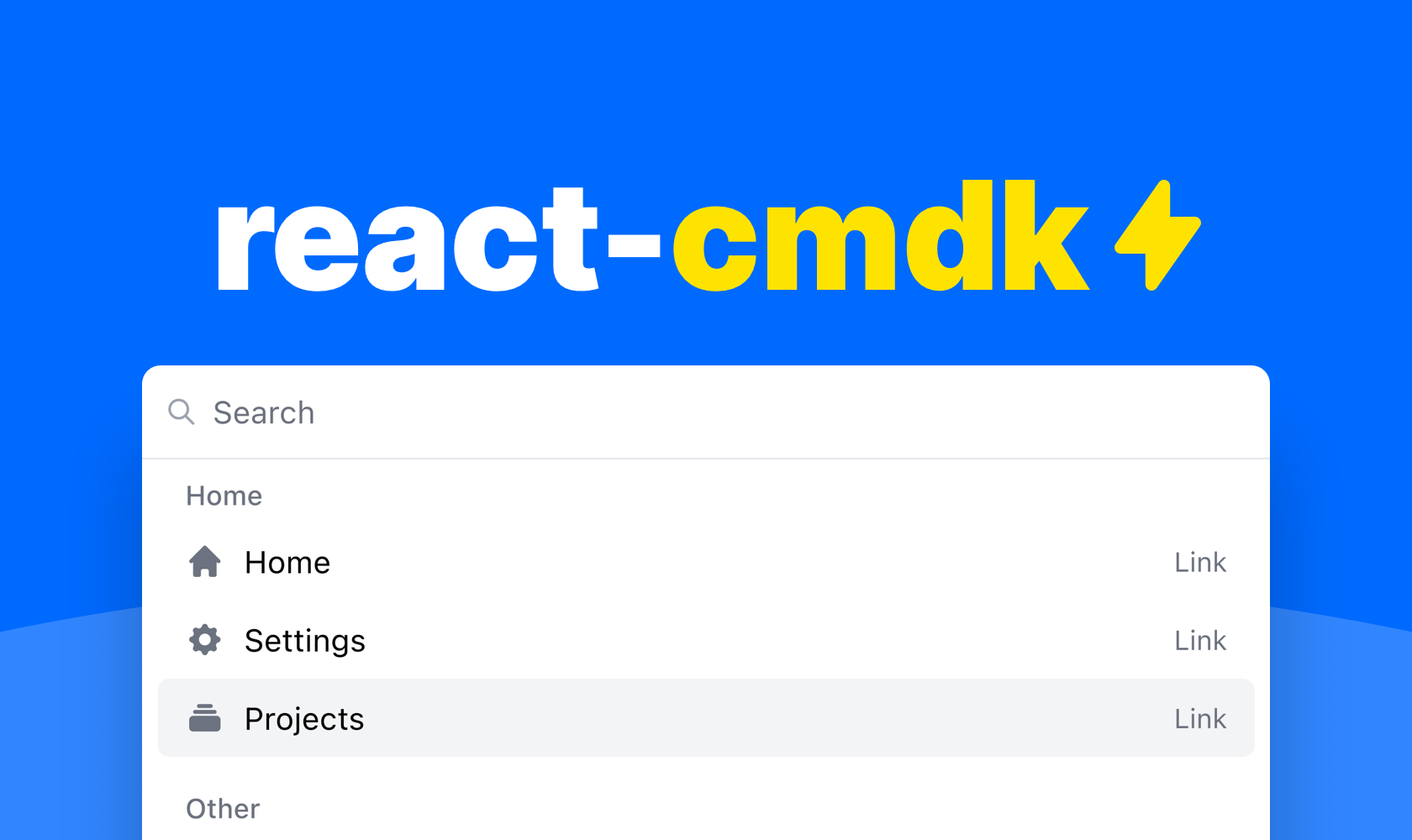
A package with components for building your dream command palette for your web application.
Watch the YouTube demo or try it out here to get started.
✓ Accessible
✓ Flexible
✓ Good looking
✓ Very fast
✓ Dark & light mode
npm install react-cmdk @mui/icons-material @mui/material @emotion/styled @emotion/reac
Or if you'd rather use Yarn
yarn add react-cmdk @mui/icons-material @mui/material @emotion/styled @emotion/reac
You can compose your command palette pretty much however you like with the included components. But here is an example of a command palette that uses some of the included helpers for a very neat solution.
import 'react-cmdk/dist/cmdk.css'
import CommandPalette, { filterItems, getItemIndex } from 'react-cmdk'
import { useState } from 'react'

const Example = () => {
	const [page, setPage] = useState<'root' | 'projects'>('root')
	const [open, setOpen] = useState<boolean>(true)
	const [search, setSearch] = useState('')

	const filteredItems = filterItems(
		[
			{
				heading: 'Home',
				id: 'home',
				items: [
					{
						id: 'home',
						children: 'Home',
						icon: 'HomeIcon',
						href: '#',
					},
					{
						id: 'settings',
						children: 'Settings',
						icon: 'CogIcon',
						href: '#',
					},
					{
						id: 'projects',
						children: 'Projects',
						icon: 'CollectionIcon',
						closeOnSelect: false,
						onClick: () => {
							setPage('projects')
						},
					},
				],
			},
			{
				heading: 'Other',
				id: 'advanced',
				items: [
					{
						id: 'developer-settings',
						children: 'Developer settings',
						icon: 'CodeIcon',
						href: '#',
					},
					{
						id: 'privacy-policy',
						children: 'Privacy policy',
						icon: 'SupportIcon',
						href: '#',
					},
					{
						id: 'log-out',
						children: 'Log out',
						icon: 'LogoutIcon',
						onClick: () => {
							alert('Logging out...')
						},
					},
				],
			},
		],
		search,
	)

	return (
		<CommandPalette onChangeSearch={setSearch} onChangeOpen={setOpen} search={search} isOpen={open} page={page}>
			<CommandPalette.Page id='root'>
				{filteredItems.length ? (
					filteredItems.map((list) => (
						<CommandPalette.List key={list.id} heading={list.heading}>
							{list.items.map(({ id, ...rest }) => (
								<CommandPalette.ListItem key={id} index={getItemIndex(filteredItems, id)} {...rest} />
							))}
						</CommandPalette.List>
					))
				) : (
					<CommandPalette.FreeSearchAction />
				)}
			</CommandPalette.Page>

			<CommandPalette.Page id='projects'>{/* Projects page */}</CommandPalette.Page>
		</CommandPalette>
	)
}

export default ExampleThe package does include a helper hook for opening the command palette, but you can actually open it however you want. Here are some examples.
const [isOpen, setIsOpen] = useState<boolean>(false)

useHandleOpenCommandPalette(setIsOpen)const [isOpen, setIsOpen] = useState<boolean>(false)
useEffect(() => {
function handleKeyDown(e: KeyboardEvent) {
if (e.metaKey && e.key === 'k') {
e.preventDefault()
e.stopPropagation()
setIsOpen((currentValue) => {
return !currentValue
})
}
}
document.addEventListener('keydown', handleKeyDown)
return () => {
document.removeEventListener('keydown', handleKeyDown)
}
}, [])| name | type | required | default | description |
|---|---|---|---|---|
| onChangeSearch | (value: string) => void | true | Function for setting search value | |
| onChangeOpen | (value: boolean) => void | true | Function for setting open state | |
| children | React.ReactNode | true | Children of command palette | |
| isOpen | boolean | true | Open state | |
| search | string | true | Search state | |
| placeholder | string | false | "Search" |
Search field placeholder |
| page | string | false | The current page id | |
| renderLink | RenderLink | false | Function for customizing rendering of links | |
| footer | React.ReactNode | false | Footer component | |
| selected | number | false | The current selected item index | |
| onChangeSelected | (value: number) => void | false | Function for setting selected item index |
FYI. Using pages is completely optional
| name | type | required | default | description |
|---|---|---|---|---|
| id | string | true | A unique page id | |
| children | React.ReactNode | true | Children of the list | |
| searchPrefix | string[] | false | Prefix to the left of the search bar | |
| onEscape | () => void | false | Function that runs upon clicking escape |
| name | type | required | default | description |
|---|---|---|---|---|
| children | React.ReactNode | true | Children of the list | |
| heading | string | false | Heading of the list |
| name | type | required | default | description |
|---|---|---|---|---|
| index | number | true | Index for list item | |
| closeOnSelect | boolean | false | Whether to close the command palette upon click | |
| icon | (IconName, React.FC) | false | false |
Icon for list item |
| iconType | IconType | false | "solid" |
Icon for list item |
| showType | boolean | false | true | Whether to show the item type |
| disabled | boolean | false | Whether the item is disabled | |
| keywords | Array | false | Underlying search keywords for the list item |
The list item also extends the HTMLAnchorElement & HTMLButtonElement types
| name | type | required | default | description |
|---|---|---|---|---|
| index | number | false | 0 |
Index for list item |
| label | string | false | "Search for" |
Button label |
The search action also extends the HTMLAnchorElement & HTMLButtonElement types
;(props: DetailedHTMLProps<AnchorHTMLAttributes<HTMLAnchorElement>, HTMLAnchorElement>) => ReactNodeArray of
| name | type | required | default | description |
|---|---|---|---|---|
| id | string | true | Id for list | |
| items | Array<JsonStructureItem> |
true | Items for list | |
| heading | string | false | Heading for list |
CommandPalette.ListItem
Omits index & extends
| name | type | required | default | description |
|---|---|---|---|---|
| id | string | true | Id for list item |
A function for getting the current index of a item within the json structure
;(items: JsonStructure, listItemId: string, startIndex = 0) => numberA function for filtering the json structure from a search string
;(items: JsonStructure, search: string, options?: { filterOnListHeading: boolean }) => JsonStructureA function for rendering a json structure
(items: JsonStructure) => JSX.Element[](fn: React.Dispatch<React.SetStateAction<boolean>>) => void


 React
React
 Typescript
 Django
 Laravel
 Facebook
 Microsoft
 Google
 Alibaba
 D3
D3
 Tencent