
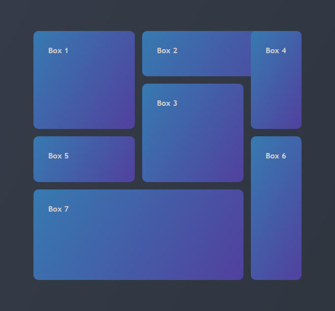
.container {
  display: grid;
  grid-gap: 15px;
  grid-template-columns: 2fr 2fr 1fr;
  grid-template-rows: 1fr 1fr 1fr 2fr;
  grid-template-areas:
    "b1 b2 b2"
    "b1 b3 b4"
    "b5 b3 b6"
    "b7 b7 b6";
}.box1 {
grid-area: b1;
}
.box2 {
grid-area: b2;
}
...Click here to see the CSS file
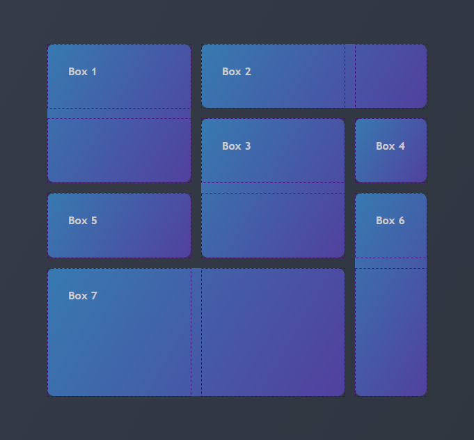
With grid-column and grid-row, you need to define the grid line that the element starts and also the line that it ends.
Here's an example with box1, that starts on column 1 and ends at the column 2, and starts on the row 1 and ends at the row 3:
.box1 {
  grid-column: 1/2;
  grid-row: 1/3;
}.container {
height: 80%;
width: 80%;
display: grid;
grid-gap: 15px;
grid-template-columns: 2fr 2fr 1fr;
grid-template-rows: 1fr 1fr 1fr 2fr;
}
.box1 {
grid-column: 1/2;
grid-row: 1/3;
}
.box2 {
grid-column: 2/4;
grid-row: 1/2;
}
.box3 {
grid-column: 2/3;
grid-row: 2/4;
}
...Click here to see the CSS file
.box2 {
  grid-column: 2/4;
  grid-row: 1/2;
}

.box4 {
  grid-column: 3/4;
  grid-row: 1/3;
}
Note that box2 starts on row 1 and ends at the row 2, and the box4 starts on row 1 and ends at the row 3


 React
React
 Typescript
 Django
 Laravel
 Facebook
 Microsoft
 Google
 Alibaba
 D3
D3
 Tencent