lightspeed / flame Goto Github PK
View Code? Open in Web Editor NEWComponent library for building Lightspeed products
License: Other
Component library for building Lightspeed products
License: Other


![dependabot-preview[bot] avatar](https://avatars.githubusercontent.com/in/2141?v=4 "dependabot-preview[bot]")
![dependabot[bot] avatar](https://avatars.githubusercontent.com/in/29110?v=4 "dependabot[bot]")


Hi,
Like it currently is with buttons, disabled states in radio and checkboxes should also affect their respective labels.
The visual cue that indicates the component is disabled becomes more reliable when it is applied to the element as a whole.
Attached is an example of the current and expected behaviour.
@ls-timothee-clain is going to submit a PR on this issue
Reviewed the case with @maartenafink .
Thanks!

Check the console https://codesandbox.io/s/flame-checkbox-bug-hgfw7
The id for an Input should probably be marked as required by it's TS typings. If not, its label will not have labelFor set.
Spit out a TS error when id is not present.
Not having an id is not flagged as an error, while the docs state that id should be set.

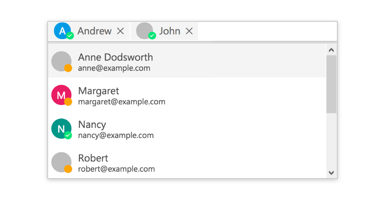
Input and don't set the id propCurrently the DropdownContainer is pretty opinionated on the position of the dropdown, while I feel like this constraint should be put on the consumer side and not on the library's end. In some situations when placing a dropdown at the bottom of the page/screen or within a limited height container, it might not always be possible to display a menu that's dropping down, but it should show above it instead.
This css makes the component very opinionated on the position of the dropdown (as well as the animation when opening):
Design question: Should the chevron be up or down in this case?

The vast majority of components already have the spacing props.
There are a few exceptions to this, like the <Card> component. It would be a good idea to add the styled-system properties to this component, since that feels more natural to use than to wrap it with a Box or a Flex. Not to mention, it simplifies the markup.
Currently, Flags has the same implementation/behaviour as Icon, in which loading the base component <Flag> will cause all svgs to be loaded as a chunk. This is normal behaviour, however it's somewhat problematic in this use case since when we're using flags, we usually want all of them loaded at the same time.
What we should be doing is instead of loading all SVGs for Flags, would be to leverage an svg spritemap instead.
Tracking issue on what's coming for the next major version of Flame packages.
@lightspeed/flameFlameFonts component from @lightspeed/flame/Core will be removed. Instead, use the link tag to load fonts. Problem is Next.js Head component does not play nice with it and actually removes the link after client-side takes over. Fonts won't be changing very frequently so its usefulness is very limited.Group will either be moved to a separate package @lightspeed/flame-group or remain undocumented but kept as an hidden feature in the codebase. See #2.@lightspeed/flame-tokensMuch cleaner and not tied to Storybook only anymore:
https://storybook.js.org/docs/formats/component-story-format/
Also available since version 5.2 of Storybook.
React-Select v3 has the latest version of emotion, which will give us not only better perf, but also better integration with our ecosystem + SSR.
Updating to the latest version should be simple, but like all major version bumps, there can be issues along the way.
While attempting to import the <Dropdown> component from Flame in the new insights app, we ran into a Typescript issue where the app wouldn't compile because children is not a valid prop in the Dropdown interface.
The insights app is using React 18 and in that version React.FC no longer includes children by default.
So any Flame components that
React.FCchildren propchildren or extend a type that does so (e.g. Box)will probably need to be updated to be compatible with React 18 and TS.
<Dropdown> and other similar components that take children can be successfully used in a React 18 / Typescript project, like lighthouse-insights.
n/a
n/a
Tooltip and Dropdown don't recalculate their position when a DOM change repositions them on the page.
When their position changes, so should the tooltip and dropdown menu.
They keep their original position and appear disconnected from their triggering element.
Make a dropdown element to add an item above it. The dropdown menu won't follow its dropdown button.
Currently the dropdown components (and sub components) make it possible to render anything within the "popped out" box, but this gives us consumers a lot of freedom. I would like to see some more guidance in how to render these dropdown lists.
How about a DropdownList or DropdownMenu component that is just a styled ul and li list?
Currently within the Lightspeed products, we've seen some context menus being used within the sidebar:

But also in our some other places:

Both of these designs already show and proof that the implementations are going all over the place, while they're pretty similar.
flame/packages/flame/src/Input/Input.tsx
Line 270 in f426595
Default type is text, but should we be explicit to prevent any surprises?
When the body exceeds the screen height, a space is created with the footer
Good / Normal

Bug

The footer should be attached to the body at time and the body should be scrollable if it exceeds the window height
https://codesandbox.io/s/optimistic-cookies-06yx7
add a few elements to the modal body if you can't see it
This link -> https://github.com/lightspeedretail/cirrus/tree/master/packages/cirrus-table/examples leads to a 404 on Github.
The time is almost upon us for yet another set of breaking changes.
Nothing is final yet, but we sort of wanna communicate what's in store for the next major release.
So, what's up with this?
The infamous group component will receive a massive overhaul.
We plan on removing the component, because as it stands, Group does surprisingly too many things.
So, what's it gonna be replaced by?
InputGroup will be a new component that specifically designed to collapse Buttons/Inputs/Addons together.
This aims to replace the most common usage of group.
Usage will be as follows:
// Old
<Group noSpacing>
  <Button>Some Action</Button>
  <Input placeholder="some placeholder"/>
</Group>
// New
<InputGroup>
  <Button>Some Action</Button>
  <Input placeholder="some placeholder"/>
</InputGroup>
It is also worth nothing that the new InputGroup component will no longer recursively mess around with border radii and will
only affect the direct child for a given component. It will also ONLY affect the above listed components.
ListGroup will only take care of automatically wrapping components with a custom built <li> component
and automatically add spacing between each component.
You may toggle horizontal or vertical spacing.
// Old
<Group>
  <Button>Some Action</Button>
  <Input placeholder="some placeholder"/>
</Group>

<Group type="vertical">
  <Button>Some Action</Button>
  <Input placeholder="some placeholder"/>
</Group>

// New
<ListGroup>
  <Button>Some Action</Button>
  <Input placeholder="some placeholder"/>
</ListGroup>

<ListGroup type="vertical">
  <Button>Some Action</Button>
  <Input placeholder="some placeholder"/>
</ListGroup>Yes, Group has this super bizarre z-index magic going on.
This will be removed entirely.
We'll probably add a zIndex prop instead for all your z-index shenanigans.
The original issue ticket was opened on Jan 3rd 2018. We now have the technology to take care of this issue!
Joking aside, FormFields is a particularly scary change because it will involve some major overhaul of a few primitive components, namely:
These components will have a dramatically different (see, more streamlined API) that matches their regular vanilla HTML counterparts.
To add labels, error messages and the likes to these components, we can choose to wrap them inside the FormField component.
Label component should be display: inline-flex instead of display: flex. This will be a tricky change because some components rely on display: flex such as the Input labelHelper.
Dumbify a bit the Button Component.
<LinkButton> & <Button>Typing issues caused by dynamically swapping button -> anchor is problematic.
Simply split those components in two. Meaning the <LinkButton /> will have the href tag.
Also consider looking into using a render prop for the container element (HTML element like button, a or even a React element like Link):
https://blog.andrewbran.ch/polymorphic-react-components/#an-alternative-approach
The Button does some fun wacky wrapping of components and automatic resizing based on the presence or not of an Icon
This has got to go, as we're relying on cirrusName to do some funky manipulation. Instead, simply manually resize the content as needed.
// old
<Button>Some Action <Icon /></Button>
<Button><Icon /></Button>

// new
<Button>Some Action <Icon ml={1}/></Button>
<Button><Icon ma={1} /></Button>
Remove all Sass references and usage of it from our stories.
Since we want to promote the usage of emotion, it might make more sense to build custom components using emotion + our theme values than pulling stuff from our legacy generated Sass values.
This will also enable us to remove some rather pointless plugins to bundle css and sass into the final storybook build.
As a consumer, having too many ways of doing things can lead to having some messy code base.
While Flame has some neat features, it still feels kinda awkward to use when it comes to deviating from whatever has been pre-established. Even with the inclusion of style-props, we still can't hit the "100%" fits all solution. That's just a limitation of the style-prop itself, you can only modify 1 css style per prop. Currently, should we want to handle advanced use cases that are not planned, we would need to:
styled or the css prop jsx pragmaBoth solutions kinda suck, as we're:
In order to have a better API and a just more fun to use component system we need to limit the amount of "back and forth" between various ways to extend and have the component system handle pretty much all the base styling needs.
styled to get overrides.There's a few things we can do. Some changes can be had immediately, while others might take some time.
The first thing we can do is create our own home grown css prop that is baked into our components.
see https://github.com/rebassjs/rebass/blob/master/packages/reflexbox/src/index.js#L37 for implementation details. Essentially, rebass has 2 props, css and sx, that are baked directly into rebass components. We can do something similar, except we will not have a Only having css prop can cause conflicts with the jsx pragma of props. Easiest solution: Use rebass and re-export only the components we want.sx prop and instead just use css that is automatically hooked into the theme values.
By doing this we avoid adding yet more styled-system props and grant you full access to ALL theme values as well as just regular old css in a single prop.
The second thing is we're adding back classnames on some components (tbd). This might seem like the funkiest thing ever, but this will enable us to target specific portions of a component easily via a top level css prop. Basically, the classnames are only there to serve as markers so we can quickly do edits without having to go through the whole render slot approach of jamming a component inside a prop.
Last but not least, we're gonna cleanup the theme file just a bit. Namely collapsing some properties together (like shadows) and renaming some values, as they are kinda long winded to write down
Fixes relating to CSS specificity or stuff like that. That's for another time.
There may be a collision between our css prop and the jsx css pragma prop. If that happens, we'll need to do like rebass and split our styling into two props css for regular non themed css and sx for the magical augmented css
¯\_(ツ)_/¯
Expect a PR in a couple of phases.
We'll start by adding this functionality to Box, Flex and Text as those are our fundamental components. From there, we're gonna modify existing components to use the new fundamental components and have a way to easily override sub-components.
we should be using ["builtin", "external", "internal", "parent", "sibling", "index"] instead of the airbnb defaults as the current setup is a bit too loose in how to order imports.
We will need to:
'import/order': ['error', { groups: ['builtin', 'external', 'internal', 'parent', 'sibling', 'index'] }] to the .eslintrc.js rules objectyarn lint --fix)Congratulations on finally open sourcing the library.
I'm still making my way through the storybook to examine all the api choices you've made and I'm just blown away at the quality.
I kind of want to start using this now :D
Provide a high-level summary of your issue.
flame/packages/flame/src/Core/index.tsx
Line 106 in de4b4c8
Rather than spreading both objects together, use deepmerge so that a new theme may extend the ThemeUI without fully overriding the original theme.
The color would be deepmerged. Instead the color is overwritten by the ThemeOverride
const existingTheme = {col:{blue:'blue'}};
const newTheme = {col:{red:'red'}};
const mergedTheme = {...existingTheme, ...newTheme};
console.log(mergedTheme);
:rip:Supporting mobile devices is an important feature we would like to have.
Being mobile friendly is more than just simply resizing things to fit on a smaller screen. It's understanding that the overall UX is different. Buttons that are perfectly fine on desktop, might need a slightly bigger click area on mobile.
In order to make the Mobile version work better, we'll be revising, tinkering and tweaking a few things here and there.
There shouldn't be any substantial API changes, but instead its mostly a tweak of overall usability for smaller devices.
Add colors.background alias. This is needed to rapidly swap colours when moving from theme to theme.
 React
React
A declarative, efficient, and flexible JavaScript library for building user interfaces.
🖖 Vue.js is a progressive, incrementally-adoptable JavaScript framework for building UI on the web.
 Typescript
TypeScript is a superset of JavaScript that compiles to clean JavaScript output.
An Open Source Machine Learning Framework for Everyone
 Django
The Web framework for perfectionists with deadlines.
 Laravel
A PHP framework for web artisans
Bring data to life with SVG, Canvas and HTML. 📊📈🎉
JavaScript (JS) is a lightweight interpreted programming language with first-class functions.
Some thing interesting about web. New door for the world.
A server is a program made to process requests and deliver data to clients.
Machine learning is a way of modeling and interpreting data that allows a piece of software to respond intelligently.
Some thing interesting about visualization, use data art
Some thing interesting about game, make everyone happy.
 Facebook
We are working to build community through open source technology. NB: members must have two-factor auth.
 Microsoft
Open source projects and samples from Microsoft.
 Google
Google ❤️ Open Source for everyone.
 Alibaba
Alibaba Open Source for everyone
 D3
D3
Data-Driven Documents codes.
 Tencent
China tencent open source team.