kor-ui / kor Goto Github PK
View Code? Open in Web Editor NEWUser Interface Component Library based on LitElement / lit-html
Home Page: https://www.kor-ui.com
License: MIT License
User Interface Component Library based on LitElement / lit-html
Home Page: https://www.kor-ui.com
License: MIT License
![dependabot[bot] avatar](https://avatars.githubusercontent.com/in/29110?v=4 "dependabot[bot]")


We should enforce strict type checks and refactor code wherever necessary to resolve the errors/warnings
For props that only accept certain strings (e.g. horizontal, vertical), they should be defined as their types.
Error "TemplateResult" is not generic during build
"@kor-ui/kor": "^1.8.1"
I have a in the console:
node_modules/@kor-ui/kor/components/card/kor-card.d.ts:25:15 - error TS2315: Type 'TemplateResult' is
not generic.

25     render(): import("lit-html").TemplateResult<1>;
                 ~~~~~~~~~~~~~~~~~~~~~~~~~~~~~~~~~~~~

node_modules/@kor-ui/kor/components/icon/kor-icon.d.ts:16:15 - error TS2315: Type 'TemplateResult' is
not generic.

16     render(): import("lit-html").TemplateResult<1>;
                 ~~~~~~~~~~~~~~~~~~~~~~~~~~~~~~~~~~~~

node_modules/@kor-ui/kor/components/input/kor-input.d.ts:43:15 - error TS2315: Type 'TemplateResult' is not generic.

43     render(): import("lit-html").TemplateResult<1>;
                 ~~~~~~~~~~~~~~~~~~~~~~~~~~~~~~~~~~~~
In addition to text inputs, textarea is a useful component for entering multiple lines of text and should be added and documented as well.
Containers currently use display: flex for positioning the slots inside them. Instead, we could use position: sticky to avoid duplication of paddings.
position: sticky to header/footer slotstop and bottom coords accordinglybackground-color and z-index to header/footer slotspadding-bottom)I hope you consider providing support for grid-template-areas and so on, like that by charbelrami/grid-container.
It's easier and faster to handle dynamic areas directly with grid-template-areas than adding/modifying/removing <kor-card>s.
Would it be possible to add a dropdown component to the kor library?

I am having a particular problem with my color fonts and my custom desires
Its impossible for my change my navbar text color and i do not conflict with my expectation of colors in other components, it has become very complex and I would not want to use conventional mechanisms to make changes.
What dou you recommend?
Is your feature request related to a problem? Please describe.
Currently, spacing rules are absolute and can't be modified systematically. This gives little flexibility when theming and makes it hard to maintain styles.
Describe the solution you'd like
Use css properties to define spacing rules and expose them as theming variables.
After <kor-icon icon="favorite" size="xl"></kor-icon>, I get (in Firefox, Waterfox) a rectangular with the following characters E87D (UTF-16: 0xE87D)
When icon="train", I get E570 (UTF-16: 0xE570). Web displays a solid circle/bullet.
In both cases, brave displays only a rectangular.
<kor-icon> is used within another component. Only very basic css, nothing weird!
I am not sure if browsers in my system or the system itself have been set in a wrong way or there is problem with this component.
Thank you so much for making this awesome UI Component library.
I made this repository to lists about all kinds of interesting topics of Kor UI.
Awesome Kor
Please take a look and contribute to this repo to make it bigger and better.
If you have any useful link about Koa UI please share it with us.
Thanks
I am using kor-ui for a lit-element project I have followed the docs as stated for installation.
I added the package with this command npm install @kor-ui/kor --save . I then imported the components I would like to use within the project as shown in the docs.
import '@kor-ui/kor/components/button'; import '@kor-ui/kor/components/Icon'; import '@kor-ui/kor/kor-styles.css';
But none of the styles or Icons are showing.

What I am doing wrong? Any help to get me started using kor for a lit element project will be much appreciated.
To allow type checking on our components, we should add the global tag name map declaration to each:
declare global {
  interface HTMLElementTagNameMap {
    'my-element': MyElement;
  }
}<!-- event dispatched every time the value changes -->
<kor-input (value-changed)="myVar = $event.target.value"></kor-input>
I would like to have the ability to attach an @onChange || @change event to kor-input and turn it to a controlled input. The documentation states the component dispatches an event when a value is changed, but does not clarify how to access the changed value.
   <kor-input
    @change="${console.log("FOO")}"
     name="EntityInput"
     label="Entity Label"
     value=${this.value}
     no-clear
     condensed>
It seems attaching a change event listener and making a kor-input into a controlled input is not possible.
Writing litelement custom tags in React TSX causes TypeScript type errors:
The code actually compiles and works with all the type errors, but it's quite annoying
declare global {
    namespace JSX {
        interface IntrinsicElements {
            'kor-page': any,
            'kor-app-bar': any,
            'kor-pane': any
            //and so on...
        }
    }
}Hi all,
I'm using the following code:
<kor-accordion label="Add Command" expanded>
  <kor-input label="position" type="select" [value]="position" (value-changed)="position = $event.target.value">
    <kor-menu-item label="creation/name"></kor-menu-item>
    <kor-menu-item label="creation/entities/a/name"></kor-menu-item>
    <kor-menu-item label="creation/screens/a/name"></kor-menu-item>
    <kor-menu-item label="creation/entities/b/name"></kor-menu-item>
    <kor-menu-item label="creation/screens/b/name"></kor-menu-item>
  </kor-input>
  <kor-input label="value" [value]="value" (value-changed)="value = $event.target.value"></kor-input>
  <kor-button slot="footer" label="Add" (click)="addCommand($event)"></kor-button>
</kor-accordion>
and when the select is closed, it all looks fine:

However, if I open the select, it expands beyond the accordion that creates scrollbars.... Not very nice.

I guess the selection list should be above the rest.
We should upgrade the version of lit by switching to the new package.
lit-elementlitlit/decorators)Tooltip queries "document" for the target, it won't work when the target is inside a shadow DOM.
Is it possible to modify a kor component? I want to use the kor-page component, but the component is adding unesseary styling that does not fit my use case slot:not([name]) { padding 16px}. Can I remove this style without modifying the underlying component?
Is your feature request related to a problem? Please describe.
Containers use spacing rules based on css margin which may conflict with margin rules of the slotted content itself.
Describe the solution you'd like
Instead, kor containers could be based on flex/grid gap rules, which are now supported by all modern browsers
--body-gap, --header-gap, --functions-gap, --footer-gap)--functions-gap)--footer-gap)--body-gap)modal & add js doc
--body-gap, --header-gap, --functions-gap, --footer-gap)--body-gap, --header-gap, --functions-gap, --footer-gap)--body-gap, --header-gap, --functions-gap, --footer-gap)--body-gap, --header-gap, --functions-gap, --footer-gap)--body-gap, --header-gap, --functions-gap, --footer-gap)--body-gap, --header-gap, --functions-gap, --footer-gap)--body-gap, --header-gap, --functions-gap, --footer-gap)Have you in your roadmap to add a DatePicker component ? It would be great to get a datepicker component.
Something like that would be great: https://vaadin.com/components/vaadin-date-picker
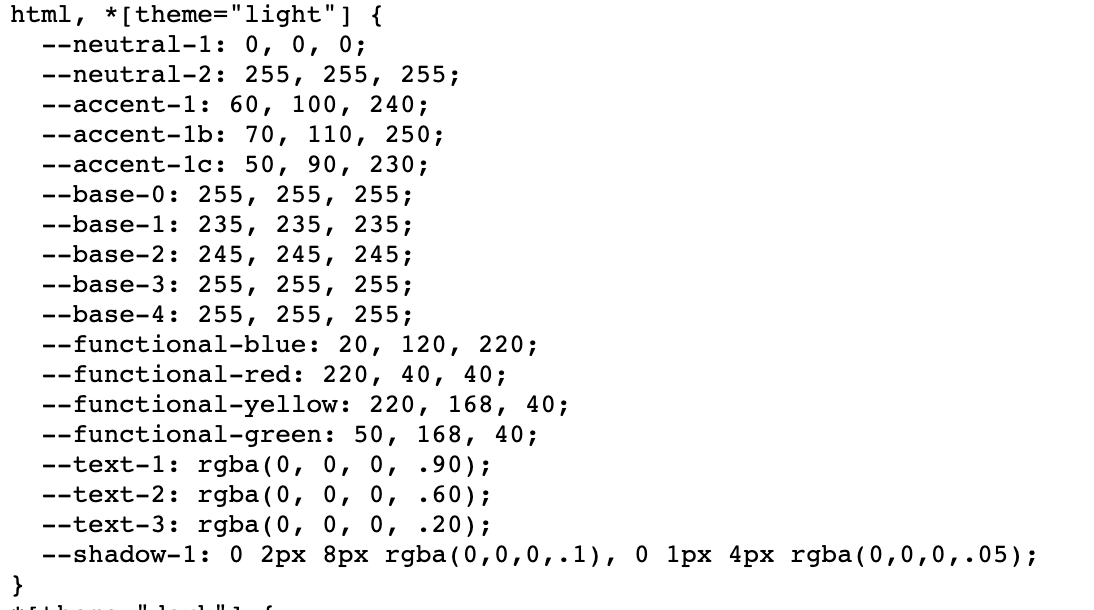
When using a kor component inside a shadow root, the default theme is not set. (Kor css is added on lazyloading inside a shadowRoot)
Can you also include
html, *[theme="light"], :host {
}
for the theme styles ?
I need to place anchor tab inside tab-item. Right now it does not render the anchor inside a tab-item
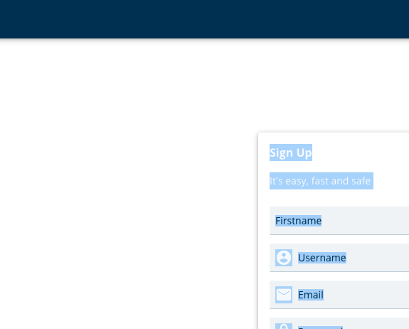
Like the native HTMLInputElement, kor-input should have the name attribute for autofill support.
Just a thought !
Icons can be selected amongst material design just by entering its name, that's quite convenient.
However I wonder if the same could be done with fontawesome icons, which are much more popular ?
Like https://github.com/FortAwesome/angular-fontawesome for Angular.
Right now you have to embed them in icon="url('./xxx/more.png')" which is a bit cumbersome.
What is the equivalent of menu component ?
The closest thing I came across was input with select, but if I reduce the width of the parent, children are also getting reduced.
Any work arounds / suggestions ?
Elements containing children (e.g. app-bar and icon) should import them as a module and define the custom element in case it is not already defined
New icons are available on the Material library, so we should update the version of the file.
In addition, we should not use css classes but inner text for the icon property binding.
Reference: https://fonts.google.com/icons
For touch devices, users should be able to swipe a component (e.g. kor-table-row) to the left or right, and trigger an action by doing that (e.g. delete or reply).
When using <kor-input type="select">, if you click the main component with the dropdown open, it isn't closed.
Clicking the main component should close the dropdown if it's open, and open if it's closed.
The search input type should not display the default clear icon.

Themes are now documented in a very high level. Instead, we could separate the different aspects of theming into their own page under a 'Theming' chapter
Hey! Working on a project with Kor I realized there's no index.js under @kor-ui/kor/components/textarea when you install it from npm on latest version (1.5.0), but strangely enough it's included inside the bundled js (@kor-ui/kor), which means you can't really import nor use the textarea comp as a single component but rather only if you import the bundled js.
Demo:
root@6316c9055ae6:~# npm install @kor-ui/[email protected]

added 3 packages, and audited 4 packages in 4s

found 0 vulnerabilities
npm notice
npm notice New minor version of npm available! 7.3.0 -> 7.4.0
npm notice Changelog: https://github.com/npm/cli/releases/tag/v7.4.0
npm notice Run npm install -g [email protected] to update!
npm notice
root@6316c9055ae6:~# ls -lah node_modules/@kor-ui/kor/components/textarea
total 16K
drwxr-xr-x  2 root root 4.0K Jan 10 04:43 .
drwxr-xr-x 38 root root 4.0K Jan 10 04:43 ..
-rw-r--r--  1 root root   46 Oct 26  1985 index.d.ts
-rw-r--r--  1 root root 1.2K Oct 26  1985 kor-textarea.d.ts
root@6316c9055ae6:~# ls -lah node_modules/@kor-ui/kor/components/text
total 44K
drwxr-xr-x  2 root root 4.0K Jan 10 04:43 .
drwxr-xr-x 38 root root 4.0K Jan 10 04:43 ..
-rw-r--r--  1 root root   38 Oct 26  1985 index.d.ts
-rw-r--r--  1 root root  25K Oct 26  1985 index.js
-rw-r--r--  1 root root  898 Oct 26  1985 kor-text.d.ts
Error while resolving import paths with webpack inside my class Contact:
...
ERROR in ./src/Contact/contactForm.ts 6:0-41
Module not found: Error: Can't resolve '@kor-ui/kor/components/textarea' in '/var/www/html/src/Contact'
 @ ./src/Contact/Contact.ts 3:0-23
 @ ./index.ts 4:0-48 9:49-56

webpack 5.11.1 compiled with 1 error and 1 warning in 6708 ms
...It would be useful to have a component for scrolling through content or images.
Thoughts on props:
// defines the interval. 100% shows 1 item at a time. takes any css 'width' value
"items-width": string;
// defines the gap between items. default is '12px'. takes any css 'gap' value
"gap": string;
// defines whether counter is shown (e.g. 1/3)
"show-counter": boolean;
// defines counter position (e.g. top-right, bottom)
"counter-position": string;Hello,
I have 2 menus in a pane, each displaying a specific page (using Angular Router), and I would like the menu of the current page to be in active state.
So I did something like this:
<kor-menu-item (click)="gotoPage('/')" [active]="isActive('/')" label="Home" toggle="false" icon="home"></kor-menu-item>
<kor-menu-item (click)="gotoPage('dev')" [active]="isActive('dev')" label="Dev" toggle="false" icon="memory"></kor-menu-item>
with the following methods:
 gotoPage(page:string): void {
    this.router.navigate([page]);
  }

  isActive(page:string):boolean {
    const ret = this.router.isActive(page, true);
    console.log(page +' is active:'+ret);
    return ret;
  }
The issue:
Despite seeing
/ is active:true
dev is active:false
in the console, the first menu-item (for '/') is not displayed as active. Both menus are inactive....
Is there any error here ?
Just to let you know I've switched to your kor-ui components for one of my project!
The preview component is now running kor-ui, with a nice interface! (But it's just the beginning...)
https://dontcode.github.io/preview-ui
from
https://dontcode.github.io project.
When the icons are not enough to describe an action, a label could be used to support it.
Examples:
Acceptance criteria:
 React
React
A declarative, efficient, and flexible JavaScript library for building user interfaces.
🖖 Vue.js is a progressive, incrementally-adoptable JavaScript framework for building UI on the web.
 Typescript
TypeScript is a superset of JavaScript that compiles to clean JavaScript output.
An Open Source Machine Learning Framework for Everyone
 Django
The Web framework for perfectionists with deadlines.
 Laravel
A PHP framework for web artisans
Bring data to life with SVG, Canvas and HTML. 📊📈🎉
JavaScript (JS) is a lightweight interpreted programming language with first-class functions.
Some thing interesting about web. New door for the world.
A server is a program made to process requests and deliver data to clients.
Machine learning is a way of modeling and interpreting data that allows a piece of software to respond intelligently.
Some thing interesting about visualization, use data art
Some thing interesting about game, make everyone happy.
 Facebook
We are working to build community through open source technology. NB: members must have two-factor auth.
 Microsoft
Open source projects and samples from Microsoft.
 Google
Google ❤️ Open Source for everyone.
 Alibaba
Alibaba Open Source for everyone
 D3
D3
Data-Driven Documents codes.
 Tencent
China tencent open source team.