Tableau is a visual analytics platform transforming the way we use data to solve problems—empowering people and organizations to make the most of their data. Tableau
My Tableau page: Mohamed Alie Kamara
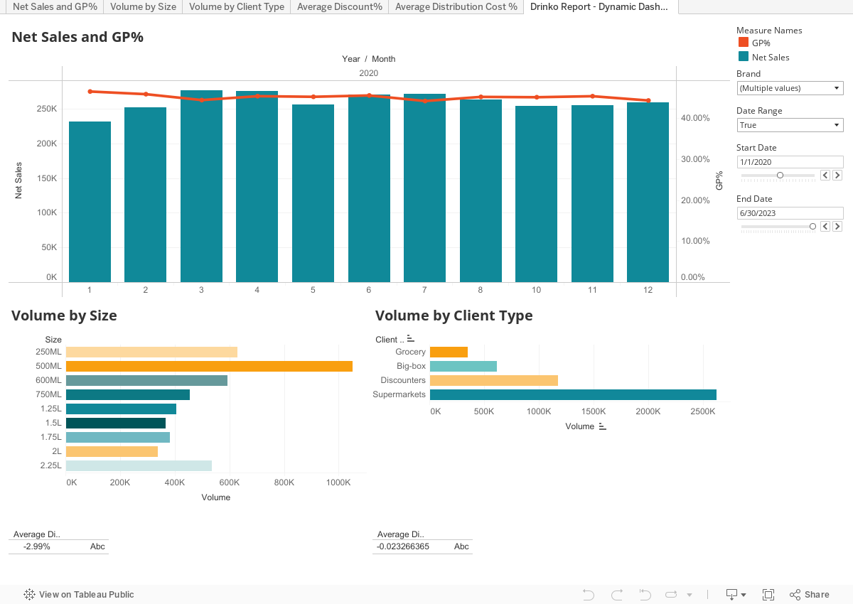
Final Case study Dashboard: Drinko Report
Lectures available: The Complete Data Visualization Course with Python, R, Tableau, and Excel with Elitsa Kaloyanova
Official video about Tableau
What.is.Tableau.mp4
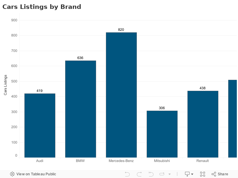
A bar chart (aka bar graph, column chart) plots numeric values for levels of a categorical feature as bars. Levels are plotted on one chart axis, and values are plotted on the other axis. Each categorical value claims one bar, and the length of each bar corresponds to the bar's value.
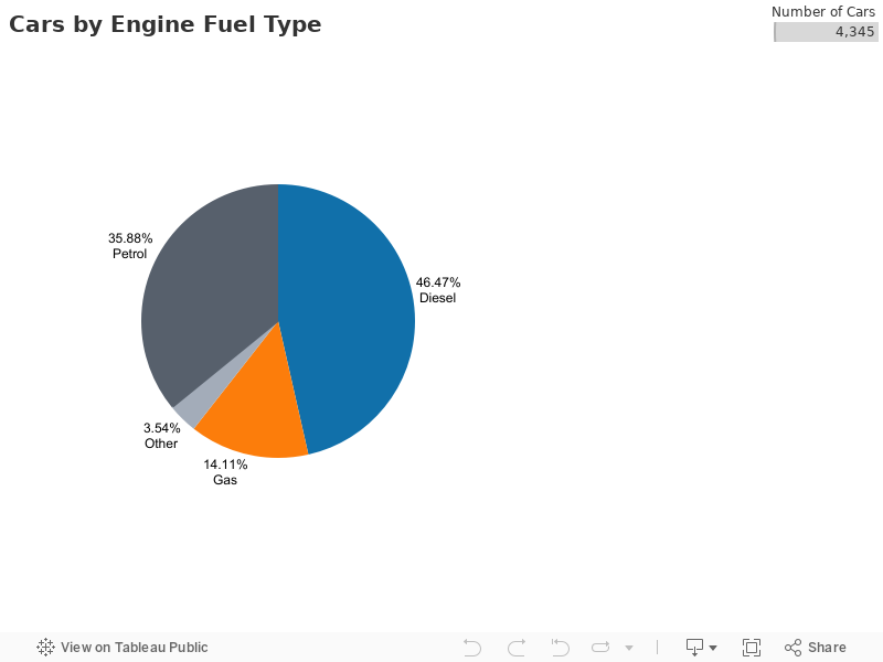
These graphs are divided into sections that represent parts of a whole. They provide a simple way to organize data and compare the size of each component to one other.
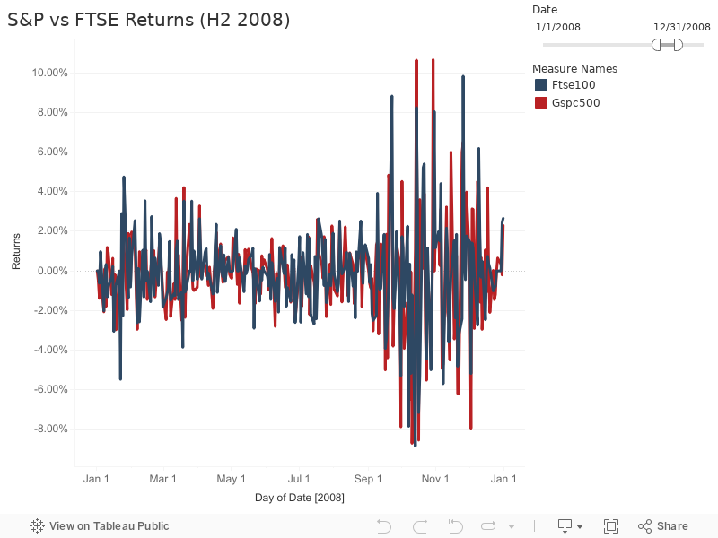
These visuals show change in one or more quantities by plotting a series of data points over time and are frequently used within predictive analytics. Line graphs utilize lines to demonstrate these changes while area charts connect data points with line segments, stacking variables on top of one another and using color to distinguish between variables.
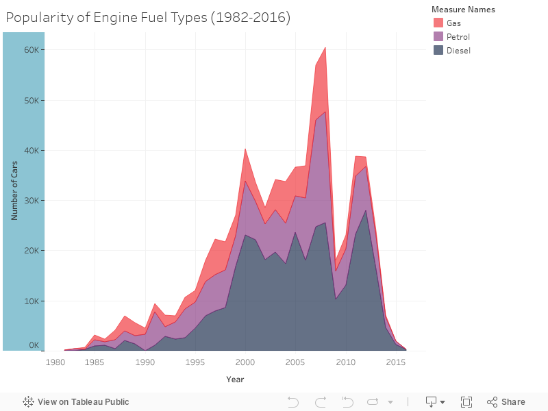
These visuals show change in one or more quantities by plotting a series of data points over time and are frequently used within predictive analytics. Line graphs utilize lines to demonstrate these changes while area charts connect data points with line segments, stacking variables on top of one another and using color to distinguish between variables.
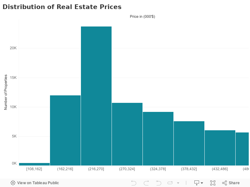
This graph plots a distribution of numbers using a bar chart (with no spaces between the bars), representing the quantity of data that falls within a particular range. This visual makes it easy for an end user to identify outliers within a given dataset.
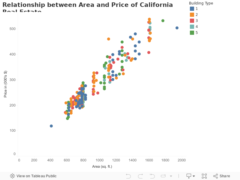
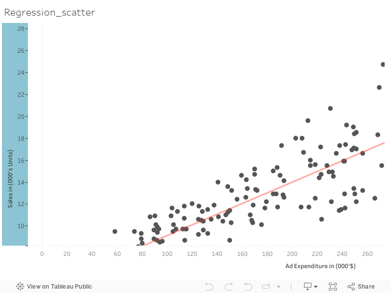
These visuals are beneficial in reveling the relationship between two variables, and they are commonly used within regression data analysis. However, these can sometimes be confused with bubble charts, which are used to visualize three variables via the x-axis, the y-axis, and the size of the bubble.
Plots can aid in the validation of the assumptions of normality, linearity, and equality of variances. Plots are also useful for detecting outliers, unusual observations, and influential cases. After saving them as new variables, predicted values, residuals, and other diagnostic information are available in the Data Editor for constructing plots with the independent variables.
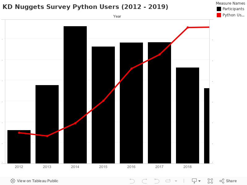
Bar-Line charts show two metric values aggregated across a group dimension. They are useful for showing quantity alongside changes in trends over time.
The first Y-axis metric displays as a bar, and the second displays as a line. The chart uses a dual-axis plot, where bars are plotted against the left vertical axis and the line is plotted against the right vertical axis.
A dashboard is a way of displaying various types of visual data in one place. Usually, a dashboard is intended to convey different, but related information in an easy-to-digest form. And oftentimes, this includes things like key performance indicators (KPI)s or other important business metrics that stakeholders need to see and understand at a glance.Tableau