I use three diagnostic plots to look at the progression. These answer the following questions:
- How active and exponential is the spread?
- How do countries compare in testing and health care system stress? (see below)
- When will the health care system become exhausted?
- When will the CDC reduce the countries' "high risk" level?
The number of confirmed cases depends strongly on the testing approach taken by each country's government.
Firstly, I was interested whether one can infer the underlying infected population based on the number of deaths. For that I simply take the number of deaths reported and divide by the number of infected reported to compare countries. This is the y-axis.
Secondly, I was interested how well health care systems can cope. I place the number of currently* infected relative to an estimate of the health care system capacity. This is basically the number of hospital beds compared to the number of elderly people. I incorporated the population demographics (age distribution of each country), to correctly identify the country-specific vulnerable population size. UN data bases helpfully provide such information for many countries, and I used the latest survey for each country. The stress on the health care system is on the x-axis.
I exclude countries with a small number of deaths relative to their population size, because these do not give stable estimates.
- update: Because the number of recovered is not reported anymore,
- currently infected is estimated from the number of reported infections 14 days earlier, and crudely assuming those that have not died have recovered.
- UN data for age demographics: http://data.un.org/Data.aspx?d=POP&f=tableCode%3a22
- UN data for hospital beds: http://data.un.org/Data.aspx?d=WHO&f=MEASURE_CODE%3aWHS6_102
- COVID-19 time series: https://github.com/CSSEGISandData/COVID-19/blob/master/csse_covid_19_data/csse_covid_19_time_series/
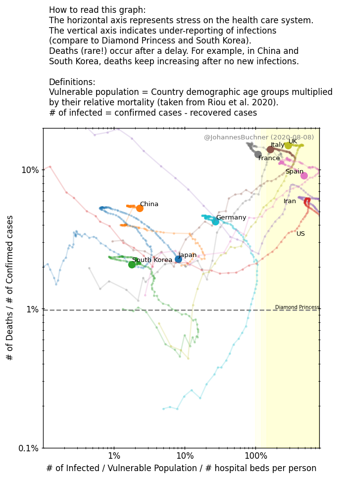
Things I notice / interpret (as a non-expert!):
- South Korea and Diamond Princess are consistent in mortality, and thought to be quite complete in infection testing. Other countries are probably under-counting the infected.
- Phases can be seen:
- first a right-down line (Early Iran, South Korea, US now), perhaps the expansion of the infection in the population, (2)
- increase to the top right (Iran, Japan), perhaps because delayed deaths are accumulating.
- Vertical upwards (China, South Korea): New infections have been stopped. Delayed deaths accumulate.
- Return to left (China): people recover, the health care system is relaxing.
- In the top right of the plot, the health care system is highly stressed (number of infected large compared to available hospital beds). Italy and Iran are there. The number of deaths increase as a country heads to the right. Spain is going there as well.
- A value of 100% does not necessarily mean that the health care system is over-loaded. Capacities can and are being expanded compared to survey data by building new hospitals or by using hotel beds.
- The US is speeding to the right, but (surprisingly?) shows little sign of under-counting the infected.
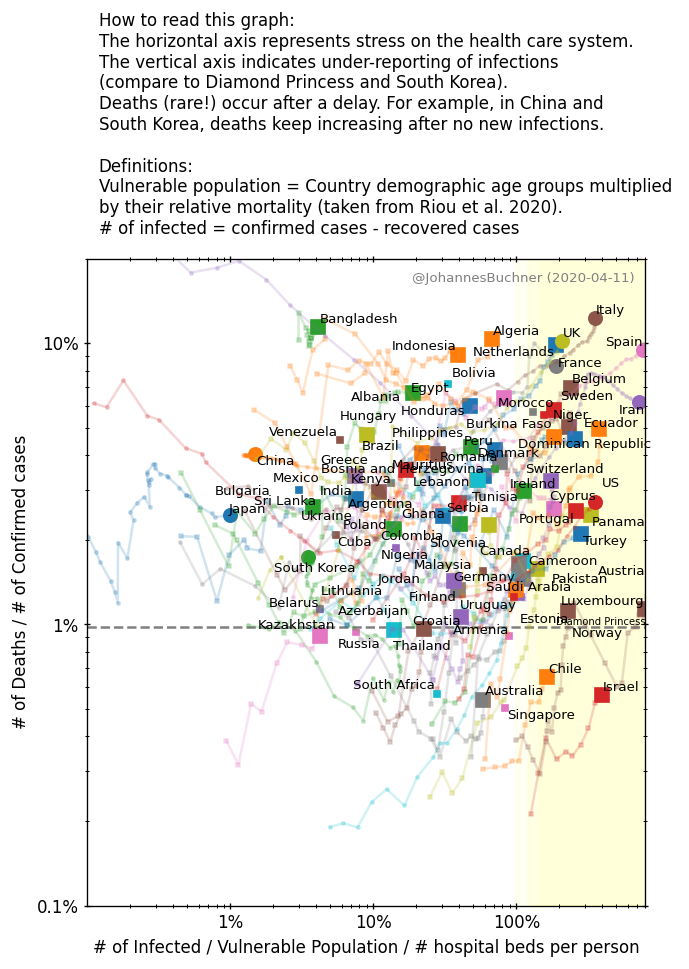
Things I notice / interpret (as a non-expert!):
- Germany, Austria (and Denmark, Norway) are at the bottom of the chart -- mortality is unusually low there. I am unsure if this is because of over-counting of infected (unlikely), undercounting of deaths ( assigning a non-COVID-19 cause), or quality and accessibility of the health care system.
I am not an epidemiologists. I recommend you listen to the experts.
- https://www.tableau.com/about/blog/2020/3/ten-considerations-you-create-another-chart-about-covid-19
- Riou+2020 paper: https://www.medrxiv.org/content/10.1101/2020.03.04.20031104v1.full.pdf
- also discussed here: https://statmodeling.stat.columbia.edu/2020/03/07/coronavirus-age-specific-fatality-ratio-estimated-using-stan/
- https://coronavirus.jhu.edu/
- https://neherlab.org/covid19/


