pure CSS masonry layout aid
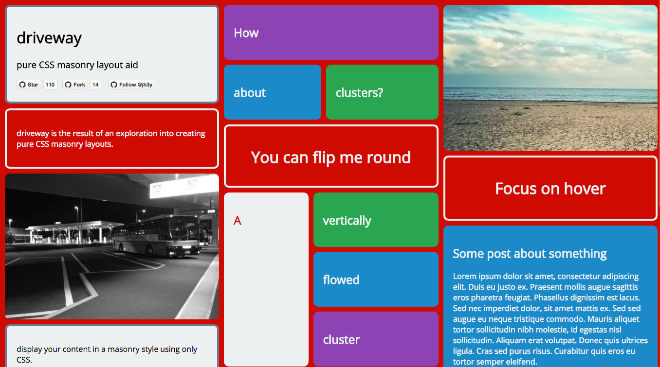
driveway is an explorative project for developing pure CSS masonry layouts. It is developed using stylus.
- easy to use
- interactive
- responsive
- config driven
- customisable
- extendable
<div class="dw">
  <div class="dw-panel ">
    <div class="dw-panel__content">
      <p>Some content.</p>
    </div>
  </div>
</div>You may have come here from the blog post I wrote about pure CSS masonry layouts. If that's the case and you want the exact code I used in that post(with vendor prefixing), you'll be best served looking in the dist folder for driveway.blog.css and driveway.blog.min.css. Alternatively, use bower to pull in the repo.
| Chrome | Firefox | Safari | Opera | Edge | IE |
|---|---|---|---|---|---|
| 😄 | 😄 | 😄 | 😄 | 😄 | 😓* |
* driveway will play nice in IE10+
driveway relies on Flexbox and multi-column layout properties. For further details on browser support for these check out caniuse.com.
In order to start using driveway, drop the driveway{.min}.css file into your page and start building your markup.
driveway simply provides the basic means to layout your content in a masonry style and provides no aesthetic styling. This should ideally be covered by your own theme files. There are some notes about theming below.
If you would like a similar theme to that used in the demo, check out the theme.styl file in the sources.
driveway is built up of different blocks;
containerpanelsclusterssegmentsflip panels(optional)focus curtain(optional)
Below is an explanation of these blocks. It may be easier to inspect the demo page or source in the repo to get a further understanding of how these piece together.
We start our layout with a container;
<div class="dw"></div>dw- layout container
Panels are the simplest building blocks of our layout. The content for a panel lives inside the dw-panel__content element.
<div class="dw-panel ">
  <div class="dw-panel__content">
    <p>Panel content.</p>
  </div>
</div>-
Focus
{dw-panel--focus}- the focus modifier will focus a panel on hover. Ust it by adding thedw-panel--focusclass to the panel. This means that a focus curtain element must exist within the layout container as the very last element.<div class="dw__focus-curtain"></div>
-
Pulse
{dw-panel--pulse}- the pulse modifier will slightly enlarge a panel on hover. Use it by adding thedw-panel--pulseclass to the panel.
dw-panel- paneldw-panel__content- panel contentdw-panel--focus- panel focus modifierdw-panel--pulse- panel pulse modifier
Clusters and segments are most likely the trickiest part of creating a layout with driveway. Clusters are used to breakup the layout flow a little more and enhance the masonry effect that's desired.
A cluster is the top level element.
<div class="dw-panel dw-cluster dw-cluster--vertical">
</div>
It's still a panel so it needs the dw-panel class in addition to the dw-cluster class. The last class is used to declare the direction of the cluster flow. dw-cluster--vertical declares that are cluster should flow vertically using columns whilst dw-cluster--horizontal would declare a horizontal flow for our cluster. This is important. Not adding the modifier class will result in that cluster not collapsing when desired.
A cluster is made up of segments. This can be tricky.
<div class="dw-cluster__segment"></div>The first children of our cluster need to be either rows or columns depending on the directional flow of our cluster. Our content will then sit within these.
For example;
A vertically flowed cluster with two columns. The row/column modifier is important to define the internal flow of the segment. Here we use dw-cluster__segment--col as we want columns. But we may use dw-cluster__segment--row if we desire a row.
<div class="dw-panel dw-cluster dw-cluster--vertical">
  <div class="dw-cluster__segment dw-cluster__segment--col ">
  </div>
  <div class="dw-cluster__segment dw-cluster__segment--col ">
  </div>
</div>
Once we have created our cluster children containers, we simply need to fill them with content. We fill them with panel blocks. These panel blocks must have the class dw-cluster__segment in addition to their panel class.
<div class="dw-panel dw-cluster__segment">
  <div class="dw-panel__content">
    <p>Panel content.</p>
  </div>
</div>
We may want to enforce that our segments take up a certain amount of real estate inside their clusters. There are two segment modifiers to ensure that a segment takes up at least 25% or 50% of the real estate in the relative direction. These are applied with dw-cluster__segment--quart and dw-cluster__segment--half respectively.
Putting it all together we get something like;
<div class="dw-panel dw-cluster dw-cluster--vertical">
  <div class="dw-cluster__segment dw-cluster__segment--col ">
    <div class="dw-panel dw-cluster__segment ">
      <div class="dw-panel__content">
        <p>I am in the first column.</p>
      </div>
    </div>
  </div>
  <div class="dw-cluster__segment dw-cluster__segment--col ">
    <div class="dw-panel dw-cluster__segment ">
      <div class="dw-panel__content">
        <p>I am in the second column.</p>
      </div>
    </div>
    <div class="dw-panel dw-cluster__segment ">
      <div class="dw-panel__content">
        <p>So am I.</p>
      </div>
    </div>
  </div>
</div>dw-cluster- clusterdw-cluster--vertical- vertical flow cluster modifierdw-cluster--horizontal- horizontal flow cluster modifierdw-cluster__segment- segmentdw-cluster__segment--col- segment columndw-cluster__segment--row- segment rowdw-cluster__segment--quart- segment taking up quarter of the real estate availabledw-cluster__segment--half- segment taking up half of the real estate available
The focus curtain is an optional element. It is required though if you wish to use the focus modifier on any of your panels. This is because driveway makes use of CSS sibling combinator syntax in order to give off the desired effect. To use, ensure that an element with the class dw__focus-curtain is placed as the very last element of the layout container.
<div class="dw">
  <!-- LAYOUT CONTENT HERE -->
  <div class="dw__focus-curtain"></div>
</div>Flip panels are layout panels that spin round on hover/tap(mobile). Due to the required markup needed for the effect, their structure is a little different to other panels.
<div class="dw-panel dw-flip dw-flip--md">
  <div class="dw-panel__content dw-flip__content">
    <div class="dw-flip__panel dw-flip__panel--front">
      <h1>You can flip me round</h1>
    </div>
    <div class="dw-flip__panel dw-flip__panel--back">
      <h1>Yeah that's right</h1>
    </div>
  </div>
</div>
A flip panel is still a panel so it still uses the dw-panel class. It also uses the dw-flip class and an additional class to define the height of the panel.
That last piece is important. In order for the flip to render and behave correctly, a defined height must be set so that each side of the panel matches up. There are size modifiers for small, medium and large. These are set in the config and are used with dw-flip--sm, dw-flip--md and dw-flip--lg classes respectively.
Our flip panel content(dw-flip__content) has to consist of two panels(dw-flip__panel). One for the front of the panel(dw-flip__panel--front), and one for the back(dw-flip__panel--back).
dw-flip- flip paneldw-flip--sm- small flip paneldw-flip--md- medium flip paneldw-flip--lg- large flip paneldw-flip__content- flip panel contentdw-flip__panel- flip panel child paneldw-flip__panel--front- flip panel frontdw-flip__panel--back- flip panel back
dw- layout containerdw-panel- paneldw-panel__content- panel contentdw-panel--focus- panel focus modifierdw-panel--pulse- panel pulse modifierdw-cluster- clusterdw-cluster--vertical- vertical flow cluster modifierdw-cluster--horizontal- horizontal flow cluster modifierdw-cluster__segment- segmentdw-cluster__segment--col- segment columndw-cluster__segment--row- segment rowdw-cluster__segment--quart- segment taking up quarter of the real estate availabledw-cluster__segment--half- segment taking up half of the real estate availabledw__focus-curtain- focus curtaindw-flip- flip paneldw-flip--sm- small flip paneldw-flip--md- medium flip paneldw-flip--lg- large flip paneldw-flip__content- flip panel contentdw-flip__panel- flip panel child paneldw-flip__panel--front- flip panel frontdw-flip__panel--back- flip panel back
driveway includes minimal theming. It provides structural styling and minimal aesthetics for things like panel padding. For the demos, utility classes are used to add color to text, panels etc.
Some areas of theming are likely to be common though such as how to display images as panels.
Displaying images in a masonry style is quite a common desire. It seems likely that when doing this, there will be no need to define an img element within our panel content as the img is the panel content.
<div class="dw-panel ">
  <img src="img/photo-2.jpg" class="dw-panel__content"/>
</div>
However, dropping this in the page with no img specific theming will break things a little depending on your image sizes. This isn't major, but for my personal theming I added the following rules to my theme.
img {
  max-height: 300px;
}
img.dw-panel__content,
img.dw-flip__panel {
  padding: 0;
}
img.dw-flip__panel {
  max-height: 100%;
}
This stops images going wild!
driveway is developed using gulp, stylus and jade.
NOTE: In order to run the source, both [node] and [gulp] are required.
- Clone the repo.
git clone https://github.com/jh3y/driveway.git- Navigate into the repo and install the dependencies.
  cd driveway
npm install- Run
gulpto take care of preprocessing and running a local static server instance.
gulpThere are some pages available for developing against that have been used to explore methods when developing driveway;
index.html- demo page fordrivewaywhich is manually built.sandbox.html- sandbox page for developing new features.dev.html- randomly generated layout in order to test different combinations.timeline.html- page for exploring timeline ordered content layouts.
Development of driveway is config driven in the sense that a set of variables defined in a json file are passed to both jade and stylus source are compiled. This makes it easier to change properties for driveway by only having to alter them in one place.
As driveway is config driven, you can make alterations to it's configuration such as classnames, responsive breakpoints and some default aesthetics by making updates to this it's config file and compiling your own versions.
In order to do this;
- clone and set up the repo.
- modify
driveway-config.json. - run
gulp compile --dist --stat. This will output new files in thedistfolder whilst giving you the new filesize.
Date ordered content is something that deserves it's own mention as this seems to be the hardest issue to tackle with implementing a pure CSS masonry layout.
Without server side rendering or some JavaScript intervention this isn't easy/possible to maintain with just CSS. I have put together a simple implementation that uses JavaScript that can be accessed from this issue.
Date ordered content can be done but it is when we try and make this content responsive that we hit a stumbling block as the order is lost between viewports.
I have experimented with different approaches(even trying to play with flexbox ordering) but I haven't come across a nice way of doing it.
The only straight forward solution seems to be duplicating the markup per viewport size breakpoint.
Let's imagine we have some content that is ordered by date.
At a larger viewport we wish to display this in four columns. This requires dropping an item of content into each column one a time from left to right, newest to oldest(1-10) until we run out of items.
| Column 1 | Column 2 | Column 3 | Column 4 |
|---|---|---|---|
| 1 | 2 | 3 | 4 |
| 5 | 6 | 7 | 8 |
| 9 | 10 | EMPTY | EMPTY |
This looks fine but when we drop down to a lower viewport would be greeted with one column and the items in the wrong order;
| Column |
|---|
| 1 |
| 5 |
| 9 |
| 2 |
| 6 |
| etc. |
One way to get round this is render two sets of content on the page and wrap them accordingly based on the viewport.
For our mobile version of the markup, we just need one column with our content in the correct order. For this, we can use a container that will be hidden with CSS at larger viewports and then a collection of panel blocks.
<div class="dw--mobile">
  <div class="dw-panel"></div> <!-- 1 -->
  <div class="dw-panel"></div> <!-- 2 -->
  <div class="dw-panel"></div> <!-- 3 -->
  <div class="dw-panel"></div> <!-- 4 -->
  <div class="dw-panel"></div> <!-- 5 -->
  <div class="dw-panel"></div> <!-- 6 -->
</div>
For our desktop version we need a vertically flowed cluster with the amount of columns that are desired. Nested clusters will work fine here.
<div class="dw--desktop">
  <div class="dw-panel dw-cluster">
    <div class="dw-cluster__segment dw-cluster__segment--col ">
      <div class="dw-panel"></div> <!-- 1 -->
      <div class="dw-panel"></div> <!-- 5 -->
    </div>
    <div class="dw-cluster__segment dw-cluster__segment--col ">
      <div class="dw-panel"></div> <!-- 2 -->
      <div class="dw-panel"></div> <!-- 6 -->
    </div>
    <div class="dw-cluster__segment dw-cluster__segment--col ">
      <div class="dw-panel"></div> <!-- 3 -->
    </div>
    <div class="dw-cluster__segment dw-cluster__segment--col ">
      <div class="dw-panel"></div> <!-- 4 -->
    </div>
  </div>
</div>
We can then control what is seen with some simple CSS theming like;
@media (min-width: 768px) {
  .dw--mobile {
    display: none;
  }
}
.dw--desktop {
  display: none;
}
@media (min-width: 768px) {
  .dw--desktop {
    display: block;
  }
}
This isn't ideal but will work. If someone has a better solution please submit a PR! 😄
Don't hesitate to post and issue, PR or suggestion. Alternatively, get in touch via email or by tweeting me @_jh3y!
MIT
@jh3y 2017


 React
React
 Typescript
 Django
 Laravel
 Facebook
 Microsoft
 Google
 Alibaba
 D3
D3
 Tencent