overview
I'm in the process of adding a new api for ttkbootstrap widgets, which will be located in the ttkbootstrap.widgets module. This requires quite a bit of refactoring and code optimization. However, it's going to be worth it. This will allow the user to customize the look of the widget as well as provide an easy-to-use keyword based style api. Additional functionality will be added on select widgets, and existing ttk widgets will still be able to use the style based api with legacy ttk.
The new ttkbootstrap widgets are going to be the best of both worlds... the flexibility of tkinter and the beauty of ttk.
The goal of this project is to allow the end-user to get a beautiful looking UI with as little code as possible. So, I'm not going to try to make everything completely customizable to the lowest grain of detail. You will be able to tweak the colors and other select attributes without having to build or interact with the ttk style api.. this by itself is a great boon for many tkinter users.... ttk widgets without having to learn the ttk style api..... You can, of course, still build your own styles if you wish.
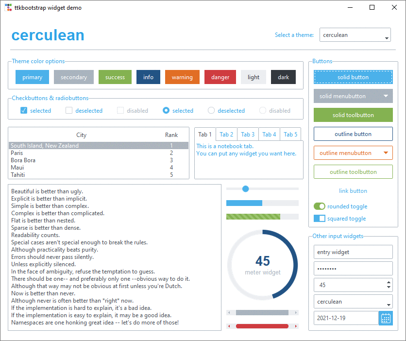
Consider the following demo:
style = Style('superhero')
root = style.master
root.configure(background=style.colors.bg)
pack_settings = {'padx': 2, 'pady': 2, 'fill': 'x'}

# smart keyword based style builder
Button(root, text='default').pack(**pack_settings)
Button(root, text='secondary', bootstyle='secondary').pack(**pack_settings)
Button(root, text='info outline', bootstyle='info-outline').pack(**pack_settings)
Button(root, text='danger link', bootstyle='danger-link').pack(**pack_settings)

# customizable colors
Button(root, text='custom solid', background='purple', foreground='pink').pack(**pack_settings)
Button(root, text='custom outline', foreground='yellow', bootstyle='outline').pack(**pack_settings)
Button(root, text='custom link', foreground='orange', bootstyle='link').pack(**pack_settings)

root.mainloop()
This produces the following result:

keywords
The bootstyle keywords will be familiar to many in the webdev world who use the bootstrap css classes. This is the same idea. The bootstyle parameter builds the style option for ttk in the background by parsing out keywords that are tied to specific styles. The order and capitalization of the words DOES NOT MATTER. So, info-outline will work just as well as well as OUTLINE info. Though, for the sake of everyone, please stick to a pattern and be consistent. I will show a few variations in this document to illustrate what can be done, but the key generally is to be consistent with a convention that you choose.
This will be backwards compatible with existing ttk widgets. So, you can still use style="info.Outline.TButton" and the style will be rendered the same as if you used bootstyle="info outline"
other features
The options are going to be fully documented in the docstring and will be clearly visible in the widget constructor, which will be a huge improvement over legacy ttk classes. You can see this in the work-in-progress Button class below.
I'm going to add features to various widgets, such as automatic creation of variables and property getters and setters where appropriate. Creating new classes will also allow me to improve or modify existing widgets, such as allowing the scale output to be formatted or modified instead of defaulting to a float or integer.
library changes
Internally, the library will change quite a bit in how styles are implemented. I'm streamlining the style creation as well as making many of the class methods static to allow more flexibility. This is required in order to make it easy to build and use styles on-the-fly when customization are made in the widget constructor.
The code will be A LOT more concise when it's done. I'm refactoring a lot of the styles and improving the code base to be easier to read and modify.
I've added support for tkinter named colors so that I can use those with PIL when building image based layouts. This is not completely fleshed out yet for all platforms, but I hope to improve this in the future. If a named color is not found, I will simply default to a fallback color.
Below the ttkbootstrap.widgets.Button class as an example. This inherits from the ttkbootstrap.widgets.Widget class as well as the ttk.Button class.
class Button(Widget, ttk.Button):
    """A Button widget displays a textual string, bitmap or image. If text is displayed, it must all be in a single
    font, but it can occupy multiple lines on the screen (if it contains newlines or if wrapping occurs because of the
    wraplength option) and one of the characters may optionally be underlined using the underline option. It can
    display itself in either of three different ways, according to the state option; it can be made to appear raised,
    sunken, or flat; and it can be made to flash. When a user invokes the button (by pressing mouse button 1 with the
    cursor over the button), then the command specified in the command option is invoked.
    """

    def __init__(
        self,
        master=None,
        anchor=None,
        background=None,
        bootstyle="default",
        command=None,
        compound=None,
        cursor=None,
        font=None,
        foreground=None,
        image=None,
        state="normal",
        style=None,
        takefocus=True,
        textvariable=None,
        text=None,
        underline=None,
        **kw,
    ):
        """
        Args:
            master (Widget, optional): The parent widget.
            anchor (str, optional): Specifies how the information in the widget is positioned relative to the inner
                margins. Legal values are `n`, `ne`, `e`, `se`, `s`, `sw`, `w`, `nw`, and `center`.
            background (str, optional): The normal background color to use when displaying the widget. Setting this
                option will override all other style based background settings.
            bootstyle (str, optional): The **ttkbootstrap** style used to render the widget. This is a short-hand
                API for setting the widget style. You may also use the ``style`` option directly using the standard
                ``ttk`` API. Using the ``Style`` option will overwrite the ``bootstyle``.
            command (func, optional): A callback function to evaluate when the widget is invoked.
            compound (str, optional): Specifies if the widget should display text and bitmaps/images at the same time,
                and if so, where the bitmap/image should be placed relative to the text. Must be one of the values
                **none**, **bottom**, **top**, **left**, **right**, or **center**. For example, the (default) value
                **none** specifies that the bitmap or image should (if defined) be displayed `instead` of the text, the
                value **left** specifies that the bitmap or image should be displayed to the `left` of the text, and
                the value **center** specifies  that the bitmap or image should be displayed `underneath` the text.
            cursor (str, optional): Specifies the `mouse cursor`_ to be used for the widget. Names and values will
                vary according to your operating system.
            font (str, Font, optional): The font to use when drawing text inside the widget. The value may have any of
                the forms described in the `font manual page`_ under FONT DESCRIPTION.
            foreground (str, optional): The normal foreground color to use when displaying the widget. Setting this
                option will override all other style based foreground settings.
            image (PhotoImage, optional): Specifies an image to display in the widget, which must have been created
                with ``tk.PhotoImage`` or `TkPhotoImage`` if using **pillow**. Can also be a string representing the
                name of the photo if the photo has been given a name using the ``name`` parameter.  Typically, if
                the ``image`` option is specified then it overrides other options that specify a bitmap or textual
                value to display in the widget, though this is controlled by the ``compound`` option; the ``image``
                option may be reset to an empty string to re-enable a bitmap or text display.
            padding (str, optional): Specifies the internal padding for the widget. The padding is a list of up to four
                length specifications left top right bottom. If fewer than four elements are specified, bottom defaults
                to top, right defaults to left, and top defaults to left. In other words, a list of three numbers
                specify the left, vertical, and right padding; a list of two numbers specify the horizontal and the
                vertical padding; a single number specifies the same padding all the way around the widget.
            state (str, optional): May be set to ``normal`` or ``disabled`` to control the disabled state bit. This is
                a write-only option: setting it changes the widget state, but the state widget command does not affect
                the ``state`` option.
            style (str, optional): May be used to specify a custom widget style.
            takefocus (bool, optional): Determines whether the window accepts the focus during keyboard traversal
                (e.g., Tab and Shift-Tab). To remove the widget from focus traversal, use ``takefocus=False``.
            text (str, optional): Specifies a string to be displayed inside the widget.
            textvariable (Variable, optional): Specifies the name or instance of a tkinter variable whose value will be
                used in place of the ``text`` resource.
            underline (int, optional): Specifies the integer index of a character to underline in the widget. This
                option is used by the default bindings to implement keyboard traversal for menu buttons and menu
                entries. 0 corresponds to the first character of the text displayed in the widget, 1 to the next
                character, and so on.
            width (int, optional): If the label is text, this option specifies the absolute width of the text area on
                the button, as a number of characters; the actual width is that number multiplied by the average width
                of a character in the current font. For image labels, this option is ignored. The option may also be
                configured in a style.
            wraplength (int, optional): Specifies the maximum line length (in pixels). If this option is less than or
                equal to zero, then automatic wrapping is not performed; otherwise the text is split into lines such
                that no line is longer than the specified value.

        .. _`mouse cursor`: https://anzeljg.github.io/rin2/book2/2405/docs/tkinter/cursors.html
        """
        Widget.__init__(self, "TButton", master=master, bootstyle=bootstyle, style=style)

        self.tk = master.tk
        self.anchor = anchor
        self.background = background
        self.font = font
        self.foreground = foreground
        self.widget_id = None

        self.customized = False
        self.customize_widget()

        ttk.Button.__init__(
            self,
            master=master,
            command=command,
            compound=compound,
            cursor=cursor,
            image=image,
            state=state,
            style=self.style,
            takefocus=takefocus,
            text=text,
            textvariable=textvariable,
            underline=underline,
            **kw,
        )
        self.bind("<<ThemeChanged>>", self.on_theme_change)

    def customize_widget(self):

        if any([self.background != None, self.foreground != None, self.anchor != None, self.font != None]):
            self.customized = True

            if not self.widget_id:
                self.widget_id = uuid4() if self.widget_id == None else self.widget_id
                self.style = f"{self.widget_id}.{self.style}"

        if self.customized:
            options = {
                "theme": self.theme,
                "anchor": self.anchor,
                "background": self.background,
                "foreground": self.foreground,
                "font": self.font,
                "style": self.style,
            }

            if "Outline" in self.style:
                settings = StylerTTK.style_outline_buttons(**options)
            elif "Link" in self.style:
                settings = StylerTTK.style_link_buttons(**options)
            else:
                settings = StylerTTK.style_solid_buttons(**options)

            self.update_ttk_style(settings)


 React
React
 Typescript
 Django
 Laravel
 Facebook
 Microsoft
 Google
 Alibaba
 D3
D3
 Tencent