cards-of-carousal's People
Contributors


Stargazers


Watchers

cards-of-carousal's Issues
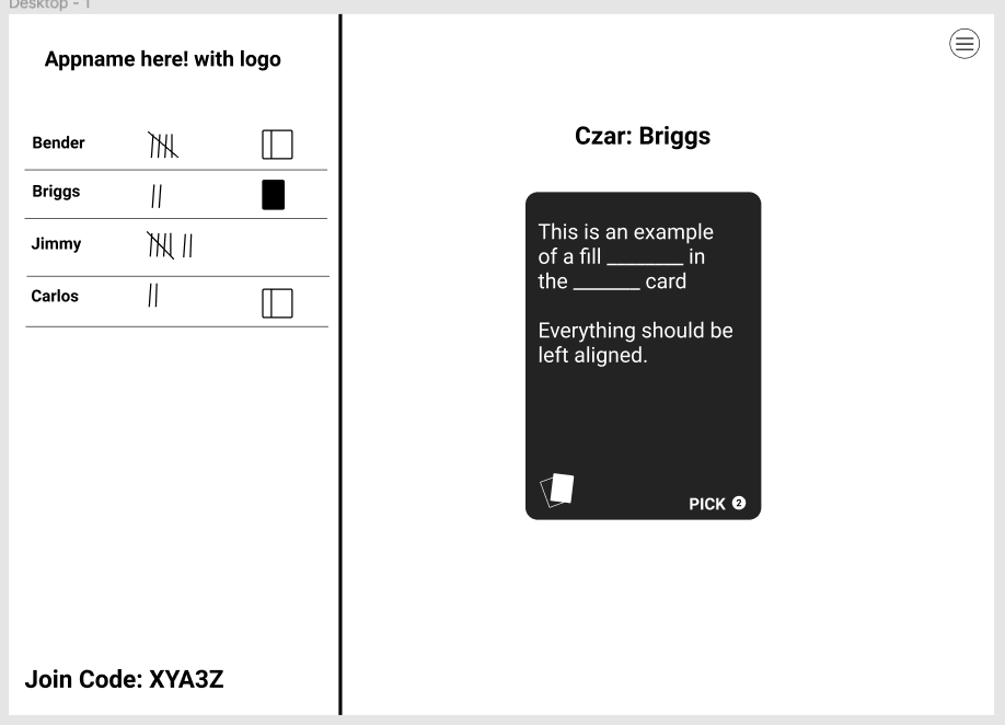
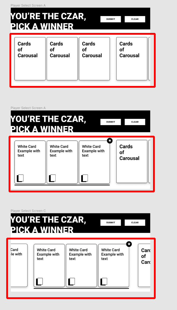
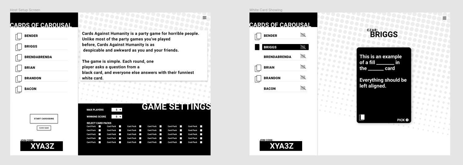
Host in-game layout
Setup Websocket listener
We need a way to connect the back-end's socket to the front-end. There are multiple routes that this socket could instantiate against and listen to. The main two being the host, and the player connection. Currently there are two routes one can connect to:
GET /lobby (for creating a lobby)
GET /lobby/:lobbyId (for joining a lobby)
We need an extensible way to connect to a websocket url, and a way to listen to events outside in the Contexts. One idea is to register the websocket itself as a singleton, or module, and pass events through the EventEmitter API exported from the websocket module that can be imported into Context Providers or components.
Here are some things that can help:
- https://alexboots.medium.com/using-react-context-with-socket-io-3b7205c86a6d
- https://www.npmjs.com/package/events
- https://developer.mozilla.org/en-US/docs/Web/API/WebSocket
Completion Criteria:
- Have a way to connect to a websocket at anytime during the application runtime
- Have a way to disconnect the websocket gracefully
- Have a way to listen for events in other files/modules/classes/contexts
- unit tested
Build button component
This component is going to be responsible for being a button! The bulk of the point of this component is going to be re-usable styling with the styled component library. However, this component will require some props to set some styles.
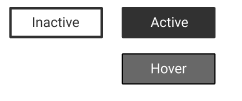
When hovering and clicking the button, it should show grey as above. When "active" the button should be black.
Completion Criteria
- Button should be grey on hover
- Button should be black when "active"
- Button should be white when "inactive"
- Button should show opposite color when clicked, (when mouse is down)
- Button should take up its container so that you can set the container size to size the button.
- Component has this signature
<Button active={Boolean} onClick={Function}>Button Content</Button> - Tested with react-testing-library
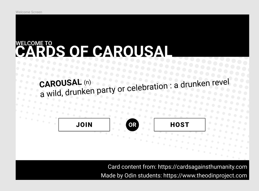
Welcome screen layout
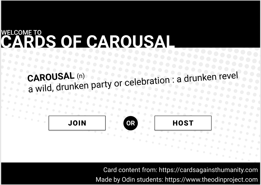
This component is the first component someone will see when they enter the website, in the future we may not load this page for mobile devices, but for now we will use a breakpoint to hide the "host" button on mobile devices. This is not ideal however and will have a refactor later to prevent somebody from attempting to host on a mobile device all-together. You do have some freedom on this design with how it scales at different sizes. Spacing is something you can work with. Ask if you have questions on it.
For now, the "host" and "join" buttons do not need to do anything.
- As a user, I would like to see this page when I first load up the application so I can feel welcomed to the game.
- As a host, I would like to have a "Host" button on the page to click, so in the future I can be taken to the "host" page
- As a player, I would like to have a "Join" button on the page to click, so in the future I can be taken to a page where I can join a lobby
- As a mobile device user, I would like to only see the "Join" button because I cannot host a game on my mobile device
Completion Criteria:
- Lives in
/components/screensdirectory - Responsive on widescreens down to mobile devices (breakpoints are OK)
- Mobile screen sizes do not show "Host" button
- Uses styled components
- Utilizes pre-defined CSS variables for colors
- Utilizes pre-defined CSS class for background
- Tested
Unit tests for Lobby class
We should aim to have 100% test coverage, the Lobby class is missing tests, lets fix that!
If you discover a bug while testing, feel free to report it to Briggs, and fix it!
Completion Criteria
- Ensure all error cases are tested
- Test all public methods
- ...spec.js file is next to the file being tested
- It is run when
npm run test:backendis executed - There are no failing tests
Build core backend
Pre-commit hook to run all tests
Blocked by: #49
After #49 has been completed, we will have prettier and eslint warnings on commit, we should probably run the tests too and make sure they all pass before making a commit. This helps us keep the codebase working if someone forgets to run the tests before making a push.
User Stories:
As a developer, I would like to have my tests run before I can commit so I can make sure I didn't break anything in the event I forgot to run all the tests.
Completion Criteria:
- On commit, all tests should run and prevent committing if there are failures.
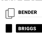
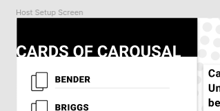
Use card-icon svg for PlayerList component
As a developer: I would like to have the PlayerList to use the card-icon SVGs instead of CSS to make it easier to modify and maintain later.
Completion Criteria:
- Remove CSS for card icon
- Use proper
xxx-xxx-card-icon.svgto match designs.
PlayerList component
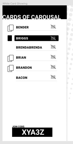
This component is meant to show a few things about the player list:
- Who submitted their cards
- who is the card czar
- what is their score
- Their names
This component should take in data that looks like this:
players = {
  playerID1: {
    name: "Bender",
    score: 3,
    czar: false,
    submittedCards: [1, 4]
  },
  playerID2: {
    name: "Bacon",
    score: 5,
    czar: true,
    submittedCards: []
  },
  playerID3: {
    name: "Briggs",
    score: 0,
    czar: false,
    submittedCards: [5, 6]
  }
}

playerIds = ["playerID1", "playerID2", "playerID3"]
Acceptance Criteria:
- Display player names within a list up-to 12 characters
- Uses prop-types
- After 10 tally marks, move to numbers
- names are displayed in the order the
playerIdsarray is received. - when a player has a score, it is displayed
- when a player has submitted cards, it is displayed
- player is identified when
czar: true - tested
Unit tests for LobbyList class
We should aim to have 100% test coverage, the LobbyList class is missing tests, lets fix that!
If you discover a bug while testing, feel free to report it to Briggs, and fix it!
Completion Criteria
- Ensure all error cases are tested
- Test all public methods
- ...spec.js file is next to the file being tested
- It is run when
npm run test:backendis executed - There are no failing tests
PlayerJoin screen
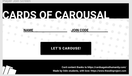
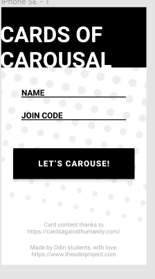
This component is going to eventually be the gateway into the game itself, right now, we do not need the screen to actually do anything except allow for some input. This will be slightly refactored later to get the data out of this component into the gamestate and send to the backend for connecting.
User Stories
As a user, I would like to be able to enter my name and lobby code with my phone in the landscape mode
As a user, I would like to be able to enter my name and lobby code with my phone in portrait mode
As a user, I would like to have a button that will eventually take me into the waiting screen if I was able to get into the game
Completion Criteria
- Has a
namefield - Has a
join codefield - Has a button that is black
- Is styled correctly
- Works on many different devices (desktops too)
- Has a landscape layout and a portrait layout
- Tested
- Links are clickable, and underline when hovered
JoinCode component

Completion Criteria:
-
<JoinCode>{String}</JoinCode> - Takes in a string and displays in the pretty format
- Uses prop-types
- tested
Run prettier through all files in project
We need to run the new prettier config through the entire project between the first and second iteration to get all files to conform to the new configuration.
Completion Criteria
- pretterize all files
setup debugger
The debugger is a vital piece of any developer's toolkit, let's use it for this project.
Completion Criteria:
- Enable debugger for backend
- Enable debugger for frontend
- Documentation on how to use
Build black card component
This component has the responsibility to display black cards, as well as the required amount of white cards to complete the "round" from each player.
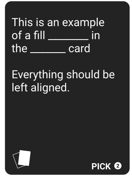
The signature of this card should look like:
<BlackCard pickCount={Number}>{String}</BlackCard/>
The black card should take in a string with this format:
"_Prompt_ cards\nformatted with _."
"I want a _ **and** _ sandwich! No corners!"
The underscores (_) should display with more space than just a single underscore, as well as properly handle \n and ** type operators. This component will require some text processing.
Completion Criteria:
- Has the following signature
<BlackCard pickCount={Number}>{String}</BlackCard> - Uses prop-types
- Display amount of white cards a player needs to draw
- Format string passed in to display properly. e.g
\nshould make newlines - underscores should show longer spaces than a single
_ - be tested with react-testing-library
Player List component has tallies backwards when there are two groups
Currently in the application, when the PlayerList tallies grow beyond 5, the lower number is on the left instead of the right hand side. To comply with reader's expectations, we should have the "full" groups on the left and remainder on the right.
It currently looks like this:
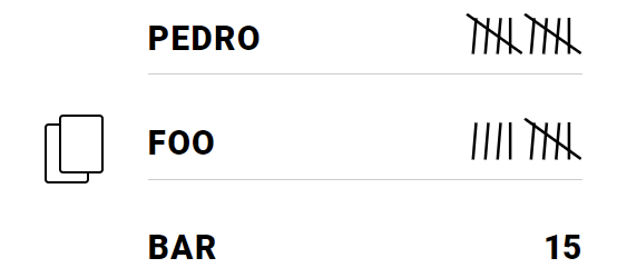
We want it to look like this:
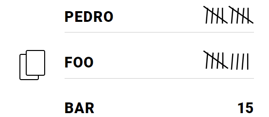
User Stories
As a user, I would like to be able to read the tally marks from left to right so I can read them in the way I would read a normal number.
Completion Criteria
- Tested
- Tally mark groups are readable left to right
- Fix naming for components
Swap callback parameters for SocketRouter
https://github.com/I3uckwheat/cards-of-carousal/blob/main/backend/app/socket.js#L19
Instead of using (req, webSocket), we should flip it to use (webSocket, req) like the wss connection's callback.
CSS structure refactor
Blocked by: #78
Currently we have some global variables set in index.css that define the primary and secondary and accent color. We should expand this a bit to be more semantic and developer friendly. Along with this, there is an issue with CSS not being organized in a semantic way. Consider that App.css has our variables, but index.css has our font imports, background class, and
For variables, we currently have:
  --primary-color: #ffffff;
  --secondary-color: #000000;
  --accent-color: #aaaaaa
While this is useful, we can do better, we should add a primary-background-color, primary-text-color, secondary-background-color, secondary-text-color to make it easy to know what colors go together, for example:
styled.div`
  background: var(--primary-background-color);
  color: var(--primary-text-color);
`
In this example, you can easily associate which variables are needed for each portion. That being said, we do not want to go overboard with too many variables this early on, what we need will be discovered as we go.
(Hint: You can use variables when defining other variables: --my-color: var(--my-var)
User Stories
- As a developer, I would like to have the CSS reset moved out into it's own file called
reset.css, and imported to theApp.jscomponent to prevent noise when reading the global CSS. - As a developer, I want to have the CSS variables, background class, and font import in the same CSS file to help prevent confusion and to make it easy to find the items I can use across the application.
- As a developer, I would like to have descriptive variable names for the CSS variables so that I can easily understand the purpose of each variable.
Completion Criteria
- Move CSS reset content into
reset.cssand import intoApp.js - Move CSS variables, background class, and font import to
App.css - Change CSS variables to be more semantic
Refactor Button component
Blocked by: #75
Currently the button component uses styled components in a way that makes it hard to read, there is a better strategy involved with this and it is to group multiple properties under the same conditional.
Instead of:
cssProp: ${(props) => (props.isTrue ? 'A' : 'B')
anotherProp: ${(props) => (props.isTrue ? 'C' : 'D')
we should be doing this:
cssProp: 'B';
anotherProp: 'D';

${(props) => props.isTrue && css`
  cssProp: 'A';
  anotherProp: 'C';
`}
This keeps the CSS that changes per-prop in one place that's easier to read. It helps the developer see the contextual changes that happen when a prop has been passed or changed. We can do this because we're able to use CSS overrides as CSS is cascading from top-down.
While we're here, we should also edit this component to use the proper CSS variables as created in #75
User Stories
- As a developer, I would like the Button component to be refactored to use a better method of using different props within styled components so I can easily understand the different variants.
- As a developer, I would like to use the proper CSS variable names in the CSS of this component so I can easily theme this component later.
Completion Criteria
- Refactor Button to use cleaner method of setting CSS in props
- Refactor Button to use proper CSS variables
Conform all code to linter
blocked by: #16
Make sure all code is aligned with the linter before continuing.
Modal component
This component will be responsible for overlaying the entire screen, while allowing elements to be wrapped for display above the overlay. This is a common functionality on many websites. Be imported into components that want to utilize the modal. It will be conditionally rendered by the parent to display the modal. Children of the Modal should have access to closing the modal as well.
For this one should use react portals: https://reactjs.org/docs/portals.html
Completion Criteria:
- Overlays the entire screen with a partially transparent div
- Allows for additional components to be wrapped with it
- Allows for clicking-off the component
- uses prop-types
- Has this API
<Modal onClickOutside={Function}> <item> <items> </Modal> - Renders on the root of the DOM, using React Portals
- Tested
Example:
		MyDiv = styled.div`
			width: 100;
			height: 100;
			background: white;
		`
		showModal = false;
		<button onClick={showModal = true}>Open Modal</button>

		showModal &&
		<Modal onClickOutside = {showModal = false}>
			<MyDiv>Hello World</MyDiv>
			<button onClick={showModal = false}>Close</button>
		</Modal>
SVG background CSS class
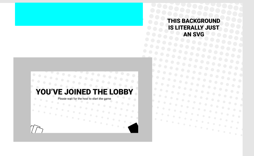
We need a CSS class that applies the SVG depicted in the image above.
Completion Criteria:
- Global CSS class to apply the SVG as a background image
Set up CSS globals
We shouldn't have to copy and paste the hex colors for things, lets make some CSS variables to help reduce redundancy and enforce good consistency.
This issue will require research into best practice, we should implement this with styled-components in a way that is most commonly used.
Add Roboto globally, no need for variable.
Completion Criteria
- Set up default stylesheet with CSS variables
-
primary-colorvariable (White) -
secondary-colorvariable (Black) -
accent-colorvariable (Grey) - Add global typeface for all text in CSS (Roboto)
- add global CSS reset
Setup README
This will help people get going and run our application locally for development
Completion Criteria:
- have a README.md file
- have information on which node version to use
- directions for installing all packages
- directions for running the test suite
- directions for running all projects
- directions for the environment variables
Player Hand
Blocked By: #11
This component will be used by the players, mostly on mobile devices, to actually play the game. This feature will have responsibilities such as: selecting white cards, and deselecting white cards. This component should receive a list of cards and have the ability to notify the wrapper of any changes in card selection. This component will also display which cards are selected by using a wrapper. This component is only the functionality of the selecting and deselecting the cards, it does not include the layout and header.
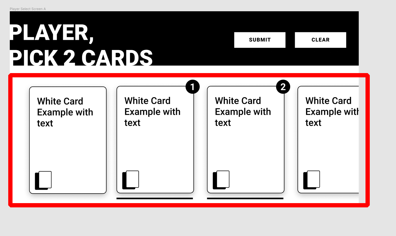
Don't worry about responsiveness of the white cards for this ticket, that will be handled in another ticket, we just need to make sure the horizontal scrolling works on all screen sizes
This component should be a "dumb" component, and only respond to events and data, it should not toggle internal state itself when selecting and deselecting cards. That will be the responsibility of the parent.
It will eventually be used similar to the below:
const [selectedCards, setSelectedCards] = useState([])

return (
  <Parent>
    <PlayerHand cards={cards} selected={selectedCards} onSelect={(selected) => setSelectedCards(selected)} />
  </Parent>
)
User Stories
- As a player, I would like to be able to see my hand with all my cards so I can later choose the best cards for the game.
- As a player, I would like to be able to select, and deselect cards before submitting, so I can change my mind before committing to a decision.
- As a developer, I would like the
onSelectcallback to be passed an array of selected card indexes
Completion Criteria
- Have the following API:
<PlayerHand cards={[Cards]} selected={[Indexes]} onSelect={Function} />
- Accepts the following data structure for
cards[ "Card One", "Card Two", "Card Three" ]
- Accepts the following structure for
selectedCards[2, 4] // Where 2, and 4 are indexes of selected cards
- Fires the
onSelectcallback when a card is touched, with the indexes of the selected cards - Displays the number of the selected card
- Utilizes the card-wrapper component #11
- Utilizes the white-card component #67
- Shows the proper order of the cards that have been selected, based on the
selectedarray - Tested
- Uses prop-types
CSS background does not tile
Currently in the application the CSS background class doesn't tile properly because the SVG is exported with a rotation. We should export this SVG without the rotation, set it to tile, then apply the rotation in the .primary-background class so tiling works effectively. Use the SVG here (not the frame it's layered over).
User Stories:
- As a developer, I would like the background to tile appropriately so it is easier to create widescreen layouts
Completion Criteria:
- Replace non-tiling SVG with fixed version
- Fix CSS to rotate tiling SVG to the same angle as the old svg
JSON parse error if message is string but not valid JSON
If a socket sends a message to the server that is a valid string, but inside is not valid JSON, an invalid JSON error message is thrown. This should be caught by our invalid message handler.
File: backend/lib/Message/Message.js
Function: Message class constructor
Problem: Accepts strings that are not valid JSON and passes them to the #fromJSON method
Replication: Establish a new socket. Run socket.send with any primitive string as an argument.
Briggs:
Completion Criteria:
- A custom error is sent instead of the default error when something goes wrong with parsing.
Header component


In context:
Acceptance Criteria:
- Fills the full width of it's container
- Accepts children to render within
- Has the following API
<Header> <button>My Button</button> <and other children/> </Header> - tested
z-index is erroneously set on PlayerList component
Reporter: @pklepa
The PlayerList component has a container set with z-index: 1 as it was required before the inclusion of the .svg files from another PR. This is no longer necessary.
The bug is that as of the current state of the Modal component, this z-index could put the PlayerList on top of other components, such as an overlay.
It can be solved by simply removing this deprecated z-index declaration.
User Stories
As a user, I do not want to see parts of the PlayerList component over other components.
Completion Criteria
- Remove z-index CSS property from PlayerList component.
Set up Prettier with Eslint
As a developer, I would like to have prettier to manage formatting my code, and eslint to manage code-concept issues to help me write code that is consistent with everybody else.
Completion criteria:
- Implemented based on this guide
- Implementation works on both frontend and backend code
Set up linter
- Works on both frontend and backend
- Husky.js is setup as a dev dependancy
- eslint is set up as a dev dependancy
- Husky is set up to prevent pushing if there are linting issues
- eslint is configured with the AirBnB style guide
Build master deck class
This singleton class will live on the back-end and will be the place where cards are gathered to be sent to the front-end. The main purpose of this class is to receive an array of indexes and return the selected card packs in a nice format.
The constructor should load a JSON file into memory of all the card packs. See here for file: https://crhallberg.com/cah/
The public endpoints should be:
getPackNames() => returns array of all pack names
getDeck([Number]) => returns all packs cards content
Completion Criteria:
- Load all cards into memory as an object in the class constructor from a card.json file, in the format outlined here: https://crhallberg.com/cah/
-
getPackNamesshould return an array of titles of the card packs -
getDeckshould take an array of numbers (corresponding to the pack indexes), and return an array that looks like this:{ black: [array, of, card objects], white: [array, of, card, objects] } - Unit tested with Jest
Remove `.xx` values in CSS.
In some components, there have been cases where people have followed the Figma designs too closely, and have used partial values. For pixels, it's impossible to have a partial pixel at once, and using decimals on percentages often doesn't make sense.
User Stories
- As a developer, I do not want non-whole numbers on sizing values
Completion Criteria
- Identify and remove all partial values in the component's CSS
Setup top level npm script and env variables
Completion Criteria:
- Env variable checking and warnings
-
one command tonpm i, andnpm startall projects - Documentation on how this works.
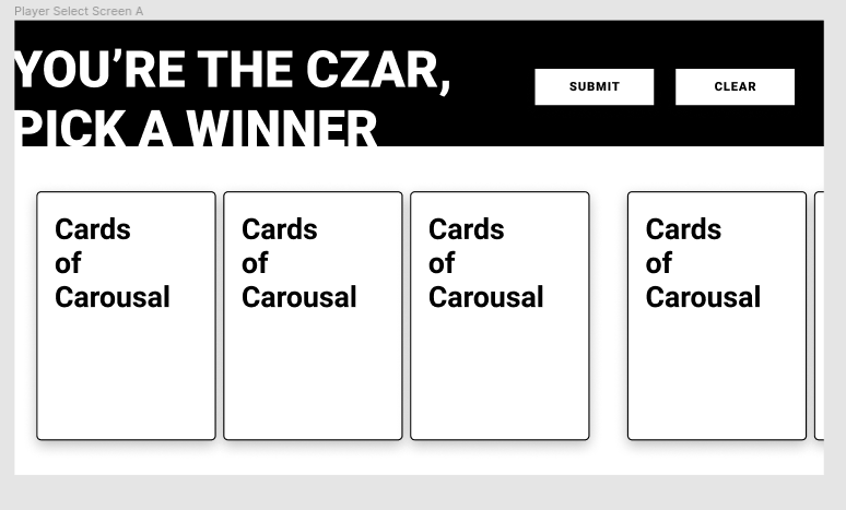
Czar Hand
Blocked By: #11
This component will be used by the players, mostly on mobile devices, to actually play the game when they're the czar. This feature will have responsibilities such as: selecting groups white cards, deselecting groups white cards, and hiding white cards until they have been selected at least once. This component should receive a list of cards and have the ability to notify the wrapper of any changes in card selection. This component will also display which cards are selected by using a wrapper. This component is only the functionality of the selecting and deselecting the cards, it does not include the layout and header.
It will eventually be used similar to the below:
const [selectedCard, setSelectedCard] = useState(undefined)

return (
  <Parent>
    <CzarHand cardGroups={cardGroups} selectedGroup={Number} onSelect={(selected) => setSelectedCard(selected)} />
  </Parent>
)
User Stories
- As a Czar, I would like to be able to see the groups of cards to select a winner, so I can play the game
- As a Czar, I would like to not be able to see groups of cards until I've tapped on them once, so I can experience the game in the same way as the Players
- As a Czar, I want to be able to select a group of cards and see that I've selected that group with the card-wrapper component
Completion Criteria
- Have the following API:
<PlayerHand cards={[Cards]} selectedGroup={index} onSelect={Function} />
- Accepts the following data structure for
cards[ ["Card One", "Card Two", "Card Three"], ["Card Four", "Card Five", "Card Six"], ["Card Seven", "Card Eight", "Card Nine"], ]
- Accepts a number for
selectedGroupnotating the index of the group selected. - fires the
onSelectcallback when a card group is touched, with the proper index of the newly selected card - Displays a star on the selected card group
- Utilizes the card-wrapper component #11
- Shows the back of cards until they are tapped, then shows the front
- Shows the front of the card when tapped, and it stays facing up until a new card array is passed
- Displays the selected card as the number noted in the
selectedprop - Tested
- Uses prop-types
Ingame-settings component layout
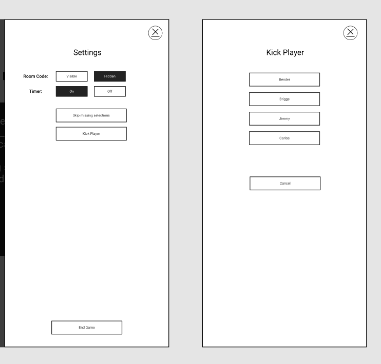
(These are placeholder options)
Git tracks .env in frontend folder
Frontend .gitignore file lacks ".env"
Solution is to add ".env" to "frontend/.gitignore".
Unit tests for SocketRouter class
We should aim to have 100% test coverage, the SocketRouter class is missing tests, lets fix that!
If you discover a bug while testing, feel free to report it to Briggs, and fix it!
Completion Criteria
- Ensure all error cases are tested
- Test all public methods
- ...spec.js file is next to the file being tested
- It is run when
npm run test:backendis executed - There are no failing tests
Build player hand class for host
This class is responsible for the player's hand. This will live on the front-end (host). It should hold a list of cards the player currently has in their hand. It is responsible for "using" and "receiving" cards.
the public API should look like:
useCards([Number]) => Returns an array of cards, selected by indexes and removes them from the hand
addCards([Card]) => Adds card objects to the hand.
getHand() => returns the entire hand in an object form
count() => returns the amount of cards currently in the hand
Completion Criteria:
- removes cards from the hand when they are "used"
- adds cards to the hand when the
addCardsmethod is called - returns the whole hand when
getHandmethod is called - returns the count of the current hand, when the
.countmethod is called - has unit tests that cover all public methods
Build deck Class
This class will live on the front-end, and will be responsible for managing the game's current deck. It will also be responsible for "refreshing" the deck when cards get low from the master-deck route on the back-end. When cards get used, they should be removed from the list of cards to prevent repeats.
The public API should look like:
drawWhiteCards(Number) => returns the amount of randomly selected white cards requested
drawBlackCard() => returns a random black card
Completion Criteria:
- Has a placeholder method for getting cards from a backend API endpoint (can just be an empty method for now)
- Calls method for getting cards when the card list is getting low
- Should load cards from backend API in constructor (calls the method to get cards)
- Has the public API of:
drawWhiteCards(Number) => returns the amount of randomly selected white cards requested drawBlackCard() => returns a random black card - never had repeat cards (hint: remove cards from the internal array as they're used)
- has unit tests
Player Message Screen
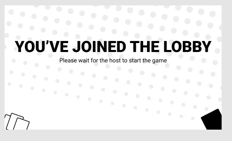
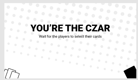
As a player, I would like to have a screen that can help communicate messages to me while I'm waiting for the next part of the game so I know what is going on at all times.
As a developer, I would like a layout for sending the players a message during downtime in the application to keep them informed about the state of the game.
Completion Criteria
- Has the following API
<PlayerMessageScreen bigText={String} smallText={String} /> - Displays the big text and small text correctly
- Uses the global background css class
- Works on screens as small as iphone 5s (320 x 568)
- Uses styled-components
- Uses prop-types
- Tested
HamburgerMenu component
This component will act as a button but with two states. An "active" state and an "inactive" state.
Inactive:
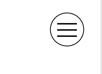
Active:
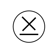
Completion Criteria:
- Has the following API
<HamburgerMenu isActive={Bool} onClick={Function} /> - Shows the proper view when "active"
- Shows the proper view when "inactive"
- Calls the
onClickcallback when clicked
Get Deck Endpoint
blocked by: #2
This endpoint is going to be created with Express, there is a good amount of work needed to clean up the server file and implement this endpoint properly.
Stories
- As a developer, I need an endpoint (
GET /deck/cards?packs=pack,ids) on the backend to hit with a configuration and receive a deck so that I can use the cards in the application. - As a developer, I need an endpoint (
GET /deck) to return pack names
Completion Criteria
- Has a GET endpoint
/deckto return all pack names - Has a GET endpoint
/deck/cards?packs=pack,idsthat returns cards based on the packIds - The
/deck/cardsendpoint with no query returns ALL cards - Integrates the
MasterDeckclass, see #2 - Pulls in the JSON file from here: https://crhallberg.com/cah/
- Instantiates an instance of
MasterDeck - Tested
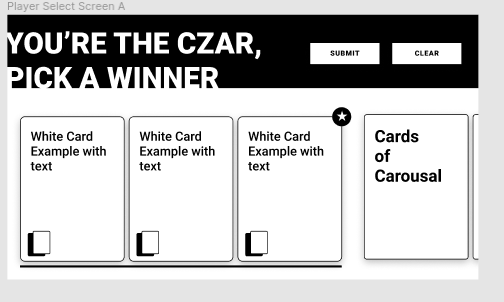
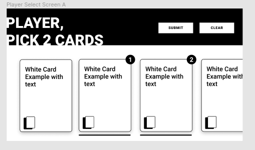
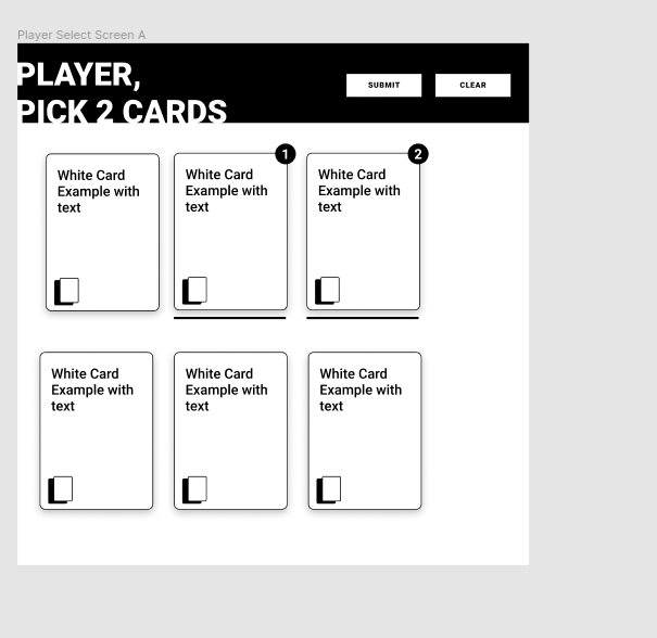
CardWrapper component
blocked by: #5
This component is meant to wrap cards in the player's hand so we have an easy way to show which has been selected.
Player has selected one card
Player has selected their second card
Card Czar has selected the winning card group
This wrapper should underline the card when it is active, and show a number, or star in the upper right corner depending on the data passed in. All styles can be applied on the wrapping div instead of on the card.
Hints:
use prop-types
use flexbox
don't try to edit the card's styles, apply them to the wrapping div
Completion Criteria:
- Has the following API:
<CardWrapper
  select={Number | "winner"}
>
  <Card /> // One or more cards
  <Card />
  <Card />
</CardWrapper>
- uses prop-types
- When select is passed a positive, non-zero number, the card is underlined and the number is shown in the top right corner of the card
- When select is passed the string "winner" the card/cardgroup is underlined and a star is displayed in the top right corner.
- When an invalid value is passed, prop-types catches and notifies the developer
- When multiple cards are wrapped by the wrapper, they have their edges touching, indicating the grouping
- Tested with Jest and react-testing-library
Build Player context
The player context will be responsible for holding information about each individual player. Such as their name, and current score.
This context should have a reducer that allows adding players, removing players, and setting the next Czar
Completion Criteria:
- Has the following actions on the reducer
ADD_PLAYER -> Add a player to the array of players REMOVE_PLAYER -> removes players from the array of players by ID hand/ADD_CARDS -> Adds cards by player ID hand/REMOVE_CARDS -> Remove cards from player by ID, from index locations - Unit tested
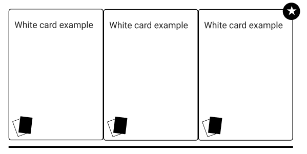
Build white card component
This component is going to be used on both the player and host application on the fronted. It will take in information and display it properly.
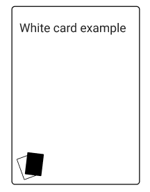
This component should be very simple and does not need to take any callbacks at this time. Avoid worrying about the selected status for now, that will be done in a wrapper later.
Completion Criteria
- Displays the text passed to it, left algined
- Shrinks text to fit when text is really long (to a certain extent)
- Has the following signature:
<WhiteCard>{String}</WhiteCard> - Tested with react-testing-library
- uses prop-types
Host Layout
Only the layout is to be completed in this ticket.
As a user, I would like a consistent layout for all host views to utilize so there is consistency between screens.
As a developer, I would like to have a left panel that I can populate with components.
As a developer, I would like to have a right panel that I can populate with components.
As a user, I would like the hamburger menu in the top right to open up a modal
Completion Criteria
- Has the following API:
<HostLayout left={Component} right={Component} modal={Component} /> - Has the header component (#36) located in the proper position
- Has the SVG background class applied to the background
- Has the hamburger menu in the top right of the right component
- When the hamburger menu is clicked, it opens a modal with the contents passed into the
modalprop - The component renders what is passed into the
leftprop - The component renders what is passed into the
rightprop - Is responsive to as many screen sizes as possible
- mobile is not a priority
- uses prop-types
- Tested
- Lives in
/components/layoutsdirectory
mini-card icons
This will be used every time we need to show a representation of a card. This should be a simple SVG file instead of a full component to allow for ease of use. You can access the source to make the SVG through the figma link.
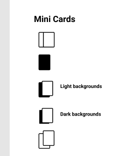
Completion Criteria:
- The following svg files
black-card-icon.svgwhite-card-icon.svgwhite-card-stack-icon.svgoffset-white-card-stack-icon.svgcards-stack-offset-light-icon.svgcards-stack-offset-dark-icon.svg
Flip callback parameters for SocketRouter
https://github.com/I3uckwheat/cards-of-carousal/blob/main/backend/app/socket.js#L19
Instead of using (req, webSocket), we should flip it to use (webSocket, req) like the wss connection's callback.
CardHandLayout
This component will wrap the CzarHand and PlayerHand components to allow for a uniform component to display them. This component does not have any functionality at this time, but will in the future.
User Stories:
- As a user, I would like to see a
clearandsubmitbutton that will eventually be used to submit my hand, or clear it to select again - As a user, I would like this to work on many screen sizes, including desktop, down to iphone 5.
Completion Criteria
- Has a header with buttons that say "submit" and "clear"
- Has the following API:
<CardHandLayout onSubmit={Function} onClear={Function} title={{top: "First Line", bottom: "Second Line"}}>{Children}</CardHandLayout> - Allows for horizontal scrolling of items in the body
- On taller screens, allows the cards to tile if there is room
- Tested
- Uses Prop-types
Recommend Projects
-
 React
React
A declarative, efficient, and flexible JavaScript library for building user interfaces.
-
Vue.js
🖖 Vue.js is a progressive, incrementally-adoptable JavaScript framework for building UI on the web.
-
 Typescript
TypeScript is a superset of JavaScript that compiles to clean JavaScript output.
-
TensorFlow
An Open Source Machine Learning Framework for Everyone
-
Django
The Web framework for perfectionists with deadlines.
-
 Laravel
A PHP framework for web artisans
-
D3
Bring data to life with SVG, Canvas and HTML. 📊📈🎉
-
Recommend Topics
-
javascript
JavaScript (JS) is a lightweight interpreted programming language with first-class functions.
-
web
Some thing interesting about web. New door for the world.
-
server
A server is a program made to process requests and deliver data to clients.
-
Machine learning
Machine learning is a way of modeling and interpreting data that allows a piece of software to respond intelligently.
-
Visualization
Some thing interesting about visualization, use data art
-
Game
Some thing interesting about game, make everyone happy.
Recommend Org
-
Facebook
We are working to build community through open source technology. NB: members must have two-factor auth.
-
Microsoft
Open source projects and samples from Microsoft.
-
Google
Google ❤️ Open Source for everyone.
-
Alibaba
Alibaba Open Source for everyone
-
D3
Data-Driven Documents codes.
-
Tencent
China tencent open source team.