

NOTE: See official demo project by Google for complete set of examples.
A demo application for Android ConstraintLayout with various usage with sample code.
Get the beta release with current snapshot!

Google has official demo project that contains a list of layouts that showcases the various features and usage of ConstraintLayout and MotionLayout
See https://github.com/android/views-widgets-samples/tree/master/ConstraintLayoutExamples
- Have a grid containing different feature set of
ConstraintLayout - For each feature, have different examples
- Each example should allow you to share the code snippet or copy to clipboard
- Each example may also contain additional resource links to blog or technical articles
- Example may have set of sliders/toggle to change metrics dynamically to visualize.
See contribution guideline if you want to add demos or fix something.
TIP: Jump to layout resources directoy to see existing layouts.
- Relative positioning
- Horizontal Axis: left, right, start and end sides
- Vertical Axis: top, bottom sides and text baseline
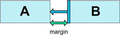
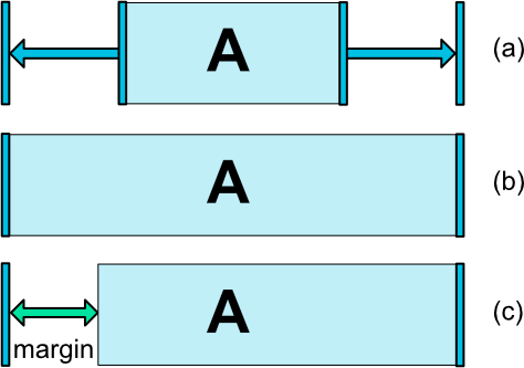
- Margins
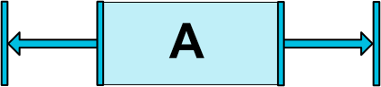
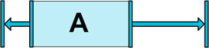
- Centering positioning and bias
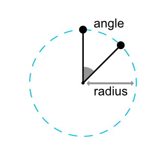
- Circular positioning (Added in 1.1)
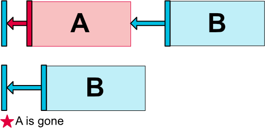
- Visibility behavior
- Dimension constraints
- Ratio
- Percent dimension
- Min and Max
-
MATCH_CONSTRAINTdimensions (Added in 1.1) -
WRAP_CONTENT: enforcing constraints (Added in 1.1) - Widgets dimension constraints
- Chains
- Chain Style
- Weighted chains
- Margins and chains (Added in 1.1)
- Virtual Helpers objects 🥇
- Guideline
- Barrier
- Group
- Optimizer (Added in 1.1)
- Fully functional demo screens 🥇
- Movie Details Screen
- TED Talk Preview Screen
- Secure PIN Entry Screen
These are the my objectives for this demo application.
- To explore all the features of constraint layout
- Learn and use material design component in the sample app
- Learn and use the new architecture components in the sample app
- Learn and use proper architecture for the app - likely MVVM
- Document everything well so that future external contribution is easier
Here is a snapshot of current progress (This will be updated from time to time).


 React
React
 Typescript
 Django
 Laravel
 Facebook
 Microsoft
 Google
 Alibaba
 D3
D3
 Tencent