Learning about Shiny Dashboards by visualizing movie data from Kaggle in R
(The app was too large to deploy on shinyapps.io) Here are a few screen shots of the app:


This shiny dashboard app provides an analysis of film trends overtime based on variables such as ratings, budget, gross, and more. The data spans from 1980-2020 and includes information about movies released in more than 100 countries around the world and contains 7668 total observations and 15 total variables.
There are several components to this dashboard.
The initial page illustrates general trends using bar graphs and line plots. You are able to observe the distributions of several variables in the bar graphs as well as the average of variables such as the score and ratings overtime with the line plot.
The 'Trends by Company' page allows you to explore the differences between the top 3 grossing companies and the worst 3 grossing companies.
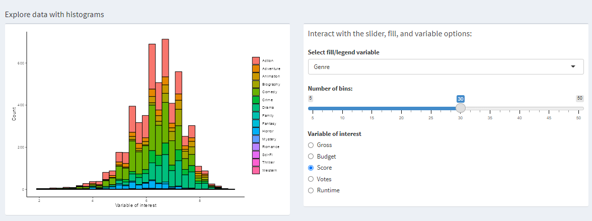
The 'Histogram' page allows you to explore the distributions of data using histograms and fills. You are able to adjust the bins and choose two variables to build a histogram for.
The "Trends by Country" page allows you to explore the average budget and gross for each country. I attempted to add more graphs to the same page but the dashboard keeps breaking. The code for those graphs should be in app.R page but it may not be the most updated version since I removed a lot to get app to rerun again.
This data was found on Kaggle. You can find it at this link: https://www.kaggle.com/datasets/danielgrijalvas/movies

