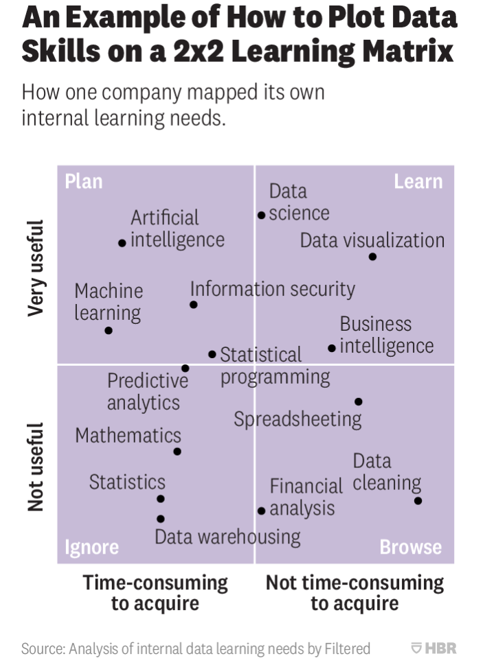
Inspired by the HBR article "Prioritize Which Data Skills Your Company Needs with This 2×2 Matrix" by Chris Littlewood
The article contains this image which has become widely discussed:
This package attempts to make this type of graphic easily accessible to R users. Using the hbrplot package and it's one command, also called hbrplot, you can create 2x2 HBR images with hbrplot. First, install the package in R using devtools:
devtools::install_github("CerebralMastication/hbrplot")
Then make up some junk:
library('hbrplot')

hbrplot(
  items = c(
    'me',
    'you',
    'dog named Boo',
    'Kris Kristofferson',
    'Janis Joplin',
    'JD Long',
    'Random Trucker',
    'Patterson Hood',
    'Mike Cooley'
  ),
  quadrants = c('love', 'pet', 'feed', 'live off land'),
  x_labels = c('fast', 'slow'),
  y_labels = c('sadly', 'happily')
)
Then bask in the joy of a glorious plot:
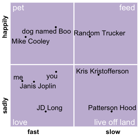
Yeah, that's sort of the point of the parody. Currently you can't control their location.
Nope, Chris Littlewood makes some really good points in his article. One of the best points is thinking about difficulty and value at the same time. The second is thinking about the "marginal" effort as well as value.
What really deserves mocking is how much of the business literature takes qualitative ideas and gives them a quantitative facade so that the ideas appear more quantitative than they actually are. So this routine mocks that by not allowing you to place the points in any quadrant, but rather by placing the points randomly.
You bet! I have already accepted a pull request to fix my junky labels!


