

Features in Brief
- 16 position.
- Live refresh of tooltip options.
- Live element checking (element removed? -> tooltip should disappear)
- Gravity: find a better position if it won't fit to the screen.
- Placement: into the root or into another target element.
- Click activated and sticky tooltips.
- Custom HTML content.
- Interactive tooltips.
- In/Out delays.
- Icon support.
Introduction
At the company I working for we use many tooltips for several purposes. Especially our admin area/control panel side has heavy tooltip usage. There were several unusual requests which always required to develop new features into our existing plugin. Now I've created Protip, a new generation of tooltips. It's not so lightweight but it doesn't intends to be. We needed a solution which can fit into every scenario we face with.
Warning!
Development of the plugin is still in progress. While it's mostly seems stable, there are still some tests need to be written and need to expand the documentation more.
Installation
Simply just include the protip.min.js and protip.min.css files and insert $.protip(); after the page has been loaded (probably in $(document).ready()).
Be sure jQuery is included.
Usage
Configuration
You may need some global configurations on the behaviors of your tooltips. You can pass some configuration options at initialization as an object.
// Available options with default values
$.protip({
    /** @type String    Selector for clickable protips */
    selector:           C.DEFAULT_SELECTOR,
    /** @type String    Namespace of the data attributes */
    namespace:          C.DEFAULT_NAMESPACE,
    /** @type String    Template of protip element */
    protipTemplate:     C.TEMPLATE_PROTIP,
    /** @type String    Template of the arrow element */
    arrowTemplate:      C.TEMPLATE_ARROW,
    /** @type String    Template of protip icon */
    iconTemplate:       C.TEMPLATE_ICON,
    /** @type Boolean   Should we observe whole document for assertions and removals */
    observer:           true,
    /** @type String    Default skin to use */
    skin:               C.SKIN_DEFAULT,
    /** @type String    Default size to use (provided by the Default skin only) */
    size:               C.SIZE_DEFAULT,
    /** @type String    Default color scheme to use (provided by the Default skin only) */
    scheme:             C.SCHEME_DEFAULT,
    /** @type Boolean   Global animation? */
    animate:            false
});
| Property | Default | Details |
|---|---|---|
| selector | .protip | We will use this selector to identify elements with protip. |
| namespace | pt | data-[NAMESPACE]-* |
| protipTemplate | See code | Template of a protip. Variables ({}) will get replaced. |
| arrowTemplate | See code | Template of a protip arrow. |
| iconTemplate | See code | Template of a protip with icon. |
| observer | true | If true, we will watch for changes in the DOM and check if a protip needs to be showed or removed. |
Attach tooltips to elements
Tooltips are controlled over data attributes. Seriously, you can control every aspect of your tooltip from the markup, no additional JavaScript code is required.
<a href="#bar" class="protip" data-pt-title="You must be at least 18!">
    Go to the bar!
</a>
What I did here was that added a protip class to my element, then defined a tooltip text in the in the data-pt-title attribute. Protip related attributes will always get a pt namespace so Protip won't conflict with your existing data attributes.
Available attributes [data-pt-*]
| Attribute | Default | Type | Details |
|---|---|---|---|
| trigger | 'hover' | String | How you want to trigger this tooltip? Available values: hover, click, sticky (sticky will be shown on load) |
| title | null | String | The tooltip content. Provide an ID starting with # to get data (even whole HTML) from another DOM element's content. Example: <div id="tooltipContent"><em>This is my tooltips content</em></div> |
| delay-in | 0 | Number | Delay of showing a tooltip. Handy in cases when you want to prevent tooltips on quick mouseovers. |
| delay-out | 0 | Number | Delay of hiding the tooltip. Handy in cases you have clickable content in the tooltip for example. |
| interactive | false | Bool | If true, protip will use a default 250ms as delayOut for clickable contents. |
| gravity | true | Bool, String | Gravity will check your tooltip before showing it and it will search for better positions if the tooltip won't fit to viewport. Gravity has multiple options available, there is a separate section in the documentation about gravity. |
| offset-top | 0 | Int | Adjust the Y position of the tooltip. |
| offset-left | 0 | Int | Adjust the X position of the tooltip. |
| position | 'bottom' | String | Preferred position. Check Positions section for available options and details. |
| classes | null | String | These classes will be added to the tooltip which may enable additional styling for example. |
| arrow | true | Bool | Hide arrow from this tooltip. At initialization there is an option to set the size of the arrow. Protip will calculate this into positions. |
| width | 300 | Int, String | This is the default max-width for the tooltip. If you need fixed width, write as this: 300! |
| icon | false | Bool, String | Adds icon template to the tooltip markup with the specified icon class. |
| observer | false | Bool | If true, we will attach an observer to the source element and watch for changes. For example if you change the data-pt-title attribute, the tooltip title will be changed also. |
| target | 'body' | Bool, String | We will append the tooltip to this selector. Use true if you want to append into the source element. |
| skin | 'default' | Bool, String | Skin to apply only to this tooltip. |
| size | 'normal' | String | tiny, small, normal, big, large (Provided only by the Default skin.) |
| scheme | 'pro' | String | Default color scheme to use (provided by the Default skin only) |
| animate | undefined | Bool, String | Animation type based on Animate.css. See: Animations |
| auto-hide | false | Bool, Number | Tooltip will hide itself automatically after this timeout (milliseconds). |
jQuery Helpers
var el = $('.el');

// Show the tooltip of this element.
el.protipShow();

// Hide the tooltip of this element.
el.protipHide();

// Toggle the tooltip of this element.
el.protipToggle();

// Hide all tooltips inside of this element.
el.protipHideInside();

// Show all tooltips inside of this element.
el.protipShowInside();

// Toggle all tooltips inside of this element.
el.protipToggleInside();
Gravity
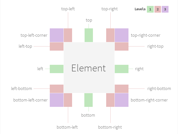
List of available positions
- corner-left-top
- top-left
- top
- top-right
- corner-right-top
- right-top
- right
- right-bottom
- bottom-left
- bottom
- bottom-right
- corner-right-bottom
- left-top
- left
- left-bottom
- corner-left-bottom
data-pt-gravity
True/False
It will enable/disable the gravity option. In case it's true, protip is going to try all positions.
The 3 level of positions
Level 1 top, right, bottom, left Level 2 All other except corners Level 3 Even corners
You may define a level number. Set to 1 in case you want to you gravity only in the most common positions. 2 will trigger both 1 and 2. 3 will trigger all of them.
Fully manual control
Sometimes you may need to have certain tooltips to have only 3 or 5 number of positions with custom offsets in all positions. There is a custom markup for this purpose:
Use only 2 position.
data-pt-gravity="top-right; bottom-left"
Use only 2 position. With custom offset. (X, Y)
data-pt-gravity="top-right 10; bottom-left -10 30"
Prioritize these position, then the others may come...
data-pt-gravity="top-right; bottom-left; ..."
Mix as you want :)
Animations
Protip has built-in support for Animate.css (https://daneden.github.io/animate.css/).
Usage:
<div class="protip" data-pt-animate="bounceIn"></div>Protip's CSS doesn't include Animate.css. Download from here: https://rawgit.com/daneden/animate.css/master/animate.css
Skins
Built in, docs are coming soon...
TODO
- Docs:
- Skins
- Schemes
- Sizes
- About .protip-target class
- Auto-interactive link detection
- Gravity vs. Offset relation
- Demo (almost done)
Credits
- nano template "engine" https://github.com/trix/nano
- MutationObserver polyfill https://github.com/megawac/MutationObserver.js
Bookmarks
- I want to use these in commit messages sometimes :) http://www.emoji-cheat-sheet.com/


 React
React
 Typescript
 Django
 Laravel
 Facebook
 Microsoft
 Google
 Alibaba
 D3
D3
 Tencent