Update: You can read this article in Medium. It is also now part of the official Flutter documentation. And it has a Russian translation by Kirill Matrosov.
When someone learning Flutter asks you why some widget with width:100 is not 100 pixels wide,
the default answer is to tell them to put that widget inside of a Center, right?
Don't do that!
If you do it, they will come back again and again, asking why some FittedBox is not working,
why that Column is overflowing, or what IntrinsicWidth is supposed to be doing.
Instead, first tell them that Flutter layout is very different from HTML layout (which is probably where they're coming from), and then make them memorize the following rule:
Flutter layout can't really be understood without knowing this rule, so I believe everyone should learn it early on.
In more detail:
-
A widget gets its own constraints from its parent. A "constraint" is just a set of 4 doubles: a minimum and maximum width, as well as a minimum and maximum height.
-
Then the widget goes through its own list of children. One by one, the widget tells its children what are their constraints (which can be different for each child), and then asks each child which size it wants to be.
-
Then, the widget positions its children (horizontally in the
xaxis, and vertically in theyaxis), one by one. -
And, finally, the widget tells its parent about its own size (within the original constraints, of course).
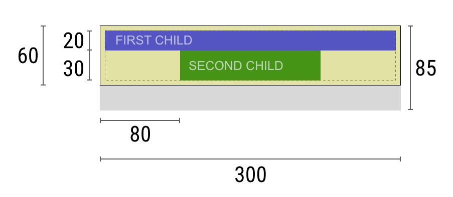
If a widget is like a column with some padding, and wants to layout its two children:
Widget — Hey parent, what are my constraints?
Parent — You must be between
90→300wide, and30→85tall.Widget — Hm, since I want to have
5pixels of padding, then my children can have at most290pixels of width and75pixels of height.Widget — Hey first child, You must be between
0→290wide, and0→75pixels tall.First Child — Ok, I wish to be
290pixels wide, and20pixels tall.Widget — Hm, since I want to put my second child below the first one, this leaves only
55pixels of height for my second child.Widget — Hey second child, You must be between
0→290wide, and between0→55tall.Second Child — Ok, I wish to be
140pixels wide, and30pixels tall.Widget — Very Well. I will put my first child into position
x: 5andy: 5, and my second child into positionx: 80andy: 25.Widget — Hey parent, I've decided that my size is going to be
300pixels wide, and60pixels tall.
As a result of the above described layout rule, Flutter's layout engine has a few important limitations:
-
A widget can decide its own size only within the constraints given to it by its parent. This means a widget usually cannot have any size it wants.
-
A widget can't know and doesn't decide its own position in the screen, since it's the widget's parent who will decide the position of the widget.
-
Since the parent's size and position, in its turn, also depends on its own parent, it's impossible to precisely define the size and position of any widget without taking into consideration the tree as a whole.
For an interactive experience, run this DartPad (there is also this GitHub repo).

Container(color: red)The screen is the parent of the Container.
It forces the red Container to be exactly the same size of the screen.
So the Container fills the screen and it gets all red.

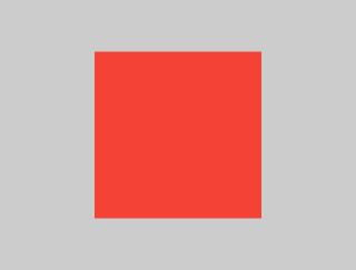
Container(width: 100, height: 100, color: red)The red Container wants to be 100×100, but it can't,
because the screen forces it to be exactly the same size of the screen.
So the Container fills the screen.

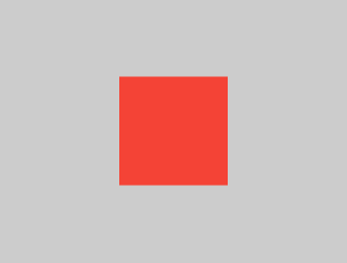
Center(
   child: Container(width: 100, height: 100, color: red))
The screen forces the Center to be exactly the same size of the screen.
So the Center fills the screen.
The Center tells the Container it can be any size it wants, but not bigger than the screen.
Now the Container can indeed be 100×100.

Align(
   alignment: Alignment.bottomRight,
   child: `Container`(width: 100, height: 100, color: red))
This is different from the previous example in that it uses Align instead of Center.
The Align also tells the Container it can be any size it wants,
but if there is empty space it will not center the Container,
but will instead align it to the bottom-right of the available space.

Center(
   child: Container(
            color: red,
            width: double.infinity,
            height: double.infinity))
The screen forces the Center to be exactly the same size of the screen.
So the Center fills the screen.
The Center tells the Container it can be any size it wants, but not bigger than the screen.
The Container wants to be of infinite size, but since it can't be bigger than the screen,
it will just fill the screen.

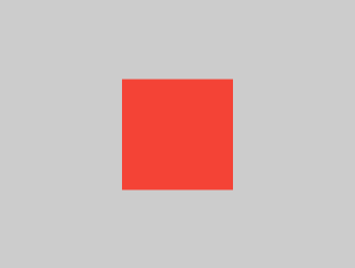
Center(child: Container(color: red))The screen forces the Center to be exactly the same size of the screen.
So the Center fills the screen.
The Center tells the Container it is free to be any size it wants, but not bigger than the screen.
Since the Container has no child and no fixed size, it decides it wants to be as big as possible,
so it fits the whole screen.
But why does the Container decide that?
Simply because that's a design decision by those who created the Container widget.
It could have been created differently,
and you actually have to read the Container's documentation
to understand what it will do depending on the circumstances.
Center(
   child: Container(color: red
      child: Container(color: green, width: 30, height: 30)))
The screen forces the Center to be exactly the same size of the screen.
So the Center fills the screen.
The Center tells the red Container it can be any size it wants, but not bigger than the screen.
Since the red Container has no size but has a child, it decides it wants to be the same size of its child.
The red Container tells its child that if can be any size it wants, but not bigger than the screen.
The child happens to be a green Container, that wants to be 30×30.
As said, the red Container will size itself to its children size, so it will also be 30×30.
No red color will be visible, since the green Container will occupy all of the red Container.
Center(
   child: Container(color: red
      padding: const EdgeInsets.all(20.0),
      child: Container(color: green, width: 30, height: 30)))
The red Container will size itself to its children size,
but it takes its own padding into consideration.
So it will be 70×70 ( = 30×30 plus 20 pixels of padding on all sides).
The red color will be visible because of the padding,
and the green Container will have the same size as the previous example.

ConstrainedBox(
   constraints: BoxConstraints(
              minWidth: 70, minHeight: 70,
              maxWidth: 150, maxHeight: 150),
      child: Container(color: red, width: 10, height: 10)))
You would guess the Container would have to be between 70 and 150 pixels, but you would be wrong.
The ConstrainedBox only imposes additional constraints than the ones it received from its parent.
Here, the screen forces the ConstrainedBox to be exactly the same size of the screen,
so it will tell its child Container to also assume the size of the screen,
thus ignoring its constraints parameter.
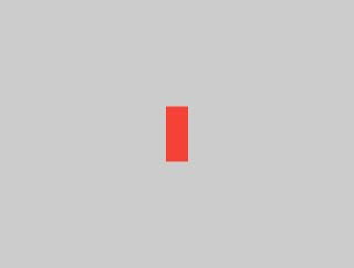
Center(
   child: ConstrainedBox(
      constraints: BoxConstraints(
                 minWidth: 70, minHeight: 70,
                 maxWidth: 150, maxHeight: 150),
        child: Container(color: red, width: 10, height: 10))))
Now, Center will allow ConstrainedBox to be any size up to the screen size.
The ConstrainedBox will impose its child the additional constraints from its constraints parameter.
So the Container must be between 70 and 150 pixels.
It wants to have 10 pixels, so it will end up having 70 (the minimum).
Center(
   child: ConstrainedBox(
      constraints: BoxConstraints(
                 minWidth: 70, minHeight: 70,
                 maxWidth: 150, maxHeight: 150),
        child: Container(color: red, width: 1000, height: 1000))))
Center will allow ConstrainedBox to be any size up to the screen size.
The ConstrainedBox will impose its child the additional constraints from its constraints parameter.
So the Container must be between 70 and 150 pixels.
It wants to have 1000 pixels, so it will end up having 150 (the maximum).
Center(
   child: ConstrainedBox(
      constraints: BoxConstraints(
                 minWidth: 70, minHeight: 70,
                 maxWidth: 150, maxHeight: 150),
        child: Container(color: red, width: 100, height: 100))))
Center will allow ConstrainedBox to be any size up to the screen size.
The ConstrainedBox will impose its child the additional constraints from its constraints parameter.
So the Container must be between 70 and 150 pixels.
It wants to have 100 pixels, and that's the size it will have, since that's between 70 and 150.
UnconstrainedBox(
   child: Container(color: red, width: 20, height: 50))
The screen forces the UnconstrainedBox to be exactly the same size of the screen.
However, the UnconstrainedBox lets its Container child have any size it wants.
UnconstrainedBox(
   child: Container(color: red, width: 4000, height: 50));
The screen forces the UnconstrainedBox to be exactly the same size of the screen,
and UnconstrainedBox lets its Container child have any size it wants.
Unfortunately, in this case the Container has 4000 pixels of width
and is too big to fit in the UnconstrainedBox,
so the UnconstrainedBox will display the much dreaded "overflow warning".
OverflowBox(
   child: Container(color: red, width: 4000, height: 50));
The screen forces the OverflowBox to be exactly the same size of the screen,
and OverflowBox lets its Container child have any size it wants.
OverflowBox is similar to UnconstrainedBox,
and the difference is that it won't display any warnings if the child doesn't fit the space.
In this case the Container has 4000 pixels of width, and is too big to fit in the OverflowBox,
but the OverflowBox will simply show what it can, no warnings given.

UnconstrainedBox(
   child: Container(color: Colors.red, width: double.infinity, height: 100))
This won't render anything, and you will get an error in the console.
The UnconstrainedBox lets its child have any size it wants,
however its child is a Container with infinite size.
Flutter can't render infinite sizes, so it will throw an error with the following message:
BoxConstraints forces an infinite width.
UnconstrainedBox(
   child: LimitedBox(maxWidth: 100,
      child: Container(color: Colors.red,
                       width: double.infinity, height: 100))
Here you won't get an error anymore,
because when the LimitedBox is given an infinite size by the UnconstrainedBox,
it will pass down to its child the maximum width of 100.
Note, if you change the UnconstrainedBox to a Center widget,
the LimitedBox will not apply its limit anymore (since its limit is only applied when it gets infinite constraints),
and the Container width will be allowed to grow past 100.
This makes it clear the difference between a LimitedBox and a ConstrainedBox.
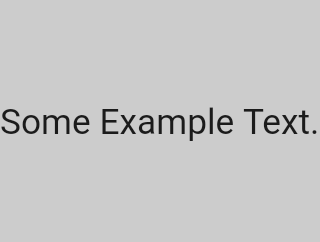
FittedBox(
   child: Text('Some Example Text.'))
The screen forces the FittedBox to be exactly the same size of the screen.
The Text will have some natural width (also called its intrinsic width) that depends on the amount of text,
its font size, etc.
The FittedBox will let the Text have any size it wants,
but after the Text tells its size to the FittedBox,
the FittedBox will scale it until it fills all of the available width.
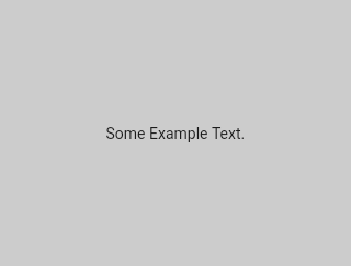
Center(
   child: FittedBox(
      child: Text('Some Example Text.')))
But what happens if we put the FittedBox inside of a Center?
The Center will let the FittedBox have any size it wants, up to the screen size.
The FittedBox will then size itself to the Text, and let the Text have any size it wants.
Since both FittedBox and the Text have the same size, no scaling will happen.
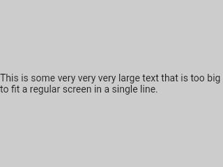
Center(
   child: FittedBox(
      child: Text('This is some very very very large text that is too big to fit a regular screen in a single line.')))
However, what happens if FittedBox is inside of Center, but the Text is too large to fit the screen?
FittedBox will try to size itself to the Text, but it cannot be bigger than the screen.
It will then assume the screen size, and resize the Text so that it fits the screen too.
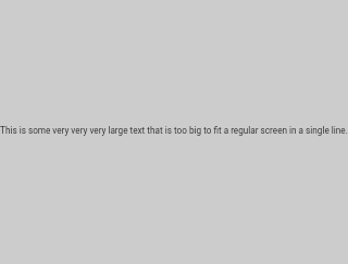
Center(
   child: Text('This is some very very very large text that is too big to fit a regular screen in a single line.'))
If, however, we remove the FittedBox,
the Text will get its maximum width from the screen,
and will break the line so that it fits the screen.

FittedBox(
   child: Container(
      height: 20.0, width: double.infinity))
Note FittedBox can only scale a widget that is bounded (has non infinite width and height).
Otherwise, it won't render anything, and you will get an error in the console.
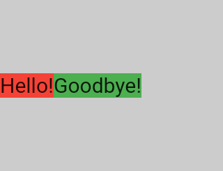
Row(children:[
       Container(color: red, child: Text('Hello!'))
       Container(color: green, child: Text('Goodbye!'))]
The screen forces the Row to be exactly the same size of the screen.
Just like an UnconstrainedBox, the Row won't impose any constraints to its children,
and will instead let them have any size they want.
The Row will then put them side by side, and any extra space will remain empty.
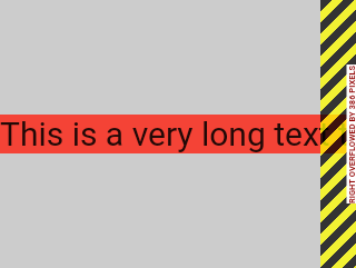
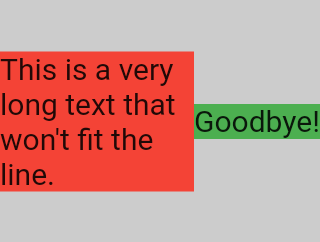
Row(children:[
      Container(color: red, child: Text('This is a very long text that won't fit the line.'))
      Container(color: green, child: Text('Goodbye!'))]
Since the Row won't impose any constraints to its children,
it's quite possible that the children will be too big to fit the available Row width.
In this case, just like an UnconstrainedBox, the Row will display the "overflow warning".
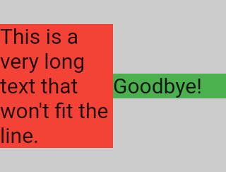
Row(children:[
   Expanded(
       child: Container(color: red, child: Text('This is a very long text that won't fit the line.')))
   Container(color: green, child: Text('Goodbye!'))]
When a Row child is wrapped in an Expanded widget, the Row will not let this child define its own width anymore.
Instead, it will define the Expanded width according to the other children,
and only then the Expanded widget will force the original child to have the Expanded's width.
In other words, once you use Expanded, the original child's width becomes irrelevant, and will be ignored.
Row(children:[
   Expanded(
       child: Container(color: red, child: Text('This is a very long text that won't fit the line.')))
   Expanded(
       child: Container(color: green, child: Text('Goodbye!'))]
If all Row children are wrapped in Expanded widgets,
each Expanded will have a size proportional to its flex parameter,
and only then each Expanded widget will force their child to have the Expanded's width.
In other words, the Expanded ignores their children preferred width.
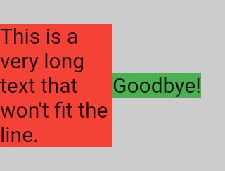
Row(children:[
   Flexible(
       child: Container(color: red, child: Text('This is a very long text that won't fit the line.')))
   Flexible(
       child: Container(color: green, child: Text('Goodbye!'))]
The only difference if you use Flexible instead of Expanded,
is that Flexible will let its child have the same or smaller width than the Flexible itself,
while Expanded forces its child to have the exact same width of the Expanded.
But both Expanded and Flexible will ignore their children widths when sizing themselves.
Note, this means it's impossible to expand Row children proportionally to their sizes.
The Row will either use the exact child's with, or ignore it completely when you use Expanded or Flexible.
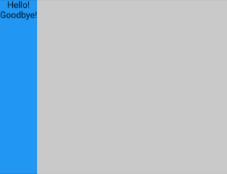
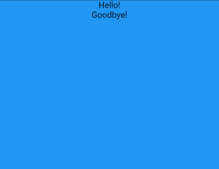
Scaffold(
   body: Container(
      color: blue,
      child: Column(
         children: [
            Text('Hello!'),
            Text('Goodbye!'),
         ])))
The screen forces the Scaffold to be exactly the same size of the screen.
So the Scaffold fills the screen.
The Scaffold tells the Container it can be any size it wants, but not bigger than the screen.
Note: When a widget tells its child it can be smaller than a certain size, we say the widget supplies "loose" constraints to its child. More on that in the article.
Scaffold(
   body: SizedBox.expand(
      child: Container(
         color: blue,
         child: Column(
            children: [
               Text('Hello!'),
               Text('Goodbye!'),
            ]))))
If we want the Scaffold's child to be exactly the same size as the Scaffold itself,
we can wrap its child into a SizedBox.expand.
Note: When a widget tells its child it must be of a certain size, we say the widget supplies "tight" constraints to its child. More on that in the article.
It's very common to hear that some constraint is "tight" or "loose", so it's worth knowing what it means.
A tight constraint offers a single possibility. An exact size. In other words, a tight constraint has its maximum width equal to its minimum width; and has its maximum height equal to its minimum height.
If you go to Flutter's box.dart file and search for the BoxConstraints constructors,
you will find this:
BoxConstraints.tight(Size size)
   : minWidth = size.width,
     maxWidth = size.width,
     minHeight = size.height,
     maxHeight = size.height;
If you revisit the Example 2 further above,
it tells us that the screen forces the red Container to be exactly the same size of the screen.
The screen does that, of course, by passing tight constraints to the Container.
A loose constraint, on the other hand, sets the maximum width/height, but lets the widget be as small as it wants. In other words, a loose constraint has minimum width/height both equal to zero:
BoxConstraints.loose(Size size)
   : minWidth = 0.0,
     maxWidth = size.width,
     minHeight = 0.0,
     maxHeight = size.height;
If you revisit the Example 3,
it tells us that the Center lets the red Container be smaller, but not bigger than the screen.
The Center does that, of course, by passing loose constraints to the Container.
If you revisit the Example 3,
it tells us that the Center lets the red Container be smaller, but not bigger than the screen.
The Center does that, of course, by passing loose constraints to the Container.
Ultimately, the Center's very purpose
is to transform the tight constraints it got from its parent (the screen)
to loose constraints for its child (the Container).
Knowing the general layout rule is necessary, but it's not enough.
Each widget has a lot of freedom when applying the general rule, so there is no way of knowing what it will do by just reading the widget's name. If you try to guess, you'll probably guess wrong. You can't know exactly how a widget will behave unless you've read its documentation, or studied its source-code.
The layout source-code is usually complex, so it's probably better to just read the documentation. However, if you decide to study the layout source-code, you can easily find it by using the navigating capabilities of your IDE.
Here is an example:
-
Find some
Columnin your code and navigate to its source-code (Ctrl-Bin IntelliJ). You'll be taken to thebasic.dartfile. SinceColumnextendsFlex, navigate toFlexsource-code (also inbasic.dart). -
Now scroll down until you find a method called
createRenderObject. As you can see, this method returns aRenderFlex. This is the corresponding render-object for theColumn. Now navigate to the source-code ofRenderFlex, which will take you to theflex.dartfile. -
Now scroll down until you find a method called
performLayout. This is the method which does the layout for theColumn.
Big thanks to Simon Lightfoot for proofreading and making content suggestions for this article.
Layout packages I've authored:
- align_positioned — Lets you declaratively position/size widgets in complex ways.
- assorted_layout_widgets
— Includes
RowSuperwhich will resize cells proportionately when content doesn't fit.
Other Flutter packages I've authored:
- async_redux
- provider_for_redux
- i18n_extension
- network_to_file_image
- matrix4_transform
- back_button_interceptor
- indexed_list_view
- animated_size_and_fade
- weak_map
My Medium Articles:
- Async Redux: Flutter’s non-boilerplate version of Redux (versions: Português)
- i18n_extension (versions: Português)
- Flutter: The Advanced Layout Rule Even Beginners Must Know (versions: русский)
My article in the official Flutter documentation:
Marcelo Glasberg:
https://github.com/marcglasberg
https://twitter.com/glasbergmarcelo
https://stackoverflow.com/users/3411681/marcg
https://medium.com/@marcglasberg


 React
React
 Typescript
 Django
 Laravel
 Facebook
 Microsoft
 Google
 Alibaba
 D3
D3
 Tencent