Giter Club home page Giter Club logo

react-dropdown-tree-select's Introduction

react-dropdown-tree-select


NPM version gzip npm download

build status Test coverage Commitizen friendly semantic-release All Contributors npm type definitions

React Dropdown Tree Select

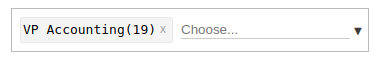
A lightweight and fast control to render a select component that can display hierarchical tree data. In addition, the control shows the selection in pills and allows user to search the options for quick filtering and selection. Also supports displaying partially selected nodes.

Table of Contents

Screenshot

animated demo screenshot

Demo

Vanilla, no framework

Online demo: https://dowjones.github.io/react-dropdown-tree-select/#/story/with-vanilla-styles

With Bootstrap

Online demo: https://dowjones.github.io/react-dropdown-tree-select/#/story/with-bootstrap-styles

With Material Design

Online demo: https://dowjones.github.io/react-dropdown-tree-select/#/story/with-material-design-styles

As Single Select

Online demo: https://dowjones.github.io/react-dropdown-tree-select/#/story/simple-select

Install

As NPM package

npm i react-dropdown-tree-select

// or if using yarn
yarn add react-dropdown-tree-select

Using a CDN

You can import the standalone UMD build from a CDN such as:

<script src="https://unpkg.com/react-dropdown-tree-select/dist/react-dropdown-tree-select.js"></script>
<link href="https://unpkg.com/react-dropdown-tree-select/dist/styles.css" rel="stylesheet" />

Note: Above example will always fetch the latest version. To fetch a specific version, use https://unpkg.com/react-dropdown-tree-select@<version>/dist/... Visit unpkg.com to see other options.

Peer Dependencies

In order to avoid version conflicts in your project, you must specify and install react, react-dom as peer dependencies. Note that NPM(version 4-6) doesn't install peer dependencies automatically. Instead it will show you a warning message with instructions on how to install them. If using Npm 7.X.X version, peer dependencies will be installed automatically.

If you're using the UMD builds, you'd also need to install the peer dependencies in your application:

<script src="https://unpkg.com/react/dist/react.js"></script>
<script src="https://unpkg.com/react-dom/dist/react-dom.js"></script>

Usage

import React from 'react'
import ReactDOM from 'react-dom'

import DropdownTreeSelect from 'react-dropdown-tree-select'
import 'react-dropdown-tree-select/dist/styles.css'

const data = {
  label: 'search me',
  value: 'searchme',
  children: [
    {
      label: 'search me too',
      value: 'searchmetoo',
      children: [
        {
          label: 'No one can get me',
          value: 'anonymous',
        },
      ],
    },
  ],
}

const onChange = (currentNode, selectedNodes) => {
  console.log('onChange::', currentNode, selectedNodes)
}
const onAction = (node, action) => {
  console.log('onAction::', action, node)
}
const onNodeToggle = currentNode => {
  console.log('onNodeToggle::', currentNode)
}

ReactDOM.render(
  <DropdownTreeSelect data={data} onChange={onChange} onAction={onAction} onNodeToggle={onNodeToggle} />,
  document.body
) // in real world, you'd want to render to an element, instead of body.

Props

className

Type: string

Additional classname for container. The container renders with a default classname of react-dropdown-tree-select.

clearSearchOnChange

Type: bool

Clear the input search if a node has been selected/unselected.

onChange

Type: function

Fires when a node change event occurs. Currently the following actions trigger a node change:

  • Checkbox click which checks/unchecks the item
  • Closing of pill (which unchecks the corresponding checkbox item)

Calls the handler with the current node object and all selected nodes (if any). Example:

function onChange(currentNode, selectedNodes) {
  // currentNode: { label, value, children, expanded, checked, className, ...extraProps }
  // selectedNodes: [{ label, value, children, expanded, checked, className, ...extraProps }]
}

return <DropdownTreeSelect data={data} onChange={onChange} />

onNodeToggle

Type: function

Fires when a node is expanded or collapsed.

Calls the handler with the current node object. Example:

function onNodeToggle(currentNode) {
  // currentNode: { label, value, children, expanded, checked, className, ...extraProps }
}

return <DropdownTreeSelect data={data} onNodeToggle={onNodeToggle} />

onAction

Type: function

Fires when a action is triggered. Example:

function onAction(node, action) {
  console.log('onAction::', action, node)
}

return <DropdownTreeSelect data={data} onAction={onAction} />

onFocus

Type: function

Fires when input box receives focus or the dropdown arrow is clicked. This is helpful for setting dirty or touched flags with forms.

onBlur

Type: function

Fires when input box loses focus or the dropdown arrow is clicked again (and the dropdown collapses). This is helpful for setting dirty or touched flags with forms.

data

Type: Object or Array

Data for rendering the tree select items. The object requires the following structure:

{
  label,          // required: Checkbox label
  value,          // required: Checkbox value
  children,       // optional: Array of child objects
  checked,        // optional: Initial state of checkbox. if true, checkbox is selected and corresponding pill is rendered.
  disabled,       // optional: Selectable state of checkbox. if true, the checkbox is disabled and the node is not selectable.
  expanded,       // optional: If true, the node is expanded (children of children nodes are not expanded by default unless children nodes also have expanded: true).
  className,      // optional: Additional css class for the node. This is helpful to style the nodes your way
  tagClassName,   // optional: Css class for the corresponding tag. Use this to add custom style the pill corresponding to the node.
  actions,        // optional: An array of extra action on the node (such as displaying an info icon or any custom icons/elements)
  dataset,        // optional: Allows data-* attributes to be set on the node and tag elements
  isDefaultValue, // optional: Indicate if a node is a default value. When true, the dropdown will automatically select the node(s) when there is no other selected node. Can be used on more than one node.
  tagLabel,       // optional: tag label in case you need it to differ from the checkbox label
  ...             // optional: Any extra properties that you'd like to receive during `onChange` event
}

The action object requires the following structure:

{
  className, // required: CSS class for the node. e.g. `fa fa-info`
  title,     // optional: HTML tooltip text
  text,      // optional: Any text to be displayed. This is helpful to pass ligatures if you're using ligature fonts
  ...        // optional: Any extra properties that you'd like to receive during `onChange` event
}

An array renders a tree with multiple root level items whereas an object renders a tree with a single root element (e.g. a Select All root node).

texts

Texts to override various labels, place holders & messages used in the component. You can also use this to provide translated messages.

The texts object requires the following structure:

{
  placeholder,              // optional: The text to display as placeholder on the search box. Defaults to `Choose...`
  inlineSearchPlaceholder,  // optional: The text to display as placeholder on the inline search box. Only applicable with the `inlineSearchInput` setting. Defaults to `Search...`
  noMatches,                // optional: The text to display when the search does not find results in the content list. Defaults to `No matches found`
  label,                    // optional: Adds `aria-labelledby` to search input when input starts with `#`, adds `aria-label` to search input when label has value (not containing '#')
  labelRemove,              // optional: The text to display for `aria-label` on tag delete buttons which is combined with `aria-labelledby` pointing to the node label. Defaults to `Remove`
}

keepTreeOnSearch

Type: bool

Displays search results as a tree instead of flattened results

keepChildrenOnSearch

Type: bool

Displays children of found nodes to allow searching for a parent node on then selecting any child node of the found node. Defaults to false

NOTE this works only in combination with keepTreeOnSearch

keepOpenOnSelect

Type: bool (default: 'false')

Keeps single selects open after selection. Defaults to false

NOTE this works only in combination with simpleSelect or radioSelect

mode

Type: string (default: multiSelect)

Defines how the dropdown is rendered / behaves

multiSelect

A multi selectable dropdown which supports tree data with parent-child relationships. This is the default mode.

hierarchical

A multi selectable dropdown which supports tree data without parent-child relationships. In this mode, selecting a node has no ripple effects on its descendants or ancestors. Subsequently, showPartiallySelected becomes a moot flag and has no effect as well.

⚠️ Note that hierarchical=true negates/overrides showPartiallySelected.

simpleSelect

Turns the dropdown into a simple, single select dropdown. If you pass tree data, only immediate children are picked, grandchildren nodes are ignored.

⚠️ If multiple nodes in data are selected - by setting either checked or isDefaultValue, only the first visited node stays selected.

radioSelect

Turns the dropdown into radio select dropdown.

Like simpleSelect, you can only select one value; but keeps the tree/children structure.

⚠️ If multiple nodes in data are selected - by setting either checked or isDefaultValue, only the first visited node stays selected.

showPartiallySelected

Type: bool (default: false)

If set to true, shows checkboxes in a partial state when one, but not all of their children are selected. Allows styling of partially selected nodes as well, by using :indeterminate pseudo class. Simply add desired styles to .node.partial .checkbox-item:indeterminate { ... } in your CSS.

showDropdown

Type: string

Let's you choose the rendered state of the dropdown.

initial

showDropdown: initial shows the dropdown when rendered. This can be used to render the component with the dropdown open as its initial state.

always

showDropdown: always shows the dropdown when rendered, and keeps it visible at all times. Toggling dropdown is disabled.

form states (disabled|readOnly)

Type: bool (default: false)

disabled=true disables the dropdown completely. This is useful during form submit events. readOnly=true makes the dropdown read only, which means that the user can still interact with it but cannot change any of its values. This can be useful for display only forms.

id

Type: string

Specific id for container. The container renders with a default id of rdtsN where N is the count of the current component rendered.

Use to ensure a own unique id when a simple counter is not sufficient, e.g in a partial server render (SSR)

searchPredicate

Type: function

Optional search predicate to override the default case insensitive contains match on node labels. Example:

function searchPredicate(node, searchTerm) {
  return node.customData && node.customData.toLower().indexOf(searchTerm) >= 0
}

return <DropdownTreeSelect data={data} searchPredicate={searchPredicate} />

inlineSearchInput

Type: bool (default: false)

inlineSearchInput=true makes the search input renders inside the dropdown-content. This can be useful when your UX looks something like this comment.

tabIndex

Type: number (default: 0)

tabIndex=0 attribute indicates that its element can be focused, and where it participates in sequential keyboard navigation.

disablePoppingOnBackspace

Type: bool (default: false)

disablePoppingOnBackspace=true attribute indicates that when a user triggers a 'backspace' keyDown in the empty search bar, the tree will not deselect nodes.

Styling and Customization

Default styles

The component brings minimal styles for bare-bones functional rendering. It is kept purposefully minimal so that user can style/customize it completely to suit their needs.

Using WebPack

If you're using a bundler like WebPack, make sure you configure WebPack to import the default styles. To do so, simply add this rule to your WebPack config:

// allow WebPack to import/bundle styles from node_modules for this component
module: {
  rules: [
    {
      test: /\.css$/,
      use: ExtractTextPlugin.extract({
        fallback: 'style-loader',
        use: [
          {
            loader: 'css-loader',
          },
        ],
      }),
      include: /node_modules[/\\]react-dropdown-tree-select/,
    },
  ]
}

Using a CDN

You can import and place a style link directly by referencing it from a CDN.

<link href="https://unpkg.com/react-dropdown-tree-select/dist/styles.css" rel="stylesheet" />

Note: Above example will always fetch the latest version. To fetch a specific version, use https://unpkg.com/react-dropdown-tree-select@<version>/dist/styles.css. Visit unpkg.com to see other options.

Using with other bundlers

You can reference the files from node_modules/react-dropdown-tree-select/dist/styles.css to include in your own bundle via gulp or any other bundlers you have.

Customizing styles

Once you import default styles, it is easy to add/override the provided styles to match popular frameworks. Checkout /docs folder for some examples.

Keyboard navigation

Adds navigation with arrow keys, page down/up / home/end and toggle of selection with enter. Arrow/page up/down also toggles open of dropdown if closed.

To close open dropdown escape or tab can be used and backspace can be used for deletion of tags on empty search input.

Performance

Search optimizations

  • The tree creates a flat list of nodes from hierarchical tree data to perform searches that are linear in time irrespective of the tree depth or size.
  • It also memoizes each search term, so subsequent searches are instantaneous (almost).
  • Last but not the least, the search employs progressive filtering technique where subsequent searches are performed on the previous search set. E.g., say the tree has 4000 nodes altogether and the user wants to filter nodes that contain the text: "2002". As the user enters each key press the search goes like this:
key press  : 2-----20-----200-----2002
            |     |      |       |
search set: 967   834    49      7

The search for "20" happens against the previously matched set of 967 as opposed to all 4000 nodes; "200" happens against 834 nodes and so on.

Search debouncing

The tree debounces key presses to avoid costly search calculations. The default duration is 100ms.

Virtualized rendering

The dropdown renders only visible content and skips any nodes that are going to hidden from the user. E.g., if a parent node is not expanded, there is no point in rendering children since they will not be visible anyway.

Planned feature: Use react-virtualized to take this to the next level. The search tree now uses infinite scroll, limiting search results to 100 items initially (more load seamlessly as you scroll) - this results in super fast rendering even with large number of nodes (see #80).

Reducing costly DOM manipulations

The tree tries to minimize the DOM manipulations as much as possible. E.g., during searching, the non-matching nodes are simply hidden and css adjusted on remaining to create the perception of a new filtered list. Node toggling also achieves the expand/collapse effect by manipulating css classes instead of creating new tree with filtered out nodes.

FAQ

How do I change the placeholder text?

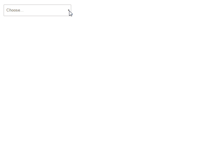
The default placeholder is Choose.... If you want to change this to something else, you can use placeholder property to set it.

<DropdownTreeSelect texts={{ placeholder: 'Search' }} />

How do I tweak styles?

Easy style customization is one of the design goals of this component. Every visual aspect of this dropdown can be tweaked without going through extensive hacks. E.g., to change how disabled nodes appear:

.node .fa-ban {
  color: #ccc;
}

The css classes needed to override can be found by inspecting the component via developer tools (Chrome/Safari/IE/Edge/Firefox). You can also inspect the source code or look in examples.

I do not want the default styles, do I need to fork the project?

Absolutely not! Simply do not import the styles (WebPack) or include it in your html (link tags). Roughly, this is the HTML/CSS skeleton rendered by the component:

div.react-dropdown-tree-select
  div.dropdown
    a.dropdown-trigger
      span
    ul.tag-list
      li.tag-item
        input
    div.dropdown-content
      ul.root
        li.node.tree
          i.toggle.collapsed
          label
            input.checkbox-item
              span.node-label

Write your own styles from scratch or copy existing styles and tweak them. Then include your own custom styles in your project.

💡 Pro tip: Leverage node's className, tagClassName or action's className prop to emit your own class name. Then override/add css propeties in your class. Remember that last person wins in CSS (unless specificity or !important is involved). Often times, this may suffice and may be easier then writing all the styles from the ground up.

If you believe this aspect can be improved further, feel free to raise an issue.

My question is not listed here

Find more questions and their answers in the issue tracker. If it still doesn't answer your questions, please raise an issue.

Development

Clone the git repo and install dependencies.

npm i

// or

yarn install

You can then run following scripts for local development

npm run demo  // local demo, watches and rebuilds on changes

npm test  // test your changes

npm lint  // fixes anything that can be fixed and reports remaining errors

npm run test:cov  // test coverage

Note: If your browser doesn't hot reload or reflect changes during npm run demo, then delete docs/bundle.js and try again. Before submitting final PR, run npm run build:docs to build the bundle.js file again.

License

License

Released 2017 by Hrusikesh Panda @ Dow Jones

Contributors

Thanks goes to these wonderful people (emoji key):


toofff

🐛 💻 📖 🤔

Grégory Copin

🐛 💻

PRIYANSHU AGRAWAL

🐛 💻 🤔

James Greenaway

🐛 💻 🤔

itrombitas

💻

Dave Henton

🚇

Swetha Kolli

💻

BaarishRain

🐛

Kovacs Alexandru Robert

🤔

Alexis Mondragon

🤔

Charlie91

🐛

Dhirendrasinh

🐛

JKapostins

🐛

josvegit

🐛

Luis Locon

🐛

Mikdat DOĞRU

🐛

Will Izard

🤔

Nikola Peric

🐛

Ramón Alejandro Reyes Fajardo

🐛

Sarada Cherukupalli

🤔

Dilip Gavara

💻

Lutz Lengemann

💻

Akshay Dipta

🐛

Ian Langworth ☠

🤔

Stoyan Berov

🐛

ellinge

💻 🤔 🚧

Sandy M

💻 🐛

Gustav Tonér

💻

Kestutis Kasiulynas

🐛 💻

Jesus Cabrera Gonzalez

💻

MJRuskin

💻

akarshjairaj

💻

Artem Berdyshev

💻 🐛

Matheus Wichman

💻

aarce-uncharted

💻

Mohamad Othman

💻 🤔

kathleenlu

💻 🐛

r-zane-spalding

💻

This project follows the all-contributors specification. Contributions of any kind welcome!

react-dropdown-tree-select's People

Contributors

aarce-uncharted avatar allcontributors[bot] avatar dilip025 avatar dpkm95 avatar eduardohley avatar ellinge avatar gandhis1 avatar gazab avatar greenkeeper[bot] avatar gregcop1 avatar ingmothman avatar isuscbrmid avatar jvgreenaway avatar kulgar avatar kyem avatar ldeveber avatar m4theushw avatar marianjuhas avatar mjruskin avatar mobilutz avatar moonjy1993 avatar mrchief avatar nagaskolli avatar non-engineer-dev avatar paycorchauhan avatar pckilgore avatar priyanshu92 avatar r-zane-spalding avatar smurfs2549 avatar toofff avatar

Stargazers

 avatar  avatar  avatar  avatar  avatar  avatar  avatar  avatar  avatar  avatar  avatar  avatar  avatar  avatar  avatar  avatar  avatar  avatar  avatar  avatar  avatar  avatar  avatar  avatar  avatar  avatar  avatar  avatar  avatar  avatar  avatar  avatar  avatar  avatar  avatar  avatar  avatar  avatar  avatar  avatar  avatar  avatar  avatar  avatar  avatar  avatar  avatar  avatar  avatar  avatar  avatar  avatar  avatar  avatar  avatar  avatar  avatar  avatar  avatar  avatar  avatar  avatar  avatar  avatar  avatar  avatar  avatar  avatar  avatar  avatar  avatar  avatar  avatar  avatar  avatar  avatar  avatar  avatar  avatar  avatar  avatar  avatar  avatar  avatar  avatar  avatar  avatar  avatar  avatar  avatar  avatar  avatar  avatar  avatar  avatar  avatar  avatar  avatar  avatar  avatar

Watchers

 avatar  avatar  avatar  avatar  avatar  avatar  avatar  avatar  avatar  avatar  avatar  avatar  avatar  avatar  avatar  avatar  avatar  avatar  avatar

react-dropdown-tree-select's Issues

Feature request: Configure the number of selected chips to display

I have a feature request to allow users to specify the maximum number of chips that can be displayed in the dropdown. Once the selected options reach that limit we can show More... text and on clicking that we can show all the selected options with Less... text just before the search box. On clicking Less... it will again show the number of chips specified by the user.

Furthermore, users can specify the text/component that should be shown in place of More... and Less....

Please let me know what you think about this feature.

Below is a GIF showing how it can work. (Example is configured to show maximum of 2 selected options)

showmoreless

Dropdown closes when child option is selected

I have a <DropdownTreeSelect> component with a 3-tier hierarchy of data. I'm using this as a search filter, so onChange I'm sending the data upstream so the search can be performed. When the app re-renders, my search filter receives the selected items as props, and then I'm editing the data I'm providing to the <DropdownTreeSelect> to set the proper items as checked = true.

Everything works perfectly for top-tier parent items. However, when I open a parent item and select a child item, the dropdown immediately closes. The data flow is still working as expected, I'm just not sure why the dropdown closes. I'd like for it to stay open until the user chooses to close it. I also don't understand why it would be working for the parent items but not child items. Any idea what could be going on here?

I'll also note that when I remove my custom onChange function, the dropdown stays open no matter what items I select (but of course my search dataflow no longer works).

Dispatching React Redux actions via onChange, onAction, onNodeToggle

I'm using React Redux in my project, and I've been trying to get the drop down to work correctly. In onChange, onAction, onNodeToggle I'm calling redux actions, which essentially is just a function that passes the variables to a reducer that sets the state tree.

Here's the component definition:

<DropdownTreeSelect
	data={this.props.state.tree}
	onChange={(currentNode, selectedNodes) => {
		this.props.actions.treeChange(currentNode, selectedNodes)
	}}
	onAction={({ action, node }) => {
		this.props.actions.treeAction(action, node)
	}}
	onNodeToggle={currentNode => {
		this.props.actions.treeNodeToggle(currentNode)
	}}
	placeholderText={'Select...'}
/>

Let's use the onChange event as an example. Here's the code for the treeChange action:

export const treeChange = (currentNode, selectedNodes) => {
    return (dispatch, getState) => {
        dispatch({
            type: types.TREE_CHANGE,
            payload: {
                currentNode: currentNode,
                selectedNodes: selectedNodes
            }
        })
    }
}

The event fires correctly, the action dispatches correctly, the state tree is modified correctly, i.e. currentNode and selectedNode is passed along and the state is set as desired.

The problem is that the control itself is not updating, i.e. the checkboxes do not get selected, the nodes don't toggle at all. It appears that the "rest" of the function that's supposed to happen after the action is dispatched just doesn't happen. If I comment out actions inside the events, it works perfectly fine.

I might be missing something really obvious... Any help would be appreciated. Thanks!

Feature request: Parent select shouldn't select all children

Hi. I'm looking for a widget where a branch or leaf in the tree can be selected. Selecting a branch/parent does not mean the children are selected. Otherwise, this widget looks great! Is there any way you could add that as a configuration option? Or maybe I overlooked a way to do this already?
The use case is that you're selecting a category in a tree. You can select 1 or more categories, but the categories can be parent or child (ie branch or leaf) categories.
Thanks!

Add CSS class for partial selected on parent node

Hello,

Already a big thank you for your work 👏

I need a CSS class that is not present at the moment in your plugin.
Adding a CSS class on the parent node when children are partially selected.

In my example, below, the 'SKI DE FOND' node should have this CSS class because their second child is not selected.
capture d ecran de 2018-03-15 16-51-18

Does this feature seem interesting to you for your plugin?

Complete Tree Retrieval

How can I retrieve the complete tree structure containing the selected as well as unselected nodes? Till now I only have the 'selecteNodes' array and 'clickedElement' information but I am unable to save the complete tree on submit button.

Get all selected values (including childrens)

Hi,
Is it possible to get all children values when a parent is selected? Or maybe to get the whole flattened tree and then filter it?
Btw, is it normal that children is undefined in currentNode or SelectedNodes in the onChange callback?

question: exclude level from available selection

Hi, for our project, we need to disallow selection on specific level. I think I can to this by wrapping DropdownTreeSelect with a custom component which will catch selection and do the job. I don't know if you want to enable this kind of behaviour in your plugin. If so, I can make a pull request to build this natively instead of using an wrapping component.

Compatibility with IE11

Hi could you please change "console.table" to "console.log" or just add some props to disable it. so we can use this lib on IE11.

thx in advance 💯

Styles is not included by default

Hello.
Thank you for your useful library.
I have found a possible issue. When i include your lib in my React.Component it has not any style within itself.
So, it requires to import additional styles which i took from node_modules;

Styles are missing for the component

Hi

I just installed this component and tried to run and noticed that it's missing a few styles. I don't see the arrow in select input and the expander symbols for opening and closing the data items. Also, only if I search for a keyword, it would expand the data items as shown in the screen-shots. Please advise!

Thanks!

image
image

Ability to have default values

When the dropdown is initialized I set a default pill that is selected, Im trying to see how I could reset this pill in case this pill is removed and they don't select anything else when they close the dropdown.

proptype issue

hi
at the first better u know I'm new at the react
I use this but see this error
Calling PropTypes validators directly is not supported by the prop-types package. Use PropTypes.checkPropTypes() to call them.

Is lazy loading possible?

There are two somewhat related parts to this question:

  • Is it possible to lazily load child nodes when the parent (or some ancestor) is expanded?
  • Is it possible to use a remote service to fetch search results instead of using only the locally available data?

Nice work on this component btw. It seems very useful. 👍

Leaf to Root Node

Given a leaf node, Is there a way to find it's full path to the root node?

uncontrolled warning on console

i can use react 16.2.0

All versions above 1.3.0 have the following warning to console; (1.4.0, 1.5.0, 1,6,0, 1,6,1 ... 1.7.0)

When choosing item from Dropdown options

index.js:2178 Warning: A component is changing an uncontrolled input of type checkbox to be controlled. Input elements should not switch from uncontrolled to controlled (or vice versa). Decide between using a controlled or uncontrolled input element for the lifetime of the component. More info: https://fb.me/react-controlled-components
in input (created by c)
in label (created by c)
in c (created by C)
in li (created by C)
in C (created by l)
in ul (created by l)
in l (created by t)
in div (created by t)
in t (at App.js:43)
in div (at App.js:38)
in App (at index.js:7)

clicking outside and closing the dropdown

Warning: An update (setState, replaceState, or forceUpdate) was scheduled from inside an update function. Update functions should be pure, with zero side-effects. Consider using componentDidUpdate or a callback.

image

Incorrect behavior while using showPartiallySelected property

Hi,

Thanks for this awesome component 😄 . I am using it to show multiple hierarchies on a page and the data for these hierarchies is pulled from a web API. When the data is loaded then the component is rendered.

The problem which I am facing is when I use showPartiallySelected property then the root node(s) become automatically checked in the UI and I see the pill(s) for all of them. I have explicitly marked the property checked as false in the data but that doesn't help also.

Could you please look into this issue? Let me know if you need more details.

PS: I cloned the repo and used showPartiallySelected in the Large Tree example and same thing happens. The root node is checked by default. However, it works fine in the Default Values example. 🤔

Thanks,
Priyanshu

Would it be interesting to have an onChangeAfter?

When we use the onChange method, we have to rewrite the desired behaviors, which I find problematic.

Could we consider having an onChangeAfter entry, to retrieve the event on the current element and the data modified by the component?

Here is my problem, when I want to update my store I go through the onChange method to retrieve the selected items.

So if I select or deselect a node, I get the selected item, but the different desired behavior are not done anymore:

  • selection of children
  • parents' deselection
  • ...

Maybe have a simpler solution and already implemented?

Support disabled, readonly attributes

Disabled and readonly states should prevent the control from being edited. This will also support better integration as form control with components like redux-forms and formik.

Select tree permanently outside choose box (not pop out arrow)

Hi
I'd like some help to understand why my choose box isn't behaving as expected please.
I'm using the bootstrap demo and the select tree is working fine but there is no arrow (or inverted arrow) for the choose box and the select tree values do not populate the choose box.
In short the choose box has no functionality.
slect_drop_tree
Thanks

The automated release is failing 🚨

🚨 The automated release from the master branch failed. 🚨

I recommend you give this issue a high priority, so other packages depending on you could benefit from your bug fixes and new features.

You can find below the list of errors reported by semantic-release. Each one of them has to be resolved in order to automatically publish your package. I’m sure you can resolve this 💪.

Errors are usually caused by a misconfiguration or an authentication problem. With each error reported below you will find explanation and guidance to help you to resolve it.

Once all the errors are resolved, semantic-release will release your package the next time you push a commit the master branch. You can also manually restart the failed CI job that runs semantic-release.

If you are not sure how to resolve this, here is some links that can help you:

If those don’t help, or if this issue is reporting something you think isn’t right, you can always ask the humans behind semantic-release.


The push permission to the Git repository is required.

semantic-release cannot push the version tag to the branch master on remote Git repository.

Please refer to the authentication configuration documentation to configure the Git credentials on your CI environment.


Good luck with your project ✨

Your semantic-release bot 📦🚀

Error running tests with PhantomJS

Hi All,
I am trying to use this component in order to replace an older hierarchy selector component. I am facing issue while running the tests on webpack yarn run test-once (which basically runs karma start --log-level info --single-run --browsers PhantomJS) while the test pass with Chrome browser running continuously using yarn run test. I installed the component using yarn add react-dropdown-tree-select and using a mix of default and custom styles.I have copied default styles into a scss file in our project and also import the react-dropdown-tree-select styles like this @import '../node_modules/react-dropdown-tree-select/dist/styles.css' in our common app.scss file which includes all the style imports. We use webpack to bundle the code and following is the error in Jenkins:

PhantomJS 2.1.1 (Linux 0.0.0) ERROR
  {
    "message": "SyntaxError: Unexpected token 'const'\nat tests.webpack.js:140960:0",
    "str": "SyntaxError: Unexpected token 'const'\nat tests.webpack.js:140960:0"
  }
PhantomJS 2.1.1 (Linux 0.0.0) ERROR
  {
    "message": "SyntaxError: Unexpected token 'const'\nat tests.webpack.js:140960:0",
    "str": "SyntaxError: Unexpected token 'const'\nat tests.webpack.js:140960:0"
  }

Anyone faced this issue before while using this component? Any help/suggestions would be appreciated.

Default child value?

How can i set if the child is default value to select? when set isDefaultValue true in child, parent automatically checked.

Broken support for Server Side Rendering

Version 1.11.0 introducing react-infinite-scroll-component at the same time breaks server-side rendering because this dependency uses window internally.

ERROR:
ReferenceError: window is not defined

Is it possible to use a custom node and to hide the tag list?

I was wondering is it possible to use custom node component. I would like to replace the checkbox with another widget and I mean widget, not just styling the input. As far as I saw in the source code- the node is not a prop. Maybe if I use a HOC?

And my second question is regarding the tags list - is it possible to disable it?

Expose onFocus, onBlur events

Forms like redux-form rely on onFocus, onBlur events to toggle dirty, touched states. Exposing these will help in validation.

Use as subcomponent

When using the component as a subcomponent componentWillReceiveProps of DropdownTreeSelect will be called for every setState in the parent component which rebuilds everything using data prop (even if data has not changed and even if it is a const variable). This means I have to update data otherwise all selections are cleared on every componentWillReceiveProps.

Since I don't want to manage the selections myself I changed componentWillReceiveProps to check if the data prop has changed and ignore it otherwise. This is however very ugly and more of a hack since the prop and the actual tree diverge this way -> I use data prop as the initial tree (see fork).

My only idea to solve this would be to return the updated tree on onChange (). This way the parent component can still decide to change the selections and the data prop and the actual selections are always in sync. However, this still means that on every componentWillReceiveProps everything is recreated (not sure what this means for the performance).

Any thoughts on this? Did I miss something really obvious?

Version 10 of node.js has been released

Version 10 of Node.js (code name Dubnium) has been released! 🎊

To see what happens to your code in Node.js 10, Greenkeeper has created a branch with the following changes:

  • Added the new Node.js version to your .travis.yml

If you’re interested in upgrading this repo to Node.js 10, you can open a PR with these changes. Please note that this issue is just intended as a friendly reminder and the PR as a possible starting point for getting your code running on Node.js 10.

More information on this issue

Greenkeeper has checked the engines key in any package.json file, the .nvmrc file, and the .travis.yml file, if present.

  • engines was only updated if it defined a single version, not a range.
  • .nvmrc was updated to Node.js 10
  • .travis.yml was only changed if there was a root-level node_js that didn’t already include Node.js 10, such as node or lts/*. In this case, the new version was appended to the list. We didn’t touch job or matrix configurations because these tend to be quite specific and complex, and it’s difficult to infer what the intentions were.

For many simpler .travis.yml configurations, this PR should suffice as-is, but depending on what you’re doing it may require additional work or may not be applicable at all. We’re also aware that you may have good reasons to not update to Node.js 10, which is why this was sent as an issue and not a pull request. Feel free to delete it without comment, I’m a humble robot and won’t feel rejected 🤖


FAQ and help

There is a collection of frequently asked questions. If those don’t help, you can always ask the humans behind Greenkeeper.


Your Greenkeeper Bot 🌴

Simple select with tree view structure

Hi Team,

I have a need to show the dropdown option in a hierarchy form and allow only to select one of them.
I tried passing keepTreeOnSearch and simpleSelect to the component but it is not working.
Do you know if there is a way to acheive this?

question: embed some node info on tag

The idea is to have children and leaf count on each node and to embed those infos on node and tag items via custom attributes ("data-nb-children", "data-nb-leaf" for ex.) so user can display them with a bit of css if he need it.

Displaying something like that
capture d ecran de 2018-02-26 15-41-18
is done via content: "("attr(data-nb-leaves)")";

I don't know if you want something like that in your module but if so, I've got a PR for you ;)

Recommend Projects

  • React photo React

    A declarative, efficient, and flexible JavaScript library for building user interfaces.

  • Vue.js photo Vue.js

    🖖 Vue.js is a progressive, incrementally-adoptable JavaScript framework for building UI on the web.

  • Typescript photo Typescript

    TypeScript is a superset of JavaScript that compiles to clean JavaScript output.

  • TensorFlow photo TensorFlow

    An Open Source Machine Learning Framework for Everyone

  • Django photo Django

    The Web framework for perfectionists with deadlines.

  • D3 photo D3

    Bring data to life with SVG, Canvas and HTML. 📊📈🎉

Recommend Topics

  • javascript

    JavaScript (JS) is a lightweight interpreted programming language with first-class functions.

  • web

    Some thing interesting about web. New door for the world.

  • server

    A server is a program made to process requests and deliver data to clients.

  • Machine learning

    Machine learning is a way of modeling and interpreting data that allows a piece of software to respond intelligently.

  • Game

    Some thing interesting about game, make everyone happy.

Recommend Org

  • Facebook photo Facebook

    We are working to build community through open source technology. NB: members must have two-factor auth.

  • Microsoft photo Microsoft

    Open source projects and samples from Microsoft.

  • Google photo Google

    Google ❤️ Open Source for everyone.

  • D3 photo D3

    Data-Driven Documents codes.