MutViz - Analysis and Visualization of Mutation Enrichments for Selected Genomic Regions and Cancer Types
Try MutViz: http://gmql.eu/mutviz/
MutViz helps to identify enrichments of somatic mutations (single nucelotide variants) falling on predefined or user-specified sets of genomic regions, such as transcription factor binding sites, promoters, specific gene sets and others.
Users can choose among several mutation datasets collected from public repositories and upload custom sets of genomic regions in a BED file format.
Moreover, MutViz provides visualization features and simple statistics that ease the comparative analysis between different types ofmutations (e.g., "C→T" is one such type) and different sets of regions and mutations.
The mutations database was build starting from ICGC data (download date July 2019).
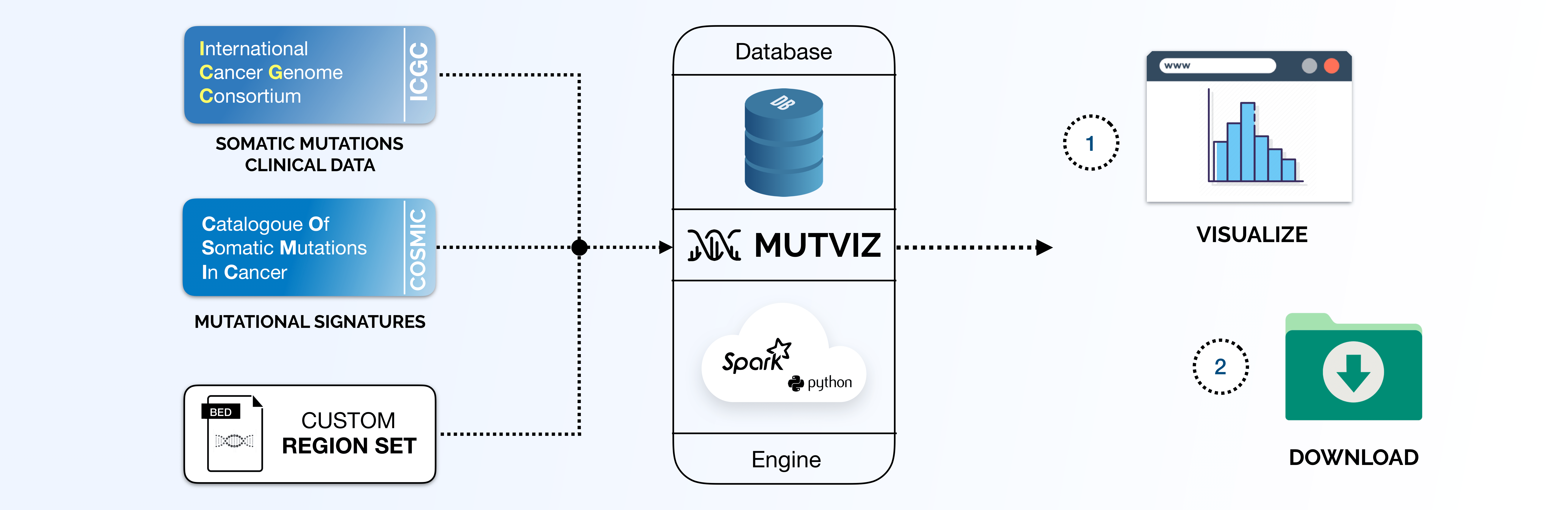
Data and Workspace
Before using the tool, the user must add at least one dataset to the workspace:
-
Either uploading a custom file (BED or narrowpeak). E.g. of BED file:
chr10	102639623	102639642	*
chr10	102639678	102639697	*
-
Or choosing a dataset from our public repository.
All regions should use reference genome hg19. The workspace structure is stored on the browser's local storage and will be available until the local storage is deleted. Therefore, closing the browser or reloading the page won't erase data in your work space. However, uploaded region sets will disappear from the workspace as soon as their survival time on our database expires (few days).
MutViz 1.0
Visualizations in this section were presented at the IEEE BIBM 2019 Conference, San Diego. You can find the related publication on IEEE Xplore.
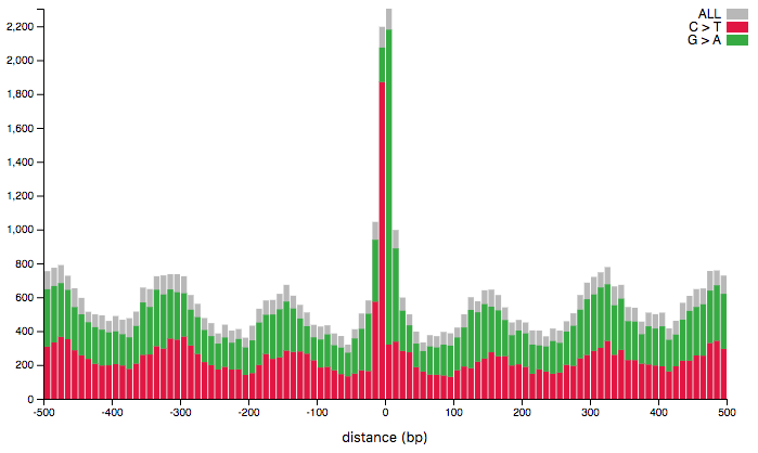
Histogram
The visualization consists of an histogram showing the distribution of mutations around the regions in the provided region-set. The x-axis represents the distance from the center of the provided regions, computed as (start+stop)/2, and the y-axis represents the number of mutations falling in the corresponding bin. Use the toolbar on the left to select:
- A region set, among the ones added to the workspace.
- A tumor type: only mutations for the selected tumor type will be displayed.
- Mutation classes: while they gray rectangles show all the mutations, colored bars represent only the selected mutation classes.
- By enabling the stacked option the tool will represent each selected mutation class with a different color.
- Disabling show total, the gray bars representing all the mutations will be removed from the plot.
- bin size: number of base pairs per bin.
- min-y: the mininum height for the y-axis. The horizontal slider helps restricting the domain. The statistical test box allows to select the area to test for increased (decreased) mutation rate by specifying the initial and final x-coordinate of the area. The testing area is displayed in the plot as a light-blue rectangle. The bin-coordinate column shows the bins corresponding to the selected coordinates. The p-value is the result of the performed permutation test. Only the selected mutation classes will be considered for testing. For further details, please refer to our 2019 IEEE BIBM paper.
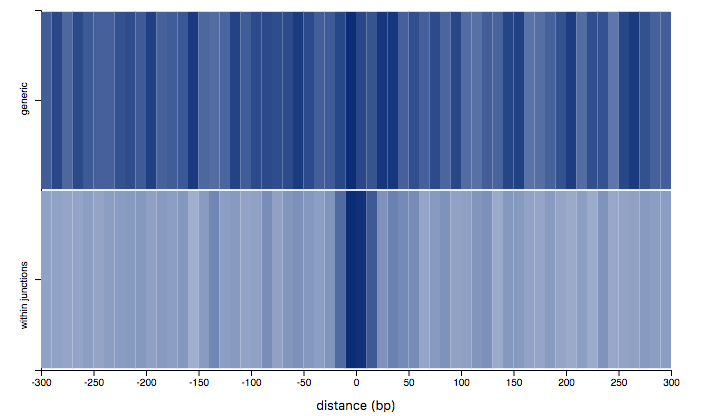
Region Comparison
The visualization allows to compare the distribution of mutations around regions in two different region-sets through a heat-map. The x-axis represents the distance from the center of the provided regions, computed as (start+stop)/2, the y-axis discriminates the two selected region sets and the color-intensity represents the amount of mutations falling in a given bin. The most opaque bin for a region set represents the bin containing the highest number of mutations. Use the toolbar on the left to select:
- Two region sets, among the ones added to the workspace.
- A tumor type: only mutations for the selected tumor type will be displayed.
- Mutation classes: only mutations belonging to the selected classes will be displayed.
- bin size: number of base pairs per bin. The horizontal slider helps restricting the domain. The statistical test returns a p-value indicating how different the currently displayed distributions are. Only the selected mutation classes will be considered for testing. For further details, please refer to our 2019 IEEE BIBM paper.
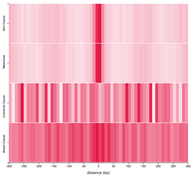
Tumor Comparison
The visualization allows to compare the distribution of mutations from different tumor-types around regions in two provided region-set through a heat-map. The x-axis represents the distance from the center of the provided regions, computed as (start+stop)/2, the y-axis discriminates the selected tumor-types and the color-intensity represents the amount of mutations falling in a given bin. The most opaque bin for a region set represents the bin containing the highest number of mutations. Use the toolbar on the left to select:
- A region set, among the ones added to the workspace. Multiple tumor types: each row of the heatmap shows the distribution of mutations for a given tumor type.
- Mutation classes: only mutations belonging to the selected classes will be displayed.
- bin size: number of base pairs per bin. The horizontal slider helps restricting the domain. The statistical test returns a p-value indicating how different the currently displayed distributions are.. Only the selected mutation classes will be considered for testing. For further details, please refer to our 2019 IEEE BIBM paper.
MutViz 2.0
Differently from the visualiations in MutViz 1.0 (histogram, regions and tumors), this representation takes into account only mutations overlapping with regions in the provided region set: i.e., given the set of mutations M and the region set R, the considered set of mutations is:
{m in M : ∃r in R, m.position ≥ r.start AND m.position ≤ r.stop}
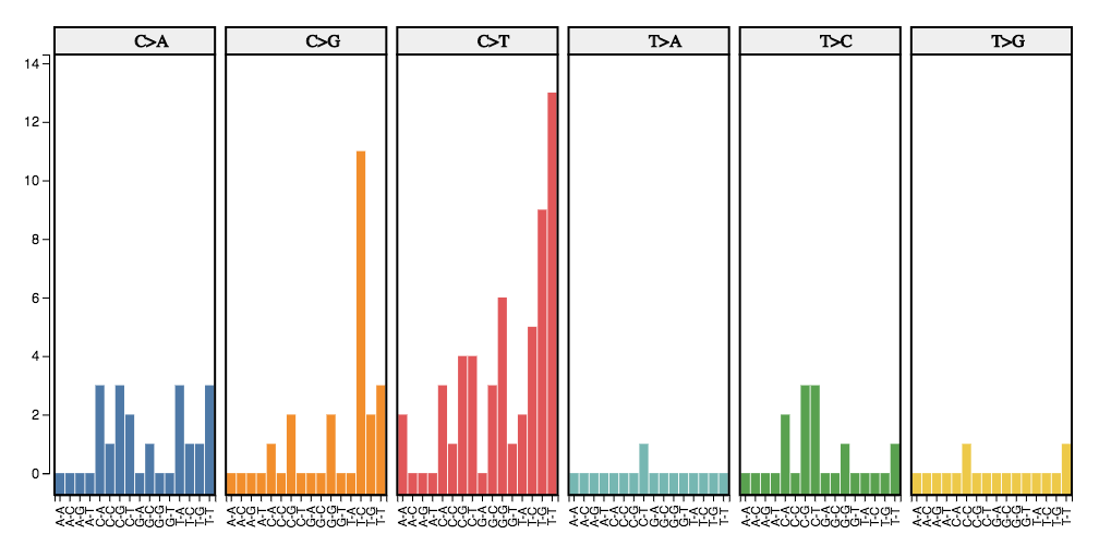
Trinucleotide Mutations
The visualization consists of a bar-plot representing the distribution of the six classes of base substitutions (C→A,C→G, C→T, T→A, T→C, T→G) within their immediate sequence context which fall into the provided region set.
This visualization takes into account the information from the 5’ and 3’ adjacent bases (also called flanking base pairs or trinucleotide context) leading to 96 possible mutation types (e.g. A[C→A]A, A[C→A]T, etc.). The mutation catalog of a tumor is created by categorizing each single nucleotide variant (SNV) (synonyms: base-pair-substitution or substitution point mutation) in one of the 96 mutation types and counting the total number of substitutions for each of these 96 mutation types.
The horizontal-axis discriminates the 96 mutation types and the y-axis represents the number of mutations for that type falling onto the region-set. Plots are grouped by the class of base substitution. Use the toolbar on the left to select:
- A region set, among the ones added to the workspace.
- A tumor type: only mutations for the selected tumor type will be displayed. You can further filter mutations by providing a predicate on the clinical condition of donors associated to the selected tumor type. Click on the filter-button next to the tumor-type selector to open the predicate editor. On top of the editor you will see the number of donors matching the current predicate.
- Mutation classes: only mutations belonging to the selected classes will be displayed.
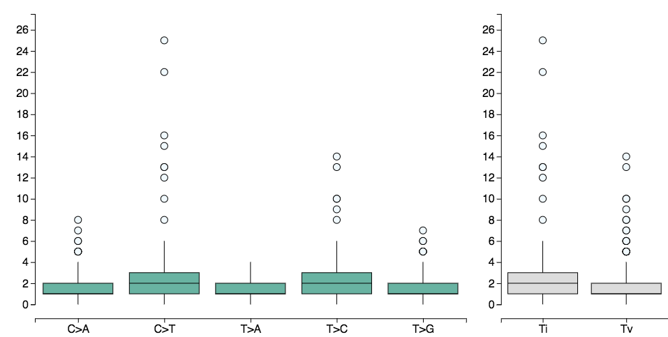
Mutations per donor
The visualization shows a box plot for each class of base substitution (C→A,C→G, C→T, T→A, T→C, T→G), representing the distribution of mutations per-donor overlapping regions in the provided region set. The box-plots on the right group the selected mutation types into transitions (Ti) and transversions (Tv). When the show trinucleotide option is enabled, the visualization takes into account the information from the 5’ and 3’ adjacent bases (also called flanking base pairs or trinucleotide context) leading to 96 possible mutation types (e.g. A[C→A]A, A[C→A]T, etc.). The mutation catalog of a tumor is created by categorizing each single nucleotide variant (SNV) (synonyms: base-pair-substitution or substitution point mutation) in one of the 96 mutation types and counting the total number of substitutions for each of these 96 mutation types. The horizontal-axis discriminates the 6 (96) mutation types (trinucleotide types) and the vertical-axis represents the number of mutations per-donor, of that type, overlapping regions in the region-set. Hovering the box-plot with your mouse you will be able to get more information on the distribution and on outliers (e.g. you can get the donor-id associated to an outlier). Use the toolbar on the left to select:
- A region set, among the ones added to the workspace.
- A tumor type: only mutations for the selected tumor type will be displayed. You can further filter mutations by providing a predicate on the clinical condition of donors associated to the selected tumor type. Click on the filter-button next to the tumor-type selector to open the predicate editor. On top of the editor you will see the number of donors matching the current predicate.
- Mutation classes: only mutations belonging to the selected classes will be displayed.
Signature Refitting
Given a catalogue of mutational signatures S and a set of somatic mutations M found in a given tumor genome, exposures E can be computed ("signature refitting"). The exposures predict what fractions of the mutations can be attributed to the given signatures. Exposures are computed such that the exposure-weighted sum of signatures reflects the distribution of mutation types in the tumor genome.
Here, the set of somatic mutations M used are only those mutations which fall onto the region set specified by the user. Since, however, the region set may have a largely different trinucleotide content than the whole genome, for which mutational signatures have been originally been determined, the signatures are adjusted according to the trinucleotide content of the region set prior to determining exposures.
This visualization shows a bar-plot in which, for each signature (horizontal-axis), the corresponding exposure (verical-axis) is reported. Alternatively, a box-plot for each signature shows the distribution of exposures over donors.
For higher accuracy in signature refitting, when the threshold is enabled (e.g. threshold=N), the tool will consider only tumors (synonyms: donors, patients) for wich more than N mutations overlap regions in the provided region-set. In case less than 5 tumors have more than N mutations, the mutations are merged and an estimation of the average signature exposure is provided.
In case the box-plot visualization is selected, hovering the box-plot with your mouse you will be able to get more information on the distribution and on outliers (e.g. you can get the donor-id associated to an outlier).
Use the toolbar on the left to select:
- A region set, among the ones added to the workspace.
- A tumor type: only mutations for the selected tumor type will be displayed. You can further filter mutations by providing a predicate on the clinical condition of donors associated to the selected tumor type. Click on the filter-button next to the tumor-type selector to open the predicate editor. On top of the editor you will see the number of donors matching the current predicate.
- A threshold (N): when enabled and set, only donors (tumors) with more than N mutations overlapping the region-set will be considered.
- Mutation classes: only mutations belonging to the selected classes will be displayed.
Once the plot is ready the number of considered patients will be displayed in the toolbar.
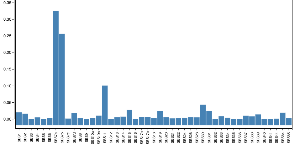
Source of mutational signatures: COSMIC Mutational Signatures v3 and Alexandrov et al.
We considered only single base substitution (SBS) signatures, excluding those which have been characterized as possible sequencing artifacts (SBS 27, 29, 43, and 45--60) or identified only in exome sequencing samples (SBS 23, 25, and 42).


