Giter Club home page Giter Club logo

lovelace-plotly-graph-card's Introduction

"Buy Me A Coffee" hacs_badge

Plotly Graph Card


image


image


You may find some extra info there in this link

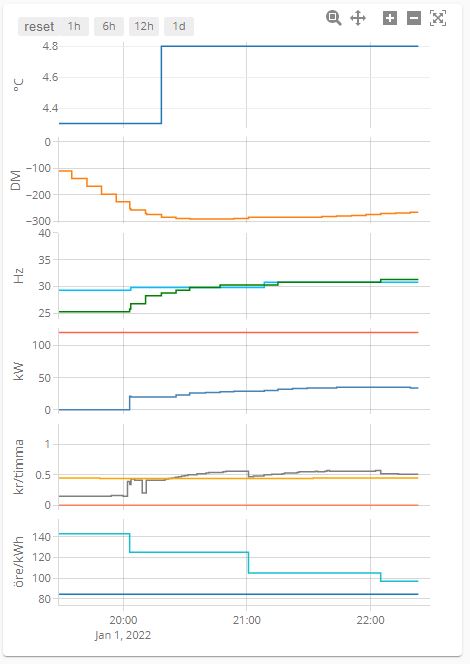
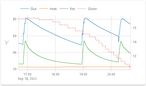
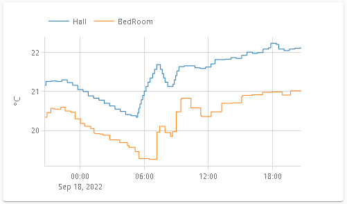
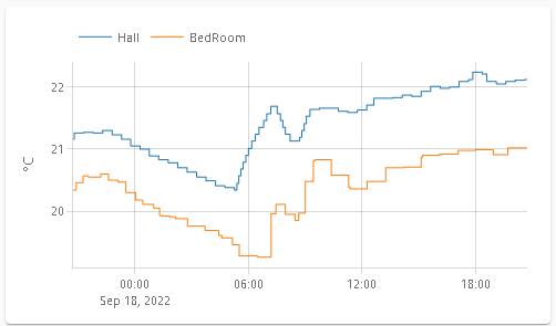
You can browse this list and find yamls by looking at images

Created with this quick and dirty script

More yaml examples

Find more advanced examples in Show & Tell

Installation

Via Home Assistant Community Store (Recommended)

  1. Install HACS
  2. Search & Install Plotly Graph Card.

Manually

  1. Go to Releases
  2. Download plotly-graph-card.js and copy it to your Home Assistant config dir as <config>/www/plotly-graph-card.js
  3. Add a resource to your dashboard configuration. There are two ways:
    1. Using UI: SettingsDashboardsMore Options iconResourcesAdd Resource → Set Url as /local/plotly-graph-card.js → Set Resource type as JavaScript Module. Note: If you do not see the Resources menu, you will need to enable Advanced Mode in your User Profile
    2. Using YAML: Add following code to lovelace section.
        - url: /local/plotly-graph-card.js
          type: module
      

Card Config

Visual Config editor available for Basic Configs (*)

type: custom:plotly-graph
entities:
  - sensor.monthly_internet_energy
  - sensor.monthly_teig_energy
  - sensor.monthly_office_energy
  - sensor.monthly_waschtrockner_energy
hours_to_show: 24
refresh_interval: 10

(*) I'm reusing the editor of the standard History Card. Cheap, yes, but it works fine. Use yaml for advanced functionality

Advanced

Filling, line width, color

type: custom:plotly-graph
entities:
  - entity: sensor.office_plug_wattage
  # see examples: https://plotly.com/javascript/line-and-scatter/
  # see full API: https://plotly.com/javascript/reference/scatter/#scatter
  - entity: sensor.freezer_plug_power
    fill: tozeroy
    line:
      color: red
      dash: dot
      width: 1

layout:
  plot_bgcolor: lightgray
  height: 400
config:
  scrollZoom: false

hours_to_show: 1h
refresh_interval: 10 # in seconds

Range Selector buttons

type: custom:plotly-graph
entities:
  - entity: sensor.temperature
refresh_interval: 10
hours_to_show: 12h
layout:
  xaxis:
    rangeselector:
      # see examples: https://plotly.com/javascript/range-slider/
      # see API: https://plotly.com/javascript/reference/layout/xaxis/#layout-xaxis-rangeselector
      "y": 1.2
      buttons:
        - count: 1
          step: minute
        - count: 1
          step: hour
        - count: 12
          step: hour
        - count: 1
          step: day
        - count: 7
          step: day

See also: autorange_after_scroll

See also: Custom buttons

btns

Features

  • Anything you can do with in plotlyjs except maps
  • Zoom / Pan, etc.
  • Data is loaded on demand
  • Axes are automatically configured based on the units of each trace
  • Basic configuration compatible with the History Card

Get ideas from all charts in here https://plotly.com/javascript/

Entities:

type: custom:plotly-graph
entities:
  - entity: sensor.temperature
  - entity: sensor.humidity

Alternatively:

type: custom:plotly-graph
entities:
  - sensor.temperature
  - sensor.humidity

Color schemes

Changes default line colors. See more here: https://github.com/dbuezas/lovelace-plotly-graph-card/blob/master/src/parse-config/parse-color-scheme.ts

type: custom:plotly-graph
entities:
  - sensor.temperature1
  - sensor.temperature2
color_scheme: dutch_field
# or use numbers instead 0 to 24 available:
# color_scheme: 1
# or pass your color scheme
# color_scheme: ["#1b9e77","#d95f02","#7570b3","#e7298a","#66a61e","#e6ab02","#a6761d","red"]

Attribute values

Plot the attributes of an entity

type: custom:plotly-graph
entities:
  - entity: climate.living
    attribute: temperature
  - entity: climate.kitchen
    attribute: temperature

Statistics support

Fetch and plot long-term statistics of an entity

for entities with state_class=measurement (normal sensors, like temperature)

type: custom:plotly-graph
entities:
  - entity: sensor.temperature
    statistic: max # `min`, `mean` of `max`
    period: 5minute # `5minute`, `hour`, `day`, `week`, `month`, `auto` # `auto` varies the period depending on the zoom level

for entities with state_class=total (such as utility meters)

type: custom:plotly-graph
entities:
  - entity: sensor.temperature
    statistic: state # `state` or `sum`
    period: 5minute # `5minute`, `hour`, `day`, `week`, `month`, `auto` # `auto` varies the period depending on the zoom level

automatic period

The option auto makes the period relative to the currently visible time range. It picks the longest period, such that there are at least 100 datapoints in screen.

type: custom:plotly-graph
entities:
  - entity: sensor.temperature
    statistic: mean
    period: auto

It is equivalent to writing:

type: custom:plotly-graph
entities:
  - entity: sensor.temperature
    statistic: mean
    period:
      0m: 5minute
      100h: hour
      100d: day
      100w: week
      100M: month # note uppercase M for month. Lowercase are minutes

step function for auto period

type: custom:plotly-graph
entities:
  - entity: sensor.temperature
    statistic: mean
    period:
      0s: 5minute
      24h: hour # when the visible range is ≥ 1 day, use the `hour` period
      7d: day # from 7 days on, use `day`
      6M: week # from 6 months on, use weeks. Note Uppercase M! (lower case m means minutes)
      1y: month # from 1 year on, use `month

Note that 5minute period statistics are limited in time as normal recorder history is, contrary to other periods which keep data for years.

show_value:

Shows the value of the last datapoint as text in a scatter plot.

Warning: don't use it with bar charts, it will only add an extra bar and no text

Examples:

type: custom:plotly-graph
entities:
  - entity: sensor.temperature
    show_value: true

Often one wants this to be the case for all entities

defaults:
  entity:
    show_value: true

If you want to make extra room for the value, you can either increase the right margin of the whole plot like this:

layout:
  margin:
    r: 100

Or make space inside the the plot like this:

time_offset: 3h

Offsets

Offsets are useful to shift data in the temporal axis. For example, if you have a sensor that reports the forecasted temperature 3 hours from now, it means that the current value should be plotted in the future. With the time_offset attribute you can shift the data so it is placed in the correct position. Another possible use is to compare past data with the current one. For example, you can plot yesterday's temperature and the current one on top of each other.

The time_offset flag can be specified in two places. 1) When used at the top level of the configuration, it specifies how much "future" the graph shows by default. For example, if hours_to_show is 16 and time_offset is 3h, the graph shows the past 13 hours (16-3) plus the next 3 hours. 2) When used at the trace level, it offsets the trace by the specified amount.

type: custom:plotly-graph
hours_to_show: 16
time_offset: 3h
entities:
  - entity: sensor.current_temperature
    line:
      width: 3
      color: orange
  - entity: sensor.current_temperature
    name: Temperature yesterday
    time_offset: 1d
    line:
      width: 1
      dash: dot
      color: orange
  - entity: sensor.temperature_12h_forecast
    time_offset: 12h
    name: Forecast temperature
    line:
      width: 1
      dash: dot
      color: grey

Graph with offsets

Now line

When using offsets, it is useful to have a line that indicates the current time. This can be done by using a universal function that returns a line with the current time as x value and 0 and 1 as y values. The line is then hidden from the legend.

type: custom:plotly-graph
hours_to_show: 6h
time_offset: 3h
entities:
  - entity: sensor.forecast_temperature
    yaxis: y1
    time_offset: 3h
  - entity: ""
    name: Now
    yaxis: y9
    showlegend: false
    line:
      width: 1
      dash: dot
      color: deepskyblue
    x: $ex [Date.now(), Date.now()]
    y: [0, 1]
layout:
  yaxis9:
    visible: false
    fixedrange: true

Graph with offsets and now-line

Duration

Whenever a time duration can be specified, this is the notation to use:

Unit Suffix Notes
Milliseconds ms
Seconds s
Minutes m
Hours h
Days d
Weeks w
Months M 30 days
Years y 365 days

Example:

time_offset: 3h

Extra entity attributes:

type: custom:plotly-graph
entities:
  - entity: sensor.temperature_in_celsius
    name: living temperature in Farenheit # Overrides the entity name
    unit_of_measurement: °F # Overrides the unit
    show_value: true # shows the last value as text
    customdata: |
      $fn ({states}) => 
        states.map( () => ({ extra_attr: "hello" }) )
      # customdata is array with the same number of values as x axis (states)
      # use statistics instead of states if entity is based on statistic   
    texttemplate: >- # custom format for show_value
      <b>%{y}</b>%{customdata.extra_attr}<br>
      # to show only 2 decimals: "%{y:.2f}"
      # see more here: https://plotly.com/javascript/hover-text-and-formatting/
      # only x, y, customdata are available as %{} template

    hovertemplate: | # custom format for hover text using entity properites name and unit_of_measurement
      $fn ({ getFromConfig }) =>
      ` <b>${getFromConfig(".name")}</b><br>
      <i>%{x}</i><br>
      %{y}${getFromConfig(".unit_of_measurement")}
      <extra></extra>` # <extra></extra> removes text on the side of the tooltip (it otherwise defaults to the entity name)

Extend_to_present

The boolean extend_to_present will take the last known datapoint and "expand" it to the present by creating a duplicate and setting its date to now. This is useful to make the plot look fuller. It's recommended to turn it off when using offsets, or when setting the mode of the trace to markers. Defaults to true for state history, and false for statistics.

type: custom:plotly-graph
entities:
  - entity: sensor.weather_24h_forecast
    mode: "markers"
    extend_to_present: false # true by default for state history
  - entity: sensor.actual_temperature
    statistics: mean
    extend_to_present: true # false by default for statistics

filters:

Filters are used to process the data before plotting it. Inspired by ESPHome's sensor filters. Filters are applied in order.

type: custom:plotly-graph
entities:
  - entity: sensor.temperature_in_celsius
    filters:
      - store_var: myVar # stores the datapoints inside `vars.myVar`
      - load_var: myVar # loads the datapoints from `vars.myVar`

      # The filters below will only be applied to numeric values. Missing (unavailable) and non-numerics will be left untouched
      - add: 5 # adds 5 to each datapoint
      - multiply: 2 # multiplies each datapoint by 2
      - calibrate_linear:
        # Left of the arrow are the measurements, right are the expected values.
        # The mapping is then approximated through linear regression, and that correction is applied to the data.
        - 0.0 -> 0.0
        - 40.0 -> 45.0
        - 100.0 -> 102.5
      - deduplicate_adjacent # removes all adjacent duplicate values. Useful for type: marker+text
      - delta # computes the delta between each two consecutive numeric y values.
      - derivate: h # computes rate of change per unit of time: h # ms (milisecond), s (second), m (minute), h (hour), d (day), w (week), M (month), y (year)
      - integrate: h # computes area under the curve in a specific unit of time using Right hand riemann integration. Same units as the derivative
      - integrate:
          unit: h # defaults to h
          reset_every: 1h # Defaults to 0 (never reset). Any duration unit (ms, s, m, h, d, w, M, y).
          offset: 30m # defaults to 0. Resets happen 30m later

      - map_y_numbers: Math.sqrt(y + 10*100) # map the y coordinate of each datapoint. Same available variables as for `map_y`
      # In the filters below, missing and non numeric datapoints will be discarded
      - sliding_window_moving_average: # best for smoothing
          # default parameters:
          window_size: 10
          extended: false # when true, smaller window sizes are used on the extremes.
          centered: true # compensate for averaging lag by offsetting the x axis by half a window_size
      - exponential_moving_average: # good for smoothing
          # default parameters:
          alpha: 0.1 # between 0 an 1. The lower the alpha, the smoother the trace.
      - median: # got to remove outliers
          # default parameters:
          window_size: 10
          extended: false
          centered: true
      - trendline # converts the data to a linear trendline // TODO: force line.shape = linear
      - trendline: linear # defaults to no forecast, no formula, no error squared
      - trendline:
          type: polynomial # linear, polynomial, power, exponential, theil_sen, robust_polynomial, fft
          forecast: 1d # continue trendline after present. Use global time_offset to show beyond present.
          degree: 3 # only appliable to polynomial regression and fft.
          show_formula: true
          show_r2: true
      # The filters below receive all datapoints as they come from home assistant. Y values are strings or null (unless previously mapped to numbers or any other type)
      - map_y: 'y === "heat" ? 1 : 0' # map the y values of each datapoint. Variables `i` (index), `x`, `y`, `state`, `statistic`, `xs`, `ys`, `states`, `statistics`, `meta`, `vars` and `hass` are in scope. The outer quoutes are there because yaml doesn't like colons in strings without quoutes.
      - map_x: new Date(+x + 1000) # map the x coordinate (javascript date object) of each datapoint. Same variables as map_y are in scope
      - fn: |- # arbitrary function. Only the keys that are returned are replaced. Returning null or undefined, leaves the data unchanged (useful )
          ({xs, ys, vars, meta, states, statistics, hass}) => {
            # either statistics or states will be available, depending on if "statistics" are fetched or not
            # attributes will be available inside states only if an attribute is picked in the trace
            return {
              ys: states.map(state => +state?.attributes?.current_temperature - state?.attributes?.target_temperature + hass.states["sensor.temperature"].state,
              meta: { unit_of_measurement: "delta" }
            };
          },
      - resample: 5m # Rebuilds data so that the timestamps in xs are exact multiples of the specified interval, and without gaps. The parameter is the length of the interval and defaults to 5 minutes (see #duration for the format). This is useful when combining data from multiple entities, as the index of each datapoint will correspond to the same instant of time across them.
      - filter: y !== null && +y > 0 && x > new Date(Date.now()-1000*60*60) # filter out datapoints for which this returns false. Also filters from xs, states and statistics. Same variables as map_y are in scope
      - force_numeric # converts number-lookinig-strings to actual js numbers and removes the rest. Any filters used after this one will receive numbers, not strings or nulls. Also removes respective elements from xs, states and statistics parameters

Examples

Celcious to farenheit
- entity: sensor.wintergarten_clima_temperature
  unit_of_measurement: °F
  filters: # °F = °C×(9/5)+32
    - multiply: 1.8
    - add: 32

alternatively,

- entity: sensor.wintergarten_clima_temperature
  unit_of_measurement: °F
  filters: # °F = °C×(9/5)+32
    - map_y_numbers: y * 9/5 + 32
Energy from power
- entity: sensor.fridge_power
  filters:
    - integrate: h # resulting unit_of_measurement will be Wh (watts hour)
Using state attributes
- entity: climate.loungetrv_climate
  attribute: current_temperature # an attribute must be set to ensure attributes are fetched.
  filters:
    - map_y_numbers: |
        state.state === "heat" ? state.attributes.current_temperature : 0

or alternatively,

- map_y_numbers: 'state.state === "heat" ? y : 0'

or alternatively,

- map_y_numbers: |
    {
      const isHeat = state.state === "heat";
      return isHeat ? y : 0;
    }

or alternatively,

- map_y: |
    state?.state === "heat" ? state.attributes?.current_temperature : 0

or alternatively,

- fn: |-
    ({ys, states}) => ({
      ys: states.map((state, i) =>
        state?.state === "heat" ? state.attributes?.current_temperature : 0
      ),
    }),

or alternatively,

- fn: |-
    ({ys, states}) => {
      return {
        ys: states.map((state, i) =>
          state?.state === "heat" ? state.attributes?.current_temperature : 0
        ),
      }
    },

Advanced

Debugging
  1. Open your browser's devtools console
  2. Use console.log or the debugger statement to execute your map filter step by step
    type: custom:plotly-graph
    entities:
      - entity: sensor.temperature_in_celsius
        statistics: mean
        filters:
          - fn: console.log # open the devtools console to see the data
          - fn: |-
              (params) => {
                const ys = [];
                debugger;
                for (let i = 0; i < params.statistics.length; i++){
                  ys.pushh(params.statistics.max); // <--- here's the bug
                }
                return { ys };
              }
Using the hass object

Funcitonal filters receive hass (Home Assistant) as parameter, which gives you access to the current states of all entities.

type: custom:plotly-graph
entities:
  - entity: sensor.power_consumption
    filters:
      - map_y: parseFloat(y) * parseFloat(hass.states['sensor.cost'].state)
Using vars

Compute absolute humidity

type: custom:plotly-graph
entities:
  - entity: sensor.wintergarten_clima_humidity
    internal: true
    filters:
      - resample: 5m # important so the datapoints align in the x axis
      - map_y: parseFloat(y)
      - store_var: relative_humidity
  - entity: sensor.wintergarten_clima_temperature
    period: 5minute
    name: Absolute Hty
    unit_of_measurement: g/m³
    filters:
      - resample: 5m
      - map_y: parseFloat(y)
      - map_y: (6.112 * Math.exp((17.67 * y)/(y+243.5)) * +vars.relative_humidity.ys[i] * 2.1674)/(273.15+y);

Compute dew point

type: custom:plotly-graph
entities:
  - entity: sensor.openweathermap_humidity
    internal: true
    period: 5minute # important so the datapoints align in the x axis. Alternative to the resample filter using statistics
    filters:
      - map_y: parseFloat(y)
      - store_var: relative_humidity
  - entity: sensor.openweathermap_temperature
    period: 5minute
    name: Dew point
    filters:
      - map_y: parseFloat(y)
      - map_y: >-
          {
            // https://www.omnicalculator.com/physics/dew-point
            const a = 17.625;
            const b = 243.04;
            const T = y;
            const RH = vars.relative_humidity.ys[i];
            const α = Math.log(RH/100) + a*T/(b+T);
            const Ts = (b * α) / (a - α);
            return Ts; 
          }
hours_to_show: 24

internal:

setting it to true will remove it from the plot, but the data will still be fetch. Useful when the data is only used by a filter in a different trace. Similar to plotly's visibility: false, except it internal traces won't use up new yaxes.

type: custom:plotly-graph
entities:
  - entity: sensor.temperature1
    internal: true
    period: 5minute
    filters:
      - map_y: parseFloat(y)
      - store_var: temp1
  - entity: sensor.temperature2
    period: 5minute
    name: sum of temperatures
    filters:
      - map_y: parseFloat(y)
      - map_y: y + vars.temp1.ys[i]

Entity click handlers

When the legend is clicked (or doubleclicked), the trace will be hidden (or showed alone) by default. This behaviour is controlled by layout-legend-itemclick. On top of that, a $fn function can be used to add custom behaviour. If a handler returns false, the default behaviour trace toggle behaviour will be disabled, but this will also inhibit the on_legend_dblclick handler. Disable the default behaviour via layout-legend-itemclick instead if you want to use both click and dblclick handlers.

type: custom:plotly-graph
entities:
  - entity: sensor.temperature1
    on_legend_click: |-
      $fn () => (event_data) => {
        event = new Event( "hass-more-info")
        event.detail =  { entityId: 'sensor.temperature1' };
        document.querySelector('home-assistant').dispatchEvent(event);
        return false; // disable trace toggling
      }

Alternatively, clicking on points of the trace itself.

type: custom:plotly-graph
entities:
  - entity: sensor.temperature1
    on_click: |-
      $fn () => (event_data) => {
        ...
        // WARNING: this doesn't work and I don't understand why. Help welcome
      }

There is also a double click plot handler, it works on the whole plotting area (not points of an entity). Beware that double click also autoscales the plot.

type: custom:plotly-graph
entities:
  - entity: sensor.temperature1
on_dblclick: |-
  $fn ({ hass }) => () => {
    hass.callService('light', 'turn_on', {
      entity_id: 'light.portique_lumiere'
    })
  }

See more in plotly's official docs

Universal functions

Javascript functions allowed everywhere in the yaml. Evaluation is top to bottom and shallow to deep (depth first traversal).

The returned value will be used as value for the property where it is found. E.g:

name: $fn ({ hass }) => hass.states["sensor.garden_temperature"].state

or a universal expression $ex (the parameters and arrow are added automatically):

name: $ex hass.states["sensor.garden_temperature"].state

which can also take a block:

name: |
  $ex {
    return hass.states["sensor.garden_temperature"].state
  }

Available parameters:

Remember you can add a console.log(the_object_you_want_to_inspect) and see its content in the devTools console.

Everywhere:

  • getFromConfig: (path) => value; Pass a path (e.g entities.0.name) and get back its value
  • get: (path) => value; same as getFromConfig
  • hass: HomeAssistant object; For example: hass.states["sensor.garden_temperature"].state to get its current state
  • vars: Record<string, any>; You can communicate between functions with this. E.g vars.temperatures = ys
  • path: string; The path of the current function
  • css_vars: HATheme; The colors set by the active Home Assistant theme (see #ha_theme)

Only iniside entities

  • xs: Date[]; Array of timestamps
  • ys: YValue[]; Array of values of the sensor/attribute/statistic
  • statistics: StatisticValue[]; Array of statistics objects
  • states: HassEntity[]; Array of state objects
  • meta: HassEntity["attributes"]; The current attributes of the sensor

Gotchas

  • The following entity attributes are required for fetching, so if another function needs the entity data it needs to be declared below them. entity,attribute,offset,statistic,period
  • Functions are allowed for those properties (entity, attribute, ...) but they do not receive entity data as parameters. You can still use the hass parameter to get the last state of an entity if you need to.
  • Functions cannot return functions for performance reasons. (feature request if you need this)
  • Defaults are not applied to the subelements returned by a function. (feature request if you need this)
  • You can get other values from the yaml with the getFromConfig parameter, but if they are functions they need to be defined before.

Adding the last value to the entitiy's name

type: custom:plotly-graph
entities:
  - entity: sensor.garden_temperature
    name: |
      $ex meta.friendly_name + " " + ys[ys.length - 1]

Sharing data across functions

type: custom:plotly-graph
entities:
  - entity: sensor.garden_temperature

    # the fn attribute has no meaning, it is just a placeholder to put a function there. It can be any name not used by plotly
    fn: $ex vars.title = ys[ys.length - 1];
title: $ex vars.title

Histograms

type: custom:plotly-graph
entities:
  - entity: sensor.openweathermap_temperature
    x: $ex ys
    type: histogram
title: Temperature Histogram last 10 days
hours_to_show: 10d
raw_plotly_config: true
layout:
  margin:
    t: 0
    l: 50
    b: 40
  height: 285
  xaxis:
    autorange: true

custom hover text

type: custom:plotly-graph
title: hovertemplate
entities:
  - entity: climate.living
    attribute: current_temperature
    customdata: |
      $fn ({states}) =>
        states.map( ({state, attributes}) =>({
          ...attributes,
          state
        })
      )
    hovertemplate: |-
      <br> <b>Mode:</b> %{customdata.state}<br>
      <b>Target:</b>%{y}</br>
      <b>Current:</b>%{customdata.current_temperature}
      <extra></extra>
hours_to_show: current_day

Default trace & axis styling

default configurations for all entities and all yaxes (e.g yaxis, yaxis2, yaxis3, etc).

type: custom:plotly-graph
entities:
  - sensor.temperature1
  - sensor.temperature2
defaults:
  entity:
    fill: tozeroy
    line:
      width: 2
  yaxes:
    fixedrange: true # disables vertical zoom & scroll

layout:

To define layout aspects, like margins, title, axes names, ... Anything from https://plotly.com/javascript/reference/layout/.

Home Assistant theming:

Toggle Home Assistant theme colors:

  • card-background-color
  • primary-background-color
  • primary-color
  • primary-text-color
  • secondary-text-color
type: custom:plotly-graph
entities:
  - entity: sensor.temperature_in_celsius
ha_theme: false #defaults to true

Raw plotly config:

Toggle all in-built defaults for layout and entitites. Useful when using histograms, 3d plots, etc. When true, the x and y properties of the traces won't be automatically filled with entity data, you need to use $fn for that.

type: custom:plotly-graph
entities:
  - entity: sensor.temperature_in_celsius
    x: $ex xs
    y: $ex ys
raw_plotly_config: true # defaults to false

config:

To define general configurations like enabling scroll to zoom, disabling the modebar, etc. Anything from https://plotly.com/javascript/configuration-options/.

disable_pinch_to_zoom

disable_pinch_to_zoom: true # defaults to false

When true, the custom implementations of pinch-to-zoom and double-tap-drag-to-zooming will be disabled.

hours_to_show:

How many hours are shown. Exactly the same as the history card, but more powerful

Fixed Relative Time

  • Decimal values (e.g hours_to_show: 0.5)
  • Duration strings (e.g hours_to_show: 2h, 3d, 1w, 1M). See Durations

Dynamic Relative Time

Shows the current day, hour, etc from beginning to end. The options are: current_minute, current_hour, current_day, current_week, current_month, current_quarter, current_year It can be combined with the global time_offset.

autorange_after_scroll:

Removes all data out of the visible range, and autoscales after each replot. Particularly useful when combined with Range Selector Buttons

type: custom:plotly-graph
entities:
  - entity: sensor.garden_temperature
autorange_after_scroll: true

refresh_interval:

Update data every refresh_interval seconds.

Examples:

refresh_interval: auto # (default) update automatically when an entity changes its state.
refresh_interval: 0 # never update.
refresh_interval: 5 # update every 5 seconds

localization:

The locale is directly taken from Home Assistant's configuration, but can be overridden like this:

config:
  locale: ar

** Home Assistant custom Number and Date format will be ignored, only the language determines the locale **

When using hours_to_show: current_week, the "First day of the week" configured in Home Assistant is used

deprecations:

no_theme

Renamed to ha_theme (inverted logic) in v3.0.0

no_default_layout

Replaced with more general raw_plotly_config in v3.0.0. If you were using it, you most likely can delete it and add this to your yaxes defaults:

defaults:
  yaxes:
    side: left
    overlaying: "y"
    visible: true
    showgrid: true

offset

Renamed to time_offset in v3.0.0 to avoid conflicts with PlotlyJS bar offset configuration.

lambda

Removed in v3.0.0, use filters instead. There is most likely a filter (or combination) that will give you the same result, but you can also translate an old lambda to a filter like this:

lambda: |
  (ys,xs) => {
    ...
    return {x: arr_x, y: arr_y};
  }
# becomes
filters:
  - fn: |
    ({ys,xs}) => {
      ...
      return {xs: arr_x, ys: arr_y};
    }

and

lambda: |
  (ys) => ys.map(y => y+1...etc...)
# becomes
filters:
  - map_y: y+1...etc...

entities/show_value/right_margin

Removed in v3.0.0, use show_value: true instead and if necessary, set the global time_offset or layout.margins.r to make extra space to the right.

significant_changes_only

Removed in v3.0.0, non significant changes are also fetched now. The bandwidth savings weren't worth the issues it created.

minimal_response

Removed in v3.0.0, if you need access to the attributes use the 'attribute' parameter instead. It doesn't matter which attribute you pick, all of them are still accessible inside filters and universal functions

Development

  • Clone the repo
  • run npm i
  • run npm start
  • From a dashboard in edit mode, go to Manage resources and add http://127.0.0.1:8000/plotly-graph-card.js as url with resource type JavaScript
  • ATTENTION: The development card is type: custom:plotly-graph-dev (mind the extra -dev)
  • Either use Safari or Enable chrome://flags/#unsafely-treat-insecure-origin-as-secure and add your HA address (e.g http://homeassistant.local:8123): Chrome doesn't allow public network resources from requesting private-network resources - unless the public-network resource is secure (HTTPS) and the private-network resource provides appropriate (yet-undefined) CORS headers. More here

Build

npm run build

Release

  • Click on releases/new draft from tag in github
  • The bundle will be built by the CI action thanks to @zanna-37 in #143
  • The version in the artifact will be set from the created tag while building.

Popularity

Star History

Star History Chart

lovelace-plotly-graph-card's People

Contributors

cendal avatar darthsebulba04 avatar dbuezas avatar edwardtfn avatar frnchfrgg avatar thecem avatar yandemontreal avatar yosilevy avatar zanna-37 avatar

Stargazers

 avatar  avatar  avatar  avatar  avatar  avatar  avatar  avatar  avatar  avatar  avatar  avatar  avatar  avatar  avatar  avatar  avatar  avatar  avatar  avatar  avatar  avatar  avatar  avatar  avatar  avatar  avatar  avatar  avatar  avatar  avatar  avatar  avatar  avatar  avatar  avatar  avatar  avatar  avatar  avatar  avatar  avatar  avatar  avatar  avatar  avatar  avatar  avatar  avatar  avatar  avatar  avatar  avatar  avatar  avatar  avatar  avatar  avatar  avatar  avatar  avatar  avatar  avatar  avatar  avatar  avatar  avatar  avatar  avatar  avatar  avatar  avatar  avatar  avatar  avatar  avatar  avatar  avatar  avatar  avatar  avatar  avatar  avatar  avatar  avatar  avatar  avatar  avatar  avatar  avatar  avatar  avatar  avatar  avatar  avatar  avatar  avatar  avatar  avatar  avatar

Watchers

 avatar  avatar  avatar  avatar  avatar

lovelace-plotly-graph-card's Issues

Fixed range for binary sensor include unknown value

Hi there!

I'm trying to use ploty for showing graph for my binary open/close sensor. I fixed range with the following:

layout:
  yaxis:
    range:
      - 'off'
      - 'on'
    fixedrange: true

However, for the first day graph looked ok (only on and off values were shown), but now it shows me also "unknown" value:
image

How could I avoid it?

Doesn't work on vertical cards

Reported here https://community.home-assistant.io/t/plotly-interactive-graph-card/347746/5

Hi. I just tried this and I really love it! It has everything that history chart was missing.
Unfortunately it worked for half an hour and now nothis is displayed anymore, both on PC and Mobile app.
Mmm… I’m trying to set it up again, it look like it doesn’t like to be put in a vertical stack card.
I created 2 charts and they are ok, if I put them in a avertical stack, no graph is displayed anymore.
By the way… great work!

"General" Lambda for all entities broken in 1.4.2?

Hi,
just upgraded to 1.4.2 to get the new statistics support - awesome!

Unfortunately, that broke one of my more advanced graphs - a stacked area graph with a lambda to sort all values into 15s buckets.
It looks like plotly can't stack the graphs any more, and looks somewhat like in earlier versions if one tried to stack graphs with different X values (timestamps):
grafik

In the developer console, I can see a lot of this:

plotly-graph-card.js?hacstag=413812496142:44 TypeError: a.lambda is not a function
    at plotly-graph-card.js?hacstag=413812496142:44:6004
    at Array.flatMap (<anonymous>)
    at Qj.getData (plotly-graph-card.js?hacstag=413812496142:44:5594)
    at plotly-graph-card.js?hacstag=413812496142:44:7499
    at Qj.withoutRelayout (plotly-graph-card.js?hacstag=413812496142:44:585)
    at Qj.plot (plotly-graph-card.js?hacstag=413812496142:44:7450)
    at Qj.fetch (plotly-graph-card.js?hacstag=413812496142:12:13141)

so it seems like the lambda is not executed any more.
And indeed, if I put a console.log in the first line of my lambda, it seems to never be executed at all.

Card configuration:

type: custom:plotly-graph
layout:
  height: 550
  title:
    text: Strommix
entities:
  - entity: sensor.strom_eigenverbrauch
    name: Direktverbrauch
    fillcolor: 90EE90
    stackgroup: verbrauch
  - entity: sensor.strom_netzbezug
    name: Netzbezug
    stackgroup: verbrauch
    fillcolor: red
  - entity: sensor.strom_netzeinspeisung
    fillcolor: '#006400'
    name: Einspeisung
    stackgroup: verbrauch
hours_to_show: 12
refresh_interval: 10
defaults:
  entity:
    line:
      width: 0
    lambda: |-
      (ys, xs) => {
          const seconds = 15 // 60
          const window_size_ms = 1000 * seconds
          const t0 = Math.ceil(+xs[0]/window_size_ms)*window_size_ms;
          const t1 = Math.ceil(+xs[xs.length-1]/window_size_ms)*window_size_ms;
          const buckets = (t1 - t0) / window_size_ms

          const result = {
            x: Array.from({length: buckets}, (_, i) => new Date(t0 + i * window_size_ms)),
            y: Array(buckets).fill(NaN)
          };

          for (let i = 0; i < xs.length; i++) {
            const t = +xs[i]
            const bucket = Math.floor((t - t0) / window_size_ms)
            const values = [ys[i]]

            for (let j = i; j < xs.length; j++) {
              const t2 = +xs[j]
              const bucket2 = (t2 - t0) / window_size_ms
              if (bucket == bucket2) {
                values.push(ys[j])
                i++
              } else {
                break;
              }
            }
            let value = values.reduce((a, b) => a + b, 0) / values.length
            //let value = values[0]
            //console.log('bucket=' + bucket + ', value=' + value)
            result.y[bucket] = value
          }
          let prev = 0;
          for (let i = 0; i < result.y.length; i++) {
            if (isNaN(result.y[i]))
              result.y[i] = prev
            prev = result.y[i]
          }
          //console.log(result)
          return result
        }

BONUS: this is my PV graph. At around noon, you can see the effect of a partly solar eclipse today!

Feature request: pop-up à la sensor card

I really like to use plotly graphs but do miss the full size pop-ups that sensor cards provide and think this would be a great feature for plotly graph cards, too

Support long-term statistics

It would be worthwhile to support long-term statistics for entities that support it. There needs to be options to toggle statistics mode on and off, select between the mean, max, min or sum, and select between the period hour, day or month (there is 5min too IIRC).

Apex-charts card already supports long-term statistics. See https://github.com/RomRider/apexcharts-card/blob/master/src/graphEntry.ts#L257 for the if/else clauses with first statistics fetching then normal history fetching. AFAICT the difference is not much and mostly in _fetchStatistics vs _fetchRecent even though the value of the datapoint then comes from entry[period] instead of entry.state or an attribute, and the time is gotten from start/end attributes instead of entry.last_changed/entry.last_updated. To me it seems that it is not too hard to retrofit the statistics fetching into the format output by fetchSingleRange() at https://github.com/dbuezas/lovelace-plotly-graph-card/blob/master/src/Cache.ts#L13

Some example JS code that actually fetches statistics data, filters it and returns a list of [timestamp, value] pairs:

      const statistics = await hass.callWS({
          type: 'recorder/statistics_during_period',
          start_time: new Date(start).toISOString(),
          end_time: new Date(end).toISOString(),
          statistic_ids: [entity.entity_id],
          period: "hour",
      });
      var result = [];
      statistics[entity.entity_id].forEach( (item) => {
        val = parseFloat(item.mean)
        if (val > 100) {
           result.push([
            ((new Date(mid.start).getTime()) + (new Date(mid.end).getTime()))/2,
            val
          ])
        }
      });
      return result;

It is adapted from https://gitlab.com/home-assistant-frnchfrgg/apex-local-extrema/-/blob/main/apex.yaml that I use in production currently (but lovelace-ploty-graph-card has features I hope to use, in particular your data mangling feature is not per-point so I could do all this without abusing a data generator).

I would do it myself in a pull request (and maybe will) but since you embed the history entry into the result I would have to check all around what fields you expect to see in users of the cache.

Error creating configuration card

reported here: https://community.home-assistant.io/t/plotly-interactive-graph-card/347746/3

Firstly, This is excellent. I have used 2 graphs previously to track short term and long term CPU usage and this provides exactly what I was trying to achieve. Thank you.

I had a problem this morning, I am seeing this error when I edit the card:-

Configuration errors detected:

*** document.createElement(...).constructor.getConfigElement is not a function**
The card config which was working last night is as follows -

type: custom:plotly-graph
entities:

  • entity: sensor.load_1m
  • entity: sensor.processor_use_percent
    hours_to_show: 2
    refresh_interval: 10
    title: CPU Load
    Clearing the browser cache had no effect but a restart of HA seemed to resolve it so it could be an issue with my setup.

I will convert more of my graphs to plotly and let you know if anything else occurs.

~B

"fill: tonexty" broken when "show_value" is used

adding fill: tonexty at the same level as the entity works here and links with the previous entity in the yaml list. Warning: AFAICT it links to the previous one that is enabled. If you disable it in the legend then it links to the previous one and so on.

It makes me crazy... i can do it outside HA, but not inside...
Here is one of my example:

  - entity: sensor.ths_fridge_humidity
      name: φ[%] (max)
      fill: none
      line:
        color: rgba(143, 86, 164, 0.6)
        width: 1
      statistic: max
      period: 1day
      showlegend: true
      
    - entity: sensor.ths_fridge_humidity
      fill: tonexty
      name: φ[%] (min)
      line:
        color: rgba(143, 86, 164, 0.6)
        width: 1
      statistic: min
      period: 1day
      showlegend: true
      
    - entity: sensor.ths_fridge_humidity
      fill: none
      name: φ[%] (mean)
      line:
        color: rgba(143, 86, 164, 1.0)
      statistic: mean
      period: 4hour`

The result:
2022-10-27 11_16_01-YAML Dashboard – Home Assistant
I think I was exhaustive in trying different combinations of fill, order of entities, but I get similar results....

Originally posted by @r-jean-pierre in #75 (reply in thread)

Strange behaviour with DST

DST change happened Sunday morning in my country which uncovered a bug in plotly-graph: it generated two points with the same x value for the two consecutive hours, which creates a strange graph:
image

I think an easy way to solve this bug is to always convert dates and times to UTC when generating data points, and if needed converting anew to the local timezone for axes label and tooltip display. I'll try when I have time.

use more space for the card

as wished in #85 :

Could the width of the card be better used in the standard layout?
As you can see there is a bigger right boarder on the right side that could be used for the graph...
(Just compare to the "standard" history graph). Left side could be a little bit more narrow as well :-)

image

Thx for your great work,

Sebastian

Feature Request: Preprocess Data

Would it be possible to enable a normaliz function on the data on the latest value? (or on the first/average value of the selected timeframe 1day, 1 week,..)
e.g. if you have a 5 stock charts with a large difference in their stock value, this would allow to compare the trends of the stocks

Broken statistics period in 1.5.0

First, since installing 1.5.0 plotly-graph behaves as if period: auto was set even if I set period: hour in defaults:/entity:.

Second, the transition between hour and day occurs roughly when there are 10 days visible, which does not mean 500 data points are visible (only 10, maybe 15 at most). Even if I considered that it sums over all six displayed entities, that's not 500 points by far. I can supply a GIF screen cast if you cannot reproduce.

Wrong axis titles on subplots

I want to start by thanking you for an incredibly good card.
It's exactly what I've been looking for. 😃 😃

I have 2 problems with the card.

I do not get hoverlabel (I think it is called that) to appear on my Mobile App with Android.
The box with the current value when you have the mouse pointer over.
But it shows up on my pc with windows.

I love the new possibility of multiple graphs in 0.6.0 that are together

But I'm having problem with the left column with the unit.

In my example it should have been:
"°C"
"DM"
"°C"
"Hz"
"kr/timma"
"öre/timma"

There is no sensor with Hz as unit in the third graph.

Thank you,

Skärmklipp2

Customization: hovertemplate behavior

I'm trying to customize hovertemplate but whatever I set seems to get %{customdata.name} : added in front of it, am I missing a configuration option or is there some other way to prevent this? See yellow and red boxes below for an example

image

I poked around a little bit in plotly-graph-card.ts but my js is pretty weak. I see where the default template is set but can't figure out why the name : still gets added when I provide a template?

image

Feature request: support for daily / hourly values

I have some sensors for hourly and daily values that increase till the next hour/day and then reset. It is now not very easy to create a graph of the maximum of these hourly/daily values (a bar chart for example)
For example I have this graph (created in another graph library, but this does not allow me to scroll easily):
image

This is based on this sensor:
image

Conditional date formatting in time axis

Hi,

Could the date be shown in the time axis as the normal historiy graph?
In the history graph the date is shown instead of "00:00" which is kind of nice as it saves one line.
image

Thx for your great work,

Sebastian

Button for browsings days

Hi.
Your graph has the great feature to be able to scroll along the timeline, so I think that a button that can shift the displayed data +/- 12 or 24 or maybe a configurable amount of hours would be very useful.

Since "hours_to_show" is a configurable parameter, the +/- button could simply move the displayed data forward or back for the value used in "hous_to_show".

Thank you again for this very useful card.

Limit zoom to x axis

[from xalex75 in the HA community]

About zoom… yes, probably zooming only x axis would be more effective, otherwise I noticed that I need to move down the graph everytime

Y scale not in sync

I have 2 Power meter in 1 scale
1x PV
1x Real used power

The graphs ar not in sync in the y axis.
graph

x axis labels sometimes don't fit

[from xalex75 in the HA community]

I noticed that on mobile and pc there’s a little difference in showing time and day, and that on pc it results cut.

PC:
image
Mobile:
image
It happens only in 12h view, while both 6h and 1d views are ok, and only on PC.
Probably showing the year is not necessary and can save space.

Missing graph sections

Hi
i recently discoverd this card, and i like it very much, but why are there sections in graphs omitted if the value doesn't change.
it looks bad compared to the history-graph, for example:

image
image

or am i missing some parameter? apologies if i do
tonexty and tozeroy are not the solutions i am looking for

High CPU usage when card left on-screen

I use a tablet that stays on 24/7, and I have noticed the CPU temperature of my netbook home assistant host PC show severe spikes as long as the lovelace-plotly-graph-card is kept visible on screen. If i go to another lovelace page, without this custom card, the CPU temperature spikes are immediately gone.

image

Add optional buttons to scroll in the x axis

[from xalex75 in the HA community]

Hi.
I just saw the reply in issues section.
There you proposed something little different from what you realized here, buttons for shifting back he view, not just for changing hours to view.
On the screen they look the same, so probably using both at the same time could be a little confusing.
What about left and right buttons for shifting the view back or forward for the amount of hours selected?
I don’t know if this would be something that would require too much work or not, I’m just asking from the user point of view 😉

Zoom buttons loose fixed axis

If you have a line graph with two fixed axes, and change the zoom using the time period buttons, and then use the reset button, it loses the left axis fixed scale, whilst retaining the one on the right.

Layout setting become persistent ?

Have one plotty card configured for right Y-axis:

layout:
  margin:
    r: 50

image

Issue is: after switching to other lovelaces this setting become applied on cards where NOT configured !!!
image

Before card with layout configured opened once card with no right margin looks as expected:
image

Autoscale = Reset

Very strange situation if move graph zoom select only some lines and press Autoscale
in 90% of cases is just same as I press Reset

Not a browser problem tested with different browsers, same effect.

card-mod support

Currently, plotly-graph is not compatible with card-mod. I think there are two ways of making it compatible. A way which will work only with card-mod, and another which should make plotly-graph sufficiently similar to a vanilla card that card-mod and any other similar mod will work.

The first way is to call some card-mod primitive yourself so that it can do its magic. See https://github.com/thomasloven/lovelace-card-mod/blob/master/README-developers.md where AFAICT el should be the <ha-card/>, type should be what you want it to be (probably plotly-graph but you can use card which is what card-mod uses when it can hook into the ha-card itself as in the complicated method), styles should be config?.card_mod?.style || config?.style || "" where config is the whole card configuration, variables should be { config }, the unused should be null, and the last one I think should be false.

See https://github.com/thomasloven/lovelace-card-mod/blob/master/src/patch/ha-card.ts#L25 which is what card-mod wants ha-card to do when it is patched. I do not know if and when you are supposed to use the returned object to call its refresh() method as the patched ha-card does.

The other way is to make plotly-card extend LitElement instead of HTMLElement, as apexcharts-card does here: https://github.com/RomRider/apexcharts-card/blob/master/src/apexcharts-card.ts#L116. Another much simpler example to get inspiration from is https://github.com/thomasloven/lovelace-card-mod/blob/master/src/mod-card.ts whose role is only to wrap elements without an inner <ha-card/> into one.

But maybe the only thing that makes a LitElement work as-is with card-mod and your HTMLElement-based card not is that you do not provide any update() method ? Maybe adding a dummy update() would magically make things work ? I'll have to try if you do not get to do it before me.

Note that I never programmed in TypeScript before so I am very slow and naive. Sorry for that.

Error “Custom element doesn’t exist: plotly-graph” on older versions of iPad

Error Description
The card cannot render on older versions of the iPad, and returns error “Custom element doesn’t exist: plotly-graph”. The card works on both PC and Android, so the configuration is correct.

Setup
iPad Air (1st gen) running IOS 12.5.4.
Tested and failes on Chrome v 87.0.4280.77, Safari as well as in Home Assistant app v 2022.3.

UA Info Chrome:
Mozilla/5.0 (iPad; CPU OS 12_5 like Mac OS X) AppleWebKit/605.1.15 (KHTML, like Gecko) CriOS/87.0.4280.77 Mobile/15E148 Safari/604.1
UA Info Safari:
Mozilla/5.0 (iPad; CPU OS 12_5_5 like Mac OS X) AppleWebKit/605.1.15 (KHTML, like Gecko) Version/12.1.2 Mobile/15E148 Safari/604.1

Further info
There are no errors in the Home Assistant log.

The issue might be related to the following issue and seems to be resolved based on the comments:
AlexxIT/WebRTC#107

Fixed Axis not working if two axes specified

I have a graph with both left and right axes. I want both to be fixed, but only the right one obeys the config

- type: custom:plotly-graph
            entities:
              - entity: sensor.pressure_stats_mean
                name: Pressure
                show_value: true
                right_margin: 40
                yaxis: y1
                line: 
                  shape: spline
              - entity: sensor.pressure_change
                show_value: true
                right_margin: 40
                yaxis: y2
                line: 
                  shape: spline
            title: Pressure
            hours_to_show: 24
            refresh_interval: 10
            layout:
              yaxis1:
                gridcolor: whitesmoke
                zeroline: false
                range:
                  - 900
                  - 1010
                fixedrange: true
              yaxis2:
                gridcolor: whitesmoke
                zeroline: true
                range:
                  - -5
                  - 5
                fixedrange: true
              xaxis:
                rangeselector:
                  "y": 1.2
                  buttons:
                    - count: 1
                      step: hour
                    - count: 12
                      step: hour
                    - count: 1
                      step: day
                    - count: 7
                      step: day
                    - count: 28
                      step: day
            view_layout:
              grid-area: footer7

Thousands separator inconsistent

I have a graph that has 4 digit numbers that are sometimes whole and sometimes have a decimal.
When hovering over the numbers, if it's a fraction, it will have a comma for the thousands separator, when it's a whole number, there is no separator:
5236
6,241.5
Verified the data in Home Assistant History, and it consistently adds the thousands comma separator.

Don't drop state duplicates when rendering the graph

Edit:
Since the code is dropping duplicate values, the graph is not able to handle sensors that rarely changes because it draws a straight line between the first two different values, which is not right.

immagine

I found that the cause should be to remove minimal_response here:

minimal_response +

The reason is that:

With minimal response we do not care about attribute changes so we can filter out duplicate states

https://github.com/home-assistant/core/blob/9864090e0b414b0c610cd0c33c6a49f81940bb9d/homeassistant/components/recorder/history.py#L417-L421


Old comment (you can ignore it)

I keep this content for reference, but please do not consider it.
With significant_changes_only, the graph is not able to handle sensors that rarely changes because it draws a straight line between the first two different values, which is not right.

Please consider changing significant_changes_only=1 to significant_changes_only=0 in

`significant_changes_only=1` +
or at least make it configurable.

Moreover, it seems that significant_changes_only alone is not enough, I saw that here

const isRepeated =
prev?.last_changed === last?.last_changed - 1 &&
prev?.state === last?.state;
if (isRepeated) {
// remove the old one
h.splice(h.length - 2, 1);
}
you are trying to remove duplicate values, but there are cases in which those values are desirable.

And I suspect that there should be other places in the code that tries to remove the duplicates.

Support for nested attributes

As described here, there is currently no way to access nested attributes. However, this would be incredibly useful for weather forecast data.

use local time format

as wished in #85 :

Could the date be shown in the localized format?

Right now it is in english with your card, but I set it to the german way in my profile settings:
image

German in profile, english in the card:
image

Thx for your great work,

Sebastian

show daily energy consumption as a bar graph

Discussed in #92

Originally posted by Jn115759 October 30, 2022
I am new using this fantastic plotly integration and was hoping someone could help me with the issue above.
I defined a utility meter helper "sensor.helper_elektriciteit_aanvoer_net" which resets daily. Values are shown in the graph below in blue.
image

Now I would like to see the daily consumption as a bar graph.
According to the documentation this should be fairly simple.
image

I used the code below.

type: custom:plotly-graph
entities:
  - entity: sensor.helper_elektriciteit_aanvoer_net
    statistic: max
    period: day
hours_to_show: 144
refresh_interval: 30
title: Energy

Unfortunately this only results in a flat line.

image

Would appreciate some hints to learn what I am doing wrong.
Many thanks.

Feature request: add offset field

https://github.com/RomRider/apexcharts-card has a offset field that is used to "move" the x values of a series.
I already tried to use data transformation, but the problem is that values outside the graph are not available.

Why is it a problem? I have an entity that gives a forecast of a value 12h in the future. I therefore need to move the entity values 12h in the future because the current value refers to a future event. However, I can only "move" data that are already visible, which leaves a blank space. If I scroll left, the data is loaded, but it is of course inconvenient.

immagine


The transformation I used:

# this works only partially
    lambda: |-
      (ys, xs) => {
        const result = {x:[], y:[]}
        for (let i = 0; i < xs.length; i++) {
          const x = xs[i].setHours(xs[i].getHours()+12) # move the x-values (<--)
          const y = ys[i]
          if (x<((new Date).setHours((new Date).getHours()+2))){ # only show 2 hours in the furure (not relevant for this issue)
            result.y.push(y)
            result.x.push(x)
          }
        }
        return result;
      }

Weird resizing behavior with horizontal stack

Using plotly-graph-card with horizontal-stack causes some weird behavior from the plotly-graph-card.
It just keeps resizing from some maximum to some minimum size, over and over again.
I found it a little difficult to describe the issue, so I've attached a video showing the problem.

2022-07-22.00-36-39.mp4

I've had the same problem with multiple configurations, but this is the dashboard configuration I'm using in the example:

views:
  - title: Home
    cards:
      - type: horizontal-stack
        cards:
          - type: gauge
            entity: sensor.apc_br1200gi_load
            name: Load
            needle: true
            severity:
              green: 0
              yellow: 30
              red: 70
          - type: gauge
            entity: sensor.apc_br1200gi_battery_voltage
            max: 27
            min: 20
            needle: true
            name: Batt. Voltage
            severity:
              green: 24
              yellow: 23
              red: 0
          - type: gauge
            entity: sensor.apc_br1200gi_input_voltage
            min: 200
            max: 260
            needle: false
            unit: V
            name: AC In
          - type: gauge
            entity: sensor.apc_br1200gi_battery_runtime
      - type: horizontal-stack
        cards:
          - type: custom:plotly-graph
            entities:
              - entity: sensor.apc_br1200gi_load
            hours_to_show: 1
            refresh_interval: 30
            title: Load/Time
          - type: gauge
            entity: sensor.apc_br1200gi_battery_charge
            max: 100
            min: 0
            needle: true
            name: Batt. Charge
            severity:
              green: 75
              yellow: 25
              red: 0
          - type: custom:plotly-graph
            entities:
              - entity: sensor.apc_br1200gi_input_voltage
            hours_to_show: 24
            refresh_interval: 10
            title: AC In/Time
          - type: custom:plotly-graph
            entities:
              - entity: sensor.apc_br1200gi_battery_runtime
            hours_to_show: 1
            refresh_interval: 10
            title: Runtime/Time

LTS support: discrete Period grouping steps by time range mapping is not yet working, scrolling neither.

Added as a new issue for tracking purposes and details updated where needed:

When specifying the discrete mapping steps in YAML, the period grouping is not shown any more.
In 'auto' mode, it shows up fine. It would be nice if it was there, to validate the correct behaviour.
If you don't want to put it there by default (e.g. for space savings on the graph), please make it at least 'includable' with an option.
Or in upcoming beta releases included it, till all has been verified to be correct. Then it can be removed if you want.

So right now I can't really tell if the discrete grouping is indeed working.
But already by looking at the graphs I'm expecting it doesn't ...

24hr time range, data point labels are per hour (should be 5minutes)
image

1 month time range, data points labels are still per hour (should be day):
image

1 year time frame, data points label per day but multiple data points shown for the SAME date, hence the zigzag. This still points to an hourly number of data points. So not a single mean period grouping by day has been used:
image

I tried 1.6.0-beta and after reverting to 1.5.3, same behaviour.

Zooming in/out doesn't change any period value, too.

My YAML:

type: custom:plotly-graph
entities:
  - entity: sensor.th_livingroom_temperature
    statistic: mean
    legendgroup: 1
    name: Livingroom
    yaxes: y1
    line:
      color: red
      shape: spline
  - entity: sensor.th_kitchen_temperature
    statistic: mean
    legendgroup: 2
    name: Kitchen
    yaxes: y1
    line:
      color: orange
      shape: spline
  - entity: sensor.th_garage_temperature
    statistic: mean
    legendgroup: 3
    name: Garage
    yaxes: y1
    line:
      color: green
      shape: spline
  - entity: sensor.buienradar_temperature
    statistic: mean
    legendgroup: 4
    visible: legendonly
    name: Outside
    yaxes: y2
    line:
      color: gray
      shape: spline
  - entity: sensor.th_office2_temperature
    statistic: mean
    legendgroup: 5
    name: Office
    yaxes: y1
    line:
      dash: dot
      shape: spline
  - entity: sensor.th_guest_temperature
    legendgroup: 6
    name: Guest
    yaxes: y1
    line:
      dash: dot
      shape: spline
      color: red
  - entity: sensor.th_master_br_temperature
    statistic: mean
    legendgroup: 7
    name: Master
    yaxes: y1
    line:
      dash: dot
      shape: spline
      color: orange
  - entity: sensor.th_alastair_temperature
    statistic: mean
    legendgroup: 8
    name: Alastair
    yaxes: y1
    line:
      dash: dot
      shape: spline
  - entity: sensor.th_bathroom_temperature
    statistic: mean
    legendgroup: 9
    name: Bathroom
    yaxes: y1
    line:
      dash: dot
      shape: spline
hours_to_show: 24
no_default_layout: true
layout:
  dragmode: pan
  margin:
    t: 30
    l: 50
    r: 30
    b: 50
  showlegend: true
  height: 1028
  legend:
    x: 0
    'y': 1
    bgcolor: rgba(0,0,0,.4)
    orientation: h
    itemsizing: fixed
    font:
      size: 10
  grid:
    rows: 3
    columns: 1
    roworder: top to bottom
  yaxis:
    title:
      text: Temperature
  yaxis2:
    title:
      text: Humidity
  yaxis3:
    title:
      text: Abs. Humidity
  plot_bgcolor: black
  y1:
    gridcolor: whitesmoke
    zeroline: false
    fixedrange: true
  xaxis:
    rangeselector:
      'y': 1.02
      buttons:
        - count: 3
          step: day
        - count: 7
          step: day
        - count: 14
          step: day
        - count: 1
          step: month
        - count: 3
          step: month
        - count: 12
          step: month
        - count: 36
          step: month
defaults:
  entity:
    line: null
    period:
      24h: 5minute
      3d: 5minute
      7d: hour
      14d: hour
      1m: day
      3m: day
      12m: day
      36m: day
  width: 1
title: Climate

Stacking Multiple Sensors on one grap

I am having some trouble getting my graph to look right. I am stacking 3 power monitoring sensors (phase 1,2,3) on one graph. The data from the sensors has a DateTime with ms precision. Because of this, the data do not all fall at the same time but instead get drawn at their own interval on the graph. I'm using the stackgroup function to put them all in a single stack and plot them on top of each other.
What seems to happen is that the system is looking at the precise time stamp instead and stacking only data that has the same time stamp to the millisecond. If the timestamps are different (even by millisconds) it inserts a 0%{customdata.unit_of_measurement} for the value of the other sensors. This results in add short spikes or gaps in the data.

Could I tell plotly if there is no specific data point for that time stamp to keep using the last datapoint from the same sensor? or can I re do the graph and align it by minute instead of second or millisecond?
Capture
Capture2

Feature request: programmable y axis limits

It would be great if we could change the autoscale behavior. For example one of the following (or all) would be nice:

  1. Exclude certain entities from the automatically computed axis limits.
  2. Specify either a hard coded lower or upper bound for an axis, but have the other bound automatically computed.
  3. Specify a function for automatical computation of limits, for example:
range:
  - max(entities)
  - max( min(entities), 20 )
  1. Potentially have 'range selector' buttons like we have for the x-axis, but then for various settings. For example button 1 could represent fixed range of 0 - 20, button 2 could be from 12-30, button 3 could be automatic computation, button 4 could be automatic computation with a certain entity excluded, etc.

[Q] Update chart on value change?

I'd like to have the chart updated when the sensor value changes, like it is done with the history card. Is this possible?

If not: is it possible to have buttons to change the update interval, just like the range selector buttons?

Recommend Projects

  • React photo React

    A declarative, efficient, and flexible JavaScript library for building user interfaces.

  • Vue.js photo Vue.js

    🖖 Vue.js is a progressive, incrementally-adoptable JavaScript framework for building UI on the web.

  • Typescript photo Typescript

    TypeScript is a superset of JavaScript that compiles to clean JavaScript output.

  • TensorFlow photo TensorFlow

    An Open Source Machine Learning Framework for Everyone

  • Django photo Django

    The Web framework for perfectionists with deadlines.

  • D3 photo D3

    Bring data to life with SVG, Canvas and HTML. 📊📈🎉

Recommend Topics

  • javascript

    JavaScript (JS) is a lightweight interpreted programming language with first-class functions.

  • web

    Some thing interesting about web. New door for the world.

  • server

    A server is a program made to process requests and deliver data to clients.

  • Machine learning

    Machine learning is a way of modeling and interpreting data that allows a piece of software to respond intelligently.

  • Game

    Some thing interesting about game, make everyone happy.

Recommend Org

  • Facebook photo Facebook

    We are working to build community through open source technology. NB: members must have two-factor auth.

  • Microsoft photo Microsoft

    Open source projects and samples from Microsoft.

  • Google photo Google

    Google ❤️ Open Source for everyone.

  • D3 photo D3

    Data-Driven Documents codes.