Giter Club home page Giter Club logo

urbanist's Introduction

Urbanist

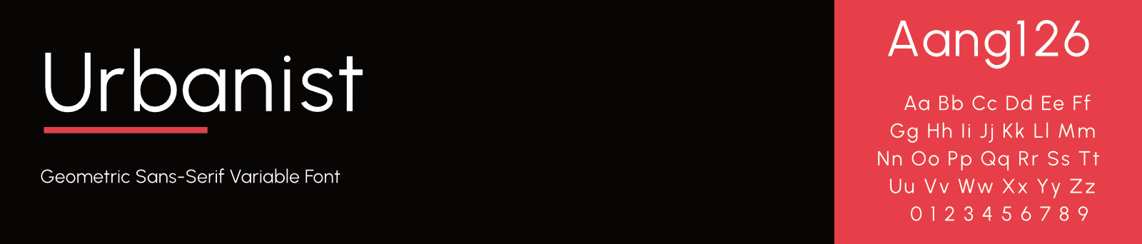
Urbanist is a low-contrast, geometric sans-serif inspired by Modernist design and typography. The project was launched by Corey Hu in 2020 with 9 weights and accompanying italics. Conceived from elementary shapes, Urbanist's neutrality makes it a versatile display font for print and digital mediums. The font is currently available as a variable font with "Weight" and "Italic" axes.

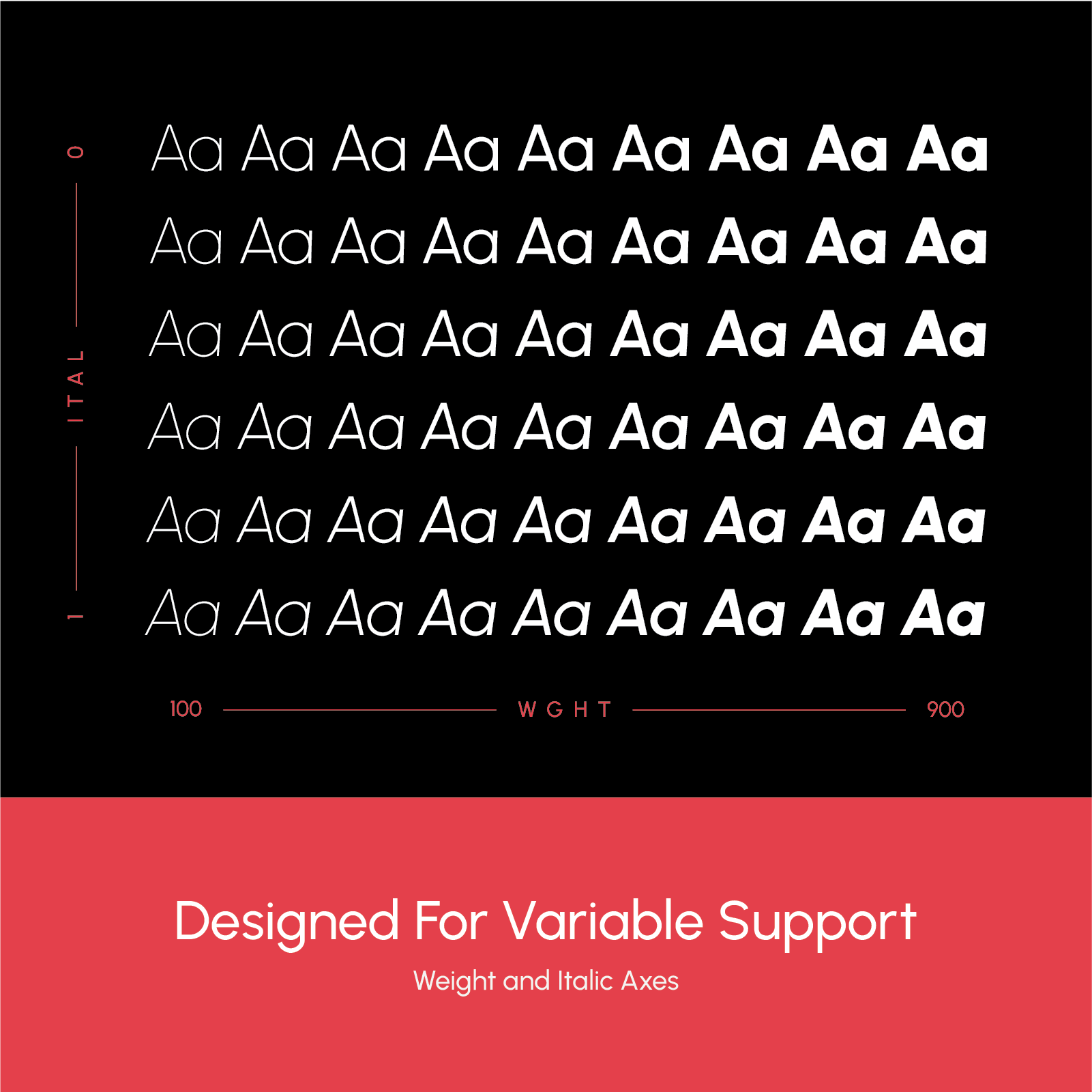
There are 9 predefined weights, each with an italic set.

  • Thin
  • ExtraLight
  • Light
  • Regular
  • Medium
  • SemiBold
  • Bold
  • ExtraBold
  • Black

The variable font file utilizes 2 axes for tuning weight (100-900) and italics (0-1).

Want to suggest an improvement?

To suggest an improvement or fix, open an issue (please check if a similar issue exists first). If you have changes, open a pull request. See more details in CONTRIBUTING.md

Build from source

To build fonts from the source file, use the build command in your terminal:

  1. Clone this repostory: git clone https://github.com/coreyhu/Urbanist.git && cd Urbanist
  2. Use the build command: make build
  3. Find the built font files in the fonts/ directory

Copyright

Copyright (c) 2024, Corey Hu ([email protected])

License

This Font Software is licensed under the SIL Open Font License, Version 1.1. This license is available with a FAQ at: https://scripts.sil.org/OFL

urbanist's People

Stargazers

 avatar  avatar  avatar  avatar  avatar  avatar  avatar  avatar  avatar  avatar  avatar  avatar  avatar  avatar  avatar  avatar  avatar  avatar  avatar  avatar  avatar  avatar  avatar  avatar  avatar  avatar  avatar  avatar  avatar  avatar  avatar  avatar  avatar  avatar  avatar  avatar  avatar  avatar  avatar  avatar  avatar  avatar  avatar  avatar  avatar  avatar  avatar  avatar  avatar  avatar  avatar  avatar  avatar  avatar  avatar  avatar  avatar  avatar  avatar  avatar  avatar  avatar  avatar  avatar  avatar  avatar  avatar  avatar  avatar  avatar  avatar  avatar  avatar  avatar  avatar  avatar  avatar  avatar  avatar  avatar  avatar  avatar  avatar  avatar  avatar  avatar  avatar  avatar  avatar  avatar  avatar  avatar  avatar  avatar  avatar  avatar  avatar  avatar  avatar  avatar

Watchers

 avatar  avatar  avatar  avatar

urbanist's Issues

Adjust curve heights on rounded glyphs

Tops and bottoms of the curves on abdghmnpqu are pretty pinched.
The highest and lowest points of the curves on these offset shapes should be more offset.

Letter spacing issue

Hi there!

After comparing different Google sources I loved yours.
When using it I have found an issue between the letters "i" and "g" when using the word "design". This can be seen in the heavier variants.
It would be great to correct it if you have time. I'll let you know if I find more.

Greetings.
Carlos.

Captura de pantalla 2021-10-21 a las 20 56 21

Some issues (4, 0)

i have zero knowledge of typography, but i'll show changes visually

  • 4 looks too weird, especially with larger text size and lighter weights
  • 0 is too fat
    image
    Legend:
    First column: Proposed change
    Second column: Urbanist 1.303
    Third column: Proposed vs original - proposed changes are in red

Bold: Fix f

The interior section of the bold f really doesn't work well. Could use a more "defined" top hook.

Tabular figures support

Love this font - is it possible to add support for tabular figures, such that 111 and 123 take up the same amount of space when using the following CSS properties?

font-variant: tabular-nums;
-moz-font-feature-settings: "tnum";
-webkit-font-feature-settings: "tnum";
font-feature-settings: "tnum"

Lowercase 't' looks out of place

The images in the README show lowercase 't' with a crossbar lined up with x-height, which looks very nice, but the current font files render 't' with a much lower crossbar that appears out of place next to most other characters (particularly 'r' and 'z'). 'f' shares the same crossbar height, but is less awkward looking due to its taller ascender.

Confusing degree and ordinal symbol

Símbolo de grado y ordinal confuso. Se muestra como parecido a esto '60o'.

  • 60ª
  • 60º

Una gran fuente. He encontrado una buena sustituta a la Futura :)

Thank you very much!

Undesired kerning offset appears with bolder thicknesses

First off, I just want to say good job on this font. It's coming along rather nicely.

I've noticed some kerning offset gradually appearing between certain characters as the font gets bolder.
Notice the i's spacing progressively getting unbalanced between the two bordering t's:
image
image

I'm no typographer so I don't know how I could help, but I thought I'd point this out as it can sometimes become pretty apparent with headings (and kerning can be troublesome to fix at specific places when using the font for web)

Google Fonts QA report

Fontbakery report

Fontbakery version: 0.7.15

[1] Family checks
WARN: Is the command `ftxvalidator` (Apple Font Tool Suite) available?
--- Rationale ---

There's no reasonable (and legal) way to run the command `ftxvalidator` of the
Apple Font Tool Suite on a non-macOS machine. I.e. on GNU+Linux or Windows etc.

If Font Bakery is not running on an OSX machine, the machine running Font
Bakery could access `ftxvalidator` on OSX, e.g. via ssh or a remote procedure
call (rpc).

There's an ssh example implementation at:
https://github.com/googlefonts/fontbakery/blob/master/prebuilt/workarounds/ftxvalidator/ssh-implementation/ftxvalidator


  • WARN ftxvalidator is not available.

[1] Urbanist-Black.ttf
WARN: Checking OS/2 achVendID.

[1] Urbanist-BlackItalic.ttf
WARN: Checking OS/2 achVendID.

[1] Urbanist-Bold.ttf
WARN: Checking OS/2 achVendID.

[1] Urbanist-BoldItalic.ttf
WARN: Checking OS/2 achVendID.

[1] Urbanist-ExtraBold.ttf
WARN: Checking OS/2 achVendID.

[1] Urbanist-ExtraBoldItalic.ttf
WARN: Checking OS/2 achVendID.

[1] Urbanist-Italic.ttf
WARN: Checking OS/2 achVendID.

[1] Urbanist-Light.ttf
WARN: Checking OS/2 achVendID.

[1] Urbanist-LightItalic.ttf
WARN: Checking OS/2 achVendID.

[1] Urbanist-Regular.ttf
WARN: Checking OS/2 achVendID.

[1] Urbanist-SemiBold.ttf
WARN: Checking OS/2 achVendID.

[1] Urbanist-SemiBoldItalic.ttf
WARN: Checking OS/2 achVendID.

[1] Urbanist-Thin.ttf
WARN: Checking OS/2 achVendID.

[1] Urbanist-ThinItalic.ttf
WARN: Checking OS/2 achVendID.

Summary

💔 ERROR 🔥 FAIL ⚠ WARN 💤 SKIP ℹ INFO 🍞 PASS 🔎 DEBUG
0 0 15 842 85 935 0
0% 0% 1% 45% 5% 50% 0%

Note: The following loglevels were omitted in this report:

  • SKIP
  • INFO
  • PASS
  • DEBUG

Diff images: urbanist_qa.zip

Bring out "corners" on rounds

The “corners” of the rounds seem kind of little pushed in. See COobpq (in bold especially). Also the hmn shoulders particularly feel kind of slumped so we could try bringing them out a bit more.

Woff2 variable font

Are there any plans to release a woff2 variant of the variable font? This would help massively with our bundlesize

"B" capital not smooth curve

Hey Corey,

I found a not smooth curve in the capital "B".
It is seen more in Bold, ExtraBold and Black.
Attached capture.

Cheers.
Carlos.

Captura de pantalla 2021-12-16 a las 11 16 34

Use anchors

Sorry I haven't spotted it earlier, your design is missing anchors, preventing from generating a proper mark_to_mark feature. This feature allow combination of accents for non-encoded letters. you can add them with cmd+u in glyphs. Then make sure your accented letters have automatic alignment, and adjust positon of accents by moving the anchors.

the tuto is pretty straightfoward : https://glyphsapp.com/learn/diacritics

Turkish letter support

Hello,
Liked this font so much, I want to use it on my website. But I can't use it because there is no support for Turkish letters. Can you please add Turkish letters like İ, Ğ, Ü, Ş, Ç, Ö, ğ, ü, ş, ç, ö?

Lowercase A is not properly slanted in thicker weights

While testing Version 1.310 of the typeface, I realized that a (U+61 LATIN SMALL LETTER A) is not properly slanted in thicker weights! (Especially the Regular weight, of course.) Below here is the screenshot of Ubanist Black Italic on Windows 10 Pro, version 21H2 (Build 19044.1706):
image

Missing diacritics for Polish [Latin Extended]

Polish language is based on Latin script with addition of a few diacritics.
Polish diacritics are ą Ą ć Ć ę Ę ł Ł ń Ń ó Ó ś Ś ż Ż ź Ź.

Looks like the font currently handles almost all of them correctly, only ł Ł are unable to be rendered. Checked in the Google Fonts preview.

Polish language is the 7th language with most native speakers in Europe with ca. 40 million native speakers. Millions of Polish speakers can also be found in countries such as Germany, Czech Republic, Slovakia, Canada, Argentina, Brazil, Israel, Australia, the United Kingdom and the United States.
I think adding missing Polish diacritics would make sense for the font, especially that most letters (standard Latin + most of Polish diacritics) for Polish are already implemented.

STAT and fvar issues

In STAT:

  • Double Black instances.
  • Regular instance should be elidable.
  • Italic instances are missing (two instances: Roman, elided, and Italic).

In fvar and name:

  • postscriptNameID should have a nameID 25 component.

gftools gen-stat could solve these issues.

"i" has too much space if before or next to some letters.

Hey, I just found this font on Google Fonts and I love it.

I've found that the i's have too much space when next to an a, v or e.

I attached some screenshots.

Not sure if it's intentional, but I think it would look better if it had a little less spacing after the i'
firefox_f9OjaEbiOZ
firefox_e0fzUj11AZ
firefox_8rfglObHbA
firefox_NmmJrIQ2SD
firefox_x7jR7cQEbG
firefox_PZdlwSwERD

Thank you for the great font.

Kerning on V/T/W paired with A/O is too wide

It's seems the kerning on V, T and Ws in caps is too wide when pairing it with As or Os. Should be more compressed. It's very noticeable in the word FOV where the V is very far away.

Maybe there are other combinations, but I haven't seen them so far.

Please see screenshot compared with other fonts.
Screenshot 2023-12-19 124550

When using Illustrator I can use optical kerning and that (kinda) fixes it but that option not available when importing the font to software like UE5.

Not sure if it matters, but I'm using Windows

Letters ū Ū get distorted on chromium based browsers

Letters ū Ū get distorted on chromium based browsers when they have any character before or after it. The dash above the letter gets moved to the right side of the letter.
Issue can be reproduced on google fonts using any chromium based browser.
No issue on firefox though.

Ss are kind of topheavy

Ss should be pretty symmetrical right now. Maybe try shrinking the size of the upper half of these glyphs

Recommend Projects

  • React photo React

    A declarative, efficient, and flexible JavaScript library for building user interfaces.

  • Vue.js photo Vue.js

    🖖 Vue.js is a progressive, incrementally-adoptable JavaScript framework for building UI on the web.

  • Typescript photo Typescript

    TypeScript is a superset of JavaScript that compiles to clean JavaScript output.

  • TensorFlow photo TensorFlow

    An Open Source Machine Learning Framework for Everyone

  • Django photo Django

    The Web framework for perfectionists with deadlines.

  • D3 photo D3

    Bring data to life with SVG, Canvas and HTML. 📊📈🎉

Recommend Topics

  • javascript

    JavaScript (JS) is a lightweight interpreted programming language with first-class functions.

  • web

    Some thing interesting about web. New door for the world.

  • server

    A server is a program made to process requests and deliver data to clients.

  • Machine learning

    Machine learning is a way of modeling and interpreting data that allows a piece of software to respond intelligently.

  • Game

    Some thing interesting about game, make everyone happy.

Recommend Org

  • Facebook photo Facebook

    We are working to build community through open source technology. NB: members must have two-factor auth.

  • Microsoft photo Microsoft

    Open source projects and samples from Microsoft.

  • Google photo Google

    Google ❤️ Open Source for everyone.

  • D3 photo D3

    Data-Driven Documents codes.